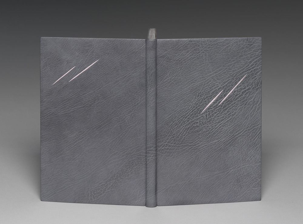
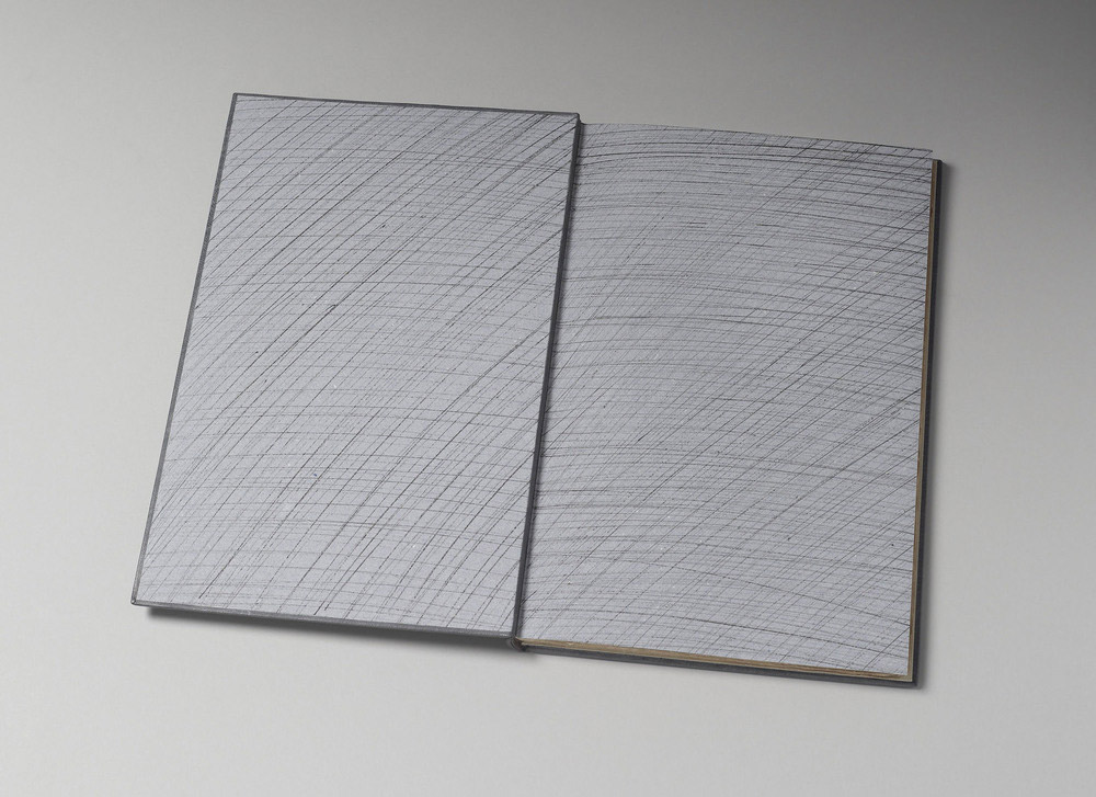
The 1926 Nonesuch Press edition of Herman Melville’s Benito Cereno with illustrations by E. McKnight Kauffer was bound by Kathy Abbott in 2013. The book was bound in full grey goatskin with recessed paper inlays. The head edge was gilt in Caplain leaf to appear distressed.
I would love to talk about your aesthetic. Your designs are compelling because of their simplicity, where does your inspiration come from? Are you drawing from the book itself or outside influence?
I am a passionate reader, so the inspiration comes from reading and re-reading the text until I get a ‘sense’ of the book. A colour usually is the first thing that comes to my mind and then I write down the key themes of the text, which stay with me after I have finished reading: that’s my starting point. I then search for the skin of leather that best expresses the essence of the text or that will emphasise my idea for the design.
My ideas usually get distilled down to their absolute essence: I want to lure the reader in to my books, to entice them to discover what the book is about.
For Benito Cereno I wanted to express the extreme savagery of the text. The story is set on a shipwrecked boat that has been mutinised by its slaves, who have slain most of the crew with cutlasses. I chose the skin because the grain looked windswept and stormy and I also wanted to continue the feeling of a windy storm within the endpapers and in the scratches to the Caplain-gilded head of the book.
After practicing the slash marks many times, I found that the only way to make them look savage and frenetic, was to actually slash the book very fast with a scalpel, once the book was covered. This was hugely stressful, as I only had one chance to get it right: once the first one was done, I had to hold my breath and repeat it three more times!
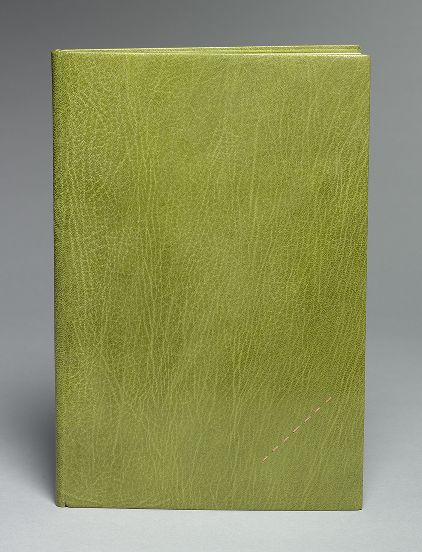
In addition to Kathy’s binding of Benito Cereno, I also wanted her to speak about her design for A Stitch in Time or Pride Prevents a Fall. This binding was created in 2010 and is also a Nonesuch Press edition published in 1927.
A Stitch in Time is quite a silly poem about a 1930’s girl about town, who finds herself a slightly dangerous situation when she is duped into having lunch alone with a man who has sexual intentions towards her. She gets herself out of a potential sexual assault because she can’t bear the thought of her assailant seeing a tear in her green petticoat, which she had hastily sewn up with pink thread before leaving her house.
I tried to make the pink leather onlays on this binding look like they were sewn through the green leather.

Beautiful books Kathy. Remember the red one from my time with you.
Happy New Year.
Love
Vivi