RSS Feed

‘binder of the month’ Category

  1. Catching Up With Lori Sauer // No. 4

    August 20, 2017 by Erin Fletcher

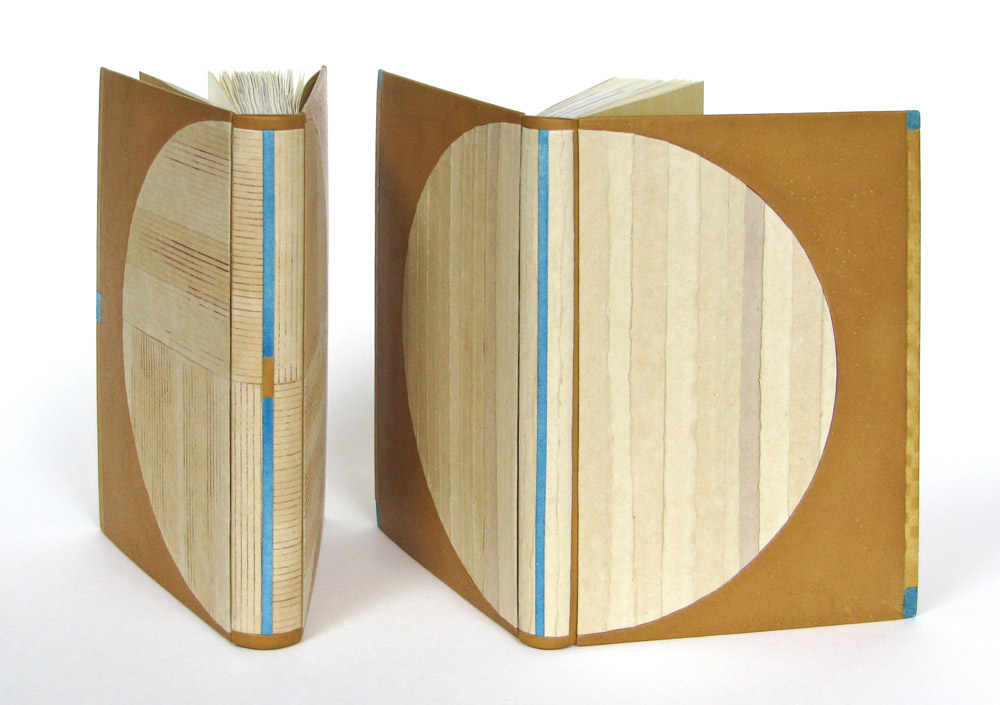
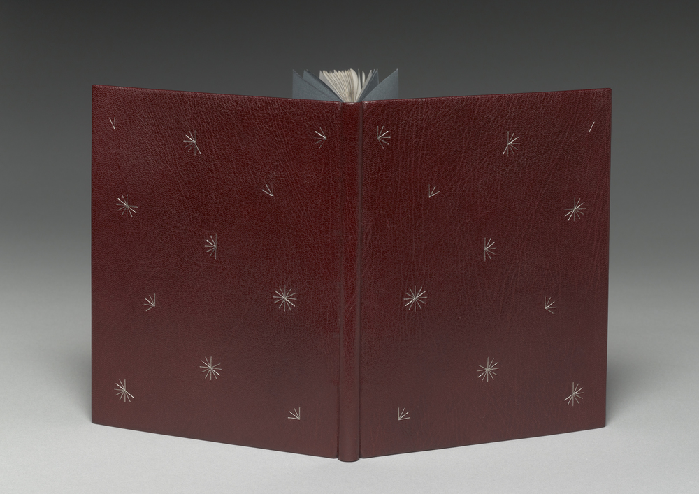
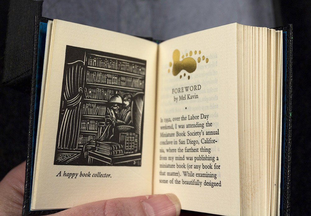
    In 2016, Lori Sauer was one of six Designer Bookbinder Fellows selected to bind one the six titles shortlisted for the Man Booker Prize. Lori bound Madeleine Thien’s Do Not Say We Have Nothing, which was presented to the author on the night of the award ceremony.

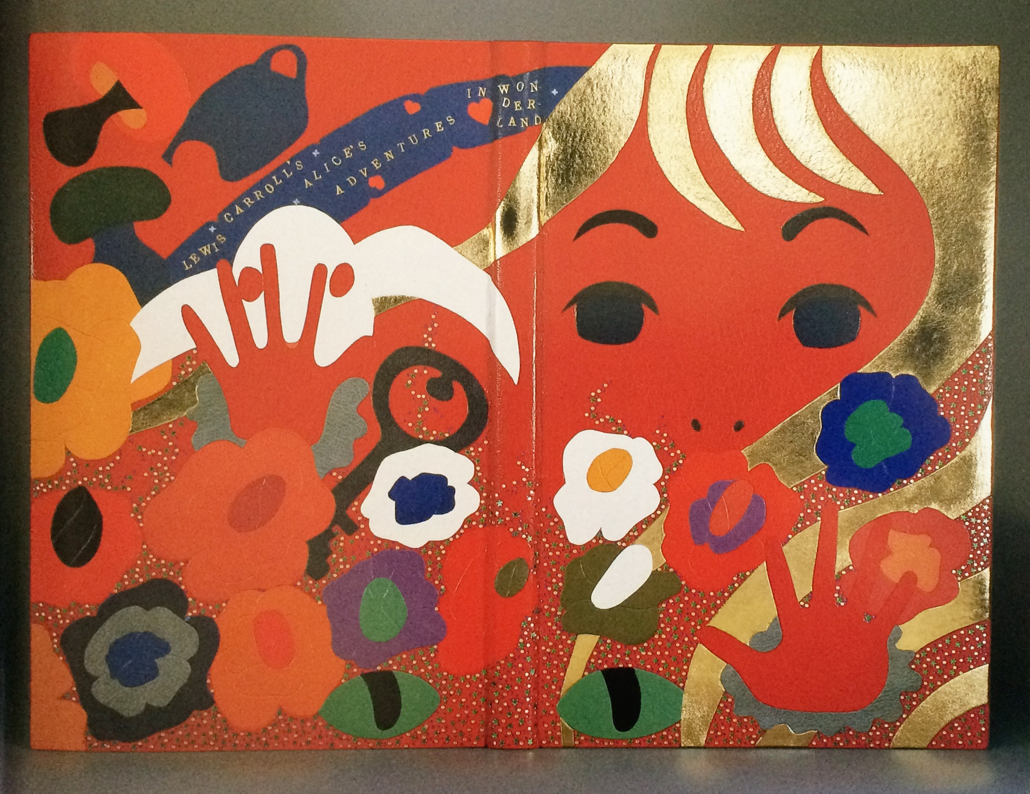
    Your designs are so delicate, but have the power to capture deep emotion. Each element feels meticulously planned and placed in perfect harmony. Can you go through the stages of planning for Do Not Say We Have Nothing, specifically touching on the placement of the small red pieces?
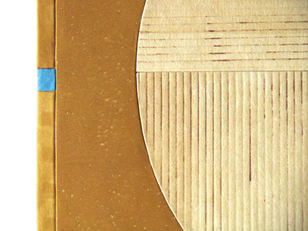
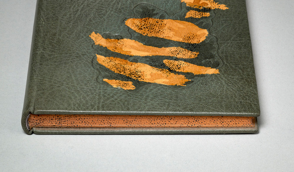
    This is a binding done for the Man Booker Prize shortlist, work that always has a very tight deadline. I loved the novel, an epic tale spanning three generations of two separate families, who lived through a turbulent time of Chinese history in the mid twentieth century (the Cultural Revolution through to Tiananmen Square). There is a book within the book, called The Book of Records that ties the families and generations together. Classical music also plays a big part, in particular The Goldberg Variations, a piece based on repeated patterns and mathematics.

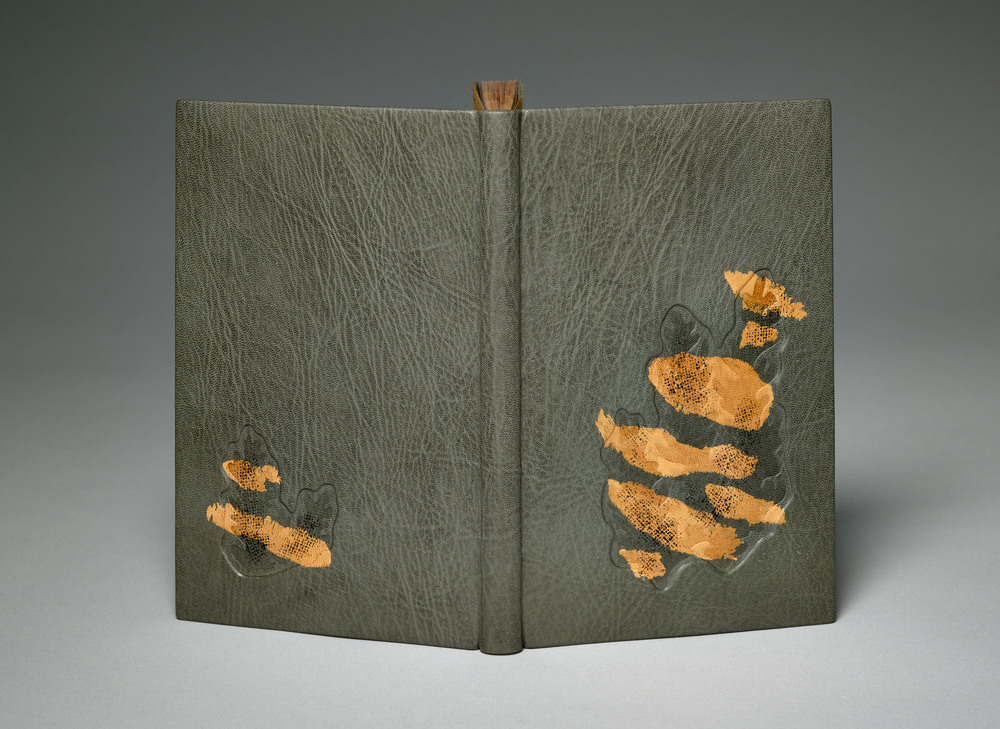
    I usually tend to work in light and pale colours, my penchant for minimalism. This is the first dark binding I’ve done for a long time but I felt it was needed to capture the psychological temper of the period. All of Chinese society at the time wore uniforms – drab, dark colours with only the Red Guard having something bright.

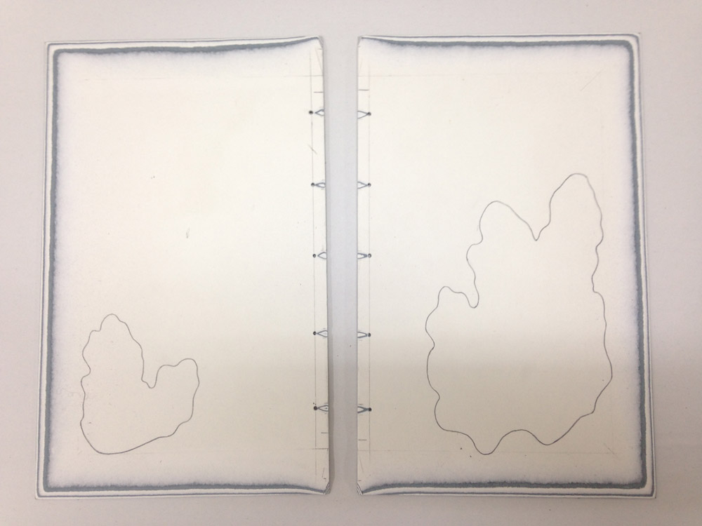
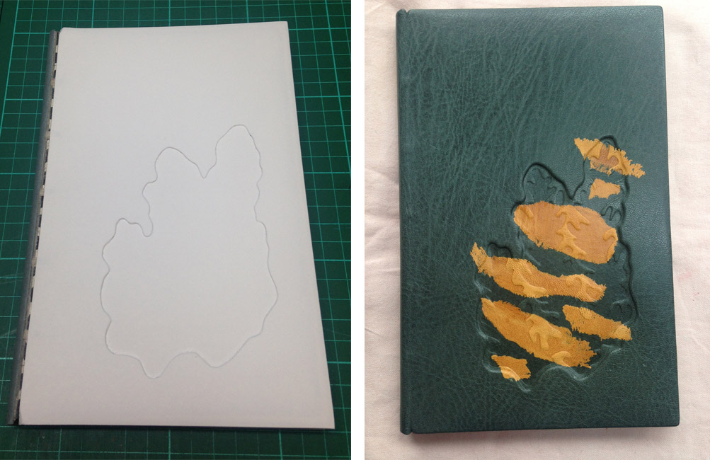
    With all of these elements stewing around in my mind I begin to sketch and when some of them start to work for me I make paper mock-ups – cutting out the right colours and shapes and moving them about – and take photos of the best compositions. I also work on my iPad with a drawing app. (I like Art Rage). I eventually settle on something that makes my fingers want to start work. Sometimes I settle on a design that’s a very long way from my starting point but I’m not unduly bothered that I move off in a sideways direction, as a good design will stand up on its own.

    The final design is my visual solution to a novel about music, the passage of time, families and Chinese writing.

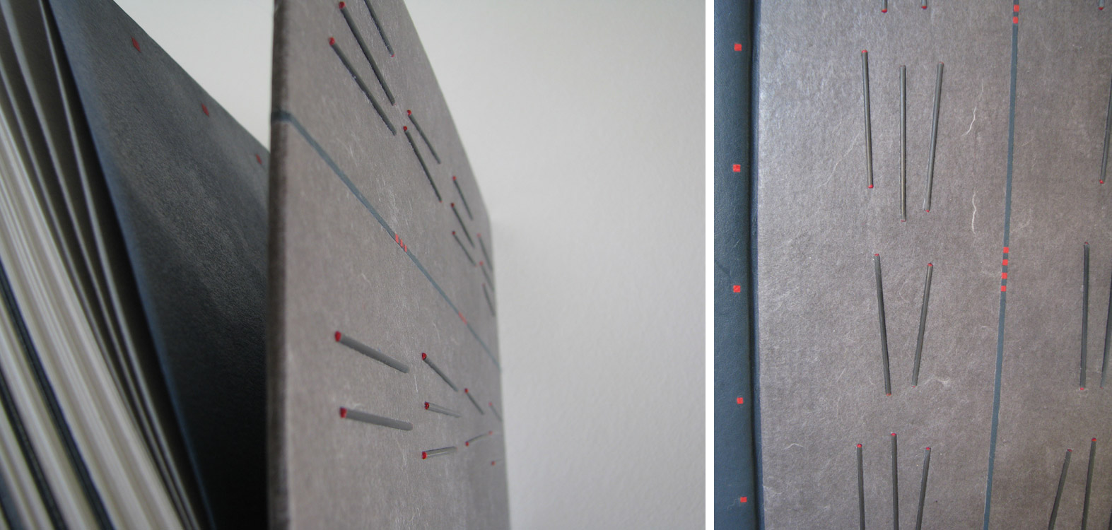
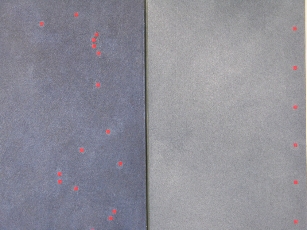
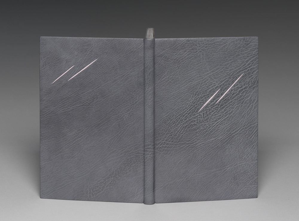
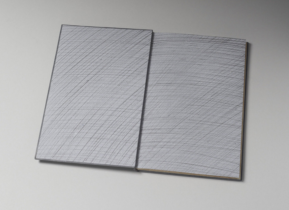
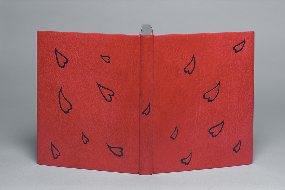
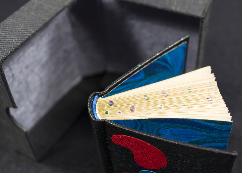
    You’ve asked specifically about the small red dots. The ones on the outside (leather, shown above) were placed for compositional balance and add a necessary shot of colour. The dots on the doublures (paper, shown below) were very randomly applied. I worked instinctively and fairly quickly here and photographed a pattern I liked so I could use it for reference when gluing them down later.


  2. Catching Up With Lori Sauer // No. 3

    August 13, 2017 by Erin Fletcher

    Lori Sauer bound The Moonstone by Wilkie Collins in 2015, just three years after it was published by Arion Press. This limited edition includes illustrations by Stan Washburn. As Lori mentions below, she split the text into two volumes, creating two fine bindings that compliment each other beautifully. Each binding is covered with calfskin and decorative handmade paper.

    Can you talk about your use of materials and how they connect to the text? Which elements are paper and why use paper over another type of material?
    Relating a material to a text is not something that I ever find myself mulling over. In rare cases one might pick wood for a book about wood, etc., but in the majority of cases leather is used, as convention. I’ve moved away from leather and now mainly bind in vellum because it’s so beautiful. Just to break out from my habit I bound this one in calfskin and paper. The calfskin because it has no grain and paper because I’ve always wanted to use it as major material for a design binding. I’ve always had the feeling (perhaps I’m wrong here) that paper is not considered appropriate for serious work. But it has a longer shelf life than leather, is open to a wide range of decorative treatments and I haven’t met a binder yet who isn’t besotted with it.

    The circular shapes are paper and the area around the circles is calfskin. The paper is a heavy weight Griffen Mill, specially made for a commission I did and these are some of the off-cuts. The pieces have been tinted with watercolour to achieve a range of neutral shades. The leather has been sanded over the top of a pimply surface to create texture.

    This is a very long novel with many characters and lots of narrative layers. There were a number of key scenes set on some shifting sands, a metaphor for the quasi-surreal nature of the plot. My colour choice came from this and also why I wanted to use a variety of textures/materials.

    This is a single volume production (Arion Press) but I decided to split it in to two bindings because I find very thick books rather clumsy. It worked out well to divide it because of how Collins had structured the story into two sections. I liked doing a pair of complimentary bindings, as I was able to use more than just one of the many compositions I had played around with.

    Shown below are the two interior views of each volume. 


  3. Bonus // Bookbinder of the Month: Kathy Abbott

    December 31, 2015 by Erin Fletcher

    WingedChariot-KathyAbbott

    I am ending my interview with Kathy Abbott with a bonus post. The binding above is Winged Chariot by Walter de la Mare. Kathy completed this binding in 2012 by covering the book in full burgundy goatskin. The tooled designs are done in Caplain leaf and the head edge is gilt in the same.

    When laying out a tooled design, especially one that is to be symmetrical across the book (like the design on Winged Chariot), what is your approach? Have you always employed the same method for transferring your design or has your technique changed over time?
    I have been fortunate to have been taught gold tooling in both the traditional manner, whilst I was at college and then latterly, in the contemporary manner by Tracey Rowledge. Both Tracey and my traditional gold finishing tutors have used the same method of marking out a diaper pattern (a diagonally marked grid), which can be a useful way of creating symmetry across both boards.

    This design of this book wasn’t done using a diaper pattern. It contains one long poem, about time and to express this, I had a very fine 5mm short pallet made to create the imagery, and wanted the tooled design to be fairly random. I made a paper template the same size as one of the boards, drew out the design with a fine ink-pen. I photocopied the drawing, cut out some of the areas of the design and re-positioned them until I was happy with it. I then traced the design and reversed it. I always pin my designs up on the wall and live with them for a while before I begin tooling.

    When I was ready, I photocopied the design onto thin handmade paper, attached it to the binding, tooled through the template, removed the template and blind-tooled again direct, applied the glaire and then tooled each impression with 3 layers of Caplain gold leaf (which was picked up on the tool itself).


  4. Bookbinder of the Month: Kathy Abbott

    December 27, 2015 by Erin Fletcher

    LovesLaboursLost-KathyAbbott

    This 2006 binding from Kathy Abbott is Shakespeare’s Love’s Labour’s Lost with illustrations by Berkeley Sutcliffe. The binding is covered in full pink goatskin and includes multi-colored goatskin onlays. The top edge is colored pink to match the leather.

    One of the reasons that I wanted to do this interview with you is that you create such striking and simplistic designs, which really push forward the beauty of the leather. What is your selection process for choosing the perfect leather?
    I adore the graininess of Nigerian goatskin: every skin tells a different story through its grain. Depending on which angle you cut your piece of covering leather, you can express a landscape, a sea, a wind, trees; all sorts. I don’t often use the spine of the skin on the spine of my books: I find it much more interesting to move my template window around the skin until I find something more arresting about the grain. I also love all the faults on skins: dyeing faults, holes, scars etc.

    When I have read my text, I set off to find the perfect skin to express as much of the story as possible. I have often looked through a hundred or more skins at the tannery until I find the ‘right’ one: the poor guys at Harmatan have been so patient with me over the years! Often, I have found it difficult to embellish the skin I have chosen, as the grain is saying everything I want to say about the text. I do all I can to celebrate the beauty in every skin I use.

    Sadly, we can no longer get Nigerian goatskins because of the political situation there. So obtaining anything grainy now is a challenge as the grain of Indian goatskins is quite flat in comparison. Luckily I have a large stock of Nigerian skins, so I will be ok for a while, but I won’t be able to be so choosy in the future.

    NewYorkRevisited-KathyAbbott

    This is a binding of Kenneth Auchincloss’s New York Revisited that includes wood engravings by Gaylord Shanilec. The book was published by The Grolier Club of New York in 2002. Kathy covered the binding in full black goatskin and detailed the covered with handmade paper onlays. Click on the image to get a full sense of the graininess of the leather.


  5. Bookbinder of the Month: Kathy Abbott

    December 20, 2015 by Erin Fletcher

    BenitoCerano-KathyAbbott

    The 1926 Nonesuch Press edition of Herman Melville’s Benito Cereno with illustrations by E. McKnight Kauffer was bound by Kathy Abbott in 2013. The book was bound in full grey goatskin with recessed paper inlays. The head edge was gilt in Caplain leaf to appear distressed.

    I would love to talk about your aesthetic. Your designs are compelling because of their simplicity, where does your inspiration come from? Are you drawing from the book itself or outside influence?
    I am a passionate reader, so the inspiration comes from reading and re-reading the text until I get a ‘sense’ of the book. A colour usually is the first thing that comes to my mind and then I write down the key themes of the text, which stay with me after I have finished reading: that’s my starting point. I then search for the skin of leather that best expresses the essence of the text or that will emphasise my idea for the design.

    My ideas usually get distilled down to their absolute essence: I want to lure the reader in to my books, to entice them to discover what the book is about.

    For Benito Cereno I wanted to express the extreme savagery of the text. The story is set on a shipwrecked boat that has been mutinised by its slaves, who have slain most of the crew with cutlasses. I chose the skin because the grain looked windswept and stormy and I also wanted to continue the feeling of a windy storm within the endpapers and in the scratches to the Caplain-gilded head of the book.

    BenitoCerano3-KathyAbbott

    After practicing the slash marks many times, I found that the only way to make them look savage and frenetic, was to actually slash the book very fast with a scalpel, once the book was covered. This was hugely stressful, as I only had one chance to get it right: once the first one was done, I had to hold my breath and repeat it three more times!

    AStitchInTime2010

    In addition to Kathy’s binding of Benito Cereno, I also wanted her to speak about her design for A Stitch in Time or Pride Prevents a Fall. This binding was created in 2010 and is also a Nonesuch Press edition published in 1927.
    A Stitch in Time is quite a silly poem about a 1930’s girl about town, who finds herself a slightly dangerous situation when she is duped into having lunch alone with a man who has sexual intentions towards her. She gets herself out of a potential sexual assault because she can’t bear the thought of her assailant seeing a tear in her green petticoat, which she had hastily sewn up with pink thread before leaving her house.

    I tried to make the pink leather onlays on this binding look like they were sewn through the green leather.


  6. Bookbinder of the Month: Kathy Abbott

    December 13, 2015 by Erin Fletcher

    In the interview at the beginning of the month, I asked Kathy Abbott about Tomorrow’s Past, an exhibit inspired by Sün Evrard’s article in The New Bookbinder, Volume 19. The idea is to rethink the approach of repair work in a contemporary and more visible way. In this post Kathy explains the treatments for two bindings and why she chose to do these repairs in an unconventional way.

    I’ve chosen a selection of bindings from your Tomorrow’s Past portfolio. I find the treatments to be delightful yet still respectful to the bindings historic value.
    Thank you. I could never undertake this sort of conservation treatment if I hadn’t worked for 9 years as a book consevator and bindery manager at the antiquarian booksellers: Bernard Quaritch Ltd. I learned so much there about antiquarian books and from working on such a wide variety of them, each with very individual needs. I continue to conserve antiquarian books as well as Islamic manuscripts, where I constantly have to stretch my skill base in order to do the right thing for the book in my care. This allows me to have a lot of tacit knowledge at my fingertips when I approach my Tomorrow’s Past work.

    SacredDramas-KathyAbbott

    In the treatment of Sacred Dramas (1818) you’ve included this brightly hand-colored tissue that is quite a stark contrast from the original covering material. What was the prior condition of the book and why did you choose, what could be perceived as an unconventional route of conservation?
    I made this work for a Tomorrow’s Past exhibition at the Aram Gallery, London, in 2013.

    SacredDramas2-KathyAbbott

    I found the book with both boards detached and no spine, and I spent a lot of time looking and handling the book before I decided on the course of action. The book’s sewing was intact and each edge was marbled, so I didn’t want to disturb it by re-sewing. The book didn’t open well, so I reattached the boards with linen and they now open right back and touch each other at the spine. I didn’t want a heavy spine that would impede the book’s opening even more, so decided on a sort of hollow, made from handmade paper but the head and tail of the spine has a little flap which tucks down inside the hollow, so that it doesn’t have a vulnerable cut edge. The decoration on the spine is hand drawn with acrylic inks, to relate to the decorative gold tooling on the boards. The boards themselves were quite damaged and needed to be repaired, so I decided to highlight both the board attachment and every repair, with the same bright blue colour that appears within the marbled edges on the book-block. The re-binding of this book came the year after conserving Q. Horatii Flacci Carmina Expurgata, where I first explored the concept of highlighting the repairs and it felt absolutely like the right thing to do. It has caused a lot of controversy though: people either love it or hate it.

    SacredDramas3-KathyAbbottSacredDramas4-KathyAbbott

    – – – – – – – – – – –

    QHoratiiFlacci-KathyAbbott

    The repair on the binding of Q. Haratii Flacci Carmina Expurgata (1784) is subtle yet stunning. Can you walk us through the steps: was the book resewn and how was the hand-gilded paper used to repair the binding?
    This poor book was in such bad shape when I found it but I absolutely loved its original binding and thought it was essential to keep every last crumb of it. My good friend is a Kintsugi restorer: this is where broken Japanese ceramics are repaired with lacquer and the repairs are highlighted in real gold or silver powder, rendering the piece even more beautiful. I thought that this particular book would really benefit from this sort of treatment.

    QHoratiiFlacci2-KathyAbbott

    The sewing was broken in many places and the alum-tawed thongs were very brittle and had snapped in several places, making them unusable. I didn’t want to use new, white thongs, as they would look very bright and at odds with the rest of the book, so decided to dye some alum-tawed skin dark brown to match the titling, using conservation leather dyes.

    I pulled the book and then repaired the tears in the cover with Japanese tissue, the text-block did not need to be guarded nor repaired. I then re-sewed the book following the original sewing positions. I gilded a piece of hand-made paper with 23.5 carat gold leaf and the piece was then inserted under the turn-ins of the cover and was adhered to the original turn-ins only, using methylcellulose.

    QHoratiiFlacci3-KathyAbbottQHoratiiFlacci4-KathyAbbott

    The sewing of the front section to close the binding was very complex: the fold of the pastedown was hooked around the first and last sections. To close the binding, (join the cover to the sewn text-block) I had to sew through the front section and the hooked fold of the pastedowns at the same time. The sewing had to go around the thongs, (which needed to be laced through the cover before the sewing could be done), without piercing through the pastedowns nor the cover. I had to make a series of needles, curved to different angles in order to achieve it. It was one of the most technically difficult things I have ever had to do but the result looks very simple. On the finished binding, the gold is only visible where there is a piece of the spine missing and a tiny bit through the lacing positions.


  7. Bookbinder of the Month: Kathy Abbott

    December 6, 2015 by Erin Fletcher

    AsYouLikeIt-KathyAbbott

    Jumping back to 2008 with this binding of William Shakespeare’s As You Like It. Kathy Abbott bound this 1903 Roycroft Shop edition in full scarlet goatskin. The cascading hearts are black goatskin onlays. The head edge is gilt using moon gold.

    I’ve noticed that you never title your bindings. What are your reasons for this choice? Are you ever criticized for this decision by collectors or other binders?
    I wouldn’t say criticized but it is often commented on! I like the reader to be curious about what’s inside the book, without actually ‘telling them’ what it’s about. For me, a book’s design must flow freely across the front board, the spine and the back board without interruption. I feel that a title would break the flow in my work. This is purely personal: I have seen many binders use titling beautifully as an essential element of their design but this is just not for me, at least for now that is! All of my bindings are housed in bespoke drop-back boxes and the title of the book is always on the box, so it’s not a problem.

    The free-flowing design for this book is a nod towards the love letters that Orlando leaves for Rosalind in the trees of the forest.


  8. December // Bookbinder of the Month: Kathy Abbott

    December 1, 2015 by Erin Fletcher

    OnACalmShore-KathyAbbott

    On a Calm Shore is a 1960 edition by Frances Cornford with illustrations by Christopher Cornford. In 2015, Kathy Abbott bound this copy in full grey goatskin with recessed and embossed onlays with relief printing. The edges are decorated and printed to match the design on the covers.

    Can you walk us through the processes used to create the layered design in the recessed areas of the binding?
    This text-block was a very unusual choice for me as it was printed in the 1960’s on modern paper and was heavily illustrated. I am usually drawn to early 20th century, letterpressed printed books from private presses, with no illustrations. When I found this text in a second-hand bookshop, I was delighted: the poems were charming and the illustrations were so vibrant and alive, that I just had to buy it.

    OnACalmShore2-KathyAbbott

    I made this binding for an exhibition in London last year called: Covered. I have responded to the references to the sea in the poetry and to the layered screen-printed illustrations by the author’s son, Christopher Cornford on this binding. I felt that the structure had to be a fine binding over layered pasteboards so that I could sculpt the boards easily, and cover it in beautiful grainy leather, to create different textures.

    OnACalmShore3-KathyAbbott

    Boards before lacing onto the book.

    To create this design, I cut away parts of the boards; laced the boards on and lined the outside with paper to form a solid ground for the leather. I then covered the book with Nigerian goatskin, pushing the leather into the recesses with a very fine-pointed bone folder. I made seaweed-y shapes from millboard (a very laborious job achieved by cutting out the shapes with a scalpel and making bespoke sanding tools to get into the nooks and crannies) and then pressed the millboard pieces really hard into the dampened recessed areas of the covers. I applied the feathered yellow onlays, pressed the millboard shapes in again and then relief printed on top with acrylic ink through scrim, to achieve the texture, which is consistently used within the book’s illustrations.

    OnACalmShore4-KathyAbbott

    left: Boards laced onto book with design cut out | right: Binding covered in goatskin with feathered onlays.

    My response to each book I bind dictates the technique I must employ, often pushing me outside anything I have ever tackled before, and forces me to be on the edge of my practice technically: I always embrace this process.

    What techniques did you employ to carry that pattern onto the edge decoration?
    I coloured the edges with terracotta coloured acrylic ink and then used the same relief printing technique for the texture.

    OnACalmShore5-KathyAbbott

    This interview comes as a suggestion from Haein Song after I interviewed her back in February 2014. Not knowing anything about Kathy or her work, I soon discovered that, though her bindings may appear simplistic, her designs are meticulously planned and thoughtfully executed. In addition to her striking designs, I was pulled in by the gorgeous leathers used to cover her bindings. In the interview, I ask Kathy about her design processes, techniques and her strategy for choosing the perfect skin. She also goes into the concept behind Tomorrow’s Past and the ease of publishing a bookbinding manual.

    Check out the interview after the jump for more about Kathy’s training and her creative process. Come back each Sunday during the month of December for more on Kathy’s work. You can subscribe to the blog to receive email reminders, so you never miss post.

    read more >


  9. Bonus // Bookbinder of the Month: Tini Miura

    October 25, 2015 by Erin Fletcher

    YouCanJudge-TiniMiura

    In a recent competition put on by the Washington University Libraries Special Collections, the public was encouraged to judge books by their covers and cast their vote for favorite binding. Fittingly, the book being bound was Bernard C. Middleton’s You Can Judge a Book By Its Cover, which was published by Mel Kavin and designed by Ward Ritchie in miniature form back in 1995 (which is presumably around the time it was bound as well).

    The first book of this edition was designed and bound by Tini and Einen Miura and printed by Henry Morris. Later on, 32 more binders were invited to create their own unique binding and to celebrate the artistry of the miniature book.

    Tini bound the book in black morocco. She used the onlaid shapes and design to tell a story about the author. The ascending tooled area represents Bernard Middleton’s larger than life character. Running along side this path are circle onlays of various sizes and colors, which show the abundance of information he has shared with the world throughout his professional life.

    In the image above, the book is shown on the right with the slipcase pictured on the left. Tini also made a miniature chemise, which would be placed around the book before sliding it into the slipcase.

    YouCanJudge2-TiniMiura

    The edges are gilt and headbands handsewn in colored silk. The doublures, seen above, have multicolored circular onlays and tooling.

    The scale of many of the bindings in your book A Master’s Bibliophile Bindings: Tini Miura 1980 – 1990 are quite large. For the final post in your interview I would like to talk about two miniatures you did for Bernard Middleton’s You Can Judge a Book by Its Cover. What challenges did you come across when scaling down the binding and decorating processes?
    Usually my books are large, because they are limited edition livre d’artiste. They have signed original images by artists like Picasso, Leger, Roualt, etc. and are extremely expensive.

    I prefer large books that open well and can be enjoyed easily, while lying on a table. Small books have to be held on both sides to keep them open, there is no weight to the text. But I have enjoyed doing some immensely. No change in binding steps for miniatures.

    – – – – – – – – – – –

    Tini bound an additional copy of Middleton’s book in black morocco with several colored inlays (inspired by the shape printed at the top of the foreword) and foil tooling.

    YouCanJudge3-TiniMiuraYouCanJudge4-TiniMiura

    The edges have been gilt and gauffered with colored polka dots. The endpapers are marbled. The book lives in a small clamshell box.

    YouCanJudge6-TiniMiura


  10. Bookbinder of the Month: Tini Miura

    October 25, 2015 by Erin Fletcher

    Alice-TiniMiura

    Alice’s Adventures in Wonderland is one of those titles that has been bound so many different ways and by so many different binders. In 1983, Tini Miura, added her binding to this list with her brightly colored, kaleidoscopic design for an equally mind-bending story. This particular edition was published by the Pennyroyal Press in 1982.

    Bound in red morocco with several onlays that run the spectrum of color between white and black with tooling in gold and green foil. The doublures are a dark red sheepskin and the edges have been in gilt in the rough.

    I love your interpretation of this book, the design emotes feelings of chaos and helplessness. In many of your designs you incorporate floral elements. What does the flower mean within your designs, specifically for this binding and in general?
    It is a fairytale-like story and the things Alice encounters, like rabbit, teapot, etc. Therefore I chose fantasy flowers to make the whole interpretation happen in a “wonderland”.

    Flowers are a wonder of nature that bring joy – like  beautiful words. They do something to your soul, you feel alive and joyful (colors and music does that to me as well).

    When I do a book and see the design in my head, the design becomes this image which I physically execute. After reading the story, if it is not worldwide known literature, I often understand the design after I read the book. I know that is weird. But I feel it is a present and I don’t ever change or complain – just go with it.

    Another reoccurring design element are the built up areas of tiny tooled shapes, which usually flow across the binding. What can you say about the use of this in your work?
    The small dots or squares are my “Pixie” dust, magic or wonderment in the words or stories.


  • My name is Erin Fletcher, owner and bookbinder of Herringbone Bindery in Boston. Flash of the Hand is a space where I share my process and inspirations.
    The StudioNewsletterInstagramEmail me
  • Archives