RSS Feed

Posts Tagged ‘arthur c. clarke’

  1. My Hand // 2001: A Space Odyssey Part Two

    June 13, 2019 by Erin Fletcher

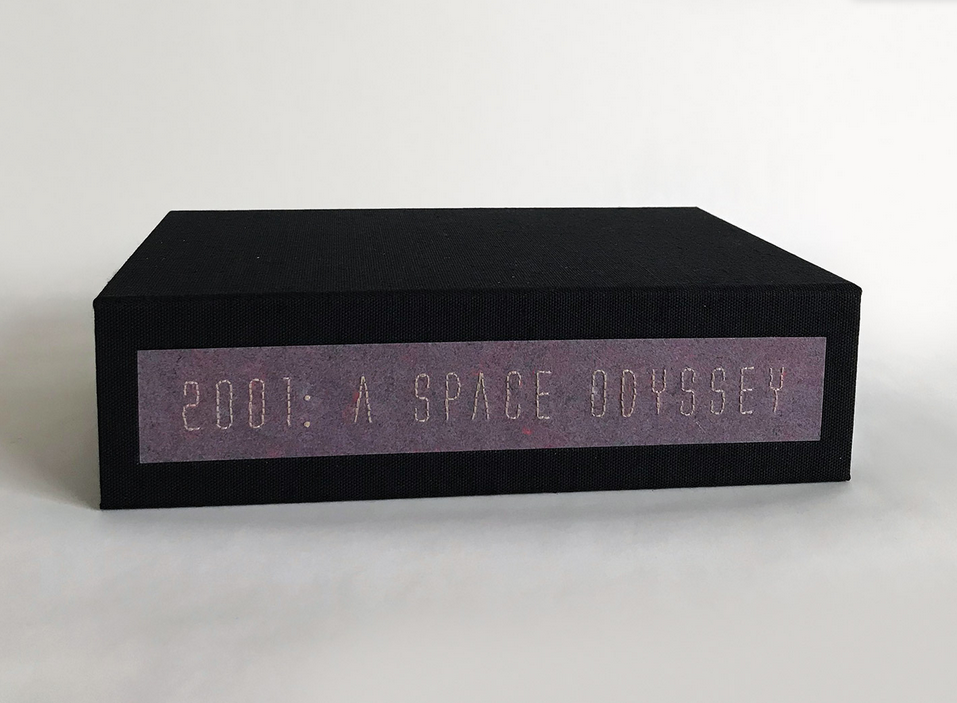
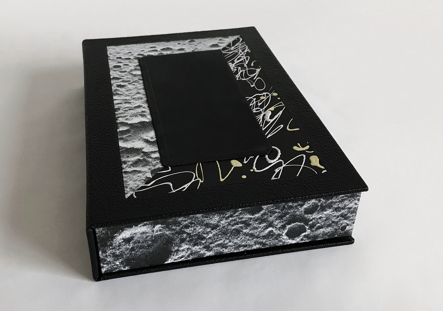
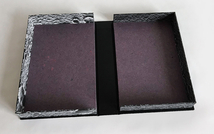
    In my previous post, I went through the various enclosures crafted to hold my binding of 2001: A Space Odyssey and how they represented different parts of the Clarke’s text and Kubrick’s film. This post will focus on the binding itself, the inspiration and the process.

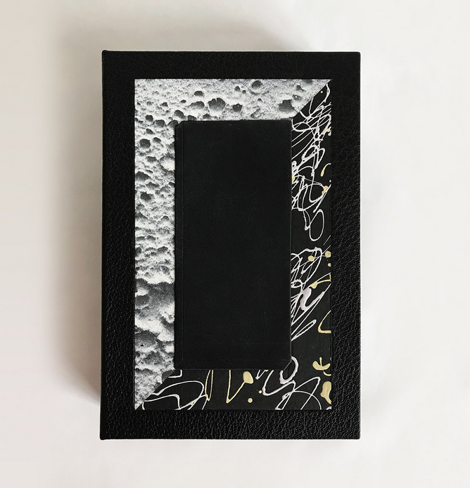
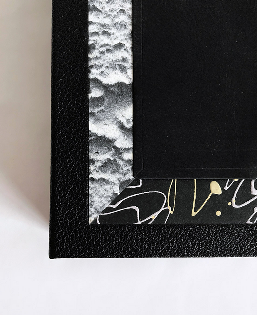
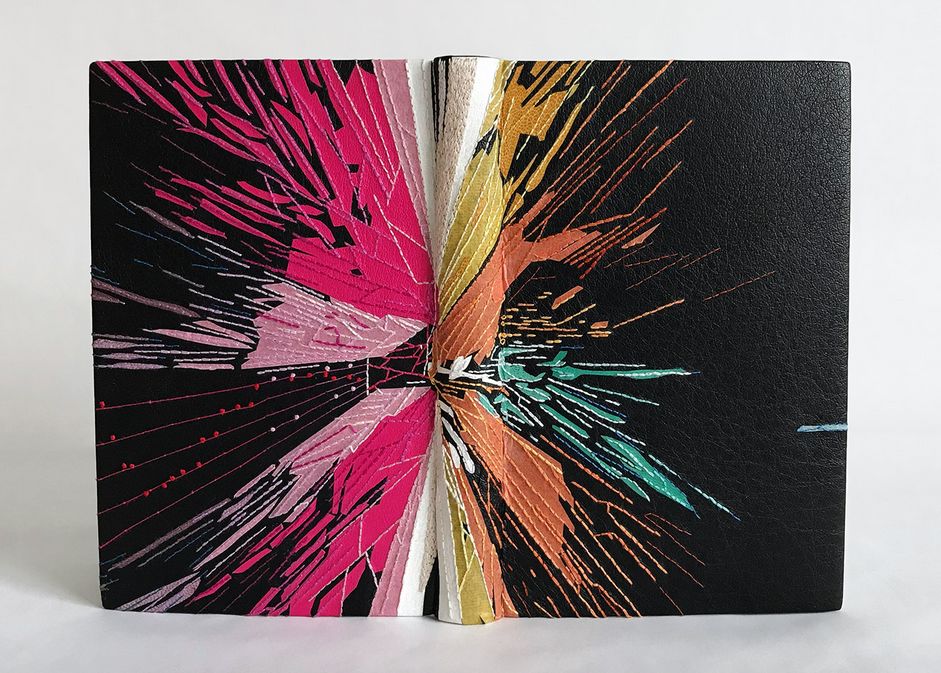
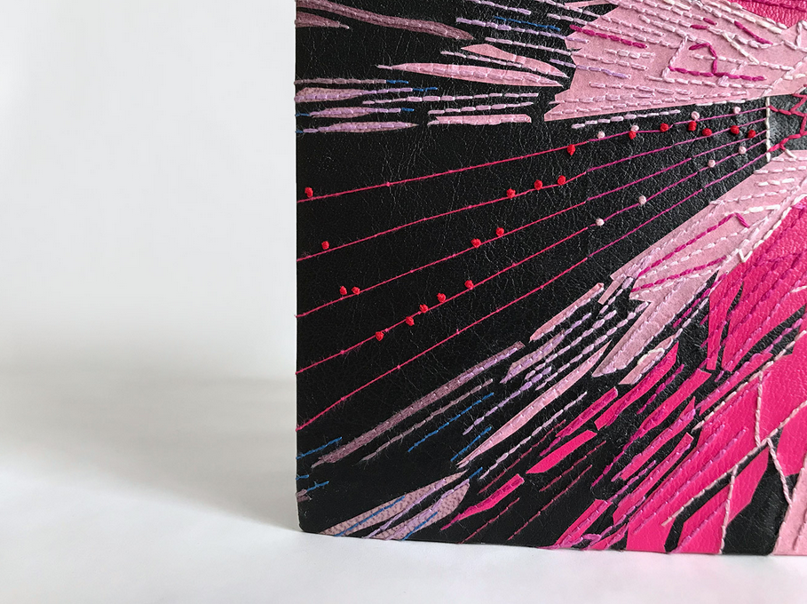
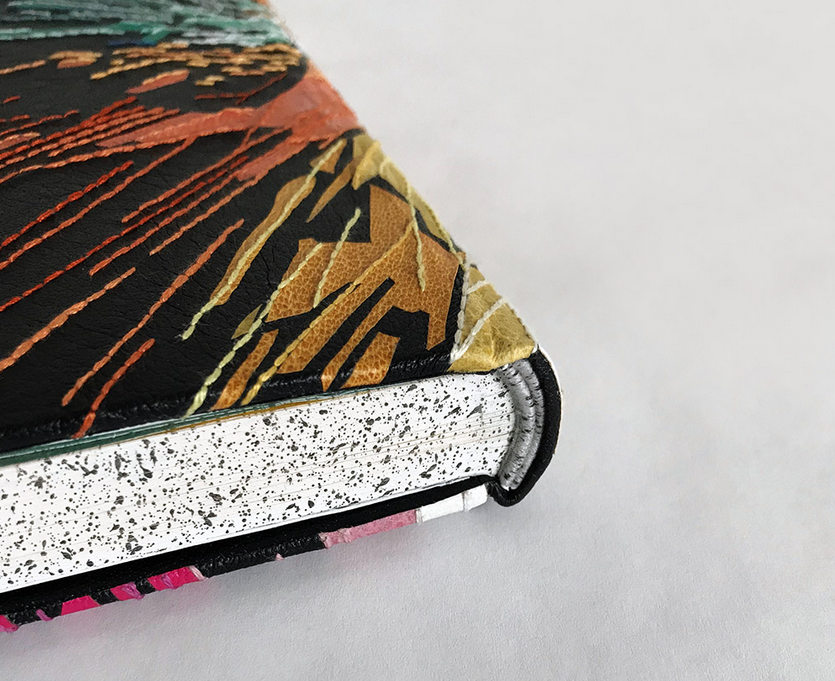
    Sitting inside the clamshell box is a binding decorated with a burst of color that plays homage to one of the most iconic scenes from Kubrick’s film. It is at this point, that the protagonist Dave flees the now inhospitable spaceship that was intended to carry him and his crew safely to Saturn. To recreate these star streaks, I bound the book in black buffalo skin with a range of back-pared onlays in goatskin, suede and handmade kozo paper. Additional embellishment is created through hand embroidery. Many times I create a template for my embroidery work. For this design I worked more spontaneously.

    Each stitched line was first marked out by scoring with a thin bone folder against a ruler in the desired spot. Then I pre-punch holes along this line in preparation for the embroidery. You can see my progression below as I was building up the design with both the onlays and the embroidery.

    This slideshow requires JavaScript.

    Tucked in between the section of pink onlays is a segment from Verdi’s Requiem Mass (Dies Irae) which is achieved with couching the embroidery floss and French knots for the notes. After narrowly escaping Hal’s attempt to kill him, Dave dismantled the computer and spent time in the ship contemplating his next move. He played a range of music to combat the silence. Verdi was blasted across the ship at the height of his loneliness and despair.

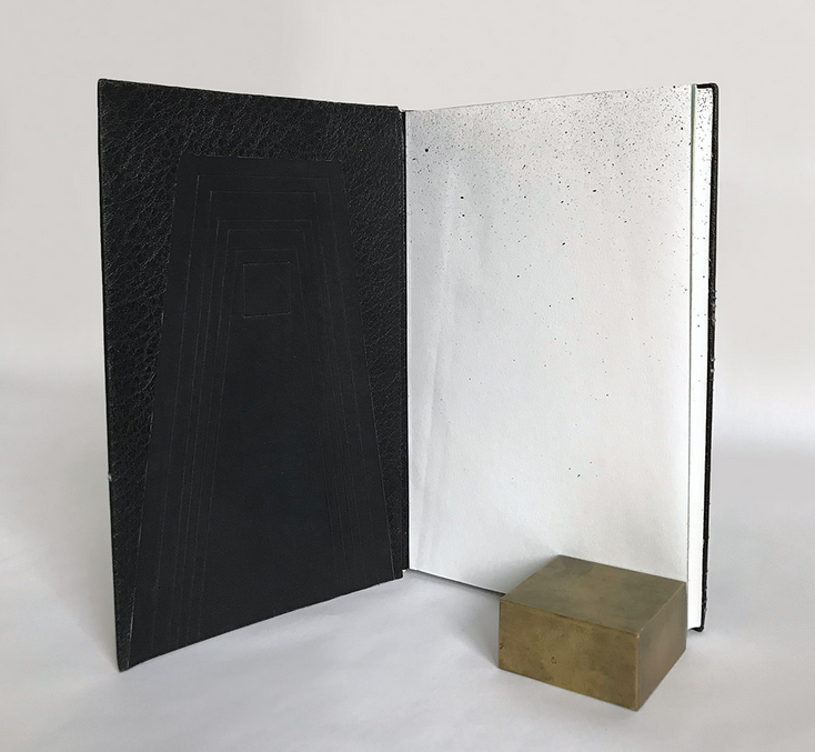
    Dave finally flees the empty ship and enters the final stages of his evolution. This is communicated by the interior side of the boards, flyleaves, edge decoration and endpapers. In his escape pod, Dave enters a space with gaping black shafts filled with squares, triangles and polygons before emerging into a white space peppered with a myriad of tiny black specks overhead.

    Dave ends this portion of his journey in a room where the objects seem familiar but at closer inspection deemed poor replicas. Dave calls out how two paintings hung on the walls are quite blurry yet recognizable. These two paintings are Van Gogh’s Bridge of Arles and Wyeth’s Christina’s World. I altered and cropped these paintings for the endpapers to be the final visual representation of the book before getting to the actual text.

    And that’s my rendition of this iconic science fiction story. You can see more images of the binding and boxes at my website.


  2. My Hand // 2001: A Space Odyssey Part One

    April 22, 2019 by Erin Fletcher

    If you ask a binder what book they would love to bind, I’m sure they would have a list of titles at the ready. I’ve had 2001: A Space Odyssey by Arthur C. Clarke on my list for sometime now. After working on the binding on and off for over a year, I can finally check it off my list.

    I was first enchanted by this story not by reading the science fiction novel by Clarke, but through the film by Stanley Kubrick. It’s one of my favorite films and I see it on the big screen any chance I can. It wasn’t until after I read Clarke’s telling of 2001, that I began to investigate the unusual collaboration that produced both the film and the novel. Kubrick and Clarke wrote the story together, yet parts of the story don’t appear in the film and vice versa. Each respective storyteller put their own unique spin on the tale.

    The film actually debuted before the novel, which makes me feel better about not reading the book before watching the movie. In fact, I think the novel enriches the film, expanding on the story in a way that could not be visualized in the film.

    When I embarked on binding a copy of 2001, I had all of this history in the back of my mind. I read the novel again, this time through the lens of a designer, pulling out segments and phrases I found inspirational. Unconsciously, I was also visualizing imagery from the film; scenes that were so impactful and had influence on my design. I could not separate the two when working on the design.

    One other hurdle I came upon, was the sheer volume of inspiration from the novel and film. There were too many significant moments; which do I highlight? So, I came to the conclusion that I needed to create a design that would represent each major moment of the story.

    In this multi-part post, I will describe each aspect of the piece, going into detail about the inspiration for the design and how I chose to execute it through various materials and techniques.

    Let’s start with the outermost enclosure: the storage box. The entire collection of enclosures and binding are housed in a standard full cloth clamshell box. I don’t really view this box as part of the overall concept, it merely serves the purpose of storing the contents safely. However, this is the only piece where the title appears as a label on the spine. The title is embroidered in a futuristic font on handmade paper from Hook Pottery Paper.

    Sitting inside the storage box is a paper wrapper, which is meant to represent Part I: Primeval Night. The story begins at the dawn of humankind, witnessing the moment that our primitive ancestors develop tools to be used for killing animals for consumption, but soon this same tool becomes a weapon against an enemy tribe as it is used to murder the leader of a neighboring group. The 4-flap wrapper is made from yellow ochre St. Armand paper, which is a nod to the vast desert setting for this incident. A coyote foot bone aids in opening the wrapper and is an obvious cue to this significant part of the story.

    Unfolding the wrapper reveals the interior clamshell box, which includes the elusive monolith. A symbol that appears throughout the novel. This transition from wrapper to clamshell is referencing two moments: the monolith first appears to the primitive humans at the precise moment described above and then not seen again for centuries until it is unearthed on the moon. So the action of unfolding the paper wrapper to reveal the monolith underneath speaks to these two moments in the story and moves into Part II: TMA-1 and Part III: Between Planets.

    The monolith onlay is constructed according to the 1:4:9 ratio described in the book. I used black calf skin wrapped around 20pt. museum board. After attaching the leather, I pressed the piece with mylar to create a shiny surface on the leather. Depth is created through the simple addition of three blind tooled lines at the left side and bottom edge.

    The monolith is surrounded by a frame of handmade moon paper from Hook Pottery Paper and paper from Moth Designs with a scribble design.

    The case is covered with black buffalo skin and the same moon paper is used to cover the trays. The purple paper, which I used for the label on the storage box lines the interior of the box.

    That covers all of the enclosures for the binding. In my next post I will go into detail about the concept and construction of the binding and how I worked in the remaining portion of the story.


  • My name is Erin Fletcher, owner and bookbinder of Herringbone Bindery in Boston. Flash of the Hand is a space where I share my process and inspirations.
    The StudioNewsletterInstagramEmail me
  • Archives