RSS Feed

Posts Tagged ‘book art’

  1. Book Artist of the Month: Natalie Stopka

    April 27, 2015 by Erin Fletcher

    BotanicalPrintBook-NatalieStopka

    In this final post with Natalie Stopka, we continue the discussion on her techniques that employ natural pigments for dying and image making by looking at her 2012 artist book Botanica.

    This binding consists of a series of eco-prints that are brilliant in both color and detail. Can you discuss the process behind eco-printing?
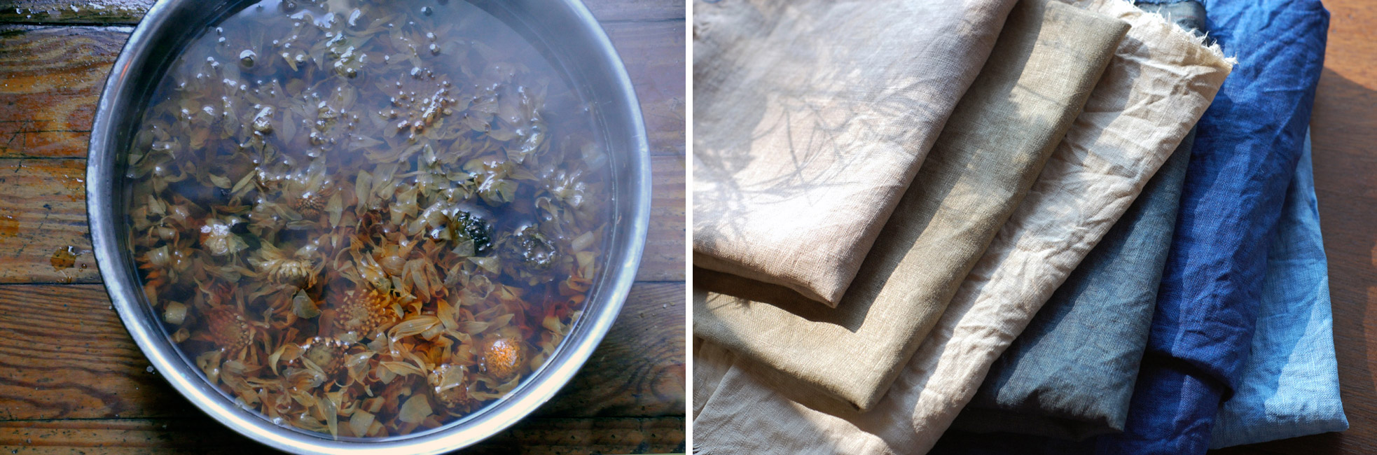
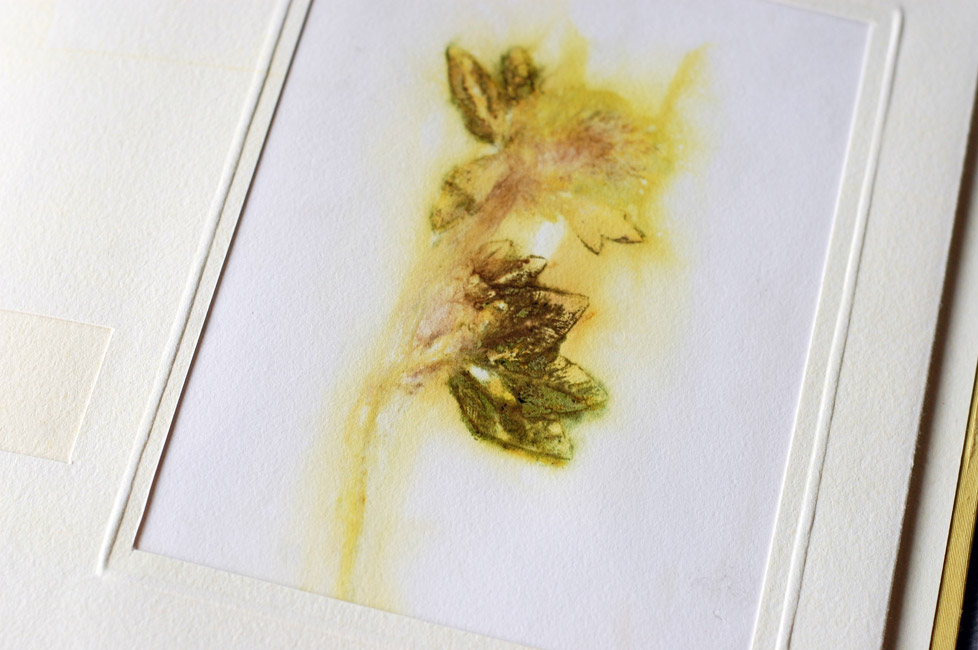
    Eco printing is the process of making a plant print using only the natural colorants contained within the plant. As opposed to nature printing in which pigment is applied to the surface of natural objects, in eco printing the plants can be smashed, pressed, bundled, soaked, steamed, or even frozen to coax the dye colorants out. There are a variety of techniques and terms to describe them. Hapa zome is the pounding of fresh plants directly onto a fiber substrate, and bundle dyeing involves tightly wrapping plant or other dye materials in fabric before burying or steaming them.

    Botanica2-NatalieStopka

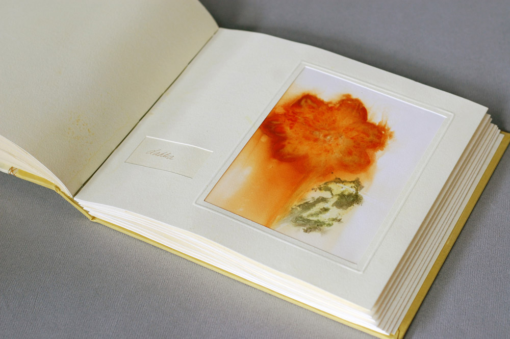
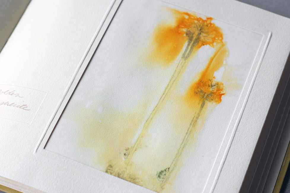
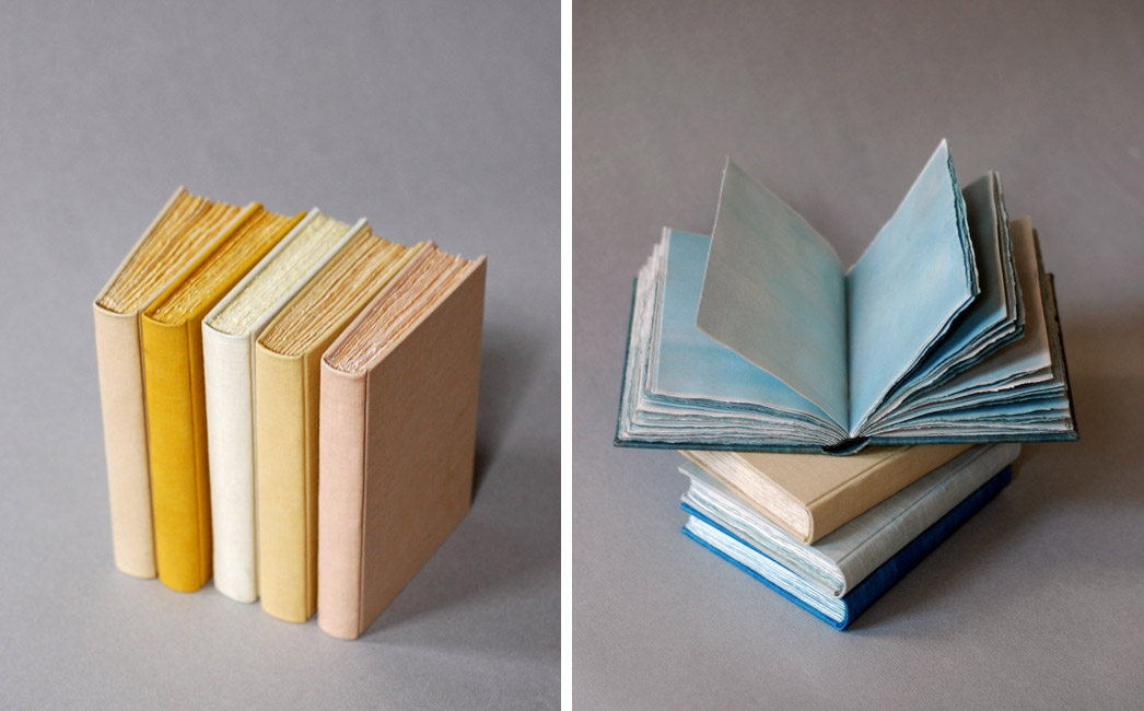
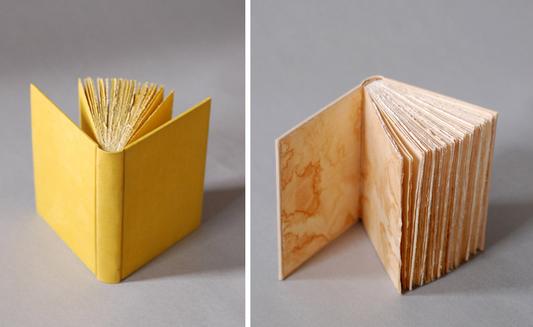
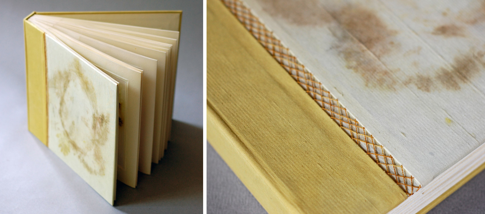
    To create Botanica, I gathered a dozen different dye plants one August day. These included mint, yarrow, dahlia, coreopsis, and goldenrod. Each specimen was folded within alum-mordanted paper, guarded with additional paper, and vigorously smashed with a mallet to break down the plant fibers and transfer the colorants within. I lowered this sandwich, with the plant still inside, briefly into a pot of simmering water. The hot water further drew out the dyes, creating an aura of color around the plant image, and made the print as permanent as possible. I was left with two mirrored images of each plant to create an edition of two books.

    Botanica4-NatalieStopka

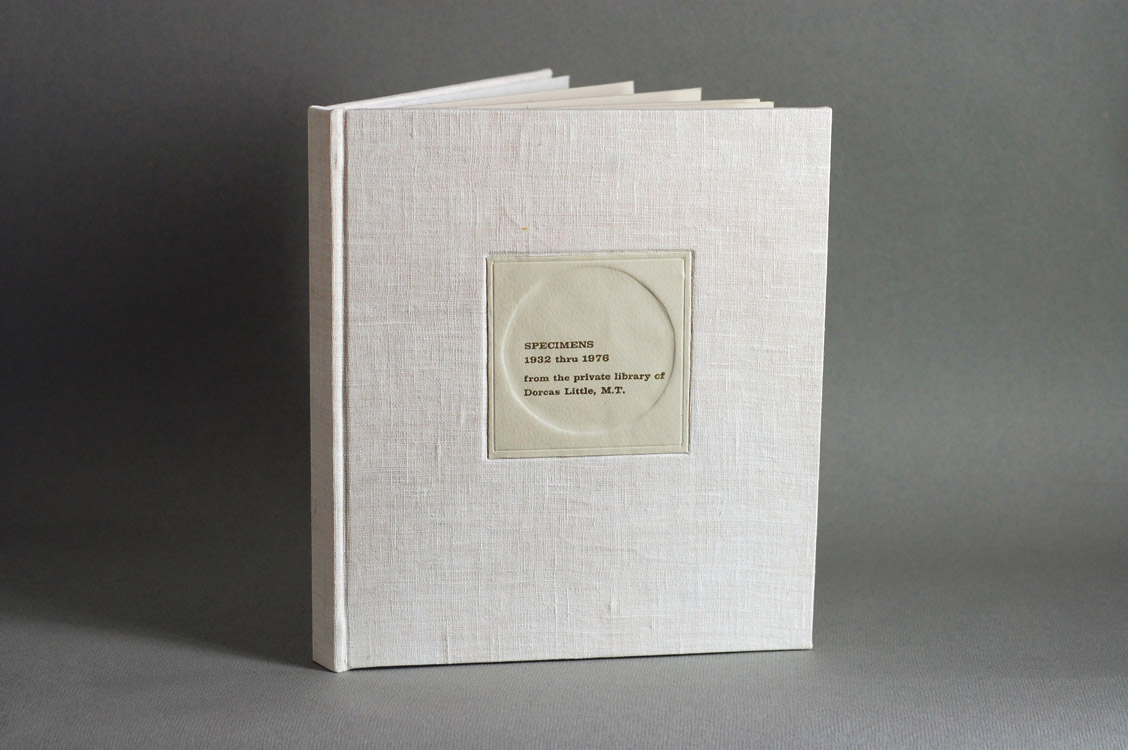
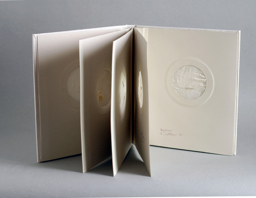
    In binding the books I adopted a flat back variation of Richard W. Horton’s light album structure, with each print mounted inside an accordion fold of naturally dyed paper. The paper as well as the silk book cloth and thread on the cover were dyed with a mix of wildflowers.

    Botanica5-NatalieStopka


  2. Book Artist of the Month: Natalie Stopka

    April 20, 2015 by Erin Fletcher

    Specimens1-NatalieStopka

    Up until this post, Natalie Stopka has shared her techniques for natural dyeing, as well as her methods for marbling and suminagashi. In the last two posts for the month, we’ll look at two artist book projects starting with her 2011 book Specimens.

    Can you talk about the concept behind this work and your inspiration for the book’s structure?
    I’m very interested in the notion of fabricated histories, including artifacts of dubious or bogus provenance such as the Voynich Manuscript or Cottingley fairy photographs. In creating Specimens I bound together the textile fragment collection of the (fictional) Dorcas Little, seemingly a phony collection that she had created and catalogued in the mid-1900s. Each textile fragment was hand sewn from vintage materials to look as if the fibers were is some aspect growing or reproducing. Mounted in a petri-shaped window, each piece is visible from both sides.

    Specimens3-NatalieStopkaSpecimens4-NatalieStopka

    I have a love/hate attitude towards album structures, which are very useful for a book such as this, but generally inelegant and tedious to bind. I elected to use a double guarded album binding, which has the institutional appearance I was hoping for, but a somewhat more graceful movement. As if, in order to augment the appearance of authenticity, the collection’s owner had commissioned the housing.

    Specimens2-NatalieStopka


  3. Book Artist of the Month: Natalie Stopka

    April 6, 2015 by Erin Fletcher

    CompleteDye-NatalieStopka

    As a continuation from last week’s post, I extended the conversation on natural dyes with book artist, Natalie Stopka. During her time at the Center for Book Arts as a Van Lier/Stein Scholar, Natalie also completed a collection of case bindings, where each component beautifully represents the subtleties of natural dyes.

    CompleteDye2-NatalieStopka

    The variation between the different materials is subtle and beautiful. I wonder what your inspiration was for this project?
    Besides my enjoyment of the process of foraging and dyeing with plants, I love the sympathy between natural dyes and fibers, as well as the resonance of using historical methods with historical materials. Prior to the discovery of synthetic dye in 1856, all books were decorated with naturally derived dyes, inks, and pigments. That is a lot of artistic heritage that has been largely supplanted in the past 150 years. I wanted to create some books that were all of a piece referencing that period just prior to the advent of synthetics, using a hollow-back structure with linen book cloth, hand sewn headbands, uncut pages folded down from full sheets, and, of course, natural dyes. I ended up binding a dozen books in different colors, partly as an exercise in honing my binding skills, as well as a continuation of my dye experiments.

    Can you walk through your dying process from the creation of the pigments to the dying of the materials? Where did you learn these techniques?
    Beginning with the techniques I learned at the Textile Arts Center, I extended my natural dye experiments into bookbinding. There was some trial and error at first as I selected and mordanted paper samples. Papermakers generally color the pulp with pigment prior to forming sheets, so there is not a lot of information on how to dye paper, or how the dyes and mordants affect it over time. But paper is just cellulose fiber like many fabrics I had experience dyeing, so I jumped in. I decided to use Zerkall Ingres, which is quite absorbent due to its composition, but also has good wet strength. And when folded down it makes a lovely signature size.

    The first step in dyeing is to source or collect plant material. In this case I used plants I foraged in upstate New York including oak leaves, cherry bark, Queen Anne’s lace, apple bark, and yarrow, the only exception being indigo. I chopped and soaked or simmered the plant material to extract the dye, then strained the dye liquor into a big stainless steel vat containing the mordanted paper and other book materials. After about 12 hours in the vat, everything was ready to carefully remove and dry.

    DyeProcess-NatalieStopka

    As with my embroidered botanical illustrations, these books demonstrate the different shades of color (sometimes slight) that result when a single dye is applied to various substrates. The linen cover, silk headbanding thread, Zerkall Ingres pages, and linen binding thread were all dyed in the same vat. The endpapers were made from the uppermost sheet of paper in the bath, which became patterned by the evaporation of the dye. My favorite book was dyed with black cherry bark – I left the dye vat outside overnight, and a light frost left crystal patterns on the endpapers! Initially I expected the papers to take the dye evenly in a uniform shade, but most dyes were absorbed with a good deal of variation, making a richly toned surface.

    CompleteDye3-NatalieStopka


  4. Book Artist of the Month: Sarah Bryant

    December 22, 2014 by Erin Fletcher

    Simulations-SarahBryant

    I really enjoyed this week’s response by Sarah Bryant on her inspiration and creative process behind Simulations on a Two-dimensional Grid. You can read about it below, but first the specs. Simulations was created in 2013 in an edition of ten. Zerkall paper is used for the pages and have been manipulated with letterpress printing, hand-drawn imagery, wax and folding. The loose pages are bound up in a waxed paper wrapper also decorated with hand-drawn imagery.

    Simulations2-SarahBryant Simulations3-SarahBryant

    Two sources of inspiration are behind this artist book: Barb Tetenbaum’s Aritst Book Idealation Deck and David Allen’s 2011 dissertation. Can you talk about how these two pieces came together as a guide for the concept of this artist book?
    So in late 2012, Barb Tetenbaum invited me to participate in a show using a set of cards that she and Julie Chen had developed over several years called “The Artist Book Ideation Deck.” The deck has categories for structure, paper, layout, technique, text, image, color, and description. It also has “adjective” cards. Barb and Julie drew random hands from this deck for all of the artists who would be making a book for the show. My hand went as follows:

    Imagery: none
    Structure: unbound/boxed
    Text: collaborate with writer/poet/other
    Layout: across folds
    Color: favorite
    Technical: hand drawn, painted/collaged, etc.
    Paper: pre-treated, crumpled, painted, pasted, etc.
    Describe: narrative
    Adjectives: personal, scientific, ordinary, complicated, colorful

    Dave Allen and I had been talking at this point about collaborating on a book, (this was just before his visit to the UK and the beginning of our Figure Study project,) so I turned to him for some text. He sent me a few excerpts from his PhD thesis for the University of Michigan and I selected this one: Simulations on a two-dimensional grid reveal that if the conditions are met to destabilize the spatially homogenous equilibrium then individual patches cycle out of phase with their neighbors. At any particular time the grid has a checkerboard-like structure (Figure 2.1), and through time individual patches exhibit a two-cycle.

    We worked together to pair it down to the following: Simulations on a two-dimensional grid reveal that if conditions are met to destabilize the equilibrium, individuals cycle out of phase with their neighbors. This felt more like a universal text, open-ended enough to invite us in and call for different interpretations.

    Once the text was selected, it was time to work with it and knead it into a book using the external prompts that came from the Ideation Deck. I used a series of folds, expanding from sheet to sheet, to disturb a grid made up of holes and lines. I loved this project, it forced me to do some new things that I surely wouldn’t have attempted without a set of instructions. Waxing the pages, for example. Also the loose sheet format that I have adopted for two subsequent projects.

    Several people have pointed out that my book is not strictly following the guidelines set by the deck. It does have imagery, for example, even if that imagery is minimal. And of course this is true. But the deck is meant to generate ideas, and so I considered the cards as prompts rather than unbreakable rules. You can still get the decks, by the way. I use mine all the time in classes or just to get my mind moving.

    – – – – – – – – – – –

    Setting limitations for a project can bring unique challenges and even heighten creativity. I was so thrilled to learn about Tetenbaum and Chen’s Idealation Deck. I may need to get my own copy and begin exploring artist books again.

    If you’d like to read a more in-depth description of Simulations, check out Heather Doyle-Maier’s review on the Abecedarian Gallery Blog, where she describes the tactile qualities of the book.


  5. February // Book Artist of the Month: Diane Jacobs

    February 2, 2014 by Erin Fletcher

    HairTalk3-DianeJacobs

    Hair Talk is a three volume artist book set that was created by Diane Jacobs over the course of three years from 2009 to 2011. The structure is inspired from a binding by Roberta Lavadour, except in this case, Diane binds the series in human hair. The content within each book are the collected replies to a set of questions, where an individual wrote about their feelings regarding their own hair. 

    The books are letterpress printed and bound with covers made from Cave Paper. 

    HairTalk2-DianeJacobs

    When binding this book with human hair, did you find the material to be tricky to work with or did you treat the hair first (like a bookbinder would wax their thread)?
    I learned this binding from Roberta Lavadour. It is a twine binding technique that she invented. Instead of twine I used human hair and transparent thread that resembles hair. Each folio is a set of four questions, so in order for that particular person’s responses to stay together I needed to sew each folio individually into the spine. With Roberta’s book, she would sew a thick signature with each twine line. I did not treat the hair with anything. It was a little tricky, but do able.

    The way a person chooses to wear and style their hair can suggest a lot about them, whether these connotations be positive or negative. What did you hope to extract from this survey and what did you find to be surprising?
    I was surprised that more people did not want to trade their hair in for different hair. The majority of people wanted to keep their hair. My questions were not about style (that would have been interesting) they were:            
    Question 1: Describe your hair (color, texture, body, length…)
    Question 2: What don’t you like about your hair?
    Question 3: What do you like about your hair?
    Question 4: Would you trade your hair in for different hair? If so, what would it be?

    HairTalk4-DianeJacobs HairTalk5-DianeJacobsHairTalk-DianeJacobs

    Diane’s work is intriguing and thought provoking. She is driven by the language that inhabits issues surrounding women, racism, equality and other social issues. Her work spans over several mediums from artist books and sculptures to prints and two-dimensional pieces. This month long interview will cover some of Diane’s artist books plus a few additional pieces I found to be relevant to my set of questions. 

    See the interview after the jump and come back each Monday during the month of February for more posts on the work of Diane Jacobs. She discusses her materials and inspirations sources such as feminism and nature. 

    read more >


  6. Book Artist of the Month: Michelle Ray

    September 23, 2013 by Erin Fletcher

    tocomeuponastreet-michelleray

    During the Standards of Excellence Seminar in 2012, presenter Steve Miller, professor at the University of Alabama brought a fine collection of student work to share with the audience. One of these pieces was To Come Upon a Street, a collaborative artist book between Michelle Ray and poet, AB Gorham. Michelle met AB in her front yard while living in Tuscaloosa. AB is the new Small Craft Advisory Press resident artist as well as Michelle’s neighbor. 

    Bound in a hardcover case is a modified tunnel book on the right and an accordion on the left in an edition of 40. The text is written and designed by AB, while the visual design, printing and binding was completed by Michelle. The images and text are printed using photopolymer plates on machine made and handmade papers. 

    tocomeuponastreet3-michelleray

    The visual content of To Come Upon a Street captures the intimacy of the tunnel book structure through an act of voyeurism. The view is of a lewd street scene, where letterpress “ladies of the evening” echo the four complex stanza written by AB. The visual content is quite appealing despite its crude imagery. It strikes a balance between delicate tenderness and indecency.

    Michelle describes this work as creating a piece that is kitschy yet tender; a celebration of delicate visual smut and witty double entendre.

    To Come Upon a Street is housed in several collections including the Maryland Institute College of Art, The University of Utah and Chapman University in California. You can add this wonderful and humorous artist book to your private collection through Michelle’s Etsy shop: MichelleRayArt.

    tocomeuponastreet2-michelleray


  7. Book Artist of the Month: Michelle Ray

    September 9, 2013 by Erin Fletcher

    homeiswhere-michelleray

    In this unique artist book created in 2010, Michelle Ray explores human relationships in the scope of the houseguest. Home is Where I’m Alone Unless I Have Company includes a series of interviews conducted with houseguests capturing feelings on personal and public life, intimacy and human interaction. These interviews are inkjet printed on scrolls encased in a wooden enclosure. This artist book is held at the Mandeville Special Collections Library at the University of California in San Diego.

    A note from Michelle:
    An artist’s book is an ideal medium for conveying the duality of private and public living, as books are democratic objects that live in the public but demand an intimate viewing experience.

    homeiswhere2-michelleray


  8. Book Artist of the Month: Susan Collard

    May 13, 2013 by Erin Fletcher

    shortcourse-susancollard

    A Short Course in Recollection was built by Susan Collard in 2009 for the Guild of Book Workers national exhibit Marking Time and through this book I was introduced to Susan’s work. Although the book may appear fairly plain on the outside, the interior pages are an inch thick in order to house a series of ramps and switchbacks. Susan began with her fascination of children’s toys built of ramps and towers. This literal marking of time in a direct, mechanistic, clattering fashion appealed to Susan (as did the technical challenge of interpreting that into a book).

    shortcourse2-susancollard

    At the top left of the first page is a vertical slot where the steel marbles are fed into the course. A blue toggle switched to the left stales the first marble upon its decent. The next marble will knock the toggle to the right and both marbles will move forward into the course on different paths. This toggle trick was inspired by woodworker, Matthias Wendel, who builds complex and ingenious marble machines. Susan approached the design of Short Course just as many artists do, by considering her materials first. In order to reduce any awkward bulkiness to the book, Susan choose steel marbles that are smaller then normal (about 7/16″). The ramps are made from ½” poplar and the face of the pages are aircraft plywood. The pages are bound together with slotted brass hinges. 

    Susan drafted full-size diagrams of the pages and made a cardboard model to aid in the building of Short Course. This is more planning that usual for Susan and all aesthetic elements came in after the pages started taking shape and the title of the book was chosen. 

    shortcourseprocess3-susancollardshortcourseprocess-susancollard shortcourseprocess2-susancollardshortcourse4-susancollard

    The third and fourth pages are more open, where the steel marbles can navigate more reliably. The marbles that fall to the right of the first toggle switch come down a ramp above the sleeping girl’s head, then hit a second toggle switch at her feet.

    The book can only function in one position, with the pages butted together tightly so the marbles can travel freely between them. There are three distinct courses, regulated by two toggle switches. The mechanism of the book does work, but rather temperamentally and can be viewed as a metaphor for memory. Some marbles will travel the course flawlessly, while others get hung up between pages, jump a guardrail or cause a traffic jam. As Susan so elegantly says “it seems easy to extend the metaphor to include these accidents of blockage and retrieval. Perhaps the book, as is, is a better representation of our own flawed memories than if it worked reliably every time. Which is not to say I wouldn’t fix it in a heartbeat if I had the ability. Probably my favorite thing about this book was integrating more childish elements (the fairy tales, alphabet blocks, even the colors of the milk paint) with the very intricate mechanisms and depictions of machinery—as if to suggest childhood is a serious and convoluted endeavor, or that understanding the world requires great leaps of nonsense and whimsy.” 

    shortcourse3-susancollard


  9. Book Artist of the Month: Susan Collard

    May 6, 2013 by Erin Fletcher

    cameraobscura2-susancollard

    In 2007, Susan Collard built Camera Obscura, a wooden box fitted with all the components that allows one to view the world around them in a more intimate manner. Once the camera is placed in a sturdy position, the viewer may sit at the viewing window with their head and shoulders covered by the cloth hood. As the image is projected into the viewing window adjustments can be made to focus the lens. Susan recommends positioning the camera towards a scene that is well lit as the experience will be more magical.

    In addition to its more traditional parts, Susan has included a bookshelf to hold three coptic bound books – he, they and the eye. Each book can be viewed and read inside the chamber with the aid of light from outside the camera. Each book has a set of strings, much like a marionette, that allow the viewer to turn the page without reaching into the chamber. The copper string ends vary in length, which allow the viewer to distinguish them by touch. 

    cameraobscura1-susancollard cameraobscura3-susancollard cameraobscura4-susancollard

    In this last image, we get a glimpse at the interior pages of one of the three coptic books in addition to the detailed set of instructions that come with the piece.


  10. May // Book Artist of the Month: Susan Collard

    May 2, 2013 by Erin Fletcher

    interlinear-susancollard

    In 2011, Susan Collard crafted Interlinear, a wooden accordion-like structure collaged with various imagery and texts. I’m particularly attracted to the inclusion of delicate embroidery threads; connecting the illustrations in a playful manner and drawing the viewer’s eye from page to page through doorways and into secret compartments. 

    interlinear2-susancollard interlinear3-susancollard interlinear4-susancollard

    During my first year at North Bennet Street School, the students were invited to aid in the set-up of the Marking Time Exhibition at Dartmouth College. It was here that I first saw and played with Susan’s work. As we gathered around her work, we dropped one of the steel balls to investigate the hidden channels and pathways between each page. 

    Read the interview after the jump. Come back each Monday during the month of May for more posts about Susan’s work, which include in progress photos for A Short Course in Recollection and more detailed images of Camera Obscura

    read more >


  • My name is Erin Fletcher, owner and bookbinder of Herringbone Bindery in Boston. Flash of the Hand is a space where I share my process and inspirations.
    The StudioNewsletterInstagramEmail me
  • Archives