RSS Feed

Posts Tagged ‘haein song’

  1. March // Bookbinder of the Month: Tracey Rowledge

    March 1, 2015 by Erin Fletcher

    FourQuartets1997a-TraceyRoweledge

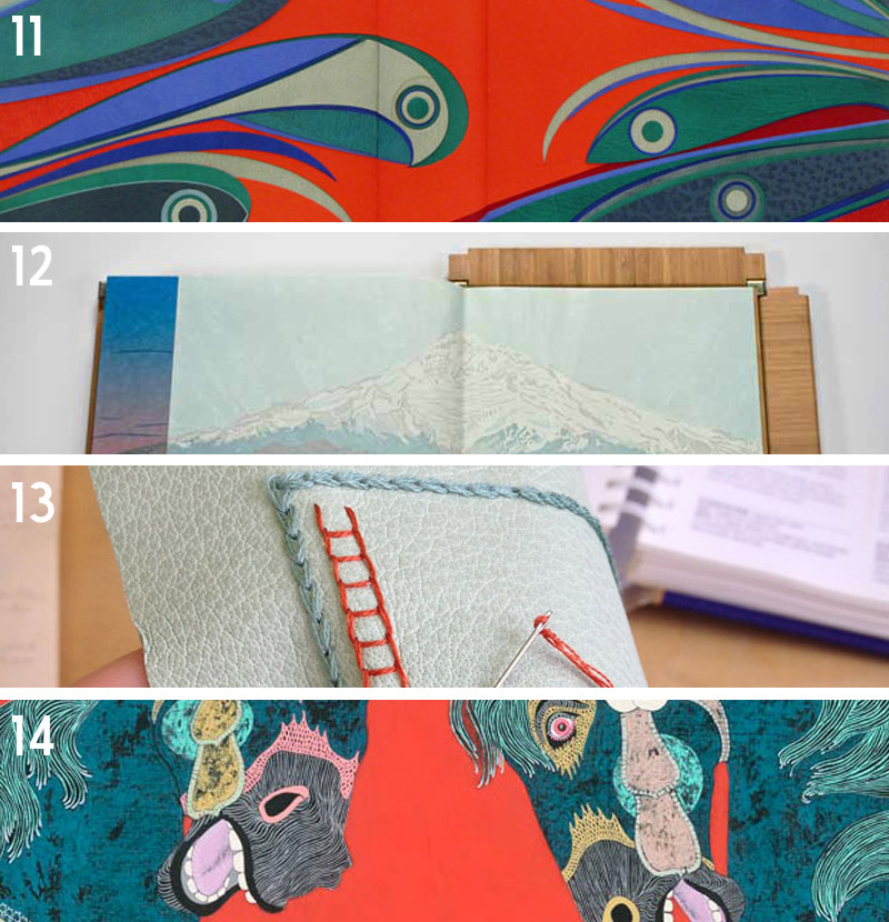
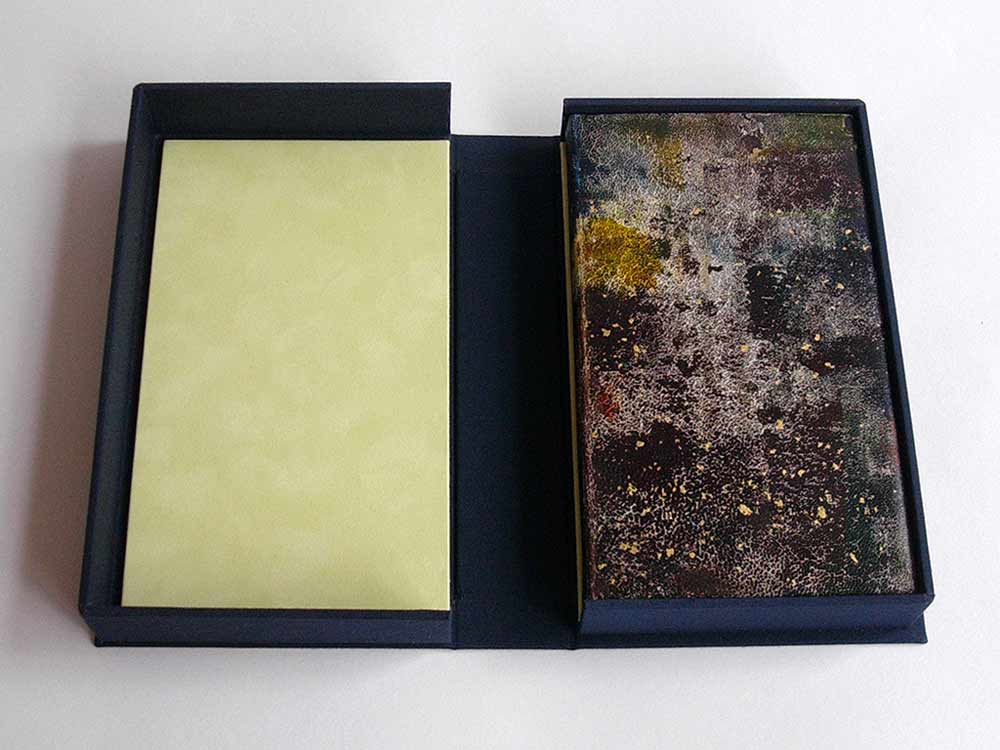
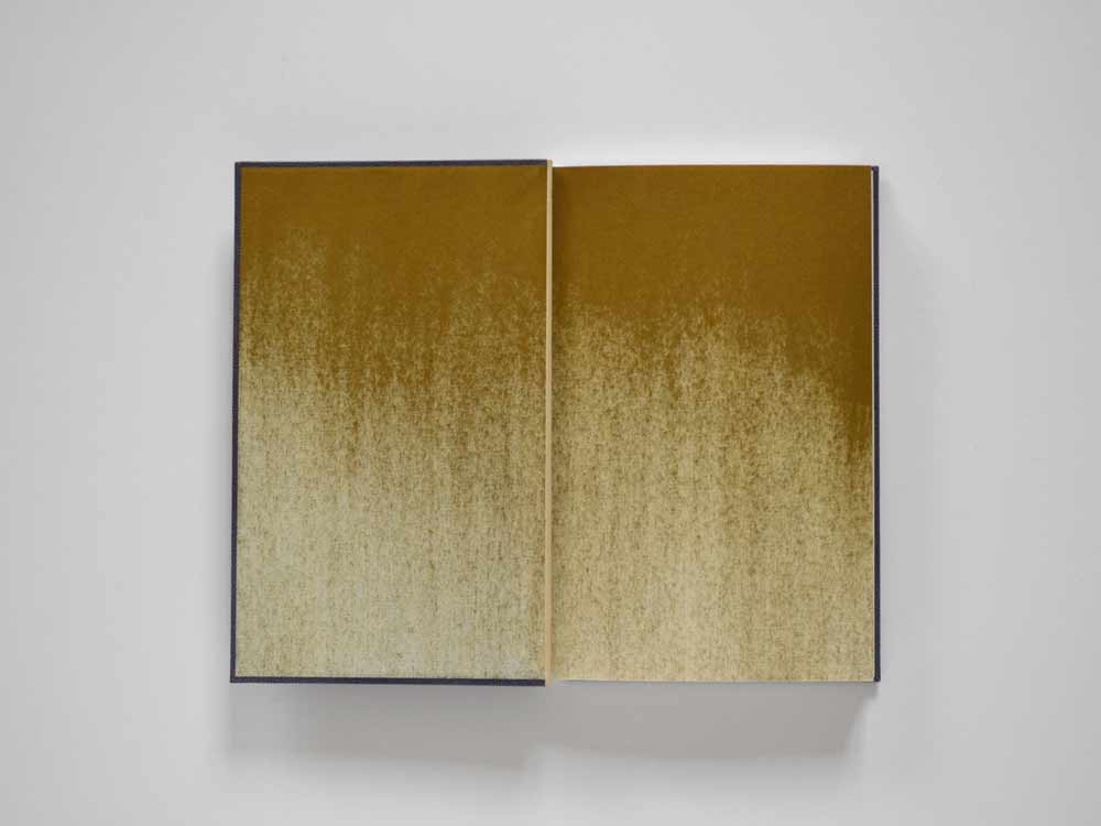
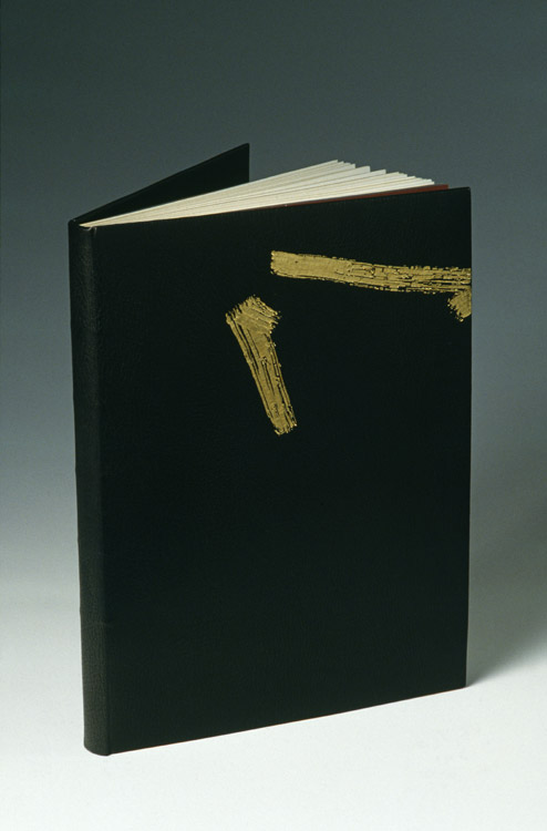
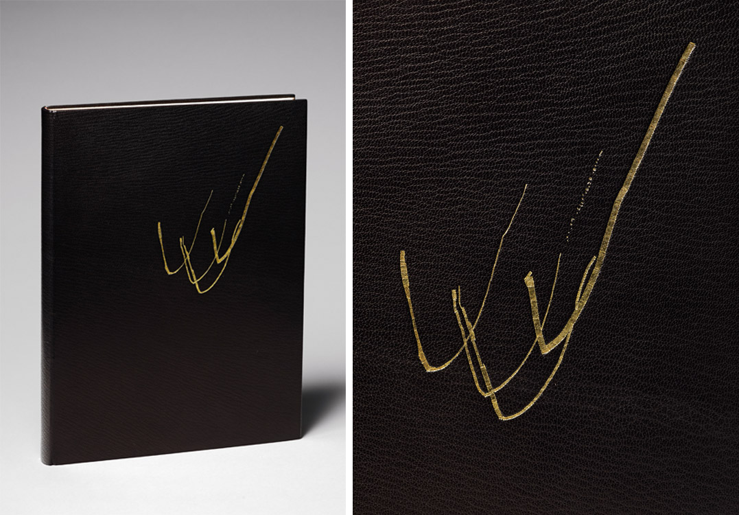
    Tracey Rowledge bound her first copy of T.S. Eliot’s Four Quartets in 1997 (shown above) years before she would revisit the text again with a parallel binding in 2014.

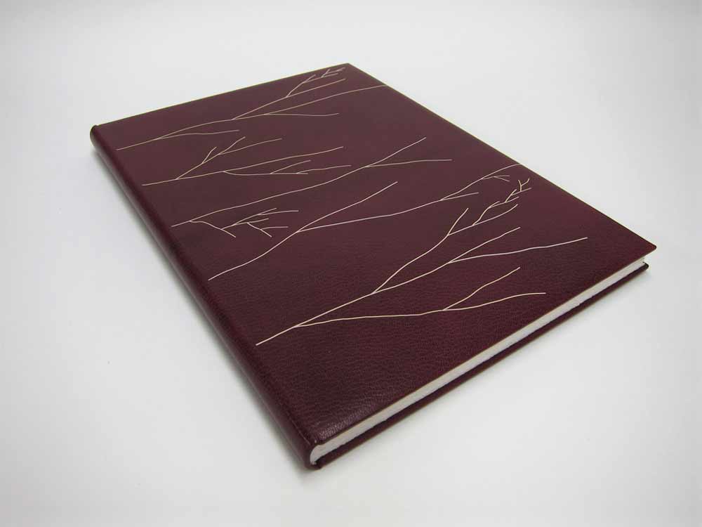
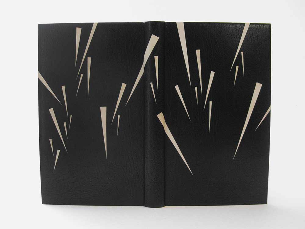
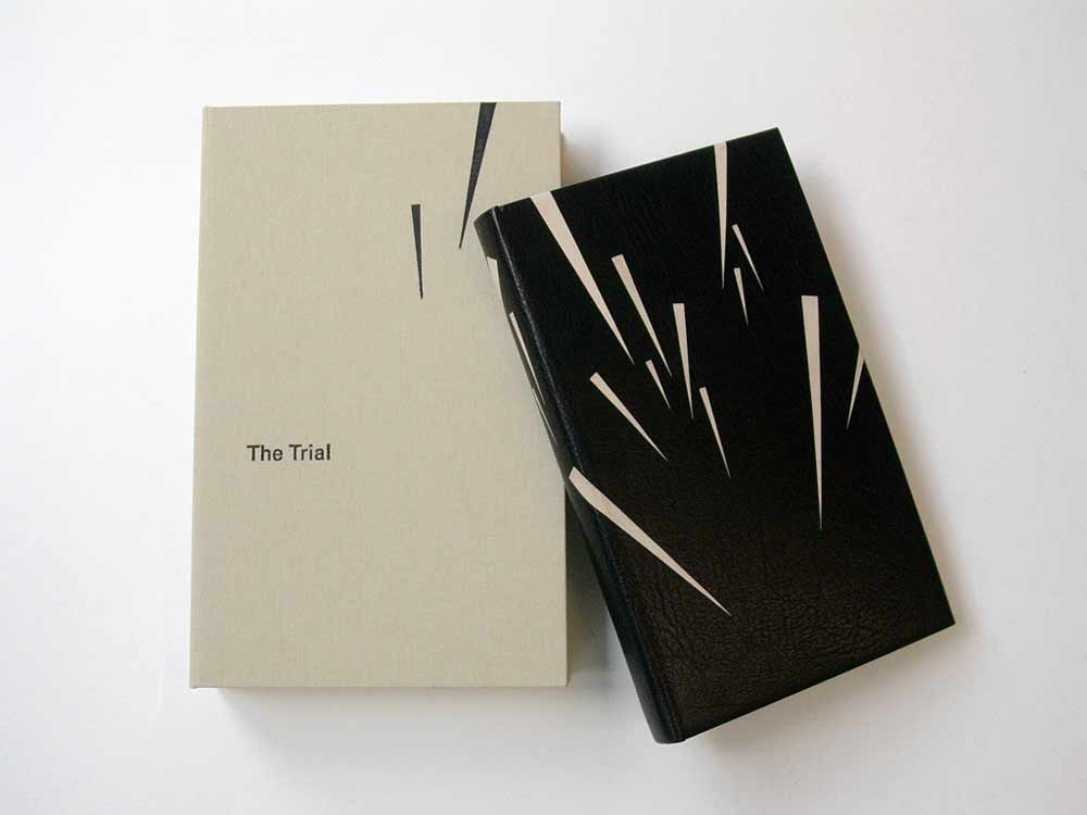
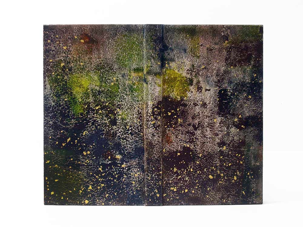
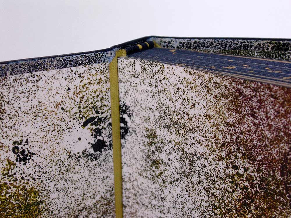
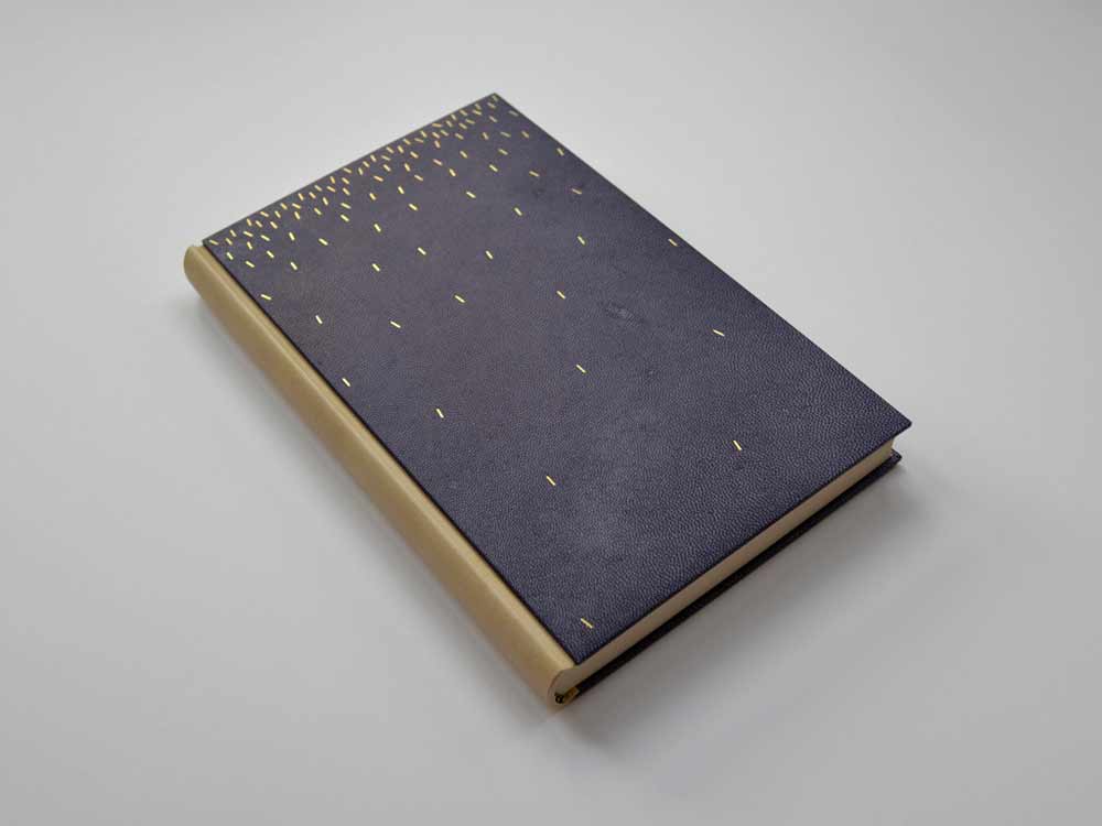
    You have created two very similar bindings for T.S. Eliot’s Four Quartets; bound in black goatskin with gold tooled markings. The gold tooled design on the earlier binding offers freedom and movement while the gold tooled design on the later binding feels more direct and deliberate. Can you discuss your concept behind each binding?
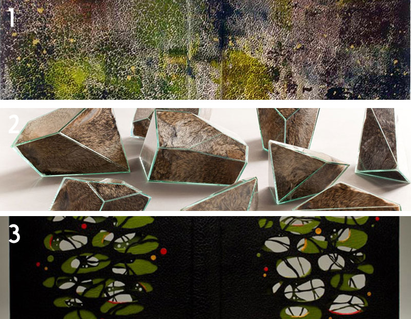
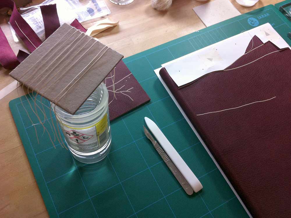
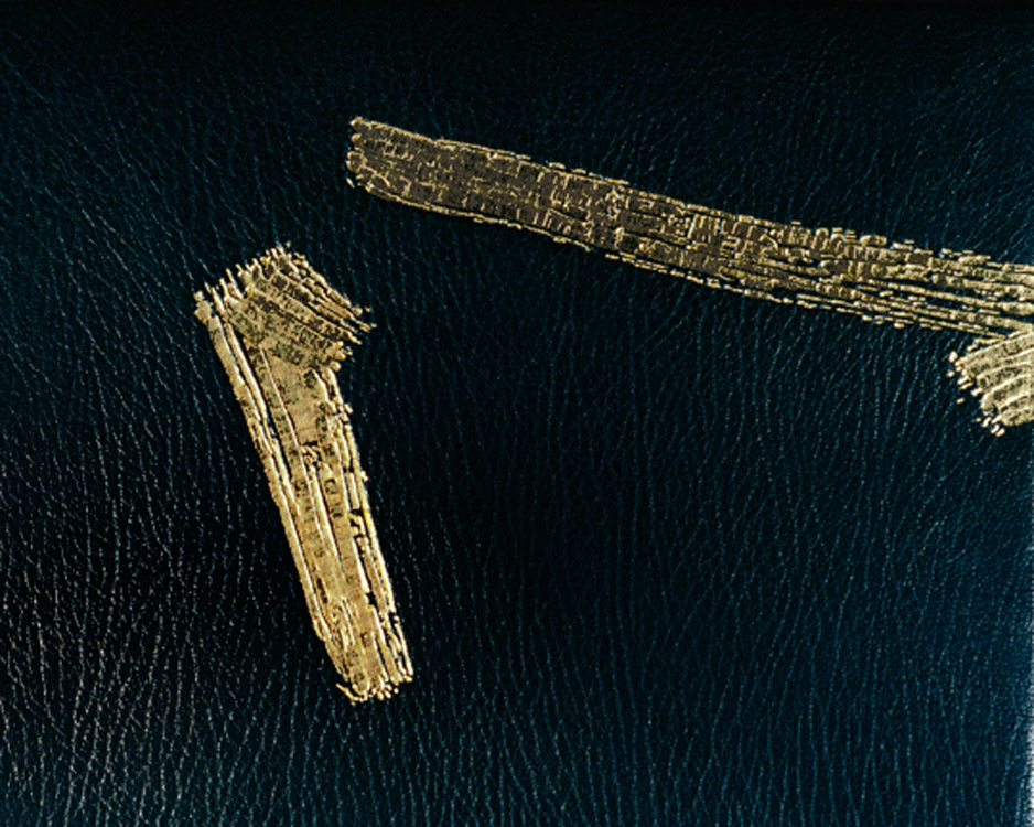
    For the first binding I was conscious of T. S. Eliot’s dislike for images on the covers of his books, so I decided to create two brush marks that evoked the flow of his writing, rather than creating an image depicting anything I perceived to be pictorial. This was a very early fine binding and as the book was letterpress printed on thick paper, it was my first rounded-only fine binding (i.e. not backed). It was also the most technically demanding gold tooling I’d undertaken to date.

    FourQuartets1997b-TraceyRoweledge

    Ivor (Robinson) very generously told me that my first binding of Four Quartets would be one of his desert island books, and it was during the second binding of this book that Ivor died. The image on this book responds to the text, to my first binding of the book, but also, and for me just as importantly, this image contains my thank you letter to Ivor, it was the perfect and most poignant place for it.

    FourQuartet2014-TraceyRoweledge

    – – – – – – – – – – –

    I’m so pleased to present the following interview with Tracey Rowledge. I didn’t know of Tracey’s work until Haein Song, whom I interviewed back in February of 2014, suggested that I interview her. What I came to discover is that Tracey is a keen artist who found a calling in bookbinding. Her artistic curiosities continue to influence her design choices as she blends together her artist techniques with those common to bookbinding. In the interview, I question Tracey both about her bookbinding and artwork and how the two have influenced each other.

    Check out the interview after the jump for more about Tracey, her background and creative process. Come back each Sunday during the month of March for more about Tracey’s work. You can subscribe to the blog to receive email reminders, so you never miss post.

    read more >


  2. Best of 2014

    December 31, 2014 by Erin Fletcher

    As the year 2014 comes to a close, I want to send out another thank you to the nine bookbinders and book artists who took time away from their busy schedules to participate in my interviews. Another thank you goes to those who read and subscribe to my blog and I especially appreciate the kind comments I’ve received either in person or via email.

    Now to reflect on my year: Herringbone Bindery was busy yet again this year. I had the opportunity to work on some really great projects, amongst them were commissions from the Old State House in Boston, artist Laura Davidson and the Veatchs booksellers. An unusual amount of traveling this year took me to Rare Book School for the first time, up to Maine for a mini-conference and across the country to Vegas for the Guild of Book Workers conference.

    Things to expect in the New Year:
    – an updated website with all the projects I completed in 2014 (including some beautiful design bindings)
    – a Herringbone Bindery newsletter
    – more posts on my own projects (expect to see more on Dune as I will be covering right after the holidays)
    – another round of interviews

    As we ring in the new year, I just wanted to share my favorites posts from 2014.

    bestof2014a

    1. February // Bookbinder of the Month: Haein Song
    Haein Song was recommend to me by Hannah Brown and I was so thankful for her suggestion. Haein’s work is so clean and skillfully crafted. Her headcaps are so impeccable that I gape in awe.
    2. Artist: Marcela Cárdenas
    3. May // Bookbinder of the Month: Monique Lallier
    I greatly admire the work of Monique Lallier and was just ecstatic that she agreed to be interviewed for the blog. She has become such an influence in our field and openly shares her support and wisdom.

    bestof2014b

    4. My Hand: A Desert Inspired Edge for Dune
    5. August // Bookbinder of the Month: Mark Cockram
    The interview with Mark Cockram captures the boisterous and enthusiastic charms of both his personality and love of the craft. Each post examines the intensity of his designs and complexity of his techniques.
    6. Conservation Conversations Column
    Beginning this year, I invited six of my colleagues working in conservation to post about a field that encapsulates their professional lives. Topics range from using the appropriate adhesive and what to consider when building a conservation lab to various conservation considerations and philosophies.

    bestof2014c

    7. My Hand: Boxes for Laura Davidson
    My first project with Laura Davidson after interviewing her on my blog.
    8. Artist: Lydia Hardwick
    9. Photographer: Andrea Galvani
    10. January // Book Artist of the Month: Mary Uthuppuru
    I’m so charmed both Mary Uthuppuru and her work. She really engages the craft by exploring and experimenting with bookbinding and printmaking techniques. Mary is quite inspiring.

    bestof2014d

    11. November // Bookbinder of the Month: Sol Rébora
    It was a pleasure to interview Sol Rébora. Her insights to bookbinding in Argentina were refreshing, as are her imaginative and unique design bindings.
    12. February // Book Artist of the Month: Diane Jacobs
    Diane Jacobs employs important topics like feminism, body issues and societal issues against women in book arts and other art forms. I am very engaged and compelled by these issues and enjoyed dissecting her work in the interview.
    13. My Hand: Leather Embroidery Samplers
    14. Artist: Jennifer Davis

    Happy New Year!


  3. Bookbinder of the Month: Haein Song

    February 23, 2014 by Erin Fletcher

    RomeoAndJuliet1-HaeinSong

    In 2012, Haein Song bound this copy of Shakespeare’s Romeo and Juliet in full leather maroon goatskin. The delicate linear design was created by applying a series of natural goatskin onlays. The endpapers are monprinted in gold with suede doublures. 

    RomeoAndJuliet3-HaeinSong RomeoAndJuliet2-HaeinSong

    At first glance, the decorative elements appear to be hand tooled, but those thin lines are actually several onlays. Did you find it difficult to manipulate such delicate and thin pieces of leather?
    Leather pieces are paired down very thin (0.2.mm) and I cut them into long lines of a width of 1mm. It isn’t easy to glue the pieces so I put pva and paste mix on the glass surface then lay the piece on top so it can catch the adhesives. Then with a help of scalpel and tweezers I lay them on the the cover of the book based on my design. I think the idea of doing it seems more challenging than actually executing it. Once you are used to the thinness and longness of the piece it become a little bit like a drawing tool. And when I was laying down the pieces I had a feeling that I was drawing with a leather.

    RomeoAndJulietOnlays-HaeinSong


  4. Bookbinder of the Month: Haein Song

    February 16, 2014 by Erin Fletcher

    TheTrial1-HaeinSong

    The striking design on this fine binding of The Trial by Franz Kafka was created by the talented Haein Song in 2011. This Folio Society edition is covered in full black goatskin with reverse pared natural goatskin onlays. Keeping in fashion with her other bindings, the endpapers are hand printed and sit opposite a leather joint. 

    TheTrial2-HaeinSong

    The head edge and tail edge of the text block are decorated with black acrylic, leaving the whiteness of the paper on the fore edge exposed. Breaking up the edge decoration like this can be very interesting for the overall concept of the design and I think Haein is really playful in this area of the book. 

    TheTrial4-HaeinSong TheTrial3-HaeinSong

    You’ve created design bindings for some prominent authors such as Camus, Kafka and Kipling. Do you have an affinity for these authors? Do you plan to bind more of their works?
    I’m an admirer of few authors, which include Beckett, Camus, Kafka, Borges, Pessoa, Calvino, Kundera, Perec, Hesse and Carroll. I’m also very fond of playwriters associated with The Theatre of the Absurd. Whenever I have an urge and space I look for some of those authors’ books and I have few waiting to be bound. How I came to bookbinding is from the love of reading and interest in language. I don’t think it was easy for me to acquire a second language after being a grown-up so my love is mixed with the frustration I had to go through. And some of the authors I mentioned above express what I want to say through their books eloquently, articulately and poetically.


  5. Bookbinder of the Month: Haein Song

    February 9, 2014 by Erin Fletcher

    JustSoStories-HaeinSong

    This Folio Society edition of Just So Stories by Rudyard Kipling was bound by Haein Song in 2010. Bound in the Bradel binding structure, the spine is covered in reverse goatskin. The front and back boards are covered in hand dyed goatskin. The geometric pattern is tooled in white. The monoprinted endpapers sit opposite a leather joint. 

    JustSoStories3-HaeinSong JustSoStories-Tooling-HaeinSong

    Haein shared this image showing the the tooling in-progress. I love how clean and organized her space looks, a perfect calm environment for tooling.

    JustSoStories4-HaeinSong

    I choose to feature this binding because I’m such a proponent of using a single color to create sublty in design. Sometimes the simplest ideas can create the most extraordinary pieces of art. Using reverse goatskin for the spine creates not only a deeper red, but introduces a change in texture. For this binding, you utilize the Bradel binding, which allows you to create the exterior in three parts. Is there a fondess to this structure that you find supports your design sense more than a full leather binding?
    I like what Bill Evans, an American pianist and composer, said about that – “The simple things, the essences, are the great things, but our way of expressing them can be incredibly complex.” I’m attracted to the very essential and elemental quality of seemingly simple forms like dots, lines, squares and circles.

    When it comes to the structure I don’t think I prefer a bradel binding to a full leather binding – both have different qualities and attractions. But as you’ve mentioned a bradel bindings can provide simple design solution by changing materials or colours and there is a something architectural about that. I used a bradel binding for this book precisely because of that reason.


  6. Bookbinder of the Month: Haein Song

    February 2, 2014 by Erin Fletcher

    Whistler-HaeinSong

    The design on this full leather binding from Haein Song really transforms the material to mimic a textured painted canvas. Haein bound this copy of Whistler by Haldane Macfall in 2009. Sprinkled on top of the hand colored natural goatskin are flecks of gold leaf. The title is also tooled in gold on the front cover. If you click on the image above, you can see the title on the front cover toward the tail. I spotted the “H” first. Happy hunting. 

    The endpaper and matching panel doublures are monoprinted and sit opposite a leather joint. The edges are decorated with blue and brown acrylic pigment and sprinkled with gold leaf. 

    Whistler2-HaeinSongWhistler3-HaeinSong

    There seems to be quite an influence from Mark Cockram in the design of this binding. I can tell you were a student of his. The decoration on the leather has such a painterly quality to it, can you talk about your technique for achieving this affect?
    Do you think so? That is quite interesting as I haven’t thought in that way. Mark’s teaching involved structures, materials, tools and many tips from his experience except aesthetics. He thought, I believe, everyone has different aesthetics. But I suppose what you see influences how you express.

    Few Whistler’s paintings were on display at Tate Britain when I started this book. I remember walking around feeling his paintings titled Nocturne. I wanted to convey that feeling to the cover. Back then I was trying simple but different dyeing and printing technique. How it was achieved was simply rolling few different chosen (or mixed) relief inks onto the glass surface then lay the leather on top and rub it. Endpapers were made in similar way. There is a little bit of trial and error until you get the desirable outcomes. Also depending on the amount of inks and pressure you can achieve a very different look. Whistler was very much interested in Japanese prints. To finish I used a technique called Sunago (Japanese technique in woodblock printmaking, which involves sprinkled or scattered gold leaf) to reflect that.


  7. February // Bookbinder of the Month: Haein Song

    February 1, 2014 by Erin Fletcher

    MythOfSisyphus-HaeinSong

    This beautiful binding of The Myth of Sisyphus and Other Essays by Albert Camus was crafted in 2013 by Haein Song. Bound as a Bradel binding, the spine is covered in a natural goatskin with dark blue vellum covers. The sprinkled dashes on the covers are hand tooled in gold. The spectacular endpapers are hand printed. 

    MythOfSisyphus2-HaeinSongMythOfSisyphus3-HaeinSong

    This binding is absolutely stunning and so flawlessly executed. The covers are a beautiful dark blue vellum. Did you find the material difficult to work with in either the structural or tooling aspect of the binding process? I have a single experience with vellum over boards, but I know that bookbinders approach the board construction differently. May I ask if you prepped the boards for the covers in any particular way for the vellum?
    I heard few notorious rumours about vellum but I don’t think I found it difficult at the time I was working on it. Partly because it was a relatively small bradel binding and there wasn’t headcaps or joints. The spine of the book is covered in natural goatskin. 

    What I found afterwards was that the front and back vellum boards sometimes change their shapes depending on the humidity or temperature of the surrounding. But surprisingly it comes back to the original shape after some time. I was told that it needed a little bit of time to climatise.

    Later I was also told that lining vellum with a very thin paper (archival bible paper or Japanese paper) would reduce this changeable characteristic. 

    Tooling wasn’t particularly hard after practising enough on sample boards but I don’t think I have an ample amount of experience to compare differences in tooling on leather or vellum.

    – – – – – – – – – – –

    I have not yet had the pleasure of meeting Haein or been presented the opportunity of viewing her work in person. However, I’ve had her website bookmarked for a while now, checking back from time to time to ogle her work. As I began preparing a list of people to interview this year Haein’s name popped up as a suggestion from Hannah Brown, whom I interviewed at this time last year. So with Hannah’s endorsement and my growing fondness, I present the following interview with Haein Song. The interview ends with Haein’s elegantly worded philosophy on bookbinding. 

    Come back every Sunday during the month of February for more posts on Haein’s work. You don’t want to miss it, Haein shares some of the creative techniques behind her expressive and artistic bindings. 

    read more >


  • My name is Erin Fletcher, owner and bookbinder of Herringbone Bindery in Boston. Flash of the Hand is a space where I share my process and inspirations.
    The StudioNewsletterInstagramEmail me
  • Archives