RSS Feed

Posts Tagged ‘incline press’

  1. Catching Up With Lori Sauer // No. 1

    August 1, 2017 by Erin Fletcher

    I first interviewed Lori Sauer for the blog back in March 2013. I thought it might be time to check in and see what new bindings Lori has created over the past four years. Over the month of August, I’ll be featuring five of Lori’s more recent bindings. Let’s begin with a book Lori bound in 2013, a copy of A Line illustrated by Suyeon Kim.

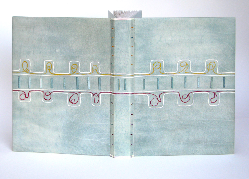
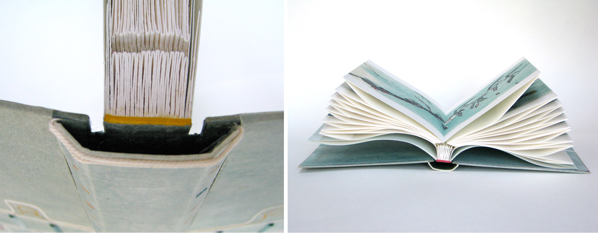
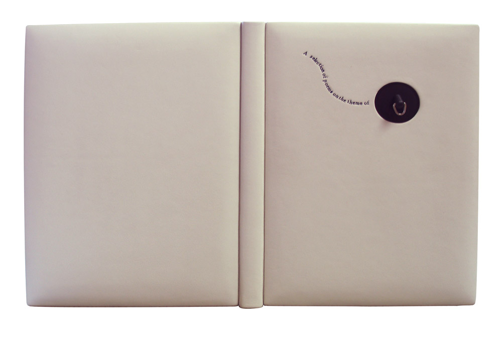
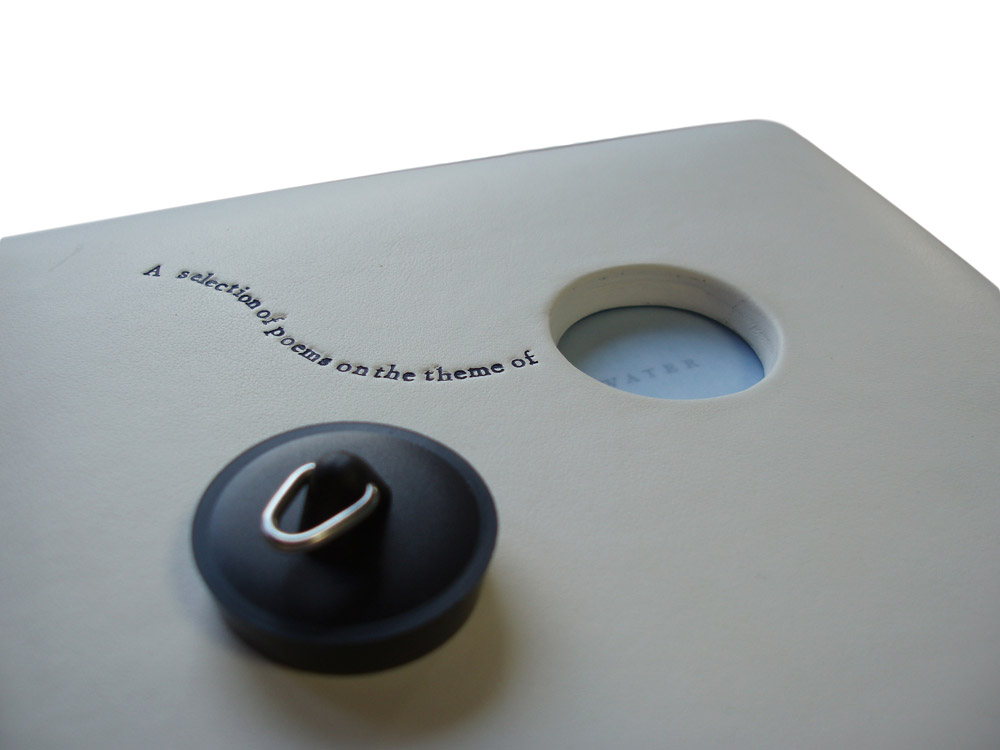
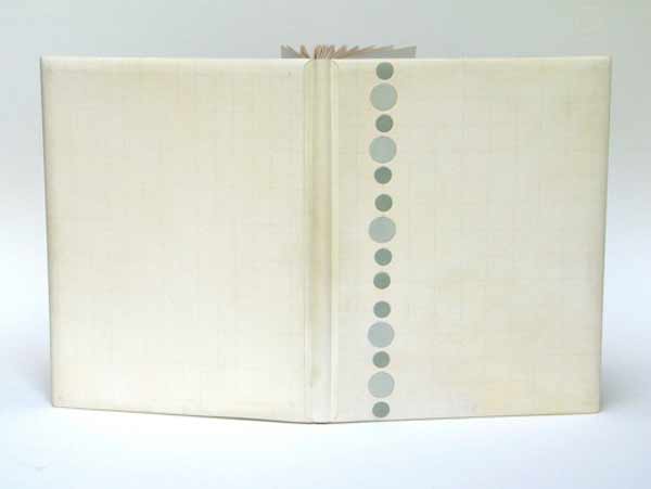
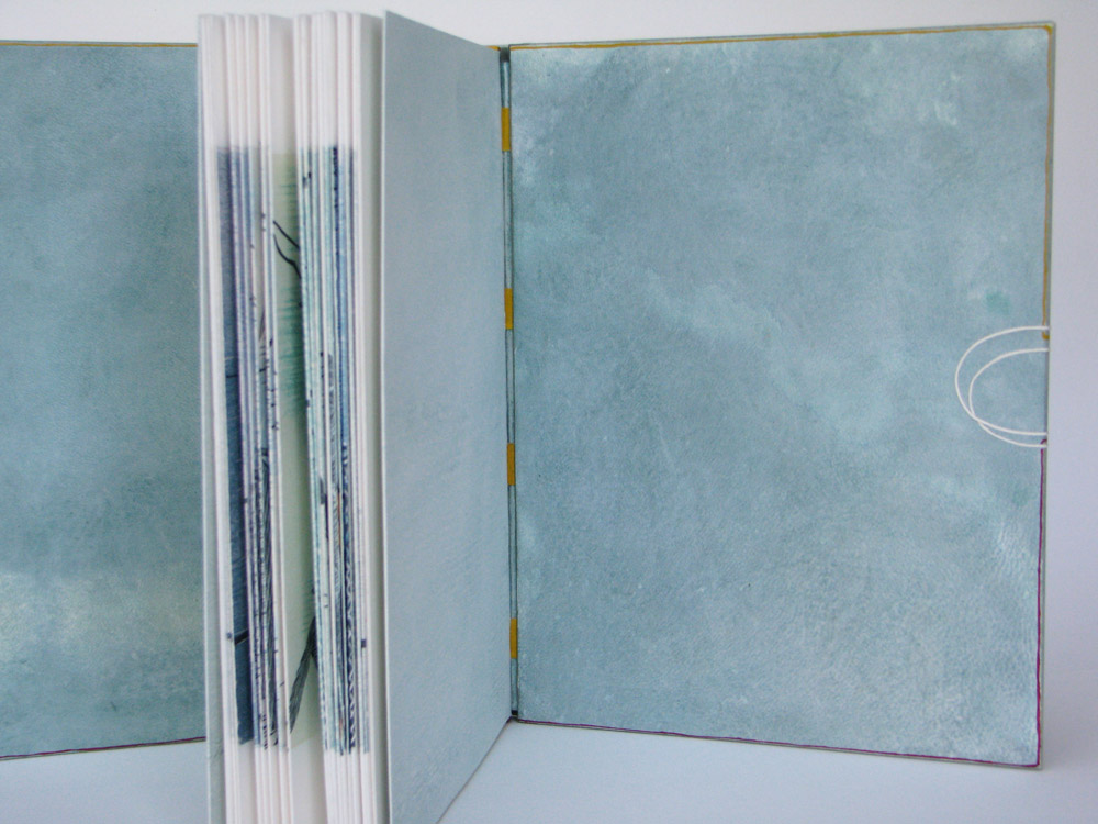
    A Line was published by Incline Press in 2009 and is an illustrative narrative of linocut prints by Suyeon Kim depicting the companionship between a blind fisherman and his dog. Lori bound her copy in the dos rapporté structure with dyed vellum. Lori adds decorative elements with twine and ink.

    I love the playfulness of the cover compared with Suyeon Kim’s linocut prints. How did you manipulate the vellum to achieve a hazy water-like quality?
    I love this book, no text, just a narrative in images. The images veer off in to fantasy, a bit like a Chagall painting, and are full of warmth and charm.

    You asked about the vellum – I dyed it. I buy very clear and clean white skins for this and interesting markings appear with the dye (I use watered down FW acrylic inks). I start with dying the flesh side as it soaks up moisture better. If I need to I’ll wipe some of the ink on the hair side too. The first pieces I coloured for this weren’t exactly right so I did a second set. I ended up using the first set as doublures. I can go through a lot of vellum this way in order to get the right shade but the rejects always get used up eventually.

    Are the red and yellow lines actual threads running across the binding? If so, how are they adhered to the vellum covers?
    The red and yellow lines are also acrylic ink, applied with a nib. The white line is inlaid string.

    I’ll also say that the book is printed as a concertina and folds out to seventeen feet, I think. It was pretty badly folded so I had to fiddle quite a bit to get the edges to line up. I decided that it would be rare or never that someone would open it all the way so I attached guards on the reverse to keep it like a conventional book. I then used a stub for the spine so that the pages would fan open. The physical result ties in well with the playfulness and watery theme of the images.


  2. Bookbinder of the Month: Ben Elbel

    July 5, 2015 by Erin Fletcher

    Water-BenElbelFor the Designer Bookbinders International Bookbinding Competition in 2009, binders were invited to produce a binding for the set book Water, a collection of poems and illustrations based on the the theme of water. The set book was published by Incline Press in a limited, letterpress edition that included images from various talented illustrators and marblers. This was the first international competition since the organization began offering competitions back in 1975.

    Ben Elbel put together a beautiful binding in white calf (and quite impressive in how pristine it looks). The bath plug fits snugly into the front cover, but is easily removable to reveal the end of the title.

    This binding is so clever and probably the first binding of yours I ever saw. Can you talk about the process of fitting the plug into the front cover?
    This binding was my entry for the 2009 Designer Bookbinders international competition and was among the prize winners.

    My initial plan was to have the boards produced from enameled steel, the material from old fashioned bath tubs, but a quote from a supplier made me change my mind.

    The boards are made up from 2x 3mm boards, so a total thickness of 6mm. They are heavily beveled around the edges but retain full thickness in the middle to accomodate the plug. The leather was also very thick and I had to thin it down locally to turn it in the hole. This is how I did it.

    Water2-BenElbel


  3. Bookbinder of the Month: Lori Sauer

    March 10, 2013 by Erin Fletcher

    water-lorisauer

    The first Designer Bookbinders International Competition was organized in conjunction with the Bodleian Library in 2009. Each binder involved submitted a binding of the set book Water, which is a collection of poems and illustrations based on the theme of water. The set book was published by Incline Press in a limited, letterpress edition.

    In 2008, Lori Sauer bound a copy of Water as a stub binding covered in three stages: the spine attached first with the covers stuck on afterwards. The binding is covered in white vellum and the surfaces are decorated with impressions of circles that sit on a graphite grid. The rear board has pairs of circles and the front has single, larger circles. Onlaid colored circles run down the length of the front board. The spine has a pattern of plus symbols. The doublures are Fabriano Roma.

    Lori describes the text as being filled with a myriad of styles of illustrations and poems from different writers, adding to its broad theme. The circles of her design are simply the symbols for the chemical composition of water, two hydrogen atoms plus one oxygen. The onlaid colored circles on the front cover were added a couple of years after completing the binding as Lori felt a focus was needed to the design. I certainly think the addition of the circles offers a focal point to the viewer, then you slowly begin to realize the complex pattern of lines and circles underneath. 


  • My name is Erin Fletcher, owner and bookbinder of Herringbone Bindery in Boston. Flash of the Hand is a space where I share my process and inspirations.
    The StudioNewsletterInstagramEmail me
  • Archives