RSS Feed

Posts Tagged ‘kaitlin barber’

  1. A visit to the Annual UK Bookbinding Competition Exhibit

    November 14, 2016 by Erin Fletcher

    During my visit to London, I was delighted to have my trip overlap with the 2016 Annual UK Bookbinding Competition Exhibit. A collection of bindings are on display at the St. Bride Foundation and during the opening reception on November 10th, many of the exhibitors received awards for their work. The exhibit is sponsored by Designer Bookbinders and The Folio Society, who provided the set book: La Vita Nuova by Dante Alighieri. Written between 1292 and 1294 as an innovative mix of prose and poetry, La Vita Nuova is considered Dante’s fist major work. The text is an expression on the torments and joys of young love before transcending into the ether.

    In addition to the set book, many of the binders chose to submit an additional binding. If you are in the London area, the exhibit will be on view until November 24th. Check out my some of my favorite pieces from the show. I absolutely loved Ann Tout and Glenn Malkin’s books, but the bright red leather on their bindings were difficult to photograph well (on that line, please excuse any awkward reflections and glare).

    Kaitlin Barber

    vitanuova-kaitlinbarber

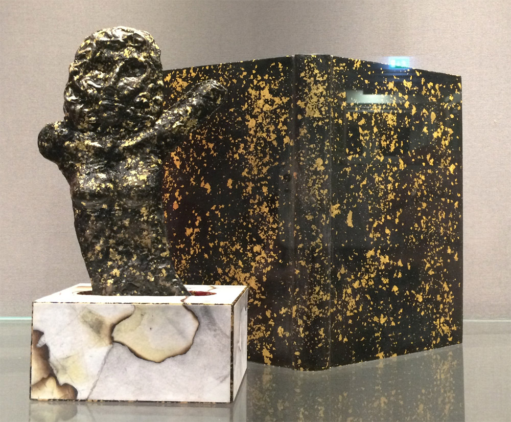
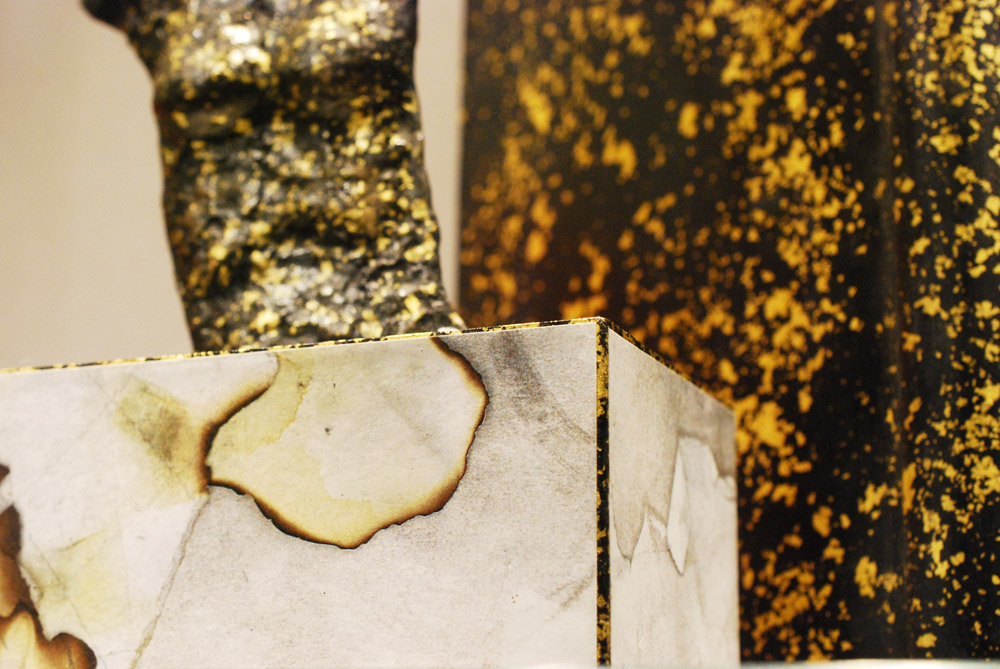
    Kaitlin Barber‘s interpretation of Vita Nuova extended beyond the book form with her 3-dimensional piece representing Dante’s dream of Beatrice in flames. The binding is covered with hand-dyed goatskin and decorated using the Sunago technique in gold leaf. Kaitlin’s binding won the St. Bride Foundation Prize for Finishing.

    vitanuova-kaitlinbarber2

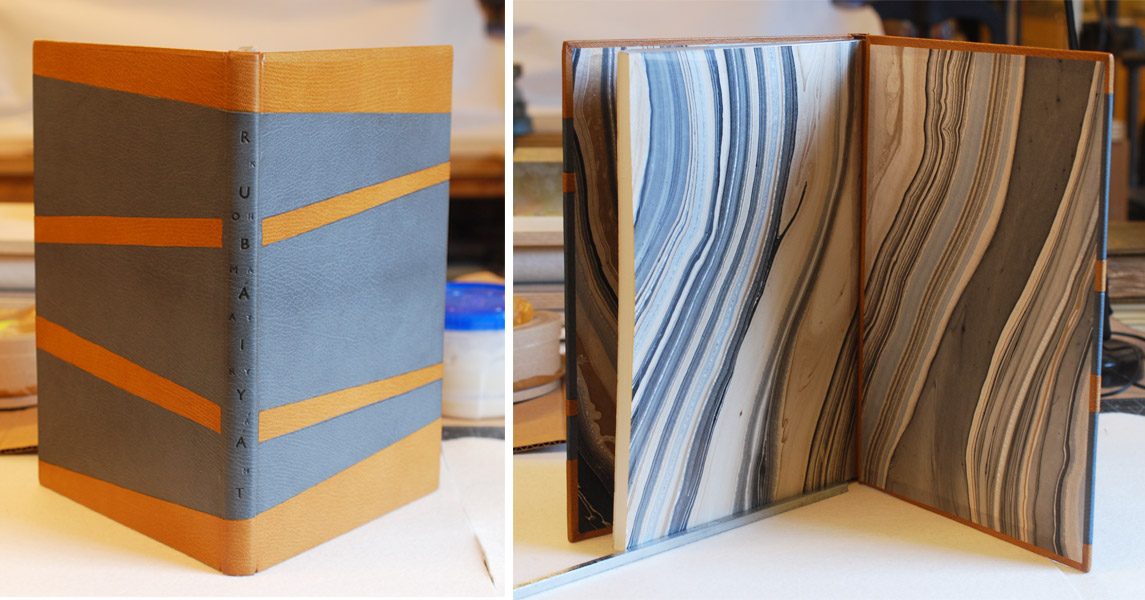
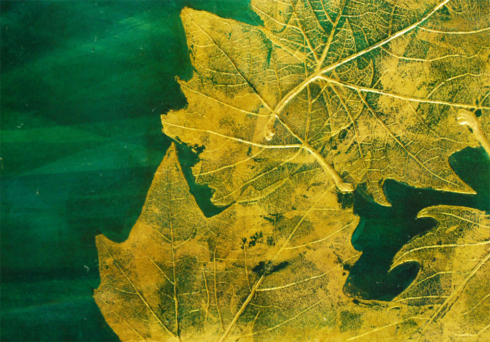
    Kaitlin’s second submission was In Smoke: Ten Variations on Eugenio Montale by Gary Michael Dault. Kaitlin created another beautiful binding using a hand-dyed leather that creates so much movement.

    insmoke-kaitlinbarber

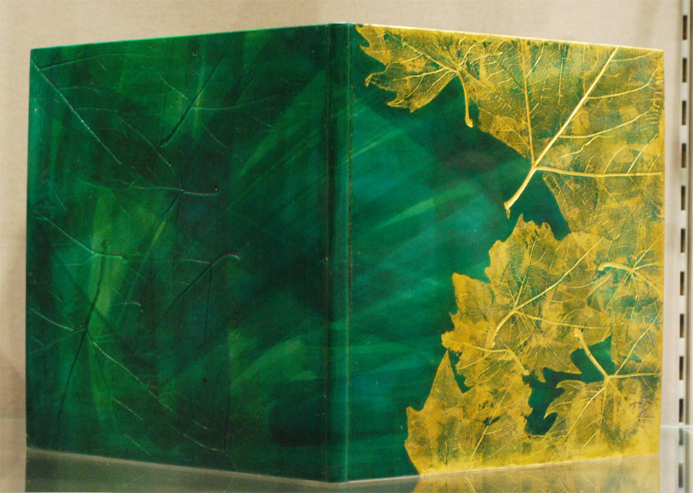
    The front and back boards have been debossed with leaves, with the front accented in gold leaf. The consistent themes of nature and repeated imagery of foliage and gardens within the text inspired Kaitlin’s design. The second place Clothworkers’ Prize of the Open Choice Book was awarded to Kaitlin’s second entry. I am so happy for Kaitlin, as a fellow North Bennet Street grad, it’s so great to see her skill and creativity grow. Congrats Kaitlin!

    insmoke-kaitlinbarber2


    Bec Britain

    vitanuova-becbritain

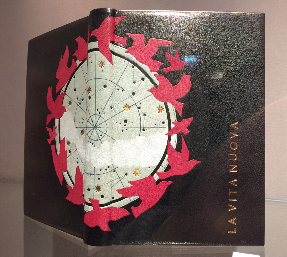
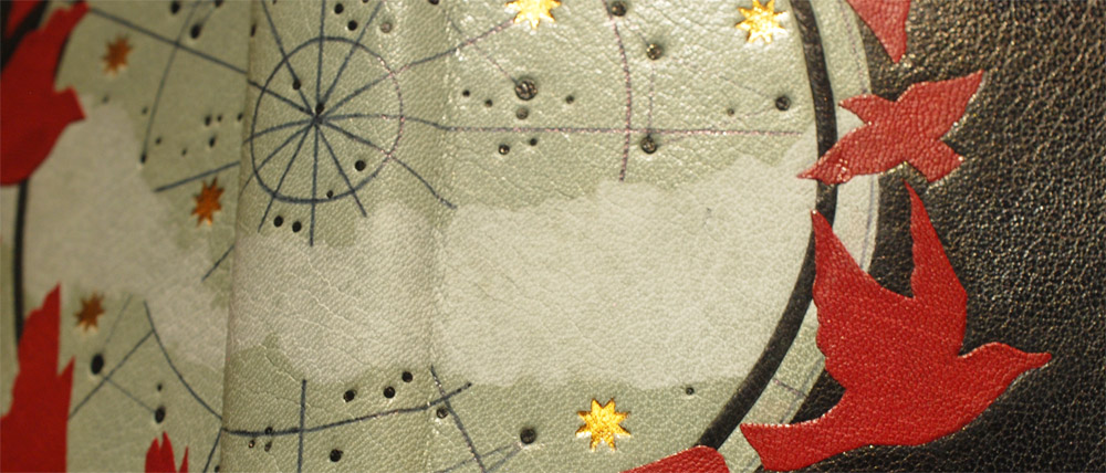
    Bec Britain created this gorgeous binding for Vita Nuova. As the exhibit pamphlet reads “the design reflects Dante’s evolving sense of the limitations of courtly love and its transition into sacred love.” The central design is created with crimson leather onlays, tooling and ink. Bec was awarded the Harmatan Ltd Leather Prize, which she completely deserves. Her combination of techniques created such a sleek and captivating design.

    vitanuova-becbritain2


    Jeanette Koch

    vitanuova-jeanettekoch

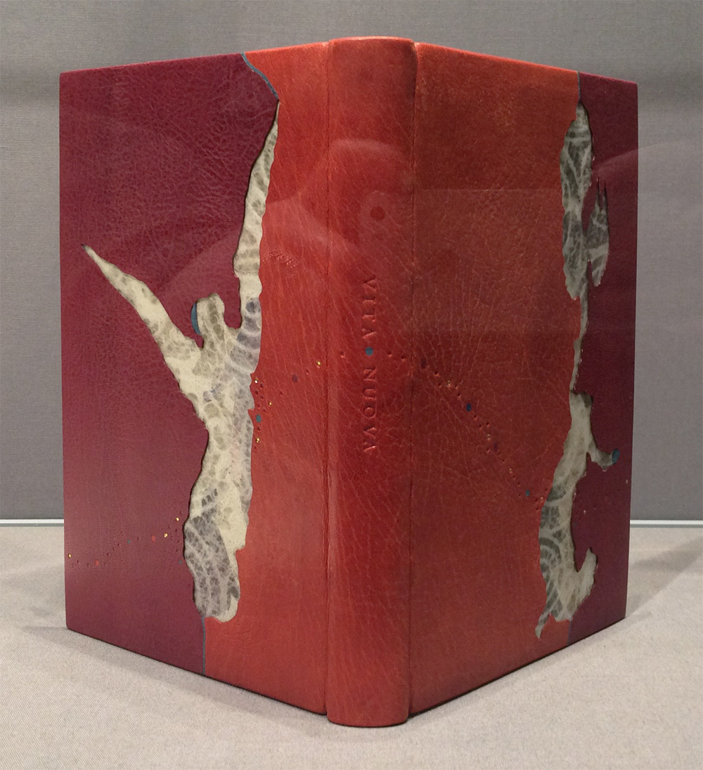
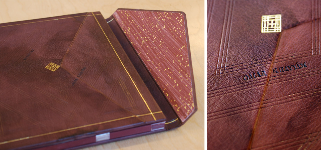
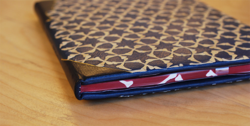
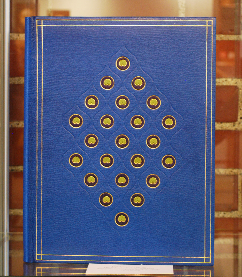
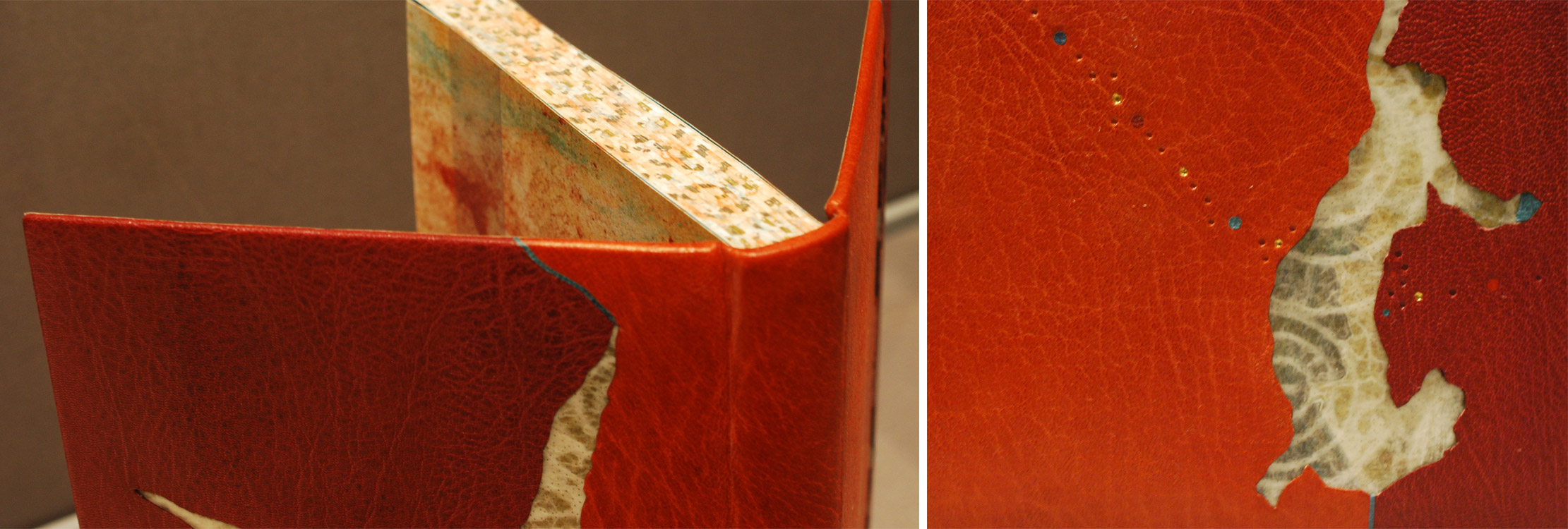
    Jeanette Koch’s binding for Vita Nuova is covered in terra-cotta and burgundy goatskin. The leather is cut-out to reveal laminated decorative paper and transparent vellum. I love the way Jeanette transformed the decorative paper in her design.

    The edges are decorated with watercolor, palladium and gold leaf. Jeanette was honored with the Lisa von Clemm Prize for this binding.

    vitanuova-jeanettekoch2

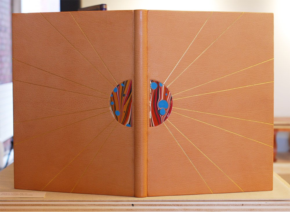
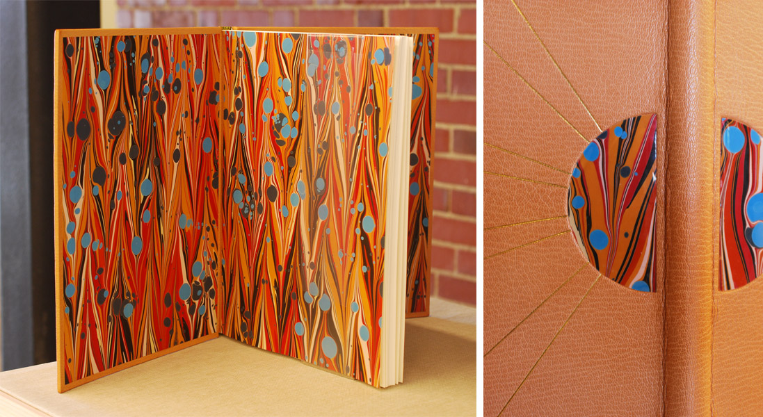
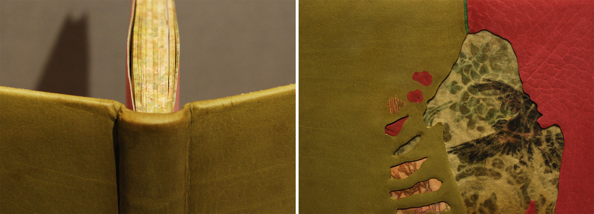
    Jeanette also submitted a binding of the late 14th-century Sir Gawain and the Green Knight, an Arthurian story on chivalric romance.

    sirgawainandthegreenknight-jeanettekoch

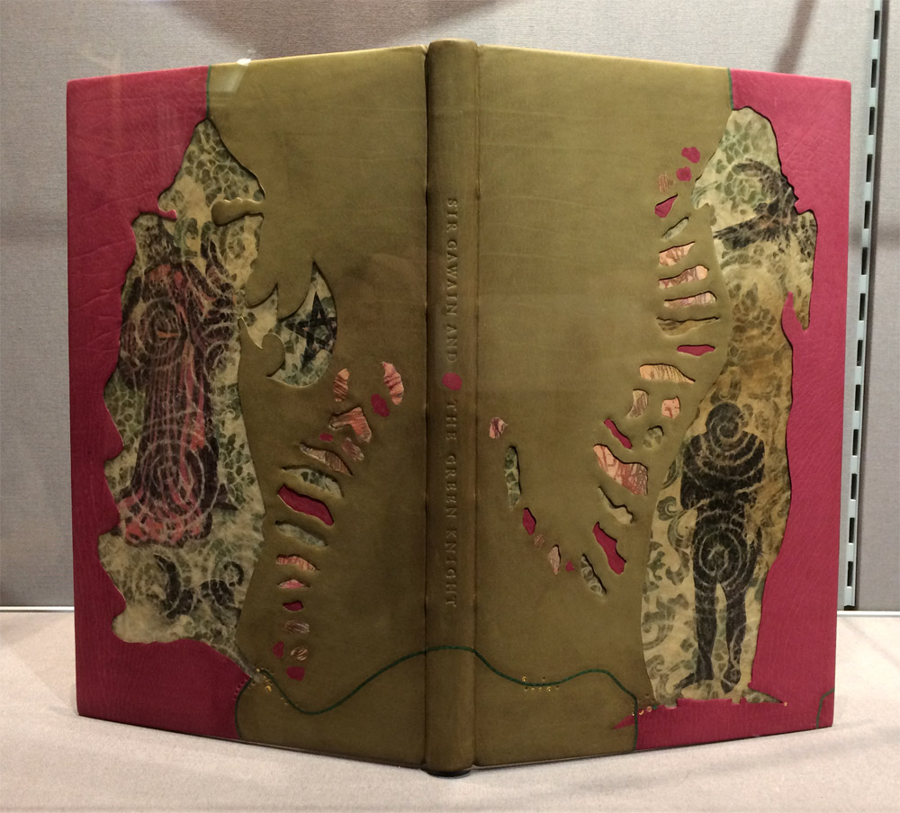
    This is one of my favorite bindings from the exhibit. The judges seems to agree, as Jeanette received The Judges’ Award and the Arthur Johnson Prize for this binding. Covered in green and burgundy French goatskin; Jeanette chose a beautiful green skin with stunning grain detail at the spine.

    Like Vita Nuova, this binding also has cut-outs revealing laminated decorative Japanese paper and vellum.

    sirgawainandthegreenknight-jeanettekoch2


    Kaori Maki

    vitanuova-kaorimaki

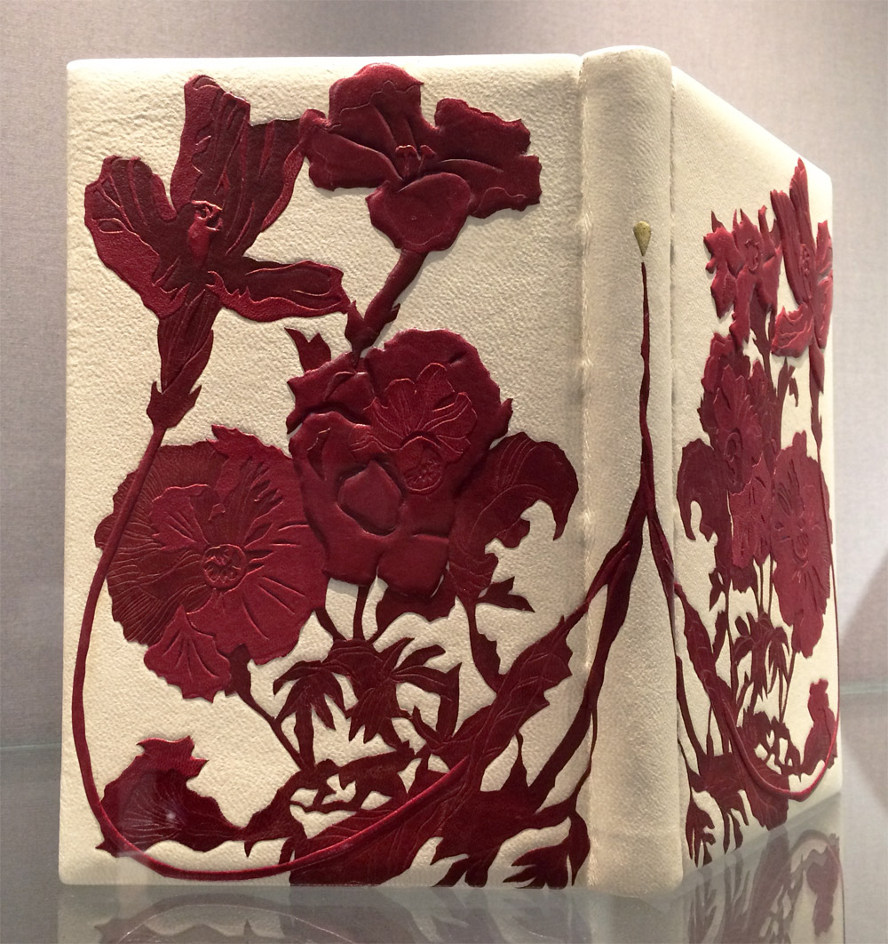
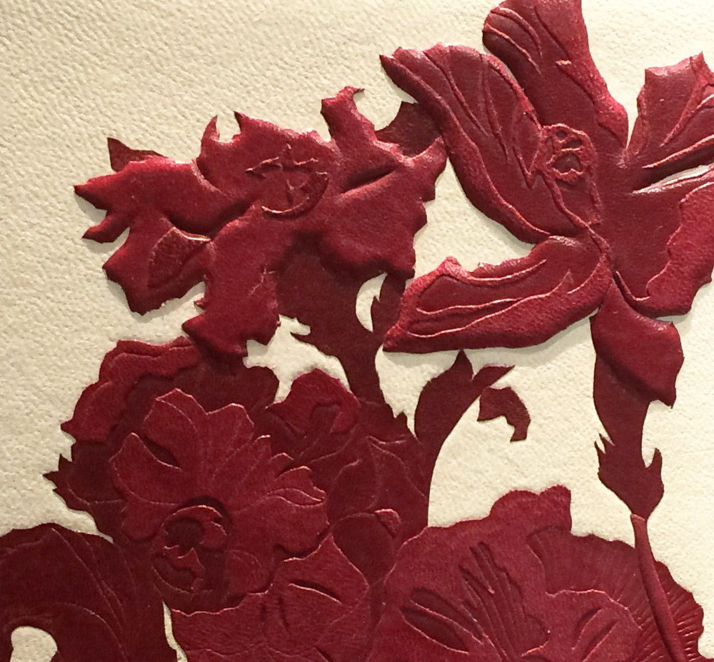
    I was so in awe of Kaori Maki‘s binding for Vita Nuova, which was bound in alum-tawed goatskin. Kaori decorated her binding with an intricate and bold floral design using back-pared, cushioned onlays dyed red. Kaori’s binding received second place for The Folio Society Prize for the Set Book, which was so well deserved, her decorative work was so unique and captivating.

    vitanuova-kaorimaki2


    Yuko Matsuno

    throughthewoods-yukomatsuno

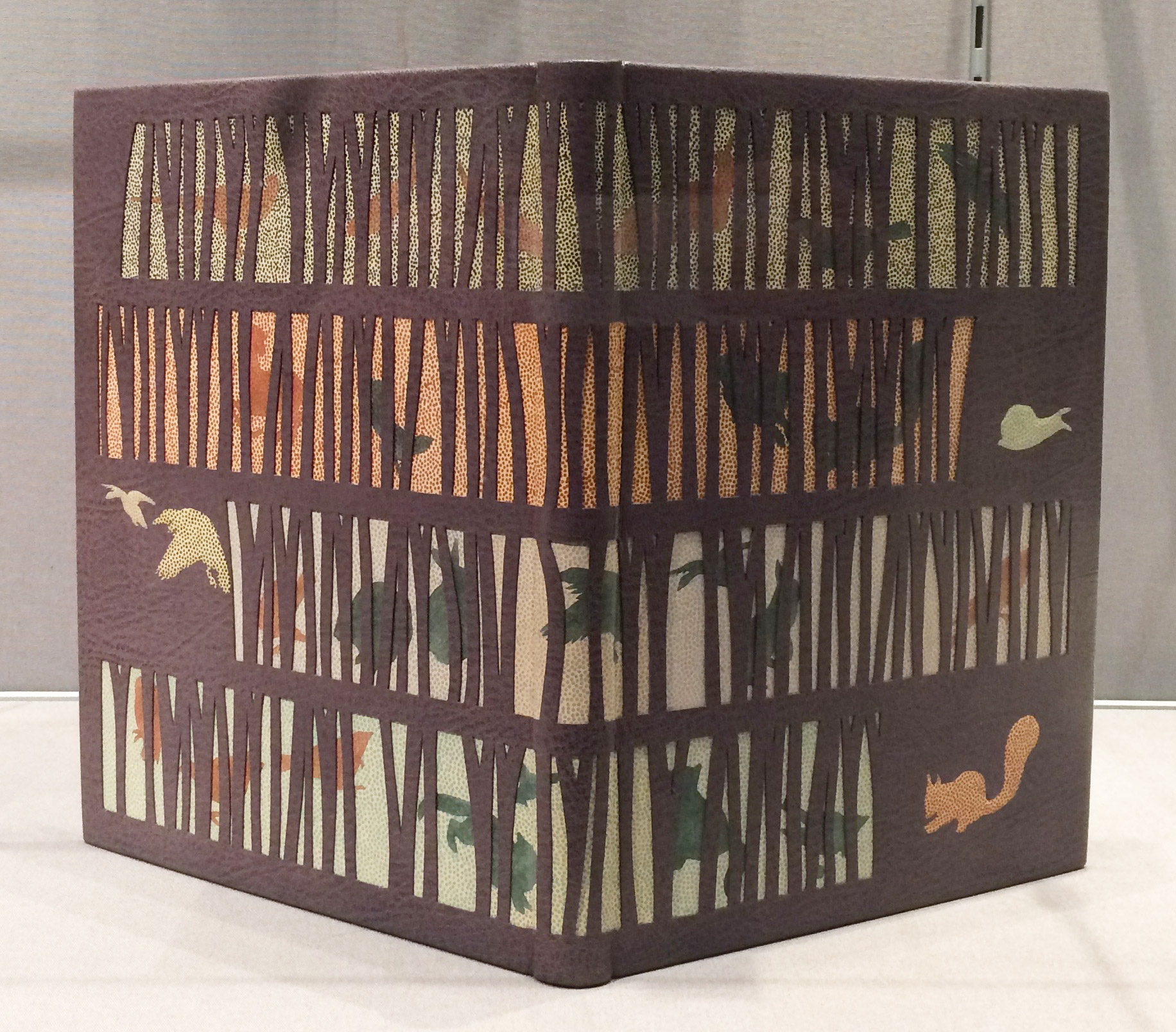
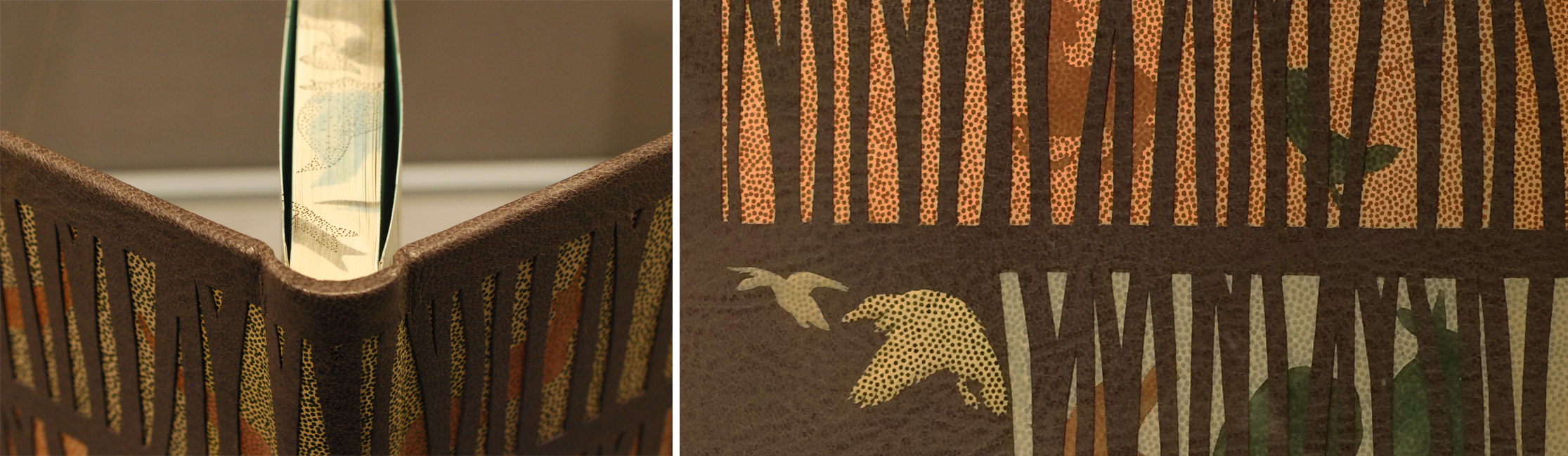
    The most celebrated binding of the evening was crafted by Yuko Matsuno. Her binding of Through the Woods by H.E. Bates is bound in grey goatskin with decorative underlays. Ink-dotted calfskin and Zerkall paper peeks through a forest silhouette with animal onlays of colored Gampi and cushioned calfskin.

    The edges and endpapers are decorated using soft pastel to mimic the imagery from the cover. Yuko received first place for The Clothworkers’ Prize for the Open Choice Book and the ultimate prize: The Mansfield Medal for the Best Book in the Competition.

    throughthewoods-yukomatsuno2


  2. North Bennet Street School // Student & Alumni Exhibit 2015 – Part Two

    May 28, 2015 by Erin Fletcher

    In addition to the set books I wrote about in Part One of this post, the Student and Alumni Exhibit at North Bennet Street School includes a selection of bindings produced by current students and alumni of the full-time program. In this post, I’ll be highlighting some of my favorites.

    I’ll start with my own bindings. This year I submitted two miniature bindings, which I’ve completed within the last 8 months. The book on the left is Goose Eggs & Other Fowl Expressions bound in the Dorfner-style with wood veneer boards. I wrote about the process a few months ago, you can check that out here.

    The second binding is The Nightingale and the Rose by Oscar Wilde. The book is bound as a traditional French-style fine binding. The nightingale on the front board is created using various back-pared onlays, feathered onlays and embroidery. For those of you who know the story, there is also a small wood veneer inlay that represents the rose’s thorn. The binding includes tan goatskin doublures. The back doublure showcases the rose and was created in the same manner as the nightingale.

    ErinFletcher-NBSSExhibit

    Next up is Jacqueline Scott’s embroidered binding of Hans Christian Andersen’s The Wild Swans. Jacqueline is apart of the 2015 graduating class and I featured her set book in the first post. Her work is so stellar and I had the delightful opportunity to see this book as it took a journey to became this very gorgeous binding.

    The embroidery is so delicately handled and the feather embroidered on the spine of the box adds just the perfect amount of intrigue. The swan’s wings extend beyond the fore edge and are covered on the backside with matching green goatskin leather. I can’t wait to see how Jacqueline continues to explore embroidery in her work.

    JaquelineScott-NBSSExhibit

    The rest of the images were taken after the exhibit was fully installed, so please pardon any glares, shadows or my reflection. I would also like to note that I had intended to include the work of Rebecca Koch and Anne McLain, but it was rather difficult to capture an accurate photograph of their bindings due to reflection and glare issues. So sorry you two but I would like to say that loved your bindings!

    The following binding was recently bound by my charming bindery mate Colin Urbina, 2011. In his binding of Twenty Thousand Leagues Under the Sea by Jules Verne, he created an abstract underwater scene with several tooled leather onlays and inlays of pearl. Other portions of the design are texturized with an open circle tool and by pressing sandpaper into the wet leather. The title and author are blind tooled on the spine.

    The head edge is painted in a vibrant purple with brushstrokes that cross over one another. Colin put in matching edge-to-edge doublures and added a frame of ascending “bubbles” using the same open circle tool.

    ColinUrbina-NBSSExhibit

    GabrielleCooksey-NBSSExhibit

    Monsters and Beasts is the work of the incredibly talented Gabrielle Cooksey, 2014. Unfortunately, I don’t know much about this piece. But I believe that everything from the illustrations to the printing were all done by Gabrielle. It’s absolutely beautiful work!

    KaitlinBarber-NBSSExhibit

    Kaitlin Barber is the master of miniatures (and there always seems to be one in every class). In this adorable and wildly impressive collection of bindings, Kaitlin has miniaturized a selection of historical bindings she learned over the course of her time at North Bennet Street School. She’ll be apart of the 2015 graduating class and I wrote more about her work in the first post.

    Continuing on with the topic of historical structures, the students were treated to a week long workshop in the spring with Dr. Georgios Boudalis. Using his extensive understanding of Byzantine culture, he taught the students none other than a traditional 12th century Byzantine structure. Todd Davis, 2016, included his binding in the exhibit. The bindings are quite massive and required a lot of detailed work, such as board shaping, primary and secondary headbands, braided straps and clasps. After all that blood, sweat and tears, the class bound some really lovely models.

    ToddDavis-NBSSExhibit

    The next binding on my list of favorites was done by another studio mate of mine, Lauren Schott, 2013. Bound in the Dorfner-style (same as Goose Eggs) with wood veneer boards and a leather spine. Lauren’s design on this binding of Walt Whitman’s Song of the Broad-Axe is so elegant.

    Lauren and I are both a big fan of incorporating shapes and symmetry into our designs. The front and back board are gold tooled onto the wood veneer; the tooling sits in the veneer so that at certain angles becomes almost invisible.

    LaurenSchott-NBSSExhibit

    And to round out the favorites is this stunning binding from Johanna Smick Weizenecker, 2010. This binding of Chairmaker’s Notebook is a quarter leather goatskin binding with semi-hidden corners. The design on the front and back cover continues onto the spine as an onlay. The title and author are hand titled using black and copper foils.

    JohannaSmickWeizenecker-NBSSExhibit

    So that concludes this year’s Student and Alumni exhibit at the North Bennet Street School. I hope you enjoyed this overview and I want to thank all of you who were able came out to see the show in person!


  3. North Bennet Street School // Student & Alumni Exhibit 2015 – Part One

    May 20, 2015 by Erin Fletcher

    It’s graduation season, which means it’s time for this year’s post on the North Bennet Street School’s Student and Alumni Show. (You can read the past two years here and here). This is an event that I always look forward to. The graduating students are each given a copy of the same book (a set book) and asked to create a design fine binding. The amount of creativity and talent that goes into each binding really displays each student’s personality. The exhibit is currently on view at the North Bennet Street School in Boston, Massachusetts until May 29th. If you are around, please pay a visit to see these bindings up close.

    The set book for this year’s graduating class is the The Rubáiyát of Omar Khayyám. It’s a beautifully illustrated book printed in a rather large format, which is something many of the students discussed with me. After photographing each book*, I had a discussion with each binder. We talked about the inspiration behind their designs, their thoughts on the binding process and what challenges they faced.

    * I want to note that the photographs were taken in various spaces at the school under not ideal lighting. So you may see variation in color for some of the bindings.

    Kaitlin Barber

    Rubaiyat-KaitlinBarber

    Kaitlin Barber‘s approach to her design stems from her admiration of 18th century tooled panel and Cambridge panel patterns. Though in her design, she reinterpreted this look in a sleek and modern way. The binding is covered in a maroon goatskin with a raised window framing two inset panels of spalted tamarind. Kaitlin’s decision to use wood was inspired from an article by Helene Jolie and during a workshop taught by Jim Croft. In the article, Helene writes about the variety of materials one might employ as an inset panel, while Jim introduced shaping possibilities during his workshop.

    I think Kaitlin’s use of the spalted tamarind is genius, not only is it really beautiful and is elegantly shaped, but it also acts as symbolism for the message of life and death peppered throughout the book’s text. The dark abstract shapes in the spalted wood occurs when fungus enters the tree often causing it to die.

    Rubaiyat3-KaitlinBarber

    Gold tooled borders highlight the spalted tamarind as well as frame the entire the book. The title is tooled alongside the front panel. The head edge is airbrush with a brilliant blue acrylic, then sprinkled using gold leaf. The French double core headbands are sewn with silk threads. Kaitlin used a marble paper as her paste down and flyleaves.

    One of the main challenges Kaitlin faced during the binding process was working with such a large format, specifically when it came to paring the leather. Due to its size the leather included many areas of the skin such as the arm pits and backbone. These parts of the skin will react differently when being pared; the arm pits are stretchy while the backbone is a bit tougher. In the end it was a really great learning experience for Kaitlin.

    After graduation Kaitlin will continue in her internship at the Boston Public Library’s Rare Book Room, which began in January and will run through the summer.

    Lauren Calcote

    Rubaiyat-LaurenCalcote

    Lauren Calcote’s interpretation of The Rubáiyát is brilliant. The text is notably one of the most famous pieces of Persian literature, which was translated into English for the first time by poet Edward Fitzgerald in 1859. Considering this relationship between its origins and the initial translation, Lauren played with the binding structure by combining a fine binding and Islamic binding.

    The book is covered in fair goat that was hand-dyed by Lauren in a beautiful mottled aubergine purple. The fore edge flap speaks to the Islamic binding structure, but sits on top instead of underneath the front cover. The flap lays inside a well securely fastened with a hidden magnet.

    Rubaiyat2-LaurenCalcote

    Decoration on the front and back covers include gold and blind tooled lines laid out in a geometric design inspired by Persian patterns. The title is carbon-tooled on the front cover. The poet’s last name appears on the front of the flap and in the well.

    Other details include the custom-made endpapers reminiscent of those found in Islamic bindings. The paste down and fly leaf are hand painted with sprinkles of gold leaf. The edges of the text block are decorated in the same fashion. The headbands follow the Islamic chevron pattern around a round core.

    Planning this hybrid structure was an enjoyable challenge for Lauren, particularly finding the right fit for the flap by making sure it didn’t sit too proud. Another issue came during covering, Lauren initially wanted to cover the book in one full piece (from flap to front fore edge). Yet to achieve the desired height for the flap, Lauren choose to cover the base of the well with a separate thinner piece of leather. This seam is absolutely flawless and I would have never known if Lauren hadn’t explained the process to me. So bravo, Lauren.

    The last major design hurdle was where to tool and how to tool (mainly on the flap and well). She flip-flopped between tooling the well and leaving it bare. Lauren and I discussed how tooling the well was definitely the better decision. That the design works whether the flap is open or closed.

    After graduation, Lauren will be spending the next six months at the Boston Athenaeum as the 2015 Lisa von Clemm fellow.

    Joshua Crotty

    Rubaiyat-JoshuaCrotty

    On December 1, 1948 an unidentified man was found dead on Somerton Beach in Australia. This mystery was dubbed The Taman Shud Case, a phrase meaning ended or finished in Persian. Found in a hidden pocket of the man’s trousers was a printed scrap of paper, which turned out to be removed from the final page of The Rubáiyát of Omar Khayyám.

    This eerie tale is where Joshua Crotty drew his design inspiration. This simplistic design conveys a sense of heat, like being stranded on an Australian beach or Persian desert. The binding is covered in a beautiful sandy tan goatskin. The central inlaid design is created using marbled paper laminated to mylar representing a hot, golden sun. Gold tooled lines radiate from the half-circle inlays creating the rays of the sun.

    Rubaiyat2-JoshuaCrotty

    Joshua creates a fluid design by using the same marbled paper as the paste down and flyleaf. The head edge is gilded in the rough with gold leaf. I really love simple designs that are captivating and strong. Joshua’s inspiration is intriguing and really shines through; his simple design is ambiguous and holds a little bit of mystery.

    Joshua’s talents as a binder has already landed him in an impressive position as a hand bookbinder for the U.S. Government Publishing Office. His job is to serve the needs of Congress by creating finely crafted bindings to suit their needs. Joshua relocated to D.C. during his last semester at North Bennet Street School and this became one his major challenges during the binding process. He left behind a nice large bench to working on a kitchen table while also dealing with D.C.’s humidity; experiencing extended drying time made things a bit tough. These challenges didn’t hinder his ability to create crisp, clean gold tooled lines. Beautiful binding Joshua!

    Megan Gibes

    Rubaiyat-MeganGibes

    The Rubáiyát of Omar Khayyám was the title given by translator Edward Fitzgerald, whom I mentioned above. A ruba’i is a two-stanza with two parts per line, hence the word rubáiyát (a word derived from the Arabic language root for “four”) means “quatrains”.1

    As Megan Gibes describes the inspiration behind her design she explains that the poems are broken up into four lines with the crescendo occurring in the third line. The binding is covered in a medium gray goatskin with stripes of onlays in tan goatskin representing these four lines. The inner onlays are tooled, while the onlays near the head and tail are back-pared. This clean, minimalistic design is exactly what Megan wanted to achieve from the beginning as a way to juxtapose the grandiose bindings generally associated with The Rubáiyát.

    Rubaiyat2-MeganGibes

    The title is carbon-tooled down the length of the spine with Rubáiyát sandwiched between Omar and Khayyám (click on the image above for a better view). The head edge is shaded with graphite and gauffered with a thin line palette. The headbands are sewn in silk over a single parchment core. Megan sourced the perfect marbled paper to line the boards and fly leaf. This large-scale marbled design works so well with the format of this binding, while also tying in the color scheme Megan chose for the cover.

    Megan and I chatted about the challenges of creating a fine binding, how overwhelming the process can seem. Megan’s strategy was to isolate each step and to only move forward when she felt completely satisfied. One challenge that arose came during the paring process and some miscalculations. By edge paring the leather a bit too short, this left with a visual drop in the leather after covering. Megan added a patched onlay, which fixed the situation and actually looks quite seamless.

    After graduation, Megan will be moving across the country to Santa Barbara, California. She’s been hired as the Head Binder for Neve Albums where she’ll be producing unique albums, guests books and custom boxes. Neve Albums brought on Megan to help establish an in-house bindery to help expand their business. Best of luck Megan, sounds like a great gig!

    Shannon Kerner

    Rubaiyat-ShannonKerner

    Omar Khayyám lived during the 11th and 12th century making a living as a mathematician, astronomer, philosopher and poet. His poetry includes several themes such as life, death and love. For her design, Shannon Kerner reinterpreted these themes using symbols found on Southwestern Native American rock wall art.

    Rubaiyat2-ShannonKerner

    The shapes of each vase is derived from typical Persian styles. The first vase represents the spirit of the ancestor with the tree of good life growing from the ancestor and falling rain. The symbol on the center vase represents the virgin. The final vase includes the title tooled in gold along with the symbol for the water clan, which is represented by two inverted triangles inside of a rectangle. This final symbol, just like the vases, are symbols for water and life, which circles back around to the first vase.

    As I mentioned before, Omar Khayyám worked as an astronomer and was tasked with reforming the calendar in order to minimize seasonal errors; this was something Shannon wanted to reflect in her design. The top half of the design includes a sun created through surfacing gilding palladium and gold. The rain passes through a dreamy cloudscape and blind tooled stars representing the night sky.

    Rubaiyat3-ShannonKerner

    Shannon’s binding is bound in a bright teal goatskin with several layered onlays. Other decorative elements include surface gilding, foil tooling and blind tooling. The head edge was rough edge gilt. The paste down and flyleaf are covered with a hand marbled paper made by Shannon (detail shown above).

    Shannon employed a variety of techniques in her binding. One particular element that I found intriguing was her use of three different colored foils within the teardrop tool, which offers an elegant subtly to the design. As we chatted about her process, she pointed out the challenges presented when creating the sun. The center is surface gilt with gold leaf, while the outer rays are surface gilt with palladium leaf. Butting up these two leaves meant that the Frisket (a masking film) would be placed on the gold leaf. This film pulled up some of the leaf, but Shannon successfully mended any losses creating a striking image for her overall design.

    Come graduation, Shannon is looking forward to her next step and where it might take her. She is anxiously awaiting to hear the results of prior interviews.

    Lindsay Nakashima

    Rubaiyat2-LindsayNakashima

    Earlier this year, Boston College exhibited the work of Mark Esser, who was the first instructor at North Bennet Street School and is apart of a lineage of master bookbinders. His work greatly inspired Lindsay Nakashima as she approached her design for The Rubáiyát. Lindsay also planned to utilize both gouges and palettes as a challenge to work with the tools she has been introduced to over the course of the second school year.

    The binding is covered in a vibrant purple chieftain goatskin from Hewit (best represented in the image below). The other students chose to use Harmatan goatskin for their bindings, but Lindsay was attracted to not only the lush color, but the heavy grain. This was also a great opportunity to play around with a different type of leather, to get a sense of how it can be manipulated and tooled.

    Rubaiyat-LindsayNakashima

    The head edge is rough edge gilt with French double core headbands wrapped in silk. Zerkall paper was used for the paste down and fly leaf. Lindsay’s binding has quite a classic, clean look. She emphasizes the back corner, which offers a more elegant (or dare I say more feminine) feel for the size of the binding.

    Lindsay’s most challenging aspect of this process was the gold tooling, which most binders can attest to its difficulties. Yet tooling on an unfamiliar leather can heighten the challenge. Lindsay noted that the chieftain goat felt less spongy and less susceptible to making an impression. But Lindsay plowed through the process and created beautifully tooled lines.

    After graduation, Lindsay will be moving back home to Austin, Texas where she’ll be setting up a bindery space. Her intentions will be to open this space for teaching simple workshops while also bringing in restoration commissions under the name Nakashima Books. Best of luck, Lindsay.

    Jacqueline Scott

    Rubaiyat-JacquelineScott

    Death is a reoccurring theme in Khayyám’s poetry and one that inspired many of the students in this exhibit. Jacqueline combined this theme with a love story threaded throughout the text. These themes are represented by the profile of a couple embracing and bones. Jacqueline’s book is bound in a blue goatskin with over 400 parchment back-pared onlays, these parchment bones create a classic Arabic geometric design.

    Jacqueline’s work with the parchment is quite impressive and I asked about her approach to using this unconventional material as a back-pared onlay. In her initial tests she overlapped two bones, but this created too much bulk and tore during the paring process. She also backed the parchment with tissue using gelatin. Jacqueline used this tissue as a barrier between the PVA and parchment, plus the tissue increases the opaqueness of the onalys. A little setback occurred during covering when the gelatin lifted from the moisture in the paste, but Jacqueline was able to reattach any raised onlays.

    Rubaiyat2-JacquelineScott

    The shape of the couple is accented by dark blue gold tooled onlays. The title is gold tooled down the length of the spine. The head edge is airbrushed with a deep red, bone shapes are masked out revealing the white of pages underneath. The boards are lined with matching edge-to-edge doublures and cork paper fly leaves.

    Rubaiyat3-JacquelineScott

    After graduation, Jacqueline will begin the first of three internships. Starting with a month-long internship at the Francis Loeb Library which is affiliated with the Harvard Design School. I’m looking forward to seeing Jacqueline later in the summer at the University of Virginia during her second internship while I’ll be attending Rare Book School.

    Jeff Altepeter

    Rubaiyat-JeffAltepeter

    The success of the student’s bindings are due to the instruction from Jeff Altepeter and I thought it best to end this post with his colorful binding. Jeff drew inspiration from The Great Omar. In 1909, Sangorski & Sutcliffe was commissioned to create a sumptuous binding for The Rubáiyát of Omar Khayyám. Given carte blanche and a limitless budget, the remarkable firm created the most ornate binding with thousands of jewels, complex gold tooled designs and leather onlays. Upon completion in 1911, the binding was shipped a year later to New York by way of the Titanic.

    Jeff pulled a single element from “The Great Omar”: the peacock (also a common motif on Sangorski & Sutcliffe bindings). His abstract interpretation of the peacock feather is laid out in a lozenge-like pattern. Instead of the traditional straight lines he employed the ogee finishing tool, which is a long, thin “S” shape. This tool created a very elegant, feather-like border around the “eye”. This center shape is made up of two gold tooled onlays. The inner one is tooled from a custom made finishing tool. Jeff is a master at crafting his own finishing tools; he made a few variations of the tool before settling on an open design rather than a closed one.

    The book is bound in a brilliant blue goatskin with an airbrushed head edge and hand sewn French double core headbands in silk. Marbled paper lines the inside of the covers and flyleaves.

    I asked the students about their challenges during the binding process and I posed the same question to Jeff. In an ideal situation, a binder wants a comfortable amount of time between each step. Yet for an instructor these steps might get rushed in order to show the process to students in a timely fashion. And there are less chances to tweak your design within these time constraints. But I think Jeff was able to capture the spirit of The Great Omar.

    So there you have it. My best to the graduating class of 2015 as you enter the world of bookbinding and conservation!

    1 Wikipedia


  • My name is Erin Fletcher, owner and bookbinder of Herringbone Bindery in Boston. Flash of the Hand is a space where I share my process and inspirations.
    The StudioNewsletterInstagramEmail me
  • Archives