RSS Feed

Posts Tagged ‘my hand’

  1. Manipulating Stone Veneer with Coleen Curry

    April 22, 2016 by Erin Fletcher

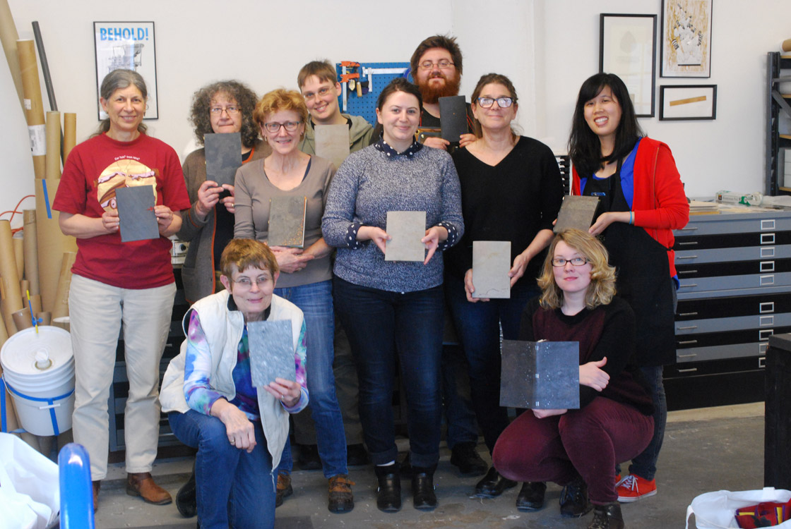
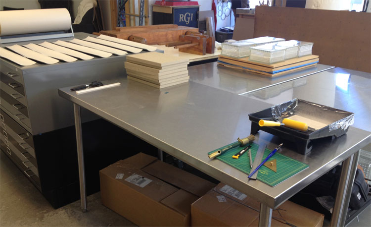
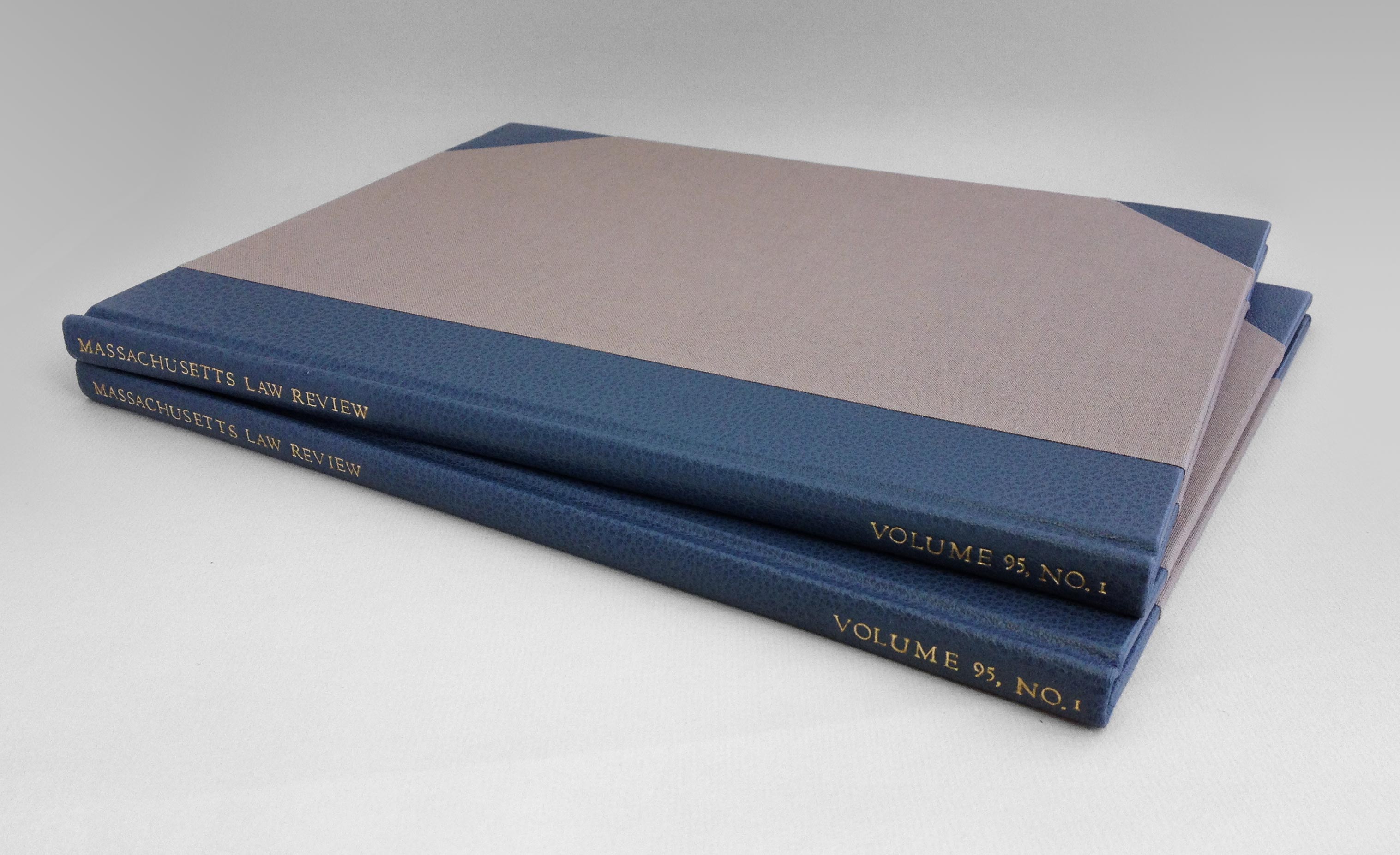
    Over the first weekend in April, Third Year Studio hosted a workshop organized by the New England Chapter of the Guild of Book Workers. Third Year Studio is located in Boston and is run by Colin Urbina, who just so happens to be my friend and studio mate (Herringbone Bindery is run out of Third Year Studio). This was the first workshop we hosted and Colin was so gracious to opened his space to members of NEGBW and to our guest instructor Coleen Curry.

    Coleen traveled to a unseasonably warm, then snowy Boston to teach 10 local New England binders, book artists and conservators Staple Binding in Stone Veneer. Coleen learned this innovative structure from Sün Evrard, who developed this binding as a conservation solution under the Tomorrow’s Past ideology. We began the first day of the workshop by handing around models of the Stone Veneer binding while introducing ourselves and learning about the structure and its history. The stone veneer comes from a place in Italy where it is cut to a veneer-thickness by use of lasers. This process puts an adhesive coating on the surface, while the back is coated with a cotton-fiberglass layer. The veneer comes in two varieties: slate or quartzite. Yet within these two categories you can find a range of textures, patterns and tones.

    StoneVeneerWksp-ErinFletcher

    left: Dorothy Africa and Coleen Curry | right: detail of  Toad Poems

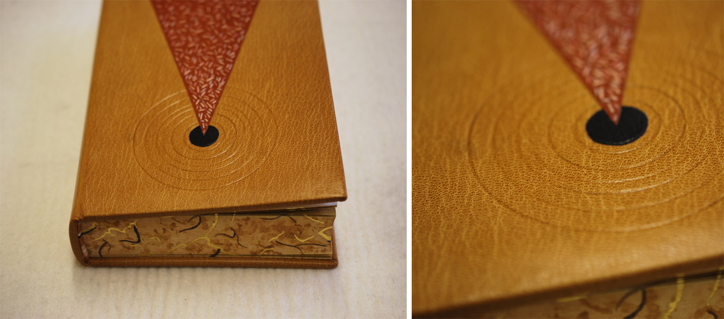
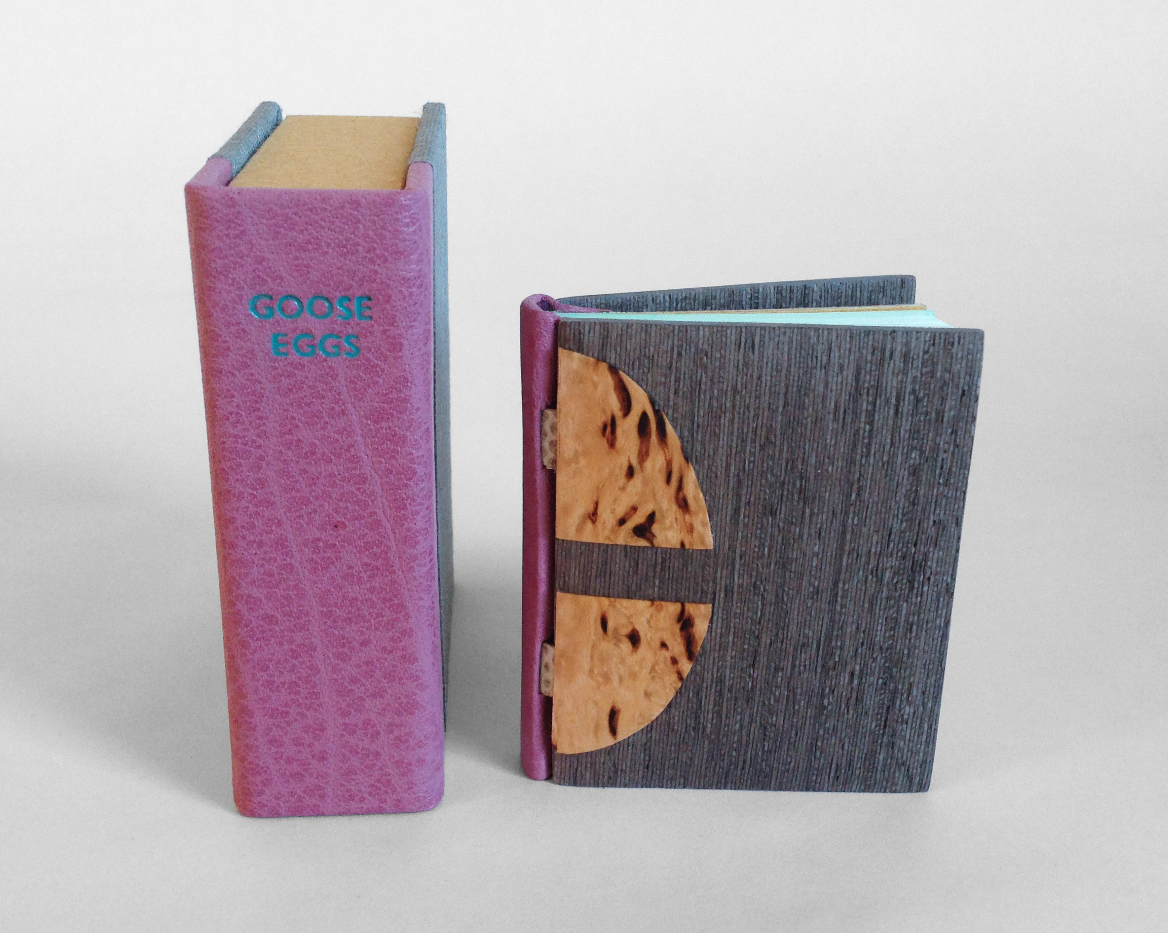
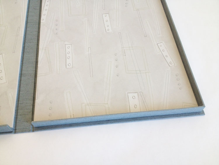
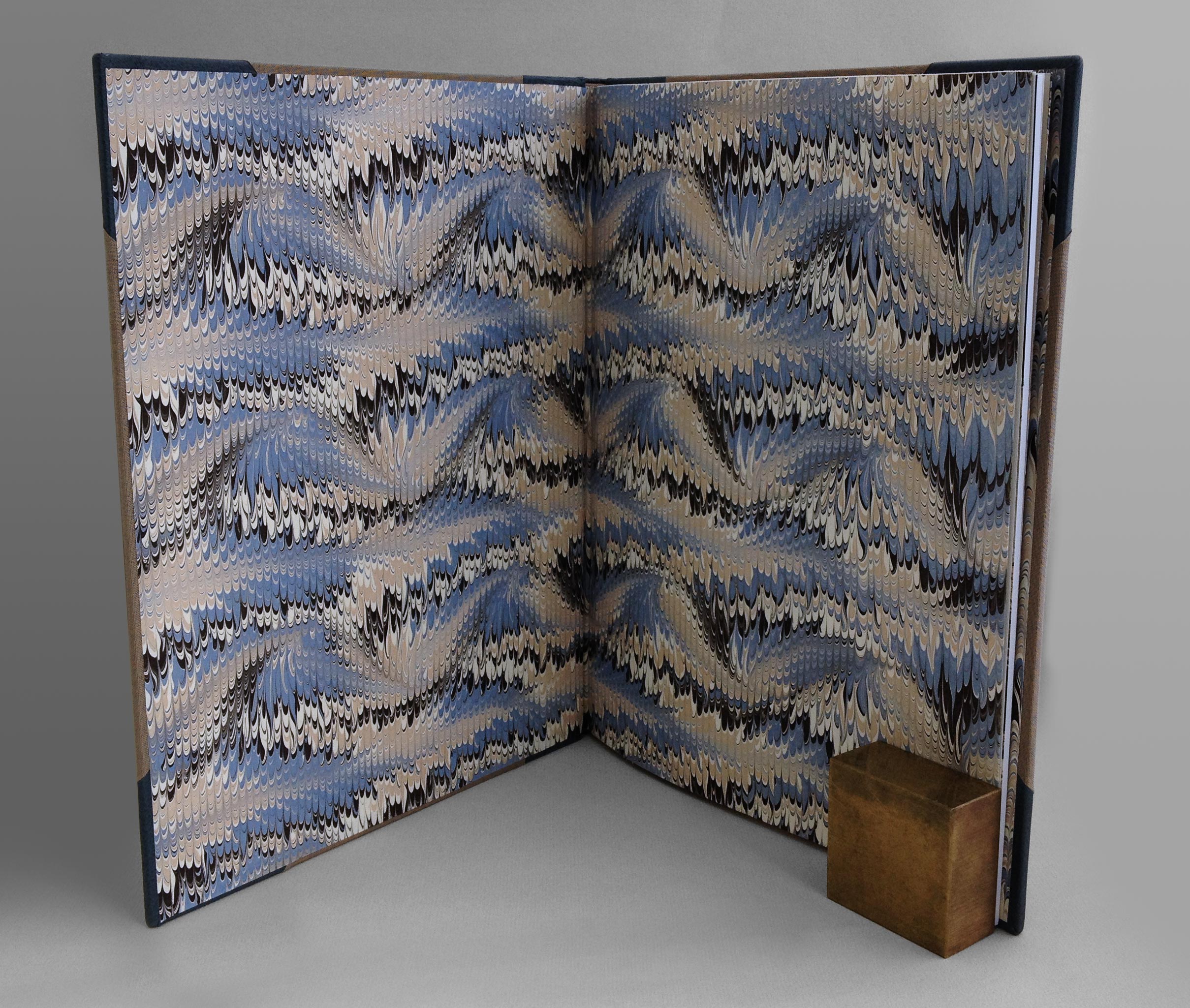
    The decoration on the slate stone veneer binding of Toad Poems above was achieved by placing a gilt piece of paper behind a cut-out in the covers. The windows are aligned with the staples, an example of how to incorporate the layout of the staples with the overall design.

    StoneVeneerWksp2-ErinFletcher

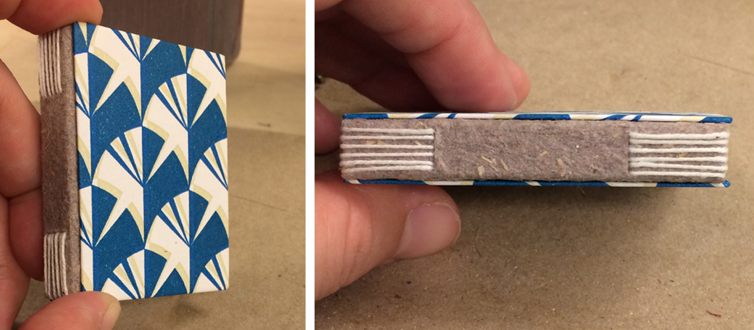
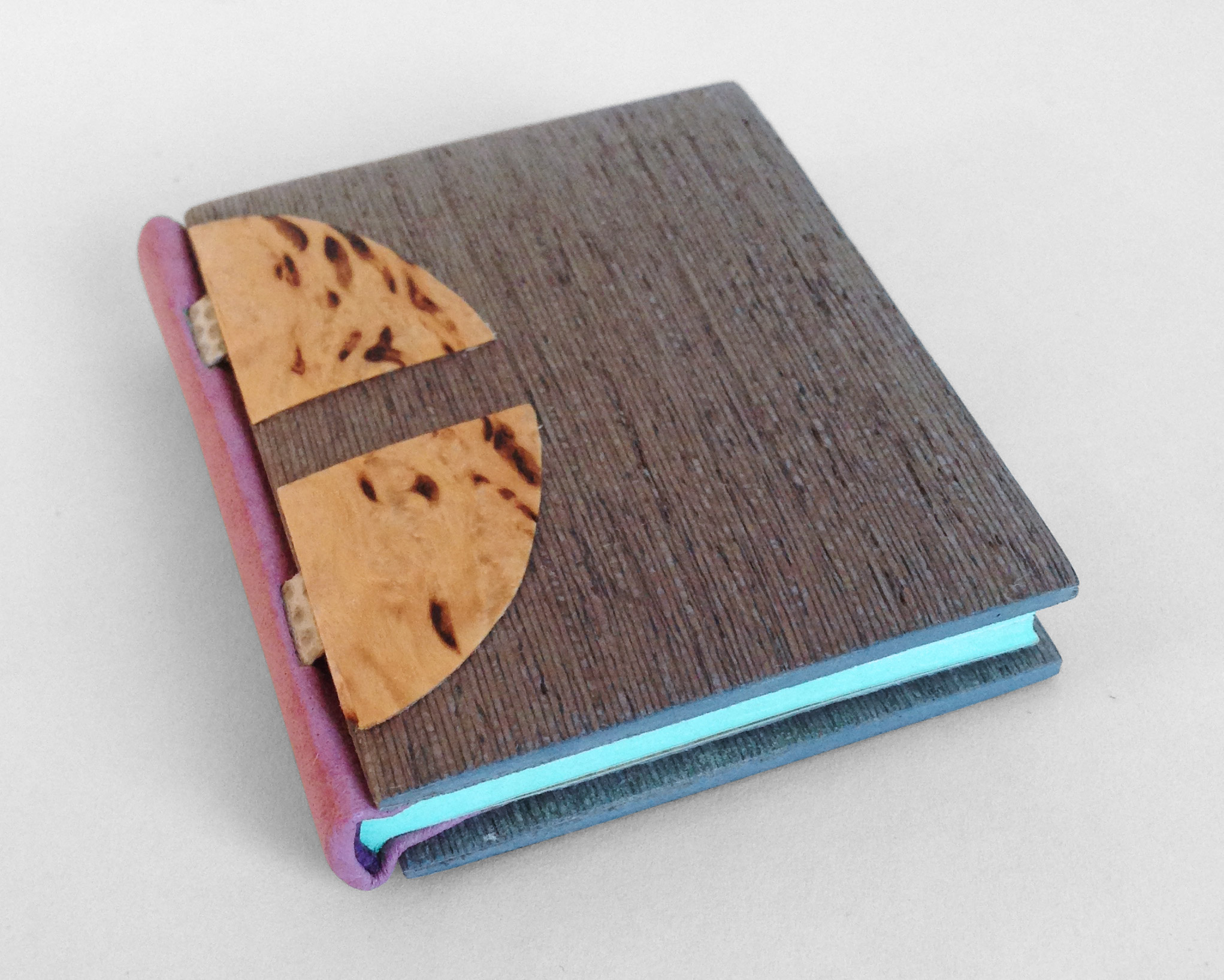
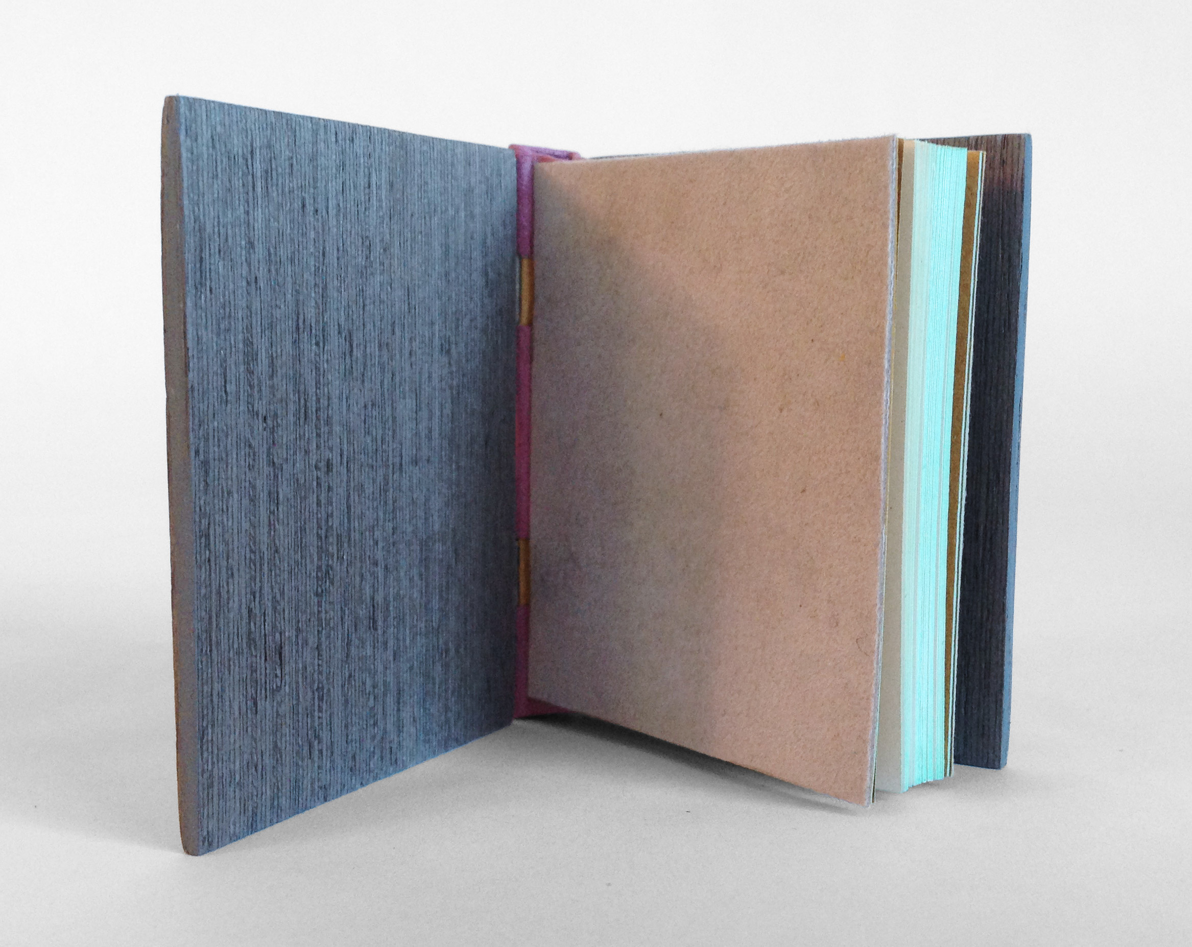
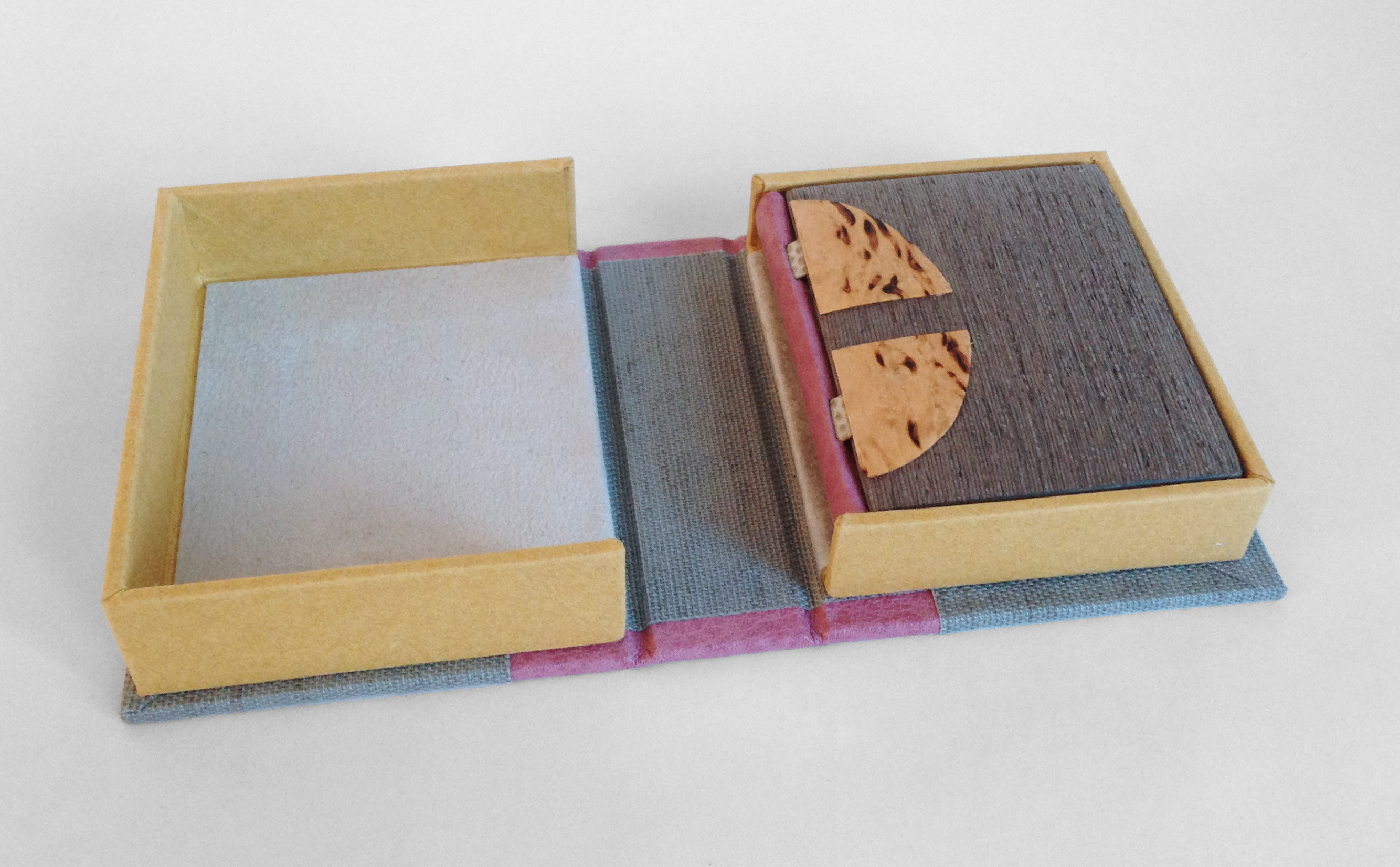
    The details of the binding above are of the blank model that Coleen made during the workshop with Sün, where she learned this structure. The covers were decorated using a Japanese screw punch. The circular cut-outs were backed with various colored Japanese tissues, offering a small pop of color against the grey slate. The image on the left shows part of the interior construction.

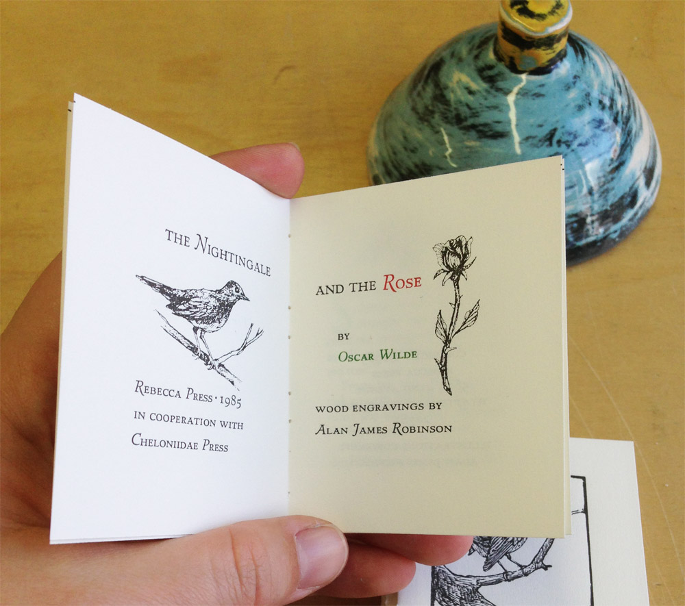
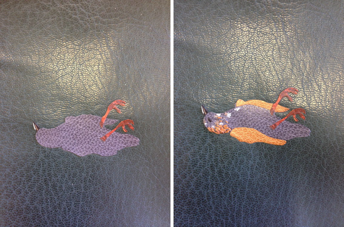
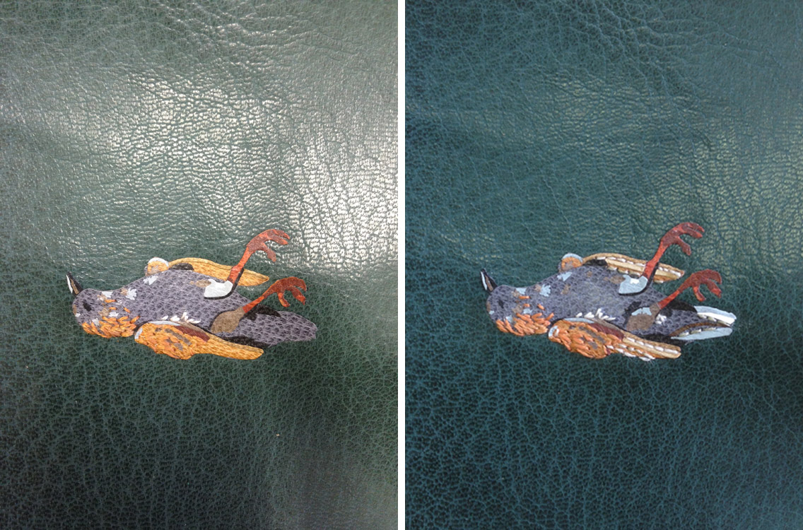
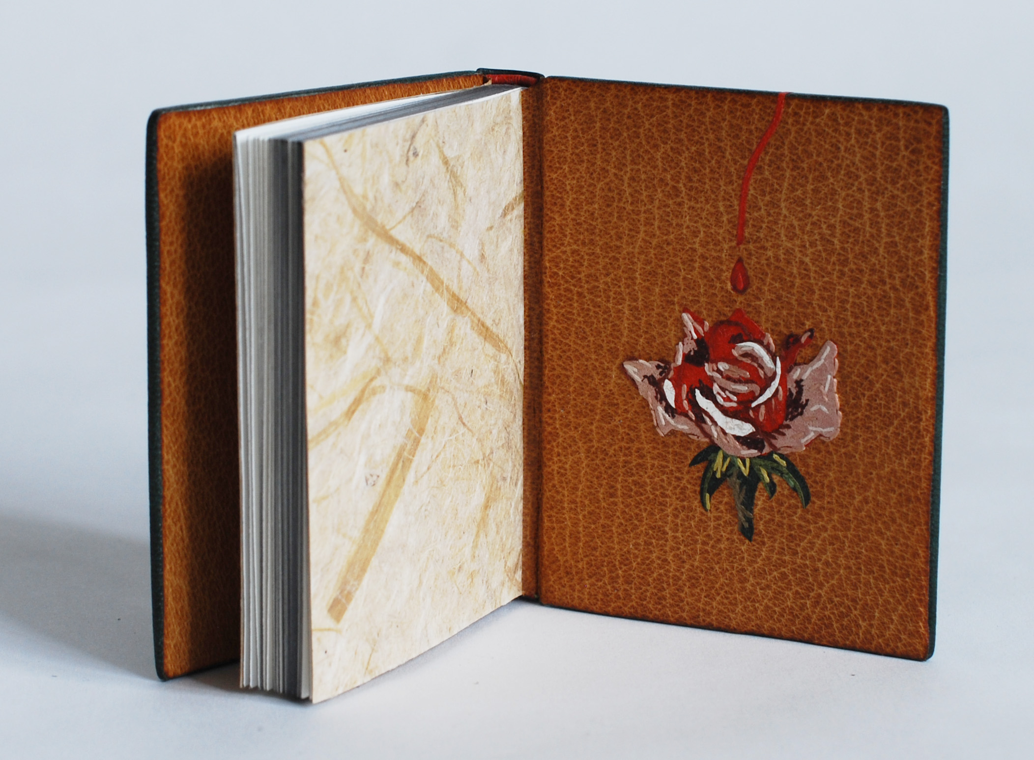
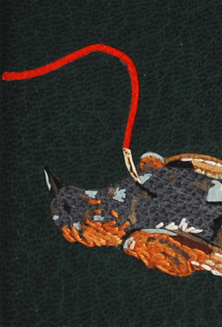
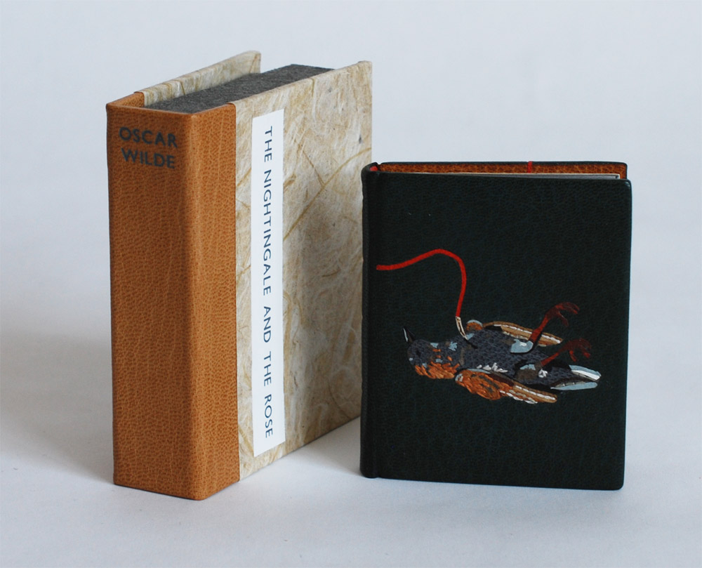
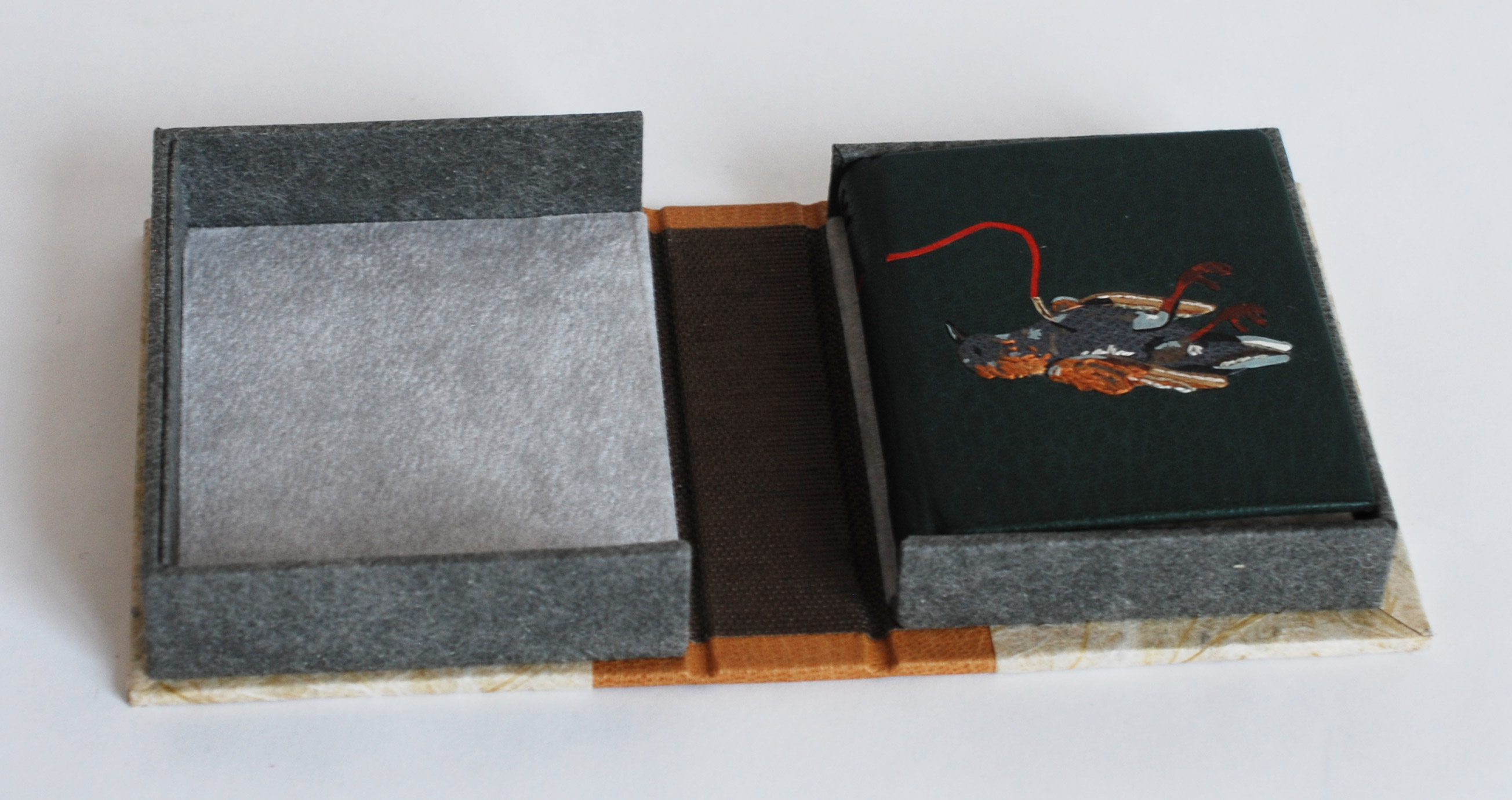
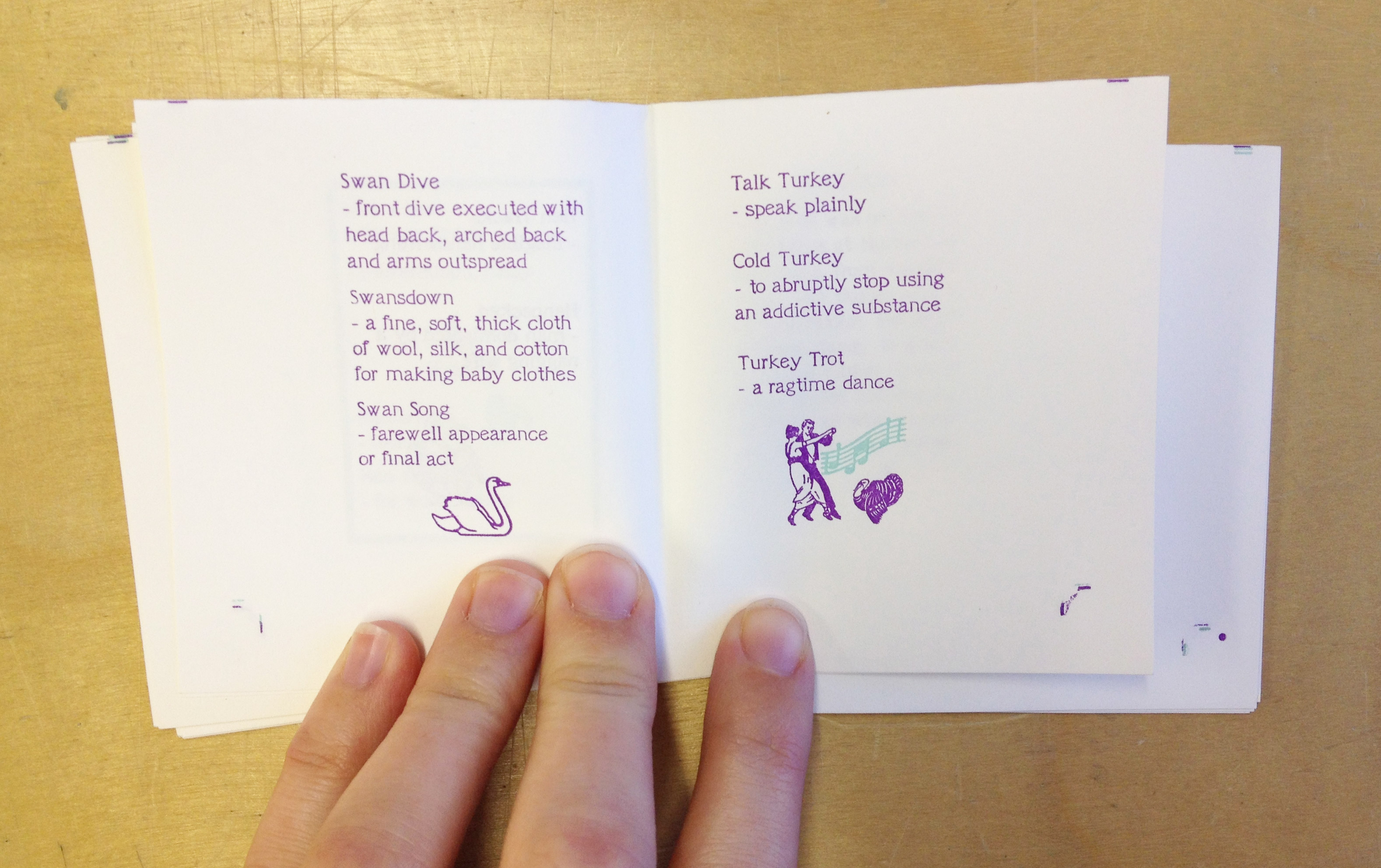
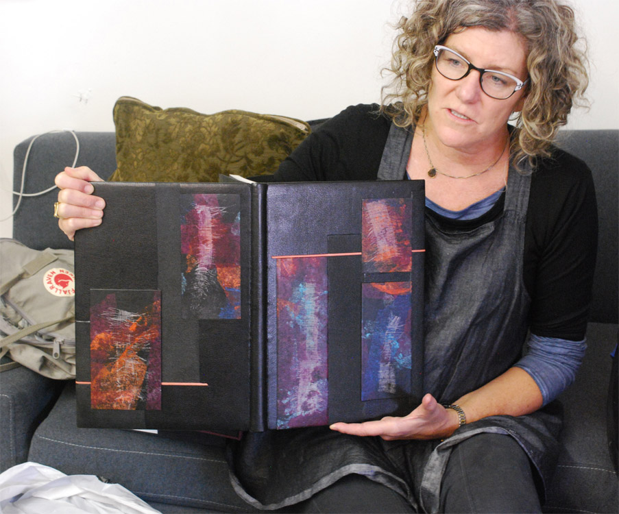
    Another example binding that Coleen shared with us, is this binding of Jabberwocky by Lewis Carroll. It was a great example of how well the stone tools and how it can handle embroidered decorations.

    StoneVeneerWksp4-ErinFletcher

    I especially loved the playfulness of the patched endpapers and use of embroidery to mend the edges.

    StoneVeneerWksp3-ErinFletcher

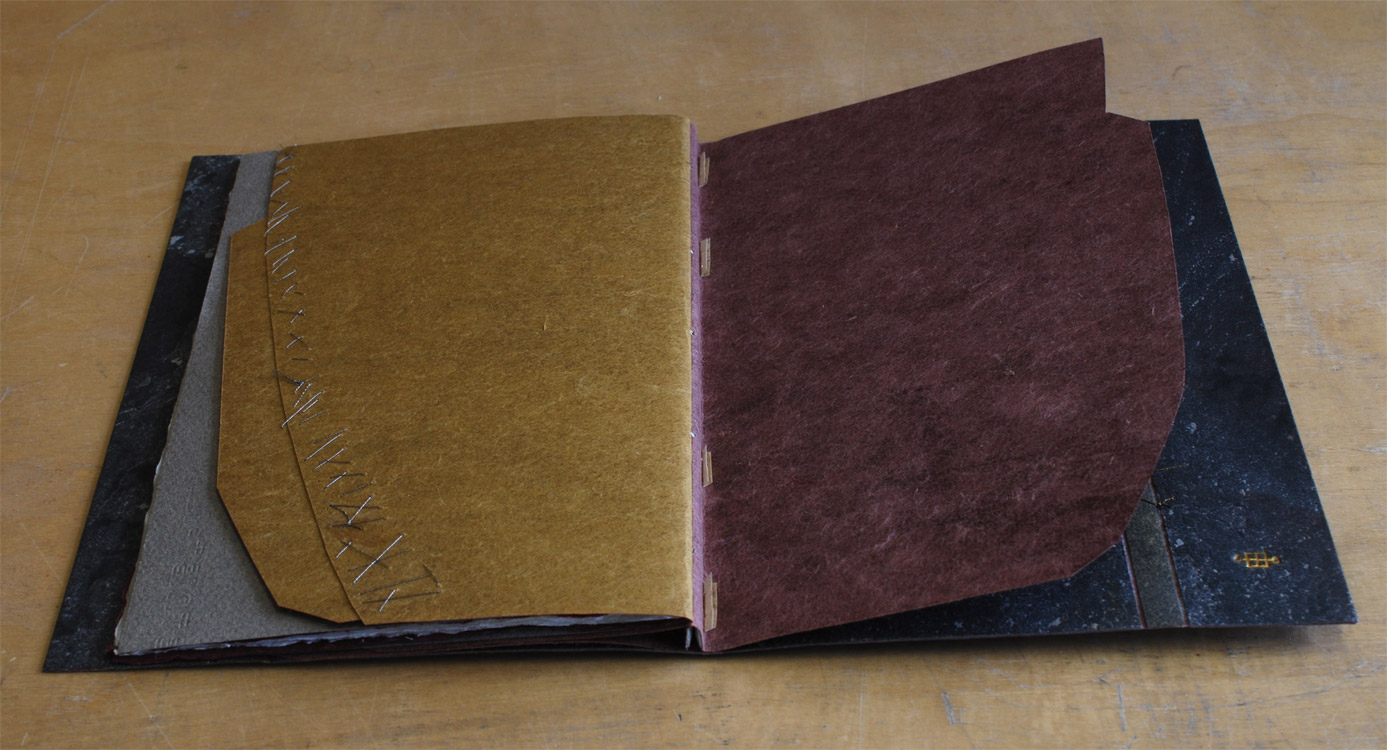
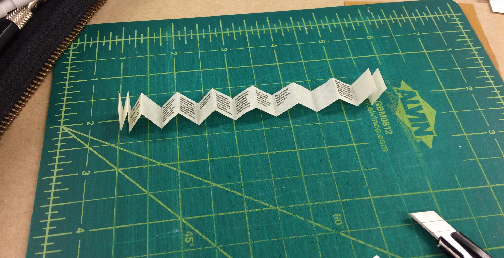
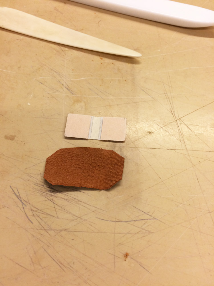
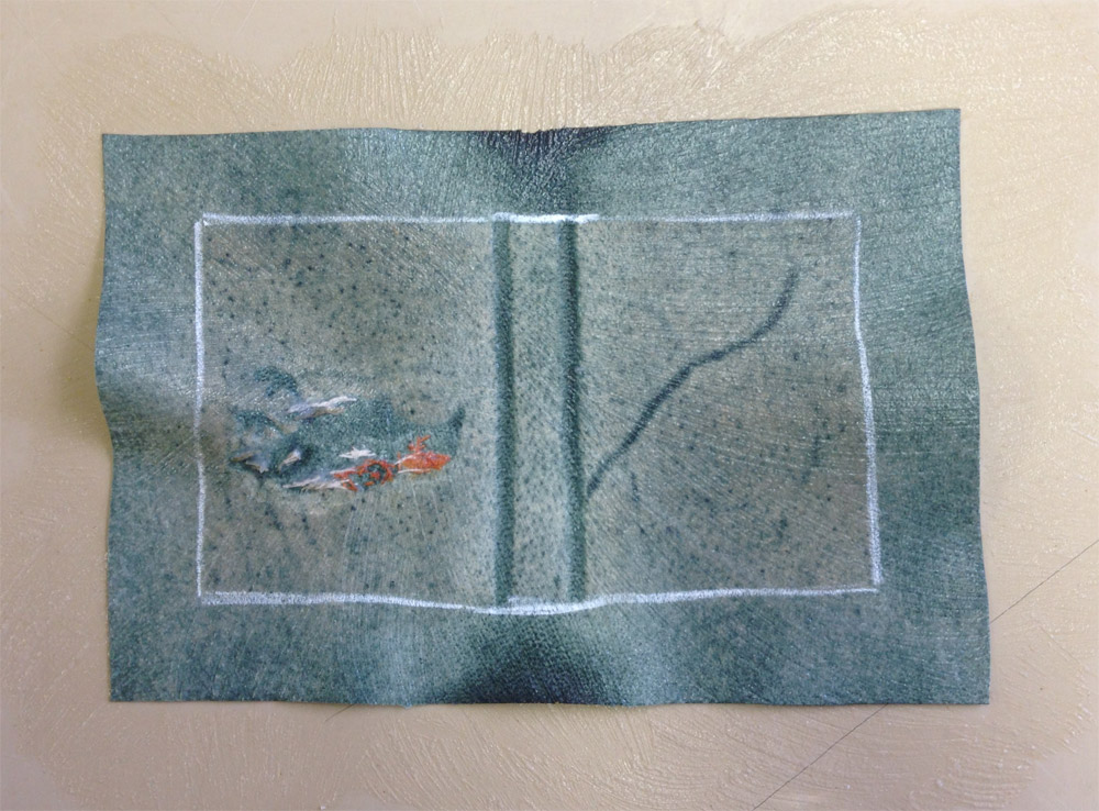
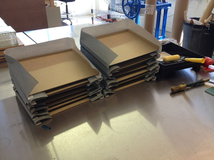
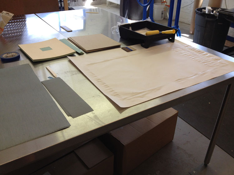
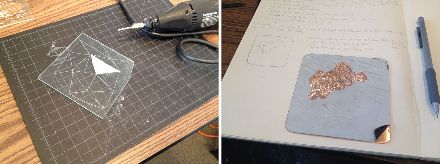
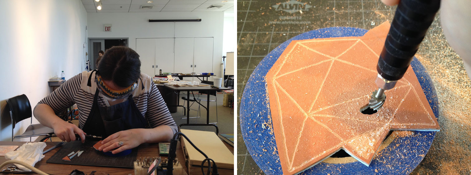
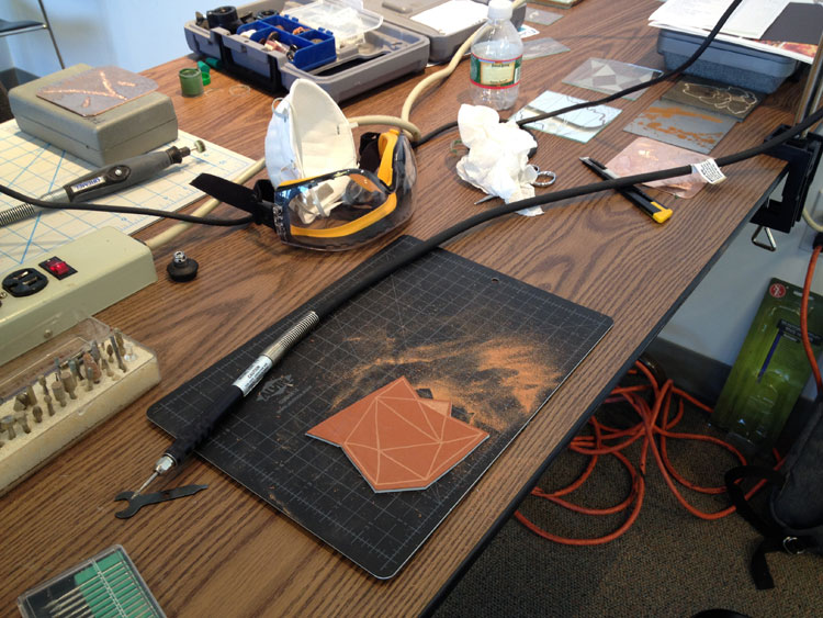
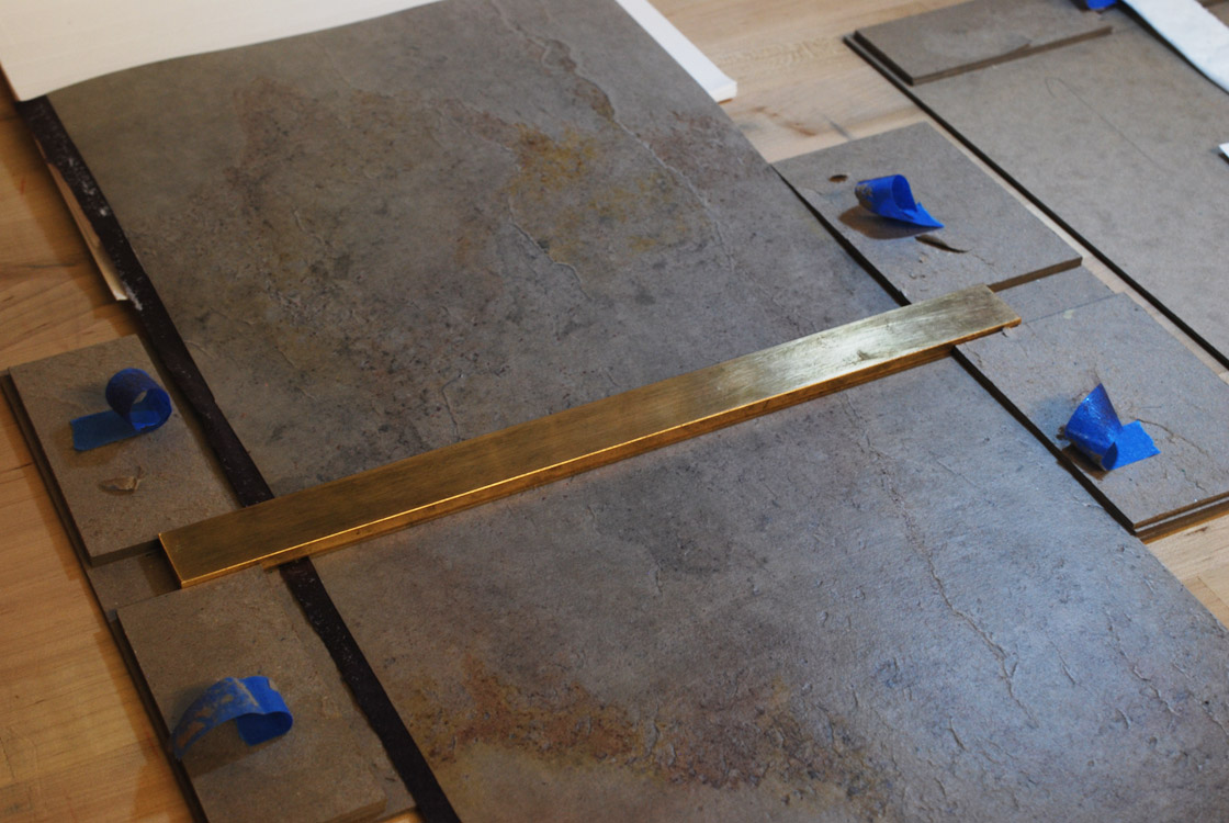
    After looking through Coleen’s examples, it was time for us to make our own model. After choosing our unique piece of stone (I chose a lovely light colored slate with splashes of yellows, pinks and purples), we were instructed to stamp a series of parallel lines into the center (or spine) of the stone. We did this by strapping our stone and a heated brass rule into a contraption and keeping it under the weight inside our large press. Afterward, we laminated a second layer of Japanese tissue to the backside of the stone. While that was put to bed, we laminated together pieces of colored Japanese tissue that would ultimately become our endpapers.

    StoneVeneerWksp5-ErinFletcher

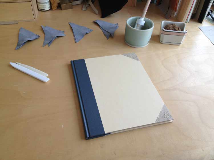
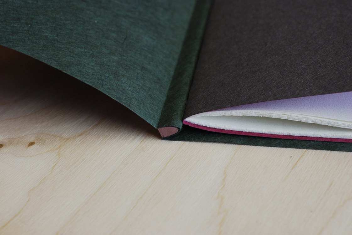
    While our stone continued to dry, we trimmed down our endpapers to either match our text block or extend slightly behind the edges. The image below shows Coleen demoing the pamphlet stitch that we would use on the text block. The image on the right shows how I trimmed my endpapers. In the end I didn’t like how much of a square I gave the outer (green) endpaper. With the additional square from the stone, the overall square became to large for the size of the text block.

    StoneVeneerWksp6-ErinFletcher

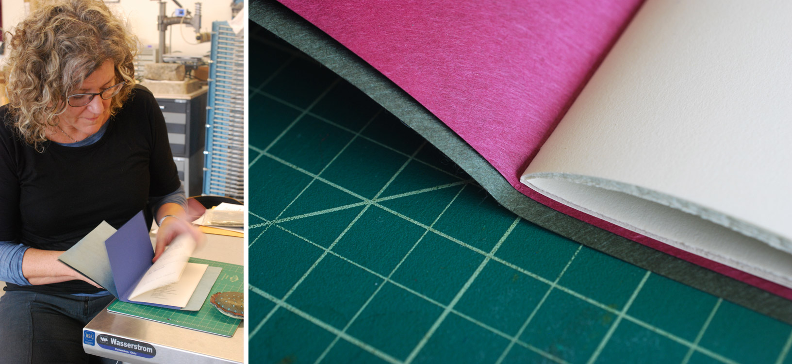
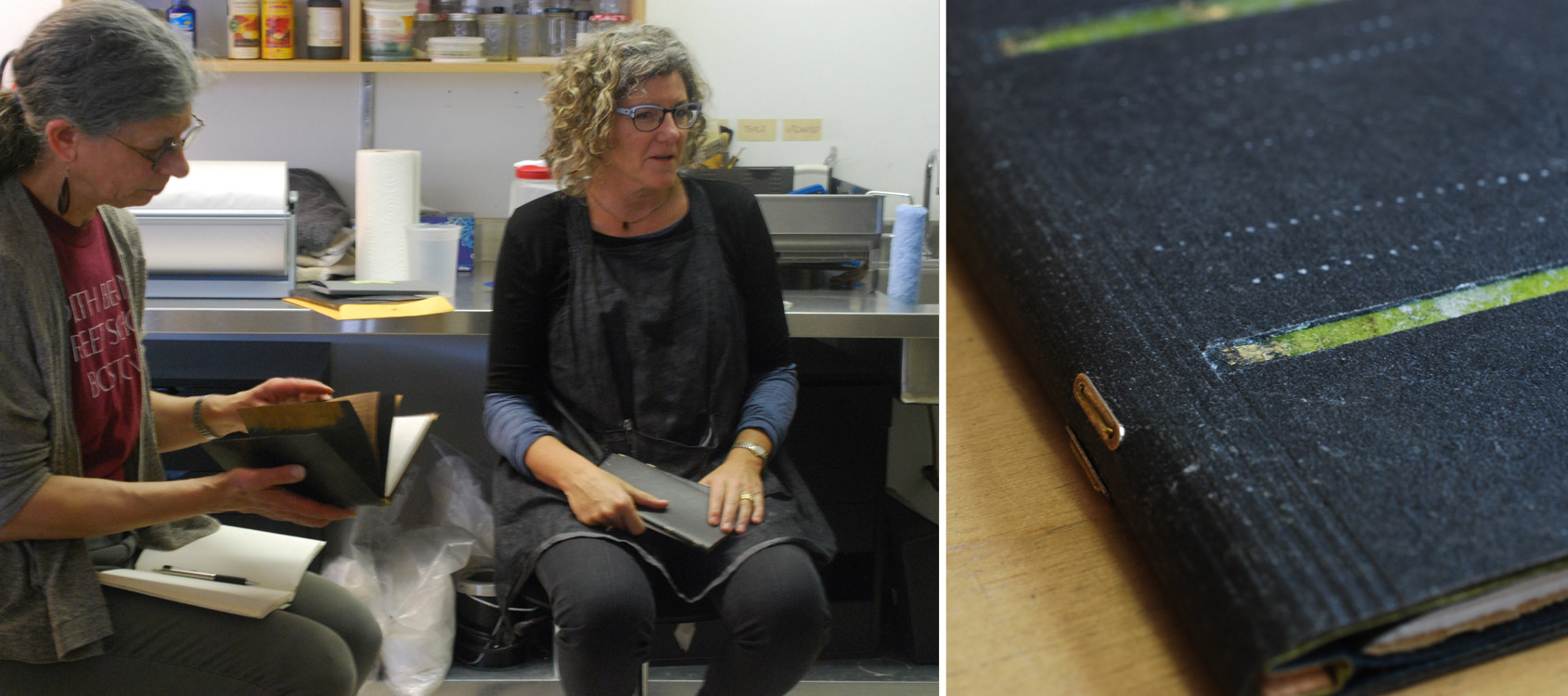
    At the end of day one, Coleen shared with us two fine bindings on loan from a local collector. It was an unexpected and delightful treat to handle and speak with Coleen about her bindings and decorative techniques.

    StoneVeneerWksp7-ErinFletcher

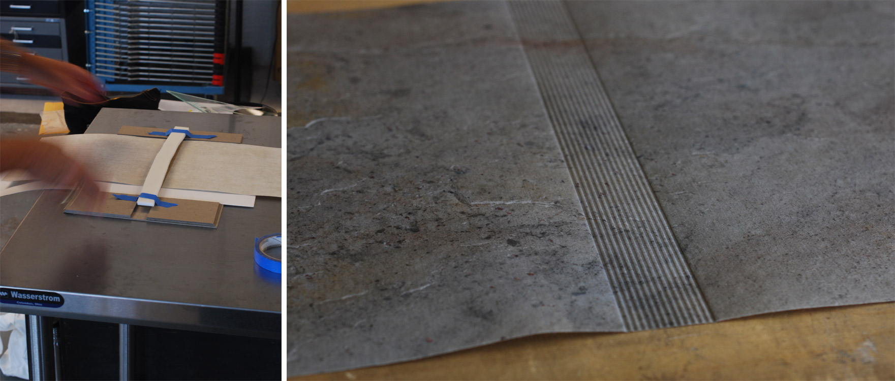
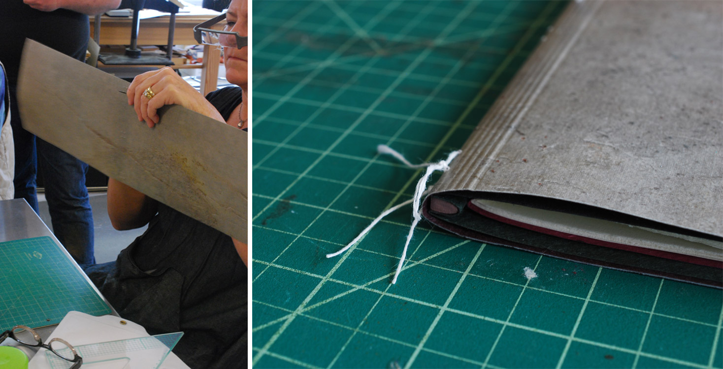
    On day two of the workshop, we were all reunited with our backed stone veneer. We went through the unnerving task of stamping our veneer with the brass rule three more times to redefine the lines and make sure we had an even amount on the outside and odd number on the inside. It was very important to register the brass rule correctly each time, so that our lines stayed crisp and parallel to one another. I snapped a photograph at the very end when I was ready to take the brass rule and stone out of our jig.

    StoneVeneerWksp8-ErinFletcher

    We also advanced on the text block by attaching the wooden spine stub piece. This stub could be made from a number of materials, but we choose from a selection of basswood pieces that were cut down and laminated to match the height of the outer endpaper and thickness of the text block. The wooden piece was also shaped to match the roundness of the folded signature. I painted the ends of my spine piece to offer a bit of decoration to the head and tail. After trimming, shaping and painting, the spine piece was affixed to the outer endpaper and the fore edge was finally trimmed to the final width.

    StoneVeneerWksp9-ErinFletcher

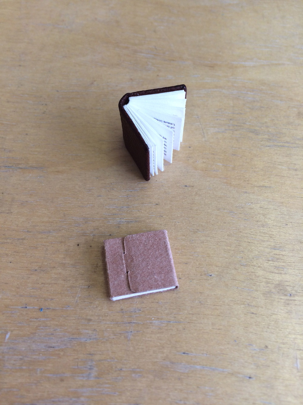
    At this point, we were ready to attach our text block to the stone veneer. The first steps were to create a punching jig to guide our awls to punch holes in the folds of the outer endpaper and in the stone cover. The stone was easy to pierce, once you felt it was in the right place, I simply used an awl to poke through the stone. We laced our text block temporarily into the stone covers in order to fold the fore edge and trim off any excess.

    StoneVeneerWksp10-ErinFletcher

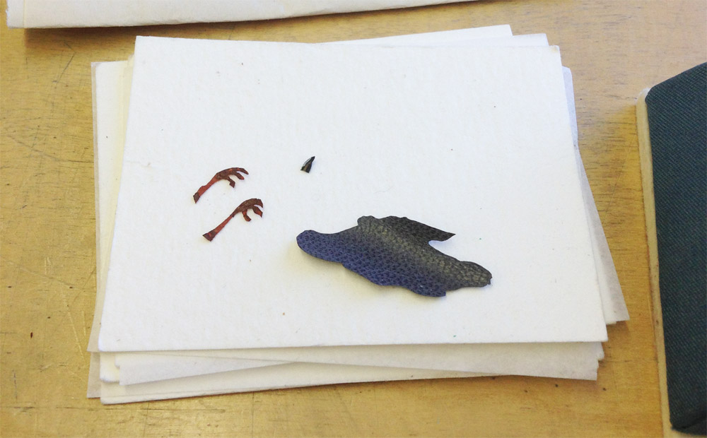
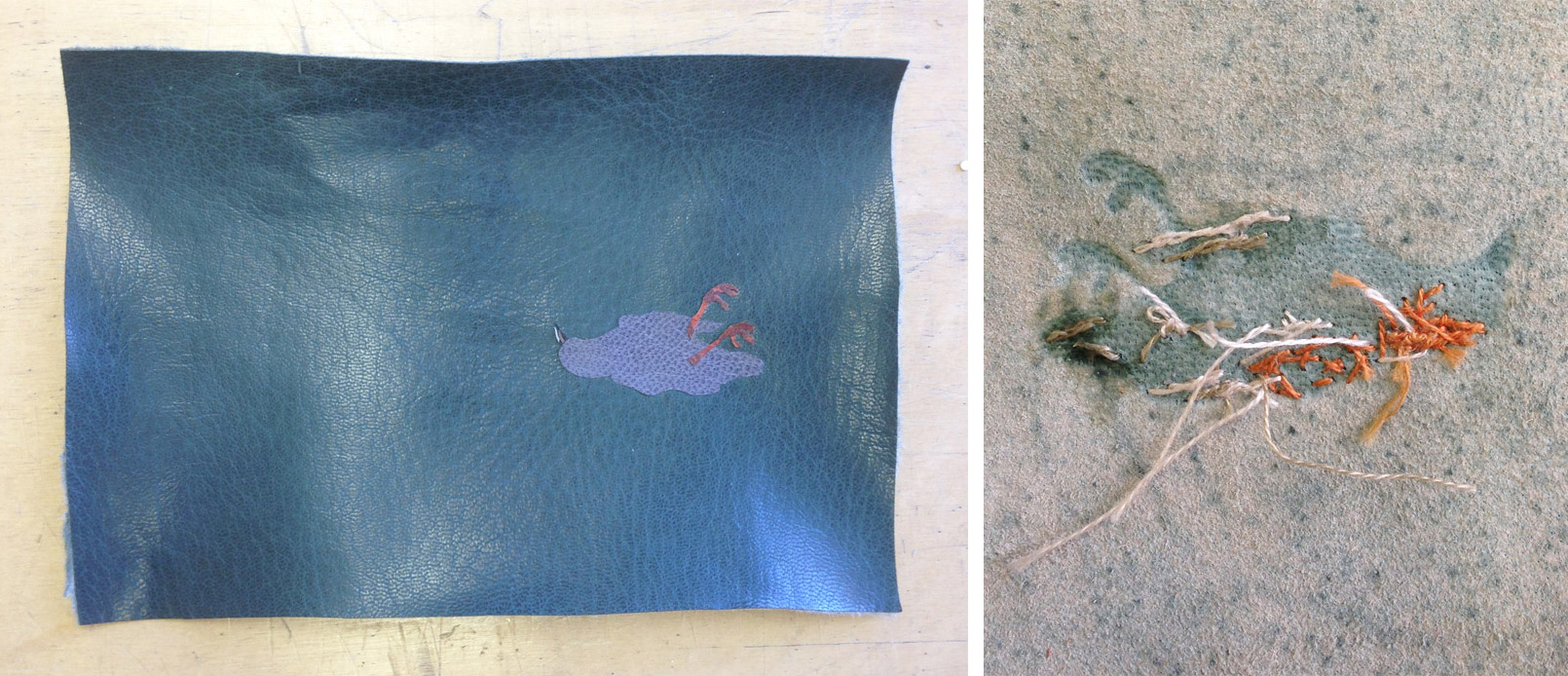
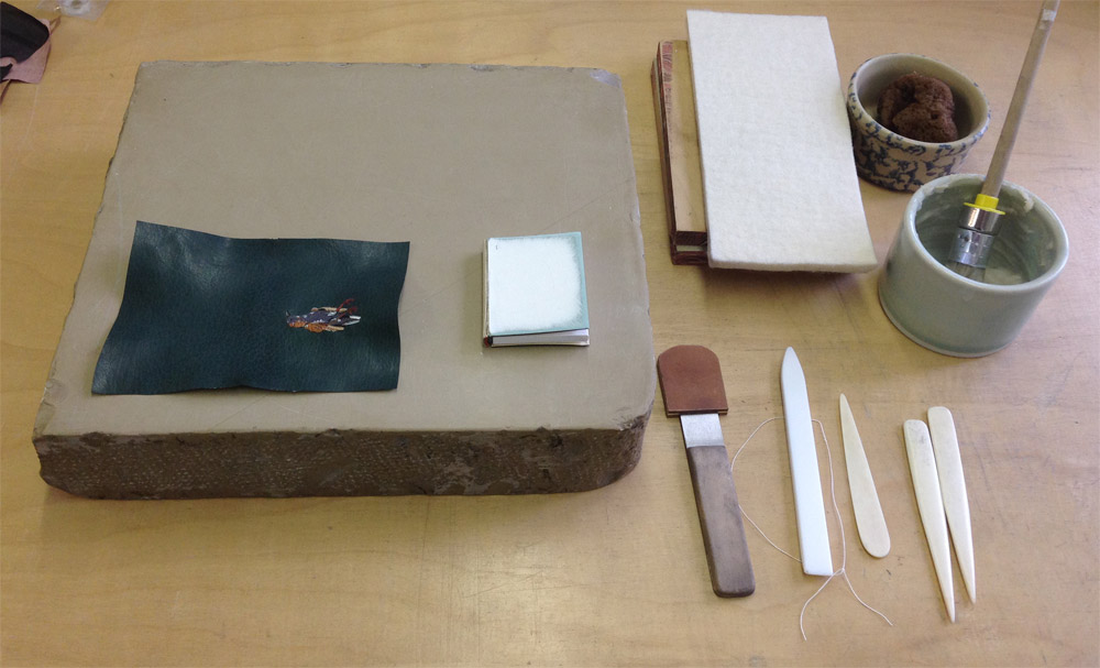
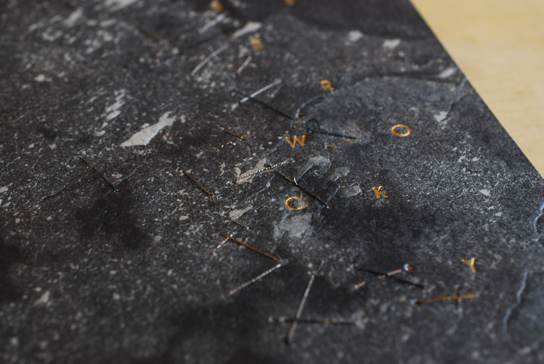
    Before laminating the folded stone onto itself, you have the opportunity to add any decorative elements such as cut-outs, sewing, tooling, etc. Due to time constraints (I had to remake a painted wooden stay that I dropped on the floor), I chose to add some simple embroidered stitches just to see how well I could sew through the stone. This was mostly done on the inside of the front cover.

    StoneVeneerWksp11-ErinFletcher

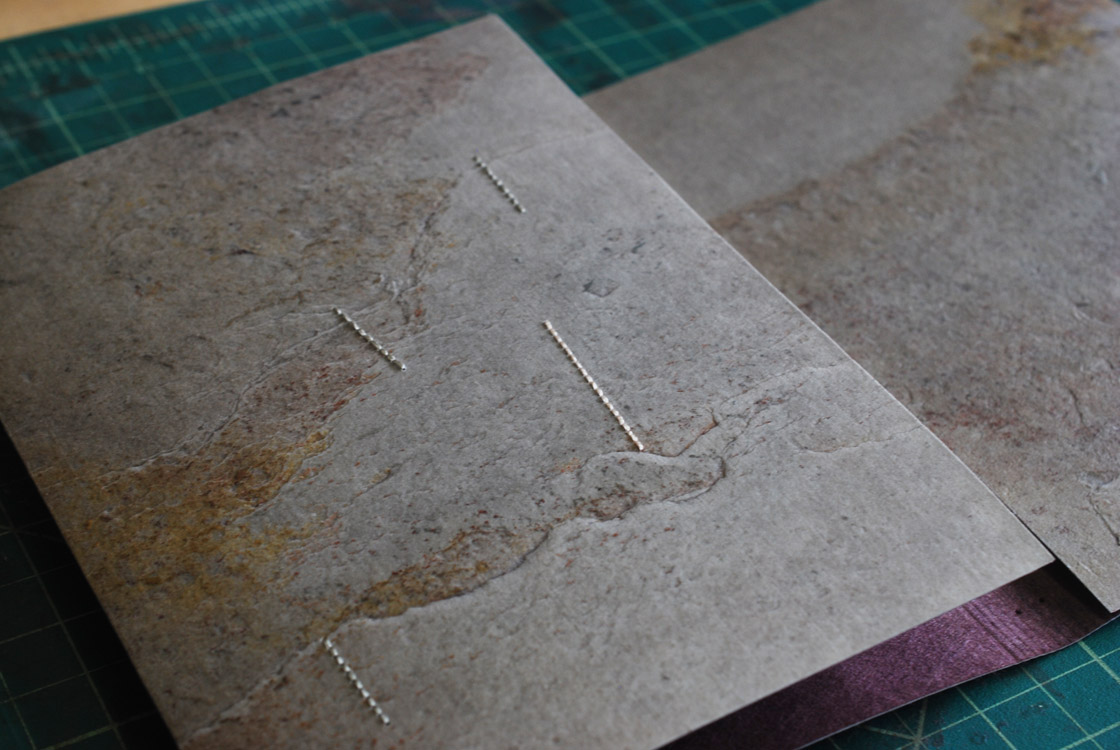
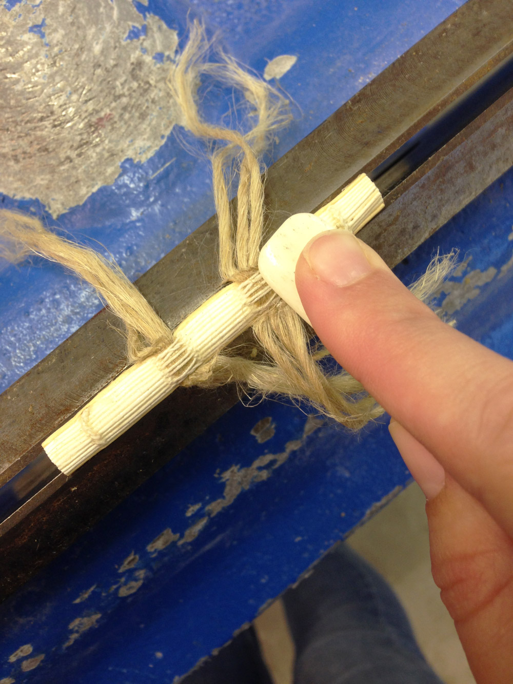
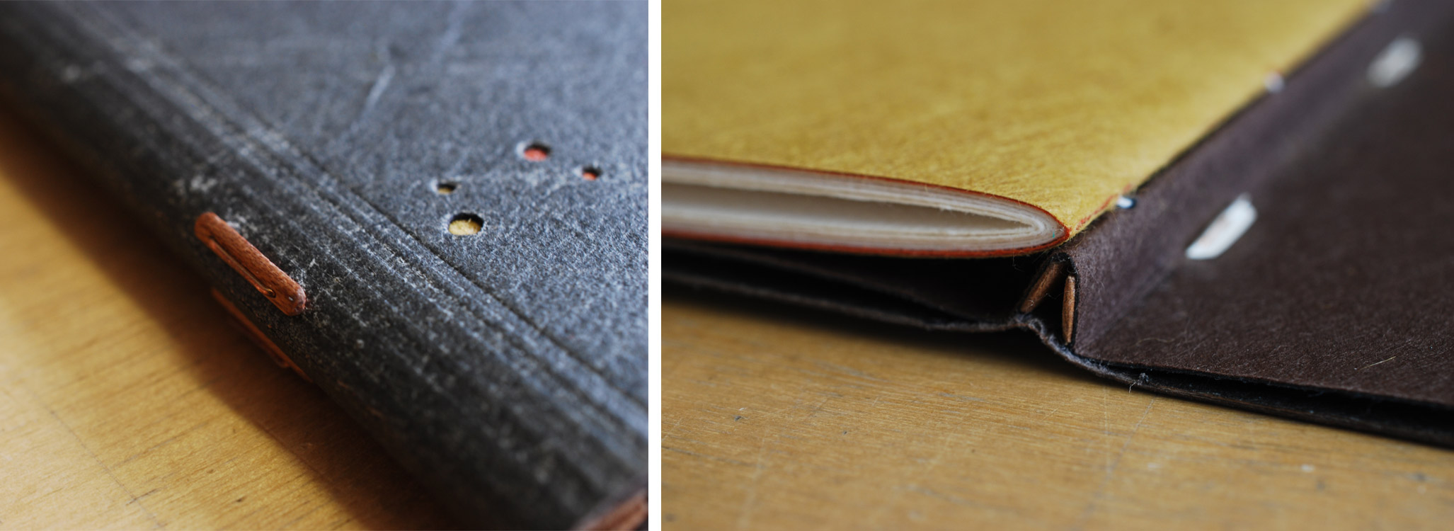
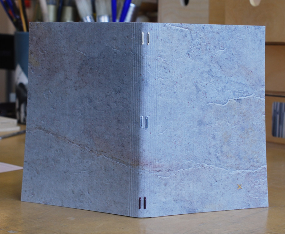
    With a pile of stays (wooden, metal and vellum) and metal staples in hand, I was ready to securely attach the text block to the stone veneer covers. In the image on the right below, Coleen is demonstrating how to use plastic tubing to make it easier to insert the staples and stays.

    StoneVeneerWksp12-ErinFletcher

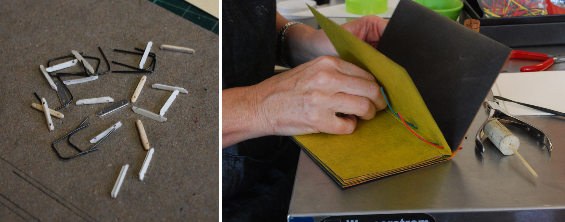
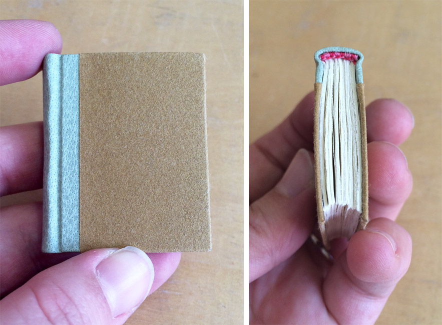
    For my binding, I chose to use both metal connectors and wooden stays. I painted one set of wooden stays to match the dark purple laminated to the backside of my stone. The staple is inserted through the stay and the vellum catches the legs of the staples on the inside of the endpaper. We stuck an orange stick into a piece of cork, this strange looking tool (seen above) aided in folding over the legs of staples. And viola! The binding is complete. At this point I could still add tooling, but I loved the look of my stone, that I chose to leave it untouched.

    StoneVeneerWksp13-ErinFletcher

    We had a great workshop with Coleen, she brought so much experience and knowledge to the workshop. Her patience and persistence ensured that everyone walked away satisfied and with a finished binding.

    StoneVeneerWksp14-ErinFletcher


  2. Making Miniatures with James Reid-Cunningham

    March 30, 2016 by Erin Fletcher

    Last year, I took a workshop at North Bennet Street School on Miniatures Bindings with James Reid-Cunningham. Bookbinding itself has a certain lure, but miniature bookbinding can pull you in even further. There is always this challenge of how small can one actually go while still keeping some integrity to the craft. It certainly felt this way during the 3-day workshop as James had us construct smaller and smaller books for each project.

    We started off the class with a hardcover long stitch binding. In terms of size, this was the macro-mini measuring out to 46mm wide by 59mm tall. The text block was sewn through a paper spine piece which also acted as the endpaper paste down. The boards were covered in paper and then pasted to the paper wrapper. Before attaching the covers we used our bone folder to round off the board’s corners, offering a very subtle touch of softness to this miniature book.

    MiniWksp-ErinFletcher

    Our second project for the workshop was to construct a miniature quarter leather case binding. We employed the use of miniature presses to aid in the forwarding process. James brought his own contraption (two wooden slabs connected with bolts and wing nuts), while a fellow classmate brought one of Frank Wiesner’s miniature ploughs for the class to use.

    MiniWksp2-ErinFletcher

    After sewing up the text block over two tapes (cut down from ramieband) I chose to sew headbands in light and dark pink stripes. We continued with the forwarding process by lining the spine. Using a very thin piece of leather, we assembled the case with shaped endcaps. The rest of the case was covered in paper. For my miniature, I used a scrap piece of buffalo skin and handmade paper from Katie MacGregor. This binding measures 38mm wide by 46mm tall.

    MiniWksp8-ErinFletcher

    Our final project was considered a micro-mini measuring to just 13mm wide by 13mm tall. The text was supplied to use with content laid out and printed by James. The text block was printed on a variety of tissues ranging in different weights. For our last project I chose to try out two different weights and assemble one as a soft cover paper wrapper and the other as a full leather binding. The first task for both was to carefully fold the text block into a neatly squared accordion.

    MiniWksp3-ErinFletcher

    To construct the full leather binding, the components of the case were cut to size and glued down to a single piece of tissue. Once the case was assembled the fore edge was trimmed to fit the text block and the corners were rounded to accommodate the thickness of the leather.

    MiniWksp4-ErinFletcher

    The leather was pared to onlay thickness and the corners were pre-cut before covering. The covering was swift and simple. And once the leather was dry, I attached the outer panels of the accordion to inside of the case. The book can be read as a codex or the accordion can be expanded.

    MiniWksp5-ErinFletcher

    MiniWksp7-ErinFletcher

    The workshop was a delightful insight to bookbinding in miniature form. The main challenge was rethinking and reworking how to use my hands and tools in such a narrow space. I was a fan of miniature bookbinding before I took James’ workshop and I still am. However, I think I’ll stick to the macro-mini for any future work. Anything smaller is just too excessive for me.

    MiniWksp6-ErinFletcher


  3. My Hand // The Nightingale and the Rose

    February 16, 2016 by Erin Fletcher

    Nightingale1-ErinFletcher

    This binding was featured very briefly on the blog last year in my review of the North Bennet Street School’s 2015 Student and Alumni Show. After the show, I sent it off to England for the Society of Bookbinder’s International Competition. Just last week, I was finally reunited with this macabre little binding. Its presence on my bench reminded me that this binding needed a proper post documenting the steps involved in its creation.

    NightingaleAndTheRose1-ErinFletcher

    This edition of Oscar Wilde’s The Nightingale and the Rose was printed by Rebecca Press in 1985 and includes wood engravings by Alan James Robinson of Cheloniidae Press. My design for both the nightingale and the rose are drawn straight from Robinson’s engravings. The text block was sewn on two flattened cords and rounded and backed in a job backer. Which was a bit excessive for such a tiny binding, but offered me a bit a humor. In lieu of a backing hammer, I used the flat, rounded side of my bone folder to achieve the rounded shape of the spine.

    NightingaleAndTheRose2-ErinFletcher

    Once the forwarding on the book was complete, I could focus on the design. I photocopied the image of the nightingale and rose from the text; enlarging them to the desired size. These photocopies became my guide for drawing out each shape of the bird and flower. Beginning with the bird, the first onlays attached to the base leather were a silhouette of the body, the beak and feet. In order to get some depth and texture to the bird’s feet, before cutting out the two shapes I laid feathered onlays of maroon goatskin over thinned out terracotta goatskin.

    NightingaleAndTheRose3-ErinFletcher

    Although I would normally use PVA to place my onlays onto the leather, I chose to use paste because I was worried about staining the tiny pieces of leather when applying the PVA. After the the onlays went down, I pressed the skin between acrylic boards. Then I back-pared the leather. In the image below you can see the shape of the onlays on the reverse side of the leather (the change in color appears because more flesh is being pared from the areas with onlays, this creates a smooth transition from onlay to base leather on the surface.)

    NightingaleAndTheRose6-ErinFletcher

    After paring the leather, I was free to begin with the embroidery. When I embarked on this task, I had very loose plans and approached it in a very free form way. I would build up the image with embroidery and then switch to adding feathered onlays, then more embroidery until I felt satisfied with the look of the bird. You can see this progression below (please forgive the poor photography and variation in color).

    NightingaleAndTheRose7-ErinFletcherNightingaleAndTheRose8-ErinFletcher

    With the design of the bird fully assembled and embroidered, I prepped for covering. After pasting out the leather, I laid down any stray tails from the embroidery beside a stitch to hide its appearance from the front. Then I progressed with the covering, formed the endcaps, wrapped the turn-ins around the cover boards and pleated the corners. After setting the boards, I put the book to rest between a small scrap of felt in my small wooden press.

    NightingaleAndTheRose9-ErinFletcher NightingaleAndTheRose10-ErinFletcher

    Once the book had dried, I carefully opened each cover and began the steps to prep the inside for the leather doublures. The back doublure was embellished with a multi-onlay and embroidered rose. The steps involved in creating the rose mimic those used to create the bird. The tricky part here happened while back-paring. It was impossible to pare to the desire thickness for doublures without slicing through the rose onlay. So the rose is not a true back-pared onlay, it actually sits on the surface of the leather. I was worried this extra thickness might impact the neighboring flyleaf or the way the book closed, but neither became an issue.

    Nightingale2-ErinFletcher

    The Nightingale and the Rose is a tale about a nightingale who chooses to give her life so that a young man may find love. By piercing her breast into the thorn of a rose, her blood stains a white rose red. This part of the story is illustrated with a tiny wood veneer inlaid “thorn”. The red goatskin Ascona onlay runs from the top of the thorn across the spine (at the “I” in Wilde) and to the rose on the back doublure.

    NightingaleAndTheRose12-ErinFletcher

    The book is housed in a miniature quarter leather clamshell box. I used the same tan goatskin on the spine of the box which was used on the doublures. The rest of the case is covered in a paper I made using cotton and leek skins, also used for the flyleaves in the binding. The author name is stamped in matte grey foil on the spine and the title is stamped on a Mohawk label that sits in a recessed well. The trays are covered in granite colored Cave Paper.

    NightingaleAndTheRose13-ErinFletcherNightingaleAndTheRose14-ErinFletcher

    The trays are lined with a light grey Silsuede fabric. I prefer using a faux suede to line boxes for embroidered books and veneer bindings, I think it offers a bit more cushion and less chance of wear on the binding.

    I’m really proud of this little binding. My embroidered work is definitely evolving and I like the direction it took with The Nightingale and the Rose. I have a few fine bindings lined up to complete this year and I look forward to sharing their designs and techniques with you.


  4. My Hand // Dune

    May 1, 2015 by Erin Fletcher

    It’s been a while since I wrote about my binding of the science fiction classic Dune. After sharing my technique for the edge decoration, hand-sewn headbands and the process of covering, I’m finally ready to unveil the finished binding.

    Dune11a-ErinFletcher

    So now I’ll go over the steps that led to the finished look. After covering and letting the book rest, I began working on the remainder of the design for the front cover, which included a series of concentric circles. All seven circles would be tooled using gold leaf, but only the inner circle would also include a leather onlay. In the image below (on the left) is my initial sketch of the front cover design. It includes a list specifying the size gouge for each circle. The image on the right is the final outline drawn on tracing paper, which includes fewer circles due to spacing issues. This also became the template I would use to transfer the design to the book (hence the wrinkles and cut out squares).

    Dune13-ErinFletcher

    In the image below you can see the tooling template attach to the underside of the front board. At this point, I’ve flipped it off the book to check the placement of the first circle.

    Dune8-ErinFletcher

    Happy with the first circle, I continued working my way through the remaining 6 circles. Each circle was initially placed onto the leather with a plastic circle template and thin bone folder. I then used the appropriately sized gouge to make the first impression, with the tool being cold. Below is an image of all the different gouges used on the binding.

    Dune12-ErinFletcherDune9-ErinFletcher

    In the midst of winter and in an incredibly dry studio, I began to add the gold to the circles. After a few failed attempts and some adjustments I made to the atmosphere, the gold started to stick. In between the tooling process on the front cover, I moved to the spine where I tooled in the title and author’s last name.

    Inspired by the lettering seen on French fine bindings from the 1920s and 30s, I used a combination of gouges and line palettes to design my own alphabet. In the image below, I’ve finished the initial blind layer and am about to begin the gold tooling.

    Dune10-ErinFletcher

    The title and author’s name are divided by a blind tooled onlay of buffalo skin in a lovely light pink, which also appears on the back cover. This design is again a play on the French fine bindings from the 1920s and 30s.

    With the outside complete, I moved to the inside of the book. The fly leaves are a soft suede in dark brown which matches the onlay on the front cover. The matching DUNEblures (a silly nicknamed coined by my witty studio mate Colin Urbina) are tooled in a design that mirrors itself on the back cover. The angle of the lines match that of the triangle on the front cover. The spacing between the lines is consistent with the spacing between the concentric circles.

    Dune14-ErinFletcher

    The book is housed in a quarter leather clamshell box using the same terracotta goatskin as for the triangle back-pared onlay. The leather has been embroidered in the same fashion and tooled with the title. The rest of the case is covered in brown Canapetta cloth. The trays are covered with handmade paper I bought from Katie MacGregor and lined with the same suede as the fly leaves.

    Dune16-ErinFletcher Dune15-ErinFletcher

    In mid-April, I received the exciting news that my binding of Dune will join the Guild of Book Workers Traveling Exhibit: Vessel! This will be the second time I’ve participated in a GBW show and what’s more exciting is that this exhibit will be hosted by the North Bennet Street School. So halfway through the tour, I’ll get the chance to revisit my binding.

    The exhibit will open later this year in California and I’ll be writing a post to remind those nearby.


  5. My Hand // Goose Eggs & Other Fowl Expressions

    March 16, 2015 by Erin Fletcher

    GooseEggs4-ErinFletcher

    At the Guild of Book Workers’ Standards Conference in DC, I picked up a couple miniature text blocks from Gabrielle Fox. One of the them being Goose Eggs & Other Fowl Expressions printed by Rebecca Press in 1991. The letterpress printing was done in a vibrant purple with hints of mint blue and bright yellow. The image below is a spread from the book.

    GooseEggs-ErinFletcher

    For the binding, I decided to test the limitations of the Dorfner binding in a miniature format. Last year I had the chance to learn this very special binding structure. Unfortunately not from Edgard Claes himself, but from Colin Urbina who had the opportunity to take a workshop from the celebrated Belgian binder. The Dorfner-style binding was originally developed by German binder Otto Dorfner.

    I sadly did not take any images during the process of creating this binding as it was the first miniature I’ve ever bound and was delighted by how quickly I was able to move through each step. So needless to say, I forgot to stop and take images, but I will explain the binding process a bit in this post.

    GooseEggs6-ErinFletcher

    The book is sewn on two silver snakeskin tapes (initially lined with silk) before being rounded and backed. The edges were properly prepped for a layer of mint blue gouache paint. Leather wrapped headbands decorate the head and tail in a skin that perfectly matches the purple ink from the text block.

    The spine piece is wrapped in mauve buffalo skin, which was shaped and the headcaps were formed off the book. After cutting away to expose the tapes, the spine piece is attached to the text block and then the light grey suede flyleaves are put in place.

    GooseEggs5-ErinFletcher

    Now comes the fun part. The MDF boards are carefully shaped, first with a power sander and then by hand to offer an elegant cushioned edge. Afterward, the boards are laminated on both sides with a wood veneer. For this binding, I used an unknown wood that I found in a sample pack of domestic and exotic woods (so if anyone can identify this wood, please let me know). A channel is cut out of the veneer and the tapes are glued down to attach the board. To hide the tapes a second veneer is cut and glued down. For this binding, I cut four tabs out of Karelian birch in the shape of a goose egg.

    GooseEggs3-ErinFletcher

    The book is housed in a tiny clamshell box. The spine is covered in the same mauve buffalo skin and silver canapetta cloth that mimics the veneer on the cover boards. The trays are covered in a yellow handmade paper from Katie MacGregor, which was also used as the book’s endpapers. The book is protected with a light grey suede lining.

    GooseEggs1-ErinFletcher

    Goose Eggs is the second Dorfner binding that I’ve made to date. I really love this structure, it has a unique elegance and it can be assembled rather quickly. So I’m looking forward to working with this structure again and hope to incorporate some common elements of my work like gold tooling and embroidery. I also hope to learn more about marquetry in order to create intricate designs in the veneer.


  6. My Hand // Boxes for Laura Davidson

    September 19, 2014 by Erin Fletcher

    LauraDavidsonBoxes6-ErinFletcher

    Photo courtesy of Laura Davidson

    A while back, I had the chance to interview the artist Laura Davidson as a part of my Book Artist of the Month series. Since then, Laura and I have stayed in contact with each other, which has given me the opportunity to view some of her works in their various stages. Most recently Laura completed a set of prints illustrating various bridges across the country. These six bridges were chosen due to their close proximity to the many spaces Laura views as home. The act of crossing these bridges, Laura is filled with the anticipation of almost being home, therefore, the set of prints are aptly titled Almost Home.

    AlmostHome2-LauraDavidson

    Photo courtesy of Laura Davidson

    AlmostHome3-LauraDavidson

    Photo courtesy of Laura Davidson

    Laura presented me with the opportunity to build an edition of boxes to house the prints from her Almost Home series. I was quite elated. I’ve really enjoyed Laura’s work and was excited to be working with her. Laura knew she wanted a clamshell box, something sleek and clean. I’m came by her studio and we discussed material options and how the prints would fit in the box.

    After everything was settled and the materials were ordered, I began working on the small edition of 8 clamshell boxes. Clamshell boxes are pretty straight forward, but with Laura’s boxes I would be adding a few custom elements. First, the base of the interior tray would include some padding. The prints themselves had no discernible thickness, but Laura wanted the box to be at least ½” thick.  So the outward appearance of the box was the right height for Laura and the interior height of the tray was right for the prints.

    Once the binders board was cut and the trays were assembled, it was time to cover them. Laura chose silver Canapetta cloth for its durability and textural qualities. The color also complimented the prints and the industrial feel of bridges. To streamline the process I used a small paint roller and paint tray filled with PVA.

    LauraDavidsonBoxes7-ErinFletcherLauraDavidsonBoxes2-ErinFletcher

    The second custom element came as the material used on the lining of the trays. Laura provided me with 8 sheets of hand-drawn decorative paper. Using a combination of ink and markers, Laura’s custom lining paper pulled imagery from the prints and grabbed colors from the boxes and brown wrapper. Below is an image of one of the finished boxes showcasing the lining.

    LauraDavidsonBoxes9-ErinFletcher

    Finally, it was time to make the cases, which were also covered in silver Canapetta cloth. Before covering, however, I had to create a label well on the front cover board and the spine piece. Each of these wells would be filled with a printed label that Laura had provided me. I also used a paint roller to streamline the process of making the cases.

    LauraDavidsonBoxes3-ErinFletcherLauraDavidsonBoxes4-ErinFletcher

    The hand-printed label on the front cover is an ‘A’ both acting as the support beams of the bridge and the first letter to the title of the series. The label on the spine came from extra prints from the series. Laura artistically cut down the print to isolate some compelling and inciting imagery.

    It was quite a joy to create these boxes and to work for an artist as talented as Laura!

    LauraDavidsonBoxes5-ErinFletcher

    Photo courtesy of Laura Davidson

    LauraDavidsonBoxes8-ErinFletcher

    Photo courtesy of Laura Davidson


  7. Free Shipping at Herringbone Bindery Etsy – Celebrate National Read a Book Day

    September 5, 2014 by Erin Fletcher

    readabook-sept6blog14

    Just in time for the school year, grab yourself a new journal or notepad. Celebrate the book this weekend for National Read a Book Day at my Herringbone Bindery Etsy shop and receive free shipping on all orders of $10 or more. Just enter code: READABOOK10 at checkout. Have a wonderful and book-worthy weekend.


  8. My Hand // Amazing Dremel Workshop

    June 24, 2014 by Erin Fletcher

    DremelWorkshopWood-ErinFletcher

    In early May, I add the opportunity to take the Amazing Dremel Workshop with Jill Timm. I had seen her workshop being offered across the nation by various Guild chapters. Due to its popularity and my position as the Program Co-chair for the New England Chapter of the Guild of Book Workers, I brought Jill to teach her workshop at the Northeast Document Conservation Center.

    My interest in the class began when I received my Dzia’s old Dremel tool along with his collection of bits. I had never used a Dremel and wanted to get acquainted with its uses. As part of our material fee, we received a collection of bits neatly packed inside a wooden box. Jill introduced each type of bit by the material it was designed to carve into. We began by carving into glass using a series of diamond bits.

    DremelWorkshop1-ErinFletcher

    After adding a flex-shaft to our Dremel, we continued working through our wooden box of new bits by carving out designs in wood, mirror, copper and steel plates. The flex-shaft screws onto the hand tool; it’s much easier to handle because the design is similar to a pencil or stylus.

    As Jill handed out the copper plates, she gave a demo on cutting the plate to create rounded corners using a cutting disc.

    DremelWorkshopCopper-ErinFletcher

    On our second day, we began to experiment with polymer clay, ceramic and plexiglass. In addition to experimenting with the various Dremel bits, we learned how to clean our tools and keep them in good shape. Jill also introduced us to the many attachments for the Dremel tool, such as a router attachment or the drill stand giving one the ability to drill through glass and other materials.

    DremelWorkshop2-ErinFletcher DremelWorkshopBench-ErinFletcher

    Overall, the workshop was fantastic. I understand my Dremel tool better and feel comfortable working with it in the future. Perhaps I’ll be making a binding with etched glass covers or carved wooden boards, only time will tell.


  9. Client Work: Leather Panel Redesign

    October 15, 2013 by Erin Fletcher

    panelredesign-erinfletcher

    This beautiful leather box was crafted by a student at North Bennet Street School. The green leather panel was stamped with a hand carved wooden block to create the delicate design. Unfortunately, the color and subtleness of the design conflicted with the client’s vision. Placed inside the box is a daguerreotype-style plaque of Johnson Chapel located at Amherst College, where the couple noted on the cover got married. The client approached me to have the panel redesigned using the color of Amherst: purple. 

    panelredesign2-erinfletcher

    The green leather panel was carefully removed and a new piece of purple leather was cut down and pared to the right size. For the new design, I kept the original border layout and text placement, which indicates the location of the wedding, the couple’s names and the date of the ceremony. The center motif is inspired by the Johnson Chapel building. Using simple architectural lines, the tower of the chapel was recreated through carbon tooling. The clock at the top of the tower indicates the time at which the wedding ceremony began. 

    All of the text on the new purple panel has been hand tooled using Gill Sans handle letters and palladium leaf. Palladium was chosen to mimic the look of the plaque inside.

    panelredesign3-erinfletcher

    The design on the box was rather tricky to capture within the limitations of my photo-documentation set-up. But the image below highlights the design through raking light, bringing out the grain of the leather against the blackness of the tooled lines. The client was very happy with the newly completed box and couldn’t wait to present the couple with their overdue wedding present. 

    panelredesign4-erinfletcher


  10. Client Work // Single Section Half Leather Binding

    August 6, 2013 by Erin Fletcher

    STORY ABOUT THE TEXT: An article titled The Roxbury Defenders Committee: Reflections on the Early Years by the Chief Justice Roderick L. Ireland was recently published in Volume 95, No. 1 of the Massachusetts Law Review. The article speaks about the establishment of the Roxbury Defenders, a committee founded in 1971 to provide legal referrals to those who suffered financially in Roxbury, Massachusetts. The committee was founded by Ireland and his colleague and friend, Professor Wallace W. Sherwood. 

    ABOUT THE BINDING: For my client, I bound two copies of the Massachusetts Law Review journal, one for the Chief Justice and one for Professor Sherwood. The journals came to me straight from the press and bound together with staples. The staples were removed and bound as a single section bradel binding. This structure has been described in a previous Client Work post you can check out here and here.

    masslawreview1-erinfletcher

    Since the journal is printed in black ink only, I chose materials that reflected the gorgeous and vibrant image on the cover. The journals are bound a half leather binding, where the same covering material for the spine is used to cover the corners. I chose to bind the journals in a blue-gray buffalo skin against a taupe Iris bookcloth. For the endpapers I chose a beautiful handmade Cockerell marbled paper from Cambridge, England, in addition to a folio of marbled grey Bugra and off-white Hahnmühle Ingres.

    masslawreview2-erinfletcher

    Setting up my bench in preparation for covering the corners with blue-gray buffalo skin.

    To finish off the bindings, the title and volume of the journal were hand tooled along the spine with Centaur handle letters. The title was gilt with gold leaf.  

    masslawreviewspine-erinfletcher masslawreviewopen-erinfletcher


  • My name is Erin Fletcher, owner and bookbinder of Herringbone Bindery in Boston. Flash of the Hand is a space where I share my process and inspirations.
    The StudioNewsletterInstagramEmail me
  • Archives