RSS Feed

Posts Tagged ‘shakespeare’

  1. Catching Up With Hannah Brown // No. 4

    April 23, 2017 by Erin Fletcher

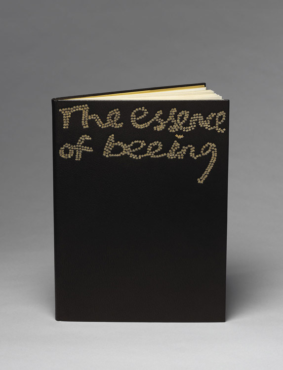
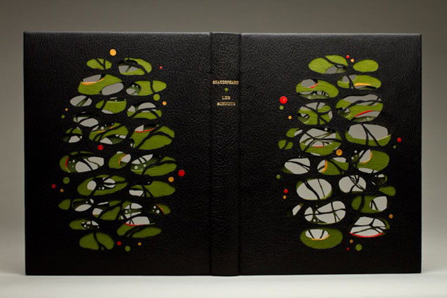
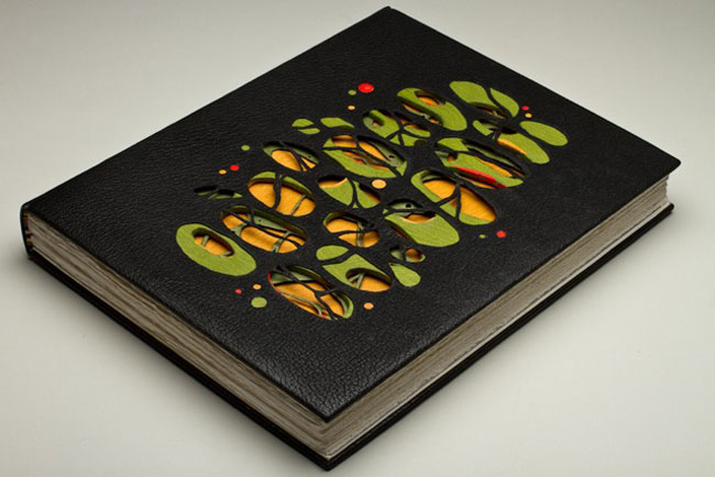
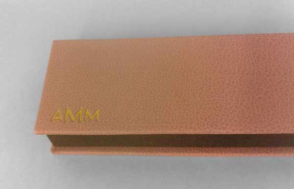
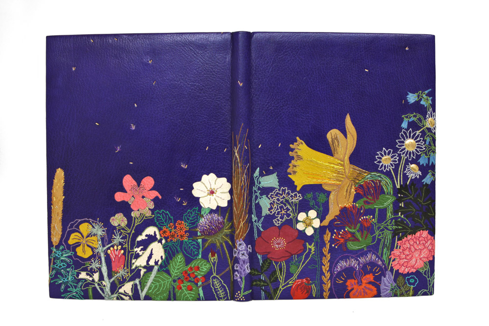
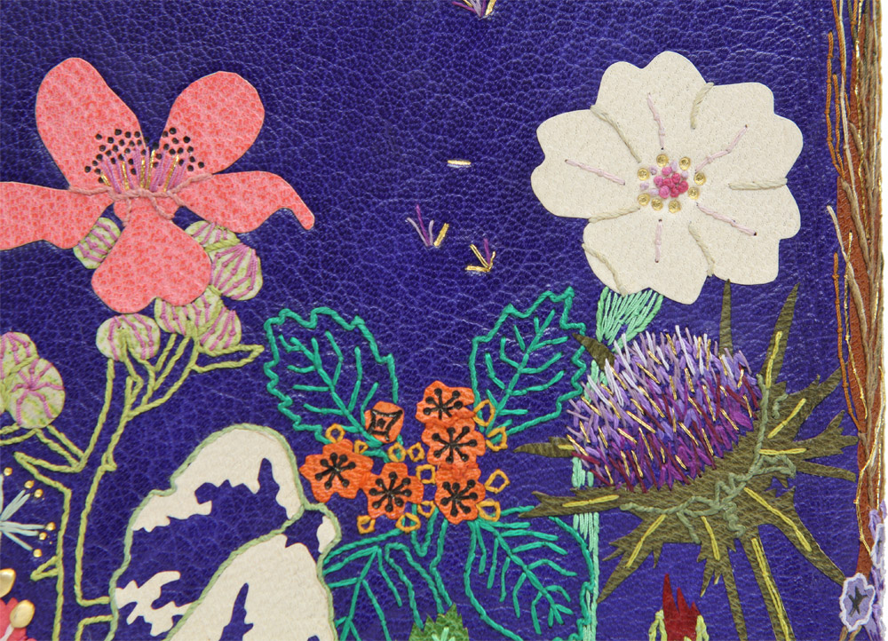
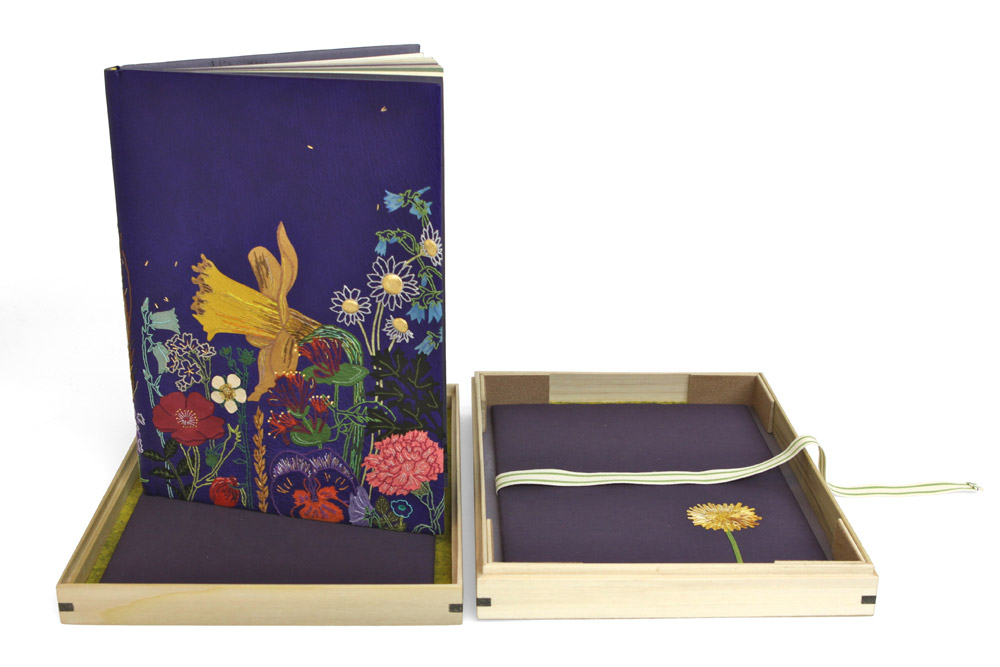
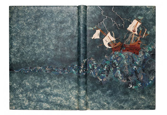
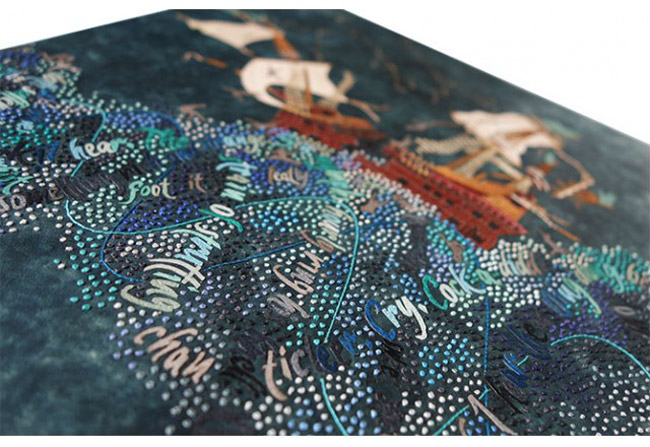
    Last year, Hannah Brown created this impeccable binding of Shakespeare’s The Tempest. Bound in full leather, Hannah first dyed the fair calf in a mottled effect, which provides the perfect stormy backdrop. The rest of the design is comprised of a variety of colored onlays, silk embroidery and blind, carbon and gold tooling.

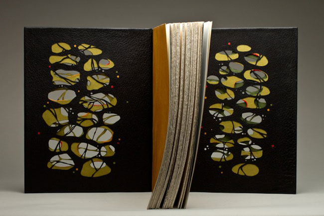
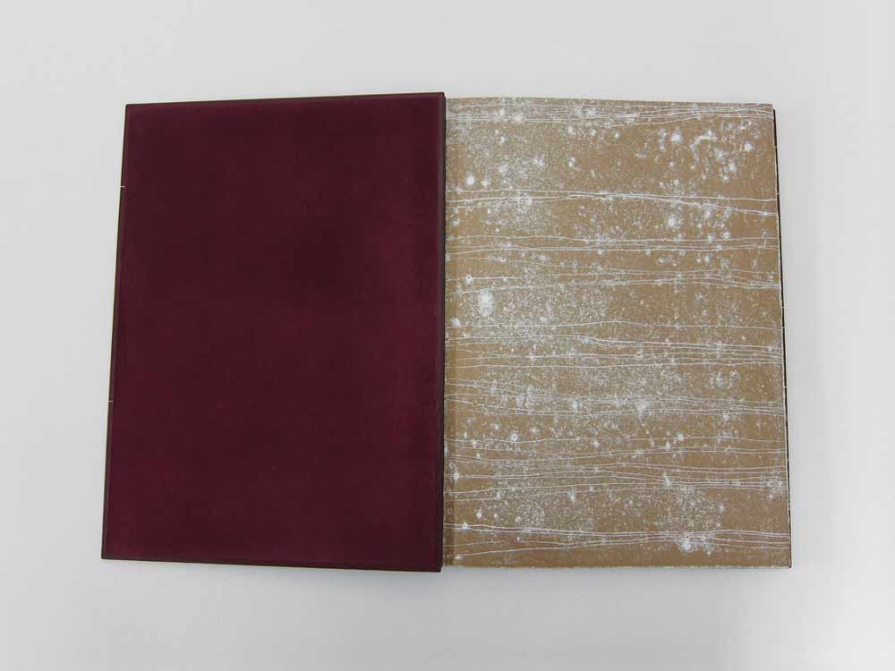
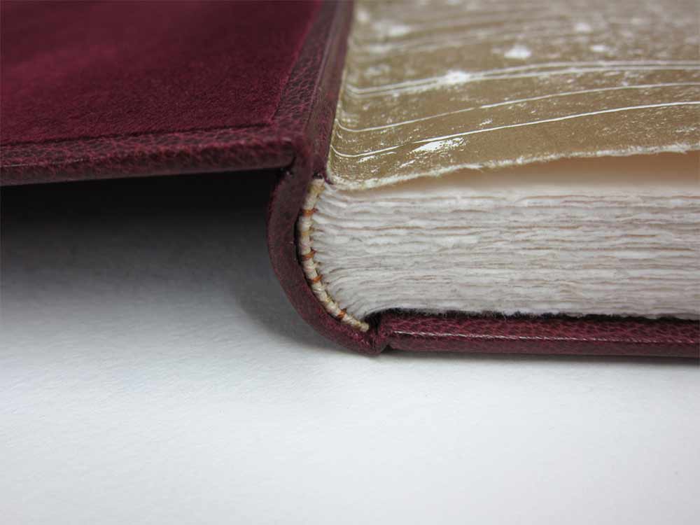
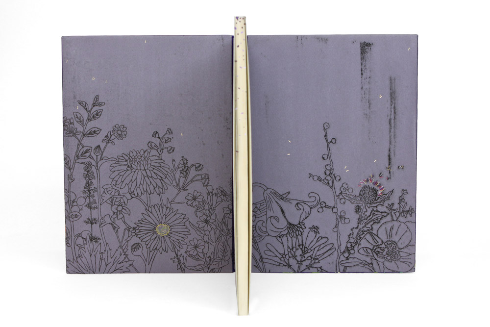
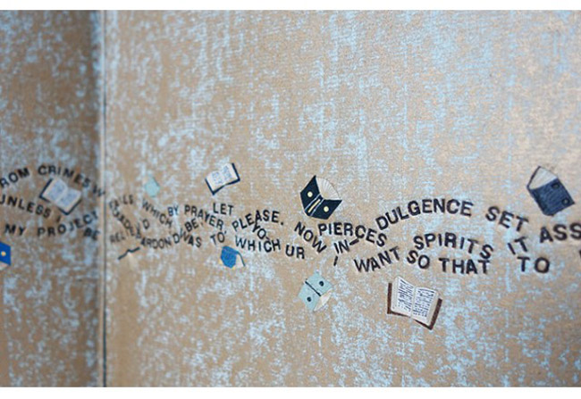
    The endpapers have a similar mottled effect as the leather cover. Yet Hannah achieved this decoration by placing the paper over  textured surface before rolling on gold letterpress ink. The book is housed in an oak box and frosted acrylic lid.
    This might be one of the most ambitious designs you’ve created thus far. First, I’d love to know how you kept track of all those little onlays as you were working.
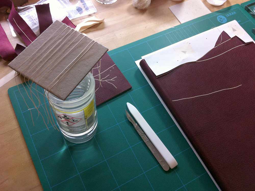
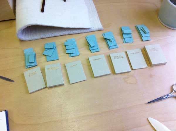
    I worked word by word and made sure there was no draft to blow the pieces away once they had been cut out! The key to ease of cutting was to regularly change my scalpel blade. As the words got smaller and smaller they became too tricky to pierce from leather so I embroidered them instead which gave me more control.

    Many of your bindings are done in goatskin, but The Tempest is bound in a hand-dyed calfskin. Did you find the calf to be more susceptible to scuffs during the embroidery process?
    Yes, this was my first time working with calf. I bought this skin as fair calf and it was dyed in a stippled pattern which I thought might help mask any possible scuffs that would occur during the embroidery process. I always make sample boards ahead of working on a binding so I was able to test whether this was going to be an issue ahead of working on the actual covering leather. Fortunately I had no issues with scuffing of the leather and since then have gone on to bind another binding in fair calf with even less margin for error!

    I will definitely use more calf in the future as I felt the smooth nature of the surface lent itself well to being embroidered. It was tough to back-pare and work ahead of applying the embroidery but I was very pleased with the end result.


  2. Bookbinder of the Month: Tracey Rowledge

    March 22, 2015 by Erin Fletcher

    TheEssenceOfBeeing-TraceyRowledge

    The prior posts on Tracey Rowledge’s work have focused on her designs mostly inspired by abstract markings. However, there are a few pieces in her portfolio that stand out for their sheer difference in design. The above binding of The Essence of Beeing by Michael Lenehan with illustrations by Alice Brown-Wagner is bound in black goatskin with a gold tooled design.

    The second binding featured in this post is a copy of William Shakespeare’s Hamlet, which was bound by Jen Lindsay in a red native-dyed goatskin with rough-edge gilding. Tracey completed the binding by gold tooling the title in 2012.

    Even though letterforms can be viewed as markings in their own right, I wanted to find out why Tracey veered toward a typographic design for these particular bindings.

    I love your use of typography as the single design element on these two bindings. The texture you create by overlapping a word or building up a letter with several impressions of a single tool is really genius. What draws you to use typography over the abstract markings you often employ in your designs?
    With The Essence of Beeing I was interested in combining my handwriting, the nature of the crosshatched images in the book and the wonderful title, to create an image that was the title – to see how far a fine binding could be simplified in appearance – to see if at first glance it could look like an art book. I don’t know if this makes sense, but to try to explain it another way – I really enjoy the look and feel of a fine binding, but I sometimes wonder if they look to others overly laboured. I was exploring in this work, whether I could remove this element.

    Hamlet-TraceyRowledge

    Hamlet was bound by Jen Lindsay in 2002 and it came to me in 2012 to be lettered. Although there was a ten year gap in between the time Jen completed the binding and I gold tooled the lettering, it was very much a collaborative process. We felt it was really important that the lettering worked with the incredible grain of the native red goatskin Jen had bound the book in. The Hamlet lettering is gold tooled using Jen’s handwriting, it being uppercase and superimposed, creates an image that also evokes something about Hamlet itself.


  3. Bookbinder of the Month: Monique Lallier

    May 4, 2014 by Erin Fletcher

    LaColouerduVent-MoniqueLallier

    La Couleur du Vent was bound in 2013 by Monique Lallier for the ARA-Canada exhibition that I may have mentioned just once or twice (even thrice) in the past. I brought up the window element in Monique’s work during the interview on the first of the month with her binding The Drawings of Caravaggio. When I saw Monique’s binding of Interpreter of Maladies at an exhibition in Chicago, I was awed and intrigued by its construction. With this binding Monique began experimenting with laser cutting technology to create detailed and intricate work. 

    IntrepreterOfMaladies1-MoniqueLallierI want to further the discussion from last week on the progression of the window element in your designs. Except this time I would like to focus on technique. The covers of La Colouer du Vent and Interpreter of Maladies were laser cut to achieve the intricacies of the design. Do you approach the structure differently on a fine binding when including laser cut elements?
    When I choose to use laser cutting I have to do a “case” binding as I have to finish the inside doublures before the laser cutting and the cover has to be flat on the table of the laser cutter. I still consider it a fine binding. 

    Did you have to alter anything about the process from your first attempt to the most recent one?
    I think I figured it out right on the first time and it worked well, so I repeated the same technique.

    – – – – – – – – – – –

    In addition, during the interview, I included a sneak peek of one of Monique’s recent bindings of Les Sonnets by Shakespeare. The complexity of the design is literally jaw-dropping. Two layers of board have been cut and sandwiched between the covering leather and leather doublures, which have also been laser cut.

    LesSonnets-MoniqueLallier LesSonnets2-MoniqueLallier LesSonnets3-MoniqueLallier


  4. Bookbinder of the Month: Haein Song

    February 23, 2014 by Erin Fletcher

    RomeoAndJuliet1-HaeinSong

    In 2012, Haein Song bound this copy of Shakespeare’s Romeo and Juliet in full leather maroon goatskin. The delicate linear design was created by applying a series of natural goatskin onlays. The endpapers are monprinted in gold with suede doublures. 

    RomeoAndJuliet3-HaeinSong RomeoAndJuliet2-HaeinSong

    At first glance, the decorative elements appear to be hand tooled, but those thin lines are actually several onlays. Did you find it difficult to manipulate such delicate and thin pieces of leather?
    Leather pieces are paired down very thin (0.2.mm) and I cut them into long lines of a width of 1mm. It isn’t easy to glue the pieces so I put pva and paste mix on the glass surface then lay the piece on top so it can catch the adhesives. Then with a help of scalpel and tweezers I lay them on the the cover of the book based on my design. I think the idea of doing it seems more challenging than actually executing it. Once you are used to the thinness and longness of the piece it become a little bit like a drawing tool. And when I was laying down the pieces I had a feeling that I was drawing with a leather.

    RomeoAndJulietOnlays-HaeinSong


  5. Client Work: Clamshell Box for Seven Miniature Shakespeare Books

    May 7, 2013 by Erin Fletcher

    clamshellmini8-erinfletcher

    A client came to me with a set of seven miniature limp-leather Shakespeare bindings in need of a clamshell box. The length of each book was exactly the same, but the width and height varied slightly. As a solution I built individual French trays for each book and assembled them side by side as the A tray for the clamshell box.

    clamshellmini4-erinfletcher

    The French trays were constructed with a single opening at the tail of each book, exposing a piece of satin ribbon. The ribbon was installed for ease in removing each book and to put less stress on the book during this process. When measuring for each French tray, I was less concerned about the width (as I knew they would vary) and the length (as they were all consistent). However, I wanted the French trays to be the same height. Since the books varied from 12mm to 19mm, I adjusted the thickness of the trays by laminating board together so the books would rest at a uniform height.

    Since each French tray would be custom fitted to a specific book, I stamped each title with gold foil on the Hahnemuhle ingres used to line the base of each tray. This would prevent any confusion when replacing the books and to make sure the books rest in their properly fitted tray.

    clamshellmini3-erinfletcher

    The walls were made from millboard and covered with brown Canapetta bookcloth.

    clamshellmini2-erinfletcher clamshellmini`-erinfletcher

    Once all of the French trays were assembled I was able to measure out the materials for the B tray and the case. The B tray was covered with the same brown Canapetta cloth and lined with earth Hahnemuhle ingres. The exterior of the box was covered with a dusty pink buffalo skin and stamped with gold foil the initials of my client’s wife. As this was to be a gift for Christmas.

    clamshellmini6-erinfletcher

    I was very satisfied with the overall construction and feel of the box, as was my client. I enjoyed the challenge that was presented by this project and working with miniatures was a nice change of pace from my regular line-up. You can see more client work on the Services page at Herringbone Bindery.


  6. February // Bookbinder of the Month: Hannah Brown

    February 1, 2013 by Erin Fletcher

    shakespeare_hannahbrown1

    This gorgeous fine binding was bound by Hannah Brown for the 2012 Designer Bookbinders International Competition. The theme of the competition was Shakespeare. Bound in full purple goatskin is a 1906 edition of Flowers from Shakespeare’s Garden: A Posy From the Plays with illustration from Walter Crane. The book contains quotes from various Shakespearean plays, each one containing the name of a flower. Walter Crane beautifully illustrates figures dressed in garments inspired by the flowers mentioned. Each flower in the book appears somewhere on the cover, doublure and endpaper design.

    The leather is embroidered over various colored leather onlays using a variety of silk and metallic threads. There are nine gold plated brass pieces attached to the boards. Using handmade finishing tools, Hannah further embellishes the cover with carbon and gold.

    shakespeare_hannahbrown5

    The endpapers and doublure design was done using soft-plate off-set printing and embellished with additional embroidery and tooling. 

    shakespeare_hannahbrown2shakespeare_hannahbrown3The binding is housed in a tulipwood box, mitered and held together with bog oak keys. A floral line drawing was etched into the lid of the box with a computer-controlled router. Pads are placed inside the box for added protection, the bottom pad was embroidered with a single flower.

    Hannah specializes in fine binding and custom commissioned pieces, working with a variety of materials and found objects; inspired by her habit of collecting. Check out the interview below to find out how Hannah got into bookbinding and come back every Sunday this month for more fine bindings.

    You graduated from Brighton University in 2004 with a BA (Hons) in Three Dimensional Craft. Can you explain your studies, what type of medium(s) did you work in and what materials were you using?
    My degree was nicknamed ‘WMCP’, standing for wood, metal, ceramics and plastics. It was a three-year degree, in the first year we rotated through the four materials learning basic making skills including wood-turning, silver soldering, mould-making and casting in resin. In our second year we had to specialise in two materials so I chose metal and ceramics and went on to make jewellery for my third year degree show.

    When were you first introduced into bookbinding and what was your attraction to it? Can you also talk about your first instructors and the training you had?
    At the Brighton University Grand Parade site, there were many different art-related degree courses running including Graphic Design, Illustration, Sculpture and Fashion. There was a permanent bookbinding studio that students could use as part of their studies if they were doing the Graphics and Illustration courses, however I was not permitted to as my degree course fell under a different department.

    I remember a fellow student on my course showing me some bindings she had made whilst doing bookbinding evening classes in her final study year. I was very impressed by the books she had made and decided to sign up for an evening class myself once I had graduated. At the time I was lucky enough to be working in Brighton for two different jewellers, improving on the metal working skills I learnt whilst doing my degree.

    I signed up to a beginner’s class and my first tutor was Peter Jones (a current Fellow and past President of Designer Bookbinders). We began by making a simple single-section book and then a few weeks later progressed on to making a multi-section, case-binding. I was hooked from pretty much class one, delighting in the fact that I had made my own little notebook!

    Due to my fascination with collecting, which developed during my degree course, I took it further and starting stitching found objects to my book covers. I moved from Brighton a few months after I graduated but was fortunate to carry on going to bookbinding evening classes at The Institute in North London, an adult education college. My tutor there was Chris Damp, a trained book conservator, and this is where I first began to learn how to work with leather.

    You were elected as a Licentiate member of the Designer Bookbinders in 2009. Congratulations! You’ve been assigned two mentors, can you talk about this experience and what opportunities have arose from this honor?
    I applied to be a Licentiate member of Designer Bookbinders after winning the Mansfield Medal in the 2008 Annual Competition for my binding of Daphne Du Maurier’s, ‘Don’t Look Now and Other Stories’. I was thrilled and it was suggested by other bookbinders that I apply.

    I was assigned both Peter Jones, my first bookbinding tutor from Brighton, and Jenni Grey (also from Brighton) as my mentors. They were chosen specifically for me as it was felt their work had specific relevance to mine. I use a lot of embroidery and sewn detail in my work, as does Jenni, and I am also trying to develop ways to use other materials (such as wood, metal and acrylic) into my bindings, which Peter does a lot of.

    The fact that both my mentors live in Brighton is fantastic as I love going down to see them, and reminiscing about by university days. In the four years that they have been my mentors I have been to see them about three times. Each time I have tried to take along work in progress as the most useful feedback I can get is during the making progress, when it is easiest to see how the book is functioning beneath the leather cover. I am able to ask other Fellows for advice too, which is an invaluable tool.

    One of the main opportunities that have arisen since being elected as a Licentiate, has been the chance to regularly exhibit my work alongside the other Fellows and Licentiates. I am also surrounded by a fantastic group of people with which to exchange advice and knowledge. DB has also recently put on a series of master-classes for Licentiates, which are invaluable for improving core skills.

    In a few years you’ll be eligible for election to Fellowship member, are you working towards this distinction?
    I work as a Museum Technician at the Victoria and Albert Museum in London four days a week and do as much bookbinding as I can around this. It is often hard as I only get small blocks of time to work on my fine bindings and commission work, however each binding I do I learn from and progress, therefore in this way I feel I am naturally working towards this distinction. I am approaching my fifth year as a Licentiate and am starting to think more seriously about applying for Fellowship, however I do not want to rush this decision as I have up to seven years in which to apply.

    The advice I get from my mentors and other fellow binders is invaluable and I still feel I have a lot to improve upon. I am confident in my design work but wish to progress further with my forwarding before applying for Fellowship, and I am not sure how long this may take.

    You currently work in your home studio in North London. Do you enjoy working in your home?
    As mentioned previously, I work a four-day week at the V&A Museum, therefore my binding work is done around this. I have often thought about looking into renting a studio space elsewhere, however at the moment it does not make sense financially. I do really enjoy working from home but I have to be quite strict with my time so as not to get distracted by household tasks!

    studio_hannahbrown

    At present my fiancé George and I are in the process of setting up a proper home bindery for myself in our spare room in North West London. In the meantime I currently work between the other rooms in the house and am in the process of expanding my range of bookbinding equipment and other machinery. I am always amazed what it is possible to produce with limited space and equipment, and if I were bookbinding permanently I would definitely chose to rent a studio space to house everything in.

    What is your most loved tool(s)? Do you make any of your tools?
    In 2007 I did my first gold tooling class with Tracey Rowledge at Cit Lit College in London. I loved the course and was thrilled to learn that it was easy, and a lot cheaper, to make my own hand tools. I bought some lengths of brass and some wooden dowel and set about filing the brass into shape. These hand-made tools are the favourite tools I own as they were so simple to make yet are so versatile.

    The first book I made with tooling on it was, ‘The Somme: An Eyewitness History’. I made a series of small tools for the design on the cover, and have since used these six tools over and over again in later bindings. I also have a series of hand tools shaped as birds, made for my binding of, ‘Don’t Look Now and Other Stories’, which I still use very regularly. I have also taught on how to make hand tools and am pleased to pass on my knowledge.

    On your about page you mention your passion for collecting. Can you talk more about your process of collecting? Do you find inspiration in the artifacts you collect or does your inspiration come from other artists and bookbinders?
    I am not a methodical collector, I hold on to items that interest me whether it be because of the colour, texture, personal significance or none of the above. I have a treasure trove of objects that I cannot bring myself to throw away and I like the idea of giving these objects new lives by adding them to my bindings. I do not do this very often in my fine binding work, but more regularly in my sketchbook and small commission work. It has however directly led to my interest in incorporating alternative skills into my fine binding work including metalwork, textiles, printmaking and woodwork.

    At university I did my dissertation on the field of collecting, looking specifically at why people amass objects and what their collections consist of. It is particularly significant to me that I am now involved in a field where my work is being added to bookbinding collections, each of my clients having their own interests and reasons for acquiring their bindings.

    As a committee member of the Society of Bookbinders, what is your role in the organization?
    I am a committee member of the London and South region of the Society of Bookbinders. I attend committee meetings to discuss matters arising in our region, plus we put on a programme of workshops and talks throughout the year.

    I am also the co-organiser of the SoB International Bookbinding Competition, with my friend Arthur Green. We have been running this competition for three years and are enjoying the challenge. It is held every two years and runs in conjunction with the Society’s biennial conference. Like the conference it has grown over the years and now attracts around one hundred entries from countries all over the world.

    There are five categories in which binders can enter books which are; Fine Binding, Case Binding, The Complete Book, Restoration and Historic Binding. There are a variety of prizes on offer and the winners are announced at the Society’s conference. These winning books then form a touring show that goes to three different venues around the UK. 

    hannahbrown


  • My name is Erin Fletcher, owner and bookbinder of Herringbone Bindery in Boston. Flash of the Hand is a space where I share my process and inspirations.
    The StudioNewsletterInstagramEmail me
  • Archives