RSS Feed

October, 2016

  1. Swell Things No. 37

    October 31, 2016 by Erin Fletcher

    stno37a

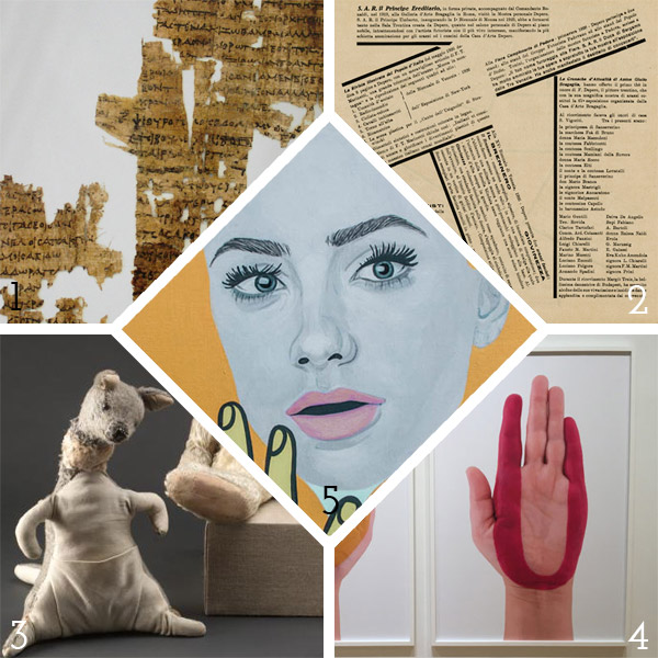
    1. A group of astronomers and physicists at the University of Texas have banded together to attempt to place Sappho at the time that she wrote her poem Midnight Poem. Existing on fragments of papyrus, the verse references the position of the moon and the visibility of Pleiades, giving clues to what time of year she may have wrote this piece of work.
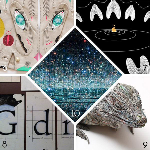
    2. Considered to be the first modern artist’s book, Depero Futurista (known as “The Bolted Book”) was published in 1927 by the Italian Futurist Fortunato Depero. Less than a thousand were produced at the time and copies of it are extremely difficult to find today. The Museum of Modern and Contemporary Art of Trento and Rovereto (home to the Depero archives) and the Center for Italian Modern Art have a launched a Kickstarter campaign with Designers & Books to republish this groundbreaking piece of art.
    3. The original stuffed animals that inspired A.A. Milne to write Winnie-the-Pooh became part of the collection at the New York Public Library in 1987. Over the past year, the animals underwent a transformation in the conservation department. They have been beautifully restored and are now back on displayed.
    4. I’m really digging the work of Rachel Beach, in particular the hand-painted hands.
    5. I’m loving these portraits by Chambers Austelle.

    stno37b

    6. Cosmic Animal Gloves by Bunnie Reiss. A painter who transforms something old into something so stunning!
    7. Marra is a dying language; an estimated 90 percent of indigenous languages in Australia are now endangered. In as little as 10 minutes, you can learn part of a dying culture through My Grandmother’s Lingo, an interactive animation. Narrated by Angelina Joshua, rediscover her grandmother’s language through voice-activated interactions.
    8. Centaur turns one hundred: In 1915, Bruce Rogers designed Centaur after a 15th century typeface designed by Nicolas Jenson. We stock Centaur in our studio for its pure elegance and grace, so happy to celebrate its subtle contribution to the world.
    9. Chie Hitotsuyama is a Japanese paper artist, who creates these magnificent realistic sculptures of animals out of rolled up strips of wet newspaper. It’s quite stunning.
    10. Want to stand alone in a mirrored room filled with thousands of tiny lights for a full minute? Well, now you can (or at least until October 2017). On view at The Broad is Yayoi Kusama’s piece Infinity Mirrored Room. Oh, how I would love to make a trip to Los Angeles to experience this!


  2. Guild of Book Workers – Standards of Excellence Seminar // Charleston 2016

    October 24, 2016 by Erin Fletcher

    After an adventuresome time in Durham, North Carolina, where I consumed delicious local brews, lost at shuffle board, ate so many southern dishes, visited Duke’s conservation lab, toured a lemur center and discovered that I’m still allergic to mosquito bites, Henry and I embarked on our drive to Charleston, South Carolina.

    Upon our arrival we were greeted by Tropical Storm Julia, but luckily the next few days proved to be quite lovely with very little rain. After checking in, I began to rummage through my conference packet and found my name tag, which was beautifully done by local calligrapher Elizabeth Porcher Jones.

    charlestonstandards15

    Day One:
    The conference began with a tour to the Charleston Library Society, an absolutely charming space that also served as the venue for the opening reception later that evening. Our tour began with Anna Smith, Special Collections Librarian, who gave us an overview the Society’s establishment and shared a few treasures from their collection. We were then led to the first floor by Kerri Harding, Director of Bindery and Conservation Studio, where she showed off their delightfully quaint bindery space. Having just relocated to Charleston, Kerri shared with us the range of her upcoming projects: a presentation leather binding, rehousing and holiday ornaments showcasing the Society’s newest titles.

    charlestonstandards1a charlestonstandards2

    Day Two:
    The first presentation of the conference was Drawn to the Writing given by calligrapher Cheryl Jacobsen. As a freelance artist living in Iowa City, Cheryl’s work ranges from design and lettering to illustrations and art. She began her presentation with her personal history on how her interest in art and lettering developed before going into a slideshow of her work. Cheryl is also an adjunct assistant professor at the University of Iowa, teaching courses at the Center for the Book. Over the course of the presentation, Cheryl created a certificate to commemorate the conference using a variety of letter forms. She spoke about line formation (this included pressure and hand position), nib use, ink/pigment preferences and tricks of the trade.

    charlestonstandards3

    At the end of presentation, the audience was rewarded with a copy of the certificate Cheryl produced during the presentation (she even offered to add your name to the certificate). We were also allowed to handle some of her artist books.

    charlestonstandards4

    For the afternoon presentation, the topic switched to bookbinding in Exploration of history and techniques for Pennsylvania German Liturgical Bookbinding before 1850. The presentation was divided into two parts: Chela Metzger, Head of Library Conservation at UCLA, demonstrated the construction of the binding and Erin Hammeke, Senior Conservator at Duke University, demonstrated the techniques used to create the bosses and clasps traditionally seen on this style of binding.

    charlestonstandards5

    Chela quickly went through the construction of the binding. The book used in the demonstration was sewn in an abbreviated pattern (usually 2-on) using thicker supports (usually two supports as one), the shoulders are quite narrow and the edges were (historically) ploughed. The wooden boards (oak or beech; usually quarter-sawn) are heavily shaped along the spine and fore edge on both sides of the board. The fore edge is also notched in preparation for the clasps. The spine is lined with linen strips that extend beyond the shoulder. Unlike most wooden board structures, the boards are not laced-in. The sewing supports are frayed and adhered to the first and last leaf, then the linen is adhered to sandwich the frayed cords. The text block edge is colored after the boards are attached, then the hand-sewn or hand-woven endbands are stuck-on.

    One of my favorite parts of the presentation was the brief demo given by Chela on the technique behind the woven endbanding material. Using a make-shift back-strap loom (popsicle crafts!), she wove a traditional white and blue endband strip. A variety of endbands have been spotted on these bindings. The image below (on the right) shows just two varieties with the hand woven style on the bottom.

    charlestonstandards6charlestonstandards7

    Chela’s portion of the presentation continued with the covering of the book and tying up the spine (this step ensures that the leather adheres to either side of the supports). The last step presented by Chela is one of the defining characteristics of this binding: the leather spine straps. Appearing on the spine at the head and tail (and sometimes the middle) many examples are seen adorned with brass studs or domes.

    charlestonstandards9 charlestonstandards8

    Using a 24-gauge brass sheet, Erin demonstrated the process for creating the corner pieces for the binding. Beginning with a flat piece of brass, Erin roughly traced out the design with a sharpie. Then she cut down the brass close to her design with metal snips; shaping it even further with needle files and emory paper. Supporting the brass with a lead block, Erin began to decorate the brass corner piece by striking the back with steel punches. This did not create a hole, rather pushed the brass into a shape that would be raised on the front side. In the image above (on the right), Erin uses a drill to create holes where the nails will be inserted when attaching the furniture to the book. After attaching this corner piece to the book, Erin began to bend the extended brass around the edge of the board with her fingers and finished its shape by striking the brass with a planishing hammer.

    Day two ended with a social gathering at a local pub for a Mentor-Mentee Happy Hour, those new to their field were encouraged to speak with the more accomplished participants. Afterward, I broke off with some friends for a very quick bite to eat before going on a Ghost and Dungeons tour through Charleston.

    Day Three:
    One the third and final day of the conference, two more presentations were given. The morning presentation was given by Betsy Palmer Eldridge on Paper Conservation Treatment Revisited. In 1989, Betsy gave a presentation at the Standards conference in Portland, this year she presented a revised version of that lecture.

    charlestonstandards10

    Betsy was introduced to book arts during her time at Wellesley College in 1957 and further advanced her training in Germany and France. In 1973, she moved to Toronto, where she established and maintained her private conservation studio. Betsy has been an active member of the Guild since 1960 and the Canadian Bookbinders and Book Artists Guild since 1983. Betsy gave an overview of a variety of conservation techniques and tricks she has picked up along the way. Many of the presentation materials she referred to were used in her original presentation 27 years ago, it was quite interesting to see how the materials had changed or retained their vibrancy over the years.

    The final presentation was on Herrnhuter Paste Paper given by Deborah Evetts. At the start of her presentation the audience received a brief history lesson paired with images of these papers collected from several sources. During the last third of the 18th century, a group of Moravian sisters living in a religious community at Herrnhut in Saxony created what came to be a very recognizable style of paste paper. The sisters traditionally used olive, bright or grayish blue, mustard yellows and reds in their papers. Deborah has seen several examples and has recreated tools to mimic the patterns seen on these historical papers. Herrnhuter Papers were used as both cover papers and endpapers on many common types of books such as ledgers and almanacs, but examples have also been found on works of literature, non-fiction and other genres.

    charlestonstandards11

    After the slideshow, Deborah moved onto discussing tools and paste preparation. She began with a quick demonstration on making your own tools such as combs, rolls and mylar templates. The first image below shows Deborah marking out a small piece of plastic and then cutting out the teeth using a sharp scalpel blade. Combs can be made from binder’s board, plastic container lids or vertical blinds. The second image below shows three different styles of paper that utilize the same decorative roll and the handmade rolls that Deborah has made. The designs were carved out of linoleum and attached to craft rollers.

    charlestonstandards13charlestonstandards12

    Over the course of the presentation, Deborah created several styles of the historical patterns seen on Herrnhuter Papers. She demystified so many patterns. One in particular that I was excited to see was the two-finger swirl. The crowd gave Deborah a round of applause after each paper blossomed before our eyes. Deborah was so delightful and high-spirited in her presentation and it was a great way to end this year’s series of presentations.

    charlestonstandards14

    At the end of the evening, we all gathered in the Colonial Ballroom at the Francis Marion Hotel for the banquet and live auction. Also during this time, two members of the Guild are rewarded with the Laura Young Award and the GBW Lifetime Achievement Award. Catherine Burkhard was awarded the former for her dedication and long-time service to the Guild. The latter was awarded to Peter Verheyen, celebrating his achievements in the fields of conservation, bookbinding, book arts and creating a thriving online community. As the night came to a close, I allowed my nose to be traced, said my goodbyes and wished everyone  safe travel back home. Looking forward to next year’s conference in Tacoma, Washington!


  3. My Hand // Into This World

    October 18, 2016 by Erin Fletcher

    IntoThisWorld8-ErinFletcher

    I recently completed a French-style fine binding around Natalie Goldberg’s Into This World. The letterpress printed text is paired with woodblock prints both carved and printed by Clare Dunne and hand-tinted by Sialia Rieke. The texture of the prints were my inspiration for the design for the binding. By combining the natural texture of the buffalo skin with embroidery and leather onlays, I hoped to capture the pops and cracks between the layers of color.

    With this plan in mind, I used a single print as my inspiration to lay out the design. For the embroidered elements of the design, I chose to play with the technique in two new ways: an embroidered title and embroidered paper doublures.

    The script used for the title mimics the author’s own handwriting taken from her signature on the title page. The title was drawn onto tracing paper and taped in place, overlapping the white buffalo back-pared onlay. I tend to pre-punch the holes for embroidery, especially when I am trying to achieve something exact. For the pre-punching, I put a thin embroidery needle in my pin vise and placed the leather onto a piece foam. Then I used the tracing paper to guide my pin vise.

    IntoThisWorld-ErinFletcherIntoThisWorld2-ErinFletcher

    The embroidery for the title happened in two steps: back-stitch to spell-out the letters with french knots for the i’s dots and then I wrapped the stitches to create a raised, more defined line.

    IntoThisWorld3-ErinFletcher IntoThisWorld5-ErinFletcher

    After the title was completed, several seed stitches were scattered around the binding with the majority of them appearing on the back cover. I used the same technique to pre-punch the holes for the seed stitches, this time using the full-scale template. The title and seed stitches were sewn with 2-ply cotton thread in an ochre yellow.

    IntoThisWorld6-ErinFletcherIntoThisWorld7-ErinFletcher

    The second embroidered element in the binding are the edge-to-edge paper doublures. The prep for paper doublures is very similar to the set-up for leather doublures; for paper I allowed a wider turn-in as I trimmed out, this would ensure a smoother surface under the paper. Below you can see the turn-ins post covering and with the leather hinge in place.

    IntoThisWorld10-ErinFletcher

    After scoring a frame around the board and spine edge, I began to trim off the excess leather at a slight bevel. In order to create a successful doublure, several layers are added to the board (one at a time) and sanded to make the board as smooth as possible. The first layer (shown on the right in the image below) was a piece of 10pt. card, first sanded along all four edges and attached with a PVA/methylcellulose mix. After allowing that layer to dry under weight for an entire day, I sanded the edges smooth (which is the state visible in the image below).

    IntoThisWorld11-ErinFletcher

    In between these stages, I began working on the embroidered paper doublures. Referencing the same print used to inspired the covers, I traced an outline of the figure from the image. I felt that her pose embodied the sentiments of the text perfectly. Using the tracing paper once again as my guide for punching the holes, I placed the paper onto a piece of foam and poked through the tracing paper into the doublure paper.
    IntoThisWorld12-ErinFletcherIntoThisWorld13-ErinFletcher

    Once the paper pieces were fully embroidered, I carefully sanded the backside of the paper to create a smoother feel along the edges once glued down to the board. Below you can see the board in it’s final stage. After sanding down the 10pt. card, I attached a medium weight smooth paper. This piece was slightly oversized on three edges and sanded down on the spine side. After allowing it to dry under weight, I sanded it down smooth. The embroidered paper doublures were attached with MIX and put under weight for a day in order to dry thoroughly and to prevent the board from cupping inward.

    IntoThisWorld14-ErinFletcher

    And here are the final results. I am so pleased with the outcome of the embroidered paper doublures, it will most certainly be a technique I use again on a future binding. To see more images of the binding and it’s embroidered quarter leather clamshell box, click here.

    IntoThisWorld9-ErinFletcher


  • My name is Erin Fletcher, owner and bookbinder of Herringbone Bindery in Boston. Flash of the Hand is a space where I share my process and inspirations.
    The StudioNewsletterInstagramEmail me
  • Archives