RSS Feed

‘bookbinding’ Category

  1. My Hand // Leather Embroidery Samplers – Part One

    April 15, 2014 by Erin Fletcher

    EmbroiderySampler-ErinFletcher

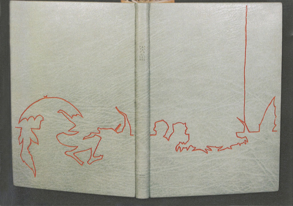
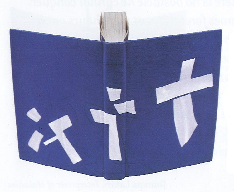
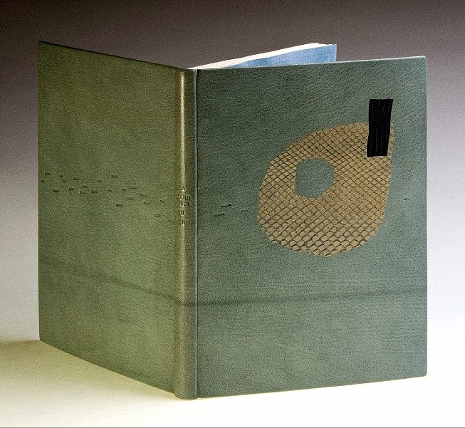
    Since my last embroidered leather binding, I’ve had the urge to experiment with various traditional stitches in leather. Through my experiments I aimed to find which stitches would translate the same way on leather as they do on fabric. In addition, I wanted to know if I could easily keep a stitched line straight during the covering process.

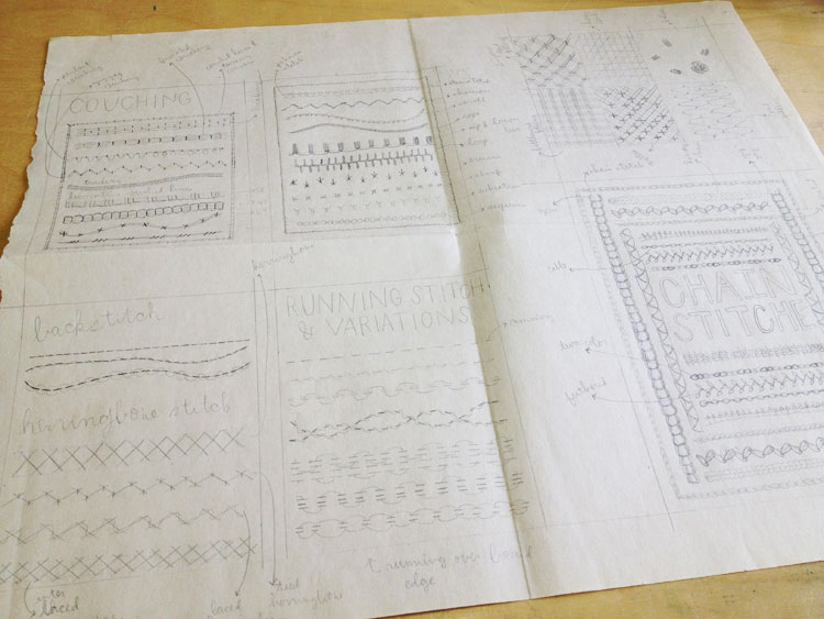
    I began with a rough sketch of each sampler, a total of six. The stitches I chose were divided into categories (such as chain stitches, variations on the back stitch, couching, etc.) and then laid out onto each sampler sketch. I choose to experiment on both goatskin and buffalo which were pared down to the thickness I use when covering a full leather fine binding (~.5 for the buffalo and .7 for the goat). 

    EmbroiderySampler5-ErinFletcher

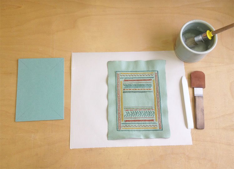
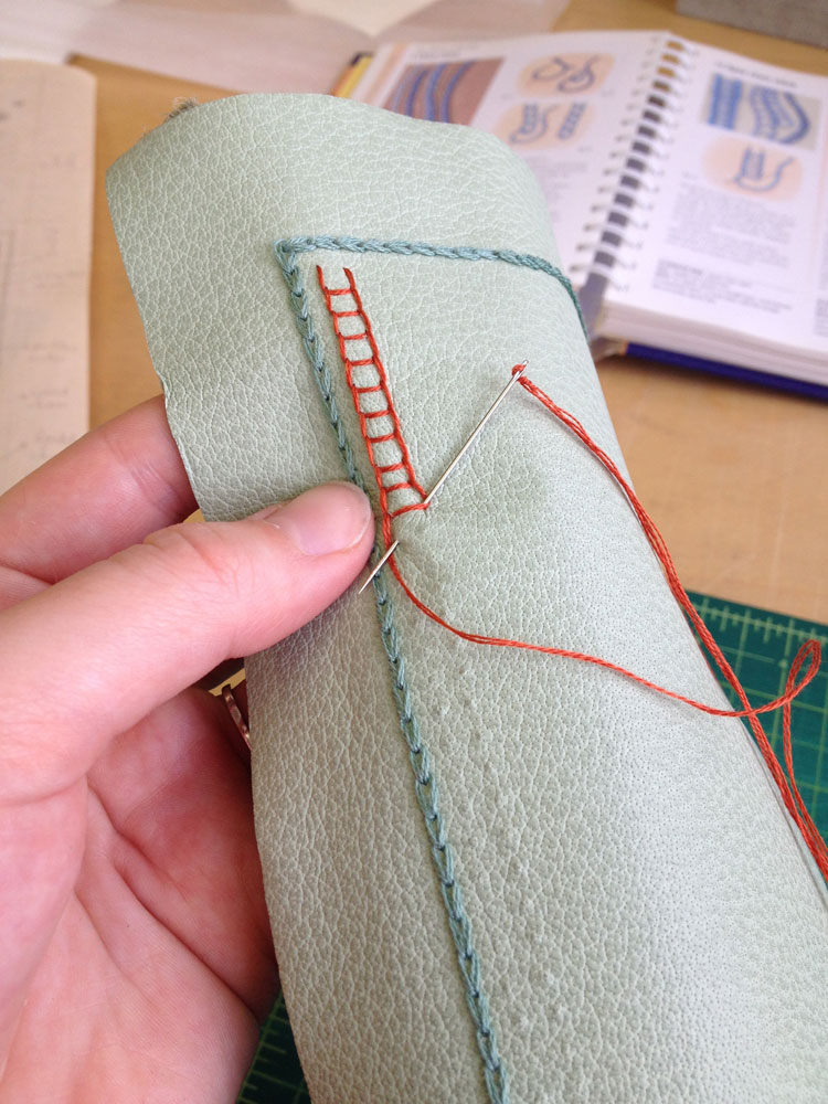
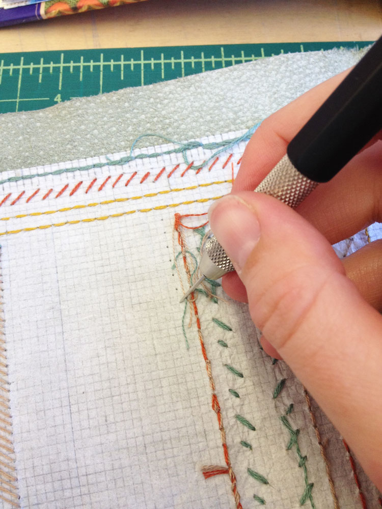
    Then, I cut down a piece of Japanese tissue to the size of the plaquette board and adhered it to the center of the leather. Once the pieces were dry, I proceeded to draw out a 1 x 1 mm square grid onto each sampler. This grid made it incredibly easy to lay out the stitches and to make sure I kept them even and straight. Before I began a stitch, I figured out the hole placement and spacing. Then with my pin vise I made pin-pricks through the leather. Laying out the holes beforehand made the act of stitching easier and faster. 

    EmbroiderySampler2-ErinFletcher

    After completing all of the stitches on a sampler, I prepped the leather for covering. Excess strings were trimmed and pasted down in line with stitches on the backside. This way any strays would not be visible on the front side of the leather. Once I readied my bench with the proper tools, the leather pieces were pasted up with wheat starch paste and attached to the board. After folding over the turn-ins and working down the corners, I stuck the plaquette under a press between foam and press boards. The foam pushes down the leather around the stitches much easier and quicker than I could. 

    When working with embroidered leather, I don’t wet out the piece before pasting up as I normally would. I do however add some moisture to the turn-ins to aid in the covering process. 

    EmbroiderySampler4-ErinFletcher


  2. Bonus // Bookbinder of the Month: Lang Ingalls

    March 31, 2014 by Erin Fletcher

    KingOfTheAlps-LangIngalls

    Just one more bonus binding from Lang Ingalls to end out the month. King of the Alps by Reginald Farrer with illustrations by Abigail Rorer was bound by Lang in 2013. The Lone Oak Press edition is signed by the illustrator.

    Bound in the French technique in full white alum-tawed goat. The geometric design on the covers is an interpretation of one of the illustrations. Lang continues to use the incision technique in which a thin line of leather is removed and painted with acrylics in grey and blue tones. The same palette continues on the inside with blue leather edge-to-edge doublures and grey suede flyleaves. The title, author, illustrator and date of edition are on decorative onlays on the spine.


  3. Bookbinder of the Month: Lang Ingalls

    March 30, 2014 by Erin Fletcher

    Ici-LangIngalls

    On exhibit from June 20th to September 14th of this year is Lang Ingalls‘ binding of Ici by Roger Munier. The exhibit is sponsored by ARA France in partnership with the city of NÎmes and its renowned Carré d’Art Library for the XIth FIRA International Forum & Exhibition.

    This edition is copy 13 of 47 and is signed by the author. Bound in the reliure à cru structure in black sanded calf with sewn red thread elements. The binding is complete with squared suede headbands, suede doublures and suede flyleaves. The title, author and date are hand tooled on both covers.

    This binding stands out in your portfolio due to the absence of color in the design, however the treatment of the leather is exceptional. It reminds me of how a photocopied image begins to degrade and become fuzzy with each subsequent copy. Was this effect created through a dyeing or printing process?
    This binding was made in Paris with Ana Ruiz-Larrea last fall. The structure is called reliure a cru, a soft-cover leather binding. The text is about how all things go round, all things in life. I decided on a circular element and taped #18 thread to the back of black calf. I sanded and — viola! — the calf was distressed and the circle came through. There is a hint of red in the text, the initial letter at the start of the copy, and I borrowed from that when I made small sewings of red thread through parts of the circle. The French teach that 2/3 of your design is on the recto and 1/3 is on the verso, thus the placings of these tiny thread elements, while considering the title, author and year.


  4. Bookbinder of the Month: Lang Ingalls

    March 23, 2014 by Erin Fletcher

    Chanson-LangIngalls2

    Chansons is a text written by the Belgian poet and playwright Maurice Maeterlink. This particular 1995 edition is in French and includes engravings by Ginette Litt; the copy is signed by Litt and bibliophile G.A. Dassonville. Lang Ingalls bound this copy in 2013 and it will be exhibited from April 4 to June 30 of this year in a show titled ‘Belgian Writers, a Binding Homage’ sponsored by Bibliotheca Wittockiana and ARA Belgica.

    The binding is bound in the French technique in pink goatskin. Lang describes the cover design inspiration and techniques below in response to my question. However, not shown are the hand-sewn silk headbands and black suede pastedowns and flyleaves.

    Once again, you’ve created such a beautiful binding. I would just love for you to discuss your concept behind the design and how you translated that into the materials used on the binding.
    This binding is recent, and one that took a long time to develop, and one that is amongst my favorites I’ve made. The shapes on both the recto and verso are taken from the etchings of Ginette Litt, one for each song (six). The shapes were removed and sanded, then re-adhered to the covers. The incision lines were painted black. The small connecting lines are thin twine that has been wound with silk thread in a near-pink hue, then adhered in a tooled line. The title is blind tooled then painted in the same black as the incisions.


  5. Half Light Bindery

    March 18, 2014 by Erin Fletcher

    HalfLightBindery5

    As Kevin Sheby graduated from the full-time program at North Bennet Street School, I had to say my goodbyes. He and his wife, with their two dogs, left soon thereafter to return to California. Since graduating in 2013, Kevin has custom built an efficient bindery space where he runs Half Light Bindery (which I have to say is a wonderfully chosen bindery name).

    Kevin is so talented and has created such amazing work that is both well crafted and artistically executed. Spending time with Kevin at NBSS, made me realize the importance of whole-heartedly investigating bookbinding structures and materials. What are the limits and what are the possibilities. Kevin has such a superb attention to detail and I’m always looking forward to the work that comes out of his bindery. 

    Recently, Kevin launched a collection of handmade leather products. Again his innate attention to details are seen in every product and within the professionalism of his website. 

    HalfLightBindery7HalfLightBindery3 HalfLightBindery2


  6. Bookbinder of the Month: Lang Ingalls

    March 16, 2014 by Erin Fletcher

    FantasyAndNonsense-LangIngalls

    The exhibition showcasing design bindings of the Tryst Press edition of Fantasy & Nonsense has been mentioned a few times on the blog. I first discussed the exhibition with my own submission, then again when I featured the work of Coleen Curry and Mary Uthuppuru. The book itself is a compilation of works by the American poet James Whitcomb Riley paired with beautiful wood engravings by Berrot H. Hubrecht. Each of the exhibitors really captured the whimsy of the poems and illustrations, transforming each binding into a unique object.

    Lang Ingalls‘ binding of Fantasy & Nonsense is no different in this respect. Her simple yet elegant design extracts the illustrations and complies them to form an intriguing landscape across the open binding. Lang created the binding in 2012 for the exhibition which was hosted by the Rocky Mountain Chapter of the Guild of Book Workers and displayed at the J. Willard Marriott Library at the University of Utah. Bound in the French technique in full light blue goatskin. The linear design was painted with acrylic inside a pulled leather line. Other design elements include colored head edge, custom paste paper endsheets and hand tooled title in blind on the spine.

    I love the color palette on this binding. Even though I had the opportunity to view this binding in person, I was stumped by how you created such a fine line of color in the leather. Can you talk about the technique you employed in this binding?
    This is one of the techniques I learned form Hélène Jolis — it is called an incision line. You actually cut the two sides of the line with a scalpel, remove the leather and paint with acrylics (yes, you need a paintbrush with only three bristles!) inside the line. I advise an optivisor for the work…


  7. Celebrate The One Year Anniversary of My Etsy Shop With This Offer

    March 14, 2014 by Erin Fletcher

    anniversary-march15blog

    March 15th marks the first anniversary of the Herringbone Bindery Etsy Shop. All items will be marked 15% off in celebration and just in time to make room for a whole new collection! 

    Browse through a selection of blank journals in various sizes, leather bound notebooks and bookbinding kits. 


  8. Bookbinder of the Month: Lang Ingalls

    March 9, 2014 by Erin Fletcher

    GoTellItOnTheMountain2-LangIngalls

    In 2011, Lang Ingalls won the Best Binding Award from the Chicago Public Library’s One Book Many Interpretations exhibition for her binding of Go Tell It on the Mountain by James Baldwin. It was during the reception for this exhibition that I met Lang. I was drawn to her binding because of the stark contrast between the rich purple leather and bright white onlays.

    Bound in the French technique and covered in purple goatskin. Spanning across the covers and spine are white eel onlays.  Other design details along with the title are hand tooled blind.

    This is the binding that led to our being introduced during an exhibit in Chicago. I am so attracted to the brilliant contrast between the vivid purple leather and the bright white eel skin onlays. I have little experience using exotic leathers, how does eel skin compare to traditional bookbinding leathers?
    This eel skin is really really thin, perfect for onlays, and not difficult to execute. I had fun deciding which way the spine parts would go to complement the design.


  9. March // Bookbinder of the Month: Lang Ingalls

    March 1, 2014 by Erin Fletcher

    LaCouleurDuVent-Lang Ingalls

    At this point I think it’s safe to say that I have found the recent ARA-Canada exhibition La Couleur du Vent to be filled with many beautiful and inspiring bindings. This particular binding was created by Lang Ingalls and is the fourth binding from the exhibition to be featured on the blog (the other three: Sonya Sheats, Coleen Curry and Karen Hanmer).

    So in case you missed those three posts I highly recommend you check them out after reading this one, but first let me summarize the exhibit. This international design binding exhibition was put together by ARA-Canada in partnership with École Estienne in Paris. The exhibition started in 2013 in Paris before traveling to Quebec then Montreal (which ended on February 28th). The show will continue to travel during this year, showing in Trois-Rivières from March to April. La Couleur du Vent is a collection of poems by Gilles Vigneault, illustrated and designed by Nastassja Imiolek under the artistic direction of Cécile Côté.

    Let’s get back to Lang’s binding. The set text is bound in the French technique using sea foam blue goatskin. On the front cover are inlays of python and lizard. A series of irregular shapes are tooled blind and span across the full length of the binding with the title also tooled blind on the spine. What I love most about this binding (besides the superb color choices) is the bold inclusion of the spine. Lang so wonderfully highlights the material and uses the natural elements of the leather to create an even more compelling design.

    This binding is stunning. The design you’ve created really celebrates the natural qualities of the materials. Can you talk about your concept behind the design?
    I bought the python and lizard used for the inlays in Paris years ago, but really love the texture and color of them — I tend to make monochromatic color choices in my books, this one is an example of that.

    – – – – – – – – – – –

    I chose to interview Lang for a few different reasons. Her work has been and continues to display thoughtful experimentation and courage with her materials. Her designs continue to engage and perplex me. She’s also just a wonderful person to be around. Lang is part of a handful of people I look forward to seeing once a year at the Guild of Book Workers Standard of Excellence Conference. Lastly, Lang’s educational experiences have greatly differed from my own. Since graduating from North Bennet Street School and having the opportunity to study with various guest instructors I’ve come to value the importance of creating what Lang describes as a ‘tool box’: gathering techniques on structures and decoration from binders with various talents and backgrounds.

    After the jump is my interview with Lang, it discusses heavily her varied educational experiences. Every Sunday this month I will feature some more of Lang’s bindings, so don’t forget to email subscribe and receive reminders when posts go live. You won’t want to miss out!

    read more >


  10. Book Artist of the Month: Diane Jacobs

    February 24, 2014 by Erin Fletcher

    Cloudland1-DianeJacobs

    Housed inside this tin box is the miniature artist book Cloudland. Painted on site in the Mt. Hood National Forest, Diane Jacobs captures the altering cloud patterns viewed across the sky with the use of watercolor and slight burning of the paper. The eight accordions inside the tin fold out to 18″ long by 2.5″ tall.

    Cloudland2-DianeJacobs Cloudland3-DianeJacobs

    I was particularly drawn to this artist book due to my fondness for clouds and the gorgeous typeface you used for the title page. The cloud formations were painted on site at Boulder Lake in the Mt. Hood National Park, was this outing planned or were you unexpectedly struck by inspiration?
    I painted all the accordion folios on site. I had an idea to do a book about clouds before going on the Alpenglow backpacking trip with Signal Fire. The first part of the trip was backpacking then we could retrieve art supplies for the remaing 3 days where we were stationed at Boulder Lake. While planning for the trip I folded up some paper trimmings to take with me. For CLOUDLAND I used handmade cotton paper scraps from Helen Hiebert.


  • My name is Erin Fletcher, owner and bookbinder of Herringbone Bindery in Boston. Flash of the Hand is a space where I share my process and inspirations.
    The StudioNewsletterInstagramEmail me
  • Archives