RSS Feed

‘bookbinding’ Category

  1. Bookbinder of the Month: Haein Song

    February 23, 2014 by Erin Fletcher

    RomeoAndJuliet1-HaeinSong

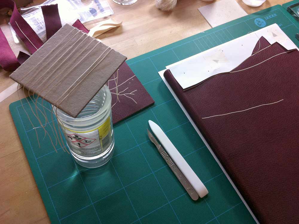
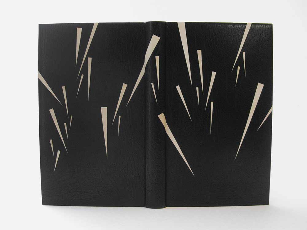
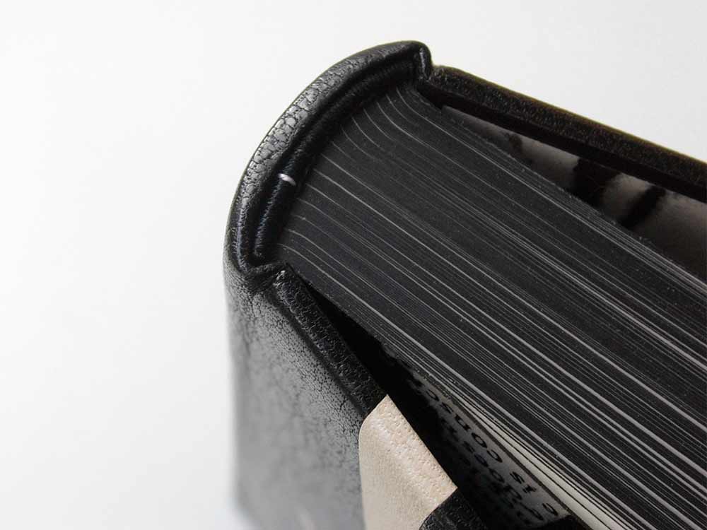
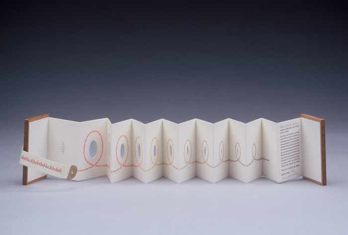
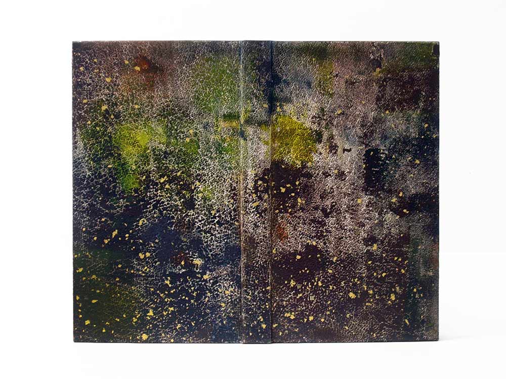
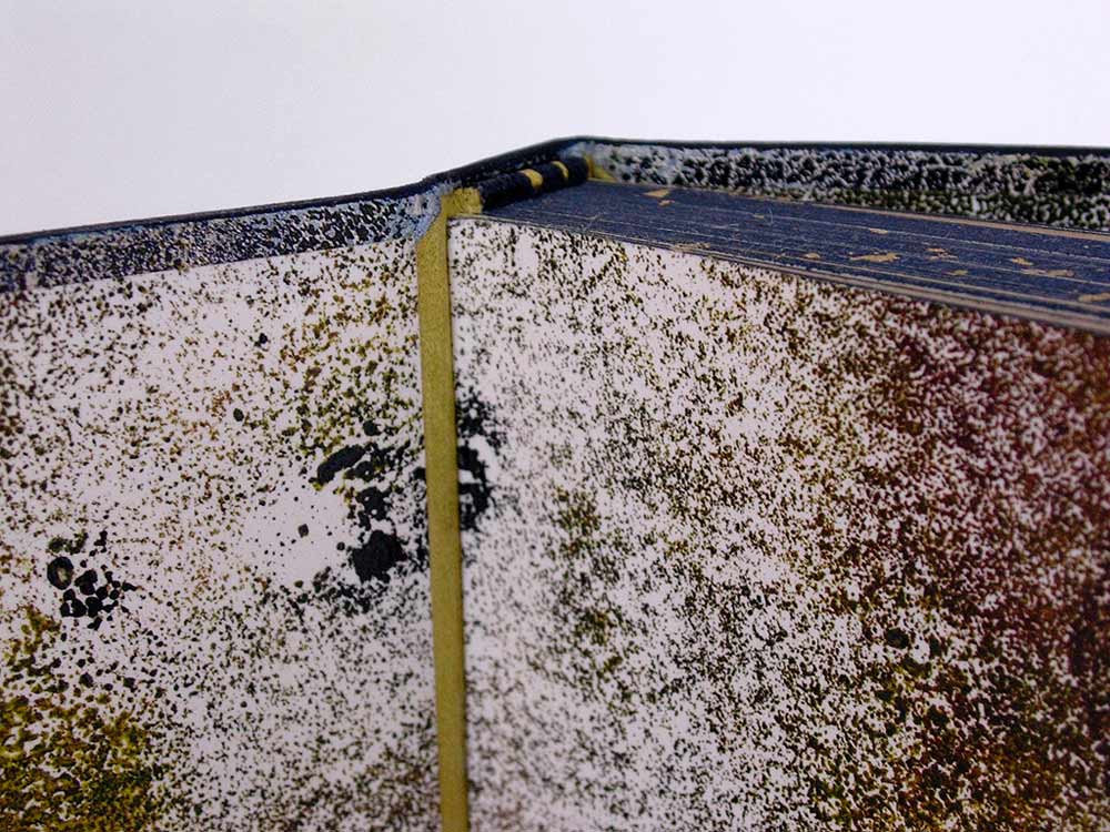
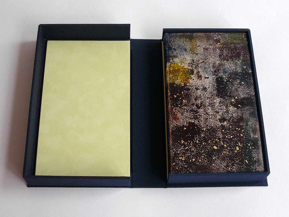
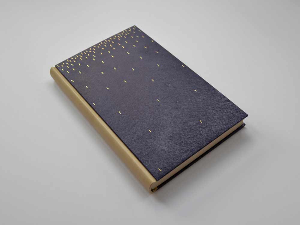
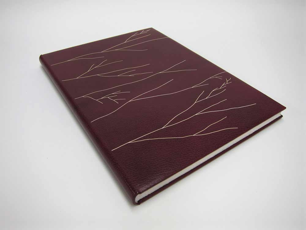
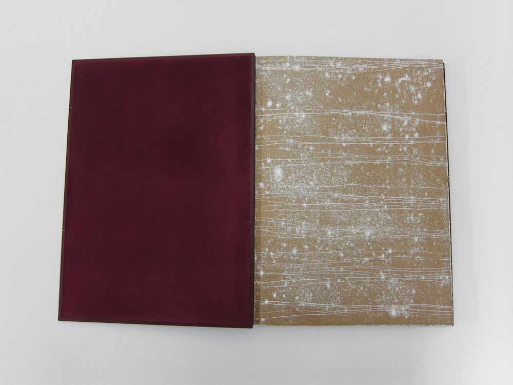
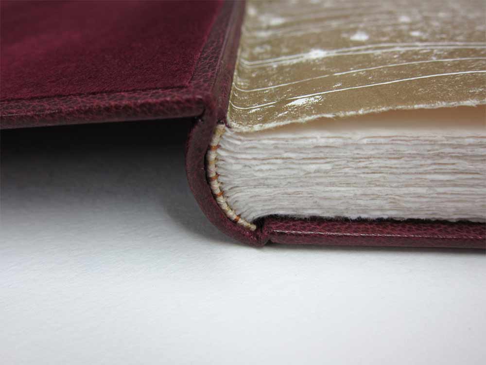
    In 2012, Haein Song bound this copy of Shakespeare’s Romeo and Juliet in full leather maroon goatskin. The delicate linear design was created by applying a series of natural goatskin onlays. The endpapers are monprinted in gold with suede doublures. 

    RomeoAndJuliet3-HaeinSong RomeoAndJuliet2-HaeinSong

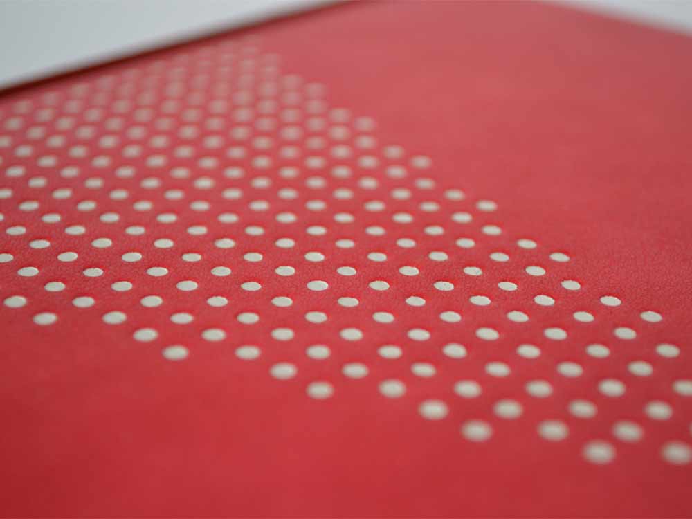
    At first glance, the decorative elements appear to be hand tooled, but those thin lines are actually several onlays. Did you find it difficult to manipulate such delicate and thin pieces of leather?
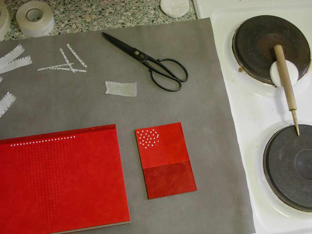
    Leather pieces are paired down very thin (0.2.mm) and I cut them into long lines of a width of 1mm. It isn’t easy to glue the pieces so I put pva and paste mix on the glass surface then lay the piece on top so it can catch the adhesives. Then with a help of scalpel and tweezers I lay them on the the cover of the book based on my design. I think the idea of doing it seems more challenging than actually executing it. Once you are used to the thinness and longness of the piece it become a little bit like a drawing tool. And when I was laying down the pieces I had a feeling that I was drawing with a leather.

    RomeoAndJulietOnlays-HaeinSong


  2. Book Artist of the Month: Diane Jacobs

    February 17, 2014 by Erin Fletcher

    Nourish1-DianeJacobs

    Housed in an elegantly crafted bamboo box are a series of prints under the title Nourish. This unique artist book was created by book artist Diane Jacobs in 2012. The book explores both the natural and man-made systems in which we as humans depend on in our daily lives. As you advance through the book, these complex systems are displayed within a delicate balance of beauty and harshness. 

    Nourish5-DianeJacobs Nourish2-DianeJacobs Nourish3-DianeJacobs Nourish4-DianeJacobs

    This is such a beautiful artist book and is quite complex with the range of materials. The illustrations are so delicately printed; I especially love the ghost image on the reverse. The structure is so flawless, can you talk about the choices you made for how the prints would be housed and read?
    My goals were to investigate color, play with the transparency of gorgeous Gampi paper, wow the viewer with complex reduction prints, and engage with the viewer to ask questions and think more deeply about the interconnectedness of all living things and the state of the environment. At first I thought the book would be bound but soon realized it needed to be free and every folio needed to be opened twice (or four times in the case of the starling murmuration). I wanted the box to collapse and this took a lot of ingenuity by Mark Burdon. The clincher was relinquishing the idea of purchasing a prefab hinge. Once we realized we had to design it, it came more quickly.

    Watch the video below to see how the book unfolds.


  3. Bookbinder of the Month: Haein Song

    February 16, 2014 by Erin Fletcher

    TheTrial1-HaeinSong

    The striking design on this fine binding of The Trial by Franz Kafka was created by the talented Haein Song in 2011. This Folio Society edition is covered in full black goatskin with reverse pared natural goatskin onlays. Keeping in fashion with her other bindings, the endpapers are hand printed and sit opposite a leather joint. 

    TheTrial2-HaeinSong

    The head edge and tail edge of the text block are decorated with black acrylic, leaving the whiteness of the paper on the fore edge exposed. Breaking up the edge decoration like this can be very interesting for the overall concept of the design and I think Haein is really playful in this area of the book. 

    TheTrial4-HaeinSong TheTrial3-HaeinSong

    You’ve created design bindings for some prominent authors such as Camus, Kafka and Kipling. Do you have an affinity for these authors? Do you plan to bind more of their works?
    I’m an admirer of few authors, which include Beckett, Camus, Kafka, Borges, Pessoa, Calvino, Kundera, Perec, Hesse and Carroll. I’m also very fond of playwriters associated with The Theatre of the Absurd. Whenever I have an urge and space I look for some of those authors’ books and I have few waiting to be bound. How I came to bookbinding is from the love of reading and interest in language. I don’t think it was easy for me to acquire a second language after being a grown-up so my love is mixed with the frustration I had to go through. And some of the authors I mentioned above express what I want to say through their books eloquently, articulately and poetically.


  4. Book Artist of the Month: Diane Jacobs

    February 10, 2014 by Erin Fletcher

    WovenUndergarments-DianeJacobs

    Over a three year period, Diane Jacobs, compiled a list of slang and derogatory words used to exploit women. Sources for this list came from friends, family, strangers and several slang dictionaries. The words were set individually out of type and letterpress printed. These printed strips were then used to weave women’s undergarments and hats offering references to women’s craft, the body and our misogynist culture. 

    WovenUndergarments2-DianeJacobs

    This work has been exhibited at the Gallery Paule Anglim in San Francisco and the Hoffman Gallery at Oregon College of Art & Craft.

    WovenUndergarments3-DianeJacobs WovenUndergarments4-DianeJacobs

    I think it’s important to distinguish that a word can be ingested as either derogatory or empowering based on the context of the situation. I think your Woven Paper Undergarment series is teetering towards empowerment; allowing the woman to be in control and wear these words with confidence and pride. Can you talk about your overall concept behind this work?
    I am really glad you feel that way. I started this body of work after an experience I had in a Bart station in San Francisco right after being at a Gorilla Girls event. A man asked me for a quarter and I gave it to him. He said “thanks honey” and I said “ don’t call me honey” and he flew out of control calling me every name in the book. After that I picked up a dictionary on slang and derogatory words. I painstakingly hand-set many many words for this body of work. The words lost their negative power and I reclaimed them.


  5. Bookbinder of the Month: Haein Song

    February 9, 2014 by Erin Fletcher

    JustSoStories-HaeinSong

    This Folio Society edition of Just So Stories by Rudyard Kipling was bound by Haein Song in 2010. Bound in the Bradel binding structure, the spine is covered in reverse goatskin. The front and back boards are covered in hand dyed goatskin. The geometric pattern is tooled in white. The monoprinted endpapers sit opposite a leather joint. 

    JustSoStories3-HaeinSong JustSoStories-Tooling-HaeinSong

    Haein shared this image showing the the tooling in-progress. I love how clean and organized her space looks, a perfect calm environment for tooling.

    JustSoStories4-HaeinSong

    I choose to feature this binding because I’m such a proponent of using a single color to create sublty in design. Sometimes the simplest ideas can create the most extraordinary pieces of art. Using reverse goatskin for the spine creates not only a deeper red, but introduces a change in texture. For this binding, you utilize the Bradel binding, which allows you to create the exterior in three parts. Is there a fondess to this structure that you find supports your design sense more than a full leather binding?
    I like what Bill Evans, an American pianist and composer, said about that – “The simple things, the essences, are the great things, but our way of expressing them can be incredibly complex.” I’m attracted to the very essential and elemental quality of seemingly simple forms like dots, lines, squares and circles.

    When it comes to the structure I don’t think I prefer a bradel binding to a full leather binding – both have different qualities and attractions. But as you’ve mentioned a bradel bindings can provide simple design solution by changing materials or colours and there is a something architectural about that. I used a bradel binding for this book precisely because of that reason.


  6. Conservation Conversations // Lab Coat Daydreams, Part II

    February 6, 2014 by Anna Shepard

    Something I have been thinking about a lot lately, as I while away hours at the bench, is the question of accessibility, specifically within the context of conservation. Recently there was a big hullaballoo at the H when a young woman, who fashioned herself as a “performing artist,” kissed a statue, smearing her dark lipstick across its pristine marble face. For this grand act of vandalism, she was fined a great sum and was required to spend an hour or so touring our conservation lab to get a feel for how complex and careful the work that goes into preserving books and flat paper objects actually is. Clearly the act is not socially acceptable and I think this young woman knew better than to leave such a noticeable mark on a statue, but it made me question the ways in which we are encouraged to engage with beauty and the ways in which we are not. Is there a right and a wrong way to experience beauty? Without proposing anything all that anarchical, I would like to address the parts of my work that break my heart and those that give a greater feeling of purposefulness.

    anna-part2a

    I was discussing the statue-kissing incident with a good friend and she pointed out that there is an element of embarrassment in the situation that I had not thought of before. As she understood it, the fact that the young woman performed a passionate act, a very active response to the beauty she was encountering, was the root of the evil. She was selfish in her act because it was an uninhibited response that many of us might have liked to perform ourselves if we only felt so free as to do so. It is this recognition of an unharnessed human response to beauty that makes the act inappropriate. In some ways I completely agree with this logic and it makes me consider the role of any museum or gallery space in exposing us to historically important and beautiful cultural relics and new forms of expression. On the other hand, if we all went around touching oil paintings and leafing through the most delicate books, they wouldn’t be around for long for us to enjoy. 

    Much of the work I have been doing lately deals directly with this same issue. I have been working with a book conservator to iron out the wrinkles in a “permanent” library exhibit–the main issue being that most of the books currently on exhibit have been sitting in their display cradles for five plus years. The continual stress on the bindings, in addition to the damage from light exposure to the displayed pages, is now something needing immediate attention. I wonder if it will make any difference to the visiting public that many of the books and original documents will be scans and facsimiles of the originals? Will they perceive this stand-in for what it is and be disappointed or will they be oblivious of the switch? One of the unique perks of working in a conservation lab is that we handle some very interesting and valuable pieces with our bare hands (well-washed, of course) and, though it is possible to gain access to virtually all of our collection by applying to be a scholar, I still wish that everyone could hold these rare books close enough to smell their paper and feel the smooth leather and frayed cloth with their own hands and it’s that part of my work that troubles me the most.

    anna-part2b

    The privilege of having such intimate experiences with these books and paper objects is the great joy of those working in the field and much of what we do in the lab is done solely for the purpose of making items more available and ready for use. The questions of functionality and usefulness and the longevity of an item are things that must be taken into consideration when dealing with each individually. It is that question: whether to change the structure of something to allow for greater access or to preserve it for undisturbed, safe keeping, that calls us to employ the keenest discernment. Being able to share these pieces of history and culture are what make it all worth while.


  7. Book Artist of the Month: Diane Jacobs

    February 3, 2014 by Erin Fletcher

    TheBlackHole-DianeJacobs

    The Black Hole is an intimate miniature accordion that explores the personal issues one may feel about body hair and so of, course it includes a surprise hairball at the end. The accordion can be read on either side and is letterpress printed with wooden covers and a parchment strap. This artist book was created in an edition of 45 by Diane Jacobs back in 2003. 

    TheBlackHole2-DianeJacobs

    In your work, you demonstrate the versatility of hair as a medium by forming hairballs, felted shapes and using full locks of hair to loose strands. Do you enjoy manipulating hair one way more than another?
    I love to roll my own hair into balls. It is very easy because of it being curly and relatively fine. But I discovered that I can pretty much roll anyone’s hair into a ball. I like comparing different hair color and texture in the ball form. I like the association of a hairball being something else when put in a different context such as the hairballs in the gum ball machine. I also enjoy weaving hair in the combs to spell out words.

    HairChart-DianeJacobs Tails-DianeJacobs Combs-DianeJacobs

    I noticed you only use hair with natural color. Do you avoid artificially colored hair for a reason?
    I am sure some of the hair I use is dyed. Personally I have always liked the natural  color of someone’s hair. I have used a bit of blue hair but that has been the only really artificially colored hair I have in my massive collection.


  8. Bookbinder of the Month: Haein Song

    February 2, 2014 by Erin Fletcher

    Whistler-HaeinSong

    The design on this full leather binding from Haein Song really transforms the material to mimic a textured painted canvas. Haein bound this copy of Whistler by Haldane Macfall in 2009. Sprinkled on top of the hand colored natural goatskin are flecks of gold leaf. The title is also tooled in gold on the front cover. If you click on the image above, you can see the title on the front cover toward the tail. I spotted the “H” first. Happy hunting. 

    The endpaper and matching panel doublures are monoprinted and sit opposite a leather joint. The edges are decorated with blue and brown acrylic pigment and sprinkled with gold leaf. 

    Whistler2-HaeinSongWhistler3-HaeinSong

    There seems to be quite an influence from Mark Cockram in the design of this binding. I can tell you were a student of his. The decoration on the leather has such a painterly quality to it, can you talk about your technique for achieving this affect?
    Do you think so? That is quite interesting as I haven’t thought in that way. Mark’s teaching involved structures, materials, tools and many tips from his experience except aesthetics. He thought, I believe, everyone has different aesthetics. But I suppose what you see influences how you express.

    Few Whistler’s paintings were on display at Tate Britain when I started this book. I remember walking around feeling his paintings titled Nocturne. I wanted to convey that feeling to the cover. Back then I was trying simple but different dyeing and printing technique. How it was achieved was simply rolling few different chosen (or mixed) relief inks onto the glass surface then lay the leather on top and rub it. Endpapers were made in similar way. There is a little bit of trial and error until you get the desirable outcomes. Also depending on the amount of inks and pressure you can achieve a very different look. Whistler was very much interested in Japanese prints. To finish I used a technique called Sunago (Japanese technique in woodblock printmaking, which involves sprinkled or scattered gold leaf) to reflect that.


  9. February // Book Artist of the Month: Diane Jacobs

    February 2, 2014 by Erin Fletcher

    HairTalk3-DianeJacobs

    Hair Talk is a three volume artist book set that was created by Diane Jacobs over the course of three years from 2009 to 2011. The structure is inspired from a binding by Roberta Lavadour, except in this case, Diane binds the series in human hair. The content within each book are the collected replies to a set of questions, where an individual wrote about their feelings regarding their own hair. 

    The books are letterpress printed and bound with covers made from Cave Paper. 

    HairTalk2-DianeJacobs

    When binding this book with human hair, did you find the material to be tricky to work with or did you treat the hair first (like a bookbinder would wax their thread)?
    I learned this binding from Roberta Lavadour. It is a twine binding technique that she invented. Instead of twine I used human hair and transparent thread that resembles hair. Each folio is a set of four questions, so in order for that particular person’s responses to stay together I needed to sew each folio individually into the spine. With Roberta’s book, she would sew a thick signature with each twine line. I did not treat the hair with anything. It was a little tricky, but do able.

    The way a person chooses to wear and style their hair can suggest a lot about them, whether these connotations be positive or negative. What did you hope to extract from this survey and what did you find to be surprising?
    I was surprised that more people did not want to trade their hair in for different hair. The majority of people wanted to keep their hair. My questions were not about style (that would have been interesting) they were:            
    Question 1: Describe your hair (color, texture, body, length…)
    Question 2: What don’t you like about your hair?
    Question 3: What do you like about your hair?
    Question 4: Would you trade your hair in for different hair? If so, what would it be?

    HairTalk4-DianeJacobs HairTalk5-DianeJacobsHairTalk-DianeJacobs

    Diane’s work is intriguing and thought provoking. She is driven by the language that inhabits issues surrounding women, racism, equality and other social issues. Her work spans over several mediums from artist books and sculptures to prints and two-dimensional pieces. This month long interview will cover some of Diane’s artist books plus a few additional pieces I found to be relevant to my set of questions. 

    See the interview after the jump and come back each Monday during the month of February for more posts on the work of Diane Jacobs. She discusses her materials and inspirations sources such as feminism and nature. 

    read more >


  10. February // Bookbinder of the Month: Haein Song

    February 1, 2014 by Erin Fletcher

    MythOfSisyphus-HaeinSong

    This beautiful binding of The Myth of Sisyphus and Other Essays by Albert Camus was crafted in 2013 by Haein Song. Bound as a Bradel binding, the spine is covered in a natural goatskin with dark blue vellum covers. The sprinkled dashes on the covers are hand tooled in gold. The spectacular endpapers are hand printed. 

    MythOfSisyphus2-HaeinSongMythOfSisyphus3-HaeinSong

    This binding is absolutely stunning and so flawlessly executed. The covers are a beautiful dark blue vellum. Did you find the material difficult to work with in either the structural or tooling aspect of the binding process? I have a single experience with vellum over boards, but I know that bookbinders approach the board construction differently. May I ask if you prepped the boards for the covers in any particular way for the vellum?
    I heard few notorious rumours about vellum but I don’t think I found it difficult at the time I was working on it. Partly because it was a relatively small bradel binding and there wasn’t headcaps or joints. The spine of the book is covered in natural goatskin. 

    What I found afterwards was that the front and back vellum boards sometimes change their shapes depending on the humidity or temperature of the surrounding. But surprisingly it comes back to the original shape after some time. I was told that it needed a little bit of time to climatise.

    Later I was also told that lining vellum with a very thin paper (archival bible paper or Japanese paper) would reduce this changeable characteristic. 

    Tooling wasn’t particularly hard after practising enough on sample boards but I don’t think I have an ample amount of experience to compare differences in tooling on leather or vellum.

    – – – – – – – – – – –

    I have not yet had the pleasure of meeting Haein or been presented the opportunity of viewing her work in person. However, I’ve had her website bookmarked for a while now, checking back from time to time to ogle her work. As I began preparing a list of people to interview this year Haein’s name popped up as a suggestion from Hannah Brown, whom I interviewed at this time last year. So with Hannah’s endorsement and my growing fondness, I present the following interview with Haein Song. The interview ends with Haein’s elegantly worded philosophy on bookbinding. 

    Come back every Sunday during the month of February for more posts on Haein’s work. You don’t want to miss it, Haein shares some of the creative techniques behind her expressive and artistic bindings. 

    read more >


  • My name is Erin Fletcher, owner and bookbinder of Herringbone Bindery in Boston. Flash of the Hand is a space where I share my process and inspirations.
    The StudioNewsletterInstagramEmail me
  • Archives