RSS Feed

‘bookbinding’ Category

  1. Bookbinder of the Month: Karen Hanmer

    December 22, 2013 by Erin Fletcher

    fragmentsofcapri2-karenhanmer

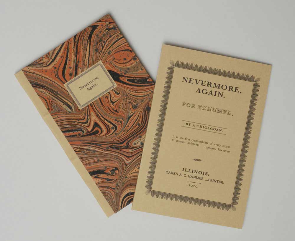
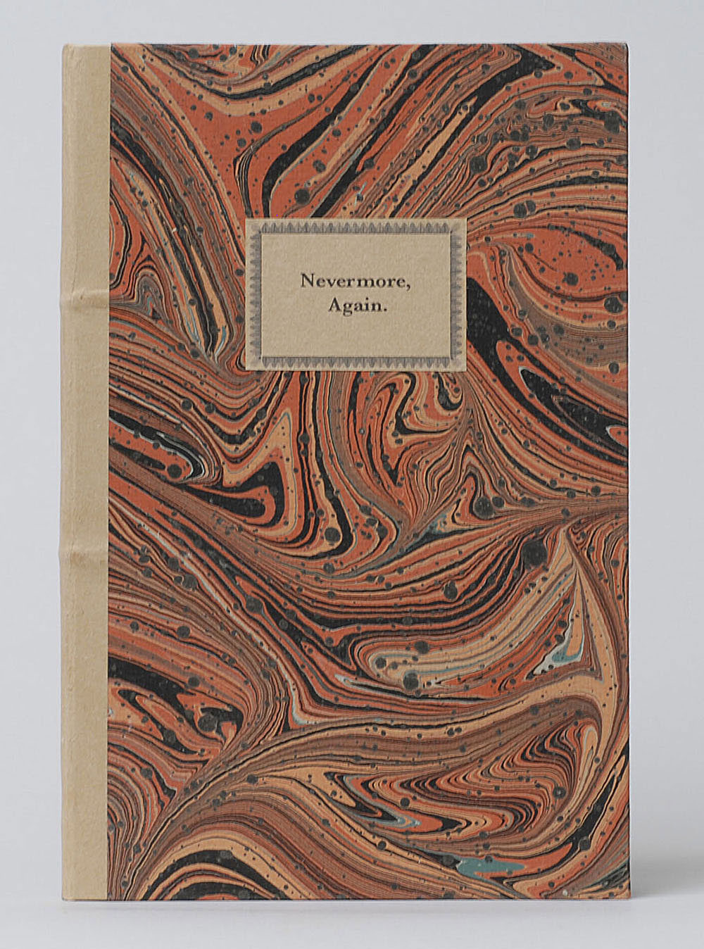
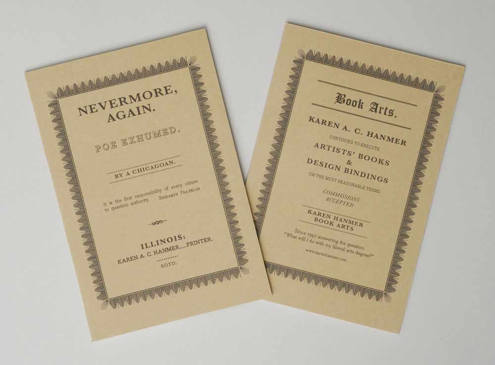
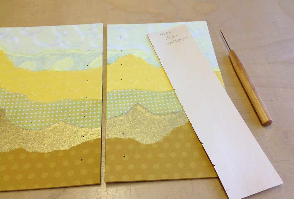
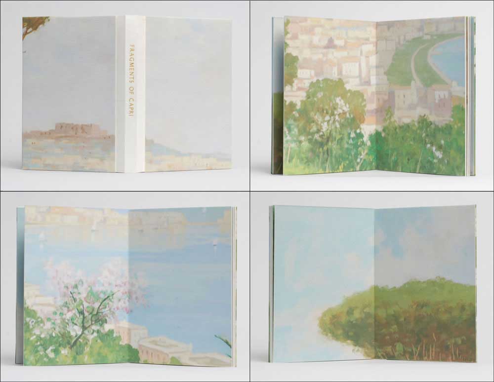
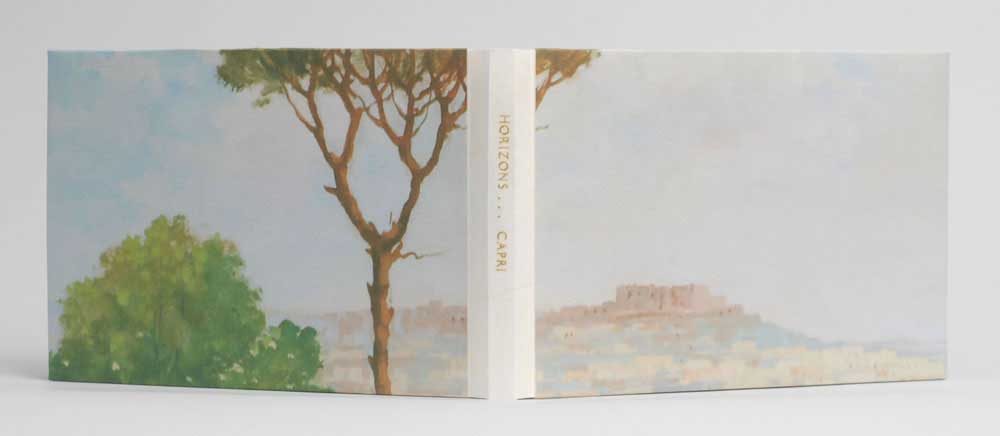
    A painting that hung above the sofa in the childhood home of Karen Hanmer became the inspiration and source material for Fragments of Capri. Taking an object that had become so engrained in the landscape of her surroundings, Karen reproduced the painting full size as several inkjet prints then proceeded to trim the painting down to postcard size pieces.

    fragmentsofcapri1-karenhanmer

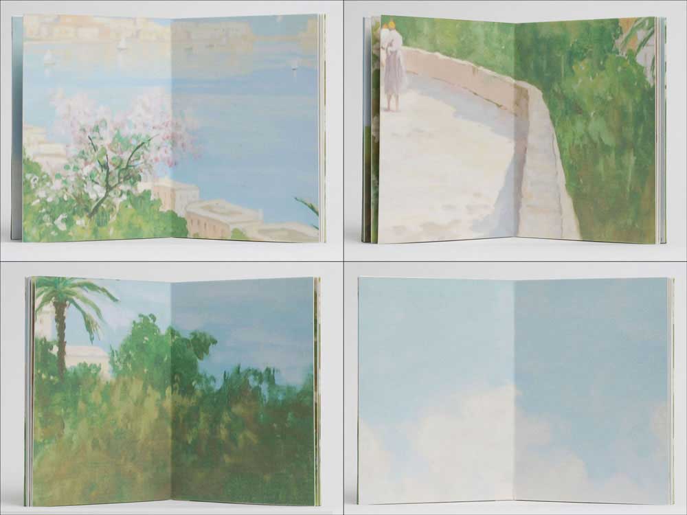
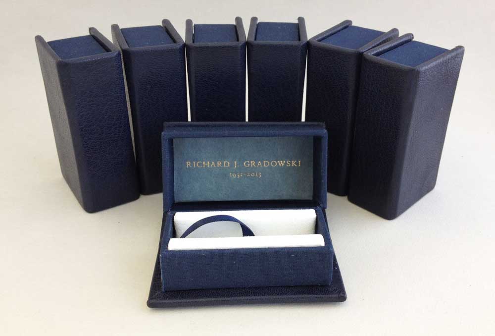
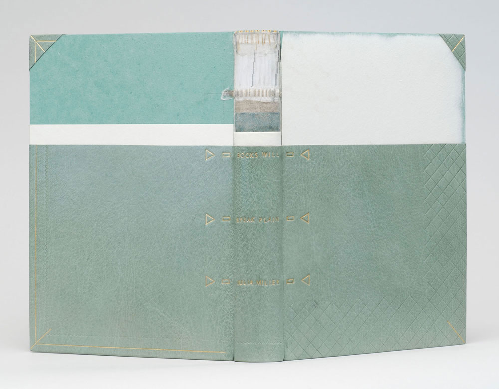
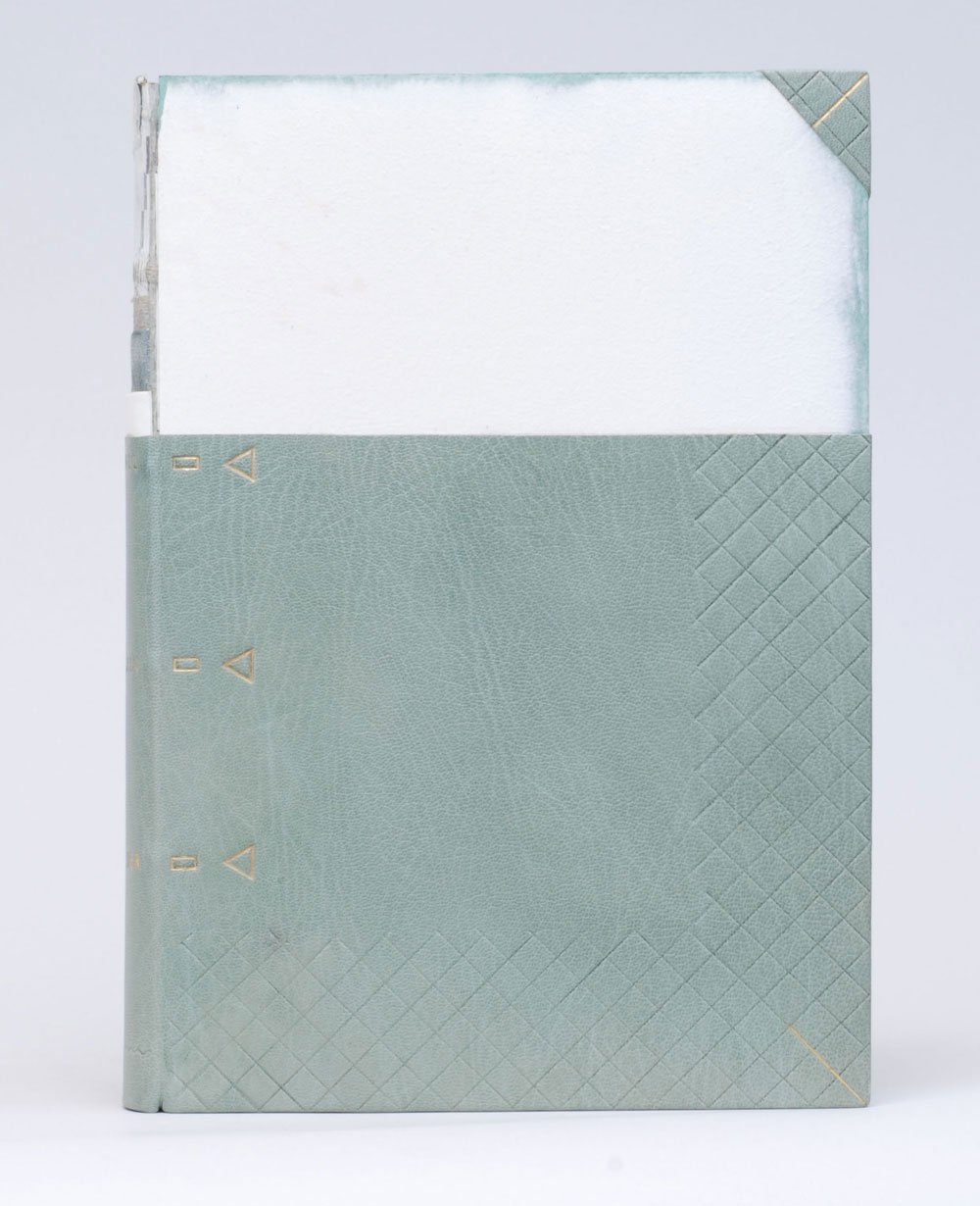
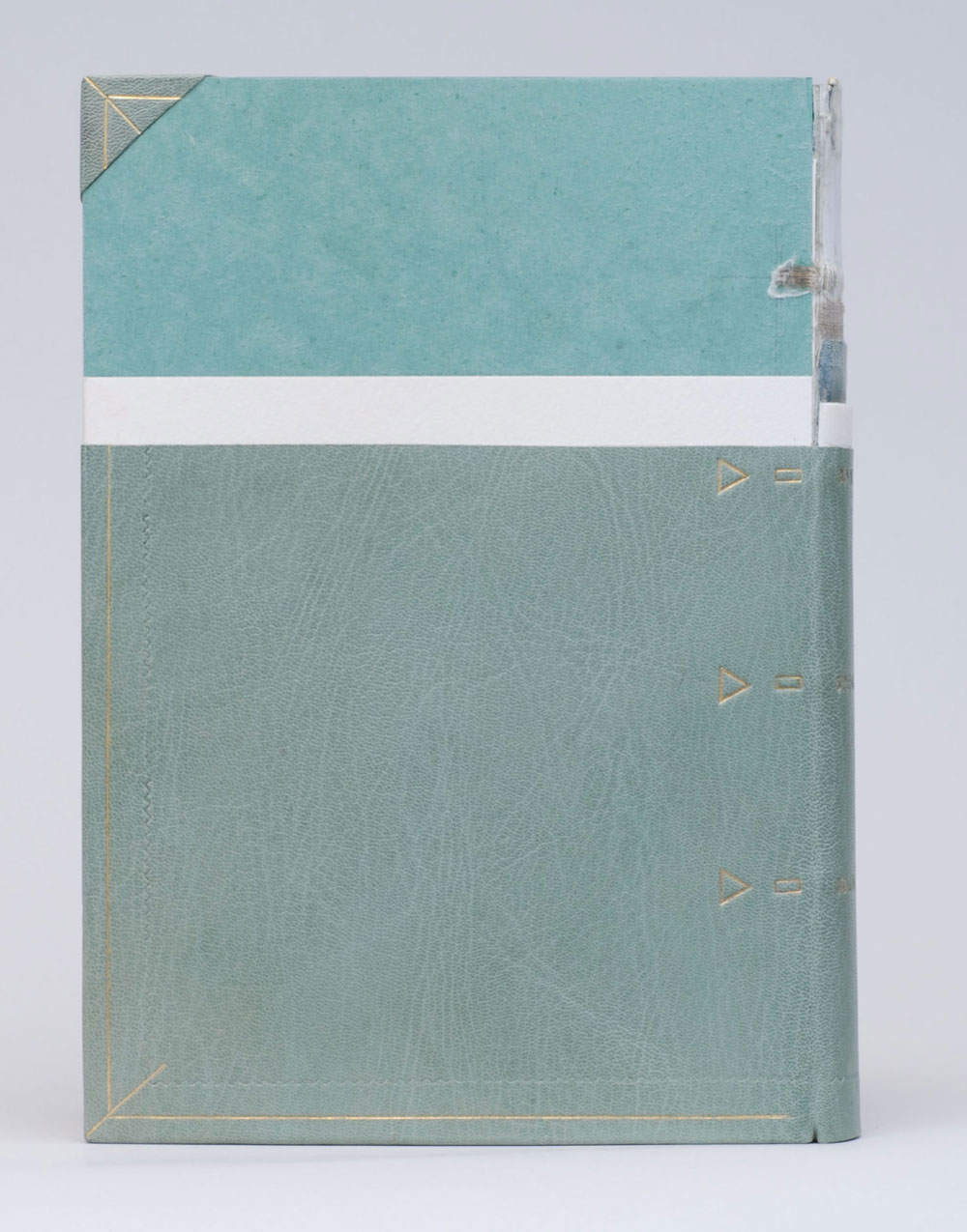
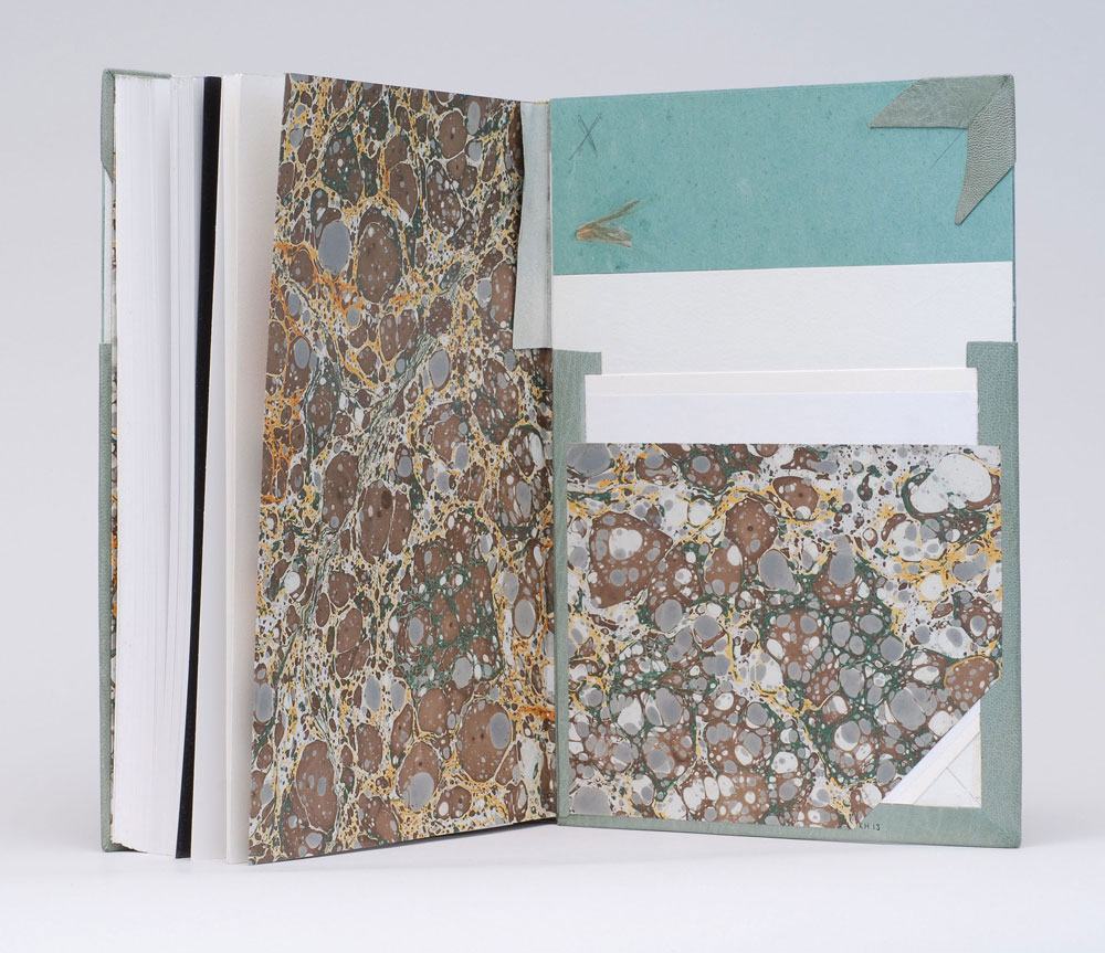
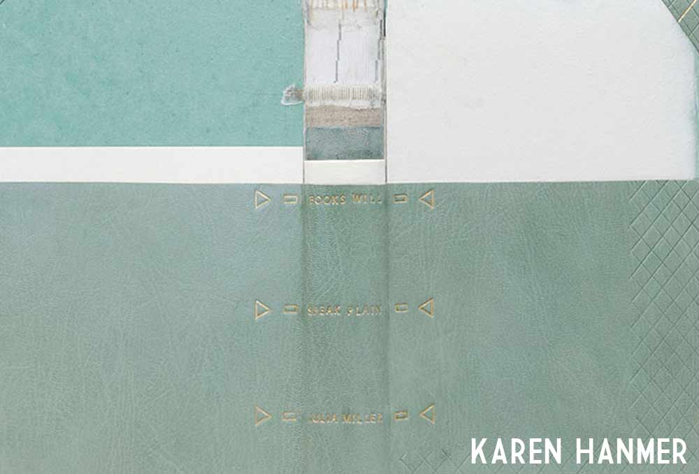
    Bound within the pages of this drum leaf structure the viewer is given a disjointed look at the painting. Although each spread creates an appealing and what appears to be finished painting, a sense of belonging quickly creeps into the narrative. Created in 2011, Fragments of Capri, is an unnumbered edition of 100. Each book is unique in the variation to covers and interior pages. The spine piece is vellum stamped with gold foil.

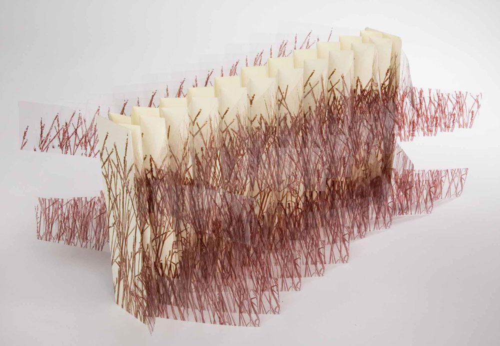
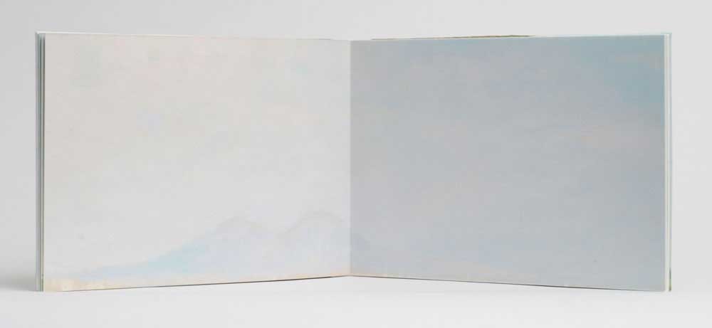
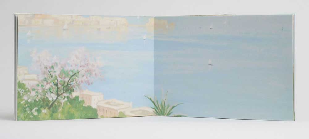
    Horizons… Capri is a similar edition where Karen continues to deconstruct and reformat this familiar painting, further fragmenting our memories of the past.  

    horizons1-karenhanmer

    Bound in the drum leaf structure with a stamped vellum spine piece, Horizons… Capri was also created in 2011 in an unnumbered edition of 30. This artist book is currently on display as part of the Guild of Book Workers traveling exhibition: Horizon

    horizons3-karenhanmer horizons2-karenhanmer

    I love these two books. The soft edges and pastel colors of the painting are beautifully paired with vellum and a touch of gold foil. Did your initial concept include both books or did one stem from the other?
    Before I began binding, I photographed my husband’s family painting hanging above the sofa it was commissioned to match. Ever since, I’d wanted to make something with my family’s painting. I was invited to make a piece for an exhibit where the works would be assembled by the viewer. I thought of a puzzle or maybe a cube constructed from a photo of the painting. That fell through, but then a friend asked for a set of 50 of something to include in his Fluxus-inspired journal. I photographed the painting, color-corrected the file to match the original, inkjet-printed several copies life-size, then cut them into postcard-size pieces.

    Working with these small prints gave me the idea to use the photograph of the painting for books also. I liked the idea of a fragmented walk through the dreamy landscape, and my first idea was to reference a pocket-sized travel-guide. The Guild of Book Workers had announced the theme “Horizon” for their next traveling exhibit, and I realized if I cut the full-size printed photo of the painting into eight long rectangles, each piece would contain an obvious horizon line. I’d been hoping for a chance to use vellum as a spine for a drum leaf or sewn boards edition, and I think the gold stamped title makes the vellum look particularly luminous.


  2. Bookbinder of the Month: Karen Hanmer

    December 15, 2013 by Erin Fletcher

    nevermoredeluxeandstandard-karenhanmer

    Nevermore Again: Poe Exhumed is an artist book from Karen Hanmer presented in multiple bound formats. The content of the work mirrors the tales of Edgar Allen Poe to contemporary economic and political stories. Pictured above on the left is the Deluxe edition which is presented as an early 19th century style publisher’s binding covered in marbled paper by Pamela Smith. The endpapers incorporate the design of the wrapper from the Standard edition, which is pictured above on the right.

    Nevermore Again: Poe Exhumed is offered for purchase in several different formats. Why have you chosen to produce this piece in various editions? Have you found one edition to be more successful over another?
    Nevermore, Again is an artists’ book exploring how current events mirror stories written by Edgar Allan Poe. I could not decide between two structures for the binding, so for the first time, I produced a book in several editions.

    The deluxe edition uses the publishers’ boarded binding I learned from Jeff Peachey. It is historically appropriate for Poe’s era, and I was eager to use this interesting cusp-of-the-industrial-revolution structure in an edition. But as I researched Poe’s bibliography, I became fascinated by Tamerlane and Other Poems, the rare first edition of Poe’s first published work. To make my book more conceptually sound, I decided that in typography, size, and structure the standard edition should be a facsimile of Tamerlane, which was presented in a simple paper wrapper. Olivia Primanis at the Harry Ransom Center sent me detailed measurements of their copy of Tamerlane, and I went to the University of Chicago to examine another in person. The only change I made was sewing through the fold instead of stabbing adjacent to the spine. I wanted my book to open well.

    nevermoredeluxe-karenhanmer nevermorestandard-karenhanmer

    I’m very pleased with the text I wrote for Nevermore, and I wanted it to have readership extending beyond those with a collector’s budget, so I made a laser-printed chapbook version also.

    I’ve sold many chapbook versions, all but one to individuals. The deluxe edition at $450 has sold significantly more copies than the standard at $275. This surprises me, especially because of pressures on institutional budgets, but I realize that Pam Smith’s marbled paper on the deluxe is hard to resist.


  3. Bookbinder of the Month: Karen Hanmer

    December 8, 2013 by Erin Fletcher

    bluestem2-karenhanmer

    The flag book structure has become a reoccurring model in Karen Hanmer’s work. She has quite an eye for transforming flat imagery into interesting movable objects. Bluestem was created in 2006 in a small edition of 25, the work is inspired by Willa Cather’s My Antonia and includes a quote printed on the rear panel.

    bluestem-karenhanmerThe grass imagery is inkjet printed on polyester film and bound on either side of the panels creating a double-sided variation on the flag book structure. As you open and close this book a nice rustle is created by the movement of the pages. It’s quite simple and beautiful. 

    Inspired by the work of Hedi Kyle, you have, on several pieces used the flag book structure. How does this structure best represent your concept?
    Women and Cars by Susan King was among the first artists’ books I saw, and it has remained an inspiration. King’s use of the flag book structure gave me a model for everything I wanted to accomplish when making a non-codex book. It pairs multiple narratives with photographs, can be held in the hand and read like a traditional codex, opens fully enough to look commanding and compelling on exhibit, and gives viewers enough to enjoy that they will not focus on the book being printed digitally if that is an issue for them.

    The Bonefolder chose flag books as the theme for our 2008 online Bind-O-Rama exhibit. Although my previously editioned flag books were quite elaborate with multiple texts and imagery on inside and outside of the spine and boards, Bluestem appeals to my minimalist side. There’s almost nothing there: just a few words of text from Willa Cather’s My Antonia on the rear board and lines representing grass printed on clear polyester film and paper, yet the piece also effectively represents the boundlessness of the prairie.

    destinationmoon-karenhanmerCreated in 2003, Destination Moon, is another simple flag book structure that involves a complex layering of material related to the moon. Archival images pertaining to the Apollo Manned Space Program are on the reverse of John F. Kennedy’s “Man on the Moon” speech in addition to the song lyrics for Roy Alfred and Marvin Fisher’s Destination Moon, about a romantic journey to the moon. 

    destinationmoon2-karenhanmer

    But when the book is fully opened, all the viewer sees is an image of the space shuttle on its way toward the moon.

    destinationmoon3-karenhanmer

    Besides the flag book, Karen has played around in a variety of movable and folded structures. In her work Celestial Navigation, the triangular pages can be held in the hand and read like a traditional book or unfolded to reveal star charts. The structure is quite playful and can be folded into fantastic sculpted shapes. 

    celestialnavigation-karenhanmer

    In Pride Prejudice Passion: Tunnel of Love, Karen appropriately uses the tunnel book structure. This works combines text from the classic romance novel by Jane Austen with images cut from covers of the modern romance novel. As the term suggests, the content can be viewed through the length of the structure, similar to peering down a tunnel. 

    tunneloflove-karenhanmer


  4. Herringbone Bindery Etsy introduces Kits

    December 3, 2013 by Erin Fletcher

    newkits-herringbonebinderyetsy

    Bookbinding kits are now available at the Herringbone Bindery Etsy shop. These particular kits supply the materials and instructions to bind your own blank flatback journal. Each kit includes paste paper made right here in the bindery with five different patterns available. 

    kitmaterials-herringbonebinderyetsy

    KIT INCLUDES: 
    1. 6 signatures for text block
    2. 2 colored endpaper folios
    3. 2 covers and 1 spine piece
    4. 1 piece of bookcloth
    5. 2 sheets of decorative paper
    6. headband material
    7. 1 piece of mull
    8. 1 needle and thread
    9. 1 piece of linen sewing tapes
    10. 1 punching jig
    11. 1 set of instructions

    The instructions were written, designed and illustrated by me. They are easy to follow for any skill level and each page includes helpful drawings to illustrate those more tricky steps.

    See the first 3 pages below: 

    flatbackkit-directions

    – – – –

    flatbackkit-directions3

    – – – – flatbackkit-directions2


  5. My Hand // Bullet Boxes

    December 3, 2013 by Erin Fletcher

    Earlier this year my family experienced the passing of Richard Gradowski, known by me and my cousins as Dzia which is Polish for Grandpa. My Dzia loved so many things in life and his passions created lasting relationships that touched so many lives. First was his love for Polka music both as an avid listener and talented musician on the harmonica and accordion. I remember hearing the cheerful rhythm of Polka music softly playing from the antique wooden radio in the kitchen upon each visit. 

    Secondly, my Dzia loved ducks, particularly mallards and loons. Seated at his work bench, my Dzia would carefully carve out the shape of each duck from a block of wood and hand paint each detail with superb skill and patience. These sculptures were scattered throughout the house and even gifted to my mother and aunts. 

    Lastly, my Dzia engaged in any material regarding WWII. His interest in war, no doubt came from his experience in the 1950s during the Korean War; where he was stationed at a United States Air Force base in DC as part of the motor vehicle squadron. As my family lay his body to rest, a military salute commenced. My mother was given seven casings from the volleys fired. One casing was meant for my Nana, while the remaining six would be given to her children. To honor the memory of my Dzia, I created a clamshell box to safely house each casing. 

    bulletboxes7-erinfletcher

    These are, by far, the tiniest clamshell boxes I’ve ever constructed. Using a thin binder’s board the pieces were carefully measured and cut down using the spring gauge on the board shear. 

    bulletboxes1-erinfletcher

    The boxes were constructed just like a standard sized clamshell box, except the interior tray has four walls instead of three. The trays are covered in navy Cialux bookcloth

    bulletboxes2-erinfletcherbulletboxes4-erinfletcher

    I wanted the casing to be surrounded by a soft material with plenty of padding. After laminating a few pieces of binder’s board to Volara foam, I tightly wrapped the padding with bright white Ultrasuede. The interior tray was lined with Ultrasuede as well and the pads lined both long walls. A piece of satin ribbon attached to the backside of the thicker pad allows for easy removal of the casing. 

    bulletboxes5-erinfletcher

    The case is covered in a matching navy Harmatan goatskin. The exterior tray is lined with blue Hahnemühle Ingres and stamped in gold foil with my Dzia’s name and the year of his birth and death.

    bulletboxes8-erinfletcher

    Each box was handed out during my family’s Thanksgiving celebration. Sadly, my husband and I could not attend this year for the feast and festivities, but my cousins Meg and Gina sent me some wonderful pictures of the casing sitting snugly in its clamshell box.

    bulletboxes9-erinfletcher


  6. December // Bookbinder of the Month: Karen Hanmer

    December 1, 2013 by Erin Fletcher

    booksspeakplain1-karenhanmer

    The Midwest Chapter of the Guild of Book Workers recently revealed the exhibitors for a traveling exhibition called Plainly Spoken, which celebrates Books Will Speak Plain, a comprehensive survey of historical bindings by Julia Miller. Amongst the highly skilled and wide variety of bindings is a cutaway model by Karen Hanmer

    Karen bound her copy of Books Will Speak Plain as a traditional fine binding, sewn on flattened cords with laced-in boards. Partially covered in a beautiful light blue goatskin, otherwise hidden elements of the structure stay visible in this cutaway model. Tooling is done in blind and 23kt. gold foil to emphasize the location of sewing supports and lacing-on in addition to turn-ins, fills, sanding of the boards and formation of corners. The use of tooling as both an aesthetic treatment and as visual aid is just brilliant!

    booksspeakplain2-karenhanmerbooksspeakplain4-karenhanmer

    Although the book may appear to be incomplete, it includes all the necessary details that make a book a fine binding. The headbands are hand sewn using silk thread and the head edge is sponged with acrylic inks and sprinkled with gold leaf. The inside continues with the cutaway theme showing off the leather hinge, marbled paper endpapers, fills and corners. 

    booksspeakplain5-karenhanmer

    How did you approach this cutaway binding? Did you study Mark Esser’s models at the University of Iowa?
    I’ve made a lot of partially-finished models. They’re useful for teaching and help me remember process. But cutaways are something different since they appear unfinished and fully complete at the same time. Peter Verheyen has loaned me his springback cutaways several times, and I used them for reference when making my first cutaways. I’d admired Mark Esser’s two cutaway fine bindings in the University of Iowa’s online collection for a long time and was able to spend time with them on two trips to Iowa City this spring.

    I was able to use my design binding on Books Will Speak Plain twice this fall: for both an online exhibit of cutaways, and in a traveling set book exhibition. For the latter I added tooling to reference the binding process: the sewing supports and lacing, the turn-ins and fills, and the board-shaping.

    – – – – 

    The online exhibit that Karen mentioned above, is an annual themed exhibit held by the Book Arts Web called Bind-O-Rama. For 2013, the theme was historical cutaway models. The online exhibit can be viewed here

    Although I don’t know Karen very well (yet), she’s been incredibly sweet and supportive of my work. I first met Karen at her bindery in Glenview, Illinois. My friend, Anna, and I were in town for an exhibition at the Chicago Public Library; where both Karen and I had bindings on display. Since then I’ve kept in touch with Karen, leaning on her from time to time when I needed help. 

    I’ve had two opportunities to watch her work, which is quite fun. Once when she came to North Bennet Street School to teach us the flag book structure and most recently during the Standards of Excellence 2013 conference in Washington, DC. I hope to have more opportunities like this in the future. 

    After the jump is a wonderfully thoughtful interview with Karen, where she shares her experiences with bookbinding, teaching and marketing. Come back each Sunday during the month of December for more in-depth posts on Karen’s work in the field of bookbinding and artist books. 

    read more >


  7. Tutorial: Top Secret Belgian Binding

    November 19, 2013 by Erin Fletcher

    secretbelgian1-erinfletcher

    The Secret Belgian binding is just one of many structures on my long list models to make. With the aid of a tutorial posted on the BookArtsWeb tutorial and references page, I was on my way to checking this structure off my list. Unfortunately the link seems to be broken now. However, within this post you’ll find my instructions, which are very comprehensive and any skill level can complete this simple structure in a matter of hours. So let’s get started*:

    *This tutorial is for a modified version I’m calling the Top Secret Belgian. This version of the structure is sewn differently and extra steps are taken to hide the interior thread. If you are looking for more instructional content, I have a growing list of tutorials and I also teach live workshops in-person and online. Check out my list of Upcoming Workshops.

    MATERIALS: 
    – binder’s board for 2 covers and 1 spine piece
    – decorative paper
    – paper to line covers and spine piece (aka paste downs)
    – colored thread
    – text block (3-5 signatures, about 3-4 folios each)
    – PVA
    – wax

    TOOLS: 
    – needle
    – bone folder
    – glue brush
    – scalpel (preferably with curved blade)
    – x-acto
    – scissors
    – pencil
    – triangle
    – awl
    – dividers (optional)

    STEP ONE: 
    For this tutorial I bound a copy of The Yellow Wallpaper by Charlotte Perkins Gilman. My inspiration for the covers came at the moment in the story when the main character begins to tear away the maddening yellow wallpaper in a desperate attempt to relieve her agony and pain. Whatever you choose as your text block, whether it be a short story, poetry or blank pages, prepare those now and fold to their final size.

    From the text block, measure the height of the signature and add about 5-7mm. Measure the width of the folded signature and add about 3-4mm. This will determine the dimension of the covers with added squares.

    The height of the spine piece will be the same as the covers. The width is determined by the thickness of your text block. Pinch the text block about 20mm from the spine, measure the flared out signatures. Add 2mm to this measure to find the width of the spine piece.

    MY MEASUREMENTS:
    text block height: 201mm
    text block width: 121mm
    text block thickness: 10mm

    cover height: 208mm
    cover width: 125mm

    spine piece height: 208mm
    spine piece width: 12mm

    Cut down the decorative paper to include excess for turn-ins (about 20mm, less for the spine piece). Cut down the paper for the paste downs, allowing a 3mm margin on all sides. Glue up the decorative paper and cover both boards and spine piece.

    secretbelgian2-erinfletcher

    Trim out the inside of the covers, so the turn-ins are even and straight. This can be done quickly with a set of dividers. Simple measure out the desired distance, lightly score a line along all four sides. Trim off excess along scored guideline with an x-acto or scalpel. Tear away the excess by pulling toward the edge of the cover.

    secretbelgian3-erinfletcher

    Glue down the paste down onto the spine piece and set aside under weight to dry.

    STEP TWO:
    Prepare a jig for punching holes into the covers. The holes should be evenly spaced along the height of the covers allowing for a fair amount of sewing stations. Using an awl punch the holes 16mm from the spine edge. The needle on the awl should have a continuous gauge and not be graduated. This way all of the holes are the same size.

    secretbelgian4-erinfletcher read more >


  8. Coming Soon: Karen Hanmer

    November 12, 2013 by Erin Fletcher

    hanmerpreview

    Beginning in December, interviews will be back starting with the wonderfully talented Karen Hanmer. Come back on the first of December for the interview. Throughout the month, I’ll be featuring Karen’s work and asking her a brief question about each piece. 

    I received a lot of intriguing suggestions for future interviews from past interviewees. So stay tuned each month for more thoughtful and in-depth interviews with bookbinders, book artists and more. 


  9. New Items in the Herringbone Bindery Etsy Shop

    November 6, 2013 by Erin Fletcher

    newetsyitems

    For the past few months, I’ve had a Nag Hammadi model sitting on my bench, provoking me. I finally found the time to sit down, examine and recreate the model (which belonged to my lovely friend Anna). This particular binding is based off one of the mid-fourth century bindings, which were unearthed from an urn near the town of Nag Hammadi in 1945; the structure was quite simple to construct. 

    For my Etsy shop I’ve created a simpler version by leaving out the cartonnage and papyrus, while incorporating bright buffalo and goat skin. These blank journals are filled with kraft paper and are quite suitable for the traveler and homebody alike. The image below displays all the pieces that come together to make the binding.

    nag-etsyall

    The journals are bound in soft and supple leather. In addition to the wrap-around tie, there are ties at the head and tail to keep your pages safe and secure. Journals are available in a five different color choices, from sea foam green with red accents to…

    nag-red nag-redopen

    mauve with maroon accents. See them all at the Herringbone Bindery shop!

    nag-maroon


  10. My Hand // Field Book of Western Wild Flowers: Part Three

    October 31, 2013 by Erin Fletcher

    wildflowers12-erinfletcher

    Part One can be read here
    Part Two can be read here

    I need to backtrack a bit. Part two ends with the covering of the matching leather doublures. The remainder of the design elements that are going to be explained in this post were applied before the doublures were pasted down. Part two has been revised accordingly. 

    The final steps to completing the design included the addition of a gold border and the title. In the early stages of designing the cover, I wanted to create the gold border through surfacing gilding. Which would have been done before covering because I didn’t want to risk getting gold leaf on the embroidery stitches. However, after a few tests I decided my supply of gold leaf was too yellow against the dusty pink buffalo skin. The border was therefore painted onto the leather with a fluid acrylic pigment. This is the same technique I used on the fine binding for The Songlines

    The title has been tooled with handle letters in the typeface Gill Sans. Buffalo can often feel spongy under the tool and requires slightly more pressure to achieve a crisp impression. I’ve found that buffalo will not blind in the same manner as other animal skins and can be a bit more finicky to tool. So with a bit more patience, the title was gilt in gold leaf one letter at a time. 

    wildflowers13-erinfletcher

    With the completion of the binding, I was set to make a custom clamshell box. The box reflects the binding in terms of color and design. The spine of the box is covered in matching leather that has also been embroidered. The design is derived from an illustration in the book and includes similar onlays from the book’s cover. The stem was embroidered freehand and Margaret Armstrong’s name has been hand tooled with gold leaf. 

    wildflowers14-erinfletcher

    The trays are covered and lined with the same handmade paper from Katie MacGregor that are used as the endpapers in the binding. The rest of the case and joint are covered in brown Canapetta bookcloth. A layer of Volara foam was added to the outer tray as protection for the embroidered stitches. 

    wildflowers11-erinfletcher

    I am really pleased with my first attempt at an embroidered leather binding. I plan to continue experiments with this technique, as well as incorporate other sewn elements. I recently had the opportunity to showcase this binding at the Standards of Excellence Conference in Washington, DC. Through the ‘Mix & Mingle’ event, I got the chance to speak with and meet many new bookbinders while discussing my binding on top of receiving wonderful compliments and suggestions. 

    wildflowers10-erinfletcher

    Finished binding next to clamshell box.

    wildflowers9-erinfletcher

    Side profile. Detail of edge decoration and hand-sewn headband.


  • My name is Erin Fletcher, owner and bookbinder of Herringbone Bindery in Boston. Flash of the Hand is a space where I share my process and inspirations.
    The StudioNewsletterInstagramEmail me
  • Archives