RSS Feed

‘bookbinding’ Category

  1. My Hand // Field Book of Western Wild Flowers: Part Two

    October 15, 2013 by Erin Fletcher

    wildflowers4-erinfletcher

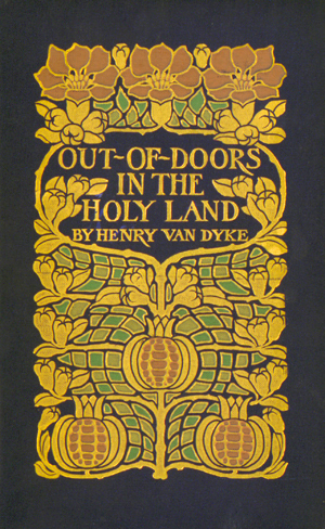
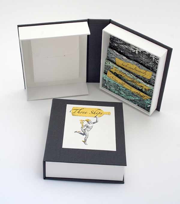
    If you missed part one, you can find it here.

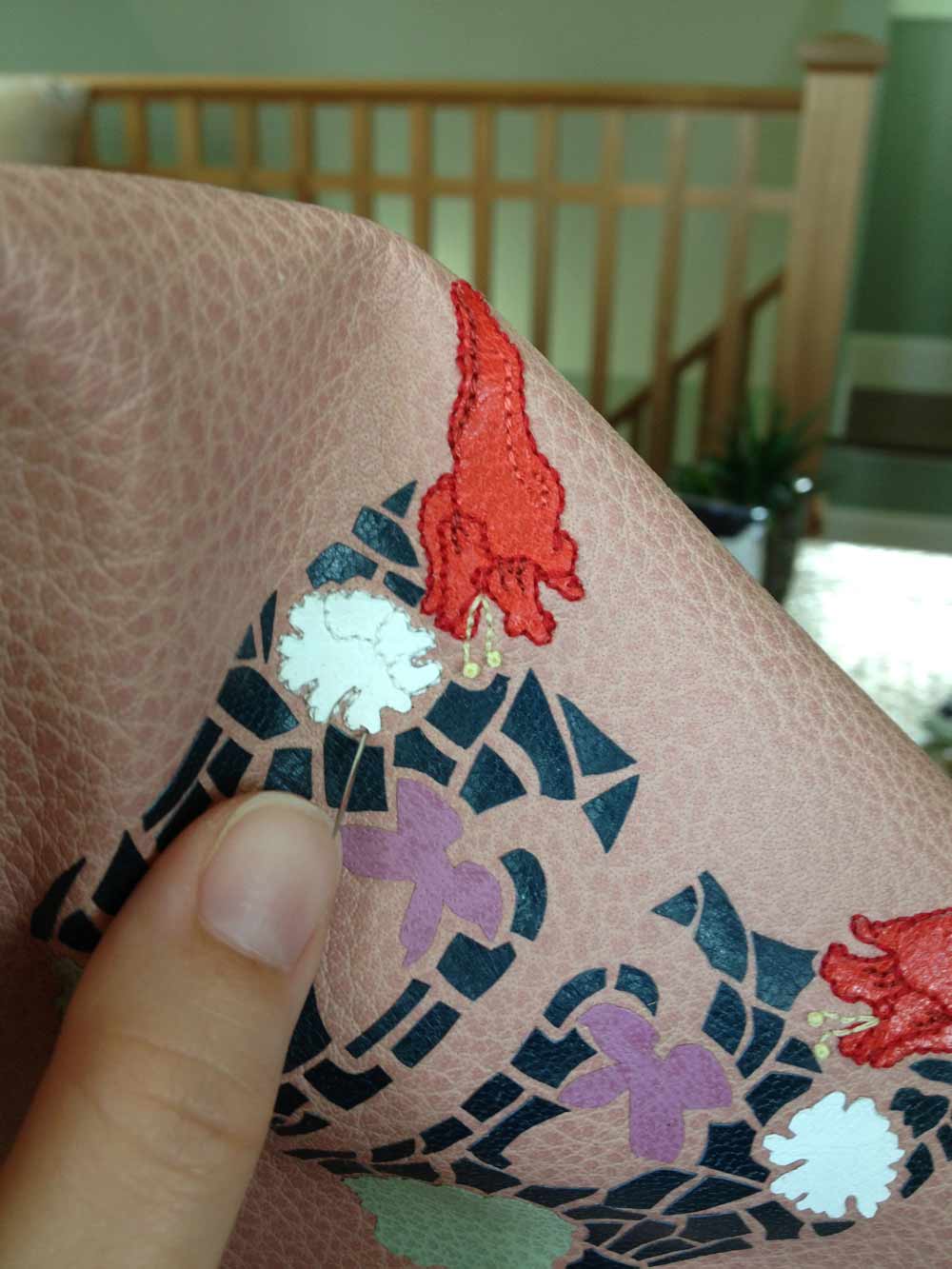
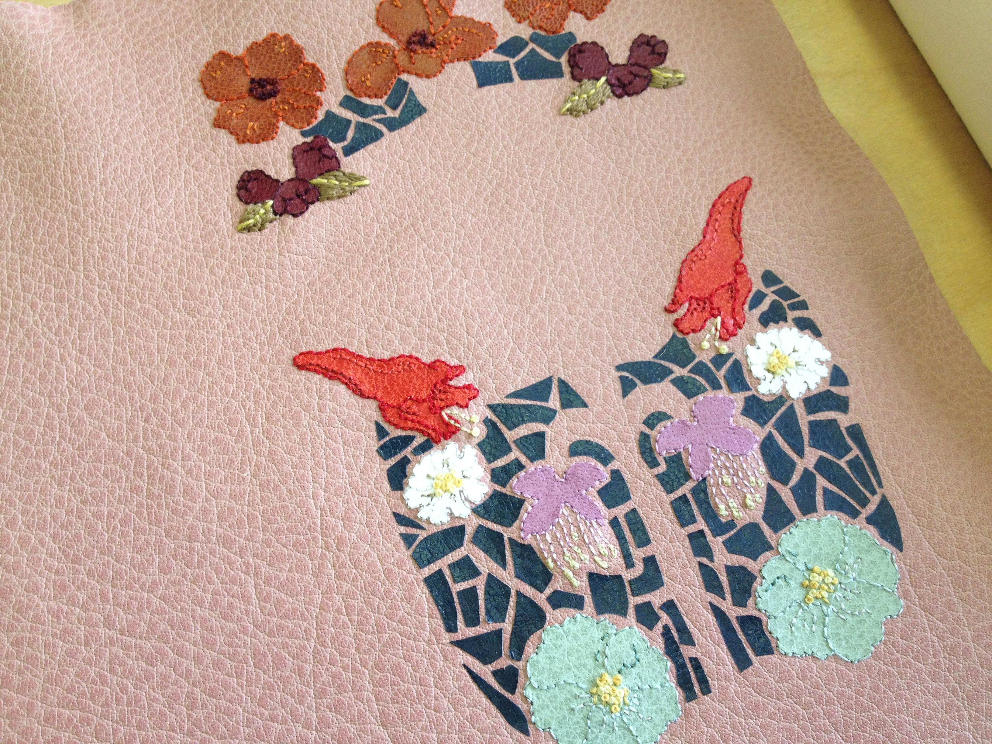
    After hours of embroidery work, I was finally ready to cover the binding. The book itself had been removed from its original case binding, taken apart signature by signature and resewn. Once rounded and backed with boards attached, the edges were ploughed and sanded down in preparation for edge decoration. At this point, I had been filling in for Jeff Altepeter at North Bennet Street School and conveniently the students already had everything set up for edge decoration and gilding. I spent the day perfecting the edge, experimenting with the application of gouache through various brushes and sponges. Finishing off the edge with the sprinkling of gold leaf. 

    The hand sewn double-core French headbands came next. I love sewing my headbands in an asymmetrical pattern and by extracting colors from the binding. Sadly, I didn’t take any in-progress photos of these two steps, but you can see hints of the edge and headband in some of the images to follow. 

    Now, back to covering. 

    wildflowers5-erinfletcher

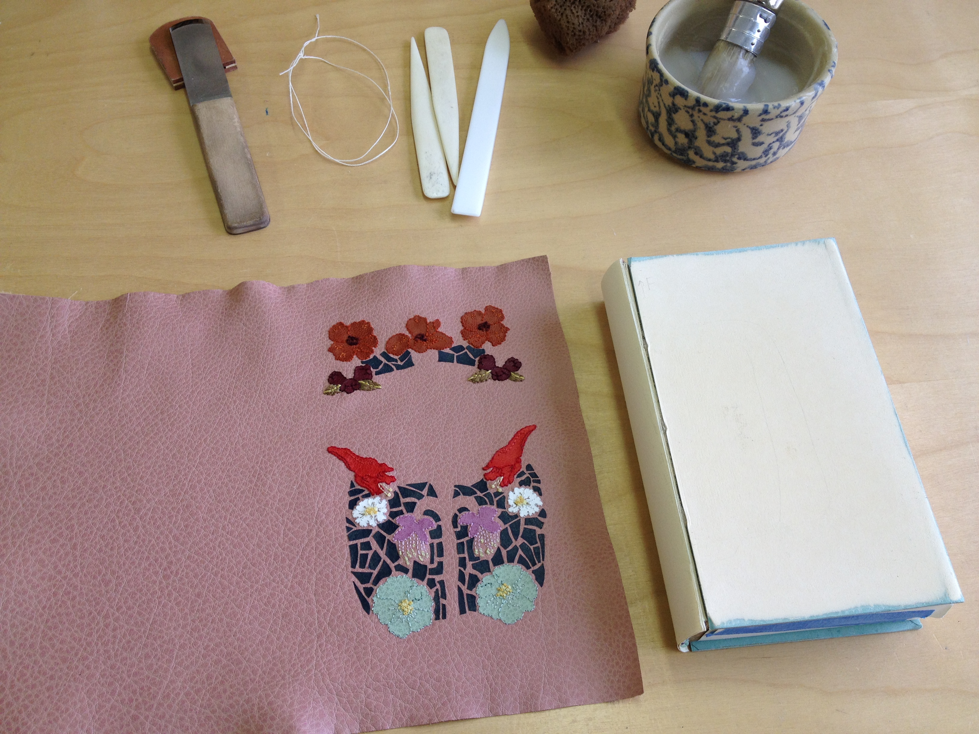
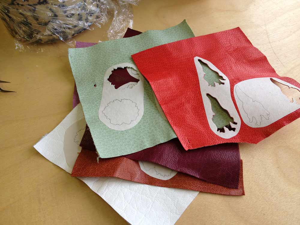
    After applying a healthy dose of wheat starch paste, the embroidered leather was wrapped around the binding, being folded and tucked and squished into place. The leather had expanded after paring more than expected, so covering became difficult to keep the shape of the design within the confines of the board. 

    wildflowers6-erinfletcher

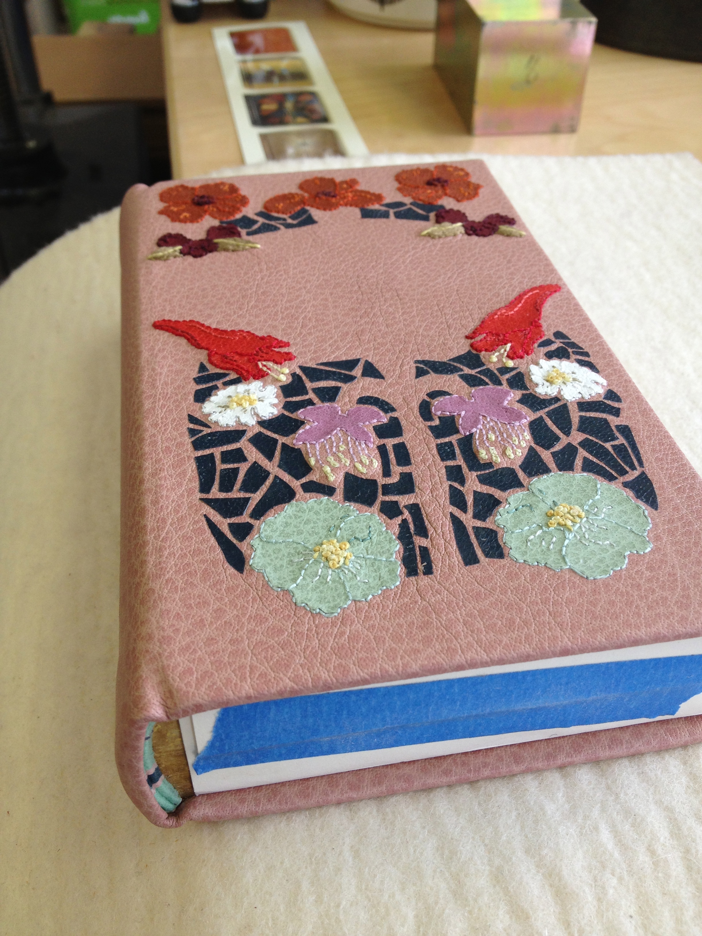
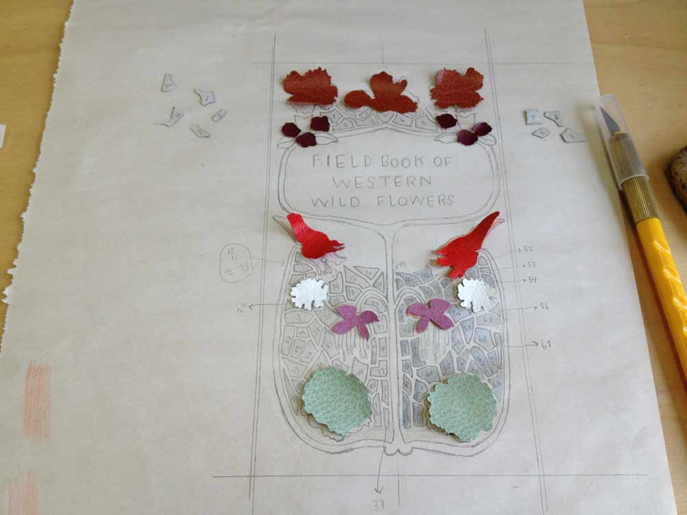
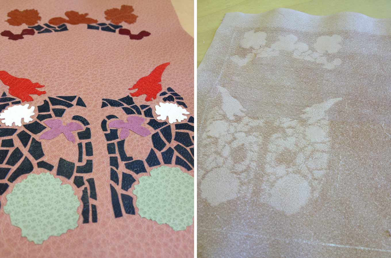
    The covered binding was put to rest under control weight between a bed of felt and acrylic boards. The next day I eased open the boards. Once the finishing design elements were added to the front cover I was able to line the inside of the boards and joint with matching edge to edge leather doublures. The handmade paper fly leaves are a perfect color match and came to me by happenstance from papermaker Katie MacGregor at Standards last year. 

    wildflowers8-erinfletcher

    Part three coming next week…


  2. My Hand // Field Book of Western Wild Flowers: Part One

    October 8, 2013 by Erin Fletcher

    During my first year at North Bennet Street School, I stumbled upon this underrepresented category of bookbindings referred to quite accurately as embroidered bindings. Embroidery has been an interest and hobby of mine since I was a child. My research into this style of binding led me as far as Cyril Davenport’s Book of English Embroidered Bookbindings, which is one of a handful of books written solely on embroidered bindings. 

    From my research, I set out to create an embroidered binding using similar materials and techniques. I bound The Crucible in 2011. The overall layout and imagery on the covers are inspired by traditional outlines and iconography seen in historical embroidered bindings. The Crucible was a success (landing me Best Binding from the OBMI Chicago Public Library Exhibition) and ever since embroidery has been a technique that I’ve been wanting to translate onto a fine binding.

    Entering for the first time to the most recent Society of Bookbinders International Competition, I decided to bind a copy of Margaret Armstrong’s Field Book of Western Wildflowers. Margaret Armstrong is notable for designing covers for Publishers’ Bindings during the 1920s. As an illustrator, she also enjoyed drawing life-like representations of wild flowers. Margaret published Field Book in 1915, surveying wild flowers throughout the western hemisphere of the United States. The book includes 500 black and white illustrations and 48 colored plates. For the design of my fine binding I wanted to capture Margaret’s fame as a designer and skill as an illustrator. The cover on my fine binding is inspired by Margaret’s design for Henry Van Dyke’s Out of Doors in the Holy Land.

    07.04

    Beginning with a detailed sketch of the cover design, I labeled each onlay with a number and color. Each flower is taken directly from one of Margaret’s illustrations. The onlay leather ranged from goatskin to buffalo, the colors chosen to best represent the natural color of that specific species of flower. The leather was pared down to almost nothing, the illustrations were then pasted down to the leather and carefully cut out.

    wildflowers-erinfletcher

    I carefully arranged each piece of leather onto the sketch as a means to keep order to the mounting onlays, which came out to a total of 93 itty bitty pieces.

    wildflowers1-erinfletcher

    I cut down the base leather to it’s final size, I chose a dusty pink buffalo skin both for it’s soft, muted color and texture. I glued down each onlay one by one with PVA, pressing it between acrylic boards as I went. Once the onlays were in place and secured, I pared the entire skin to it’s final thickness. While paring the blade is removing more flesh from the areas with onlays creating a ghost-like silhouette, thus the technique of a back-pared onlay. This allows for a smoother transition between the base leather and the onlay leather.

    wildflowers2-erinfletcher

    At this point, the leather was ready to be embroidered and this became my favorite part. Each flower onlay was outlined with a floss that best matched the color of the leather. Additional colors were chosen to add highlights and shadows. Stitching through leather was surprisingly easy. However, a misguided needle could leave a lasting hole, so it was very important to accurately pierce through the leather. 

    wildflowers3-erinfletcher

     Part Two coming soon… 


  3. Book Artist of the Month: Michelle Ray

    September 30, 2013 by Erin Fletcher

    threeships2-michelleray

    Three Ships was created by Michelle Ray in 2012 as a part of the BookArtObject Edition #4. BookArtObject is an informal group of book artists founded in Australia. The group membership includes book artists from around the globe and use their blog as the platform for discussion and as the arena to make small editions of handmade artists’ books in response to various texts.

    Three Ships is the title of a short story by author Sarah Bodman from her book, An Exercise for Kurt Johannessen. This short story acted as the springboard for Michelle’s artist book of the same name. While Michelle continues to explore this theme of the sea and everything that encompasses that theme, she finds inspiration in the memory of the three life boats from Ernest Shackleton’s Antarctic expedition: Stancomb Wills, Dudley Docker and James Caird, his stash of rare and old Highland malt whiskey, the safety and foolishness of the journey. The book also explores through mnemonic devices this relationship between time, memory and seeing.


    threeships3-michelleray

    The imagery and text are printed using photopolymer plates on Somerest Book papers and museum board, all housed in a sculptural clamshell enclosure. 

    Three Ships is housed in collections at the University of Denver and Vanderbilt University. This work was included in the Gallery Director Exhibition Award, Artists’ Book Cornucopia IV, from the Abecedarian Gallery in Denver.

    threeships-michelleray


  4. Book Artist of the Month: Michelle Ray

    September 23, 2013 by Erin Fletcher

    tocomeuponastreet-michelleray

    During the Standards of Excellence Seminar in 2012, presenter Steve Miller, professor at the University of Alabama brought a fine collection of student work to share with the audience. One of these pieces was To Come Upon a Street, a collaborative artist book between Michelle Ray and poet, AB Gorham. Michelle met AB in her front yard while living in Tuscaloosa. AB is the new Small Craft Advisory Press resident artist as well as Michelle’s neighbor. 

    Bound in a hardcover case is a modified tunnel book on the right and an accordion on the left in an edition of 40. The text is written and designed by AB, while the visual design, printing and binding was completed by Michelle. The images and text are printed using photopolymer plates on machine made and handmade papers. 

    tocomeuponastreet3-michelleray

    The visual content of To Come Upon a Street captures the intimacy of the tunnel book structure through an act of voyeurism. The view is of a lewd street scene, where letterpress “ladies of the evening” echo the four complex stanza written by AB. The visual content is quite appealing despite its crude imagery. It strikes a balance between delicate tenderness and indecency.

    Michelle describes this work as creating a piece that is kitschy yet tender; a celebration of delicate visual smut and witty double entendre.

    To Come Upon a Street is housed in several collections including the Maryland Institute College of Art, The University of Utah and Chapman University in California. You can add this wonderful and humorous artist book to your private collection through Michelle’s Etsy shop: MichelleRayArt.

    tocomeuponastreet2-michelleray


  5. Book Artist of the Month: Michelle Ray

    September 16, 2013 by Erin Fletcher

    admeasure-michelleray

    In 2011, Michelle Ray created this softcover accordion with pamphlet inserts in an edition of 35. Text and images are printed from photopolymer plates and linoleum blocks on handmade and Somerset Book papers. Admeasure is another artist book from Michelle inspired by the sea as well as maritime traditions and regulations. The term admeasure refers to the act of measuring the dimensions and capacity of a vessel for official registration. 

    admeasure5-michellerayadmeasure2-michelleray

    A note from Michelle:
    The act of naming things creates a sense of relative safety at sea. Like the pilot’s verse that guided sailors through dangerous shoals, Admeasure is about gaining a false sense of control through signifiers and ritual that guide one through a world that is largely uncontrollable. This book explores the dialectic tension between the dangerous unknown and measure, rules and tradition. While at sea, measurements, maritime law, navigation aids and other modes of dominance through organization are easily lost to the forces of nature and the psychology of a journey. 

    The content of Admeasure not only draws from Michelle’s own experiences in small boats, but also from a variety of standard journeys in the sea. These included Samuel Taylor Coleridge’s The Rime of the Ancient Mariner, Homer’s Odyssey, and Bas Jan Ader’s In Search of the Miraculous.

    Admeasure is included in a variety of collections ranging from Scripps College in California to the University of Iowa to Atelier Vis-à-Vis in France.  Admeasure is also featured amongst the pages of the recently published 500 Handmade Books Volume 2

    admeasure3-michelleray


  6. Book Artist of the Month: Michelle Ray

    September 9, 2013 by Erin Fletcher

    homeiswhere-michelleray

    In this unique artist book created in 2010, Michelle Ray explores human relationships in the scope of the houseguest. Home is Where I’m Alone Unless I Have Company includes a series of interviews conducted with houseguests capturing feelings on personal and public life, intimacy and human interaction. These interviews are inkjet printed on scrolls encased in a wooden enclosure. This artist book is held at the Mandeville Special Collections Library at the University of California in San Diego.

    A note from Michelle:
    An artist’s book is an ideal medium for conveying the duality of private and public living, as books are democratic objects that live in the public but demand an intimate viewing experience.

    homeiswhere2-michelleray


  7. Free Shipping at Herringbone Bindery on Etsy!

    September 6, 2013 by Erin Fletcher

    readabook-sept6blog

    In the market for a new journal or sketchbook? Need a gift for the writer or artist in your life. Celebrate the Book this weekend at my Herringbone Bindery Etsy shop and receive free shipping on all orders of $10 or more. Just enter code: READABOOK10 at checkout. Have a wonderful and book-worthy weekend.


  8. September // Book Artist of the Month: Michelle Ray

    September 2, 2013 by Erin Fletcher

    godcreatedthesea-michelleray

    As I read the concept behind God Created the Sea and Painted it Blue so We’d Feel Good on it, I am reminded of the Michel Gondry film The Science of Sleep and how we create vessels in the physical world to guide our journeys through our imaginary worlds. In 2013, Michelle Ray used such an experience as the inspiration for her most recent artist book. 

    godcreatedthesea3-michelleray

    Michelle first learned how to use a map while sailing. Out on the sea, where there are no landmarks just an ever-changing landscape.

    As Michelle explains: In reference to the sea, this edition’s text states, “There are no markers in this/ monochromatic/ parking lot.” In the absence of these markers, we become painfully aware of their significance. This work is about experience, perception, memory and the space in between composed of symbol, sound and object. This is the space of mediation, the space where significant things happen; it is the ocean on which my imaginary crew and I sailed­, the place for which there are no maps.

    godcreatedthesea1-michelleraygodcreatedthesea2-michelleray

    Imagery and text have been printed using photopolymer plates on handmade cotton/abaca, French Construction and Neenah Environment papers. The photographs that follow were taken to document the printing and binding processes of God Created the Sea

    godcreatedtheseaprogress-michelleray

    Photopolymer plates on the Vandercook.

    godcreatedtheseaprogress3-michelleray

    Prints laying out on the drying rack. 

    The enclosure is made of linen and basswood. The linen is printed with the image of a whale skeleton along with the title in gold. This piece was produced in an edition of 50 at the Small Craft Advisory Press as Michelle’s creative project in the MFA Book Arts Program for The University of Alabama.

    godcreatedtheseaprogress4-michelleray

    Outer linen cloth wrapper.

    godcreatedtheseaprogress5-michelleray

    Basswood enclosures.

    God Created the Sea is already housed in several collection across the United States and in the United Kingdom. In addition, been awarded Best of Show at the Foundry Art Centre in Missouri and runner-up at The Sheffield International Artist’s Book Exhibition in the UK.

    Michelle is the recent recipient of the Artists’ Book Cornucopia IV Gallery Director’s Exhibition Award presented by the Abecedarian Gallery. This announcement is when I first discovered and fell in love with her work. Although, I’ve never had the pleasure of seeing Michelle’s work in person. Her work is clearly crafted beautifully, balancing rich content and concepts with thoughtfully executed structures. Her work will be featured in a solo Reading Room exhibition from April 18 – June 7, 2014 at the Abecedarian Gallery in Denver, Colorado. Oh, how I hope I find myself in Colorado next spring. Read the interview after the jump and come back each Monday during the month of September for more posts on the work of Michelle Ray.

    read more >


  9. Bonus // Book Artist of the Month: Jody Alexander

    August 26, 2013 by Erin Fletcher

    rubyb1-jodyalexander

    The Odd Volumes of Ruby B. is a 2010 installation from Jody Alexander exhibited at Mark Henderson and Anne Sconberg’s Art Party. This room installation is another great example of how Jody incorporates her book work into larger scale pieces.

    Biography of Ruby B.
    Ruby B. spent the majority of her life living in a single room in a residency hotel. During the day she worked as a secretary, typically took the long way home finding treasures along the way, and spent her evenings using other’s words, pictures and objects to tell her stories.

    She was an armchair philosopher as she commented on life, love, laughter and loss in her copious volumes – for Ruby had removed herself from the kind of life that produced the aforementioned experiences. She left her husband and small children when she found herself in a life that she was simply incapable of living. Ruby made a choice and then she had to live with it, or perhaps it wasn’t a choice at all but something she had to do.

    Ruby has labeled each volume with an odd number hence the title attributed to her life’s work that was only discovered upon her death.

    rubyb2-jodyalexander rubyb3-jodyalexander rubyb4-jodyalexander


  10. Book Artist of the Month: Jody Alexander

    August 26, 2013 by Erin Fletcher

    exposedspines-jodyalexander

    Over the span of a year, Jody Alexander, created a series of altered books under the title Exposed SpinesThis series of work is a celebration of the most beautiful part of the book that is so often covered. Each object is comprised of discarded books, fabric and thread. 

    exposedspines2-jodyalexander

    At the end of the year in 2012, Jody exhibited Preparing for Evanescence at the Cabrillo Art Gallery in Aptos, California. This massive installation combined three different series: Sedimentals, Uphosterables and Suspendables. The Exposed Spines pieces are considered Uphosterables in this installation, although they were created before the concept of this exhibit, they were the catalyst.

    Statement for Preparing for Evanescence at Cabrillo Art Gallery
    Preparing for Evanescence addresses the relative ephemeral nature of humans compared to the belongings that we accumulate, and how we cope with our mortal awareness. The treatment of the objects in this installation exhibits a concern for their well-being, and the caretaker’s need to create and protect in the face of powerlessness and dematerialization. Each possession has been attentively prepared and placed for safekeeping between the folds of fabric, stitches of thread, in the sediment of a household.

    In the final days in this space the caretaker found that he/she was evanescing – or gradually disappearing.  The treatment of objects was as much for their care as it was a necessary process for the caretaker – a busying of the hands, a distraction from the inevitable.  Equal attention has been given to objects of use and sentiment as well as space and time.

    exposedspines4-jodyalexander

    exposedspines3-jodyalexanderpreparingforevanescence2-jodyalexander preparingforevanescence3-jodyalexander


  • My name is Erin Fletcher, owner and bookbinder of Herringbone Bindery in Boston. Flash of the Hand is a space where I share my process and inspirations.
    The StudioNewsletterInstagramEmail me
  • Archives