RSS Feed

Posts Tagged ‘artist books’

  1. Book Artist of the Month: Amy Borezo

    May 29, 2016 by Erin Fletcher

    SomeLines-AmyBorezo

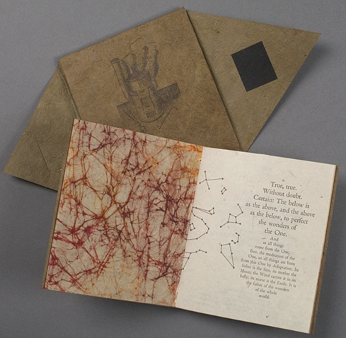
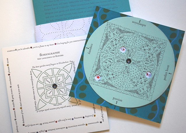
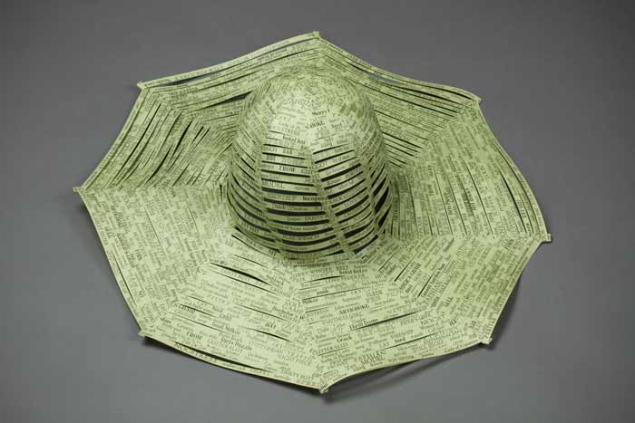
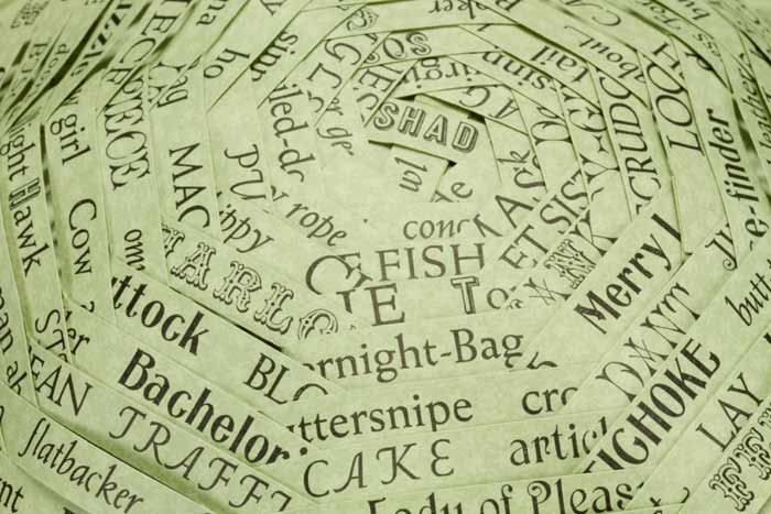
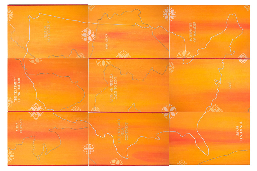
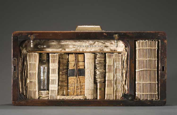
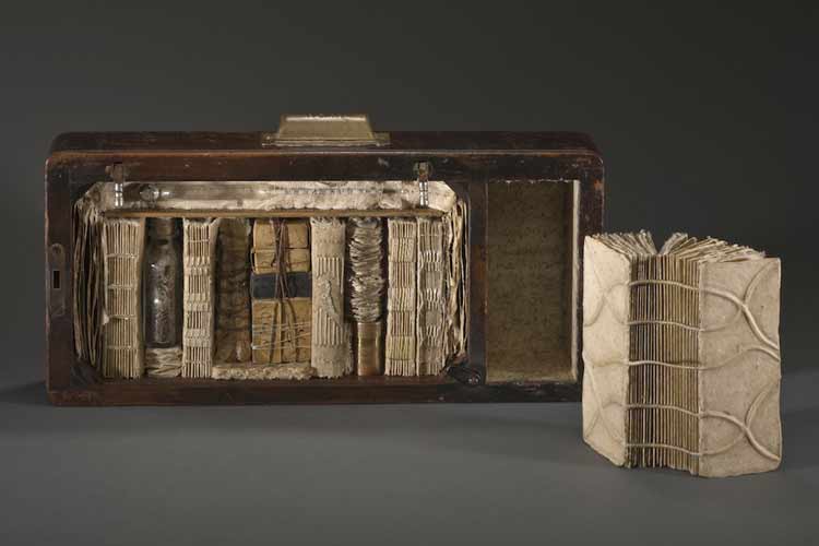
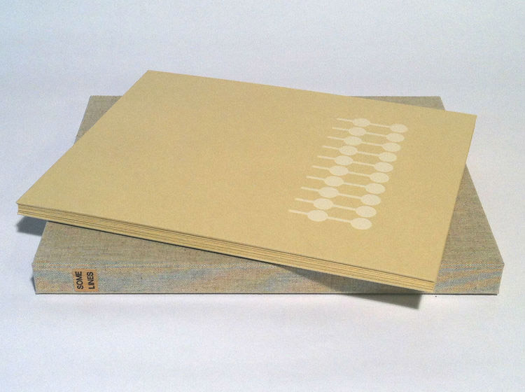
    For the final installment in my month-long interview with Amy Borezo, I am featuring an artist book she made in 2013/14. Some Lines was printed and bound in an edition of 40 copies. The first twenty copies were printed and bound by graduate students at the University of Dallas while Amy was a visiting artist; the remaining twenty copies were printed and bound by Amy with the last 5 copies bound in a deluxe edition.

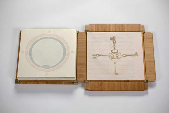
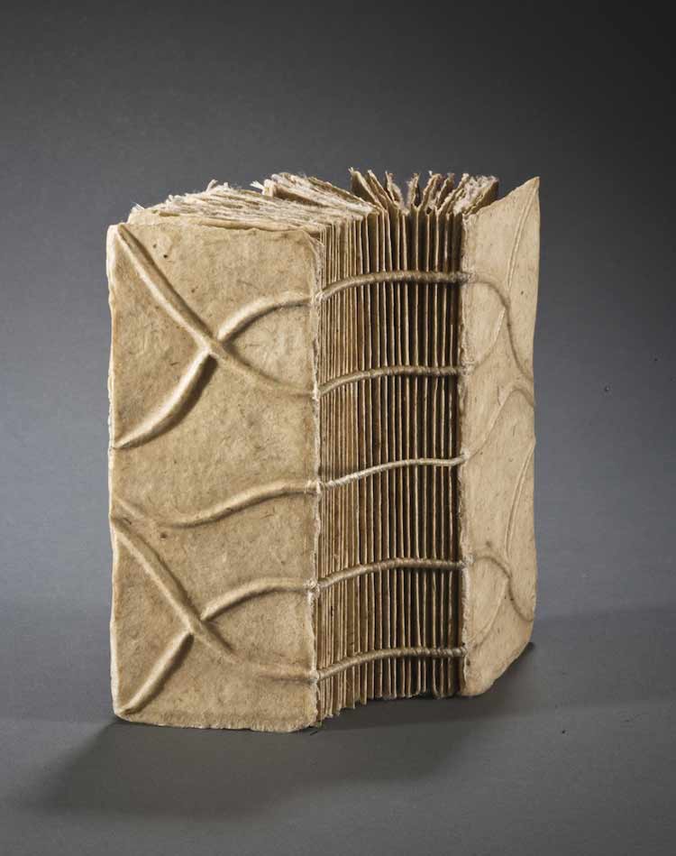
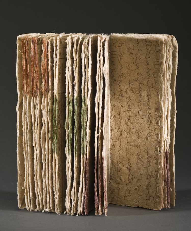
    Some Lines is bound as an accordion binding and housed in a cloth presentation box.

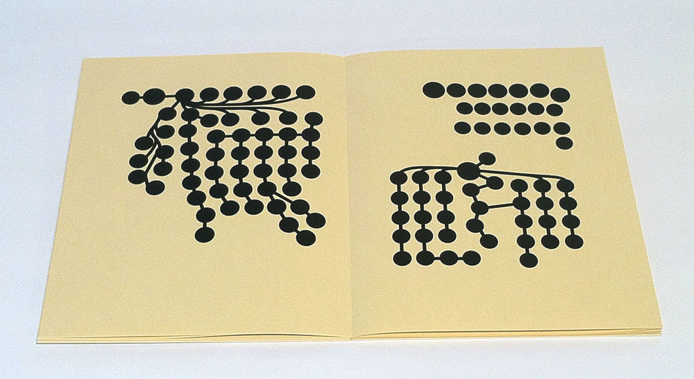
    Something that I enjoy about your work is the complexity behind the clean and simple imagery you employ. Can you talk about the concept behind Some Lines and the swift timeframe in which this book was first printed?
    I was doing research for another artist’s book on Artificial Intelligence. I am interested in distilling complex ideas down into their most basic form. AI is incredibly complex, but most teaching around it starts with Aristotle’s Categories in which he attempts to classify everything into a few simplified categories (substance, bodies, living bodies, animals, man). AI is doing something similar–teaching a computer how to classify everything that can be classified. From Aristotle’s classification system, the first branching tree information diagrams emerged. The Porphyrian Tree is a diagram of Aristotle’s Categories.

    SomeLines1-AmyBorezo

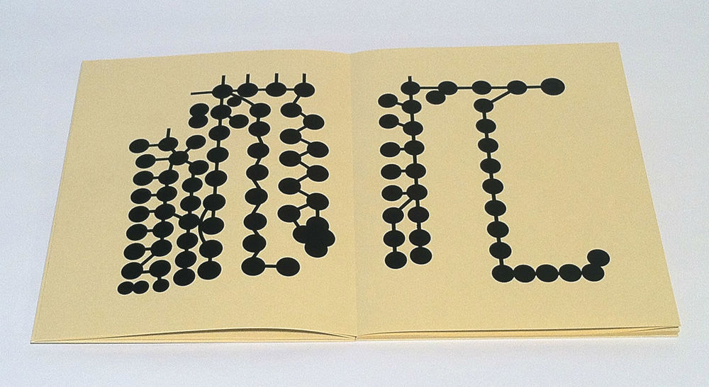
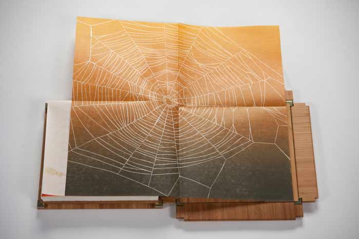
    I worked with the Porphyrian Tree diagram for a while and it wasn’t quite coalescing into a book. In my research I also came across another early branching diagram that showed the geneology of Christ. I was fascinated by this diagram because it contained a narrative within it, a story. I was also interested in how diagrams are often used to represent a viewpoint, not necessarily a fact. Data can be manipulated in its presentation. Those are some of the ideas behind Some Lines. I am also interested in the idea of drawing through time, a concept I explored in Labor/Movement. The roundels in the diagram each represent a person and most are linked by a line to another roundel through either birth or marriage. In this way, the geneology diagram represents a drawing made through generations.

    I designed the book to be printed and bound in an edition of 40 in 4 days during a residency at the University of Dallas. I had graduate students in printmaking helping with the printing and binding. We only ended up completing half of the edition there and I bound the second half in my studio. I didn’t know when designing the book that the University of Dallas is a Catholic university. It was a great experience to create that work there and have discussions with students about the concept.

    SomeLines2-AmyBorezo

    Within the description of Some Lines on your website, you mention an interest in AI (artificial intelligence). With the growing focus and development with AI and virtual reality, I am wondering if you plan to incorporate this topic into a future artist’s book?
    I might go back to AI in another work. I do have a partially finished artist’s book *in my mind* around this concept. But then again, it might be time to move on. I am not sure yet. I am quite interested in science fiction as a genre, as I’ve mentioned before, as I think it’s an extremely useful lens through which to examine the present. I love allegory. But of course, AI is no longer science fiction–it’s already here. Maybe that’s why I am not as interested in it as much right now! There usually needs to be a sense for me that a subject is fresh for examination.


  2. Book Artist of the Month: Roni Gross

    May 5, 2014 by Erin Fletcher

    ZitounaPress-RoniGross

    I See You Everywhere – 2003

    Roni Gross has successfully continued her project Zitouna over the course of 25 years. Twice a year, she creates a limited edition book or broadside which expands on the cultural ideas which emanate from Valentines Day and Halloween. The projects have explored a wide variety of themes from folklore and superstition to wordplay and mythology. 

    As a project that began in 1989, what was your initial inspiration for this ongoing work?
    The Zitouna pieces started as limited edition book-like objects made in honor of Valentines Day and Halloween each year. I chose those holidays because they are secular and thus inclusive. It began by an investigation of the origins of the traditions cross culturally, and then deepened over time to consider the seasons in which they occur – times of death and rebirth. 

    How do you find inspiration as you continue year by year?
    I have found this a very fruitful project that has led me to investigate alchemy, concepts about skeletal understanding throughout the ages, mythology and superstitions, to name a few topics. The deadline is a motivator and I have not yet felt that I am reaching the end of the possible topics for exploration.

    ZitounaPress4-RoniGross

    If Luvin’ You Is Wrong – 2008

    ZitounaPress5-RoniGross

    Alchemy – 2008

    ZitounaPress2-RoniGross

    A Very Valentine – 2010

    ZitounaPress3-RoniGross

    Lover’s Knot – 2009


  3. Book Artist of the Month: Diane Jacobs

    February 17, 2014 by Erin Fletcher

    Nourish1-DianeJacobs

    Housed in an elegantly crafted bamboo box are a series of prints under the title Nourish. This unique artist book was created by book artist Diane Jacobs in 2012. The book explores both the natural and man-made systems in which we as humans depend on in our daily lives. As you advance through the book, these complex systems are displayed within a delicate balance of beauty and harshness. 

    Nourish5-DianeJacobs Nourish2-DianeJacobs Nourish3-DianeJacobs Nourish4-DianeJacobs

    This is such a beautiful artist book and is quite complex with the range of materials. The illustrations are so delicately printed; I especially love the ghost image on the reverse. The structure is so flawless, can you talk about the choices you made for how the prints would be housed and read?
    My goals were to investigate color, play with the transparency of gorgeous Gampi paper, wow the viewer with complex reduction prints, and engage with the viewer to ask questions and think more deeply about the interconnectedness of all living things and the state of the environment. At first I thought the book would be bound but soon realized it needed to be free and every folio needed to be opened twice (or four times in the case of the starling murmuration). I wanted the box to collapse and this took a lot of ingenuity by Mark Burdon. The clincher was relinquishing the idea of purchasing a prefab hinge. Once we realized we had to design it, it came more quickly.

    Watch the video below to see how the book unfolds.


  4. Book Artist of the Month: Diane Jacobs

    February 10, 2014 by Erin Fletcher

    WovenUndergarments-DianeJacobs

    Over a three year period, Diane Jacobs, compiled a list of slang and derogatory words used to exploit women. Sources for this list came from friends, family, strangers and several slang dictionaries. The words were set individually out of type and letterpress printed. These printed strips were then used to weave women’s undergarments and hats offering references to women’s craft, the body and our misogynist culture. 

    WovenUndergarments2-DianeJacobs

    This work has been exhibited at the Gallery Paule Anglim in San Francisco and the Hoffman Gallery at Oregon College of Art & Craft.

    WovenUndergarments3-DianeJacobs WovenUndergarments4-DianeJacobs

    I think it’s important to distinguish that a word can be ingested as either derogatory or empowering based on the context of the situation. I think your Woven Paper Undergarment series is teetering towards empowerment; allowing the woman to be in control and wear these words with confidence and pride. Can you talk about your overall concept behind this work?
    I am really glad you feel that way. I started this body of work after an experience I had in a Bart station in San Francisco right after being at a Gorilla Girls event. A man asked me for a quarter and I gave it to him. He said “thanks honey” and I said “ don’t call me honey” and he flew out of control calling me every name in the book. After that I picked up a dictionary on slang and derogatory words. I painstakingly hand-set many many words for this body of work. The words lost their negative power and I reclaimed them.


  5. February // Book Artist of the Month: Diane Jacobs

    February 2, 2014 by Erin Fletcher

    HairTalk3-DianeJacobs

    Hair Talk is a three volume artist book set that was created by Diane Jacobs over the course of three years from 2009 to 2011. The structure is inspired from a binding by Roberta Lavadour, except in this case, Diane binds the series in human hair. The content within each book are the collected replies to a set of questions, where an individual wrote about their feelings regarding their own hair. 

    The books are letterpress printed and bound with covers made from Cave Paper. 

    HairTalk2-DianeJacobs

    When binding this book with human hair, did you find the material to be tricky to work with or did you treat the hair first (like a bookbinder would wax their thread)?
    I learned this binding from Roberta Lavadour. It is a twine binding technique that she invented. Instead of twine I used human hair and transparent thread that resembles hair. Each folio is a set of four questions, so in order for that particular person’s responses to stay together I needed to sew each folio individually into the spine. With Roberta’s book, she would sew a thick signature with each twine line. I did not treat the hair with anything. It was a little tricky, but do able.

    The way a person chooses to wear and style their hair can suggest a lot about them, whether these connotations be positive or negative. What did you hope to extract from this survey and what did you find to be surprising?
    I was surprised that more people did not want to trade their hair in for different hair. The majority of people wanted to keep their hair. My questions were not about style (that would have been interesting) they were:            
    Question 1: Describe your hair (color, texture, body, length…)
    Question 2: What don’t you like about your hair?
    Question 3: What do you like about your hair?
    Question 4: Would you trade your hair in for different hair? If so, what would it be?

    HairTalk4-DianeJacobs HairTalk5-DianeJacobsHairTalk-DianeJacobs

    Diane’s work is intriguing and thought provoking. She is driven by the language that inhabits issues surrounding women, racism, equality and other social issues. Her work spans over several mediums from artist books and sculptures to prints and two-dimensional pieces. This month long interview will cover some of Diane’s artist books plus a few additional pieces I found to be relevant to my set of questions. 

    See the interview after the jump and come back each Monday during the month of February for more posts on the work of Diane Jacobs. She discusses her materials and inspirations sources such as feminism and nature. 

    read more >


  6. Book Artist of the Month: Mary Uthuppuru

    January 13, 2014 by Erin Fletcher

    InterpreterOfMaladies5-MaryUthuppuru

    Mary Uthuppuru received ‘Best Binding’ for her work based on Interpreter of Maladies. This award was given at the opening reception for the second edition of One Book, Many Interpretations exhibition at the Chicago Public Library in 2011. A total of ten titles were chosen by the CPL, a handful of bindings were created for each title and the award for ‘Best Binding’ was awarded to one binding for each title. 

    Housed in a beautifully shaped slipcase are nine individual books. Each book is bound in the Bradel binding style with handmade paste cloth. Details explained below are hand stenciled. Titles are stamped in gold. 

    This piece is so complex; you divided Interpreter of Maladies into nine books, which can be arranged two different ways to create either a map of India or the United States. I’ve never read these short stories by Jhumpa Lahiri, what inspiration did you find within the text to execute the binding in this manner? 
    This was my first competition binding and it was a perfect book for me because I have an intimate look into the content of Lahiri’s subject matter. Interpreter of Maladies is a compilation of nine stories featuring Indian people both in India and the United States as they deal with cross cultural issues and in some cases, the westernization of India. While the stories are about a specific culture, Lahiri writes them in such a way that they speak to a more universal experience.

    My husband is the son of an Indian father and a Japanese mother who moved to the United States for college in the 1960s. They moved here at a time when communication and travel is nothing like it is today. Letters were written and silences between phone calls were very long if at all possible. My first memories of visiting them were the numerous maps throughout the house. After a while it became clear that when you move to a new country with your family on the other side of the world, especially at the time that they did, there is comfort in looking at a map and seeing the two places a little closer together. It is this element that helped me tie the content of Interpreter with what became familiar to me.

    Since the stories take place in India and the United States I wanted both maps to be a part of the design. However, I didn’t want to overload the books with too many design features. Having the maps only appear one at a time as simple line drawings inset in the cover was the perfect solution. Additionally, I wanted the ability to create an intense color similar to marigolds, a flower present in various aspects of Indian culture, so I created paste cloth for my cover material. This also allowed me to easily stencil guides for arranging the maps into both configurations without which would make it nearly impossible for the viewer to figure out their order.

    InterpreterOfMaladies-process2-MaryUthuppuru

    Stencils used to create guides to help in arranging maps.

    This shuffling of book covers and rearranging them to create the two countries helped reinforced the difficulty of the themes in the book: life is a challenge, and when you move to a new place or what once was familiar changes, you have to make adjustments…and it can be difficult.

    – – – – – – – – – – –

    Below are images of the map blueprints and how the covers can be arranged to create both the United States and India. 

    InterpreterOfMaladies-process4-MaryUthuppuruInterpreterOfMaladies2-MaryUthuppuruInterpreterOfMaladies6-MaryUthuppuru


  7. Book Artist of the Month: Michelle Ray

    September 30, 2013 by Erin Fletcher

    threeships2-michelleray

    Three Ships was created by Michelle Ray in 2012 as a part of the BookArtObject Edition #4. BookArtObject is an informal group of book artists founded in Australia. The group membership includes book artists from around the globe and use their blog as the platform for discussion and as the arena to make small editions of handmade artists’ books in response to various texts.

    Three Ships is the title of a short story by author Sarah Bodman from her book, An Exercise for Kurt Johannessen. This short story acted as the springboard for Michelle’s artist book of the same name. While Michelle continues to explore this theme of the sea and everything that encompasses that theme, she finds inspiration in the memory of the three life boats from Ernest Shackleton’s Antarctic expedition: Stancomb Wills, Dudley Docker and James Caird, his stash of rare and old Highland malt whiskey, the safety and foolishness of the journey. The book also explores through mnemonic devices this relationship between time, memory and seeing.


    threeships3-michelleray

    The imagery and text are printed using photopolymer plates on Somerest Book papers and museum board, all housed in a sculptural clamshell enclosure. 

    Three Ships is housed in collections at the University of Denver and Vanderbilt University. This work was included in the Gallery Director Exhibition Award, Artists’ Book Cornucopia IV, from the Abecedarian Gallery in Denver.

    threeships-michelleray


  8. Bonus // Book Artist of the Month: Jody Alexander

    August 26, 2013 by Erin Fletcher

    rubyb1-jodyalexander

    The Odd Volumes of Ruby B. is a 2010 installation from Jody Alexander exhibited at Mark Henderson and Anne Sconberg’s Art Party. This room installation is another great example of how Jody incorporates her book work into larger scale pieces.

    Biography of Ruby B.
    Ruby B. spent the majority of her life living in a single room in a residency hotel. During the day she worked as a secretary, typically took the long way home finding treasures along the way, and spent her evenings using other’s words, pictures and objects to tell her stories.

    She was an armchair philosopher as she commented on life, love, laughter and loss in her copious volumes – for Ruby had removed herself from the kind of life that produced the aforementioned experiences. She left her husband and small children when she found herself in a life that she was simply incapable of living. Ruby made a choice and then she had to live with it, or perhaps it wasn’t a choice at all but something she had to do.

    Ruby has labeled each volume with an odd number hence the title attributed to her life’s work that was only discovered upon her death.

    rubyb2-jodyalexander rubyb3-jodyalexander rubyb4-jodyalexander


  9. Book Artist of the Month: Jody Alexander

    August 19, 2013 by Erin Fletcher

    misssook-jodyalexander

    Jody Alexander found inspiration in Truman Capote’s character Miss Sook Faulk, who is directly based off of his cousin Nanny Rumbley Faulk, whom he called ‘Sook’. Miss Sook’s Dropsy Cure Drawer Remained Unbeknownst to Most is a ‘boxed book’ piece created from 2006 to 2009. 

    A found wooden sewing machine base is perfectly stuffed with handbound exposed spine books in addition to other found objects. The smaller compartment houses a single hand-sewn book made from handmade kozo/gampi paper; pack sewing over cords. The cords continue onto the covers, creating a raised mirrored design.

    misssook2-jodyalexander misssook3-jodyalexander misssook4-jodyalexander


  10. Book Artist of the Month: Jody Alexander

    August 5, 2013 by Erin Fletcher

    zelda-jodyalexander

    If She Thought It Would Help, Zelda Would Use Her Antediluvian Curse Cache to Attain Her Revenge is the title for a ‘boxed book’ project that Jody Alexander created in 2004. The wooden box is packed with books on the left and found objects in compartments on the right. The exposed spines of the books display a variety of sewing structures including packed sewing over split thongs, Coptic, longstitch, ticketed, French stitch and sewing over cords. 

    Jody expresses that the title says enough for the viewer to fill in the rest in regards to the concept of the piece. So please, make your own conclusions. 

    zeldadetail-jodyalexander


  • My name is Erin Fletcher, owner and bookbinder of Herringbone Bindery in Boston. Flash of the Hand is a space where I share my process and inspirations.
    The StudioNewsletterInstagramEmail me
  • Archives