RSS Feed

Posts Tagged ‘binding’

  1. Bookbinder of the Month: Tini Miura

    October 25, 2015 by Erin Fletcher

    Alice-TiniMiura

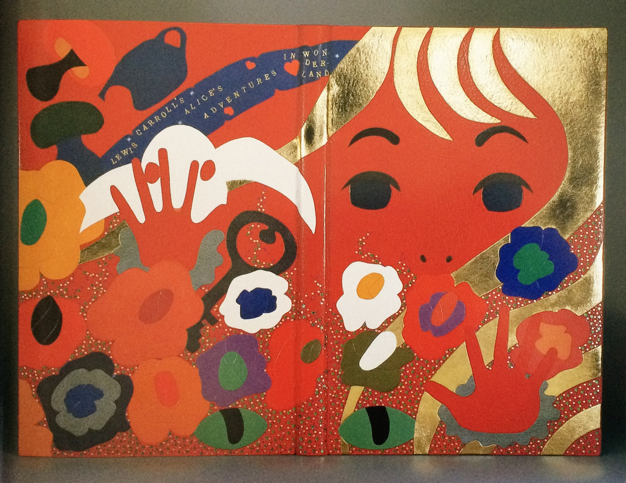
    Alice’s Adventures in Wonderland is one of those titles that has been bound so many different ways and by so many different binders. In 1983, Tini Miura, added her binding to this list with her brightly colored, kaleidoscopic design for an equally mind-bending story. This particular edition was published by the Pennyroyal Press in 1982.

    Bound in red morocco with several onlays that run the spectrum of color between white and black with tooling in gold and green foil. The doublures are a dark red sheepskin and the edges have been in gilt in the rough.

    I love your interpretation of this book, the design emotes feelings of chaos and helplessness. In many of your designs you incorporate floral elements. What does the flower mean within your designs, specifically for this binding and in general?
    It is a fairytale-like story and the things Alice encounters, like rabbit, teapot, etc. Therefore I chose fantasy flowers to make the whole interpretation happen in a “wonderland”.

    Flowers are a wonder of nature that bring joy – like  beautiful words. They do something to your soul, you feel alive and joyful (colors and music does that to me as well).

    When I do a book and see the design in my head, the design becomes this image which I physically execute. After reading the story, if it is not worldwide known literature, I often understand the design after I read the book. I know that is weird. But I feel it is a present and I don’t ever change or complain – just go with it.

    Another reoccurring design element are the built up areas of tiny tooled shapes, which usually flow across the binding. What can you say about the use of this in your work?
    The small dots or squares are my “Pixie” dust, magic or wonderment in the words or stories.


  2. Client Work: Large-scale Coptic with Collaged Paper Covers

    May 14, 2013 by Erin Fletcher

    copticopen-erinfletcher

    Weggefährten is a German word that roughly translates to companions. I was approached by my client, Nadja to create a Coptic binding for a series of letters and collaged pages to present as a gift for her partner’s 40th birthday. Each page was submitted by someone who had made a meaningful connection with her partner during the course of his life. The ‘mountainous’ landscape on the covers was chosen by my client from a previous design I had done. She enjoyed the organic quality of the design and how it mimicked the pathways of life.

    When I originally covered a Coptic in this manner, each section would overlap and turn-in at the tail of book. This created a very bulky edge at the tail of the book that was five layers thick as oppose to only one layer at the head. In order to avoid that excessive bulk, I cut each color section to the sized required. Once I drew out the design I was able to trace the shapes onto the paper, building in for turn-ins and a 2mm overlap. I used various shades of Hahnemuhle Ingres to create the design.

    The Coptic was bound with hand-dyed linen thread to match the shade of Ingres at the six sewing stations.

    copticdetail-erinfletcher

    In addition to Weggefährten, the Coptic was also stamped with the phrase 40 Jahre, which translates to 40 years. The words were individually stamped with brass handle letters to follow the horizon of the pathways. In order to do this irregular stamping on paper, I first trace the line my word will follow onto tracing paper. I place a piece of gold foil onto the cover, then lay down my piece of tracing paper. The hot tool stamps through the tracing paper and the gold foil. I do not remove either layer until the word is complete, this allows me to easily see where to stamp the next letter.

    copticpastedown-erinfletcher

    The color scheme of the book was quite surprising with pops of color and metallics in unusual places. The fold of each signature was highlighted with a bit of magenta Lokta to contrast with the subtle tones of the Ingres. The paste down is a gold metallic paper, which pairs nicely to the pale pink fly leaves.

    copticenvelope-erinfletcher

    In addition to the single pages of letters and collages, was a seven page comic and CD. Using the same pale pink paper as the fly leaf, I included a 4-flap enclosure at the end to house these additional pieces of reverence. The entire book is enclosed inside a magenta 4-flap enclosure for protection.

    It was incredibly enjoyable to work on this project because it was outside my usual flow of work. The client’s reaction was ecstatic as she saw her vision come into being and couldn’t wait to present it to her partner. Check out more Custom Projects at Herringbone Bindery.


  • My name is Erin Fletcher, owner and bookbinder of Herringbone Bindery in Boston. Flash of the Hand is a space where I share my process and inspirations.
    The StudioNewsletterInstagramEmail me
  • Archives