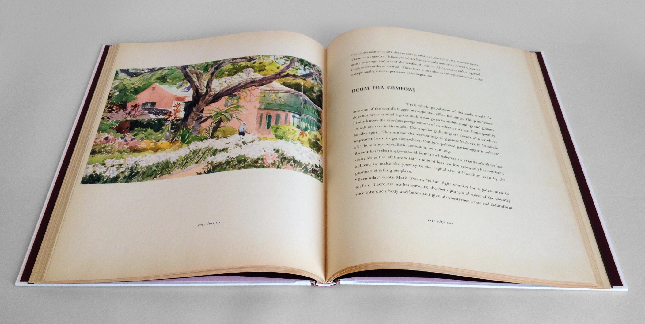
A client of mine presented me with a copy of Residence in Bermuda, a promotional text published by Bermuda Trade Development Board in an edition of 2,000 copies. This particular book was copy 591 and bound as a quarter cloth binding with a simple stamped label. My client wanted the book to be rebound in a more artistic binding, extracting colors and inspiration from one of the many photographs printed in the text.
In search of inspiration I began to page through the book when I came across one image of a watercolor painting of an iconic Bermuda home. The imagery became my direction for the exterior of the binding; the exterior walls of the house were painted a sherbet pink, which popped against the white stepped roof. The vibrancy and brushstrokes of the surrounding landscape became my inspiration for the label on the spine.
Since the binding needed to be completed in a fairly short time period and I wanted to work the boards separately, I chose to use a variant of the Bradel structure. Peter Verheyen published an article and tutorial titled Der Gebrochene Rücken: a variation of the German case binding, which was my guide throughout its construction.
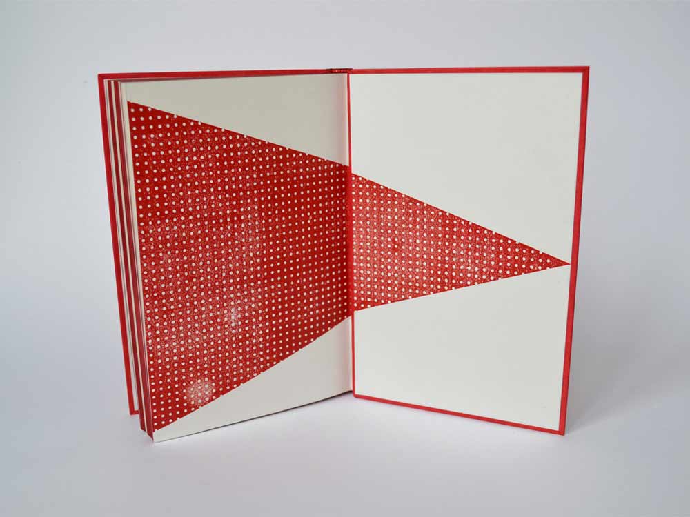
But before any binding could take place, the book had to be removed from its original case. The spine was cleaned by removing the lining and adhesive. The pages showed sign of age with some scuff marks here and there, which called for a bit of surface cleaning. The exterior folio was guarded with tissue to stabilize the paper in preparation for sewing. The original endpapers were quite beautiful and richly printed. However, they were not salvageable for the new binding, but I’ll come back to that later. So I created some new endpapers using three sheets of Canford paper in blush, plum and forest (all colors derived from my inspiration source).
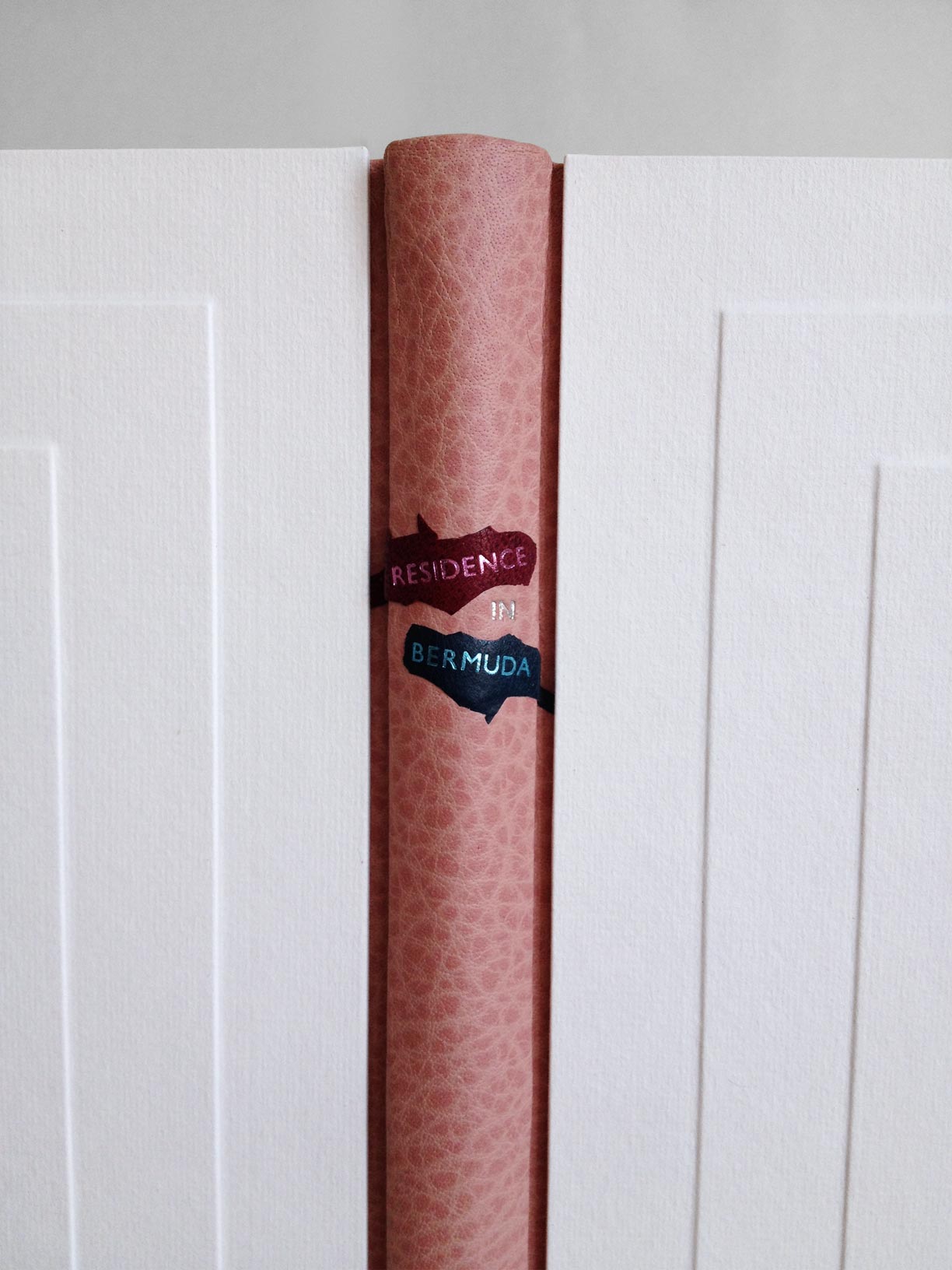
With the forwarding complete, I attached a piece of pared buffalo skin in the same sherbet pink of the house to the spine. The benefit of this particular binding allows the binder to use a specific material on the spine and another for the boards, so the cover is completed in three parts. This German-style of binding is very similar to the French simplified binding.
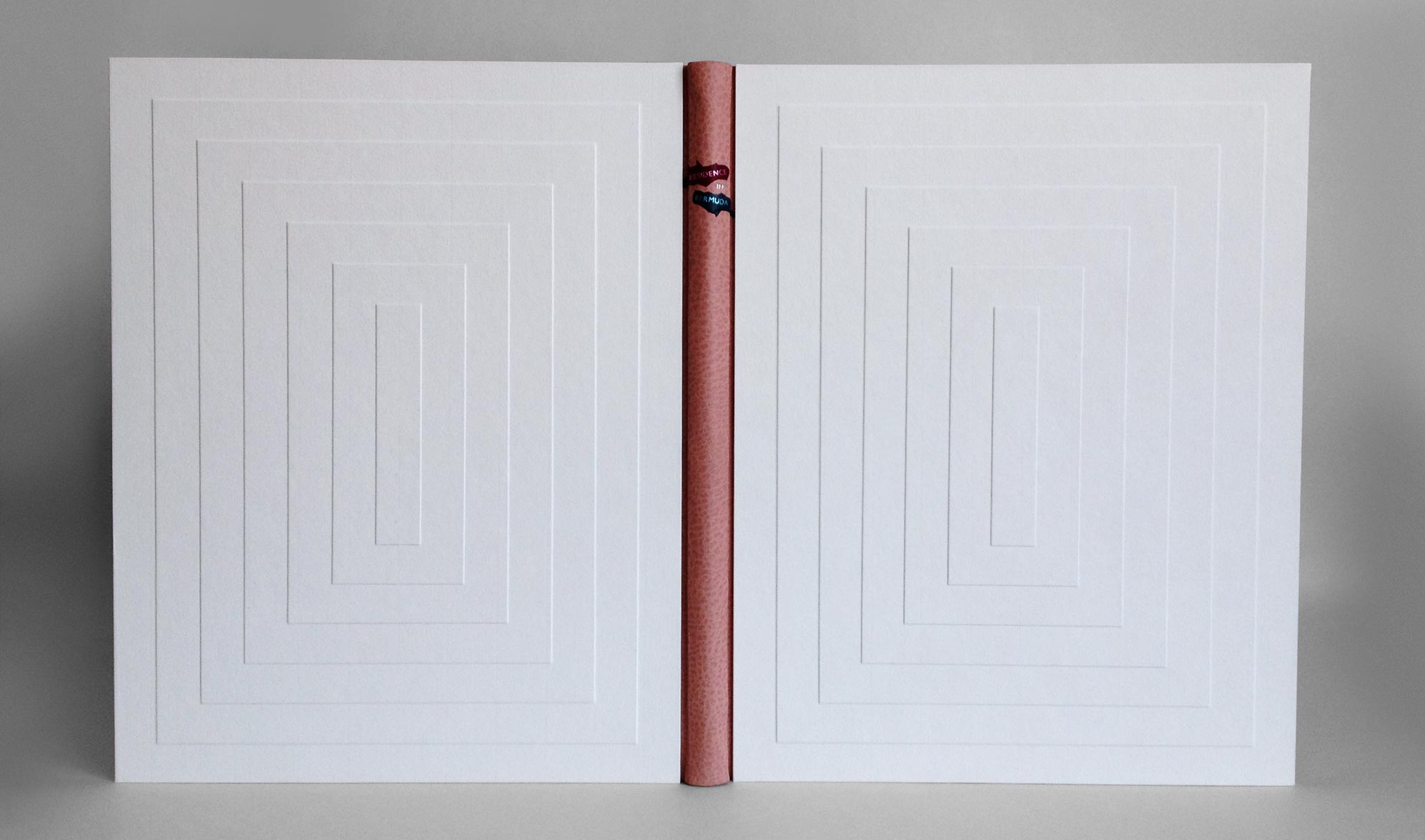
While the book lay to rest, I started working on the boards (which in my opinion are what make this binding superb). In order to best represent the iconic stepped roofs of Bermuda architecture, I decided to create stepped boards. Once I had the final size of my boards, I went to work figuring out the proper dimensions of each layer. I made a single template of each layer which I used to draw out their placement on the boards. Each layer was attached with PVA and pressed. Finally, I glue out a piece of white Hahnemuhle Ingres (which was pre-dampened with a sponge), laid it over the board and put it in the press with some foam which helped sculpt the paper around each layer or step.
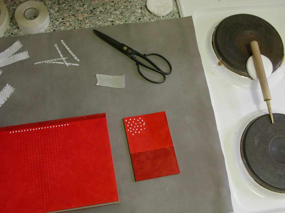
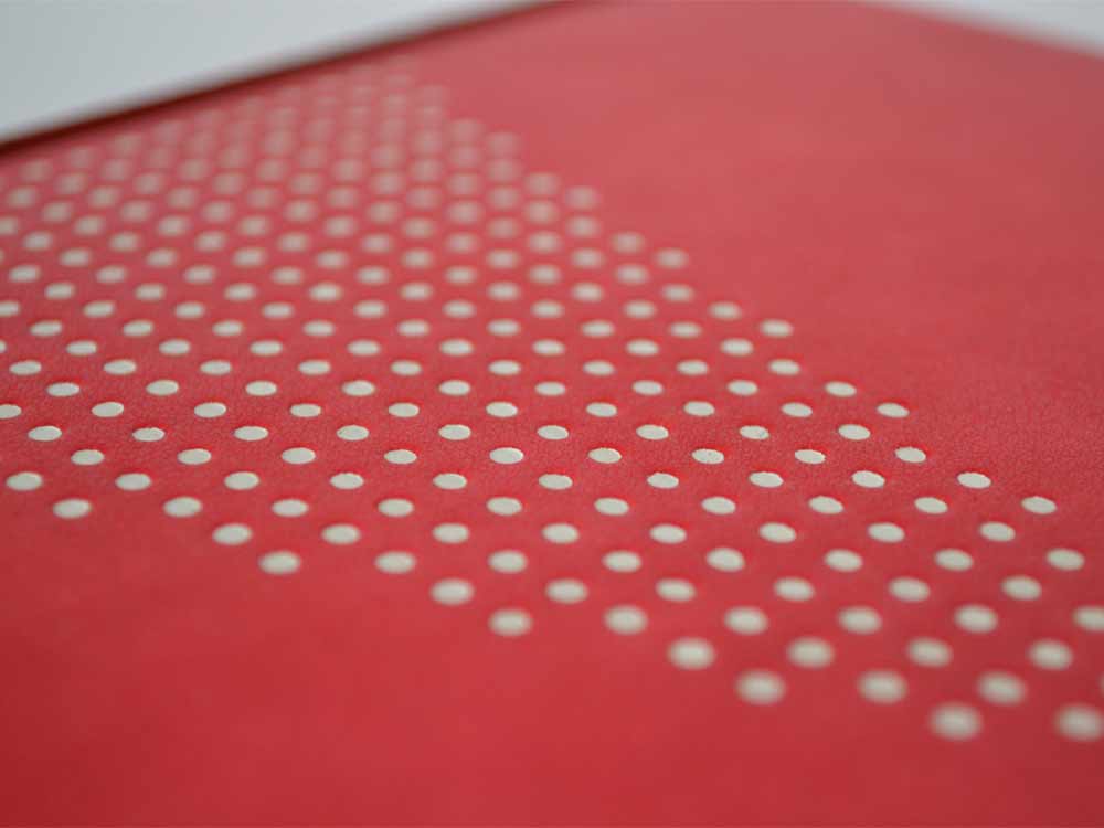
Before attaching the boards, I placed the two labels on the spine which curved down around the shoulder and onto the flange which connects the boards to the binding. Using two separate leathers with matching metallic foil, I stamped the word RESIDENCE and BERMUDA in Gill Sans using a Kwikprint. The leather was then pared away to offer a rough silhouette of a brushstroke. The word IN was hand-tooled directly on the spine in palladium.
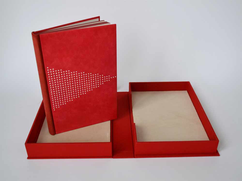
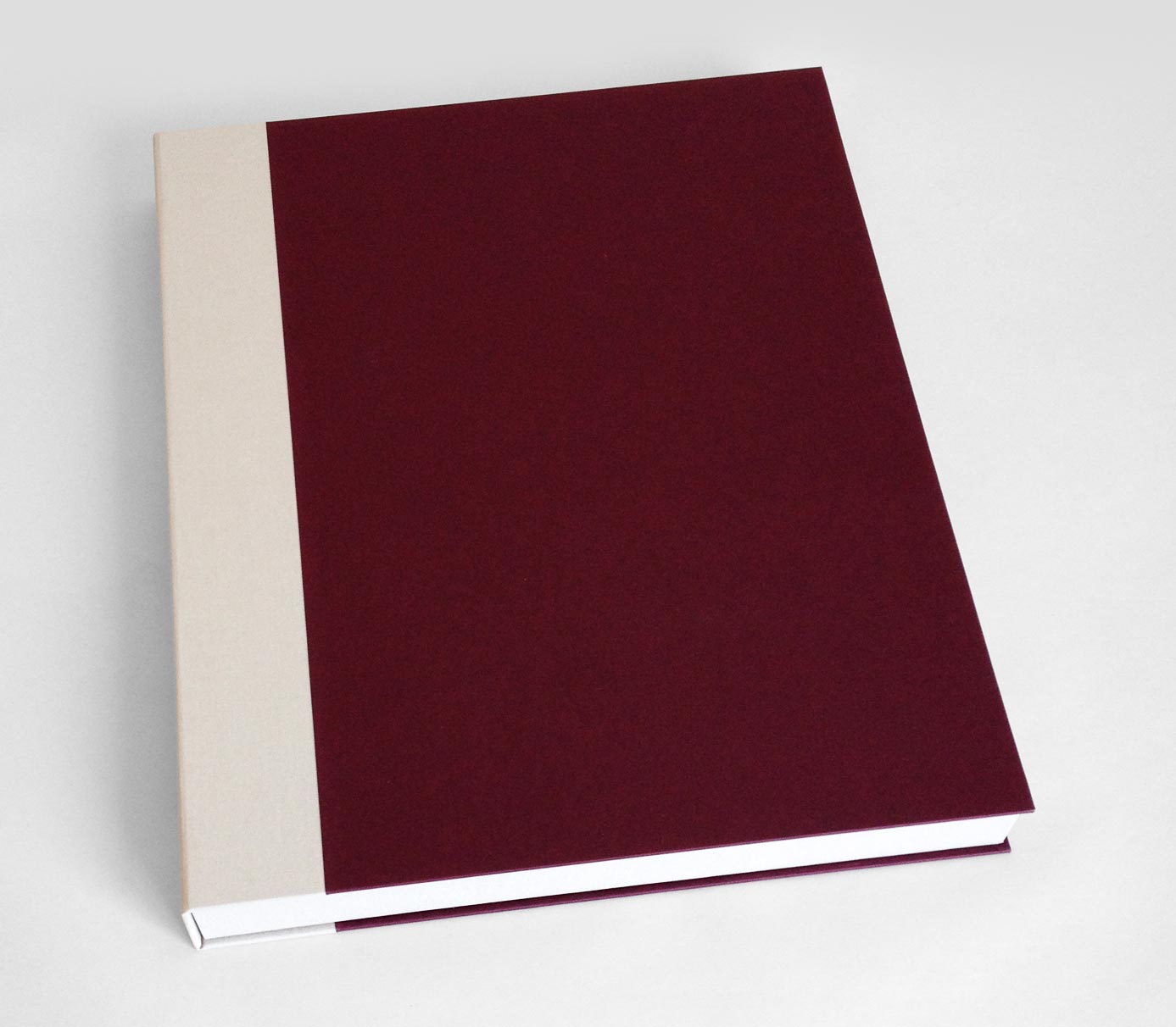
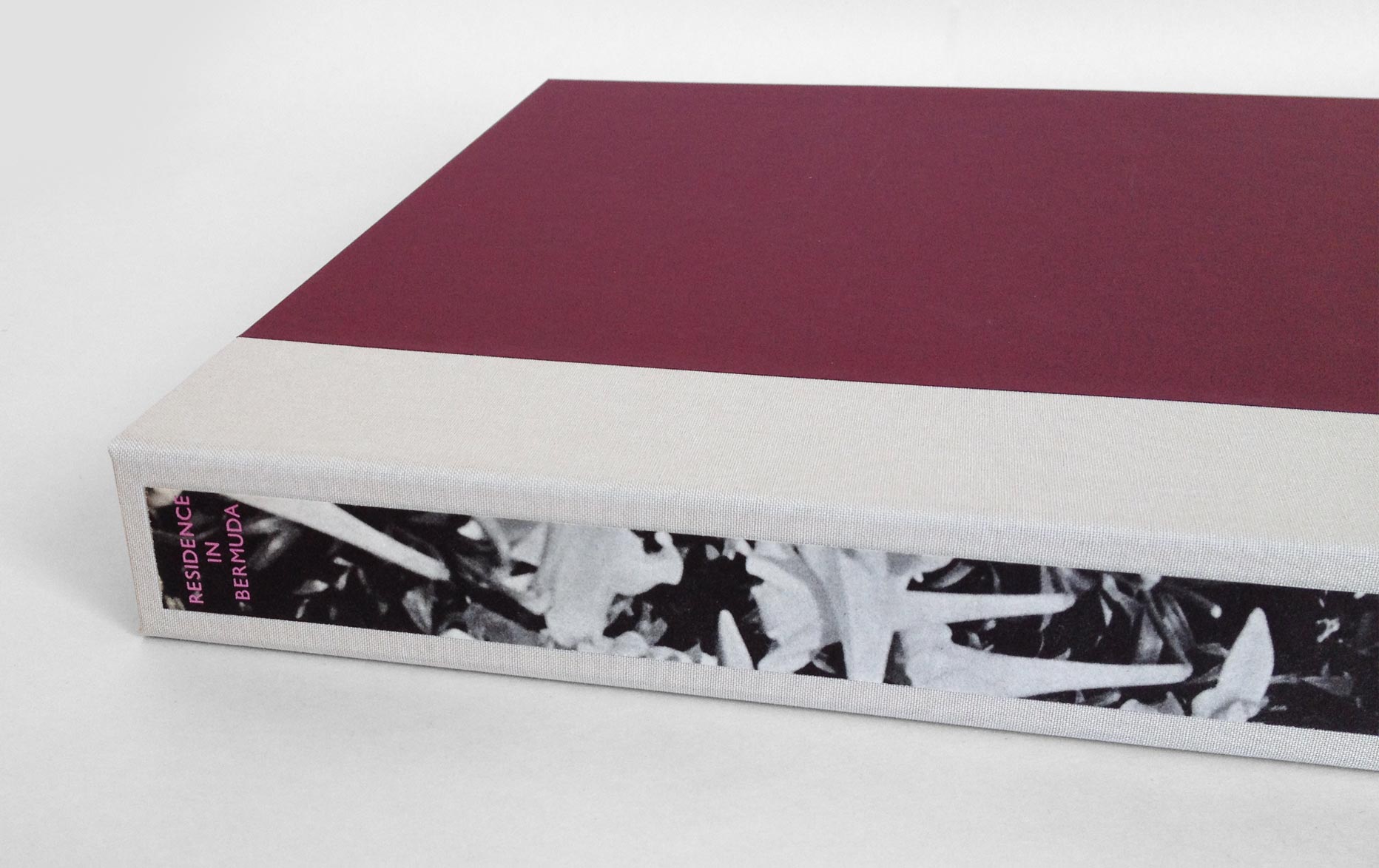
A large book with white covers needs a box or it will never appear in such pristine condition again. The clamshell box was simply made with a cloth spine sided up with paper. The spine of the box includes a long paper label stamped in metallic pink with the title. The decorative paper label is a strip of the original endpaper. The trays are lined with a frame of Volara foam for the book to rest on, preventing it from teetering side to side.
My client was thrilled with the book’s transformation. He plans to present it as a wedding gift to the Governor of Bermuda’s daughter. I hope she is equally thrilled with my interpretation of her rich and colorful surroundings.