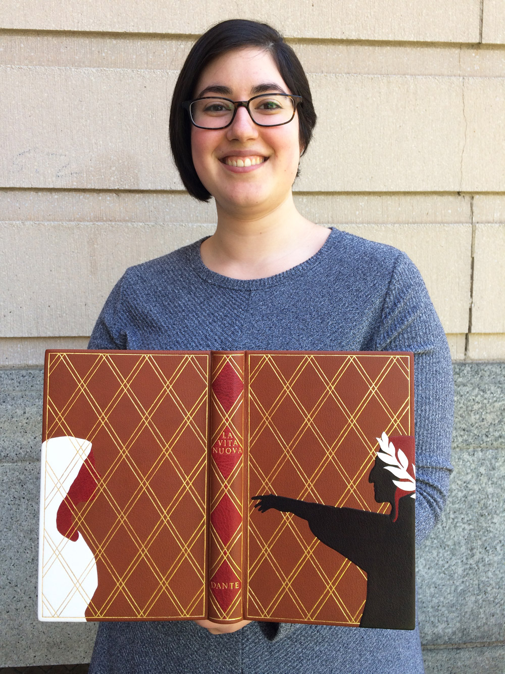
The end of the year is approaching at North Bennet Street School and the graduating students have just put the final touches on their design bindings. As many of my readers already know, I look forward to conducting these interviews and speaking with the students about their work every year. The exhibit will run from May 16 – 31 (click here for opening hours). If you are around the Boston area, come see the show in person to truly appreciate the craftsmanship of each binding. As the name of the exhibit implies, the pieces on display are showcasing work from both students and alumni of the school. This first post will focus on the Set Book bound be each of the seven graduating students. My next post will highlight some of my favorite alumni pieces from the show.
Each graduating student is given a copy of the same book (referred to as the set book) and asked to create a full leather design binding. The set book for this year was La Vita Nouva by Dante Alighieri. Expressed in the medieval genre of courtly love, a combination of prose and verse, the text was originally published in 1295. It is notable for having been written in Italian, a departure from the use of Latin typical of Dante’s other works. I spoke with each binder about how the book inspired their designs and material choices. We also spoke candidly about the challenges and successes they faced while constructing their bindings.
Before we get started I want to say how truly impressed I am with all of the students bindings. The skills and techniques presented by their work is so impressive. They should all be very proud of their work.
Marc Hammonds
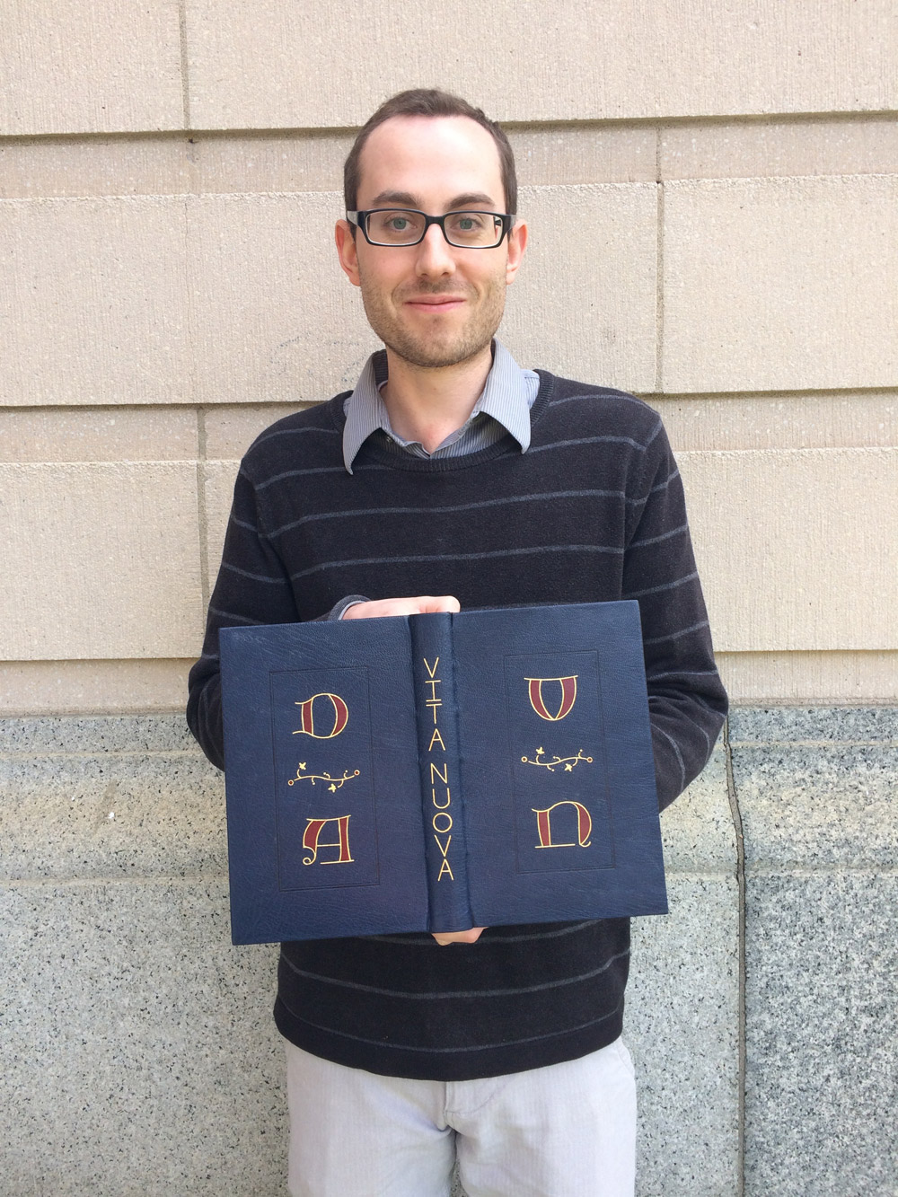
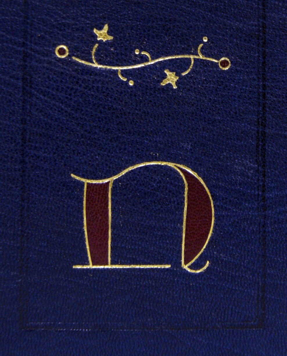
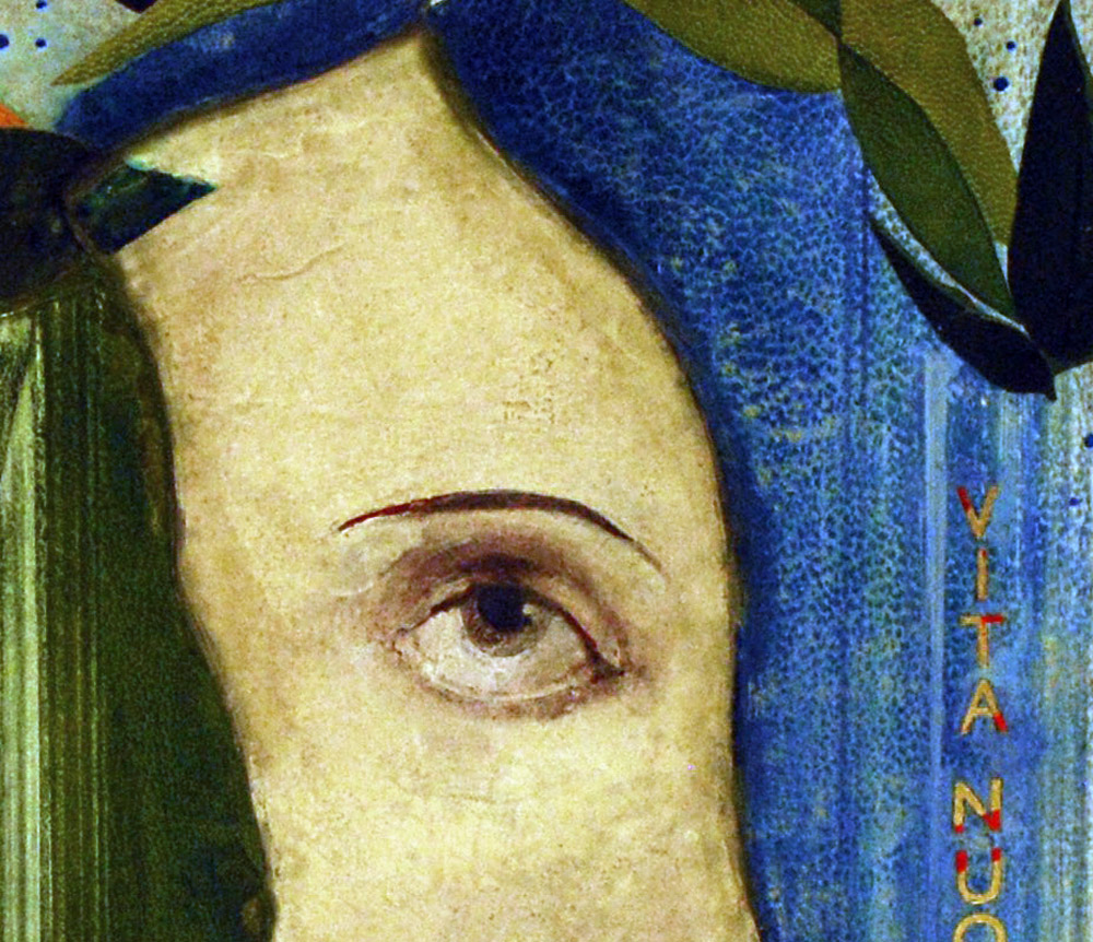
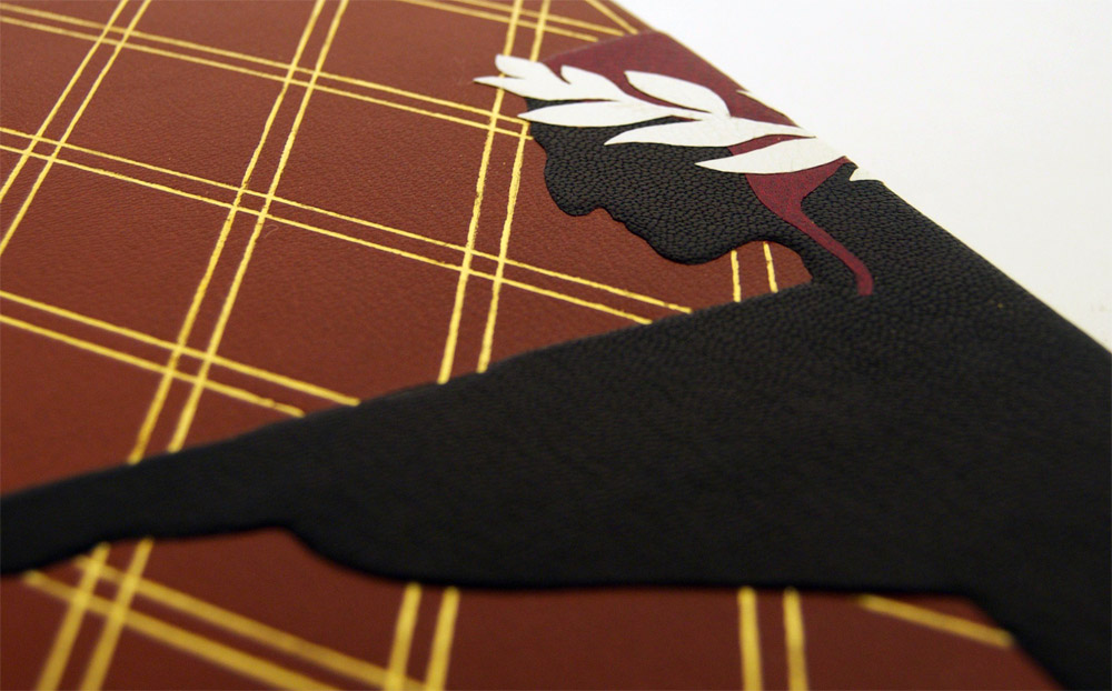
As I mentioned above, La Vita Nouva was written in the late 13th century and Marc Hammonds found great inspiration from that time period. Particularly focusing on the visual aspects of a 13th manuscript, Marc stylized illuminated initials into modern letters and put them on the outside of the book. Bound in Russell’s Oasis navy blue for its rich color and heavy grain, Marc polished the leather before tooling. The letters are formed with gouges and lines in gold leaf with maroon goatskin onlays. The motif centered on each board harkens back to the flourishes found within illuminated initials. Also tooled in gold leaf, the design is formed with gouges, dots, a leaf and bookend by two gold tooled maroon goatskin onlays. Marc created his own finishing tool in order to match the leaf to that of historical design.
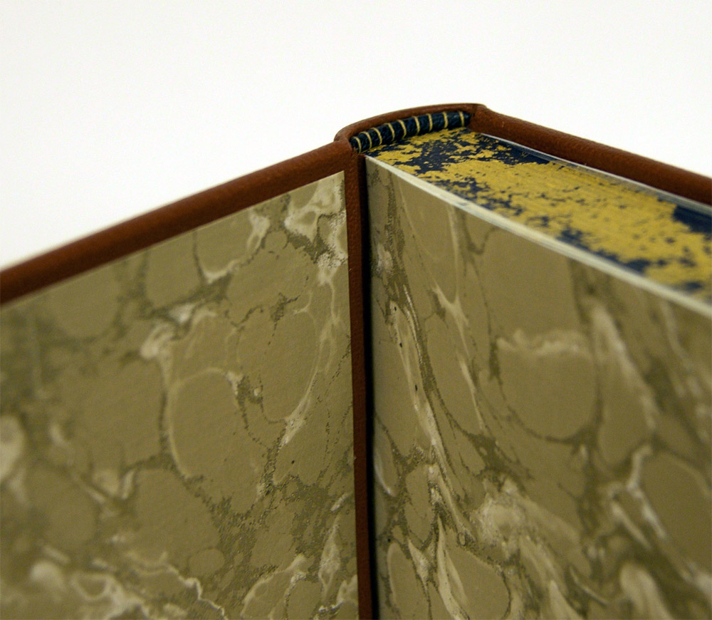
Marc cleverly contains his design within two thoughtfully placed borders. The first can be seen in the image above as a blind tooled double line fencing in his design. The second is placed subtly along the edge of the boards anchored at the endcaps with a bold gold tooled square. You can see this in the image below along with the French double-core endbands in red and blue.
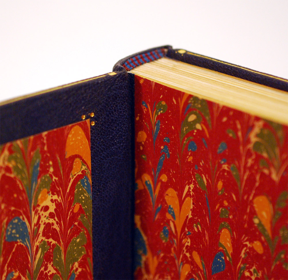
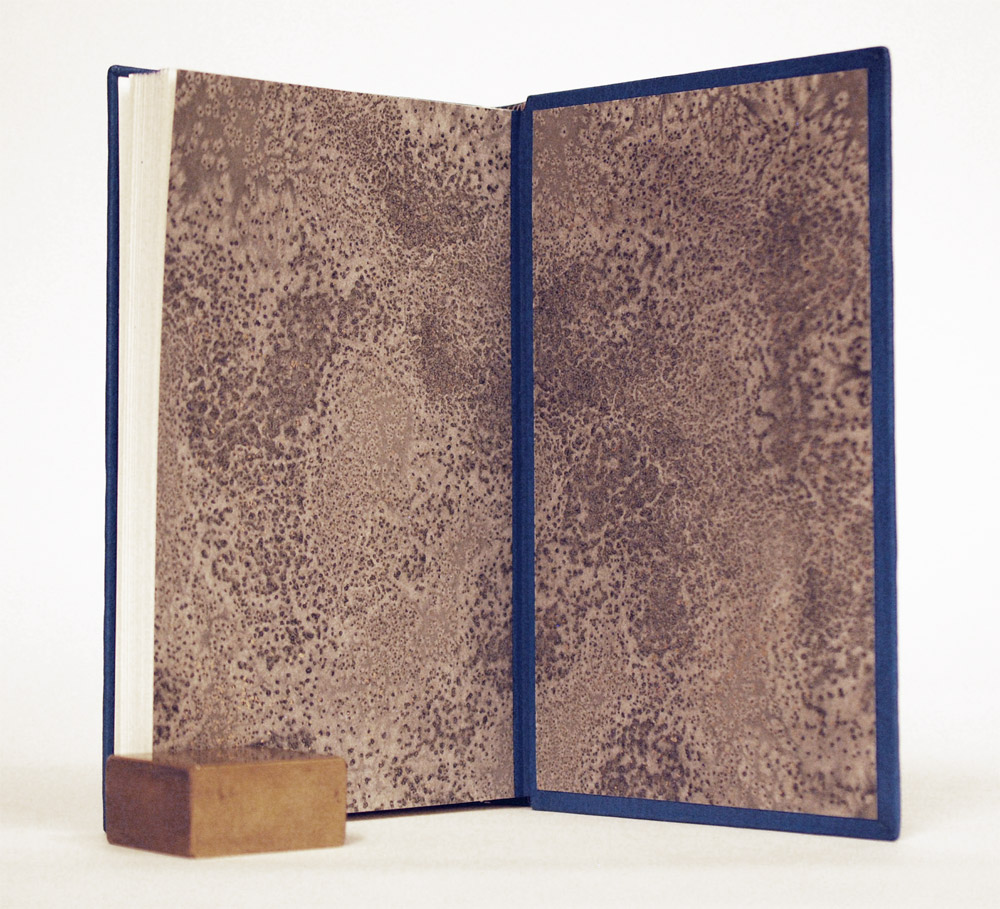
The head edge of Marc’s binding has been rough-edge gilt. The interior is adorned with a paste down and flyleaf in German marbled paper. At the corner are three gold tooled dots. With his binding, Marc has successfully reinterpreted historical patterns and shapes into a sleek and modern design. The title is hand tooled down the spine, in a font created with the use of line tools and a few gouges. The modern sans serif font fully rounds out Marc’s design.
After graduation Marc is planning to move back to the South in pursuit of edition work. If you have a chance to see the show in person, Marc has another beautifully tooled design binding on display. I hope he intends to continue along this line of work. He is quite skilled already in tooling and I can tell that he has an eye for great design.
Kate Levy
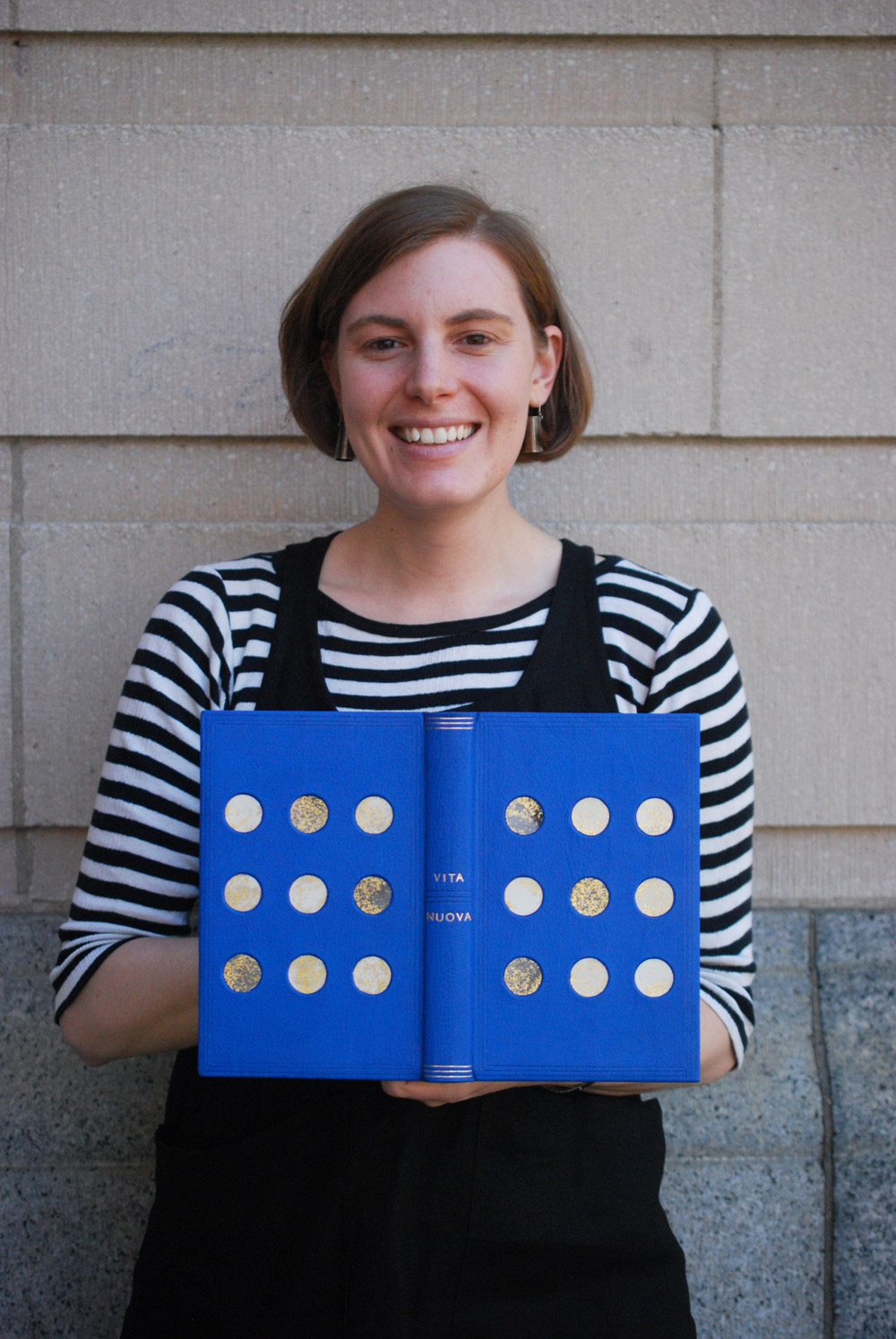
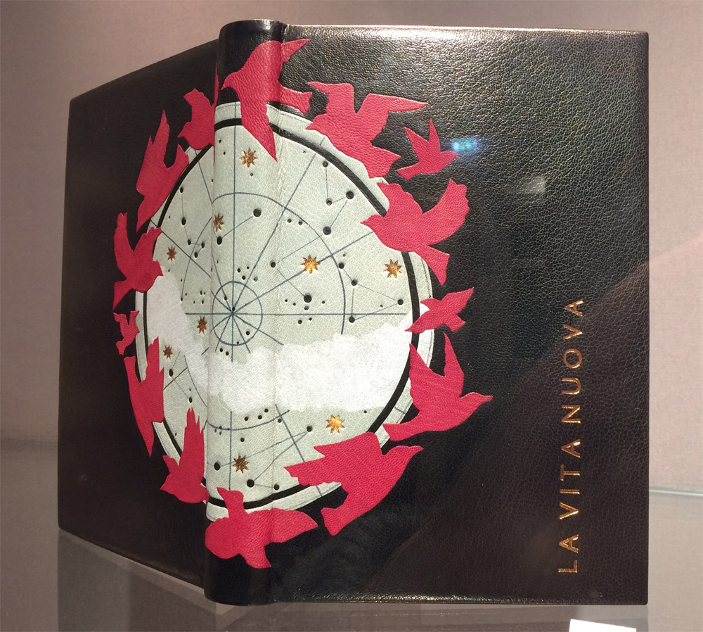
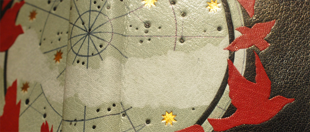
The numbers three and nine are peppered throughout La Vita Nouva. Dante uses numerology to provide proof for Beatrice’s divine qualities, sometimes stretching connections to create truths. Kate Levy chose to base her design on this descriptive language rather than the relationship it describes. Keeping to a simple and minimalistic look, Kate covered her binding in bright blue Russell’s Oasis goatskin and adorned each board with 9 parchment discs. These discs were sprinkled with a mixture of double gold, moon gold and palladium leaf.
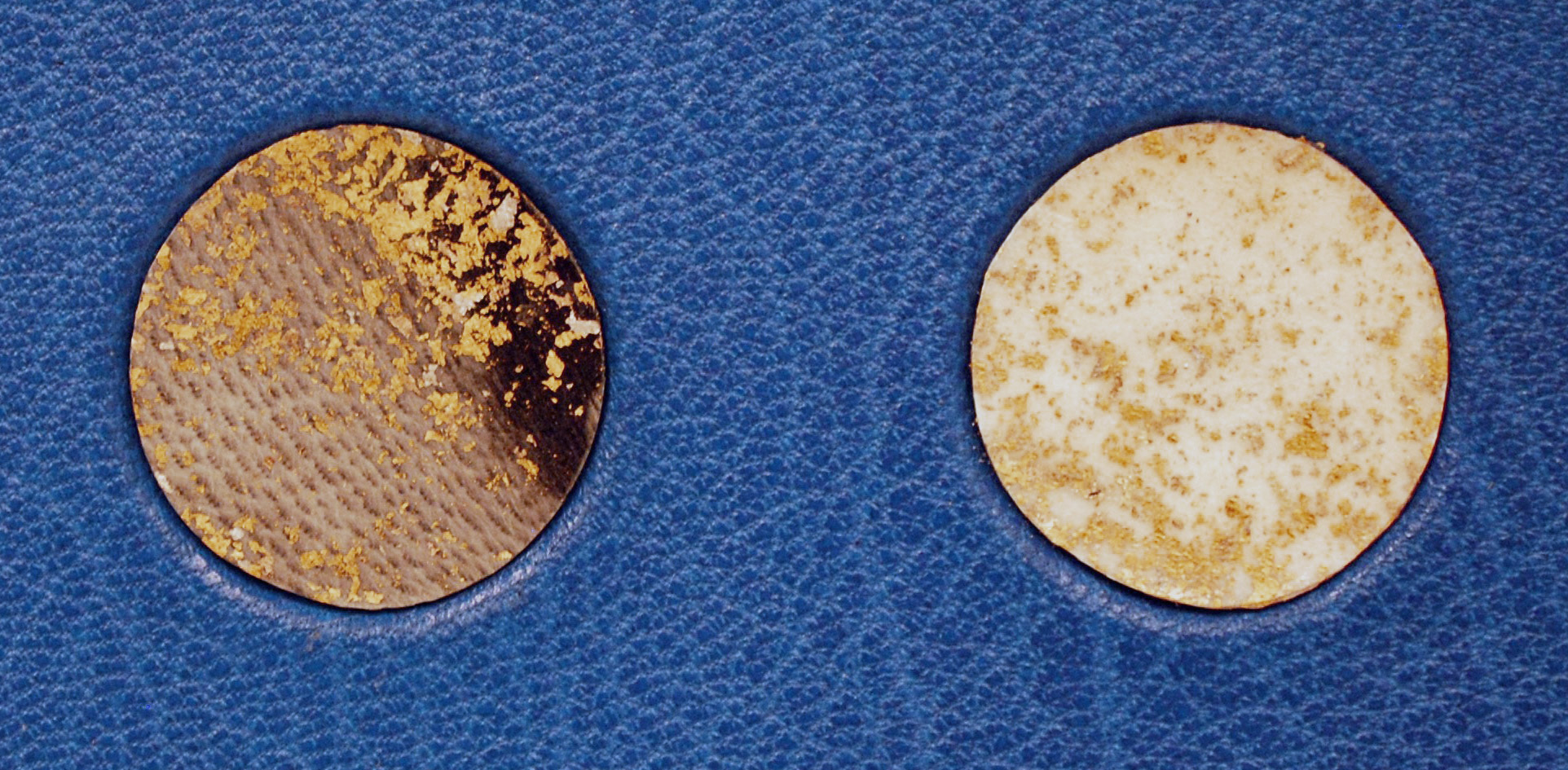
Through trial and error, Kate found the perfect process for creating her celestial spheres. Using a combination of white calf and grey kid parchment (the latter was hand-dyed by Kate during a workshop at Pergamena) she laminated the cut-out circles to one layer of paper prior to sprinkling. Afterward, each piece was layered to three more pieces of paper, all cut through one at a time. Kate constructed the boards with the top layer laser cut with nine holes, which allows the parchment discs to lay partially sunken.
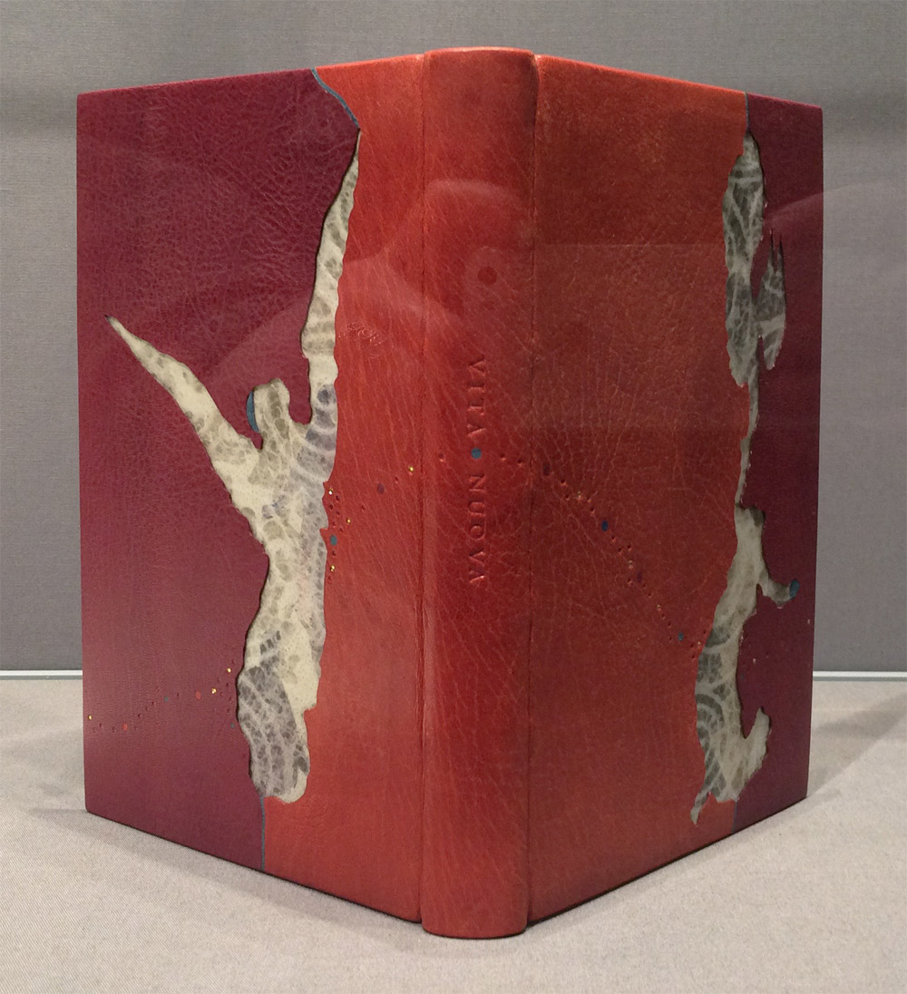
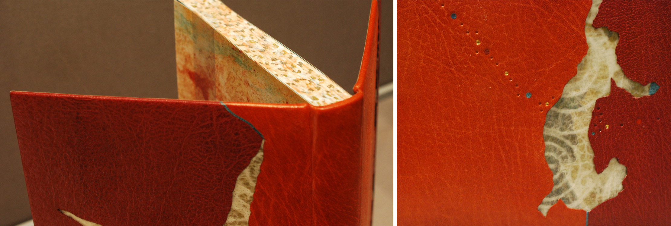
Building on the significance of numbers, Kate borders each cover board with three blind tooled lines. The spine is segmented by three sets of three lines equally a total of nine. The sets at the head and tail are gold tooled along with the title, which is separated by the blind tooled set of lines. The endbands are wrapped in black goatskin and taupe colored thread. The endbands are paired with a gilded edge in moon gold. The base was painted with ultramarine blue which cools the tone of the moon gold.
The celestial feeling of Kate’s binding continues onto the inside of the binding with these incredible endpapers. Painted with sumi ink and sprinkled with salt, the crystals react and distort the pigment. The paper is also sprinkled with moon gold adding a subtle shimmer and vibrancy. Kate’s design is visually striking and quite alluring. The amount of movement she was able to create with such a simple design is quite impressive and each part of the binding is working beautifully as a whole.
After graduation, Kate will be moving into Third Year Studio becoming one of my studio mates. I’m very much looking forward to having her vision and skill in the bindery. In addition, Kate will be working as an intern for a 1-month stint at the Francis Loeb Library at Harvard University in June. Afterward Kate will be heading to Lowell for a 10-week long project at the Northeast Region of the National Park Service, where she’ll be working with their new book conservator to set up a lab and work on items for the John Quincy Adams House and Franklin Delano Roosevelt House. You can see more of her work here.
Rebecca Métois

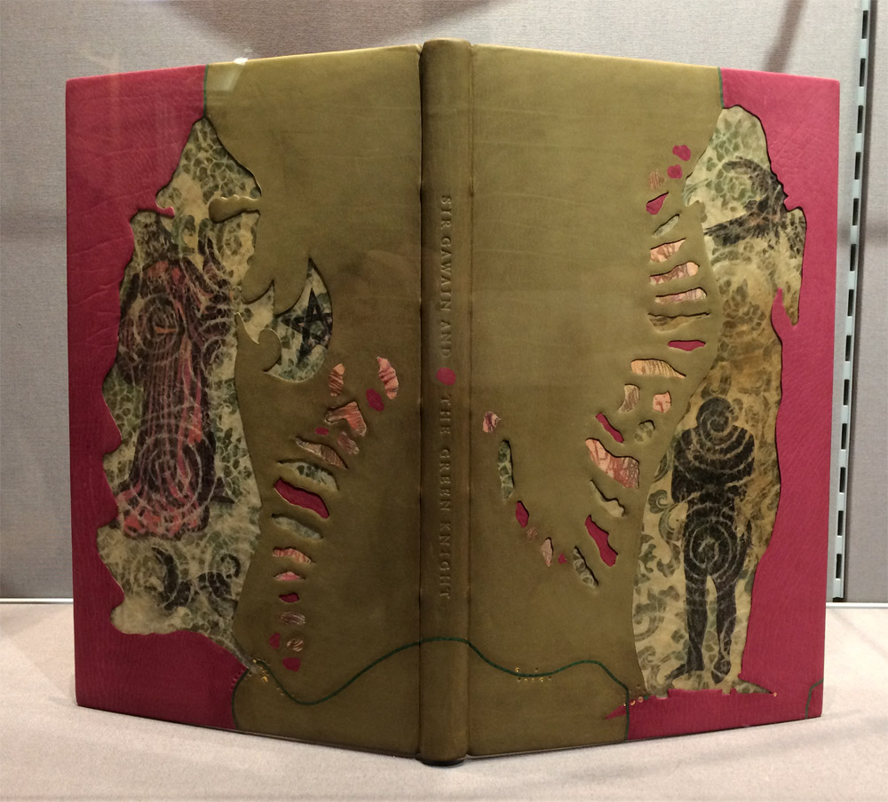
Rebecca Métois chose to embrace the sacred love described by Dante by intertwining a portrait of himself with Beatrice. Set up like a Venn diagram, Dante is portrayed on the left in yellow with Beatrice on the right in blue. Where their faces overlap the painting turns to green. A sliver of red leather acts as a division between the two characters while also framing the edge of her face.
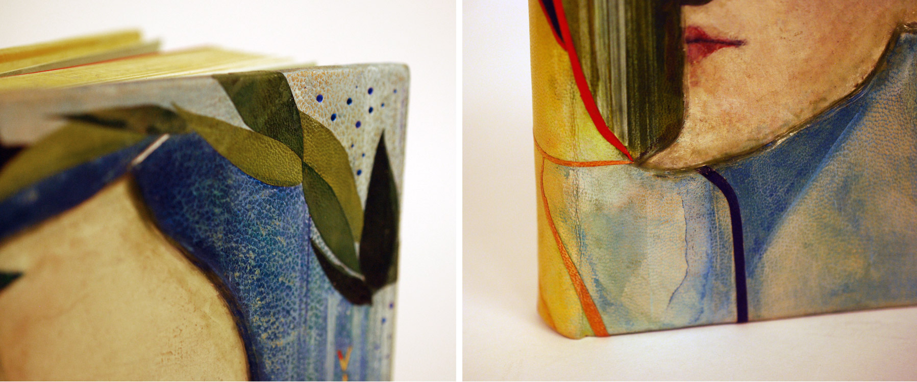
With a background in painting, Rebecca explored her technique on leather with the use of leather dyes and alcohol based paints. Working on a canvas of undyed Hewit goat, Rebecca put down a base coat of leather dyes. Then worked in details with the alcohol based paints or manipulated the pigments with straight alcohol to create washes or areas of erasure. The more you look at the binding the more details come to light. A laurel spray spans from Dante’s crown to Beatrice’s with an array of green leather onlays, some painted and others left untouched.
Rebecca painted Beatrice’s face off the book on a piece of Arches Wove with gouache and ink, sealing with encaustic to protect the pigment and to evoke the quality of a classic oil painting. The painting of Beatrice’s face is set inside her hairline and Dante’s profile which were carved out of the board and shaped slightly before covering.
Tooling through foil was used throughout the book in splashes of dots in both blue and yellow. The title is tooled through both gold and red foil. Rebecca expressed that painting on leather was rather different from painting on a traditional canvas. The image could not be built up in the same way as the leather was not as forgiving. Tooling also became more difficult on the painted surface.
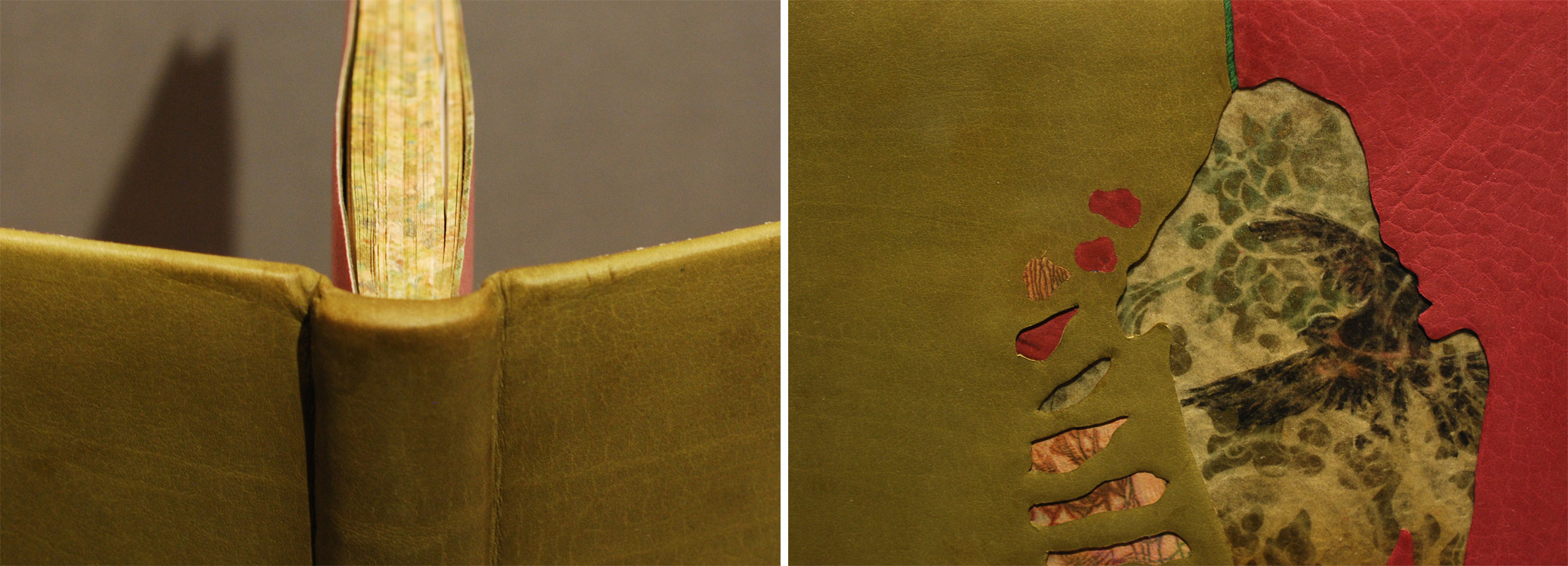
The inside is covered with handmade paper from Katherine Radcliffe chosen for its celestial quality. The head edge of the book is painted in a similar fashion with a base of yellow gouache and sprinkled with gold and palladium leaf. The endbands are French double-core with gold and light grey threads. One detail I particularly enjoyed about the interior of Rebecca’s book was her decision to color the hinge for the front of the book blue and the back of the book yellow to match the exterior.
Rebecca will be shifting her workspace to Lowell and hopes to bring in conservation related commissions. She’ll be renting a bench from Todd Davis, a 2016 graduate from North Bennet. Rebecca will also be joining Kate at the Northeast Region of the National Park Service. Although her focus will be on conservation, she plans to continue her work with design bindings and fine tune her technique. You can check out more of her work if you visit the exhibit, her binding of To Kill a Mockingbird is equally creative and impressive. Or go online to her website.
Natalie Naor
This could not be a more perfect book for Natalie Naor to bind. Having studied courtly love in college and lived abroad in Florence, Natalie pulled from these experiences when designing her book. Inspired by both the architecture of Italy and the sublime love portrayed in La Vita Nouva, Natalie placed Dante and Beatrice at a distance separated by the spine of the book and by a screen of gold tooling.
Taking cues from the text and the Italian landscape, Natalie chose a terracotta goatskin to cover the binding. Using Dante’s references to her garments, Beatrice’s silhouette is set behind the screen and made from two back-pared onlays in red and white goatskin. Dante is portrayed in a black goatskin onlay with details in the same red and white goatskin used on Beatrice. Natalie beveled the edges of the onlays at different lengths creating subtle definition and shape.
Natalie highlights the diamonds (both large and small) on the spine with tooled onlays in red goatskin. The title and author are hand-tooled in gold leaf. Pulling from the celestial references in the text and vaulted church ceilings, Natalie painted the head edge with a mixture of navy and Prussian blue gouache then densely sprinkled with gold leaf. The endbands are wrapped with dark blue goatskin and wrapped with 9 yellow-gold threads. The paste down and endpapers are reminiscent of marbling seen in architecture. The muted tone works beautifully with Natalie’s concept and compliments her color palette.
Natalie’s ambitions paid off as she successfully transformed her illustrative design with the use of traditional design techniques. The vibrancy and warmth of her binding certainly sets it apart from the others. Natalie’s skills and passion have landed her 6-months at the Boston Athenaeum as the Lisa Von Clemm fellow. You can keep up with Natalie’s work as she continues to hone her skills in conservation and bookbinding by checking out her website.
Caitlin Mai O’Brien
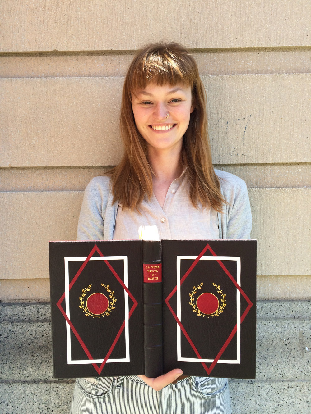
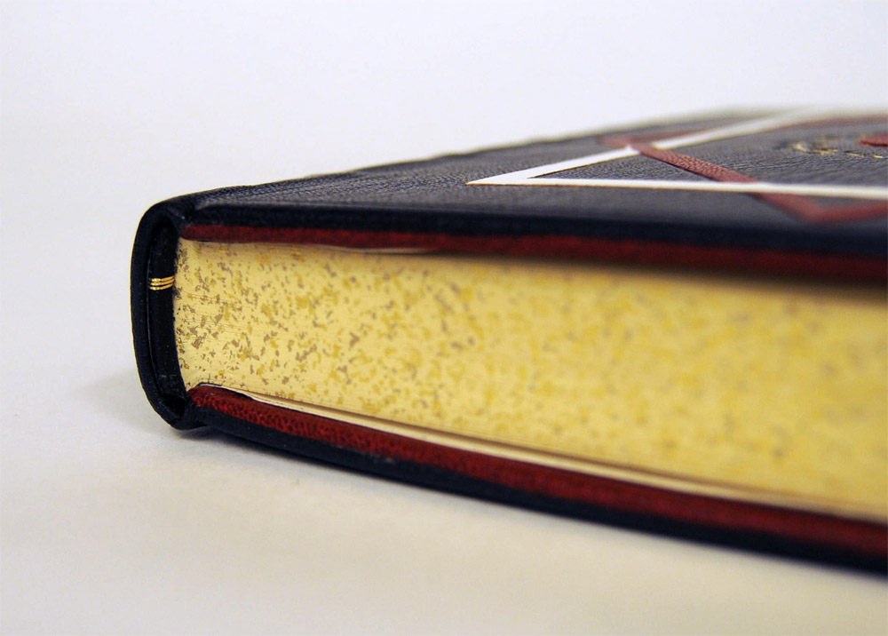
Caitlin Mai O’Brien found inspiration in wanting to create a design for her binding that would have been recognizable to Dante. Covered in dark brown Russell’s goatskin, the spine has false raised bands with a classic title piece tooled in gold leaf. The interlaced design on the covers are formed with a total of sixteen red and white goatskin onlays referring to Beatrice’s garments as described by Dante. The central motif is composed of a gold tooled onlay in red goatskin embraced by stylized gold tooled laurels.
The endbands are wrapped in the same dark brown goatskin with 3 wraps of metallic thread, three being a significant number from the text. Both the board edge and head edge decoration are offering a glimpse of what will be revealed on the interior side of the covers. The edge is decorated with a base of fluid acrylic in titan buff and sprinkled with a mixture of gold and moon gold leaf.
Caitlin decorated the fly leaves in the same manner as the head edge, sprinkling both gold and moon gold leaf on Rives paper. The edges of the board are partially covered with red goatskin onlays which span down to the inside of the board bordering a highly gilded panel of parchment.
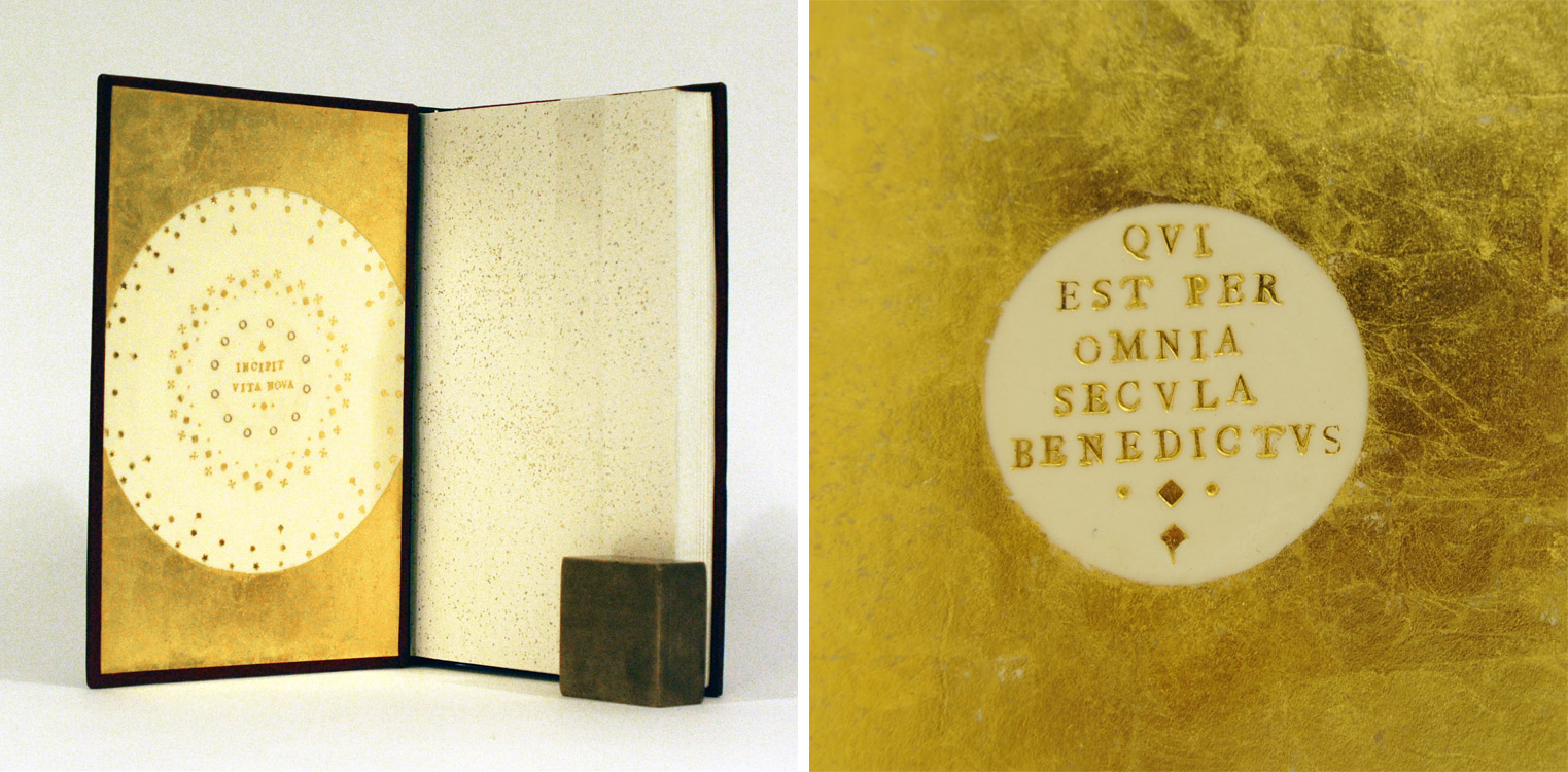
Caitlin chose to reference the celestial themes of the book and Dante’s reference to the number nine on the interior side of the binding. She surface gilt these panels of Pergamena calf parchment leaving two circular areas exposed. The front panel showcases a celestial map reminiscent of those from the 6th to the 13th century and highlights the significance of the number nine. Within the map, Caitlin uses a series of decorative tools to represent earth, moon, planets, stars and the outer realm where god resides. Both panels are also tooled using handle letters in two Latin phrases that bookend the text.
Within Caitlin’s binding she pairs a lovely classic design with this luminous interior. It’s quite breathtaking when you open the book and become enveloped by the glow of gold. The texture that she created with her surfacing gilding is also gorgeous. It offers an appropriate aged look, which ties the whole design together. After graduation, Caitlin will be moving to Washington, D.C. She is currently in the process of interviewing with the Library of Congress for their General Collections.
Rebecca Philio
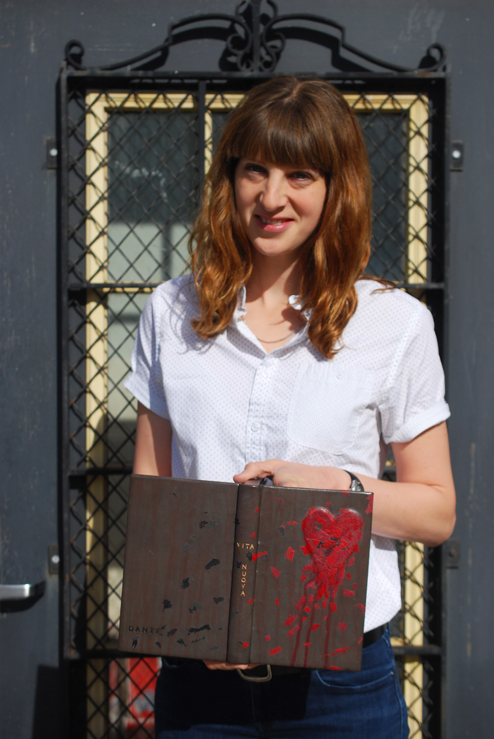
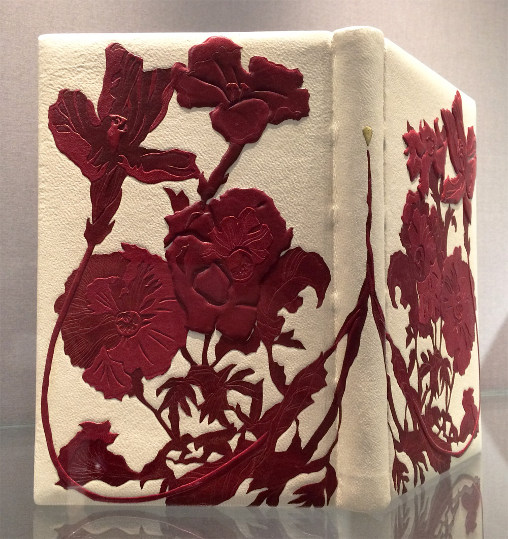
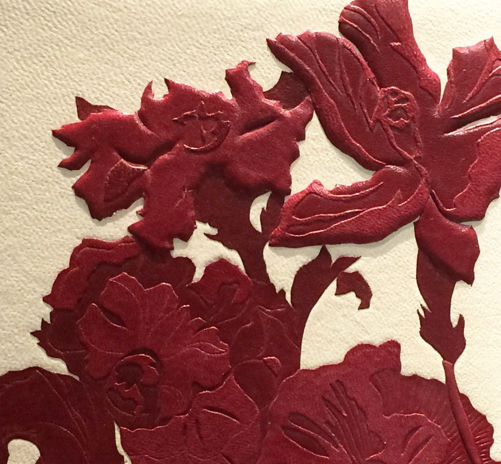
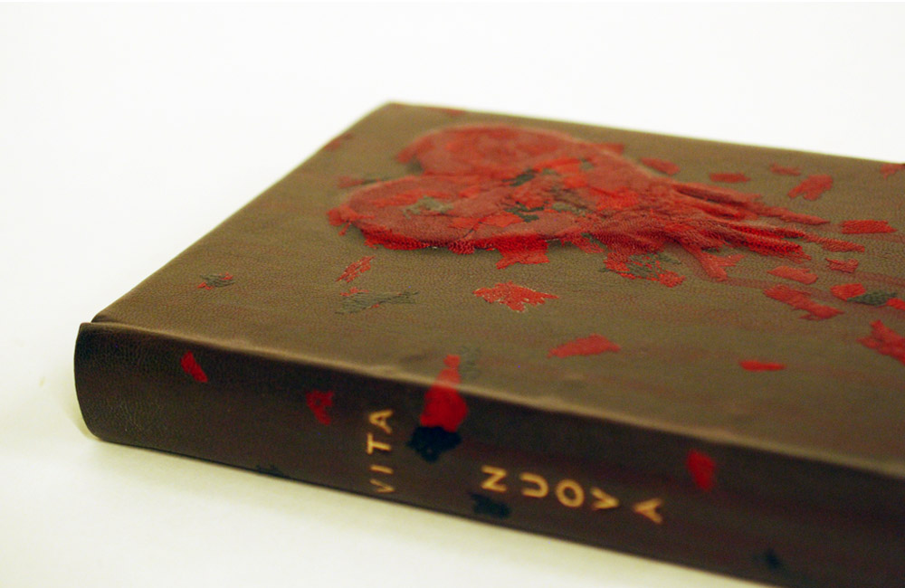
Dante yearns for Beatrice so intensely, yet he can only admire her from afar. This intense love erupts violently within Dante, leaving him alone with his thoughts of her. Pulling from such a graphic portrayal of love, Rebecca Philio created her design with an exploding heart. Building up the design on the board first, the heart is projecting from the cover as it bursts and bleeds. Rebecca covered her binding in a dark brown Russell’s goatskin and built up texture in her design with feathered onlays in two tones of red, grey and black.
Rebecca used a mixture of acrylic and methyl cellulose to create the dripping effect. This was done on the book with the aid of a sponge and syringe for more precision. The title is hand tooled on the spine with moon gold. The feathered onlays progress to black as they move their way on to the back cover where you can find Dante tooled in a combination of carbon and foil.
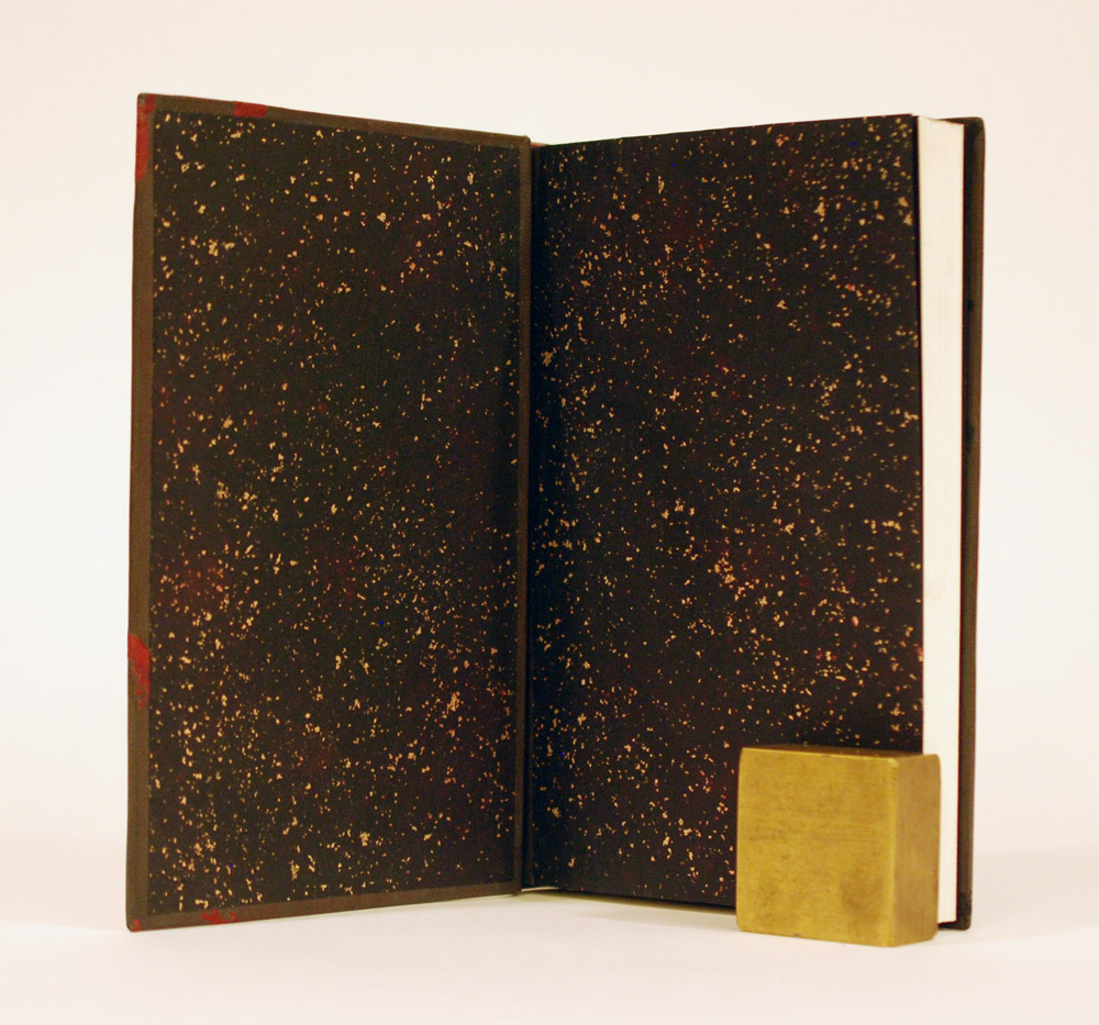
The endbands are wrapped in red leather and placed against a graphite edge with sprinkling in red acrylic. The somber color palette continues to the interior with black Ingres paper sprinkled with moon gold and red acrylic. These endpapers also connect to the celestial themes of the book.
Rebecca’s design went through a few stages before landing on the use of feathered onlays. But this was definitely the right choice, the amount of texture and movement she created through those onlays really make her concept excel. After graduation, Rebecca will be staying in Boston for a 10-week preservation internship at the Boston Athenaeum. You can catch a glimpse of Rebecca’s work at her website. Check it out here.
Linnea Vegh
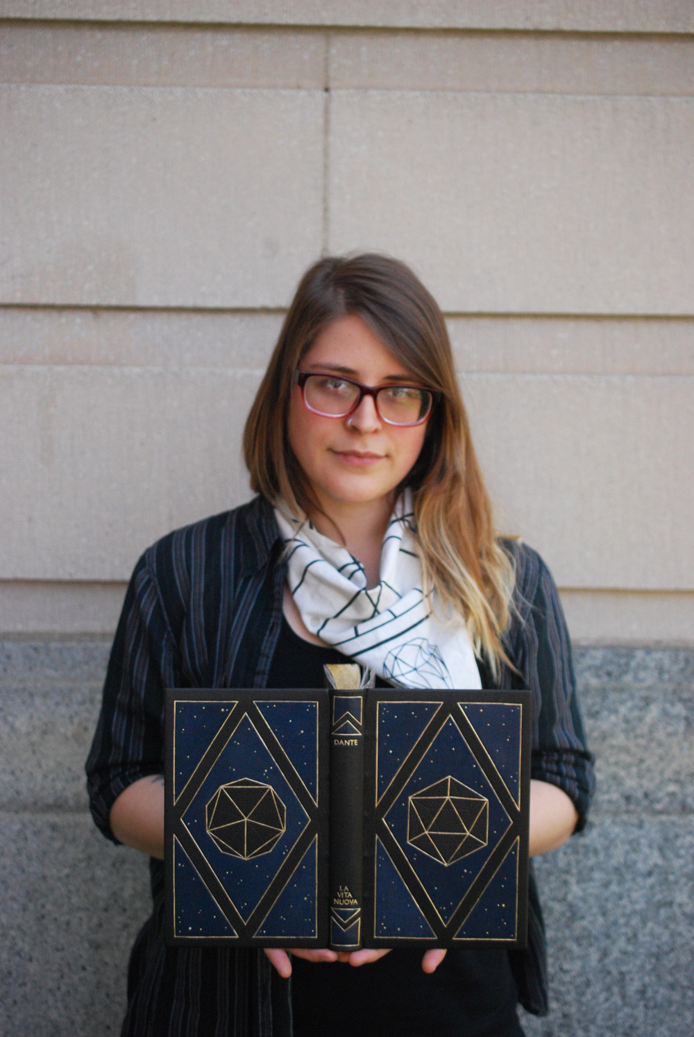
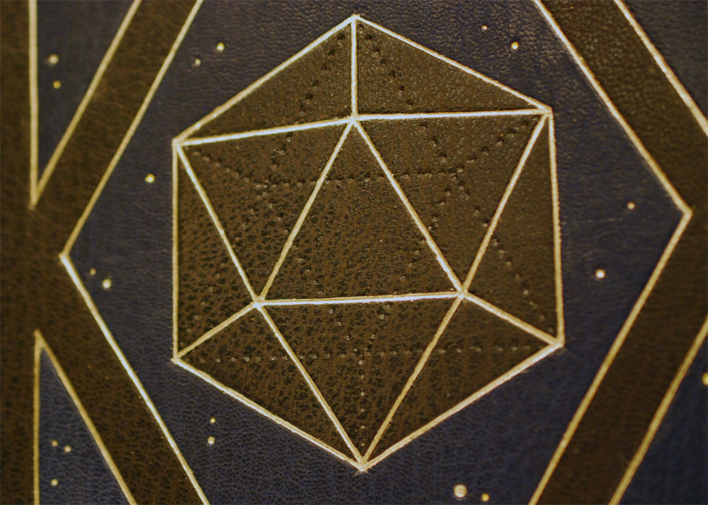
Linnea Vegh’s response to the text was quite different from her classmates, but she also found inspiration in the numerology presented by Dante. Looking beyond the text, Linnea researched life around the 13th century and what influenced art at the time. Combining Islamic influences, the discovery of celestial bodies and perfect geometry, Linnea formed a design representing a modern view of Dante’s objectification of Beatrice. Dante idolizes Beatrice, putting her on this divine pedestal, from this disassociation portrayed in the text Linnea reimagines Beatrice as an isohedron. The central shape is formed with several equilateral triangles, a perfect shape made from three equal sides.
Linnea used a dark brown goatskin from Pergamena with a slight blueish tint to cover her book. The tooled onlays are a combination of dark blue Russell’s goatskin and the same dark brown Pergamena goat. The tooling around the onlays is done in moon gold, whereas the stars are tooled in moon gold, lemon gold, palladium and double gold. The subtle variations in the leaf and dot size creates a unique sparkle and movement to the background.
The backside of the isohedron is blind tooled with an Ascona tool. Linnea presents two views of the isohedron, the front is direct and confrontational while the shape on the back is rotated slightly to distort our view. The author and title are tooled in moon gold. The text is paired with two additional tooled onlays in dark blue goat.
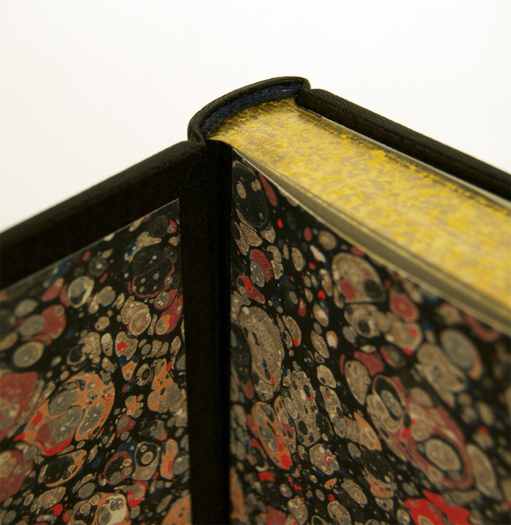
The head edge is decorated with yellow ochre boule before being sprinkled with gold and moon gold. The endbands are wrapped in the same dark blue goatskin. Linnea chose a stone and stormont marbled paper as her pastedown and fly leaves, which she made during a workshop with Chena River.
Reading La Vita Nouva with a modern lens, there are many aspects that stand out as unacceptable. Yet Linnea found a way to incorporate her response with the themes of the text into a gorgeous design. It may appear less direct, but Linnea formed a strong design that presents Dante’s work in a new light. After graduation Linnea will be spending her summer at Dartmouth College for a 2-month internship. You can follow her work on Instagram through the name runninghands.
That brings us to the end of the interview. I have to say again how impressed I am with the finished bindings. Everyone’s personalities and interests shine through their designs. The range of work also makes a more dynamic presentation of Dante’s La Vita Nouva.
Check out past interviews by clicking on the following years: 2016, 2015, 2014, 2013