RSS Feed

Posts Tagged ‘exhibit’

  1. La Couleur du Vent Exhibit is Coming to Boston

    June 22, 2014 by Erin Fletcher

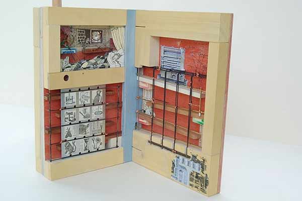
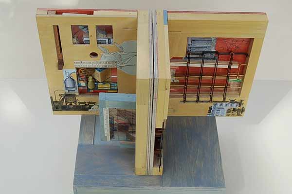
    La couleur du vent is an international fine binding exhibit organized by ARA-Canada, which I may have mentioned a few times on the blog before. After traveling around France and Canada, the exhibit will be coming to the new Windgate Gallery space at the North Bennet Street School in Boston. Needless to say, I’m really looking forward to it. The exhibit is being sponsored by the New England Chapter of the Guild of Book Workers and the American Academy of Bookbinding, along with North Bennet Street School. 

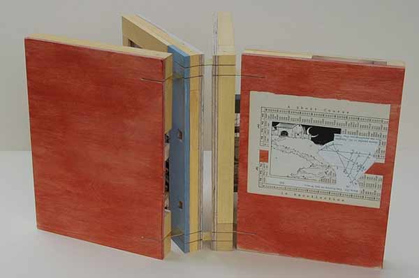
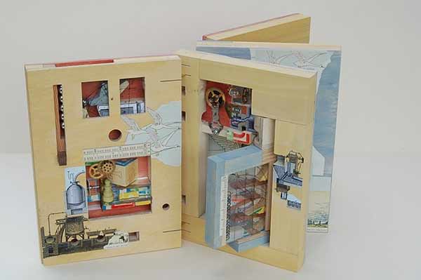
    The exhibit will feature 51 design bindings on a selected project titled La couleur du vent (The color of the wind). The text is a collection of poems by Gilles Vigneault, illustrated and designed by Nastassja Imiolek under the artistic direction of Cécile Côté.

    The opening reception will be held on:
    July 18, 2014
    North Bennet Street School
    150 North Street
    6:00 – 8:00

    But if you can’t make the reception, the exhibit will be open until September 14, 2014. Check out NBSS’s website for the official press release. Hope to see you there. 


  2. Book Artist of the Month: Susan Collard

    May 13, 2013 by Erin Fletcher

    shortcourse-susancollard

    A Short Course in Recollection was built by Susan Collard in 2009 for the Guild of Book Workers national exhibit Marking Time and through this book I was introduced to Susan’s work. Although the book may appear fairly plain on the outside, the interior pages are an inch thick in order to house a series of ramps and switchbacks. Susan began with her fascination of children’s toys built of ramps and towers. This literal marking of time in a direct, mechanistic, clattering fashion appealed to Susan (as did the technical challenge of interpreting that into a book).

    shortcourse2-susancollard

    At the top left of the first page is a vertical slot where the steel marbles are fed into the course. A blue toggle switched to the left stales the first marble upon its decent. The next marble will knock the toggle to the right and both marbles will move forward into the course on different paths. This toggle trick was inspired by woodworker, Matthias Wendel, who builds complex and ingenious marble machines. Susan approached the design of Short Course just as many artists do, by considering her materials first. In order to reduce any awkward bulkiness to the book, Susan choose steel marbles that are smaller then normal (about 7/16″). The ramps are made from ½” poplar and the face of the pages are aircraft plywood. The pages are bound together with slotted brass hinges. 

    Susan drafted full-size diagrams of the pages and made a cardboard model to aid in the building of Short Course. This is more planning that usual for Susan and all aesthetic elements came in after the pages started taking shape and the title of the book was chosen. 

    shortcourseprocess3-susancollardshortcourseprocess-susancollard shortcourseprocess2-susancollardshortcourse4-susancollard

    The third and fourth pages are more open, where the steel marbles can navigate more reliably. The marbles that fall to the right of the first toggle switch come down a ramp above the sleeping girl’s head, then hit a second toggle switch at her feet.

    The book can only function in one position, with the pages butted together tightly so the marbles can travel freely between them. There are three distinct courses, regulated by two toggle switches. The mechanism of the book does work, but rather temperamentally and can be viewed as a metaphor for memory. Some marbles will travel the course flawlessly, while others get hung up between pages, jump a guardrail or cause a traffic jam. As Susan so elegantly says “it seems easy to extend the metaphor to include these accidents of blockage and retrieval. Perhaps the book, as is, is a better representation of our own flawed memories than if it worked reliably every time. Which is not to say I wouldn’t fix it in a heartbeat if I had the ability. Probably my favorite thing about this book was integrating more childish elements (the fairy tales, alphabet blocks, even the colors of the milk paint) with the very intricate mechanisms and depictions of machinery—as if to suggest childhood is a serious and convoluted endeavor, or that understanding the world requires great leaps of nonsense and whimsy.” 

    shortcourse3-susancollard


  • My name is Erin Fletcher, owner and bookbinder of Herringbone Bindery in Boston. Flash of the Hand is a space where I share my process and inspirations.
    The StudioNewsletterInstagramEmail me
  • Archives