RSS Feed

Posts Tagged ‘guild of book workers’

  1. Upcoming Workshops in Texas and Maine

    March 26, 2018 by Erin Fletcher

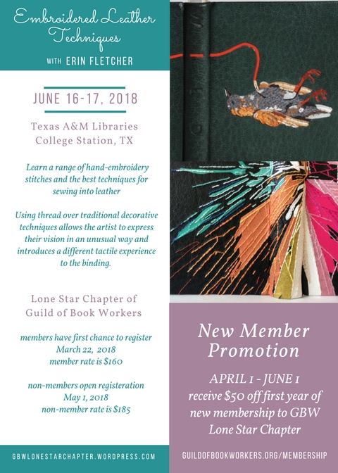
    I’m excited to announce an upcoming workshop with the Lone Star Chapter of the Guild of Book Workers and Maine Media Workshops + College.


    Lone Star Chapter of the Guild of Book Workers
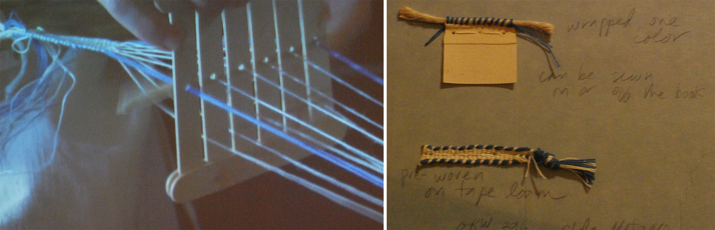
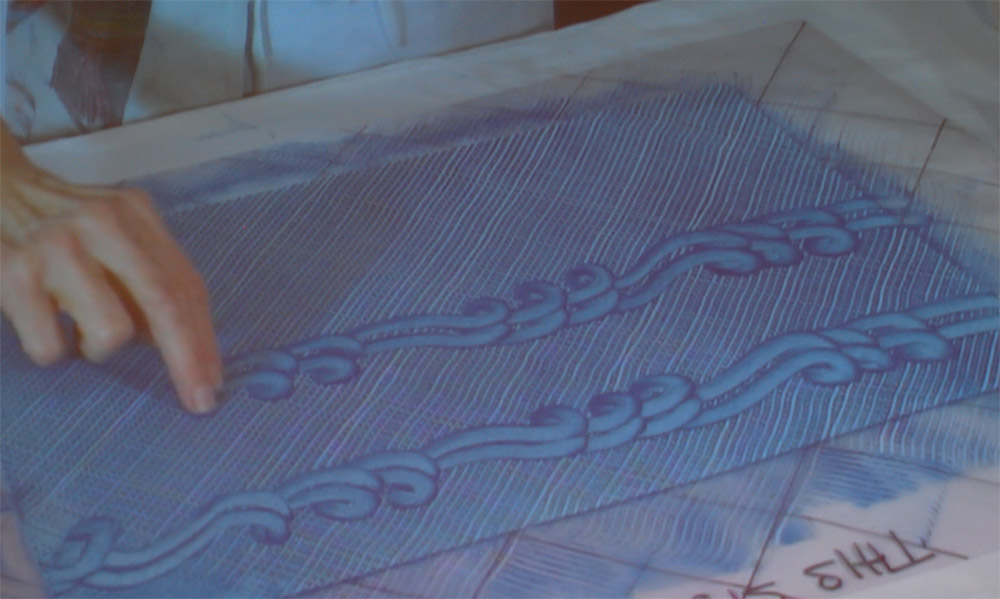
    Embroidered Leather Workshop
    June 16 – 17 (Saturday & Sunday)
    Conservation Lab at Texas A&M, College Station, TX

    Register here.


    Maine Media Workshops + College
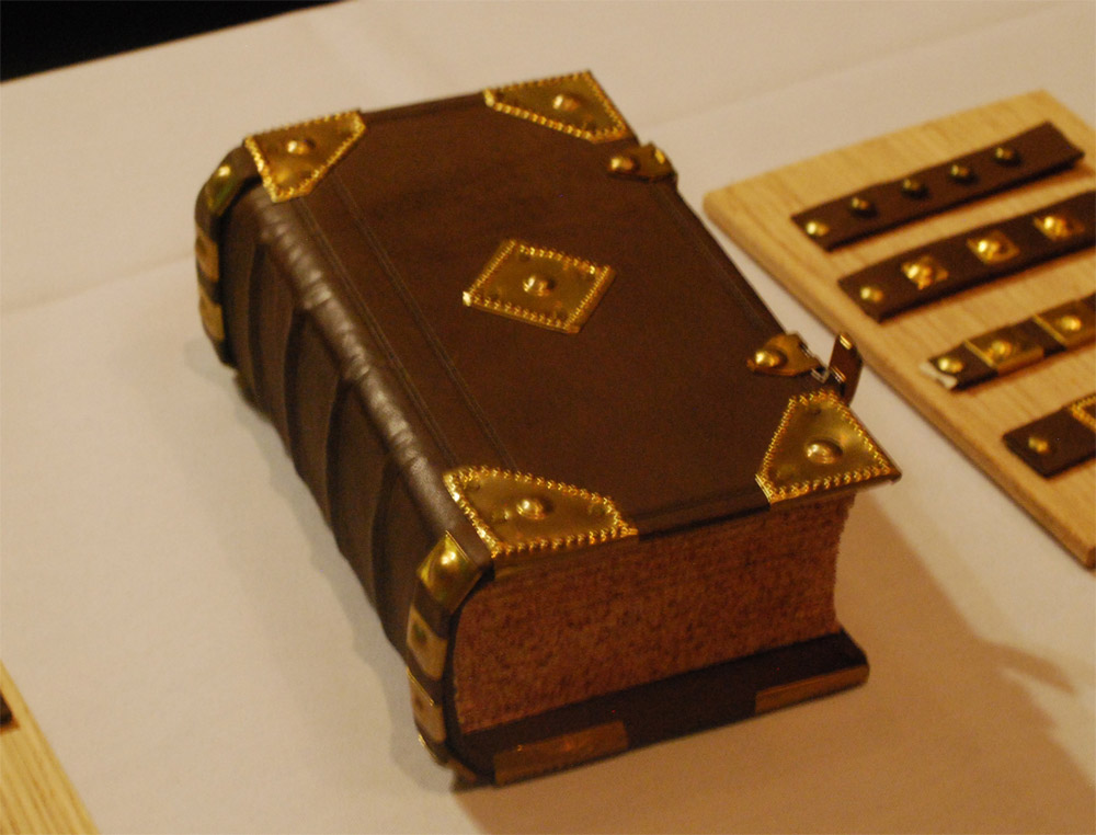
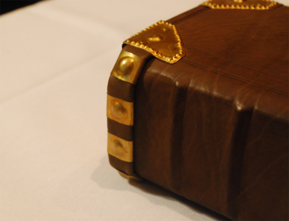
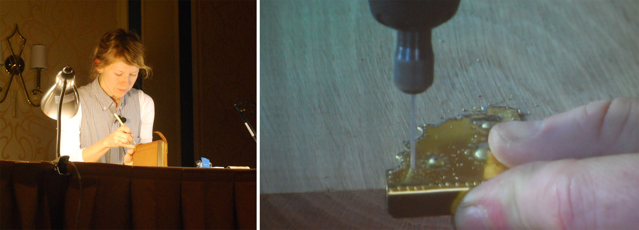
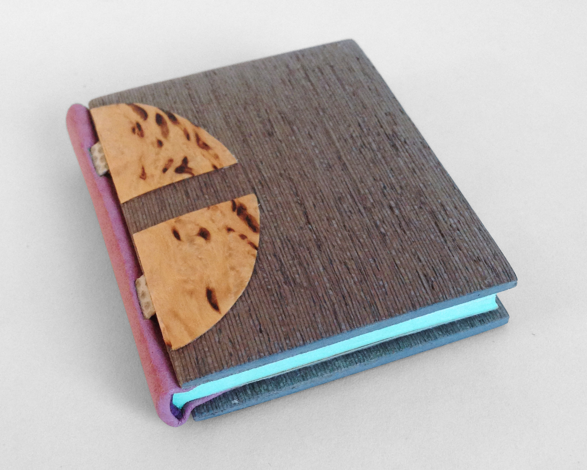
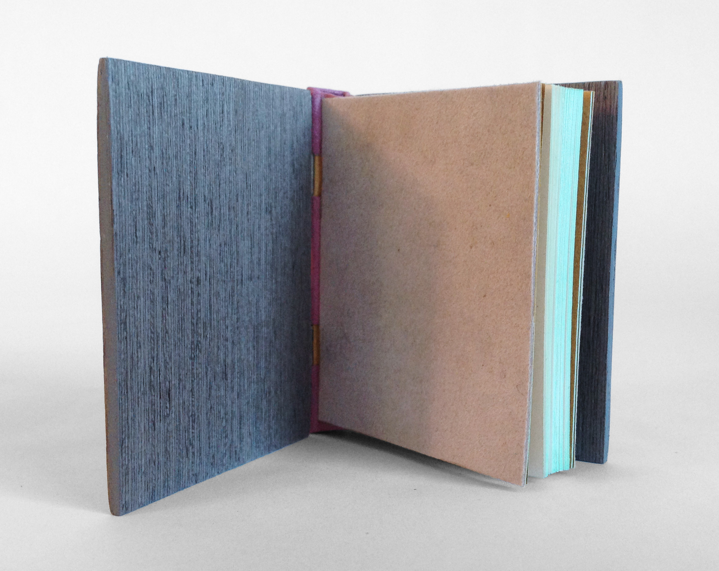
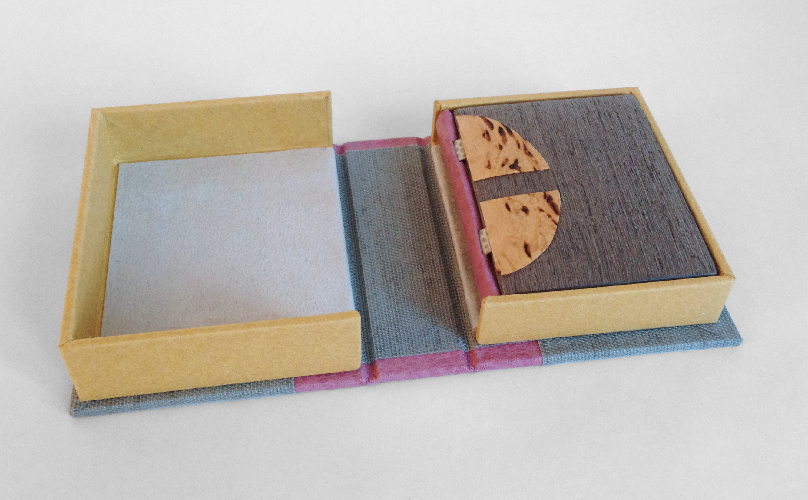
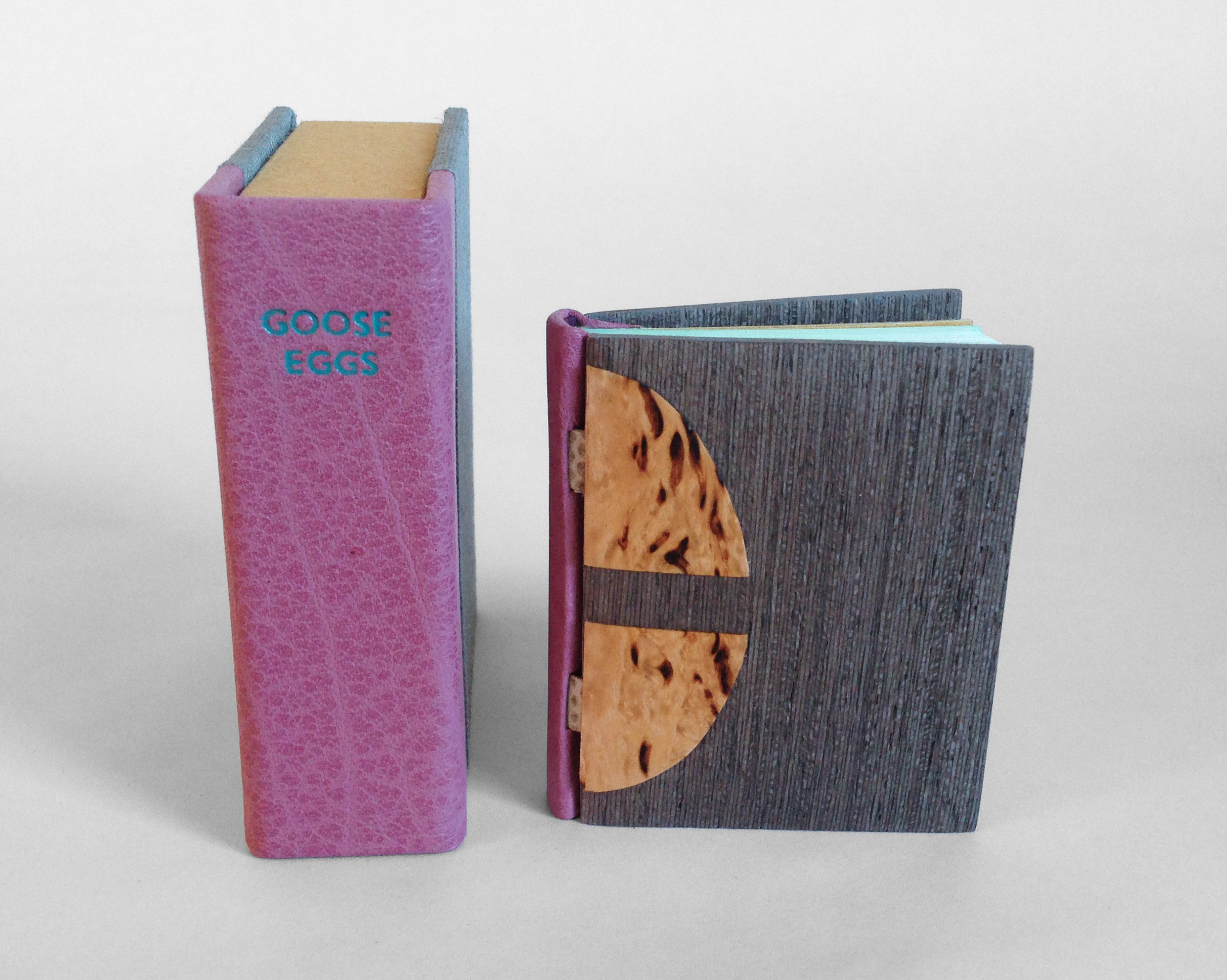
    Millimeter Binding – Rubow Style
    September 23 – 29
    Rockport, Maine

    The millimeter binding came about during the first World War when leather became a scarce resource for binders. Still wanting to provide an elegant leather binding to their clients, binders would use a minimal amount of leather to cover the spine, putting a millimeter or two of leather onto the boards. In this workshop students, will be creating a Rubow-style millimeter binding, learning how to make paste papers and work with leather. Each student will finish the course with a book wrapped in their own paste paper and with a thin strip of leather running across the top and bottom of the binding. This class is open to all and a great introduction to book arts!

    Register here.

    SaveSave

    SaveSave


  2. Guild of Book Workers – Standards of Excellence Seminar // Charleston 2016

    October 24, 2016 by Erin Fletcher

    After an adventuresome time in Durham, North Carolina, where I consumed delicious local brews, lost at shuffle board, ate so many southern dishes, visited Duke’s conservation lab, toured a lemur center and discovered that I’m still allergic to mosquito bites, Henry and I embarked on our drive to Charleston, South Carolina.

    Upon our arrival we were greeted by Tropical Storm Julia, but luckily the next few days proved to be quite lovely with very little rain. After checking in, I began to rummage through my conference packet and found my name tag, which was beautifully done by local calligrapher Elizabeth Porcher Jones.

    charlestonstandards15

    Day One:
    The conference began with a tour to the Charleston Library Society, an absolutely charming space that also served as the venue for the opening reception later that evening. Our tour began with Anna Smith, Special Collections Librarian, who gave us an overview the Society’s establishment and shared a few treasures from their collection. We were then led to the first floor by Kerri Harding, Director of Bindery and Conservation Studio, where she showed off their delightfully quaint bindery space. Having just relocated to Charleston, Kerri shared with us the range of her upcoming projects: a presentation leather binding, rehousing and holiday ornaments showcasing the Society’s newest titles.

    charlestonstandards1a charlestonstandards2

    Day Two:
    The first presentation of the conference was Drawn to the Writing given by calligrapher Cheryl Jacobsen. As a freelance artist living in Iowa City, Cheryl’s work ranges from design and lettering to illustrations and art. She began her presentation with her personal history on how her interest in art and lettering developed before going into a slideshow of her work. Cheryl is also an adjunct assistant professor at the University of Iowa, teaching courses at the Center for the Book. Over the course of the presentation, Cheryl created a certificate to commemorate the conference using a variety of letter forms. She spoke about line formation (this included pressure and hand position), nib use, ink/pigment preferences and tricks of the trade.

    charlestonstandards3

    At the end of presentation, the audience was rewarded with a copy of the certificate Cheryl produced during the presentation (she even offered to add your name to the certificate). We were also allowed to handle some of her artist books.

    charlestonstandards4

    For the afternoon presentation, the topic switched to bookbinding in Exploration of history and techniques for Pennsylvania German Liturgical Bookbinding before 1850. The presentation was divided into two parts: Chela Metzger, Head of Library Conservation at UCLA, demonstrated the construction of the binding and Erin Hammeke, Senior Conservator at Duke University, demonstrated the techniques used to create the bosses and clasps traditionally seen on this style of binding.

    charlestonstandards5

    Chela quickly went through the construction of the binding. The book used in the demonstration was sewn in an abbreviated pattern (usually 2-on) using thicker supports (usually two supports as one), the shoulders are quite narrow and the edges were (historically) ploughed. The wooden boards (oak or beech; usually quarter-sawn) are heavily shaped along the spine and fore edge on both sides of the board. The fore edge is also notched in preparation for the clasps. The spine is lined with linen strips that extend beyond the shoulder. Unlike most wooden board structures, the boards are not laced-in. The sewing supports are frayed and adhered to the first and last leaf, then the linen is adhered to sandwich the frayed cords. The text block edge is colored after the boards are attached, then the hand-sewn or hand-woven endbands are stuck-on.

    One of my favorite parts of the presentation was the brief demo given by Chela on the technique behind the woven endbanding material. Using a make-shift back-strap loom (popsicle crafts!), she wove a traditional white and blue endband strip. A variety of endbands have been spotted on these bindings. The image below (on the right) shows just two varieties with the hand woven style on the bottom.

    charlestonstandards6charlestonstandards7

    Chela’s portion of the presentation continued with the covering of the book and tying up the spine (this step ensures that the leather adheres to either side of the supports). The last step presented by Chela is one of the defining characteristics of this binding: the leather spine straps. Appearing on the spine at the head and tail (and sometimes the middle) many examples are seen adorned with brass studs or domes.

    charlestonstandards9 charlestonstandards8

    Using a 24-gauge brass sheet, Erin demonstrated the process for creating the corner pieces for the binding. Beginning with a flat piece of brass, Erin roughly traced out the design with a sharpie. Then she cut down the brass close to her design with metal snips; shaping it even further with needle files and emory paper. Supporting the brass with a lead block, Erin began to decorate the brass corner piece by striking the back with steel punches. This did not create a hole, rather pushed the brass into a shape that would be raised on the front side. In the image above (on the right), Erin uses a drill to create holes where the nails will be inserted when attaching the furniture to the book. After attaching this corner piece to the book, Erin began to bend the extended brass around the edge of the board with her fingers and finished its shape by striking the brass with a planishing hammer.

    Day two ended with a social gathering at a local pub for a Mentor-Mentee Happy Hour, those new to their field were encouraged to speak with the more accomplished participants. Afterward, I broke off with some friends for a very quick bite to eat before going on a Ghost and Dungeons tour through Charleston.

    Day Three:
    One the third and final day of the conference, two more presentations were given. The morning presentation was given by Betsy Palmer Eldridge on Paper Conservation Treatment Revisited. In 1989, Betsy gave a presentation at the Standards conference in Portland, this year she presented a revised version of that lecture.

    charlestonstandards10

    Betsy was introduced to book arts during her time at Wellesley College in 1957 and further advanced her training in Germany and France. In 1973, she moved to Toronto, where she established and maintained her private conservation studio. Betsy has been an active member of the Guild since 1960 and the Canadian Bookbinders and Book Artists Guild since 1983. Betsy gave an overview of a variety of conservation techniques and tricks she has picked up along the way. Many of the presentation materials she referred to were used in her original presentation 27 years ago, it was quite interesting to see how the materials had changed or retained their vibrancy over the years.

    The final presentation was on Herrnhuter Paste Paper given by Deborah Evetts. At the start of her presentation the audience received a brief history lesson paired with images of these papers collected from several sources. During the last third of the 18th century, a group of Moravian sisters living in a religious community at Herrnhut in Saxony created what came to be a very recognizable style of paste paper. The sisters traditionally used olive, bright or grayish blue, mustard yellows and reds in their papers. Deborah has seen several examples and has recreated tools to mimic the patterns seen on these historical papers. Herrnhuter Papers were used as both cover papers and endpapers on many common types of books such as ledgers and almanacs, but examples have also been found on works of literature, non-fiction and other genres.

    charlestonstandards11

    After the slideshow, Deborah moved onto discussing tools and paste preparation. She began with a quick demonstration on making your own tools such as combs, rolls and mylar templates. The first image below shows Deborah marking out a small piece of plastic and then cutting out the teeth using a sharp scalpel blade. Combs can be made from binder’s board, plastic container lids or vertical blinds. The second image below shows three different styles of paper that utilize the same decorative roll and the handmade rolls that Deborah has made. The designs were carved out of linoleum and attached to craft rollers.

    charlestonstandards13charlestonstandards12

    Over the course of the presentation, Deborah created several styles of the historical patterns seen on Herrnhuter Papers. She demystified so many patterns. One in particular that I was excited to see was the two-finger swirl. The crowd gave Deborah a round of applause after each paper blossomed before our eyes. Deborah was so delightful and high-spirited in her presentation and it was a great way to end this year’s series of presentations.

    charlestonstandards14

    At the end of the evening, we all gathered in the Colonial Ballroom at the Francis Marion Hotel for the banquet and live auction. Also during this time, two members of the Guild are rewarded with the Laura Young Award and the GBW Lifetime Achievement Award. Catherine Burkhard was awarded the former for her dedication and long-time service to the Guild. The latter was awarded to Peter Verheyen, celebrating his achievements in the fields of conservation, bookbinding, book arts and creating a thriving online community. As the night came to a close, I allowed my nose to be traced, said my goodbyes and wished everyone  safe travel back home. Looking forward to next year’s conference in Tacoma, Washington!


  3. Onward to Charleston, South Carolina

    September 10, 2016 by Erin Fletcher

    screen-shot-2016-09-10-at-9-30-16-am

    I am on my way to Charleston, South Carolina for the annual Standards of Excellence Seminar put on by the Guild of Book Workers. My trip begins in North Carolina with fellow guest bloggers, Henry Hébert and Jeanne Goodman. This will be my second trip to North Carolina and my first to South Carolina. I’m looking forward to traditional Carolina barbecue, lemurs, exploring the southern landscape and oh, yes all things books. This year I’m looking forward to touring the Charleston Library Society, the presentations (particularly the ones given by Chela Metzger & Erin Hammeke and Betsy Palmer Eldridge) and the vendor room.

    I’ll be writing a review of the seminar shortly after I return, so look for it around the end of September.


  4. Guild of Book Workers – Standards of Excellence Seminar // Cleveland 2015

    October 25, 2015 by Erin Fletcher

    I woke up very, very early on a Thursday morning to catch a flight out of Boston to Cleveland in order to attend the evening festivities planned for the first day of the Guild of Book Workers Standards of Excellence Seminar. I was delighted to be on the same flight with Deborah Howe, Collections Conservator at the Baker-Berry Library at Dartmouth College. The weekend-long event filled with book-related discussions had officially begun.

    We arrived in Cleveland to a brisk, yet sunny morning. My wonderful friends and colleagues, Henry Hebért and Jeanne Goodman, picked us up at the airport and we were off to the hotel located just a short walk from Lake Erie (and the Rock and Roll Hall of Fame).

    The first day of Standards began with book-related tours across the city. At the last moment, I was able to snag a spot on the tour of the Cleveland Museum of Art. Our docent, a fellow GBW member, gave us a brief tour through the Western Art galleries, stopping from time to time to show off books from their spectacular collection. It was a real treat to see some fine examples of Western-style bindings and manuscripts.

    StandardsCleveland1-ErinFletcher

    In 2002, the Museum underwent renovations that included this beautiful 39,000 square foot enclosed glass atrium that connects the original building with the newer wing and is where we met our tour guide. (click to enlarge images)

    StandardsCleveland2-ErinFletcher

    We appropriately began our tour of early bindings with an Egyptian Book of the Dead of Hori scroll on papyrus dating roughly around 1969 – 945 BC. We swiftly made our way to the 11th century as our docent pointed out this beautiful Byzantine binding with the primary headbands still intact.

    We then saw a small collection of illuminated manuscripts with pigments that had been wonderfully preserved and appeared as bright as if they were created yesterday.

    StandardsCleveland4-ErinFletcher

    As a great lover of Flemish art, Queen Isabella treasured her library of devotional books; on display at the museum is a Book of Hours crafted for her by the most talented manuscript painters active in Ghent and Bruges during early 1500s. This circle of artists were renowned for their border decoration that often featured realistically painted flowers, scrolling acanthus leaves, birds and butterflies.

    StandardsCleveland3-ErinFletcher

    The Gotha Missal dating from about 1370 – 72 is shown in the image above (left) opens to a lovely miniature painting with vines running along the margins. Since the interest for most displayed book is in the content, binders get to see very little of the actual binding. Fortunately, the CMA has digitized and photographed a large portion of their collection. The leather binding over wooden boards is quite a beautiful example of a decorative medieval binding. The tooling could have been completed with a decorative roll and covers the entire surface of the covers.

    Next in the tour was a highly decorated leather case with cut-work and hand painted details in blue once used to cover a Qu’ran dated to sometime in the 15th century. We also saw a leaf from a Jain manuscript from India dating to sometime in the 15th – 16th century. But the final piece we saw was by far my favorite.

    StandardsCleveland5-ErinFletcher

    An Illustrated Marriage of Apparitions (Bakemono konrei emaki) is a humorous hand scroll created in the mid-1800s. The story is mainly told through imagery with cartouches scattered amongst the illustrations as a way to describe the scene (much like a comic book). The scroll is displayed open to the part of the story with the birth of the first child between two apparitions or bakemono. A procession of 100 whimsical and supernatural monsters follow the couple through their matchmaking, engagement, marriage and finally to childbirth.

    StandardsCleveland6-ErinFletcher

    The evening reception occurred at the Morgan Art of Papermaking Conservatory and Education Foundation. This was my first time at the Morgan and I was blown away by the size of the space. It was covered with a multitude of various creations. From what I could gather, the space was divided into different areas, a small shop right near the entrance, an area for printing, the center of the room was used as an exhibitions space, and the back half was for paper making and other workshops. I did miss out on the tour of the garden just outside the building in the back, but I heard it was absolutely gorgeous.

    StandardsCleveland7-ErinFletcher

    Buoyancy was the exhibit on view at the Morgan, which explores themes of water and swimming and includes the work of Aimee Lee and Kristen Martincic. I really enjoyed Kristen’s realistic paper recreations of objects used in the water. Aimee created a large and impressive assortment of intricately woven sculptural ducks from hanji dyed with natural pigments.

    StandardsCleveland8-ErinFletcher

    left: Aimee Lee | right: Kristen Martincic

    Being that we were on the turf of the Midwest Chapter, members were invited to bring books for a pop-up exhibit. To our delight, this was also on display during the opening reception.

    StandardsCleveland9-ErinFletcher

    The books on display in the image above from left to right are: Cris Clair Takacs: Remembering Jan Bohuslav Sobota, Karen Hanmer: Bookbinding with Numerous Engravings and Diagrams and Richard BakerLe Tour du Monde en Quatre-Vingts Jours (Around the World in Eighty Days).

    StandardsCleveland10-ErinFletcher

    Working down the exhibit table is Eric Alstrom’s The Long Goodbye (seen on the left) and Charles Wisseman‘s World Bones. 

    StandardsCleveland11-ErinFletcher

    Next up Biblio Tech: Reverse engineering historical and modern binding structures from Karen Hanmer.

    StandardsCleveland12-ErinFletcher

    On the left is Tunnel of Love from Mary Uthuppuru with miniatures from Gabrielle Fox on the right.
    StandardsCleveland13-ErinFletcher

    Wrapping up my tour of the exhibit table is Joanna Kluba‘s Rainer Maria Rilke: Poems on the left and Emily Martin‘s Who Gets to Say on the right.

    That concludes day one of the Standards Seminar. Stay tuned for part two of the post soon.


  5. The Rock and Roll Capital of the World

    October 14, 2015 by Erin Fletcher

    cleveland

    It’s time again for the Guild of Book Workers annual Standards of Excellence Seminar. This year it will be taking place in Cleveland, Ohio. This will be my first trip to the city known as the home of Rock and Roll (perhaps I’ll make a trip to the Rock and Roll Hall of Fame). But most of my time will be spent mingling with delightful bookbinders and conservators while attending informative presentations and spending all my money in the vendor room on leather skins and other irresistible goods.

    I’ll be writing about my experience at the Seminar upon my return mid-October.


  6. My Hand // Dune

    May 1, 2015 by Erin Fletcher

    It’s been a while since I wrote about my binding of the science fiction classic Dune. After sharing my technique for the edge decoration, hand-sewn headbands and the process of covering, I’m finally ready to unveil the finished binding.

    Dune11a-ErinFletcher

    So now I’ll go over the steps that led to the finished look. After covering and letting the book rest, I began working on the remainder of the design for the front cover, which included a series of concentric circles. All seven circles would be tooled using gold leaf, but only the inner circle would also include a leather onlay. In the image below (on the left) is my initial sketch of the front cover design. It includes a list specifying the size gouge for each circle. The image on the right is the final outline drawn on tracing paper, which includes fewer circles due to spacing issues. This also became the template I would use to transfer the design to the book (hence the wrinkles and cut out squares).

    Dune13-ErinFletcher

    In the image below you can see the tooling template attach to the underside of the front board. At this point, I’ve flipped it off the book to check the placement of the first circle.

    Dune8-ErinFletcher

    Happy with the first circle, I continued working my way through the remaining 6 circles. Each circle was initially placed onto the leather with a plastic circle template and thin bone folder. I then used the appropriately sized gouge to make the first impression, with the tool being cold. Below is an image of all the different gouges used on the binding.

    Dune12-ErinFletcherDune9-ErinFletcher

    In the midst of winter and in an incredibly dry studio, I began to add the gold to the circles. After a few failed attempts and some adjustments I made to the atmosphere, the gold started to stick. In between the tooling process on the front cover, I moved to the spine where I tooled in the title and author’s last name.

    Inspired by the lettering seen on French fine bindings from the 1920s and 30s, I used a combination of gouges and line palettes to design my own alphabet. In the image below, I’ve finished the initial blind layer and am about to begin the gold tooling.

    Dune10-ErinFletcher

    The title and author’s name are divided by a blind tooled onlay of buffalo skin in a lovely light pink, which also appears on the back cover. This design is again a play on the French fine bindings from the 1920s and 30s.

    With the outside complete, I moved to the inside of the book. The fly leaves are a soft suede in dark brown which matches the onlay on the front cover. The matching DUNEblures (a silly nicknamed coined by my witty studio mate Colin Urbina) are tooled in a design that mirrors itself on the back cover. The angle of the lines match that of the triangle on the front cover. The spacing between the lines is consistent with the spacing between the concentric circles.

    Dune14-ErinFletcher

    The book is housed in a quarter leather clamshell box using the same terracotta goatskin as for the triangle back-pared onlay. The leather has been embroidered in the same fashion and tooled with the title. The rest of the case is covered in brown Canapetta cloth. The trays are covered with handmade paper I bought from Katie MacGregor and lined with the same suede as the fly leaves.

    Dune16-ErinFletcher Dune15-ErinFletcher

    In mid-April, I received the exciting news that my binding of Dune will join the Guild of Book Workers Traveling Exhibit: Vessel! This will be the second time I’ve participated in a GBW show and what’s more exciting is that this exhibit will be hosted by the North Bennet Street School. So halfway through the tour, I’ll get the chance to revisit my binding.

    The exhibit will open later this year in California and I’ll be writing a post to remind those nearby.


  7. My Hand // Goose Eggs & Other Fowl Expressions

    March 16, 2015 by Erin Fletcher

    GooseEggs4-ErinFletcher

    At the Guild of Book Workers’ Standards Conference in DC, I picked up a couple miniature text blocks from Gabrielle Fox. One of the them being Goose Eggs & Other Fowl Expressions printed by Rebecca Press in 1991. The letterpress printing was done in a vibrant purple with hints of mint blue and bright yellow. The image below is a spread from the book.

    GooseEggs-ErinFletcher

    For the binding, I decided to test the limitations of the Dorfner binding in a miniature format. Last year I had the chance to learn this very special binding structure. Unfortunately not from Edgard Claes himself, but from Colin Urbina who had the opportunity to take a workshop from the celebrated Belgian binder. The Dorfner-style binding was originally developed by German binder Otto Dorfner.

    I sadly did not take any images during the process of creating this binding as it was the first miniature I’ve ever bound and was delighted by how quickly I was able to move through each step. So needless to say, I forgot to stop and take images, but I will explain the binding process a bit in this post.

    GooseEggs6-ErinFletcher

    The book is sewn on two silver snakeskin tapes (initially lined with silk) before being rounded and backed. The edges were properly prepped for a layer of mint blue gouache paint. Leather wrapped headbands decorate the head and tail in a skin that perfectly matches the purple ink from the text block.

    The spine piece is wrapped in mauve buffalo skin, which was shaped and the headcaps were formed off the book. After cutting away to expose the tapes, the spine piece is attached to the text block and then the light grey suede flyleaves are put in place.

    GooseEggs5-ErinFletcher

    Now comes the fun part. The MDF boards are carefully shaped, first with a power sander and then by hand to offer an elegant cushioned edge. Afterward, the boards are laminated on both sides with a wood veneer. For this binding, I used an unknown wood that I found in a sample pack of domestic and exotic woods (so if anyone can identify this wood, please let me know). A channel is cut out of the veneer and the tapes are glued down to attach the board. To hide the tapes a second veneer is cut and glued down. For this binding, I cut four tabs out of Karelian birch in the shape of a goose egg.

    GooseEggs3-ErinFletcher

    The book is housed in a tiny clamshell box. The spine is covered in the same mauve buffalo skin and silver canapetta cloth that mimics the veneer on the cover boards. The trays are covered in a yellow handmade paper from Katie MacGregor, which was also used as the book’s endpapers. The book is protected with a light grey suede lining.

    GooseEggs1-ErinFletcher

    Goose Eggs is the second Dorfner binding that I’ve made to date. I really love this structure, it has a unique elegance and it can be assembled rather quickly. So I’m looking forward to working with this structure again and hope to incorporate some common elements of my work like gold tooling and embroidery. I also hope to learn more about marquetry in order to create intricate designs in the veneer.


  8. Moving Images: Guild of Book Workers Promo Video

    January 23, 2015 by Erin Fletcher

    Check out this delightful promotional video from the Guild of Book Workers. It was filmed during the 2014 Standards of Excellence Seminar in Las Vegas. The Guild of Book Workers has a unique appreciation for its younger members and really encourages the growth of all its member through dedicated support and access to information.


  9. Bookbinder of the Month: Sol Rébora

    November 9, 2014 by Erin Fletcher

    BaladaParaUnLoco1-SolRebora

    Sol Rébora bound this special one of a kind text by calligrapher Nancy Leavitt after a serendipitous meeting. The book is bound in the French-style of fine binding in full violet goatskin. The decoration is divided into six levels with onlays in purple and white goatskin.

    The text within this binding is a special edition by Nancy Leavitt. Do have a connection with Nancy, who is a calligrapher and book artist based in Northern Maine?
    I met Nancy in New York in 2006, at the 100th Anniversary Guild of Book Workers Conference. I love her work and I like her very much; she is really a beautiful person and a great artist. I proposed to her that we make a book together and she accepted; so we started to work on it. We looked for a topic which we both like to work with and [settled on the subject of] Tango. After some research we chose [the popular song] Balada para un loco [by poet Hector Ferrer].

    Sometime later she had finished the book, she sent it to me by mail, and I worked on the binding. Both of us worked totally free on our feelings.

    BaladaParaUnLoco2-SolReboraBaladaParaUnLoco3-SolRebora

    Nancy found a way to make a translation, which is very difficult for Tango. With the text and the song, she found a base to create the book.

    Later I bound the book, working with the same process I use for every design binding, but with the plus that I had been part of the creating process of the text in some way. I sent the design to Nancy before I began, (even if she didn’t ask it) and she liked it very much, so I started to work on it.

    It was a wonderful experience.

    Did you find inspiration in the text or do you draw from another source?
    To explain my way to work on a design or to find inspiration I have quite a clear process of work.

    As a starting point in the design process, I engaged in the act of reading the text of the book to be bound or I inquire about the context and history of the edition. To continue as a general basis of the process, I found very necessary to observe carefully all the aspects of the book:

    – Typography: The design of the typeface, its predominant form, size and color.
    – Print Layout: Book cover, typographic case and blank surfaces around the text.
    – Paper: Color, texture and paper weight.
    – Illustrations: Techniques used for illustrations, predominant color, size and quantity thereof.
    – Size and shape of the book: I observe the size of the book, number of booklets [signatures], leaflets or free sheets, and finally the weight of the book.

    From the evaluation of these conditions, I can begin to work on the design of the binding:
    – Structure and construction process: What may be the most appropriate structure and format and sewing by weight.
    – Materials to use: wire, paper, paperboard, leather, fabric, or alternative materials such as acrylic, wood, metal, etc.
    – Textures: Choosing textures in every material used for union or for opposition to the qualities that brings the book.
    – Colors: Colors of the materials I decide to use.
    – Design: Drawings, designs, models, colors and material testing.

    I think the openness and the preservation are the most important points on the construction process of a contemporary design binding, together with “good techniques and aesthetic criteria”.

    These are technical conditions that a binding should have to preserve the criteria that the book brings from the edition, which is accompanied by an aesthetic thought of form and color text, based on the text, work which is responsible editors, designers and illustrators.

    The design and the aesthetics or the artistic expression of the binding should be integrated to create one piece with intellectual and sensory reading from the outside. Finally, I would say the construction techniques of the structure, along with the design of the cover and applied materials, play together to achieve this unit.


  10. Guild of Book Workers – Standards of Excellence Seminar // Las Vegas 2014

    October 28, 2014 by Erin Fletcher

    The 2014 Guild of Book Workers Standards of Excellence Seminar was located in Las Vegas at the Excalibur Hotel. My initial experience of the city was enchanting. As my first trip to Las Vegas, the lights and sights were captivating and surreal. The city is constantly bustling with excitement and anticipation. However, these abstractions of Vegas began to weigh on my experience.

    Despite the circumstances, I thoroughly enjoyed myself at the Seminar and within this post I will present an overview of the events. Each Standards of Excellence Seminar includes a tour. The conservation lab at the University of Nevada, Las Vegas invited the attendees to view their facilities and see an overview of their collection, means of repair and exhibits.

    The official start of the Seminar occurred later that day with an opening reception at the University outside the Barrick Museum. We gathered outside in the warm weather to some treats and libations. The museum was open to us as well and featured a selection of contemporary 2-d and 3-d art juxtaposed with an exhibit of baskets from the Southern Paiute and Shoshone of southern Nevada. The reception is a great way to see who is attending and offers an opportunity to rekindle connections. There are a variety of people whom I connect with every year at Standards, which is one reason I love to attend the Seminar.

    Standards1-ErinFletcher

    The first full day of the Seminar included two of the four presentations and ended with a Mix and Mingle event. In addition to those happenings, is the the vendor room. Each year the vendor room is filled with colorful leathers, handmade papers, bindery tools and more. There are many vendors who are staples of the vendor room and many who are new to the crowd. I’m always pleased to chat with the vendors, it’s so wonderful to have a personal relationship with the people who supply our materials. But on to main event: the very first presentation was by Emily Martin.

    Standards2-ErinFletcher

    Emily’s artist book, The Tragedy of Romeo and Juliet, was a Distinguished Winner for the Designer Bookbinders 2013 International Bookbinding Competition and became the subject of her presentation on Carousel Books. This style of binding was first used in the 1930s becoming more popular after WWII. There are two main types of carousel books: 1) floor and wall and 2) window (or starbook). Emily’s presentation was so well executed as she demonstrated how she created a hybrid of the two types for her Shakespeare book. Her instruction was easy to follow as she demonstrated her creative process and the steps for constructing an elaborate carousel book. One other element that I enjoyed from Emily’s presentation was her use of trace monotype as a means of creating illustration.

    The second presentation was on Parchment Over Boards from Peter Geraty. This is a structure that I have learned directly from Peter, while I was a student at North Bennet Street School. So Peter’s presentation was a wonderful refresher to a structure that I am currently working on in my studio. Due to the short-time frame of the presentations, many of the steps had to be rush through, but Peter did a wonderful job of completing the major parts of the binding. It was particularly nice to see how to shape the headcap, which can be quite difficult when working in parchment.

    Standards3-ErinFletcher

    The first full day of the Seminar ended with a Mix and Mingle event, which is an informal way to show off your more recent work to the fellow attendees. A few tables were filled with a variety of book related projects from miniature bindings and finely printed artist books to handmade tools and fine bindings. It’s always delightful to handle books and have the opportunity to speak with the craftsperson about their work. This Mix and Mingle event is quite a new addition to Standards, only happening once before at last year’s Seminar, but I hope it will continue. It’s a wonderful way to engage in creative conversation with fellow bookbinders and conservators.

    Standards4-ErinFletcher Standards5-ErinFletcher

    At the start of the second day of the Seminar was a presentation on Historical Letterlocking by Jana D’ambrogio. I really enjoyed Jana’s presentation because her enthusiasm for the subject of letterlocking was quite infectious. She presented on several letterlocking variations, detailing the folds and locking techniques used in order to secure a letter of importance. And there were quite a lot of variations from using the same material to create the lock, penetrating through all folded layers, pleating, triangular lock, the penguin lock and using wax seals. Every locked letter that Jana demonstrated was based on an actual letter, that had been deeply researched and investigated by Jana herself. She has traveled all over the world viewing various letters to decipher their letterlocking structures. All this research is just the start of a new database of information and a new lexicon on the habits of security during the 15th – 16th century.

    Jana wrapped the audience into her presentation as we were tasked to unlock our own letter. She also demonstrated a quick and easy way to lock a letter into a triangular shape, which can be sent through the mail even today.

    Standards6-ErinFletcher

    To wrap up the day was the final presentation on the Traditional Medieval Girdle Book given by Renate Mesmer. In Germany the girdle book is called Das Beutelbuch and was a symbol of faith or status within society of the 15th century. The texts were either religious or legal. Around 800 girdle books can be found in art, yet only 23 physical examples are known worldwide (most in Germany and only 14 in their original cover). The structure of the book is similar to most 15th century wooden board bindings, there are so many variations to the sewing pattern, sewing support, endpapers and spine linings. Renate demonstrated the construction of the binding before moving on the creation of the girdle and Turk’s head knot.

    Renate also engaged the audience’s participation by attempting to teach us the Turk’s head knot using a bouncy ball and a long, thin piece of leather. It was quite difficult to say the least.

    Throughout Renate’s presentation, the audience was enchanted by spurts of medieval knowledge from Jim Croft, who joined the stage to discuss wood and brass hinges.

    Standards7-ErinFletcher

    The final event of the Seminar is the banquet, this year attendees were invited to dress in medieval garb (which is why Renate is dressed so appropriately during her presentation). And thanks to my classmate, Caitlyn Thompson, many of the NBSS students and alum donned hand-crocheted crowns. During dessert, the Guild’s President Mark Andersson, presented the Laura Young Award to Julia Miller and the Lifetime Achievement award to Sam Ellenport. The former is presented to someone who has served the Guild in an outstanding manner. The latter award was presented to Sam Ellenport for the countless ways he has influenced the field of bookbinding. Many people have been affected by his influence, for example, Sam was instrumental in created the bookbinding program at North Bennet Street School.

    Following the food and awards, is the real excitement of the night: the auction. Scholarship winners parade around the room with the items up for auction and excitement ensues amongst the crowd. I was delighted to participate this year for the first time and walked away with two beautiful pieces of suede that were so gorgeously decorated and altered by Coleen Curry. And thanks to Colin Urbina, I also got a dogtooth burnisher.

    Standards8-ErinFletcher

    My night ended with several goodbyes, some lovely music from Jim Croft and an excellent show and tell from Don Glaister.

    Although, I was eager to leave Vegas, I had a wonderful time at the Seminar. Looking forward to seeing all my book friends and colleagues next year in Nashville.


  • My name is Erin Fletcher, owner and bookbinder of Herringbone Bindery in Boston. Flash of the Hand is a space where I share my process and inspirations.
    The StudioNewsletterInstagramEmail me
  • Archives