RSS Feed

Posts Tagged ‘leather’

  1. Extra Bonus // Bookbinder of the Month: Tracey Rowledge

    March 31, 2015 by Erin Fletcher

    ALittleTreachery1-TraceyRowledge

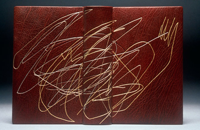
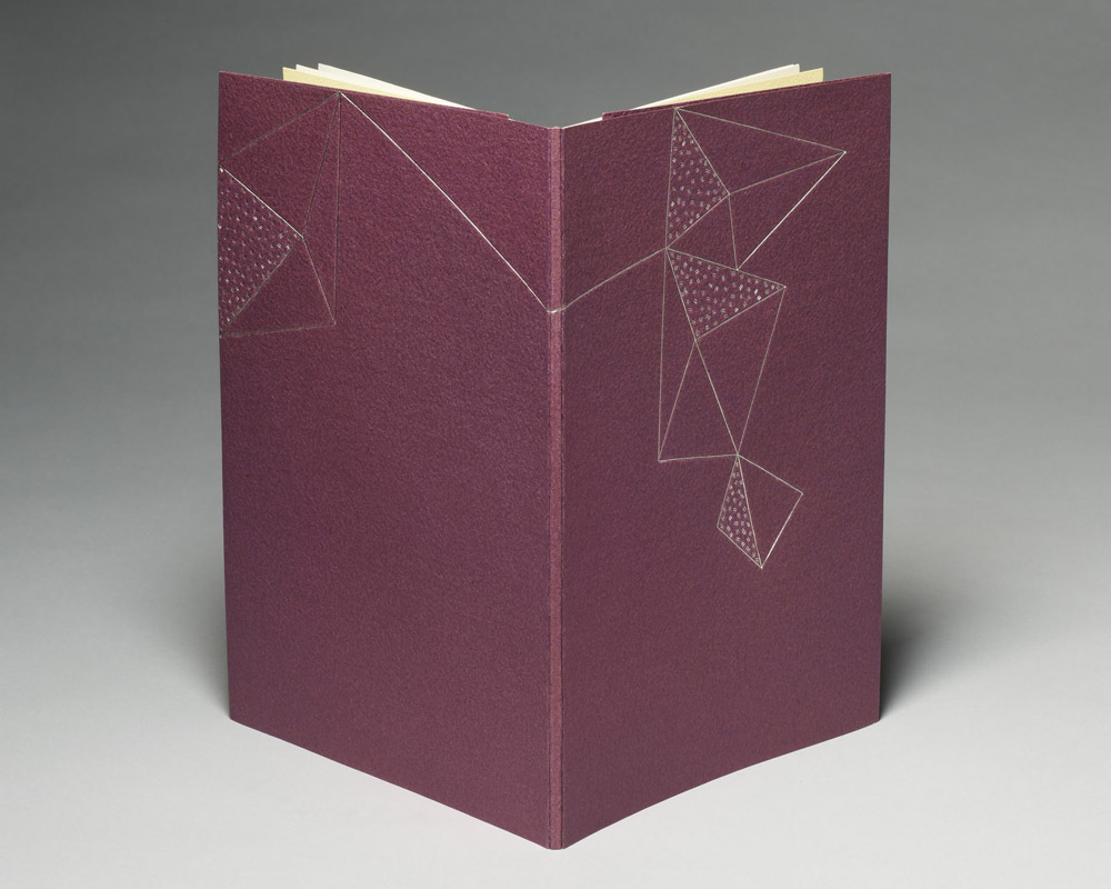
    To finish off the interview series with Tracey Rowledge, I wanted to present one final binding (or two really). Just last year Tracey bound two copies of A Little Treachery by Libby Houston, one in full leather and one in paper.

    It can seem challenging to push the envelope with a single signature text block. Yet, I think, when one begins to experiment, the creativity flows and the possibilities seem endless. What were your goals for the binding of A Little Treachery and how did you come to settle on this 2-part pamphlet structure?
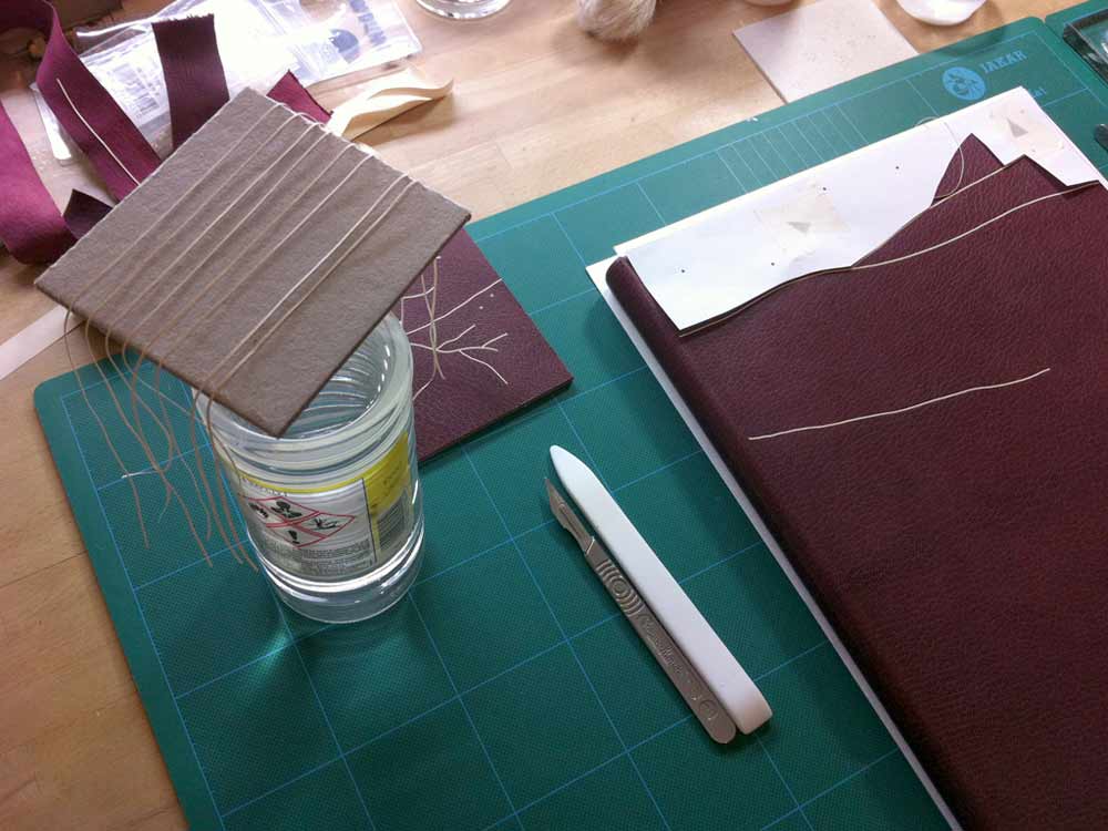
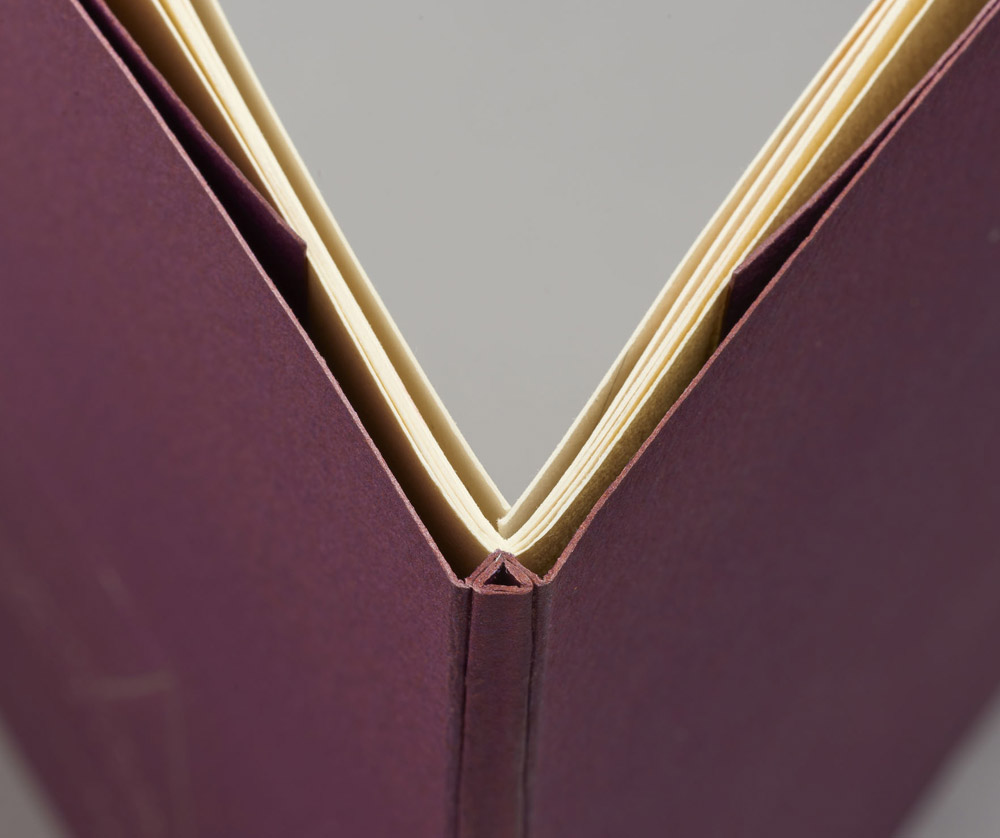
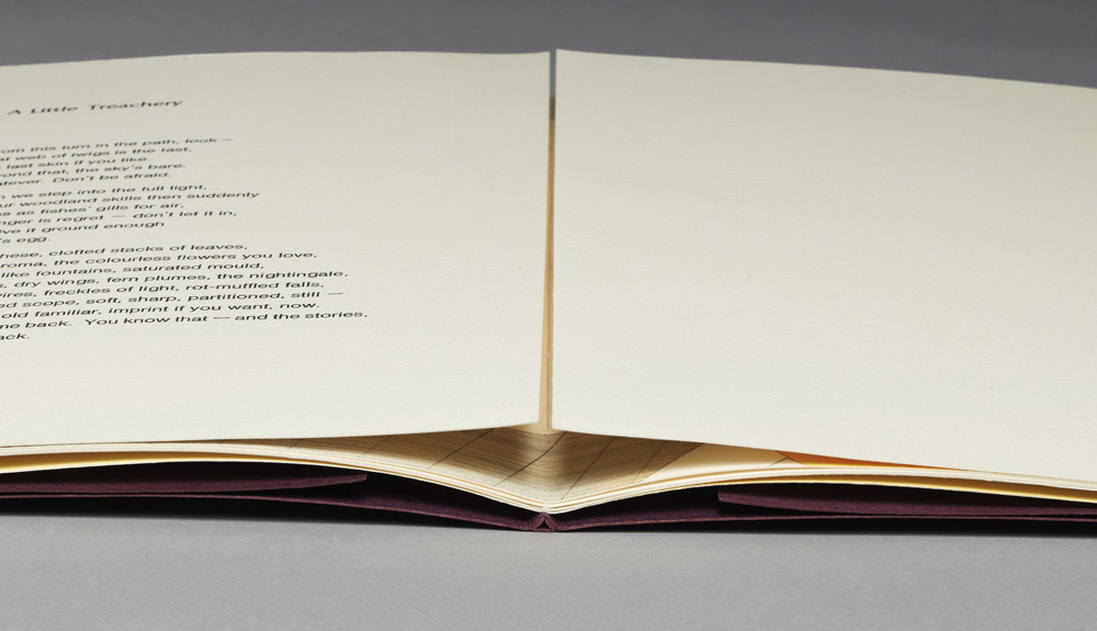
    I was commissioned to bind this book, having already bound it once as a full leather fine binding. The client liked the first binding but wanted his binding to be paper-covered. This commission gave me the luxury to revisit and develop the image I’d created for the first binding. As always, and as with the first binding I made, I wanted the book to open flat, so I devised this structure.

    ALittleTreacheryLeather-TraceyRowledge

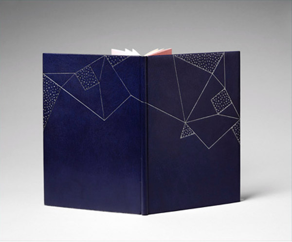
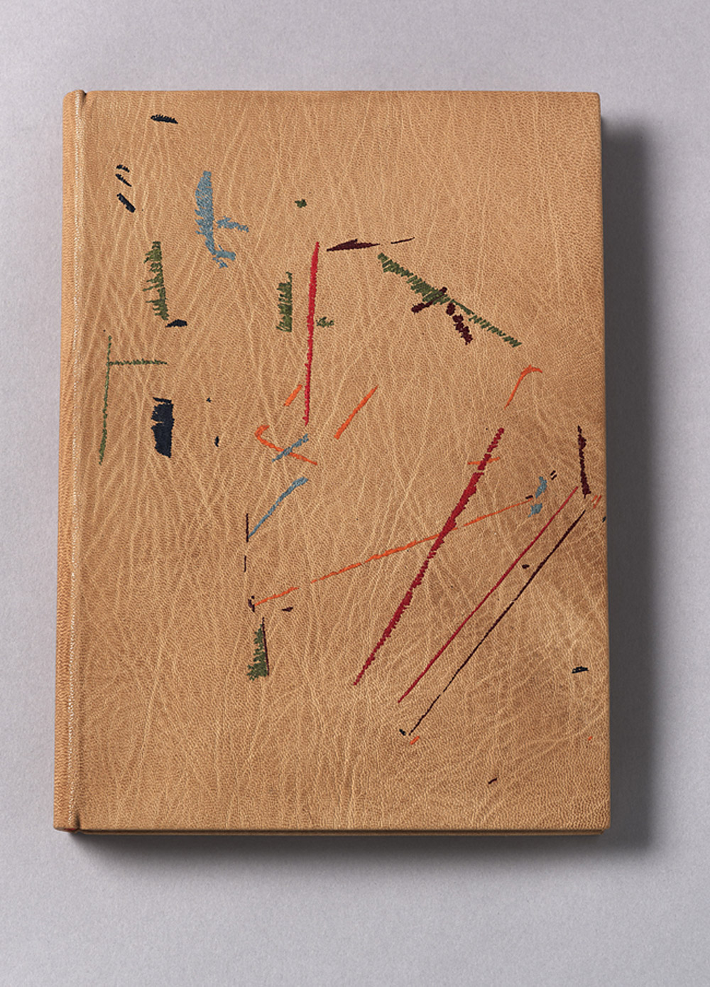
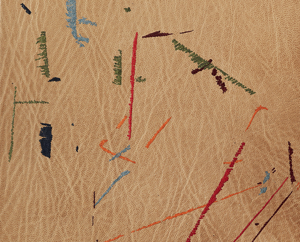
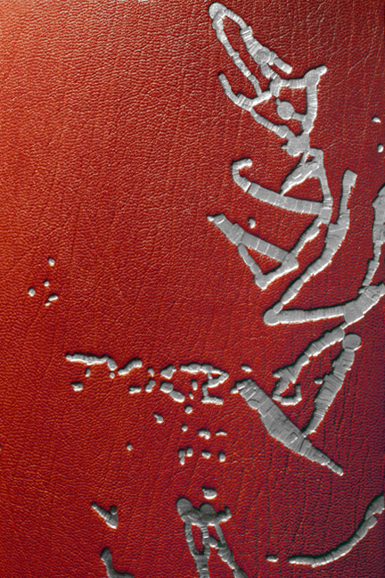
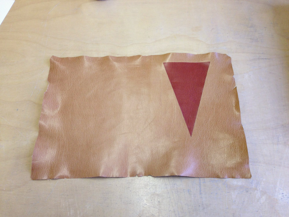
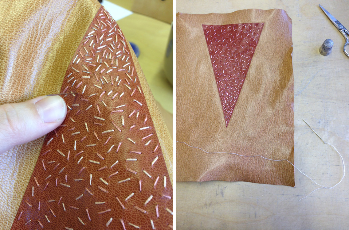
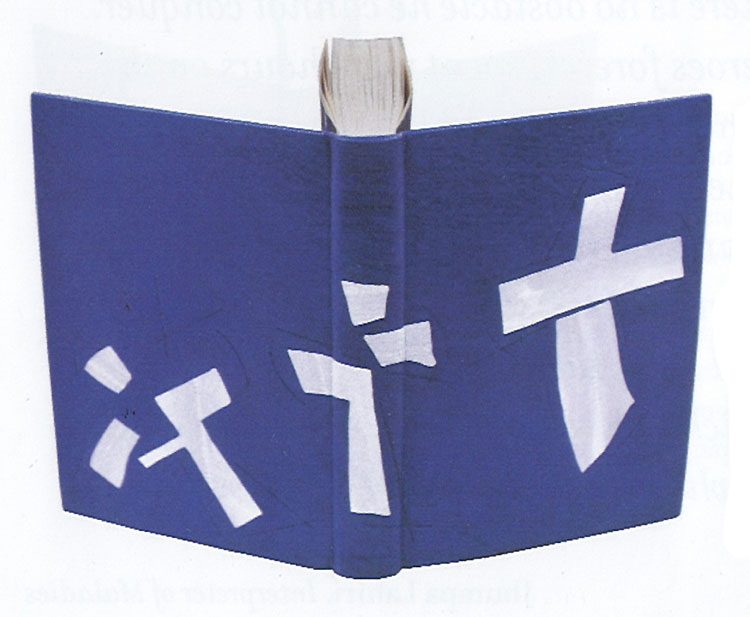
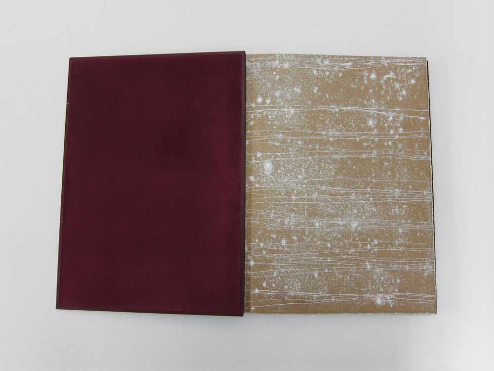
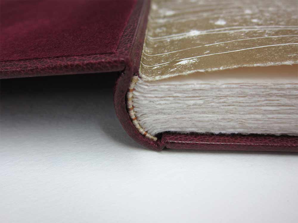
    A Little Treachery by Libby Houston with dry point by Julia Farrer (Circle Press Publications 1990) // Bound in purple/blue goatskin, sewn on a stub, with leather-jointed hand-coloured endpapers, rounded and backed and gold tooled in Palladium.

    Creating a structure bespoke for this book is no different to my creating a structure for an antiquarian book, or for a fine binding that may have alterations in the structure unbeknownst to the viewer. Really I approach all that I do in the same way: I always put the needs of the book first, employing all that I know in order to do the best thing for the book.

    ALittleTreachery2-TraceyRowledge ALittleTreachery3-TraceyRowledge

    My creative input is always there, it’s what gives the object its look, shape and feel. It’s just that in some bindings I may give deference to the age of the text-block and therefore leave room for the book as an artefact to take centre stage, rather than allowing myself to butt in with anything I might feel a pressing need to convey at that moment. Perhaps it’s all about trying to have good manners, about knowing when is the right moment to speak and when is the right moment to listen.


  2. Bonus // Bookbinder of the Month: Tracey Rowledge

    March 26, 2015 by Erin Fletcher

    Vathek1-TraceyRowledge

    To continue with the same theme from the prior post, I wanted to discuss another unique binding from Tracey Rowledge’s portfolio. The binding is of a 1929 edition of Vathek by William Beckford published by the Nonesuch Press. Bound as a fine binding in biscuit colored goatskin and feathered onlays.

    Vathek3-TraceyRowledge

    This binding is unique within your portfolio. The markings are created through feathered leather onlays instead of gold tooling. Onlays are used rather sparingly in your work, can you talk about the reason why your chose to use onlays on Vathek as opposed to a gold tooled design or colored foils?
    This book contains wonderful illustrations by Marion V. Dorn and the binding further explores my wanting to alter the language of a fine binding. The book has a rough-edge gilt top edge, the endpapers are the same colour as the text-block and are hand-coloured with coloured pencil so that when the book is open the endpapers frame the text-block with the same colours the illustrations contain.

    Vathek2-TraceyRowledge

    The leather-joints are red, the same colour as the endbands, this union I felt brought these two elements together, like an elastic band encircling the book. The natural colour of the leather is for me like a grainy blank canvas and the coloured onlays give the impression of the making of a drawing with coloured pencils: you know when you’re drawing and you lean on another piece of paper and the pencil runs off: over the edge. That’s what I wanted to create – a remnants drawing. Gold tooling wasn’t the right medium for the image, also, I didn’t want the image to be made from tooled impressions, I wanted for the image to sit on the surface of the leather. This was the only way the image felt right.


  3. Bookbinder of the Month: Tracey Rowledge

    March 15, 2015 by Erin Fletcher

    AuggieWrensChristmasStory1997-TraceyRowledge

    This is one of my favorite bindings from Tracey Rowledge; the tooling is brilliantly executed and in such a way that is perplexing. Which is precisely why it was included in the interview. Tracey bound this edition of Auggie Wren’s Christmas Story by Paul Auster in 1997 using native red goatskin.

    I’m really intrigued by the design for the binding of Auggie Wren’s Christmas Story that you created in 1997. I would love to hear about the steps involved in executing the design; from the detailed image of this book, the tooling appears staggered, as if the depth of the impressions varied. Were you using a series of hand-made tools to create the overall design and this effect?
    This was a pivotal binding for me, as this image dictated that I alter my gold tooling technique from using albumen glaire and laying the gold on the book, to using BS Glaire and picking the gold up on the tool (Ivor’s method). The tooling was done using a series of pallets and irregular shape brass finishing tools (which I’d made), that overlapped in order to fill various shapes in the image. This was the first time I’d used Caplain leaf (18 carat), it’s a difficult leaf to work with as it’s quite brittle. It remains a favourite leaf to use as it doesn’t tarnish and has a wonderful melancholic tone.

    This book took about 100 hours to gold tool.

    AuggieWrensChristmasStory1997detail-TraceyRowledge


  4. Bookbinder of the Month: Tracey Rowledge

    March 8, 2015 by Erin Fletcher

    SatyrAgainstMankind-TraceyRowledge

    The two bindings featured in this post are earlier pieces from Tracey Rowledge, but I think they represent her core interests in melding simple marks into complex gold tooled designs. The binding above is an edition of A Satyr Against Mankind by The Earl of Rochester, which was bound in a chestnut brown goatskin in 1999.

    Below is one of two bindings Tracey has completed on Ulysses by James Joyce. This particular one being the earlier binding done in 1996. Also bound in a chestnut brown goatskin; the majority of the design is gold tooled with subtle touches of blind tooled lines.

    Ulysses-TraceyRowledge

    There is a sense of exploration in the design these two bindings. The execution itself is awe inspiring and I set out to discuss Tracey’s technique and process for creating such expressive tooled designs.

    The gold tooled design on these two bindings is reminiscent of Ivor Robinson’s work; the style is very free and uncontrived. Do you execute this form of design directly on the book in a spontaneous manner or are you tracing out the design from a planned drawing?
    Thank you for the compliment of writing that these two bindings are reminiscent of Ivor’s work, for me what we have in common is leather, gold leaf and the drawn line. Ivor’s work is majestic in its rightness, the tooled lines have a tension and a stillness, which in some works causes the image to reverberate. My interest is to capture the energy of mark-making via the non-gestural process of gold tooling, I’m interested in the play between how something looks and how it is made. How can something that was made intuitively with a pen or pencil be transcribed by the painstaking process of gold tooling – and yet it can. To gold tool a gestural image you need to transfer the image onto the cover by blinding it in through a hand-made paper template, then you blind-in direct to ensure the grain is crushed in the impression and is of the correct depth; then you paint two layers of BS Glaire into all the impressions and then you gold tool each impression with up to nine layers of gold (this is done by gold tooling three layers at a time). This means that I will go into each impression up to five times.

    For something to look spontaneous it needs to have been painstakingly planned and meticulously executed – Ivor and I certainly had that in common!

    You have been noted to incorporate several shades of gold in your tooling. What are the qualities to mixing different tones of gold?
    The different golds are my pallet of colours. Using a gold that is more yellow or more grey will alter the balance of the image and will take it away from being what I think of as standard gold tooling. Using Moongold can make an image appear playful and delicate, using Caplain can give an image a solemn feel. It depends on what I’m wanting to convey as to what colour leather or paper I use to cover the book and what type of gold leaf I use.


  5. My Hand // Covering Dune

    February 10, 2015 by Erin Fletcher

    CoveringDune1-ErinFletcher

    As I have mentioned on a prior post, my inspiration for the binding of Dune came from several sources: my husband (super fan) plus Lynch and Jodorowsky’s cinematic interpretations. Once I put pencil to paper, I drew from the geometric shapes and simple forms of the French Art Deco design bindings of the 1920s/30s.

    After creating a plaquette of the final design, I outlined the steps of execution for the covering and design work. The isosceles triangle onlay was to be embroidered, which meant it needed to be attached before any paring. The triangle onlay was pared to be incredibly thin from a terracotta Harmatan goatskin then glued down to the base tan Harmatan goatskin using PVA. It’s crucial to use PVA, since the steps for covering requires moisture which could lift the onlay if paste were used.

    In the image above, I’ve laid down a paper template (this paper template is the exact dimensions of the book, it includes the turn-ins and width of the joint). It also has the markings showing me where to glue the terra-cotta triangle onlay. Once the triangle was in place, I sandwich the leather between two acrylic boards and put it in the press to dry.

    CoveringDune2-ErinFletcher

    At this point, the leather is ready to be pared. The paring went through several stages. I began by paring the whole piece of leather using a Schärf-fix, this process turned the triangle onlay into a back-pared onlay. Next I pared the edges down in preparation to use a spokeshave to cushion pare the rest.

    CoveringDune5-ErinFletcher

    Once the skin was perfectly pared, I got straight to the embroidery of the triangle onlay. I used three different shades of pink in varying thread thickness to sew lines in a random manner (being more densely applied near the point of the triangle).

    CoveringDune6-ErinFletcher

    With the embroidery complete and the leather pared, I continued with the final steps of the plan: covering the book. I’m going to keep you in suspense to see the full design once the binding is complete! Stay tuned!


  6. My Hand // Leather Embroidery Samplers – Part One

    April 15, 2014 by Erin Fletcher

    EmbroiderySampler-ErinFletcher

    Since my last embroidered leather binding, I’ve had the urge to experiment with various traditional stitches in leather. Through my experiments I aimed to find which stitches would translate the same way on leather as they do on fabric. In addition, I wanted to know if I could easily keep a stitched line straight during the covering process.

    I began with a rough sketch of each sampler, a total of six. The stitches I chose were divided into categories (such as chain stitches, variations on the back stitch, couching, etc.) and then laid out onto each sampler sketch. I choose to experiment on both goatskin and buffalo which were pared down to the thickness I use when covering a full leather fine binding (~.5 for the buffalo and .7 for the goat). 

    EmbroiderySampler5-ErinFletcher

    Then, I cut down a piece of Japanese tissue to the size of the plaquette board and adhered it to the center of the leather. Once the pieces were dry, I proceeded to draw out a 1 x 1 mm square grid onto each sampler. This grid made it incredibly easy to lay out the stitches and to make sure I kept them even and straight. Before I began a stitch, I figured out the hole placement and spacing. Then with my pin vise I made pin-pricks through the leather. Laying out the holes beforehand made the act of stitching easier and faster. 

    EmbroiderySampler2-ErinFletcher

    After completing all of the stitches on a sampler, I prepped the leather for covering. Excess strings were trimmed and pasted down in line with stitches on the backside. This way any strays would not be visible on the front side of the leather. Once I readied my bench with the proper tools, the leather pieces were pasted up with wheat starch paste and attached to the board. After folding over the turn-ins and working down the corners, I stuck the plaquette under a press between foam and press boards. The foam pushes down the leather around the stitches much easier and quicker than I could. 

    When working with embroidered leather, I don’t wet out the piece before pasting up as I normally would. I do however add some moisture to the turn-ins to aid in the covering process. 

    EmbroiderySampler4-ErinFletcher


  7. Bookbinder of the Month: Lang Ingalls

    March 23, 2014 by Erin Fletcher

    Chanson-LangIngalls2

    Chansons is a text written by the Belgian poet and playwright Maurice Maeterlink. This particular 1995 edition is in French and includes engravings by Ginette Litt; the copy is signed by Litt and bibliophile G.A. Dassonville. Lang Ingalls bound this copy in 2013 and it will be exhibited from April 4 to June 30 of this year in a show titled ‘Belgian Writers, a Binding Homage’ sponsored by Bibliotheca Wittockiana and ARA Belgica.

    The binding is bound in the French technique in pink goatskin. Lang describes the cover design inspiration and techniques below in response to my question. However, not shown are the hand-sewn silk headbands and black suede pastedowns and flyleaves.

    Once again, you’ve created such a beautiful binding. I would just love for you to discuss your concept behind the design and how you translated that into the materials used on the binding.
    This binding is recent, and one that took a long time to develop, and one that is amongst my favorites I’ve made. The shapes on both the recto and verso are taken from the etchings of Ginette Litt, one for each song (six). The shapes were removed and sanded, then re-adhered to the covers. The incision lines were painted black. The small connecting lines are thin twine that has been wound with silk thread in a near-pink hue, then adhered in a tooled line. The title is blind tooled then painted in the same black as the incisions.


  8. Half Light Bindery

    March 18, 2014 by Erin Fletcher

    HalfLightBindery5

    As Kevin Sheby graduated from the full-time program at North Bennet Street School, I had to say my goodbyes. He and his wife, with their two dogs, left soon thereafter to return to California. Since graduating in 2013, Kevin has custom built an efficient bindery space where he runs Half Light Bindery (which I have to say is a wonderfully chosen bindery name).

    Kevin is so talented and has created such amazing work that is both well crafted and artistically executed. Spending time with Kevin at NBSS, made me realize the importance of whole-heartedly investigating bookbinding structures and materials. What are the limits and what are the possibilities. Kevin has such a superb attention to detail and I’m always looking forward to the work that comes out of his bindery. 

    Recently, Kevin launched a collection of handmade leather products. Again his innate attention to details are seen in every product and within the professionalism of his website. 

    HalfLightBindery7HalfLightBindery3 HalfLightBindery2


  9. Bookbinder of the Month: Lang Ingalls

    March 9, 2014 by Erin Fletcher

    GoTellItOnTheMountain2-LangIngalls

    In 2011, Lang Ingalls won the Best Binding Award from the Chicago Public Library’s One Book Many Interpretations exhibition for her binding of Go Tell It on the Mountain by James Baldwin. It was during the reception for this exhibition that I met Lang. I was drawn to her binding because of the stark contrast between the rich purple leather and bright white onlays.

    Bound in the French technique and covered in purple goatskin. Spanning across the covers and spine are white eel onlays.  Other design details along with the title are hand tooled blind.

    This is the binding that led to our being introduced during an exhibit in Chicago. I am so attracted to the brilliant contrast between the vivid purple leather and the bright white eel skin onlays. I have little experience using exotic leathers, how does eel skin compare to traditional bookbinding leathers?
    This eel skin is really really thin, perfect for onlays, and not difficult to execute. I had fun deciding which way the spine parts would go to complement the design.


  10. Bookbinder of the Month: Haein Song

    February 23, 2014 by Erin Fletcher

    RomeoAndJuliet1-HaeinSong

    In 2012, Haein Song bound this copy of Shakespeare’s Romeo and Juliet in full leather maroon goatskin. The delicate linear design was created by applying a series of natural goatskin onlays. The endpapers are monprinted in gold with suede doublures. 

    RomeoAndJuliet3-HaeinSong RomeoAndJuliet2-HaeinSong

    At first glance, the decorative elements appear to be hand tooled, but those thin lines are actually several onlays. Did you find it difficult to manipulate such delicate and thin pieces of leather?
    Leather pieces are paired down very thin (0.2.mm) and I cut them into long lines of a width of 1mm. It isn’t easy to glue the pieces so I put pva and paste mix on the glass surface then lay the piece on top so it can catch the adhesives. Then with a help of scalpel and tweezers I lay them on the the cover of the book based on my design. I think the idea of doing it seems more challenging than actually executing it. Once you are used to the thinness and longness of the piece it become a little bit like a drawing tool. And when I was laying down the pieces I had a feeling that I was drawing with a leather.

    RomeoAndJulietOnlays-HaeinSong


  • My name is Erin Fletcher, owner and bookbinder of Herringbone Bindery in Boston. Flash of the Hand is a space where I share my process and inspirations.
    The StudioNewsletterInstagramEmail me
  • Archives