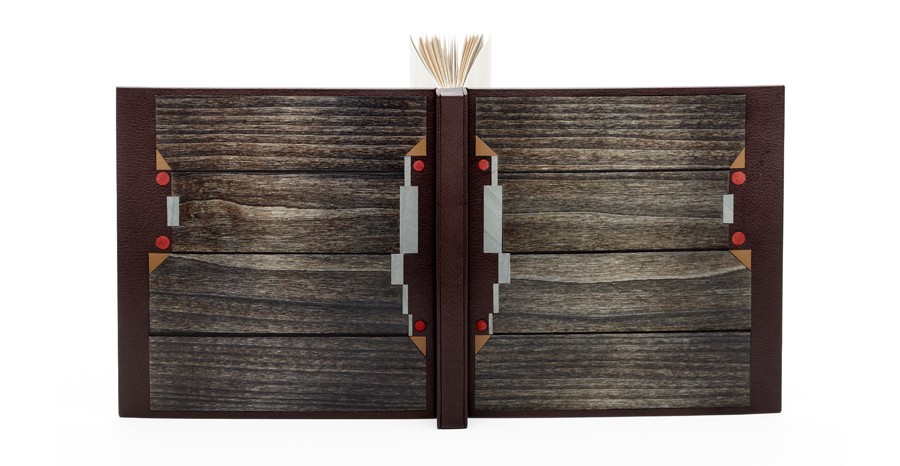
This is a binding of Los cachorros by Mario Vargas Llosa bound by Eduardo Giménez in the Oriental binding using dark brown shagreen leather. The design includes inlays of dyed wood veneers and brown calfskin, with red suede onlaid dots. Eduardo used grey Fabriano Roma paper for the endleaves.
You often incorporate wood veneer into your designs. What draws you to use this material?
I discovered very soon that wood and leather were working very well together. Wood veneers offer a big warmth to the covers. Each wood is different, has different grain and textures, and allows dyeing, polishing and the application of waxes or varnish, which adds a very pleasant visual and olfactory component as a whole with the skin. Nevertheless, wood is a living material and it is difficult to work with.
You used the new Oriental binding structure for Los cachorros. This is not a structure that I am familiar with and have only seen a few other binders use. Can you talk about the structure and why it was a suitable choice for Los cachorros.
The Oriental style binding is actually a Western version of the classical Chinese and Japanese binding. It uses hard covers and leather, contrary to its counterparts, but the form and its aesthetics are somehow preserved. I have always considered this form very beautiful. It is also a conservation binding, since the signatures are sewn on guards and they are not rounded with the hammer, neither are touched by the glue. In addition the book can be opened flat.
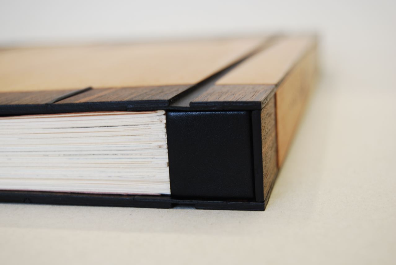
side view of Don Quijote Samurai bound in the Oriental-style binding
I think that I would not be able to give an explanation to your question of why it is a suitable choice for this book particularly. I always try that the binding is pleasant to look at. We might possibly think that an Oriental binding must only be good for an Oriental book. But, if we have adapted the structure and the materials in the Western world: why shouldn´t we also use it for a Western book?
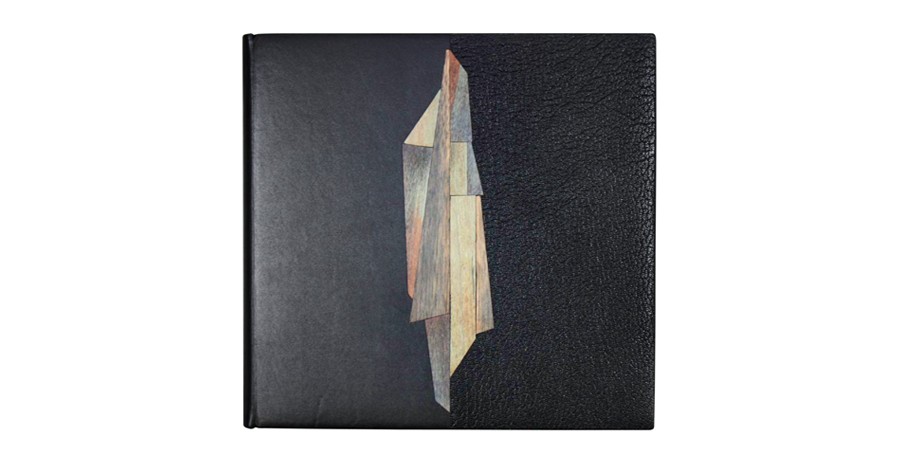 Eduardo bound this copy of Pablo Neruda’s Una casa en la arena with a striking design where black calfskin meets black Morocco goatskin at the center of the front cover. The central design is a collage of perfectly fitted pieces of dyed wood veneer onlaid between the two skins. This binding was awarded the Best Creative Binding for the International Bookbinding Competition of the National Library of Scotland in 2011.
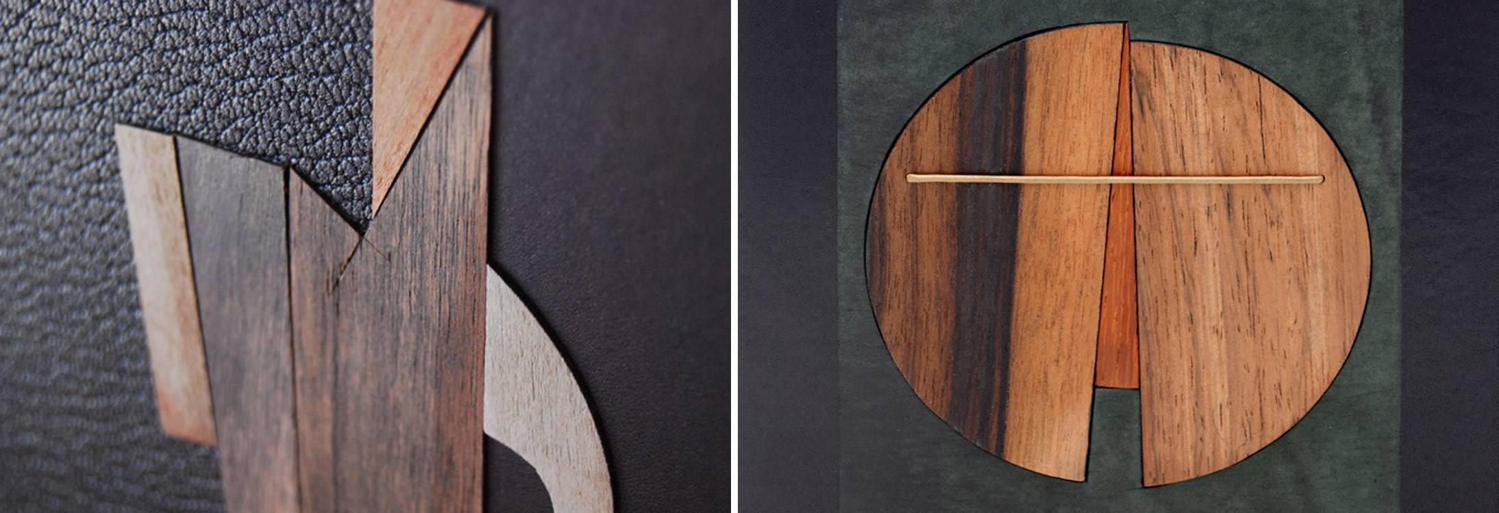
Upon first glance, the central design on Una casa en la arena acted as a distraction from the two distinct leathers. But I really love the use of both calf and goatskin on the covers. When working with wood veneer, are you treating them as inlays or onlays? I notice that on Una casa en la arena (left), the veneer sits proud of the cover, where as on Mozart (right), the veneer appears flush to the cover.
The use of two skins of the same colour and of different texture to get a good effect was the result of experimentation. The design rests on both covers over a central axis divided by the two skins that are placed at the same level. The book by Neruda contains a few beautiful photos of his house in Isla Negra (Chile). In them it is possible to see his collection of ship wooden figureheads with their straight bearing and their rich adornments. My work with small irregular pieces of dyed wood veneer, placed in the shape of a puzzle, was trying to produce that effect.
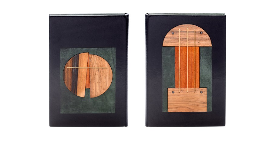 I work interchangeably with both options, inlays and onlays. In Mozart, I played with different levels in the mosaics, and I believe they gave a more dynamic aspect to the composition. In Una casa, I treated the wood veneer proud of the cover to form a more stylized, more linear figure. The pieces were there, on my table, I only had to give them an order. I often try to find an appropriate way of composing my materials placing instinct before reason.
