RSS Feed

Posts Tagged ‘paper and book intensive’

  1. Teaching at Paper & Book Intensive 2018

    August 28, 2018 by Erin Fletcher

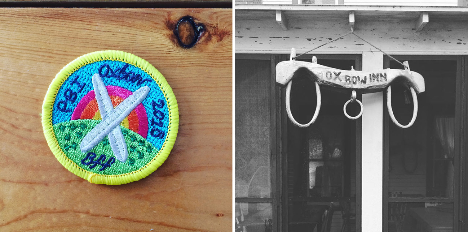
    In May of this year, I had the honor of teaching at the Paper & Book Intensive which was held at Ox-Bow School of Art in Saugatuk, Michigan. If you aren’t familiar with PBI, it’s a two-week intensive camp where participants take three workshops on topics related to bookbinding, printmaking, paper-making, conservation and book arts. Everyone stayed in lodging on the grounds at Ox-Bow and ate together during mealtimes. During off-hours, people spent their time creating, mingling, making toast from the 24-hour toasting station or roasting marshmallows at the fire pit near the lagoon.

    I had been invited to teach my 2-day Introduction to Embroidery on Leather workshop during the first session. In the first session, participants take two different workshops, one in the morning and the second in the afternoon. This meant, as an instructor, I had two different groups to teach over the span of four days. I had 13 students in the morning and 12 students in the afternoon.

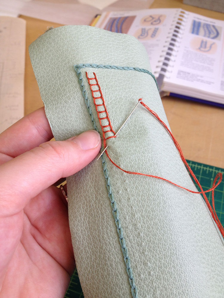
    My workshop took place on the second floor of the print building. The space was wonderful. It is a newly constructed building with high ceilings and tall windows on all four sides that looked out into the woods. After getting settled and going through materials, we embarked on our first task of poking lots of holes into leather through a paper template. The room was so quite and still, that a unique soundtrack began to play out. The ping from the pin vise and crunch of the paper template mixed with birdsongs and swaying trees.

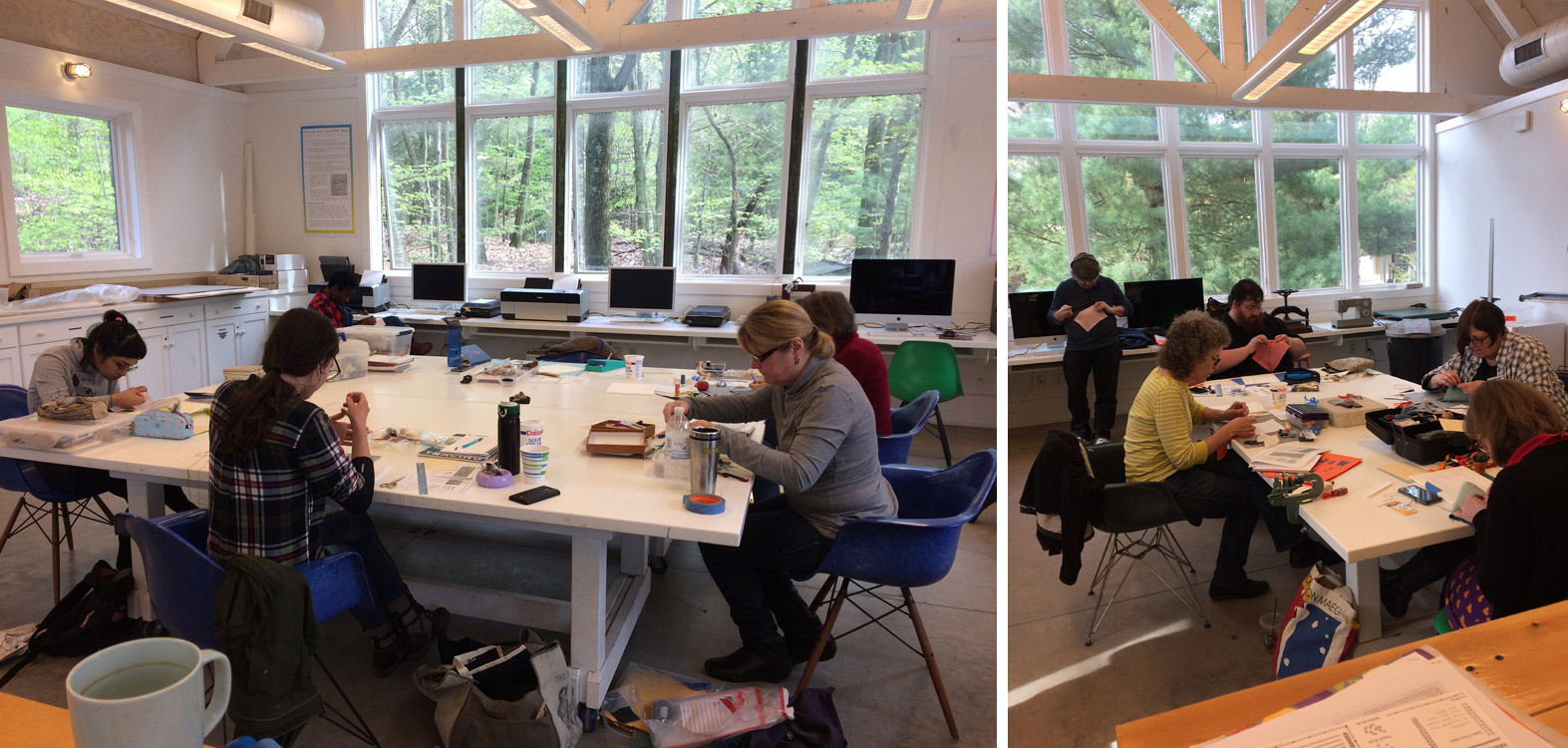
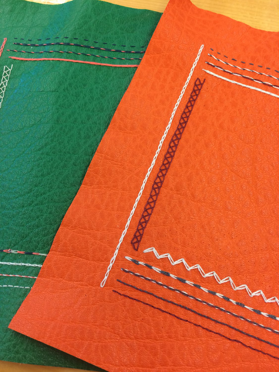
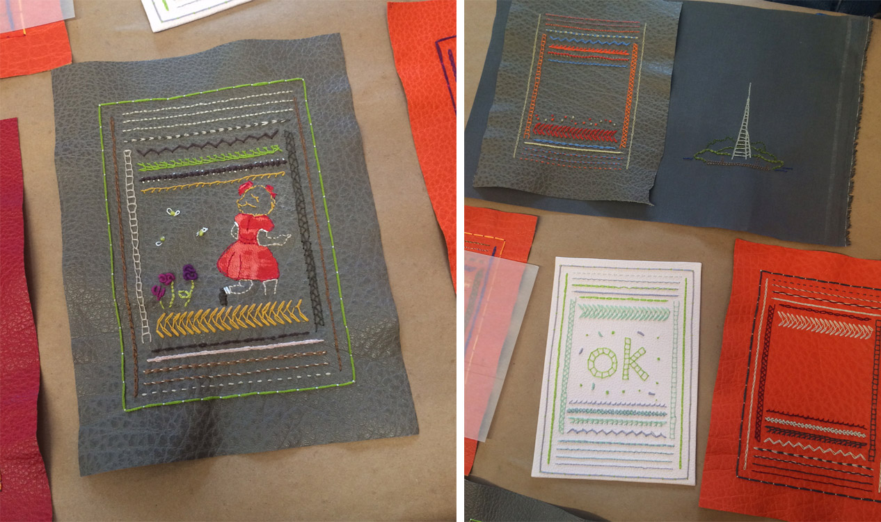
    The participants were working with buffalo skin for the samplers. It’s a leather that I love to work with and is very forgiving with embroidery work. Although certain challenges presented themselves with the darker skins. After we finished punching, we went through each stitch one by one. Students were invited to bring their own threads to play around with, so there was a nice mix of materials being used on the samplers. Some worked and some didn’t.

    At the end of the first session, everyone convened into the painting studio for a show and tell. I had been so distracted teaching by my workshop, that I didn’t get a chance to visit the other studios. So it was really great to finally see what everyone else had been working on.

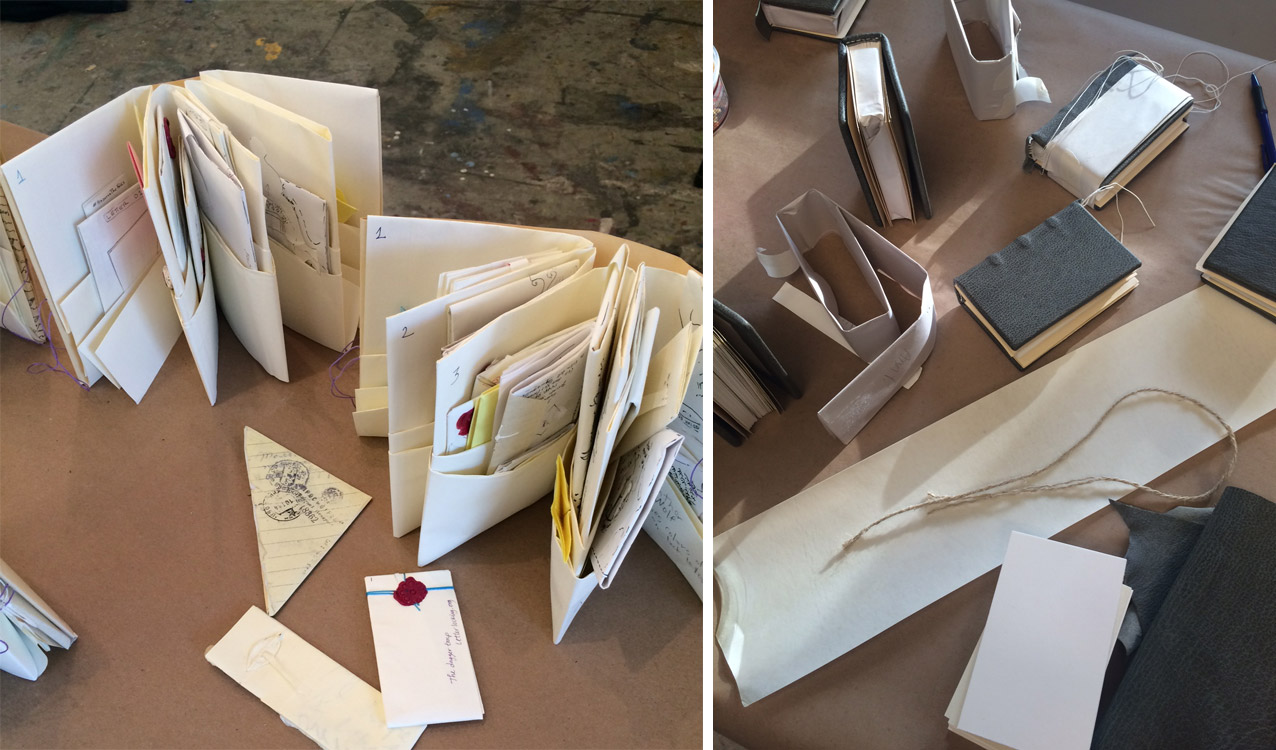
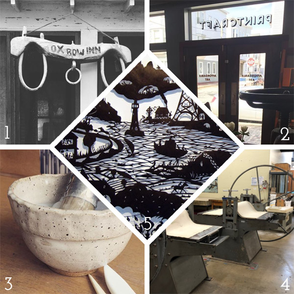
    Above are samples from Letterlocking with Jana Dambrogio (left) and Vasaré Rastonis’ Conservation Binding Model for a 13th Century European Manuscript workshop (right).

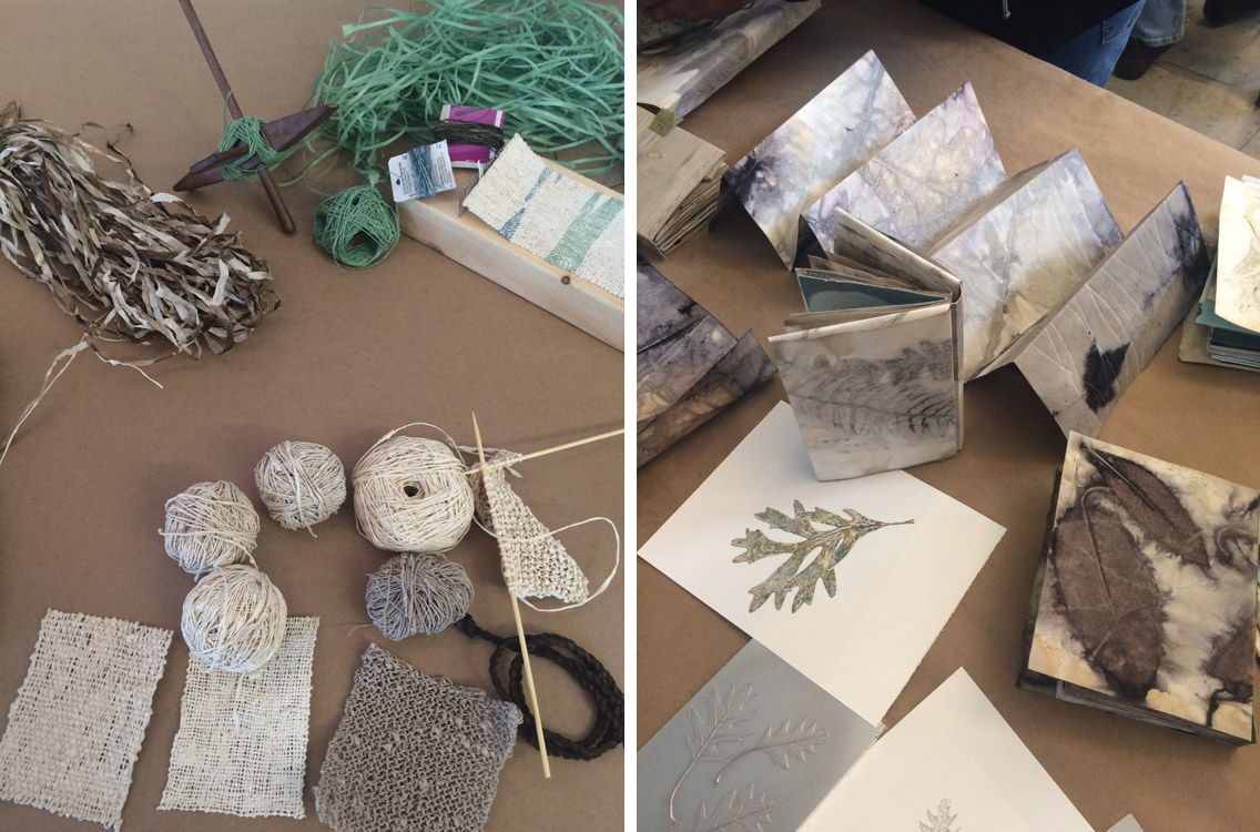
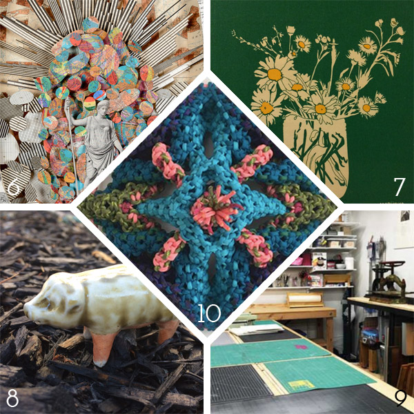
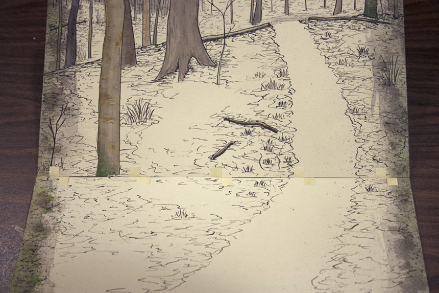
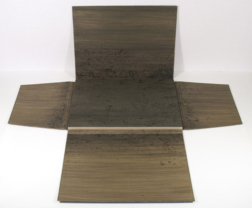
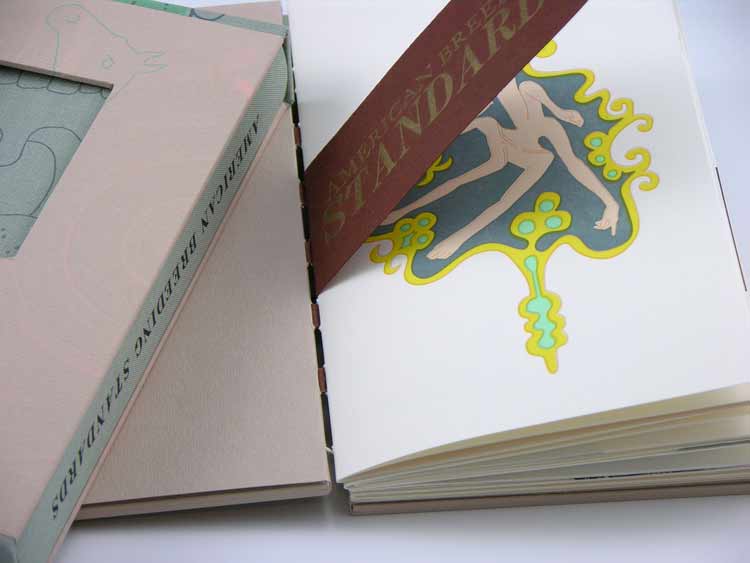
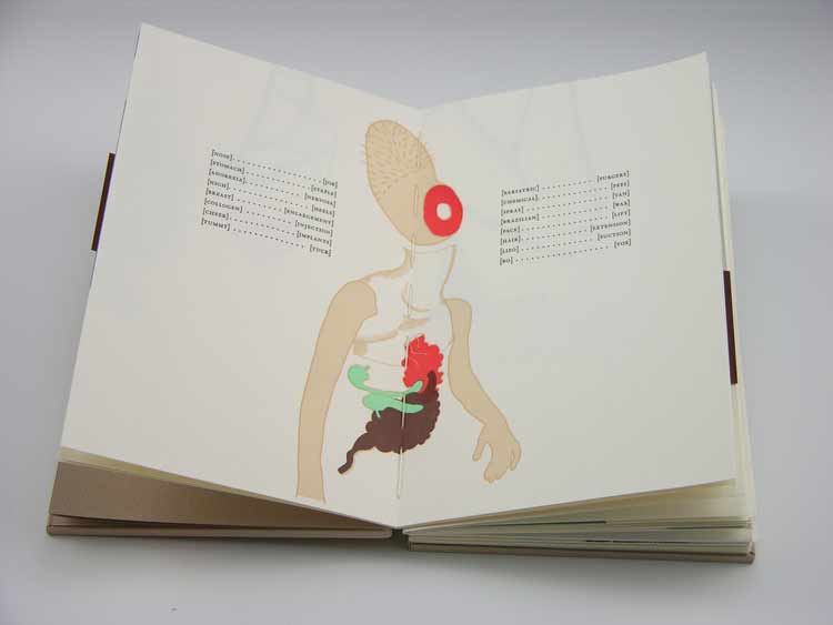
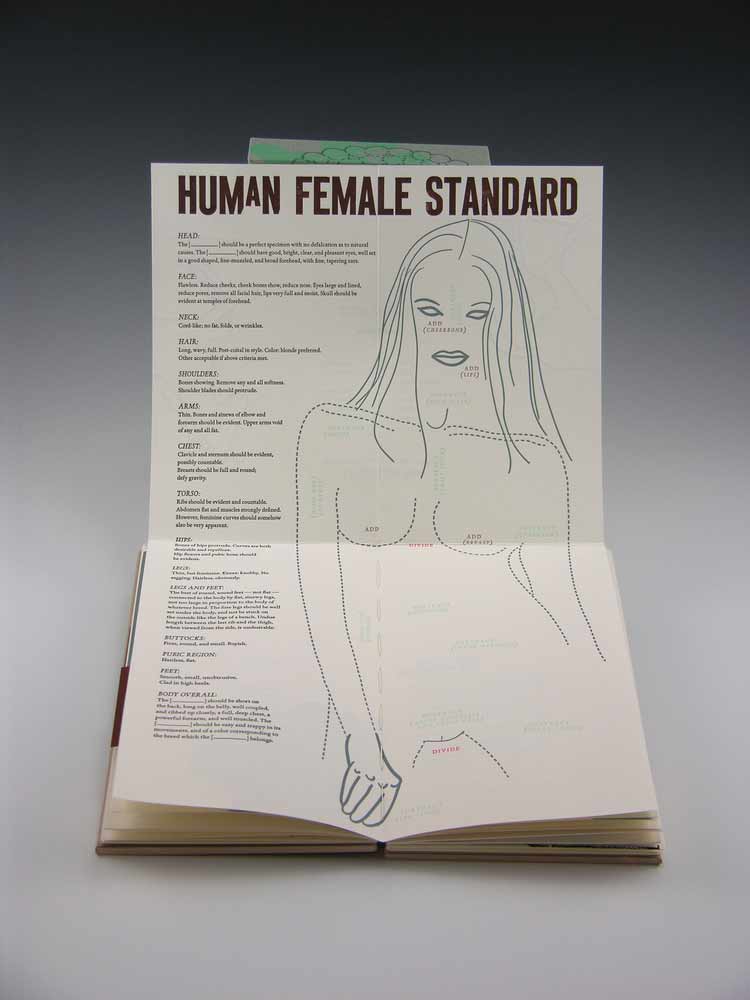
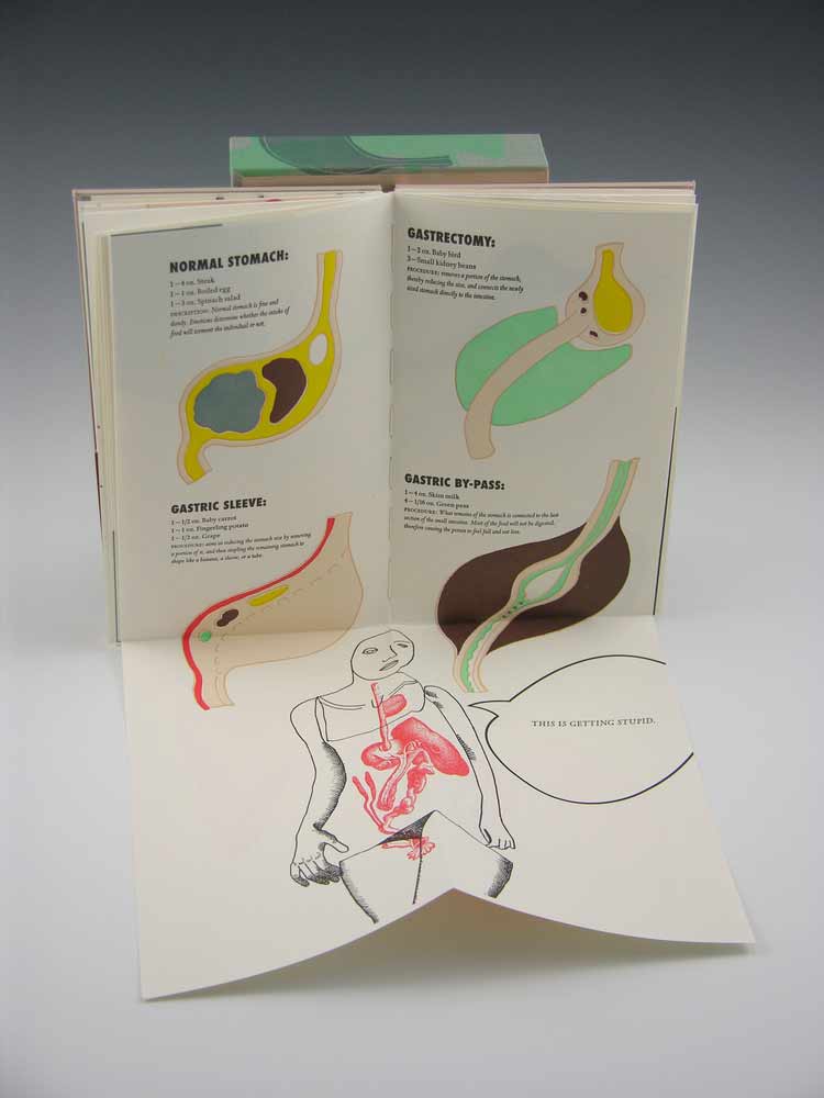
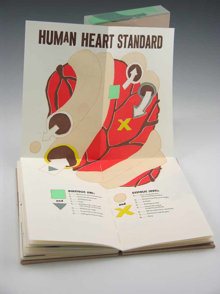
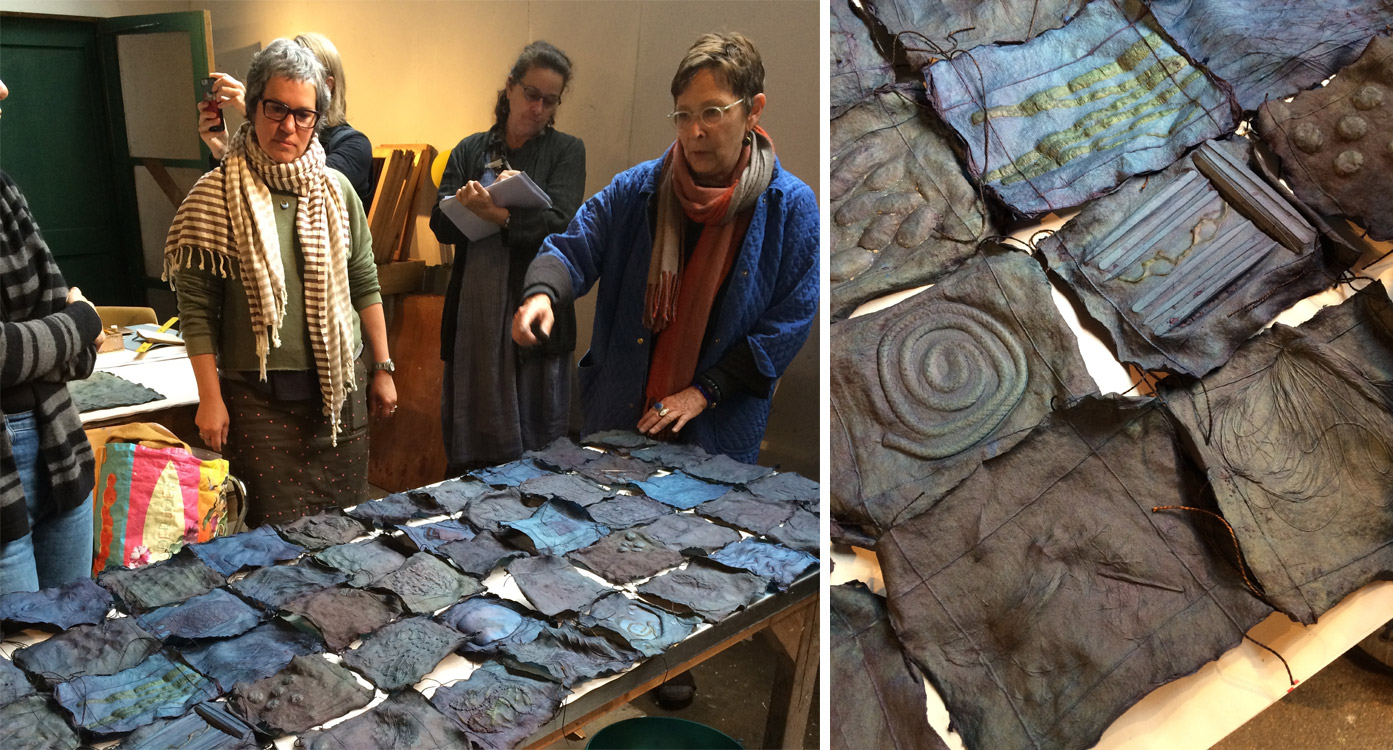
    Above are some pieces from Velma Bolyard’s Paper Threads: North Country Shift (left) and Rebecca Chamlee’s The Printmaker as Naturalist (right) workshops .

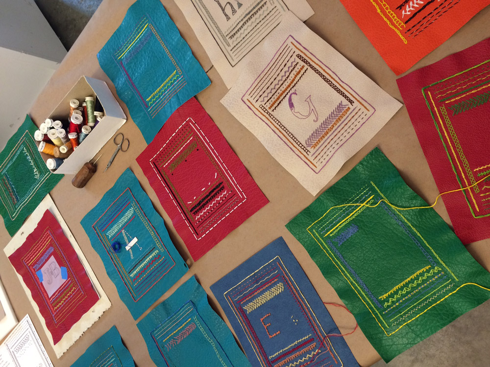
    Many of my students had little to no experience with embroidery work, but everyone was determined to master each stitch. Threads were sewn and then torn out to make second and third attempts. I was really impressed with everyone’s ability to navigate through diagrams and hard-to-see demonstrations. In the center of their samplers, I asked each participant to design a letter in whatever stitch or stitches they preferred. Some students also began embroidering into bookcloth and paper. The participants in my workshop definitely felt the intensiveness of PBI!

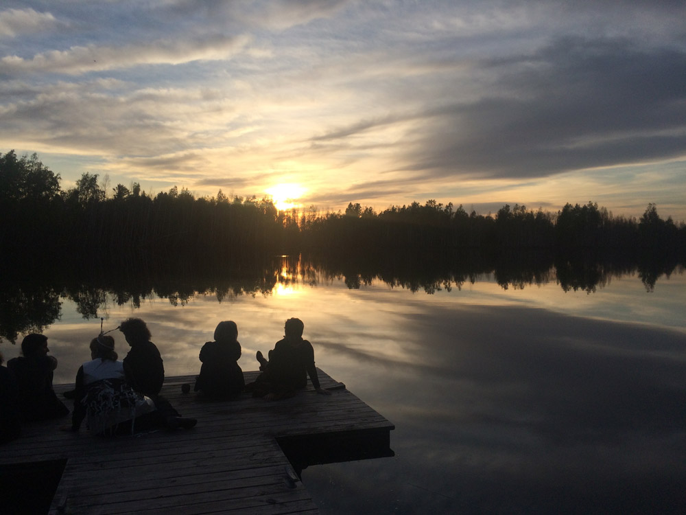
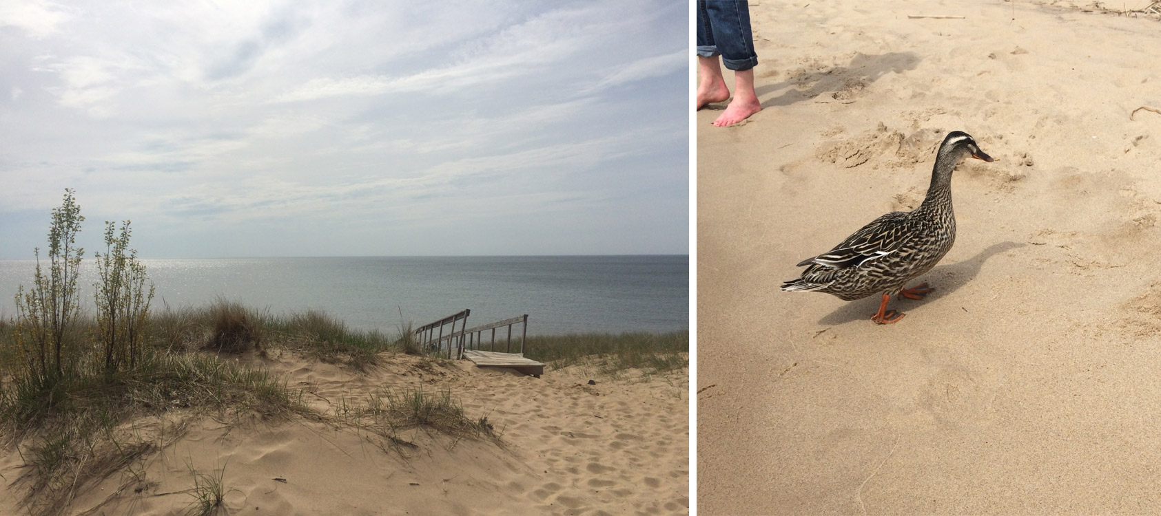
    After session one was complete, everyone had a day off to recoup and relax. I went into town with some PBI pals to shop the local antique mall and each some local grub. Afterward, we walked to Oval Beach at Lake Michigan. It was a beautiful beach and view of the lake. We even made a couple of duck friends along the way.

    As an instructor, I was able to take a workshop during the second session and I chose John DeMerritt’s The Prototype: An Exploration of Edition Binding. I had met John a few years back during my second year at North Bennet Street School and have admired his work and ingenuity, so I was really excited to pick is brain.

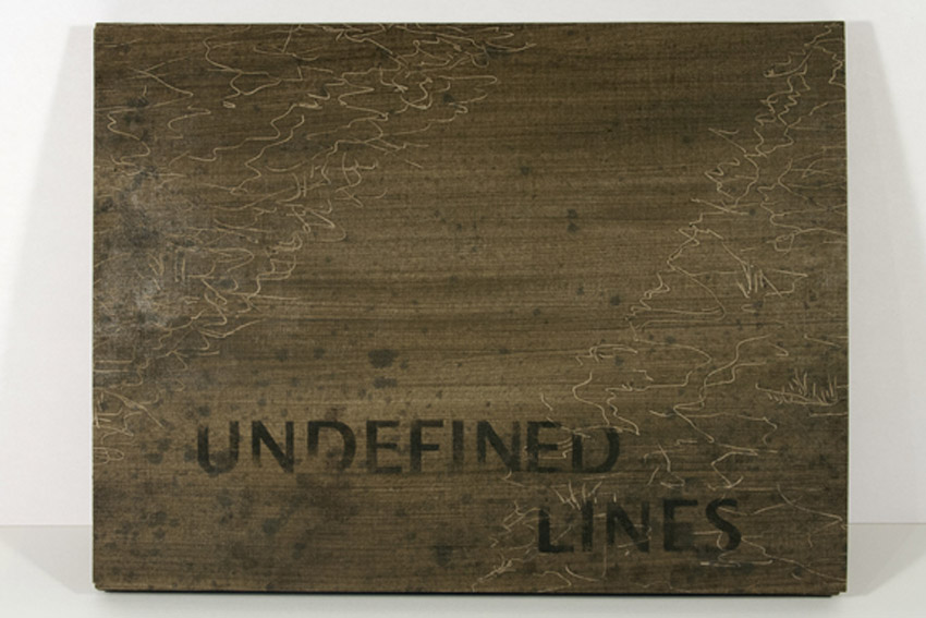
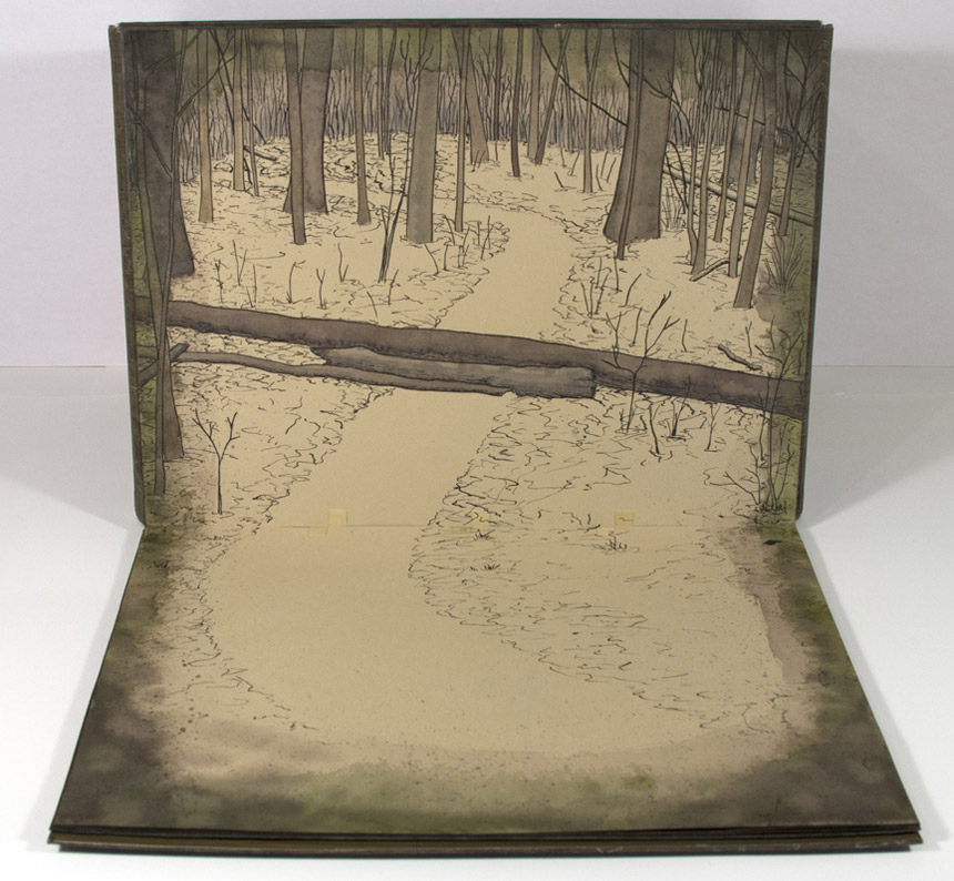
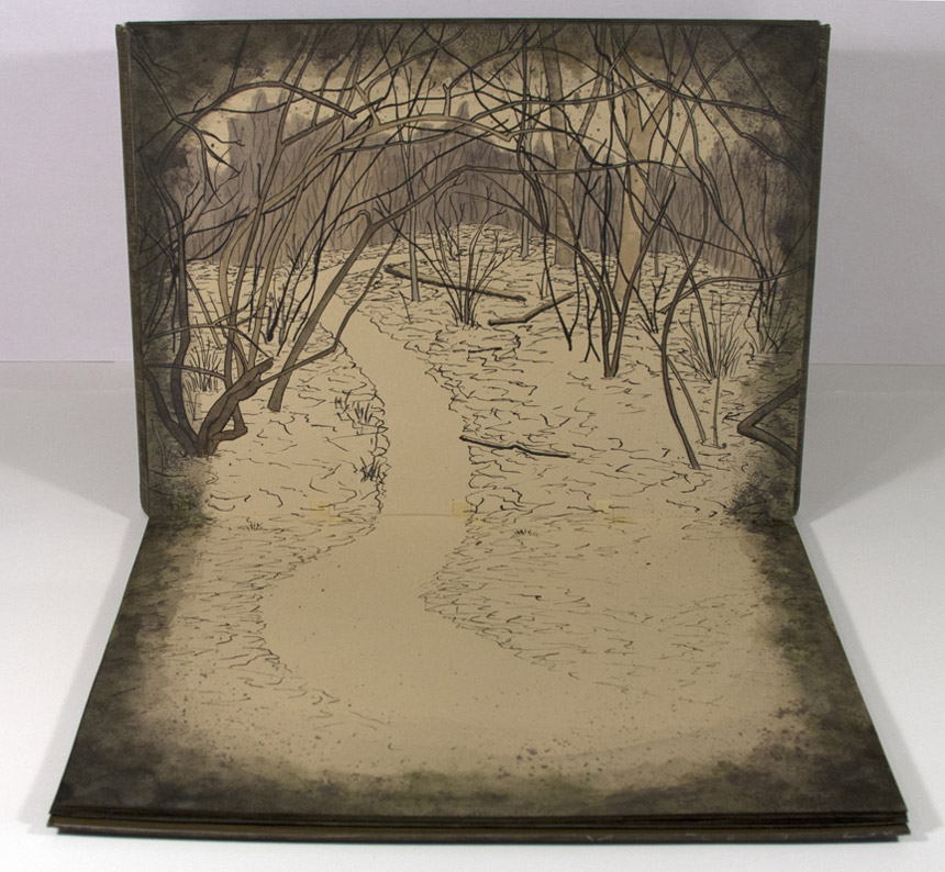
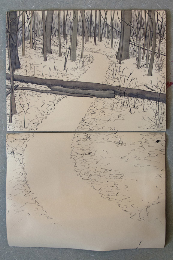
    The structure of John’s class was informal, which freed everyone up to work on their own projects. We had materials to play with in order to develop prototypes. As someone who rarely gets a chance to spend time on personal work, it was very welcoming to have these 4 days to work out the details of an artist book that has been lingering in the back of my brain.

    On our final day of John’s class, we were commissioned by Mary Hark (papermaking instructor) to build a box for a paper quilt.

    We devised a design for the box and chose materials as a team. Mary let us choose from a selection of her papers for the box and we choose a beautiful crinkled indigo paper for the tray that proved to be rather difficult and pulled many of us together to trouble shoot. And without proper weights, we had to use body weight after attaching the tray to the base.

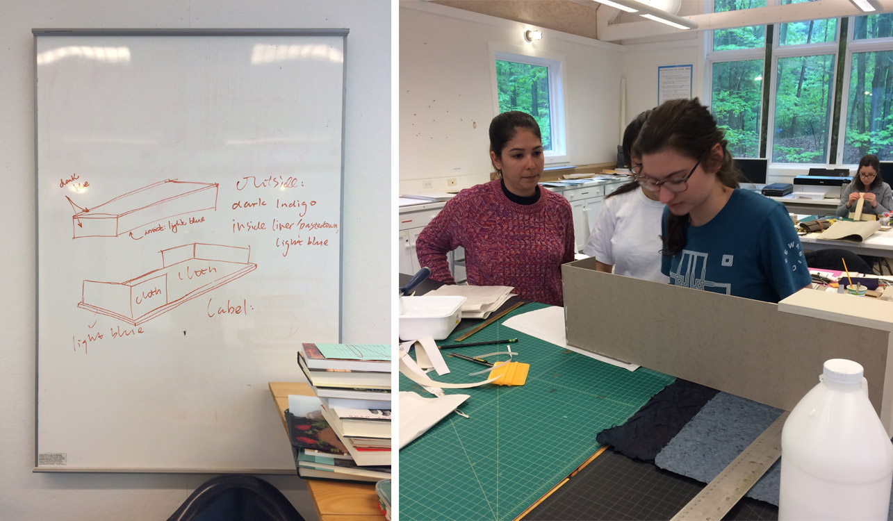
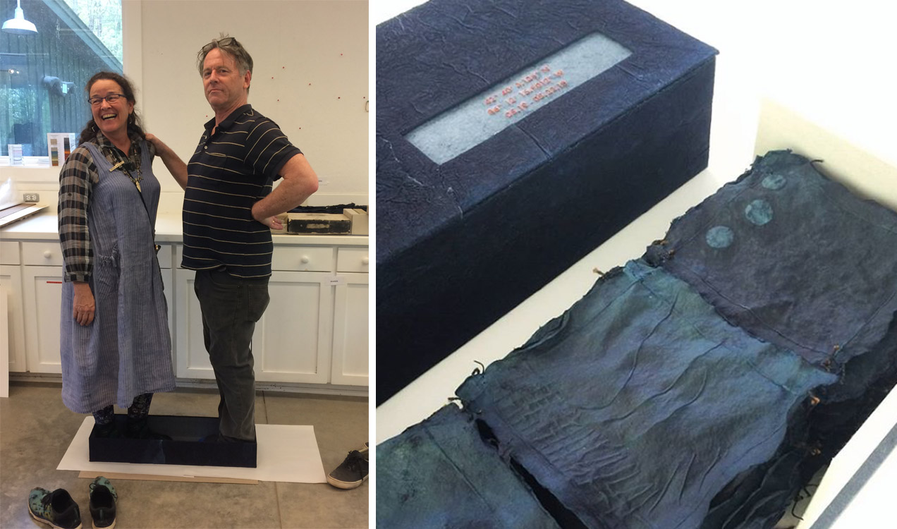
    photo credit (right): Cristiana Salomao

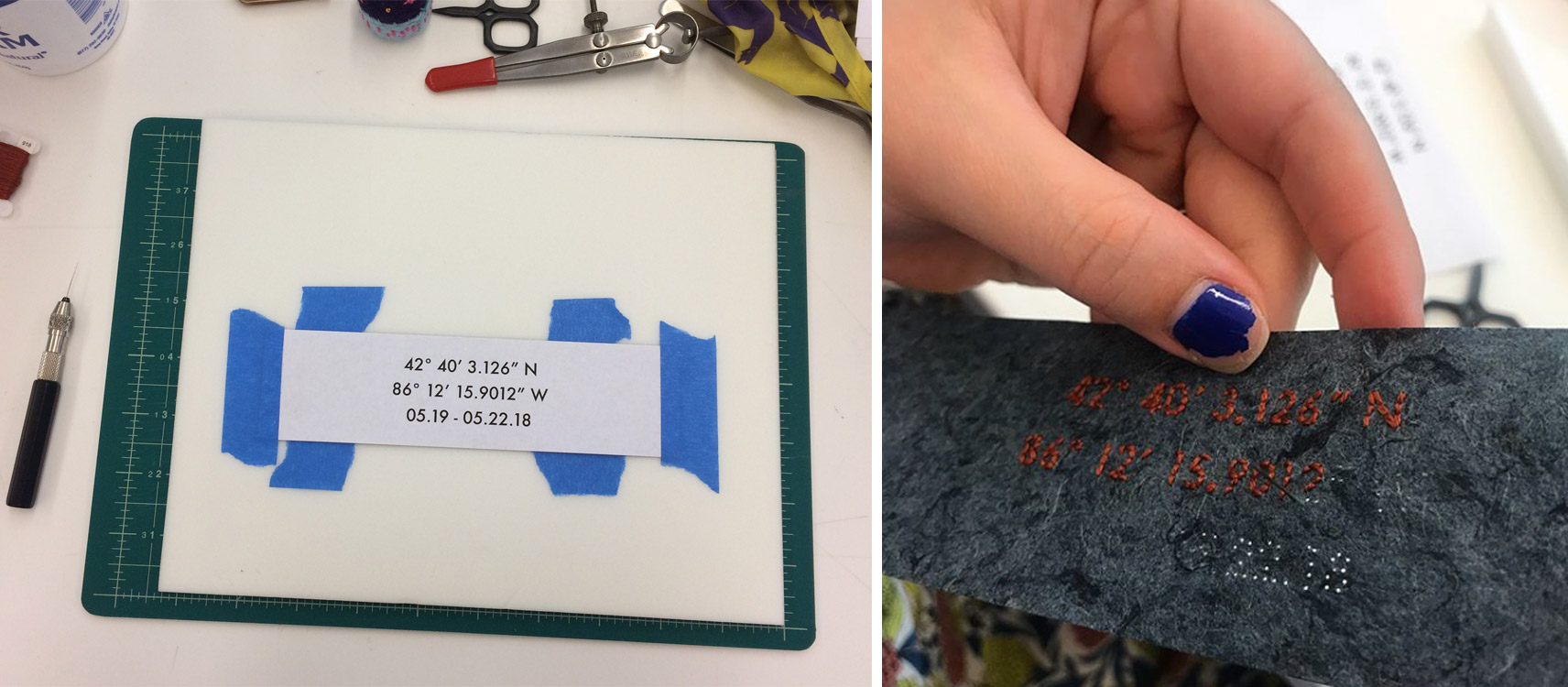
    photo credit (right): John DeMerritt

    I was tasked with creating an embroidered paper label for the box. We chose to use the coordinates of Ox-Bow and the dates of the second session as the title, as it represents the time and place of both creations. In the end, the box and quilt were put into the auction and was finally sold to the Bainbridge Island Museum of Art.

    At the end of session two, we assembled once again in the paint studio for another show and tell.

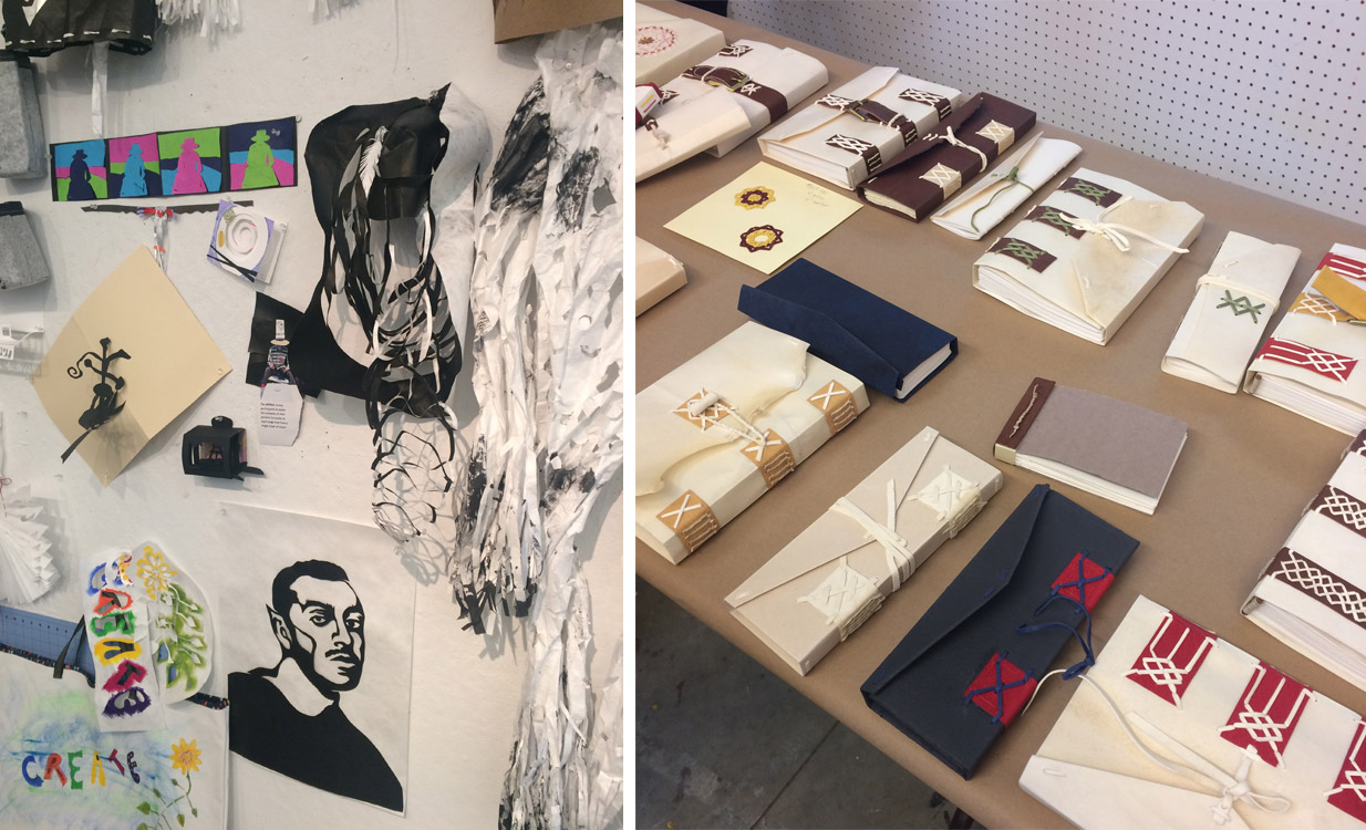
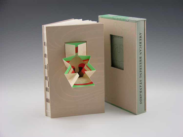
    Above are examples from Béatrice Coron’s workshop From Book Shelves to Cat Walk: Wearable Papercuts and Artist Books (left) plus Chela Metzger’s workshop Early Modern Record-Keeping Book Structures: Model Making and Investigation (right).

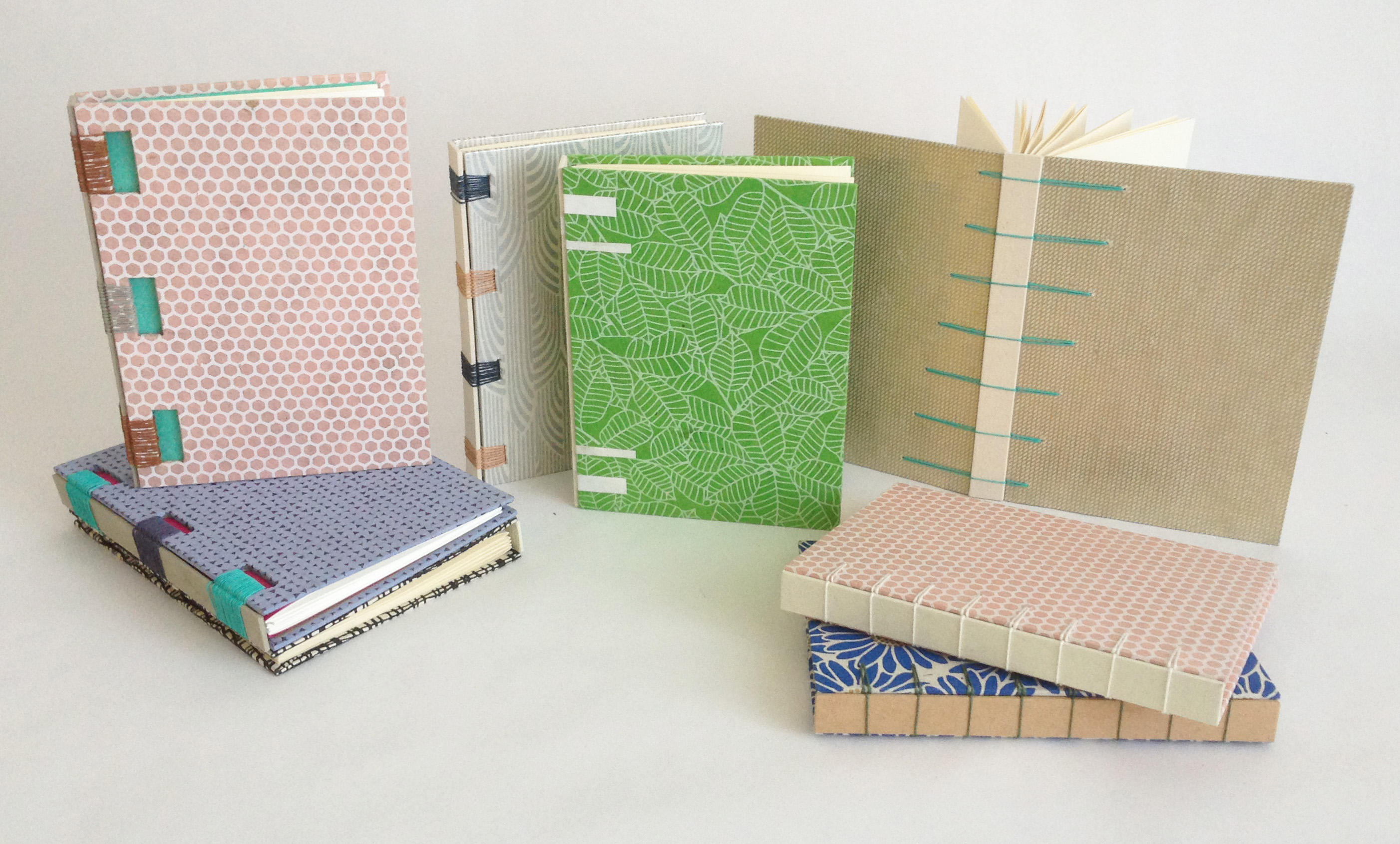
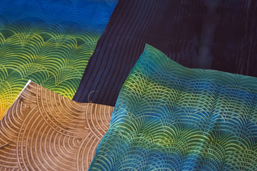
    Just a few pieces from Bridget Elmer’s workshop The Typographic Print (left) and Mary Hark’s workshop Papermaking Informed by a Sensibility for Textiles (right).

    Post show and tell, people began to wind down and get ready for the festivities ahead. That evening included a silent auction followed by a studio tour to see the various work created by the artists in residency. Along the tour, I savored some local Ox-Bow brews and chatted with a very talented artist about her brightly colored macramé sculptures. Check out the work of Noël Morical.

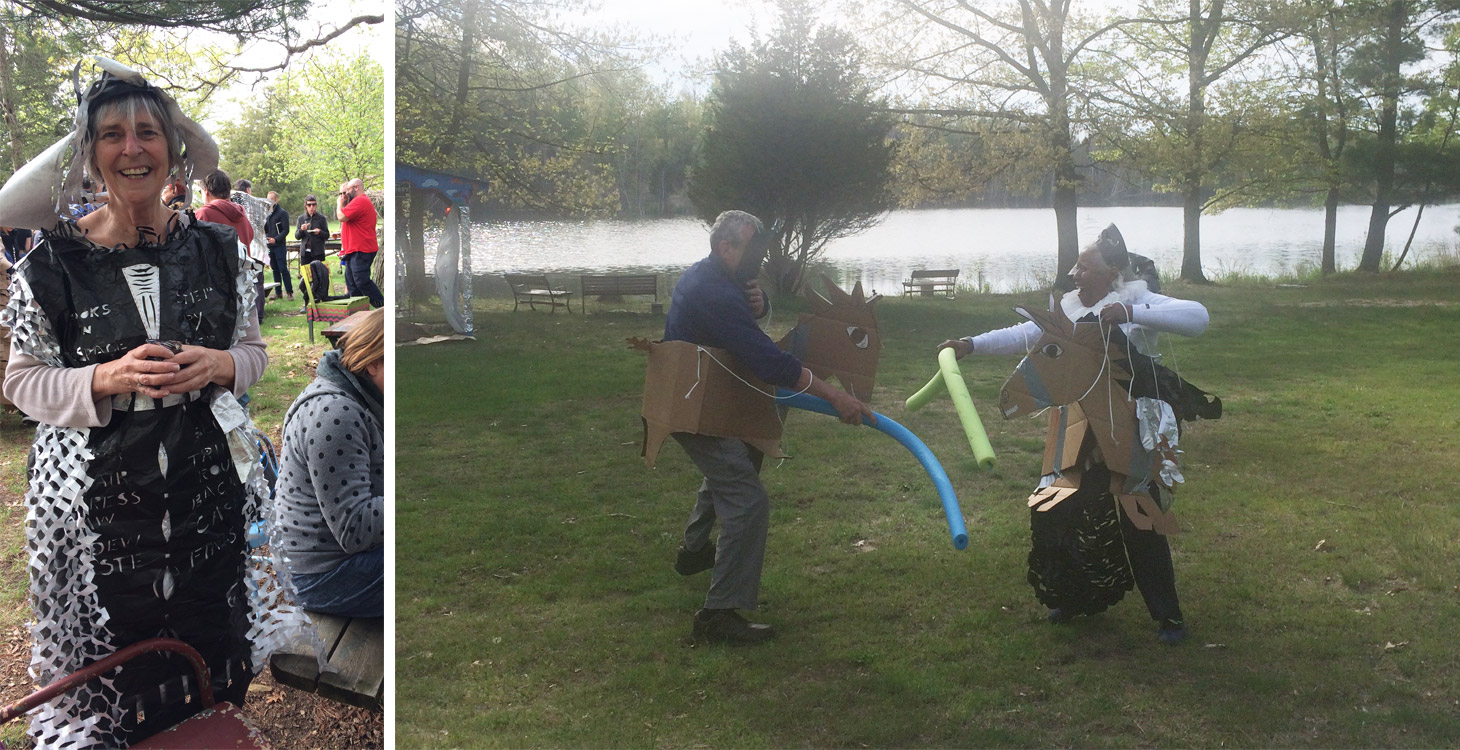
    On the following day, everyone gathered at the meadow under the theme of Renaissance in Space. We ate hors d’oeuvres and cheered on the jousters. Afterward we filed into the painting studio for one final dinner, which included lofting balloons from table to table until they popped. A mighty group effort.

    The evening quickly turned into night and people began to say their farewells. PBI was a truly incredible experience and one that I will never forget. Despite the pressures of teaching, my time at Ox-Bow was relaxing and inspiring. Being surrounded by creative and talented people who are both encouraging and supportive for two weeks can be life changing. It’s an experience that I would recommend for anyone that is apart of or wants to be involved in this community.


  2. Swell Things No. 48 // Maine, Michigan and Texas

    June 30, 2018 by Erin Fletcher

    For the past three months, I’ve been traveling to teach and have visited some incredible spaces and met really talented people. So in this Swell Things post, I’ll introduce you to a few.

    1. In May, I taught at the Paper and Book Intensive which was hosted by the Ox-Bow School of Art in Saugatuk, Michigan. This is a really unique space built near a lagoon that flows into Lake Michigan. The camp ground is filled with a variety of buildings set up for paper making, printmaking, painting, ceramics and glassblowing. All of the participants are housed on the grounds and we meet at the Ox Bow Inn for meals and social events. I highly recommend making the trip to Saugatuk for either PBI or to attend a workshop at Ox-Bow. It’s a fantastic way to unplug, relax and be creative.
    2. In April, I taught a workshop at the University of Southern Maine in Portland. And although my schedule hindered me from visiting PrintCraft, I didn’t want to miss this opportunity to tell you about it. PrintCraft is the combined studios of W.I.P. Editions and Strong Arm Bindery in Portland’s West End. Sharing equipment, experience and expertise in the fields of printmaking, bookbinding and letterpress printing, co-owners Lisa Pixley and Martha Kearsley produce an array of prints, printed matter and ever-evolving experiments in stationery. PrintCraft studio storefront is open Tuesday – Sunday from 12:00-6:00pm.
    3. At PBI, I met a delightful and talented ceramicist by the name of Gabrielle Soltis. She set up shop one evening and I walked away with this gorgeous speckled paste bowl and a handmade mug for my morning coffee.
    4. Before teaching in College Station, Texas, I made a stop in Austin to visit family. But I also made a visit to Flatbed Press and Gallery, which was founded in 1989 by Katherine Brimberry and Mark L. Smith. The space functions as a publishing workshop open for artists to produce large-scale limited editions prints. They are set up to create etchings, lithographs, woodcuts and monoprints. While walking through the studio, two large woodcuts had just been inked up and were ready to print. The inking took a little over an hour!
    5. During my time at PBI, I got to meet the extraordinarily smart, talented and hilarious Béatrice Coron. She works primarily in Tyvek creating “cut stories” by slicing away the material to reveal intricate scenes. Her work exists as flat pieces of art and wearable garments. In fact she wore a beautiful silver and black Tyvek jacket during her evening presentation. She has also designed fencing, sculptures and art for public spaces.

    6. I met Carey Watters at PBI and we spent an evening chatting about our art, our family and our love of travel. Her paper reliquaries are quite magnificent and her approach to paper cut sculptures is fresh and exciting.
    7. Vintage Marüshka fabric prints from the 1970s and 80s were scattered throughout the Ox-Bow Inn. The one pictured above was my favorite and is located in the bathroom inside the dining hall. I was able to find an authentic Marüshka cat print from 1983 that is hanging above my bookcase.
    8. I am a ceramic fanatic and when Jon Hook came out to PBI to sell some of his pieces, I jumped at the opportunity. I was in awe of so many of his vessels and mugs, but I ended up walking away with this tiny ceramic pig.
    9. Before visiting Flatbed, I made a stop at the Austin Book Arts Center (which happens to be in the same building). Mary Baughman gave me a tour of the bindery and their newly added print shop. The space is cozy and well loved. Every inch of their space is well designed to really maximize the potential of the room. They will be celebrating their third birthday in September, if you’re in the area, stop by for their auction!
    10. During one of the last few days at PBI, the resident artists opened their studios for touring. This is when I got to meet fellow School of the Art Institute alum, Noël Morical. Using macrame, Noël creates these massive hanging sculptures with bright parachute cord. She also had on display some smaller wall hangings, that to me, resembled alien-like sea creatures. I hope to own a piece one day!

    SaveSave

    SaveSave


  3. Upcoming Workshops // March to May

    March 15, 2018 by Erin Fletcher

    MARCH
    No more workshops scheduled in March


    APRIL
    Secret Belgian Binding
    April 7 – 8 (Saturday & Sunday)
    8:30am – 4:30pm
    North Bennet Street School, Boston, MA

    This class is currently full. On day one, students assemble two variations of this non-adhesive structure, which is simple and can be quickly constructed. It opens flat and is perfect for thinner text blocks. On day two, students explore modified versions of the Secret Belgian binding by playing with the amount and size of sewing holes and incorporating Tyvek.

    Secret Belgian Binding
    April 28 (Saturday)
    9:00am – 4:00pm
    Wishcamper Center, University of Southern Maine, Portland, ME

    During this single-day workshop, students will assemble two variations of this non-adhesive structure, which is simple and can be quickly constructed. It opens flat and is perfect for thinner text blocks.


    MAY
    Introduction to Embroidery on Leather
    May 13 – 24
    Paper & Book Intensive at Ox-Bow in Saugatuk, Michigan

    Historical examples of embroidered bindings typically date back from the close of the 14th c. to the mid-17thc., and were primarily done on silk, satin, velvet or canvas. These highly decorative bindings grew out of a tradition of textile bindings popular in England during the 14th and 15th centuries. The embroidered designs found can be classified in three categories: heraldic, scriptural symbolism, and floral and arabesque designs. The makers of these bindings included both professional (predominately male artisans) and amateur needle workers (typically women in their homes).

    Contemporary bookbinders and book artists have been incorporating embroidery and other sewing techniques into their work. The range of materials and methods has certainly expanded beyond the historical examples. Using thread on traditional binding techniques allows the artist to express their vision in an unusual way and introduces a different tactile experience to the binding. Embroidered threads can be used to draw in the abstract or to add highlights and shadows to an illustrative design. The threads can be kept neat or left to tangle.

    In this workshop, students will learn a range of hand-embroidery stitches and the best techniques for sewing into leather. We will look at the stitches most commonly found on historical models and ways to use them on a modern binding. We will also discuss ways to transfer the design onto leather and how to prepare the finished embroidered leather for covering. No prior experience with embroidery or leather is necessary, but some hand skills are encouraged.


  4. Swell Things No. 44 // Henry Hébert

    June 30, 2017 by Erin Fletcher

    Back for another guest post is my good friend and fellow classmate, Henry Hébert. His picks this year include some fellow bookbinders (and one of their cats), a secluded bookbinding haven and some old comforts.

    1. Zdzisław Beksiński, Untitled, oil on fibreboard: Beksiński’s dystopian surrealism is gorgeous and haunting. My favorite paintings are like this one, combining religious iconography with almost alien textures. You can see a virtual gallery of his work here.
    2. Lahey Hemostatic Foreceps: Adam Larsson, Conservator at Uppsala University Library, clued me in to using long surgical tools for quickly lacing sewing supports through paper case bindings.
    3. Darwin: I picked this print up at Horse + Hero in Asheville, NC. This line from some of Charles Darwin’s 1861 correspondence pretty much sums up how I feel most mornings.
    4. Dark Souls: I think this video game from 2011 is still one of the best games ever made. Fun to play, excellent design, and weird, weird story telling.
    5. Bradel the Cat: Noted bookbinder and artist Karen Hanmer is the caretaker of this wonderful Abyssinian cat.

    6. Trump stress ball: News getting you down? Take your frustration out by squeezing a tiny version of our president’s dumb head.
    7. Rocks: I recently saw some of these decorated, parchment-wrapped rocks made by Shanna Leino. They were just such curious, fun little objects – I had to put them on this list.
    8.  Oxbow: I just attended my first Paper & Book Intensive, held at the Ox-bow School of Art in Saugutuck, MI. It was a pretty magical opportunity to disconnect from the outside world and focus on bookbinding.
    9. Jodorowsky’s DuneThis documentary about Alejandro Jodorowsky’s failed attempt to make a film based on Frank Herbert’s Dune is wonderful. Some of my favorite artists were all set to collaborate on the project, and many award-winning projects were produced from the wreckage.
    10. Mini-dividers: Brien Beidler makes some really nice brass tools. I just happened to have a pair of tiny plastic hands on me when he showed me these mini brass dividers. I still laugh every time I look at this mini-hand-modeling photo.


  5. Book Artist of the Month: Mary Uthuppuru

    January 27, 2014 by Erin Fletcher

    UndefinedLines4-MaryUthuppuru

    In 2012, Mary Uthuppuru created Undefined Lines. This unique artist book is designed with a cover that converts into an easel, making the image heavy content read as a guided tour along a trail commonly traveled by Mary. Using ink and watercolors to layout each scene on Rives BFK, the pages have a very soft, nostalgic feeling.

    UndefinedLines2-MaryUthuppuruUndefinedLines3-MaryUthuppuruUndefinedLines-MaryUthuppuru

    Undefined Lines is a really unique structure. The binding acts as an easel to direct the point of view of the imagery. Where did your inspiration come from for this structure?
    I chose to depict a hike I take every morning in a forest near my house. It is there that I sort out the agenda for the day, contemplate what might be on my mind or just clear my head. Being a little reserved with letting imagery be the message in my books, I decided that this book would be centered on large ink drawings with watercolors.

    This structure was a complete response to the content. In an unusual way, unusual to me, I created the pages of the book before considering how it would come together in the binding. As I finished the image panels, it occurred to me that I did two things: I created single sheets that then needed to be bound, and the image format begged for each page to be upright when viewed.

    UndefinedLines-inprocess-MaryUthuppuru

    So I leaved through all of the books about artist books I could find, hoping something would trigger an idea for my unique situation. First, I stumbled upon one of Claire Van Vliet’s bindings and I remembered the quilted books for which I first came to know her. The Lilly Library has a copy of her book Woven and Interlocking Book Structures from the Janus so I paid a visit and found a binding style that worked for my pages. The woven paper allowed me to bind the single sheets in an elegant and mostly hidden way. Another inspiration for the binding came from Susan Skarsgard, from whom I took a class at the Paper and Book Intensive in 2011. She showed us a non-adhesive structure that allowed the spine piece to slide into the cover to allow for the pages to open completely flat, something I found out I needed once I decided on the cover format.

    UndefinedLines-inprocess2-MaryUthuppuru

    Woven binding detail.

    Next, was to find a way to get the pages upright. I wanted the viewer to have the experience that they were walking through the forest with me. With the images as large as they are, I thought this would be possible especially if I could get the pages to turn towards the viewer. As each page is turned down, the viewer would find themselves in a new scene. I looked for inspiration in objects that are propped up for use that already exist like iPad cases and art easels. I made a few mock ups, but none of those things would work without making the book look clunky. Remembering that the box itself could act as the “easel”, I found the simplest ways possible to prop up the book. Having the box act as the cover in the form of a multi-flap portfolio was a good solution not only can all of the flaps be folded back for my purposes, but it also had a good-for-travel sort of feel. Once all the flaps are closed, it is self-contained.

    UndefinedLines5-MaryUthuppuru

    Last week you discussed your use of painted tissue for the cover of Fantasy & Nonsense. For Undefined Lines, Interpreter of Maladies and other works you’ve used paste cloth. Can you talk about your process for creating paste cloth?
    I first learned about paste cloth at my first Standards in 2008 in Toronto. Martha Cole demonstrated her beautiful technique of creating and using paste cloth for books as well as textile pieces. She even provided everyone with her recipes. I don’t use her recipe but I make a very simple recipe for mine which is just paste cooked as though you are using it for repair work, strained and thinned to the desired consistency, then divide the paste to be mixed with Golden acrylic paints. For the cloth, I use undyed natural cotton or linen…usually cotton since it has a consistent texture and tight weave that provides a nice smooth surface for combing if desired. All of my paste work with paste cloth is done on Mylar taped to a hard surface for drying.

    PasteCloth-MaryUthuppuru

    The cloth is sprayed with water and spread flat on the Mylar. At this stage, I make sure the fabric is laying evenly and the threads are not warped or distorted. The cloth is then pasted out with clear paste until the whole piece is evenly coated. Using your hands or a long ruler, turn the pasted cloth over onto the same piece of Mylar and smooth out gently with your hands getting rid of any air bubbles. At this point, you have to start making design decisions. If you plan on combing or drawing through the paste, then you need to decide if you will allow the color of the cloth to come through, by applying a layer of clear paste first, or if you want to build different colors on top of one another, in which case you just start your painting. If you are merely painting a design with the paste/paint mixture, you are ready to begin. Paste cloth lends itself to building rich designs by layering different colors or patterns on top of one another which is really fun to play with depending on the book’s subject matter.

    – – – – – – – – – – –

    Thanks Mary for a wonderful interview. It was great of you to share some of your techniques and creative processes.

    – – – – – – – – – – –

    UPDATE: Check out this wonderful review on Undefined Lines over at the Abecedarian Gallery Blog. The post includes a great slideshow of each page of the book!


  6. July // Book Artist of the Month: Ellen Knudson

    July 2, 2013 by Erin Fletcher

    americanbreedingstandards-ellenknudson

    American Breeding Standards is the most recent work from Crooked Letter Press run by book artist and graphic designer Ellen Knudson and was produced in an edition of 60 in 2012-2013 in Gainesville, Florida. This artist book explores the systemized rules about what comprises a good or bad horse, a good or bad woman — and the steps one might take to achieve the breed standard.

    American Breeding Standards was designed and letterpress printed on Zerkall Book paper. The illustrations and text are printed from photo-polymer plates and handset metal types. Some text excerpted from American Horses and Horse Breeding (John Dimon, 1895) and Canine Breeding Standards of the German Shepherd (American Kennel Club, 2012), while the rest of the text and illustration are by Ellen.

    The binding structure is an exposed spine sewn on Cave Paper tapes and attached to paste paper covered boards. The cover of the book has a hinged pop-up that folds out. There are also 3 additional foldout pages throughout the book.

    americanbreedingstandards2-ellenknudsonamericanbreedingstandards5-ellenknudson americanbreedingstandards3-ellenknudson americanbreedingstandards6-ellenknudsonamericanbreedingstandards4-ellenknudson

    While setting up the Marking Time exhibition for the Guild of Book Workers at Dartmouth College, I came across Ellen’s piece Self-Dual (How to Walk a 30,000 Mile Tightrope). By the way, I’ll be featuring this book in a post later this month. The prints featured in this artist book are beautifully illustrated and printed in rich and muted earth tones. The book was favorably executed as the dos-a-dos style binding. 

    I’m excited to present this interview with Ellen and to post a portion of her work throughout the month of July. Ellen has such a versatile design sense, offering a range of artist books so throughly executed. Read the interview after the jump and come back each Monday in the month of July for more posts on Ellen Knudson.

    read more >


  • My name is Erin Fletcher, owner and bookbinder of Herringbone Bindery in Boston. Flash of the Hand is a space where I share my process and inspirations.
    The StudioNewsletterInstagramEmail me
  • Archives