After an adventuresome time in Durham, North Carolina, where I consumed delicious local brews, lost at shuffle board, ate so many southern dishes, visited Duke’s conservation lab, toured a lemur center and discovered that I’m still allergic to mosquito bites, Henry and I embarked on our drive to Charleston, South Carolina.
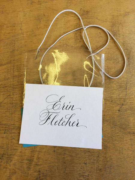
Upon our arrival we were greeted by Tropical Storm Julia, but luckily the next few days proved to be quite lovely with very little rain. After checking in, I began to rummage through my conference packet and found my name tag, which was beautifully done by local calligrapher Elizabeth Porcher Jones.
Day One:
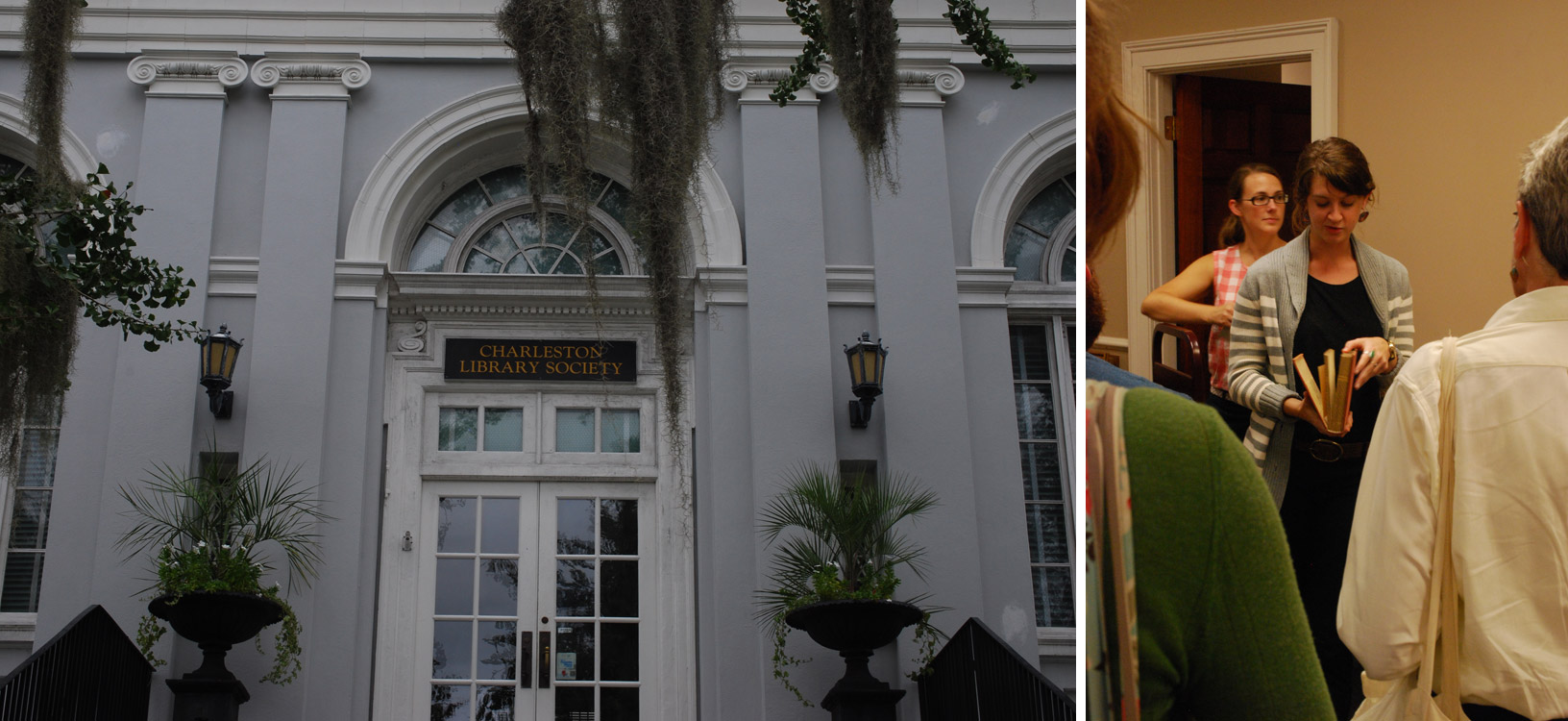
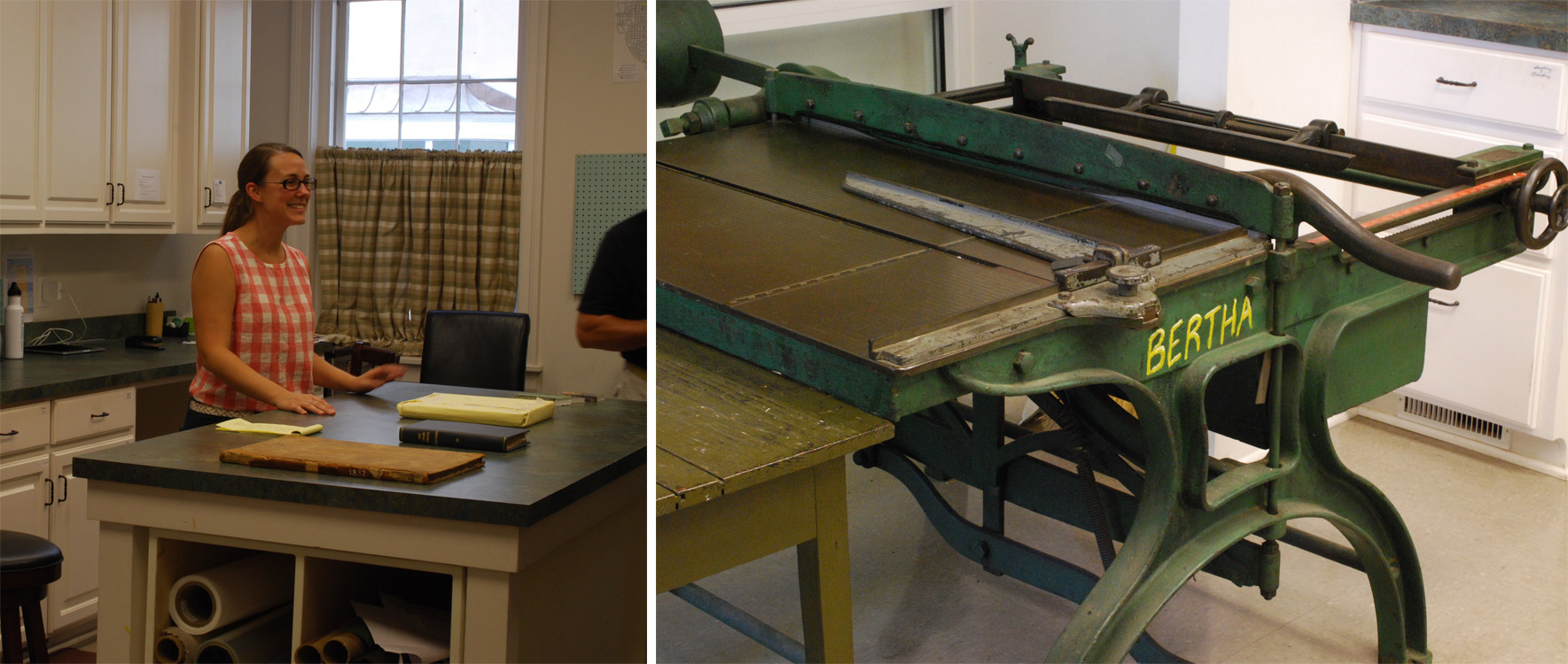
The conference began with a tour to the Charleston Library Society, an absolutely charming space that also served as the venue for the opening reception later that evening. Our tour began with Anna Smith, Special Collections Librarian, who gave us an overview the Society’s establishment and shared a few treasures from their collection. We were then led to the first floor by Kerri Harding, Director of Bindery and Conservation Studio, where she showed off their delightfully quaint bindery space. Having just relocated to Charleston, Kerri shared with us the range of her upcoming projects: a presentation leather binding, rehousing and holiday ornaments showcasing the Society’s newest titles.
Day Two:
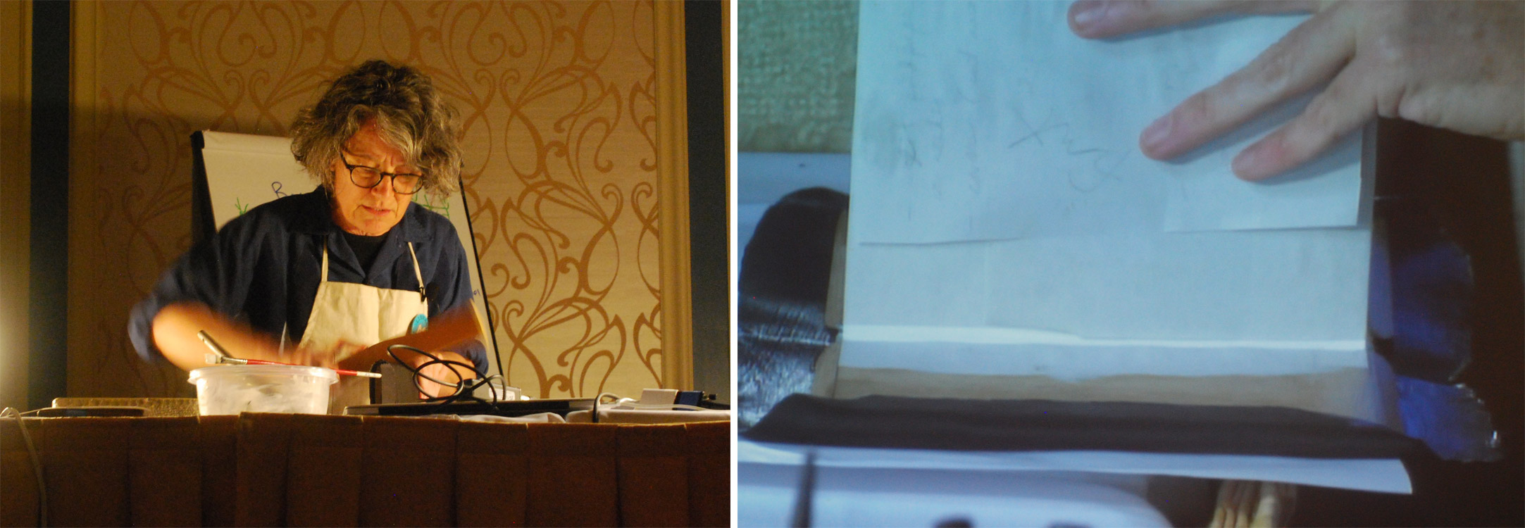
The first presentation of the conference was Drawn to the Writing given by calligrapher Cheryl Jacobsen. As a freelance artist living in Iowa City, Cheryl’s work ranges from design and lettering to illustrations and art. She began her presentation with her personal history on how her interest in art and lettering developed before going into a slideshow of her work. Cheryl is also an adjunct assistant professor at the University of Iowa, teaching courses at the Center for the Book. Over the course of the presentation, Cheryl created a certificate to commemorate the conference using a variety of letter forms. She spoke about line formation (this included pressure and hand position), nib use, ink/pigment preferences and tricks of the trade.
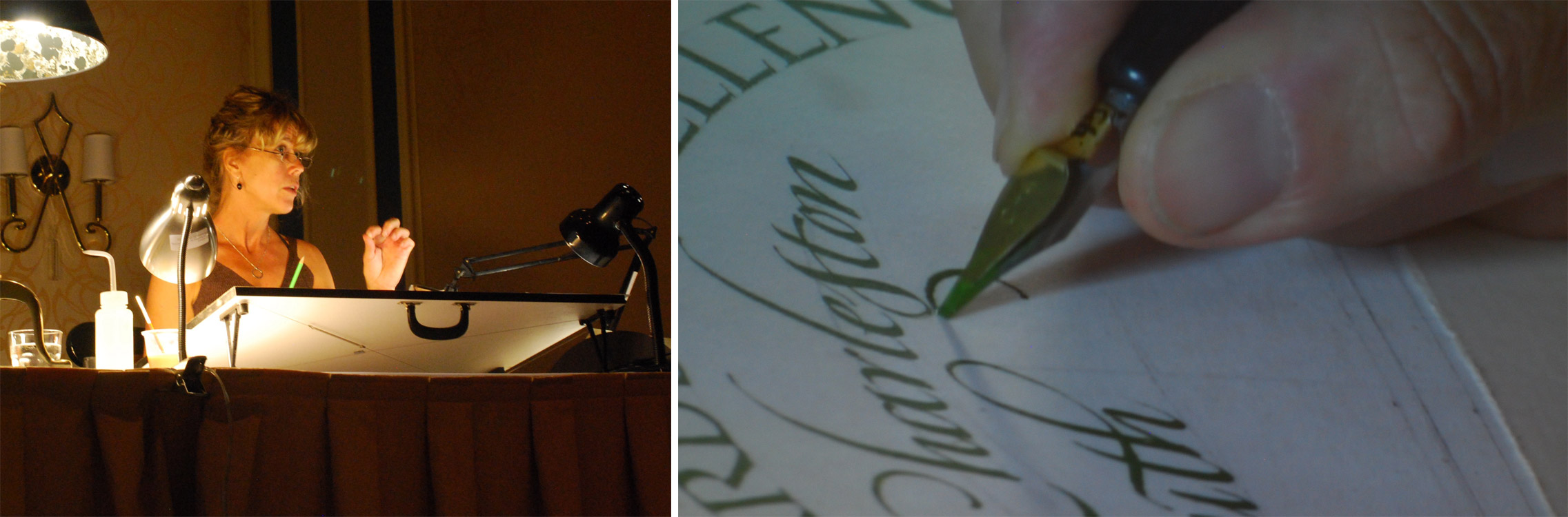
At the end of presentation, the audience was rewarded with a copy of the certificate Cheryl produced during the presentation (she even offered to add your name to the certificate). We were also allowed to handle some of her artist books.
For the afternoon presentation, the topic switched to bookbinding in Exploration of history and techniques for Pennsylvania German Liturgical Bookbinding before 1850. The presentation was divided into two parts: Chela Metzger, Head of Library Conservation at UCLA, demonstrated the construction of the binding and Erin Hammeke, Senior Conservator at Duke University, demonstrated the techniques used to create the bosses and clasps traditionally seen on this style of binding.
Chela quickly went through the construction of the binding. The book used in the demonstration was sewn in an abbreviated pattern (usually 2-on) using thicker supports (usually two supports as one), the shoulders are quite narrow and the edges were (historically) ploughed. The wooden boards (oak or beech; usually quarter-sawn) are heavily shaped along the spine and fore edge on both sides of the board. The fore edge is also notched in preparation for the clasps. The spine is lined with linen strips that extend beyond the shoulder. Unlike most wooden board structures, the boards are not laced-in. The sewing supports are frayed and adhered to the first and last leaf, then the linen is adhered to sandwich the frayed cords. The text block edge is colored after the boards are attached, then the hand-sewn or hand-woven endbands are stuck-on.
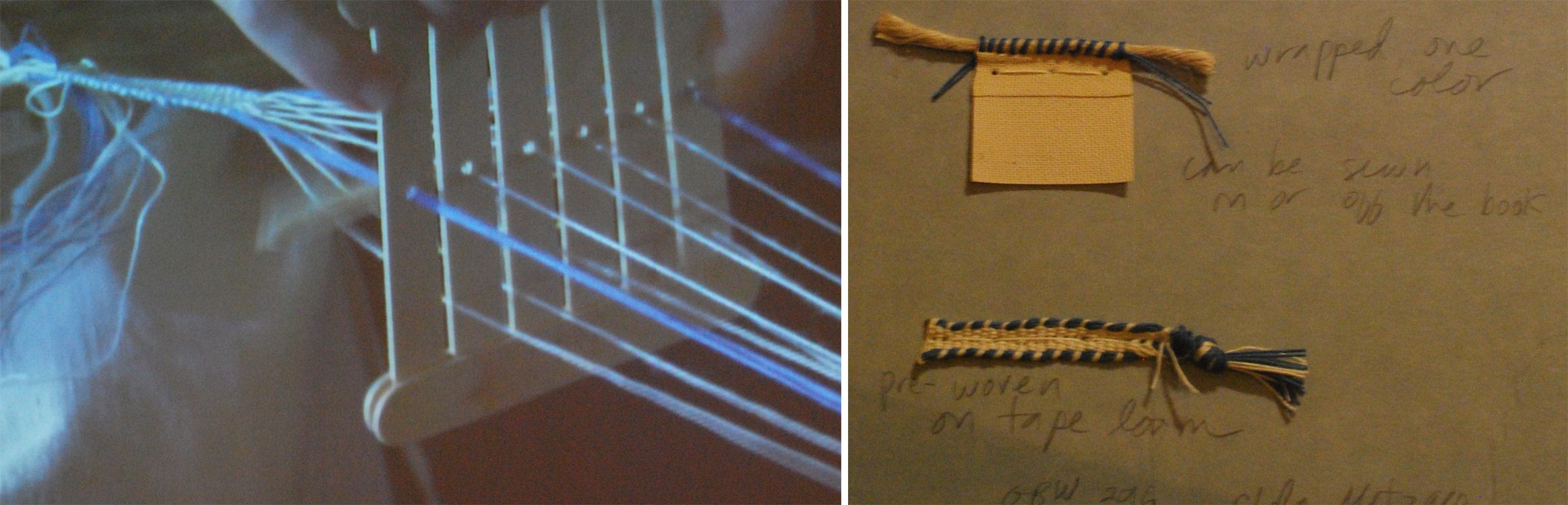
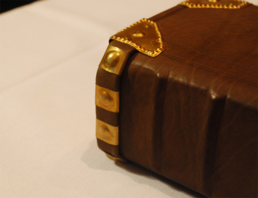
One of my favorite parts of the presentation was the brief demo given by Chela on the technique behind the woven endbanding material. Using a make-shift back-strap loom (popsicle crafts!), she wove a traditional white and blue endband strip. A variety of endbands have been spotted on these bindings. The image below (on the right) shows just two varieties with the hand woven style on the bottom.
Chela’s portion of the presentation continued with the covering of the book and tying up the spine (this step ensures that the leather adheres to either side of the supports). The last step presented by Chela is one of the defining characteristics of this binding: the leather spine straps. Appearing on the spine at the head and tail (and sometimes the middle) many examples are seen adorned with brass studs or domes.
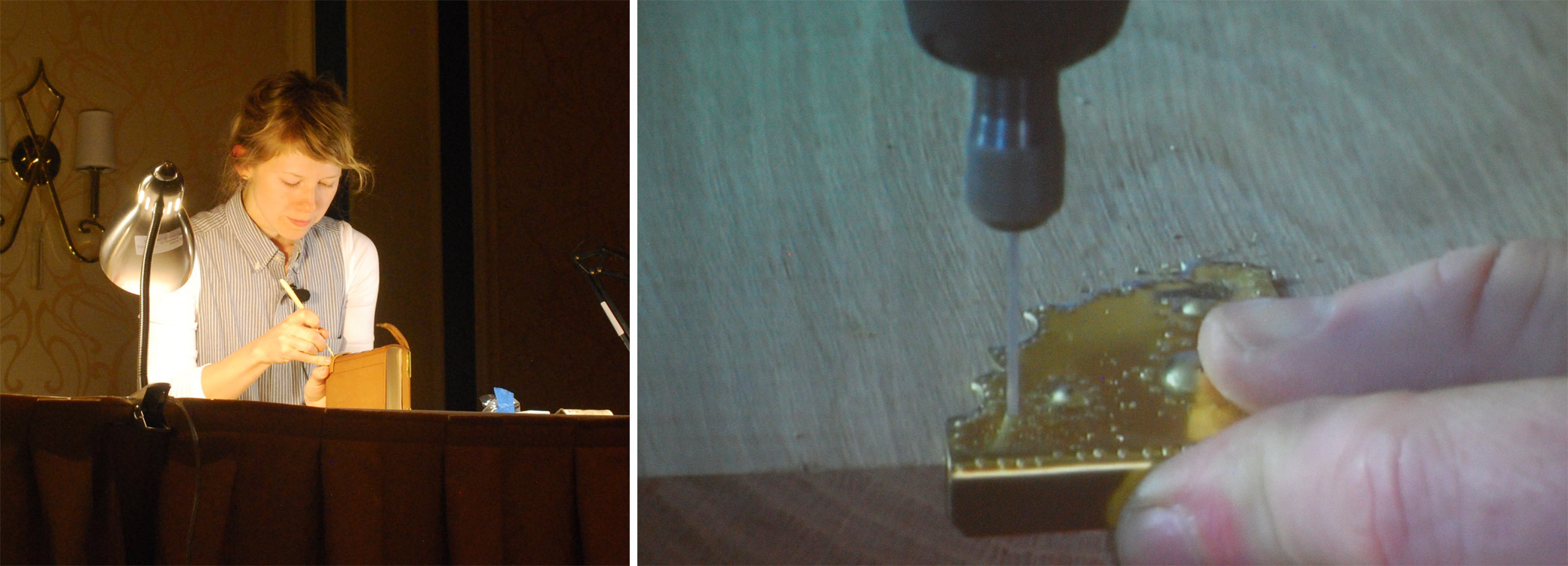
Using a 24-gauge brass sheet, Erin demonstrated the process for creating the corner pieces for the binding. Beginning with a flat piece of brass, Erin roughly traced out the design with a sharpie. Then she cut down the brass close to her design with metal snips; shaping it even further with needle files and emory paper. Supporting the brass with a lead block, Erin began to decorate the brass corner piece by striking the back with steel punches. This did not create a hole, rather pushed the brass into a shape that would be raised on the front side. In the image above (on the right), Erin uses a drill to create holes where the nails will be inserted when attaching the furniture to the book. After attaching this corner piece to the book, Erin began to bend the extended brass around the edge of the board with her fingers and finished its shape by striking the brass with a planishing hammer.
Day two ended with a social gathering at a local pub for a Mentor-Mentee Happy Hour, those new to their field were encouraged to speak with the more accomplished participants. Afterward, I broke off with some friends for a very quick bite to eat before going on a Ghost and Dungeons tour through Charleston.
Day Three:
One the third and final day of the conference, two more presentations were given. The morning presentation was given by Betsy Palmer Eldridge on Paper Conservation Treatment Revisited. In 1989, Betsy gave a presentation at the Standards conference in Portland, this year she presented a revised version of that lecture.
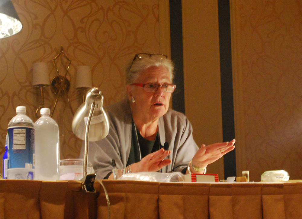
Betsy was introduced to book arts during her time at Wellesley College in 1957 and further advanced her training in Germany and France. In 1973, she moved to Toronto, where she established and maintained her private conservation studio. Betsy has been an active member of the Guild since 1960 and the Canadian Bookbinders and Book Artists Guild since 1983. Betsy gave an overview of a variety of conservation techniques and tricks she has picked up along the way. Many of the presentation materials she referred to were used in her original presentation 27 years ago, it was quite interesting to see how the materials had changed or retained their vibrancy over the years.
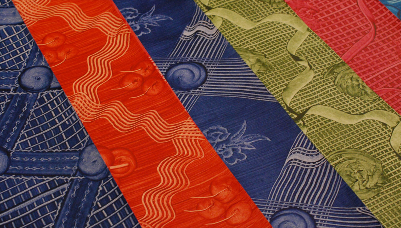
The final presentation was on Herrnhuter Paste Paper given by Deborah Evetts. At the start of her presentation the audience received a brief history lesson paired with images of these papers collected from several sources. During the last third of the 18th century, a group of Moravian sisters living in a religious community at Herrnhut in Saxony created what came to be a very recognizable style of paste paper. The sisters traditionally used olive, bright or grayish blue, mustard yellows and reds in their papers. Deborah has seen several examples and has recreated tools to mimic the patterns seen on these historical papers. Herrnhuter Papers were used as both cover papers and endpapers on many common types of books such as ledgers and almanacs, but examples have also been found on works of literature, non-fiction and other genres.
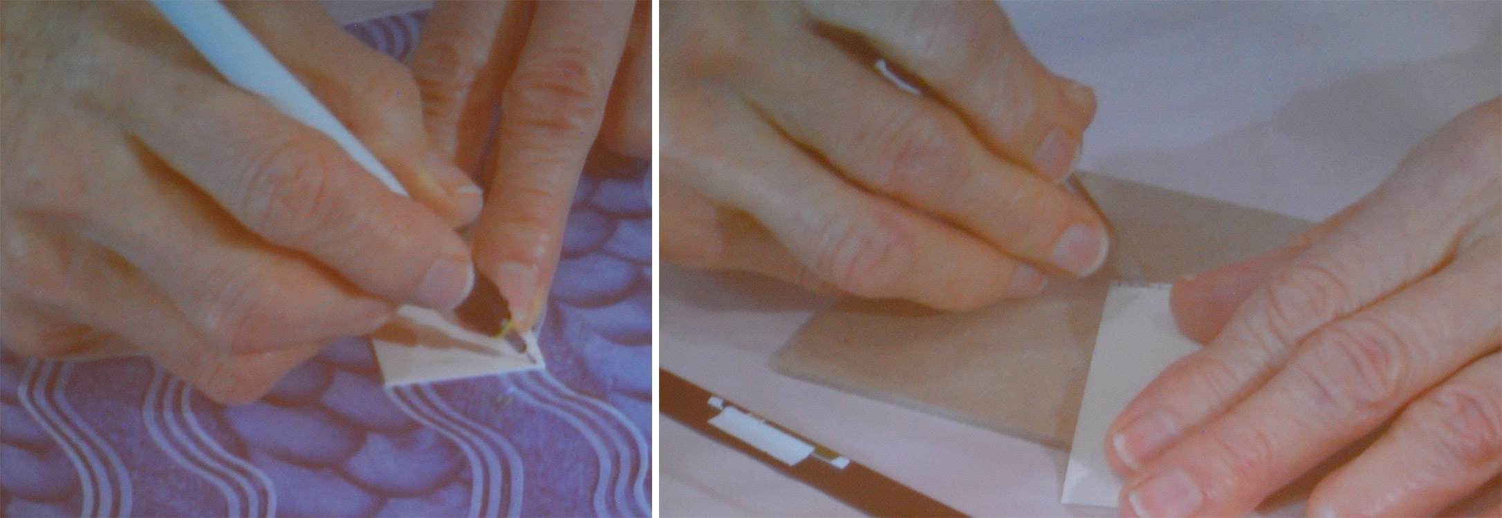
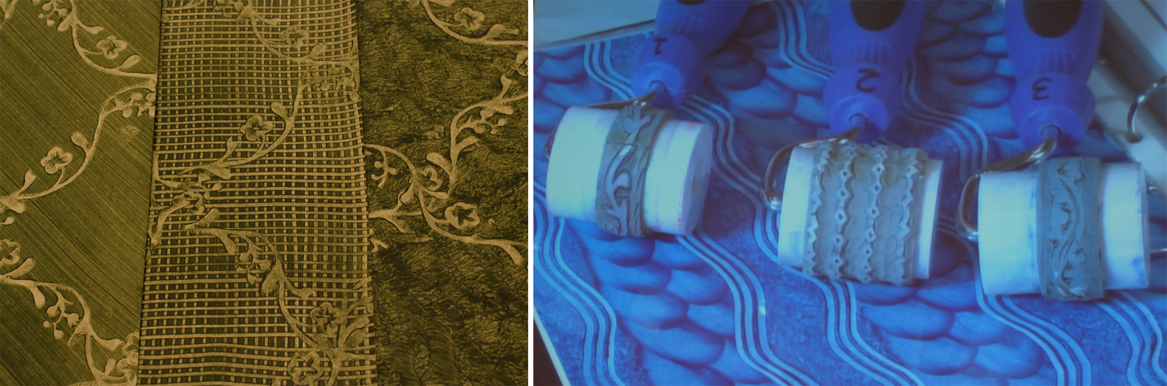
After the slideshow, Deborah moved onto discussing tools and paste preparation. She began with a quick demonstration on making your own tools such as combs, rolls and mylar templates. The first image below shows Deborah marking out a small piece of plastic and then cutting out the teeth using a sharp scalpel blade. Combs can be made from binder’s board, plastic container lids or vertical blinds. The second image below shows three different styles of paper that utilize the same decorative roll and the handmade rolls that Deborah has made. The designs were carved out of linoleum and attached to craft rollers.
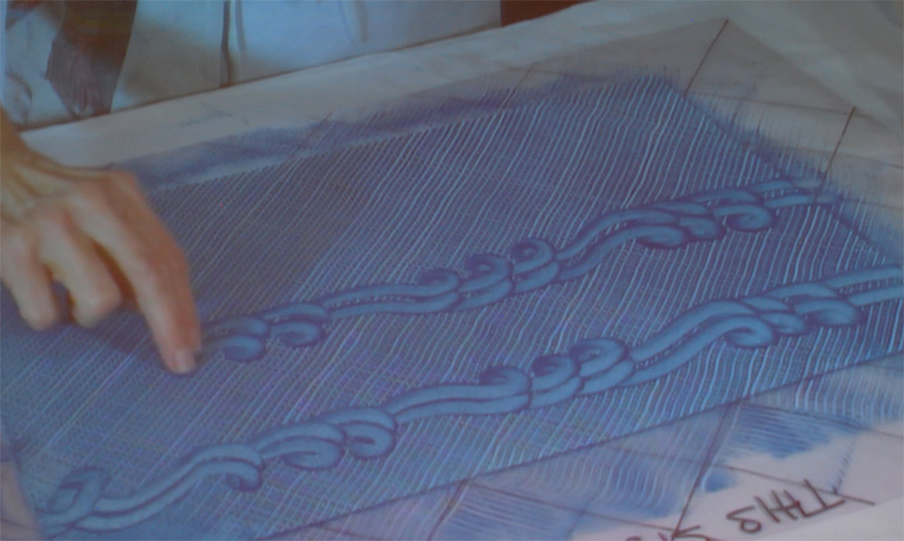
Over the course of the presentation, Deborah created several styles of the historical patterns seen on Herrnhuter Papers. She demystified so many patterns. One in particular that I was excited to see was the two-finger swirl. The crowd gave Deborah a round of applause after each paper blossomed before our eyes. Deborah was so delightful and high-spirited in her presentation and it was a great way to end this year’s series of presentations.
At the end of the evening, we all gathered in the Colonial Ballroom at the Francis Marion Hotel for the banquet and live auction. Also during this time, two members of the Guild are rewarded with the Laura Young Award and the GBW Lifetime Achievement Award. Catherine Burkhard was awarded the former for her dedication and long-time service to the Guild. The latter was awarded to Peter Verheyen, celebrating his achievements in the fields of conservation, bookbinding, book arts and creating a thriving online community. As the night came to a close, I allowed my nose to be traced, said my goodbyes and wished everyone safe travel back home. Looking forward to next year’s conference in Tacoma, Washington!