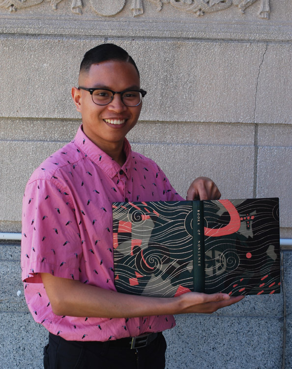
It’s that time of year again, when the next group of future bookbinders and book conservators will leave their cosy benches at North Bennet Street School and enter the next stage of their journey. And I’m happy to be back with another round of interviews with the graduating class on their set books, which will be on display during the Student & Alumni Exhibit along with work from students and alum of the other seven programs at NBSS. This year the Student & Alumni Exhibit will be on display at two locations: from May 7 – 23 at Two International Place and from June 4 – 30 at North Bennet Street School (both located in Boston). Check out the website here for more details and opening hours.
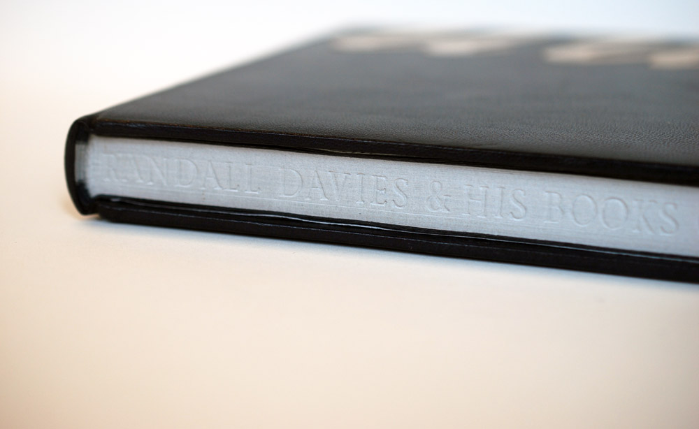
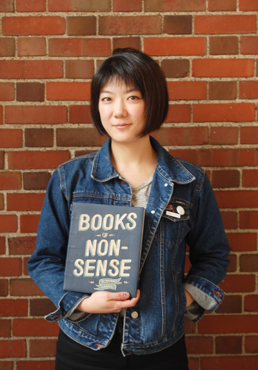
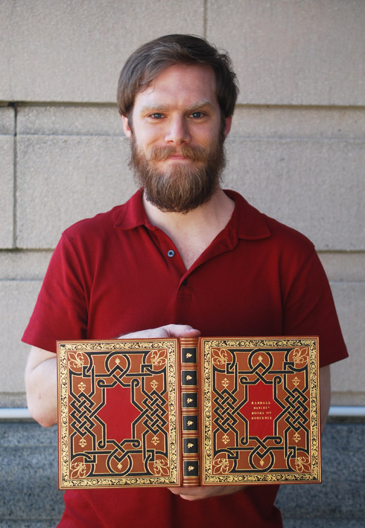
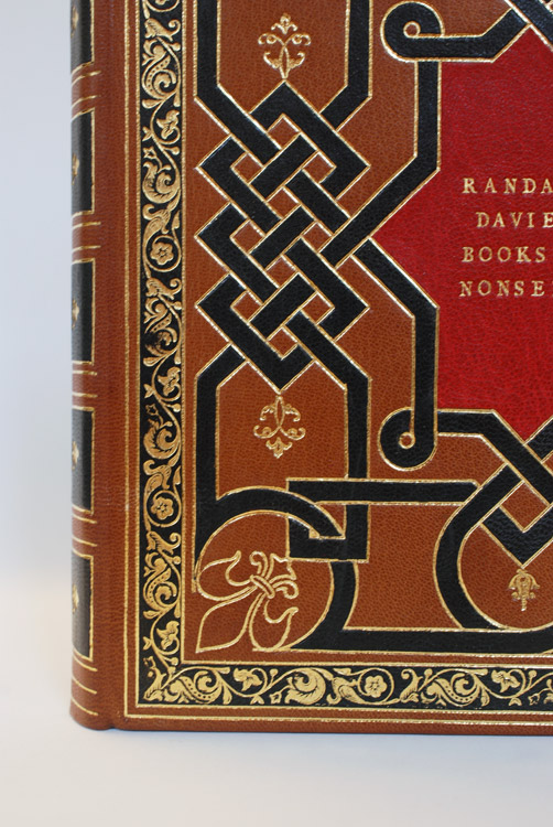
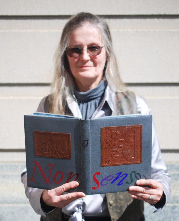
This first post will focus on the Set Book bound be each of the seven graduating students. My next post will highlight some of my favorite alumni pieces from the show. Each student was given a copy of the same book (referred to as the set book) and asked to create a full leather design binding. The set book for this year is Randall Davies and his Books of Nonsense published by Incline Press in 2014. This edition compiles both Davies’ original Lyttel Book of Nonsense published in 1912 and Cayme Press’ production of A Little More Nonsense into one volume. Each page contains a woodcut illustration along with a charmingly inaccurate limerick written by Davies.
The text block is printed on Wookey Hole mould-made paper which has a beautiful pale grey hue. The introduction was machine set in Garamond and the limericks were hand set in Italic. The 15th – 16th century woodcut illustrations are reproduced from Davie’s books and printed from line blocks. According to the introduction by historian Dr. Paul W. Nash, the original woodblocks were collected by Davies from London-based printers and bookbinders. During the interviews, I spoke with each binder about the inspiration behind their designs and how their chose to execute their concept.
I was blown away by the range of styles brought forth by the students and the level of craft. Many of the designs were quite tricky to execute and certainly caused some challenges along the way, but their efforts certainly paid off.
Rachel Jackson
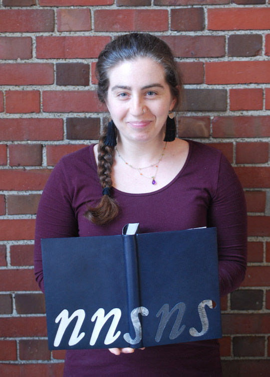
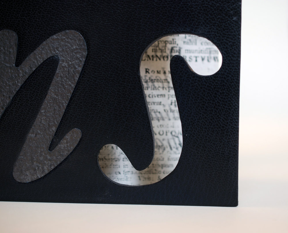
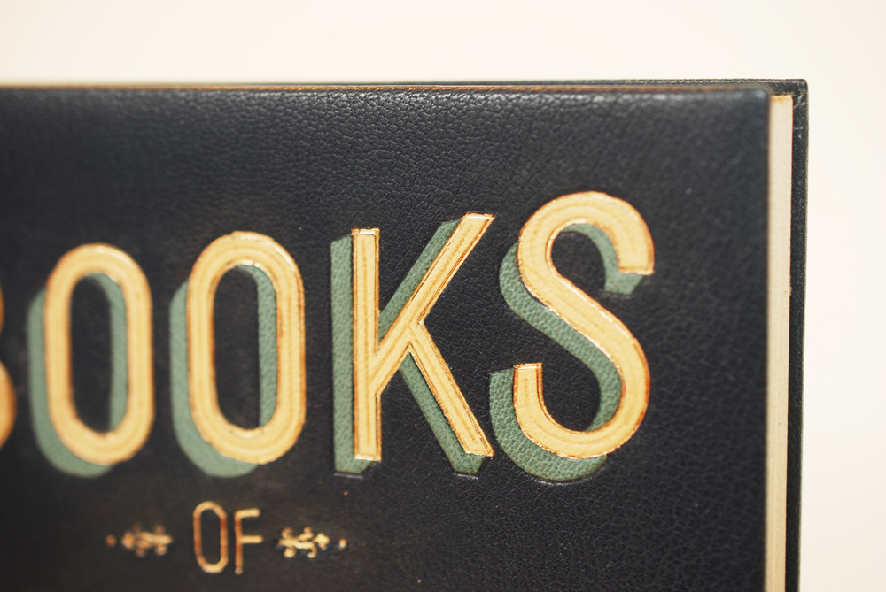
The word nonsense is the most vital part of the title and had the most influence over many of the student’s designs. In Rachel Jackson’s design, she flips the idea of nonsense to find structure. In reducing the word down to its consonants, she could focus on the orderly process of printmaking. Each letter is composed of a different material to represent each step in the printing process. The woodblock used to carve the illustrations is represented by an inset piece of bleached oak veneer. Next in line is a paper onlay followed by a hand marbled letter s, which is marbled with suminigashi ink on the suede side to represent the ink of the printing press.
The final n is a piece of indigo Cave Paper coated with graphite inset into the board to represent lead type. The printed result is depicted in the final s. Instead of an onlay, Rachel cut out a window in the shape of an s to expose a printed page below and to invite the viewer into the book. What you see is a piece of tissue printed on both sides showing a specimen of the typeface used in the text block. The entire design sits upon a base of navy blue goatskin.
The French double-core endbands were hand sewn in alternating bands of navy, dark grey and light grey. The head edge is gauffered in the most unique way, Rachel used this portion of the binding to place the majority of the title using Edinburgh handle letters agains the bare pages.
In simplifying her design, Rachel creates curiosity which is only heightened by the cut-out window. Chaos and structure commingle beautifully within the five thoughtfully placed letterforms. Each hinting to something specific, but when read to together complete both the title of the book and the technique of crafting the content within the book.
Upon graduation, Rachel will be focusing on her building her own business. You can check out more of Rachel’s binding work in addition to her calligraphy here.
Sarah Kim
Sarah Kim used her love of typography to help grapple with the chaos and to bring a sort of order to this senseless content. Her binding is covered in a medium blue goatskin with onlays in light blue and fair goatskin. By layering the fair goat over the light blue, Sarah creates a dimensional effect to the text. Each layer also receives its own special treatment. The gold tooled fair goat onlays contain a blind tooled line running through the center of the letter. The light blue onlays are blind tooled and are textured with blind tooled lines running at an angle. These subtle additions really added more depth and balance to the design.
Sarah created the “of” through gouges and line palettes and sandwiched the word between two ornate tools. To anchor the design of the front cover, Sarah incorporates a commonly used design motif: the ribbon banner. A light blue tooled onlay, the banner contains the name of the author and is also complimented by two ornate tools.
The French double-core endbands are hand sewn with strands of light blue and grey. The endbands sit over a gilt and gauffered edge. I think it was really smart for Sarah to add little touches of decoration with hand tools. In addition to the gauffered edge, the spine is also minimally tooled to help balance the overall design of the binding. When Sarah opened her binding to show me the inside, I was pleasantly surprised by the boldly patterned chiyogami paper. At once you leave the stillness of the cover to only be put on alarm before entering the text of the book.
Sarah sought to convey her concept through the use of typography; to have the viewer read beyond the words and understand that it was communicating much more than the title of the book. When paired with the decorative paper on the inside, her concept really delivers. Her design was skillfully executed and beautifully laid out. You can follow Sarah on instagram and stay apprised of her work.
Allie Rosenthal
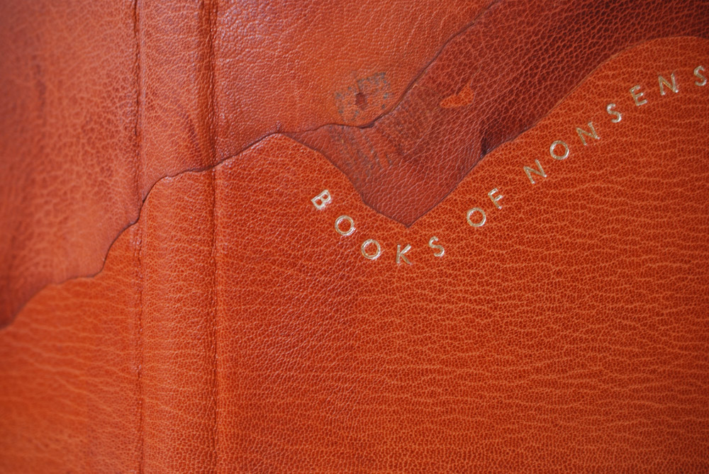
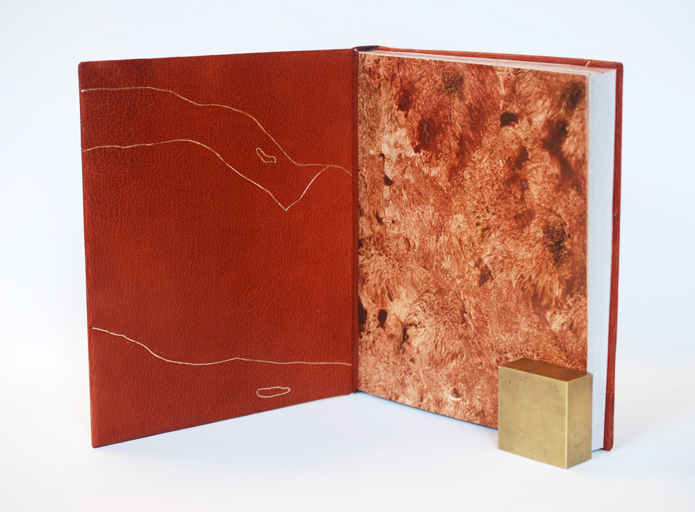
Many of the students reflected that Randall Davies’ limericks were loosely inspired by the woodcut illustrations they were meant to reflect. But every once in a while, Davies’ would incorporate a flaw from the illustration into the composition. For example, interpreting a crack as a bullet whizzing through the drawing. Allie Rosenthal found her inspiration in this and chose to incorporate the flaws and rough edges of the terra-cotta goatskin into her design. This abstract, landscape-esque design is formed by presenting the flaws in a leather skin. Putting a spotlight on the irregular coloration, tears, toggle marks from stretching the skins and flattening folds in the skin. The individual pieces were attached as back-pared onlays and laid down over hefty boards.
The title is hand-tooled in moon gold and playfully wraps along the edge of an onlay. Allie chose the modern typeface Gill Sans for the title. Other elements of Allie’s binding include French double-core endbands hand sewn in stripes of maroon, grey and brown. The head edge is rough edge sprinkled with lemon and moon gold over a ground of Armenian boule. Prior to decorating the edge, Allie mixed up the signatures. So the final result was even more chaotic in appearance than a traditional sprinkled edge.
The interior is covered in matching edge-to-edge doublures with gold tooling that perfectly mimics the erratic lines and tears created by the onlays on the cover. The style of tooling emulates the technique employed by Tracey Rowledge and Ivor Robinson where the impressions are laid with a stepped effect. The paste papers were created by fellow classmate, Liz McHugh. The texture of the paper compliments the terra-cotta beautifully.
Following graduation, Allie will be starting her Von Clemm Fellowship at the Boston Athenaeum followed by the Driscoll Family Fellowship. Her fellowship will span over 15 months.
Ned Schultz
As mentioned in the introduction, Davies collected woodcuts dating back to the 15th and 16th century. To pay homage to this period in history, Ned Schultz created a spectacular reflection of a 16th century English-style binding. Working with a historical color palette, Ned chose a medium brown goatskin for his binding. The outer frame and knot work are achieved with several black gold tooled onlays. I imagine getting the size of the gouges just right, particularly in those small, tight turns was tricky, but Ned achieved the look flawlessly. The center is adorned with a red tooled onlay and features the title on the front cover. The spine is tooled to mark the placement of bands with black tooled onlays in the spaces between.
Additional floral hand tools and a large fleur-di-lis were used as accents to the knot work. On the outer black frame, Ned used a decorative roll to nearly cover the entire space in gold. This perfectly symmetrical design glimmering in gold is so attractive to the eye and recreating work from this time period is quite impressive for someone so new to finishing.
Opening to the interior of the book, the viewer can only be delighted by the patterned paper of gold diamonds against a bright red background. Ned coated the paper with vermillion before painstakingly applying each diamond (twice) through the application of heat. The endpapers work so beautifully with Ned’s cover design and harken to the Dutch Gilt papers of the 16th century.
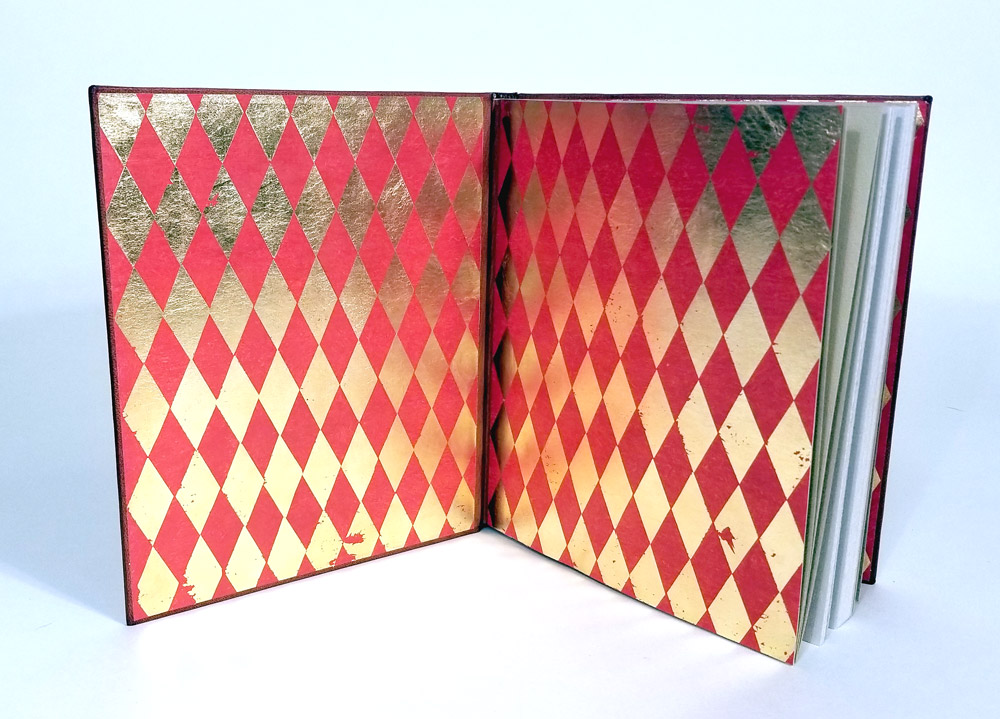
I am so impressed with Ned’s binding and can not express it enough. I look forward to seeing the next historical binding reproduction that comes out of his studio. Ned plans to pursue a career in conservation, but also hopes to further hone his skills in finishing.
Jon Simeon
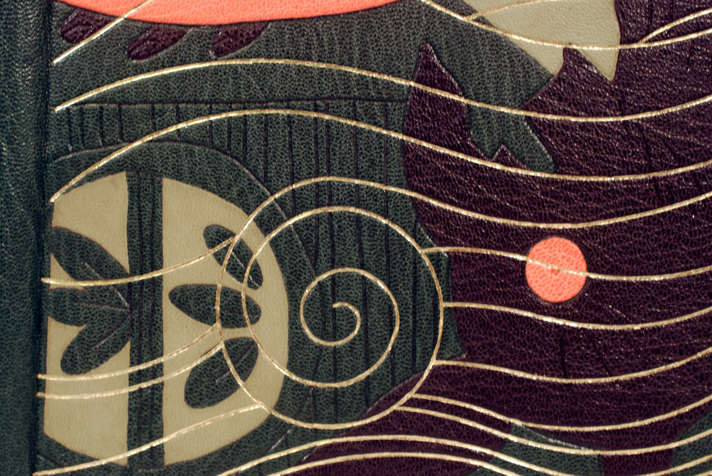
Jon Simeon took the theme of chaos to heart with this binding; taking his inspiration from how Davies disregarded the illustration when writing each limerick. Jon took elements from the illustration on the title page and cropped and layered his concept into a surreal design. The base layer is dark green oasis with back-pared olive green goatskin onlays and tooled onlays in black and pink goatskin.
Trying to decipher his actions, I asked Jon to break down his process step by step. After adhering all of the onlays, blind tooling came next. Using an ascona tool, Jon wanted to highlight the carved lines from the woodcut illustrations and did so first with the blind tooled lines and then with the gold tooled waves and swirls. The pink and black onlays are outlined and giving dimension with blind tooled lines. I love how Jon seemingly reversed a traditional image, burying the major elements behind the background.
The title is tooled along the spine amidst a blank canvas. This break in the design was thoughtfully placed to relieve the eye. This same idea continues onto the inside of the binding. Black goatskin doublures are paired with a hand marbled paper in a moire pattern. I love how this paper evokes the movement from the front cover. Other elements of Jon’s binding include hand sewn French double-core endbands in alternating bands of green, pink and olive green. The head edge is gilt with moon gold over a graphite ground and sprinkled with palladium.
This binding experience has really driven Jon to further focus on finishing after graduation. I can’t wait to see what Jon creates next. You can follow Jon on instagram so you don’t miss any of the amazing work he is bound to make in the future (pun intended).
Rebecca Fisher Staley

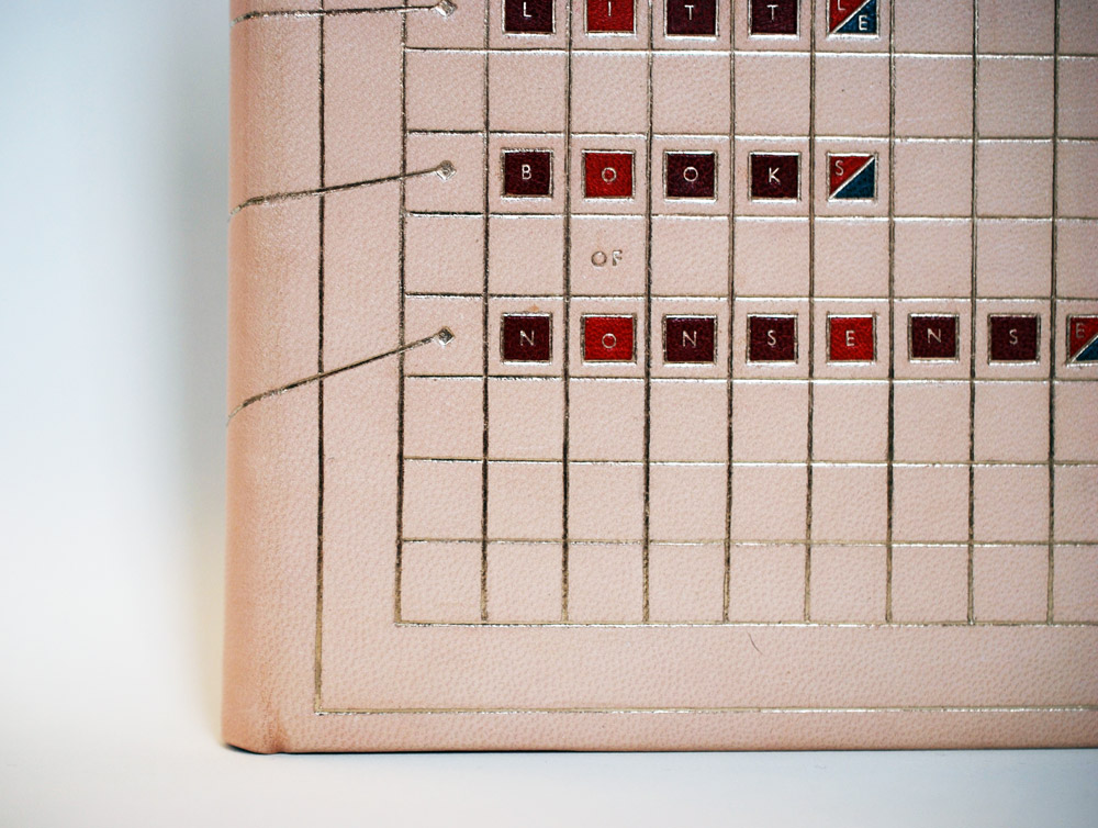
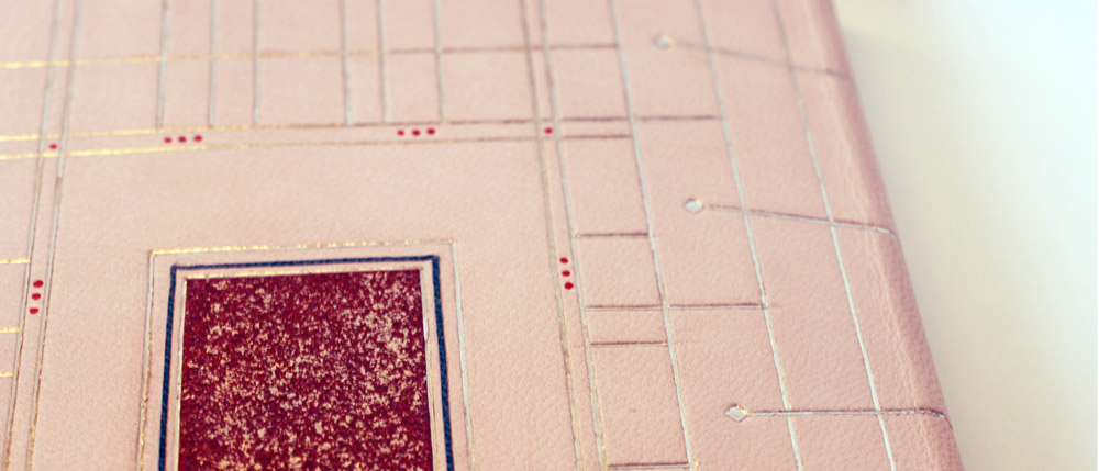
Rebecca Fisher Staley found the connection between the limericks and woodcut illustrations to be awkward and chaotic. To find some sense in this book of nonsense, Rebecca created an elaborately structured design for her binding. Taking inspiration from the anapestic meter, which dictates the syllabic makeup and stress pattern of a limerick, Rebecca constructed two unique grids. Each designed to represent the two opposing centuries found within the book: woodcut illustrations from the 15th-16th century and limericks from the 20th century.
Rebecca chose a fair goatskin for the base of her design, which developed a slight pink hue over the course of the binding process. This change in the skin blends so beautifully with the rest of her chosen color palette. The grid on the front cover is sleek and modern and holds a series of small square tooled onlays in pepper red, crimson and teal. The strategic placement of color depicts the stress pattern of a limerick in addition to containing each letter of the title.
The grid on the back board is more representative of an old English 15th century pattern. To set up this grid, Rebecca was guided by the syllable count of a limerick. The tooled crimson onlay in the center is sprinkled with moon gold to represent the chaos Rebecca found in the book and by being placed in the center of the board, the onlay physically pushes the lines of the grid closer together to create spaces of varying size. The small red dots placed just outside the inner frame are hand painted in tooled impressions. Both grids are connected across the spine in an asymmetric layout harkening back to the loose connection between woodcuts and limericks.
The interior is covered in matching edge-to-edge doublures with a sunken panel of cherry veneer which is framed by crimson leather onlays. The hand sewn endbands are traditional French double-core wrapped with stripes of white, off-white and red. The head edge is sprinkled directly on the gray paper in moon gold. The sheer amount of planning and reworking that was put into this design is astounding. Rebecca’s design is so striking, her color choices are spot on and I can’t wait to see what she makes next.
Rebecca will be working to complete two commissioned artist book editions over the summer before moving back to the Los Angeles area where she plans to open a design studio with two colleagues.
Frances Wentworth
With Frances Wentworth’s design, she playfully arranges the title in such a way that cuts the word nonsense into two words. When the book is closed the title reads as Books of Sense. The viewer is only revealed of the true title after peering to the backside. This whimsical layout takes direct cues from the layout of the book, where the woodcut illustration sits above the italicized limerick. To create the look of a woodcut block, Frances first crafted the letterforms in 20pt. museum board pieces on a 10pt. museum board base then covered it in a medium brown goatskin. The letterforms on the front cover are rigid and angular while the typography on the back cover is more wild and playful. These are direct responses to the sharpness of the illustrations and whimsy of the limericks.
The “blocks” are inset into the boards and framed with separate pieces of 10pt. museum board covered in the same medium brown goatskin. I love that Frances chose to emulate the woodcut block instead of the illustration. Viewing part of the text in reverse just adds to the humor and quirkiness of the design.
The remaining portion of the title is done in back-pared onlays in various colors of goatskin. All of the design is backed by a medium grey goatskin. Frances added a French double-core endband in stripes of blue and red silk against a graphite edge on the head. Frances chose a 19th/20th century reproduction printed endpaper with blue grey Bugra endpapers.
Although design binding isn’t what Frances sought out to do at NBSS, her concept really worked with the book. It is compelling, thoughtfully executed and sparks a bit of humor. Frances plans to pursue a career in conservation after graduation.
That brings us to the end of the interview. I have to say again how impressed I am with the finished bindings. Everyone’s personalities and interests really shine through in their designs. Best of luck to everyone in the Class of 2018!
