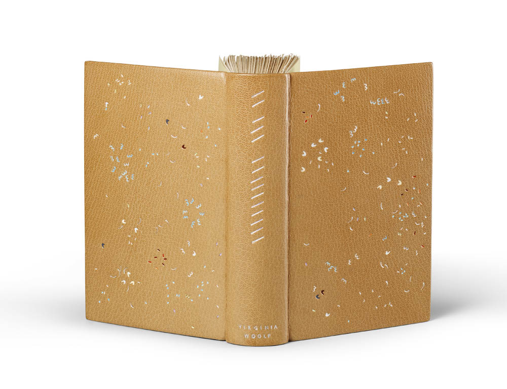
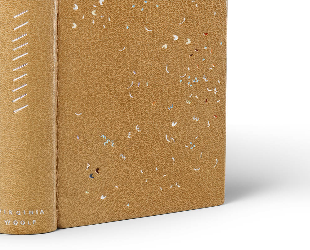
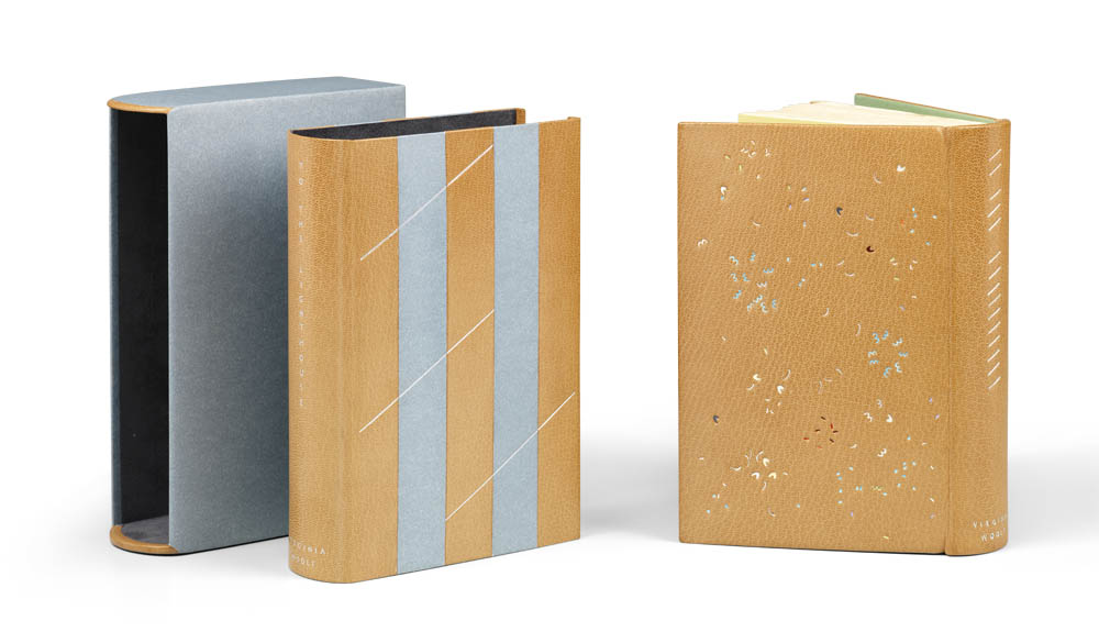
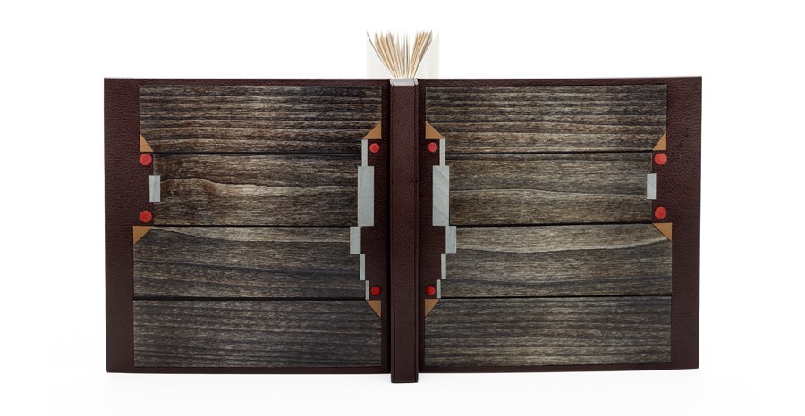
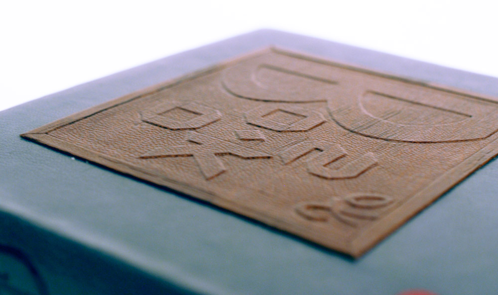
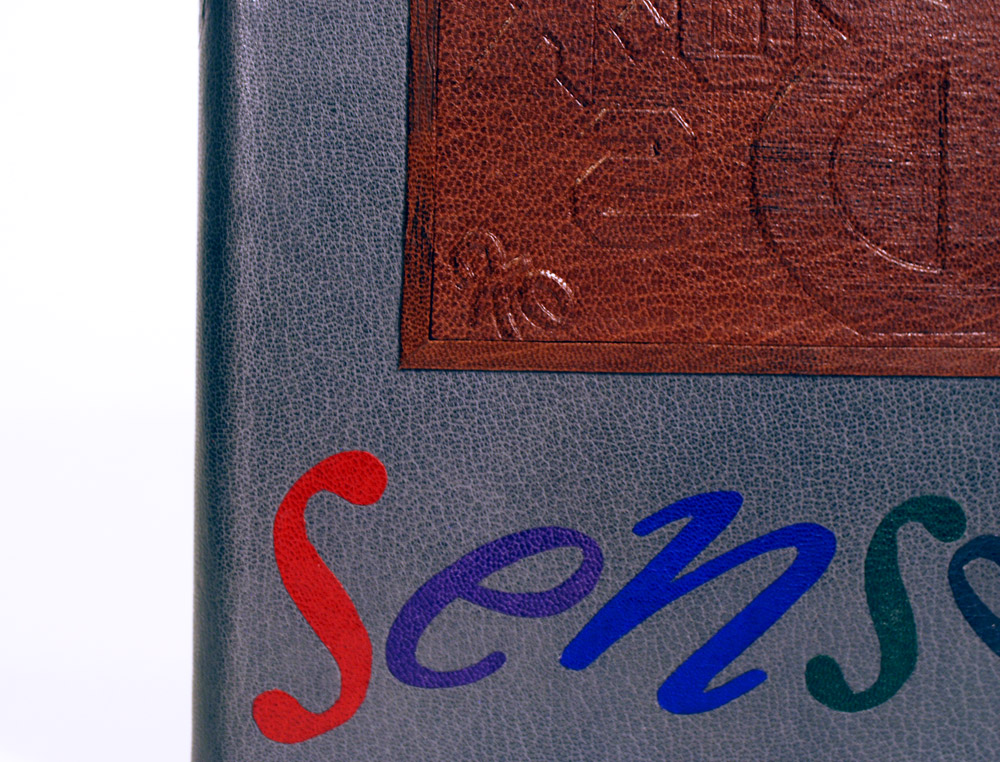
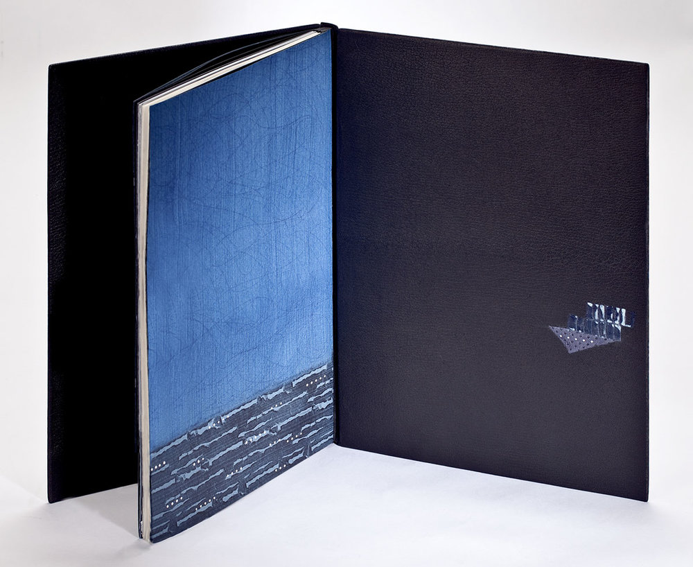
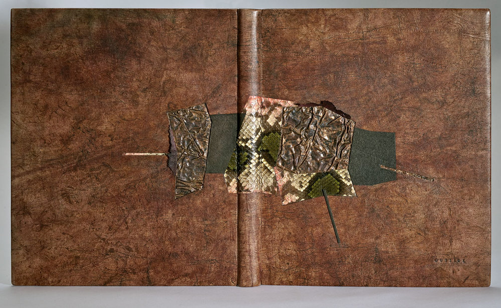
The fifth book in Annette Friedrich’s Woolf I–IX series is To the Lighthouse, which was bound in 2015. The binding is covered in a tan goatskin with green hand sewn endbands and edge-to-edge doublures. The flyleaves are a light yellow hand-dyed paper. The design is executed by tooling through silver folio and fifteen shades of pigmented foils including white, mauve, two shades of grey, two shades of blue, three shades of yellow and four shades of red. Transparent pearl foil was also used within the design.
The chemise is inlaid with blue grey paper and tooled with three shades of silver foil. The slipcase is covered in the same lilac paper used on the chemise and lined with mauve Alcantara. The design is tooled by Claude Ribal of Paris.
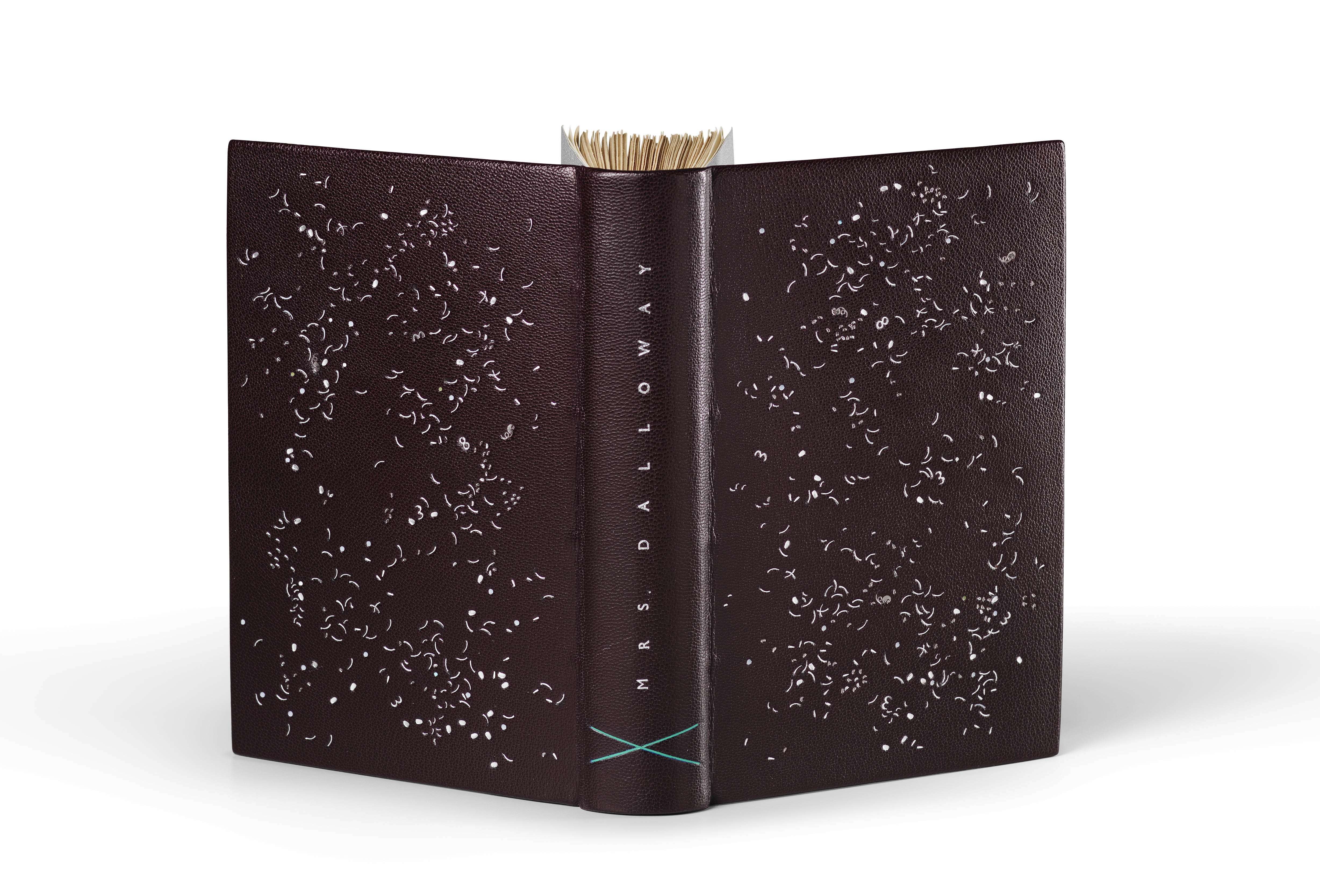
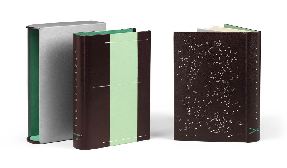
In your description of To the Lighthouse, you mention that Woolf’s style of writing changes with this novel. In comparison, the design on To the Lighthouse incorporates more color than any of your prior bindings. Do you use color in your design as a means of representing something in the text or is it an aesthetic choice or perhaps a bit of both?
Yes, next to her ongoing interest to tell a ‘story’ from the inside of her characters minds and link them together in one big flow (the stream of consciousness) she now adds another layer by weaving in a sense for the surrounding atmosphere and the general passing of time. In a weird way this is almost detached from the main plot… Anyhow! All I want to say is that it reverberates with pure poetry throughout and this did lead me to start working with color from a more painterly perspective: to create light, elusive moments, buzz and the occasional ‘clunk’.
With this binding you introduce the “special guest” foils. Is your inventory of foils growing at this point? What characteristics are you looking for in your foils and what do you try to avoid?
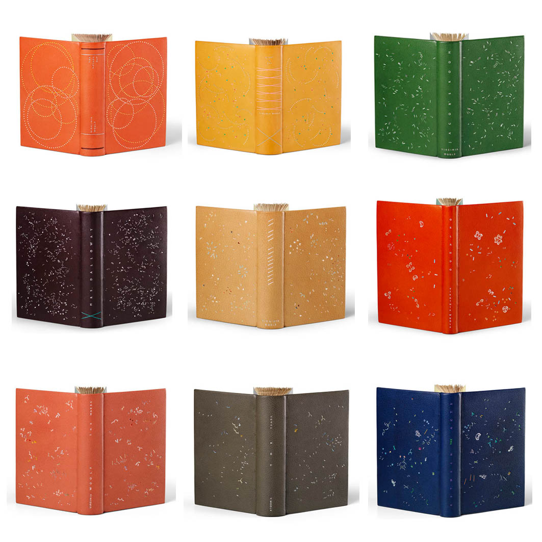
My collection of pigment foils has grown steadily over the years. I think I have approximately 60 different colors to work with at the moment. And only ‘recently’ have I discovered my ‘special guest’ foils, which are iridescent, pearly translucent or whatnot. They are used on top (or under) other foils and thus give it a kick into a direction that is beyond ‘regular’. I love them, but of course one needs to be a tad careful not to go too far down that particular route.
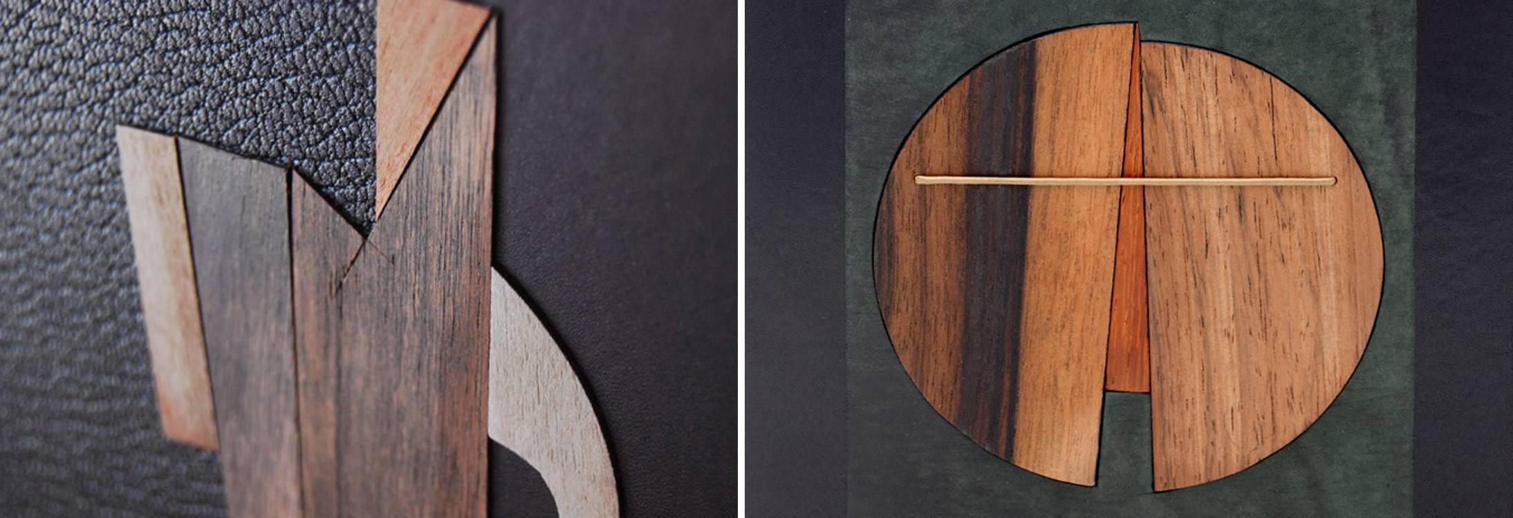
What do I look for in my foils? Well, pigment foils are mainly created for the industry, but one has to understand that the foil is merely the clever carrier for the pigment, before heat releases it from the foil onto whatever it is meant to be on. There are two main challenges that the industry is interested in and which they have solved in a satisfactory, yet mutually exclusive, way. One is to block big and coarse areas in one go. To do this, the pigment releases easily from the foil and is not too choosy about the exact level of temperature or pressure. The downside of this is, that the edge definition tends to be blotchy and that any inner negative shapes should not be covered… well, they are very likely to get filled in regardless. So they are brilliant for the big work, but not at all good for lettering. However, no need to be depressed, for the industry has developed another type of foil that is geared up for detailed and precise work and excels in high edge definition. The problem with this one is that it is super sensitive and tricky to use for hand tooling, as the temperature window needed to pull it off is extremely narrow and the surface needs to be well prepped and super flat. So those are the characteristics one can find in foils and usually each supplier will offer the same color in the varying types. So read the description and choose the ones that fit best your needs.
 The finishing work on this binding is executed by Claude Ribal. Up until this point, you had been completing the tooling yourself, why did you decide to outsource this stage of the process moving forward?
Yup. This is a very sad story and a big learning curve for myself as a maker. I have been working with tooled designs for years and years and am pretty good at it, even if I say so myself. However, as it turns out: not good enough! When I transfer a design onto the book, I do this in various stages, which are basically the same as for gold leaf tooling. The sole exception being that the foil is slid over the blinded in impression at the very last moment. It thus obscures the sighting and makes it extremely difficult to get the tool bang-on into the shape without fumbling around too much (lethal). Working with dots, lines and gauges is easy, but tackling complex shapes… basically blind-folded… eh!
As we discussed earlier, this is one of the first books where I launched myself into working with color pigment foils in a massive way. Pigment foils are more temperamental to work with than metallic ones… You can guess where this is heading to? I did it once and was not quite happy. I retraced my steps, removed the leather from the book and covered it afresh. Second attempt. Again… not good enough. It only takes three or four shapes of the many to be ever so slightly off and the whole thing looks ghastly and heavy handed. I got fairly depressed, but told myself that ‘what has to be done, has to be done’. So the next time I actually bought a completely new text block and started from scratch (just in case that this particular book was doomed). When the time came for tooling, I held my breath and launched into the third round. Do you care for fun facts and figures? To execute this design in full takes 14 hours. So no small feat, particularly if it goes again pear shaped, which it DID! What was I to do? Try and try again? I felt pretty confident that if I practiced hard over the course of a year that I would be able to raise my game from my current 88% to 95%. But did I really, really want to do this? No. What I really wanted was to push on with my design work. And so I decided to get help (I still do the titling though!). A colleague recommended Claude Ribal who is a fantastic finisher in Paris, and that’s where I went. It is a little bit complicated to get everything ready for him though, for not only does he get all of my tools, foils, and my design master sheet, but also an exact guide to inform him which shape has which color. I said earlier that I have 60 shades by now and everything needs to be super clear. Nothing is left to chance, everything is specified. Claude is not only a very kind man, but he is also really good at what he does. His expertise brings the touch of lightness within the execution to the design that is absolutely needed to pull it off and that makes me very happy and grateful.
A beautiful documentation has now been published, that traces the development of this project, which, as it turns out, took seven years to complete. WOOLF I – IX ! 98pp, with an introductory essay and 1:1 reproductions of the bindings, background information, and text excerpts.
Text: Annette Friedrich, Virginia Woolf
Design: BUCHmacher, Germany
Photo: Shannon Tofts, Scotland
£30 + postage / reserve your copy at www.annette-friedrich.com

