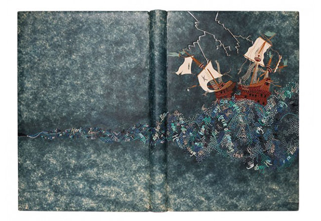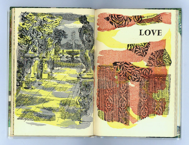
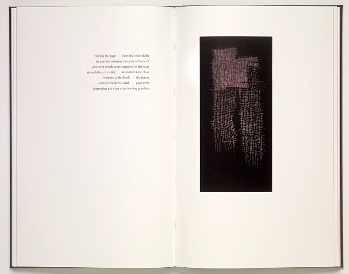
LOOM was published by Nawakum Press in collaboration with printmaker Richard Wagener and poet Alan Loney. After Richard began to explore the structure of a loom and the process of weaving, he approached Alan with three finished engravings. Alan was asked to respond in the form of a poem that would equally explore the beauty between connection and disconnection found in both woven work and life.
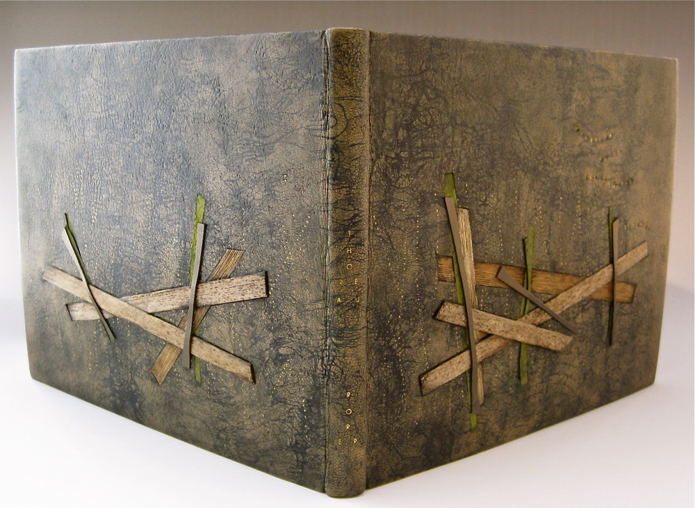
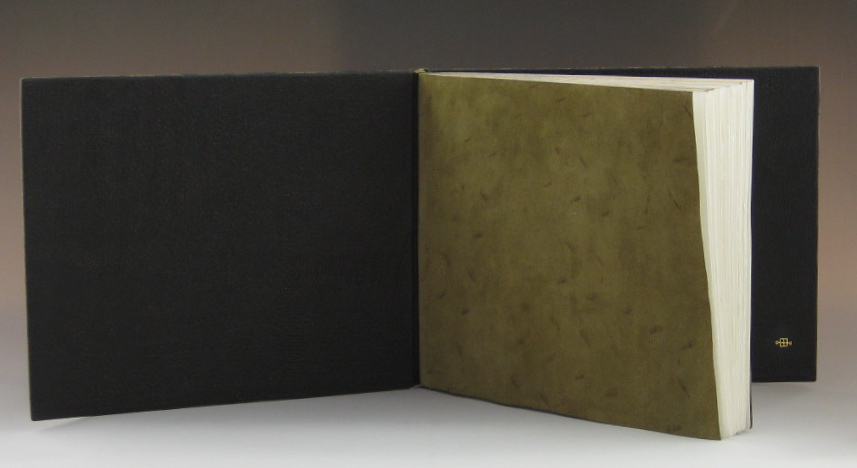
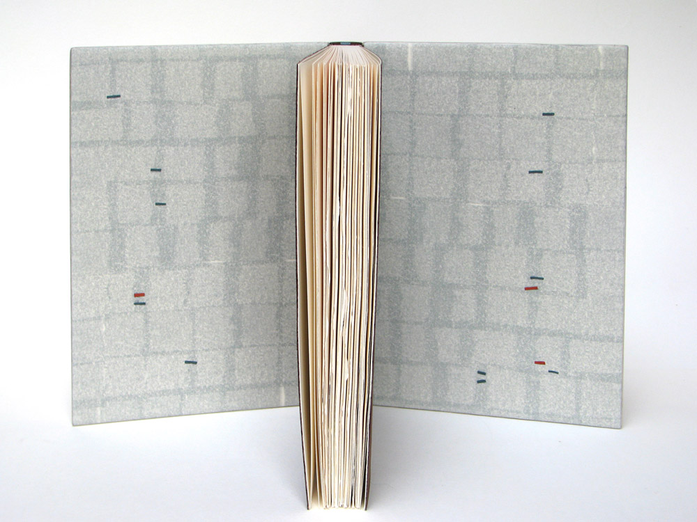
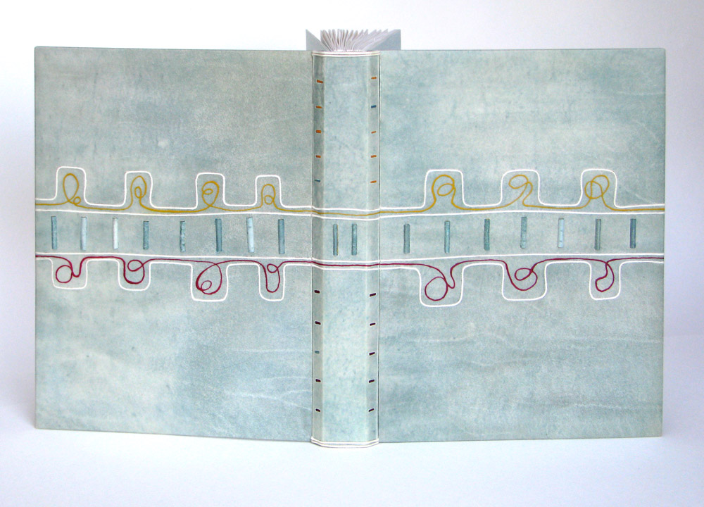
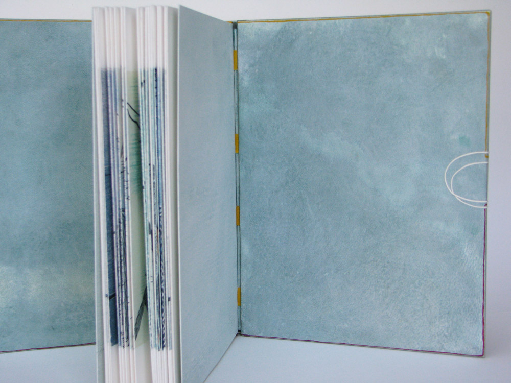
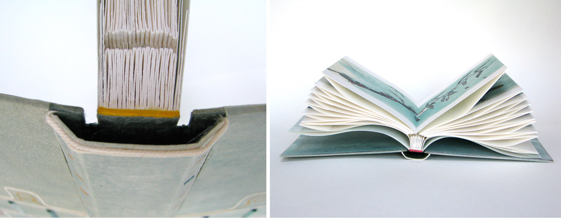
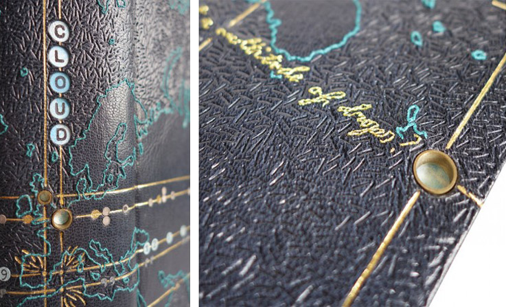
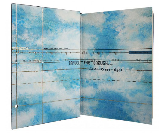
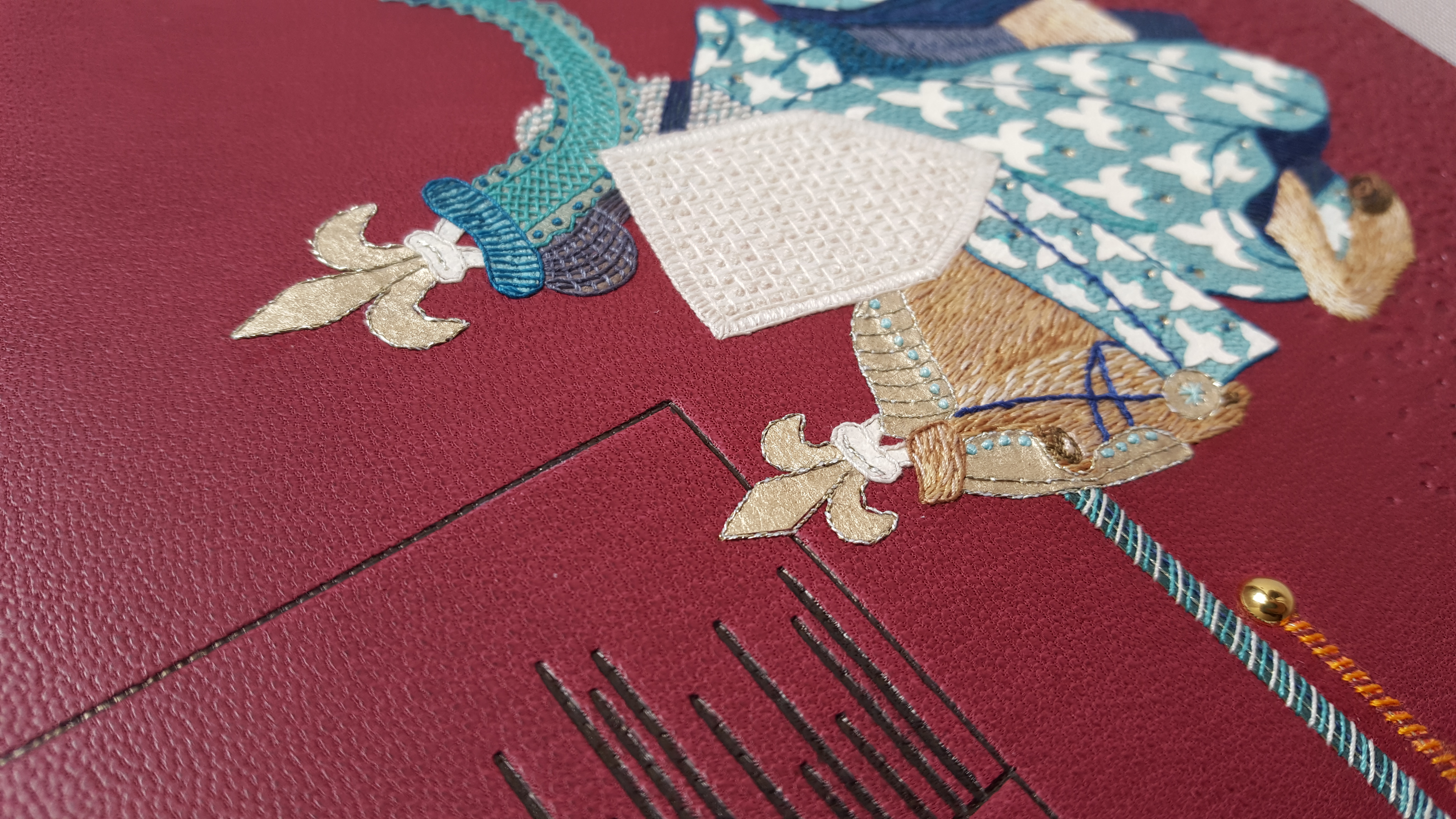
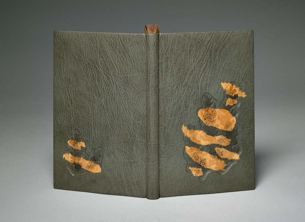
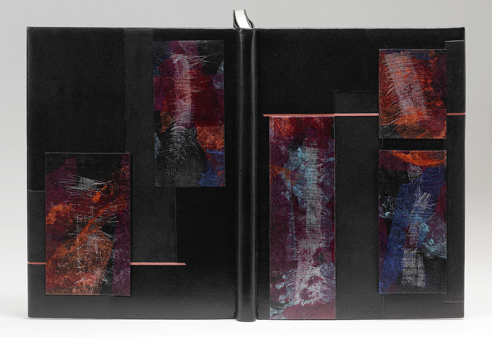
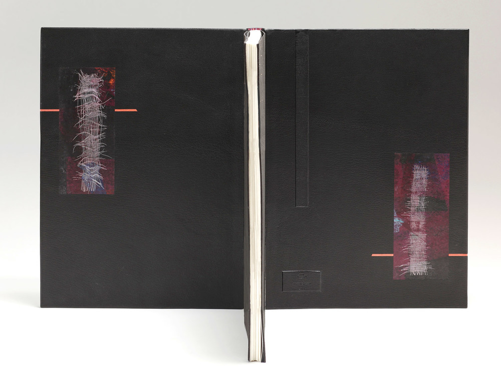
Coleen Curry bound this copy of LOOM in 2015 in a black goatskin with inlaid pieces of manipulated leather. The interior is covered in distressed edge-to-edge leather doublures that include two additional inlaid panels of the same manipulated leather.
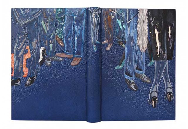
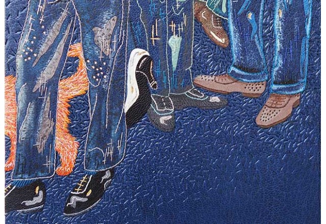
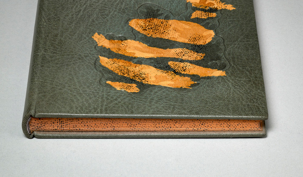
The main decorative element on this binding captures the essence of Richard Wagener’s prints beautifully. Can you discuss your technique for creating these amazing distressed leather onlays?
It was love at first sight when I laid my eyes on LOOM at the 2014 Fine Press Fair in NYC. Richard’s pristine end block maple prints are stunning and Alan Loney’s poem gently flows. I purchased a set in sheets and sat on the project for some time awaiting that design inspiration.
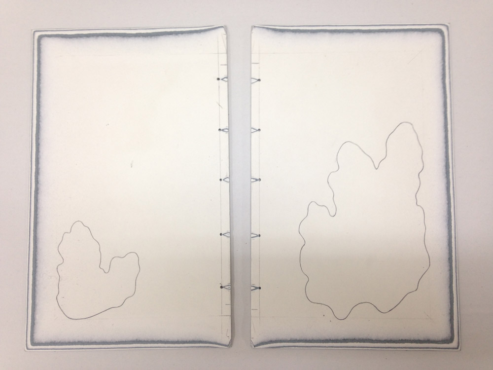
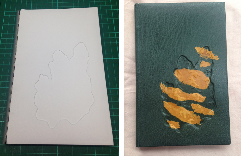
Later that year, while experimenting with suede splits, I rather unsuccessfully attempted to emboss mull into the split – it stuck and I couldn’t remove it. My ahha moment, it was beautiful! This was perfect for LOOM!
I made the colorful panels on one large piece of red by layering vivid colored papers, pressing and sanding. I then took sections of mull and carefully removed strands both vertically and horizontally until I had the shapes I desired. These were then pressed into the suede and additional layers of paper added. More sanding and pressing until I had the desired effect.
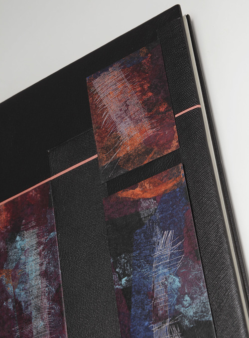
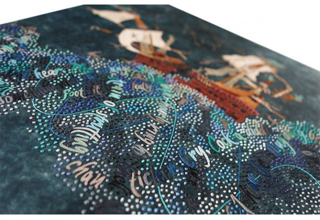
To create the design, I cut and arranged the pieces to flow across the book, taking care to ensure the mull pieces flowed harmoniously. I embossed large sections of distorted mull into dampened black leather for a few background onlays and inlays to add texture and continuity. All the panel pieces with the exception of one, are inlaid at various levels: recessed, even, and raised. I inlaid two even panels on the edge to edge leather doublures as well. The pink leather incisions were added to weave the components together.
The layouts of your designs have a rather organic flow to them, yet LOOM feels more hard-lined and controlled. Was your decision swayed by the nature of the materials or the subject matter of the book?
I hadn’t thought about the book content being so controlled. The poem is very much about weaving, earth, spirituality, and movement. The typesetting although controlled and consistent, has breaks mid line for a pause and those breaks add to a weave or flow. Richard’s prints begin with a very simple weave and build into ever more complex weaves. Nawakum Press made a 15 minute video on the making of the edition that I find inspiring.
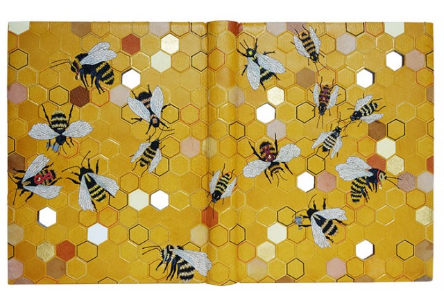
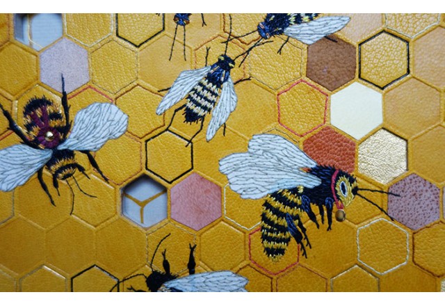
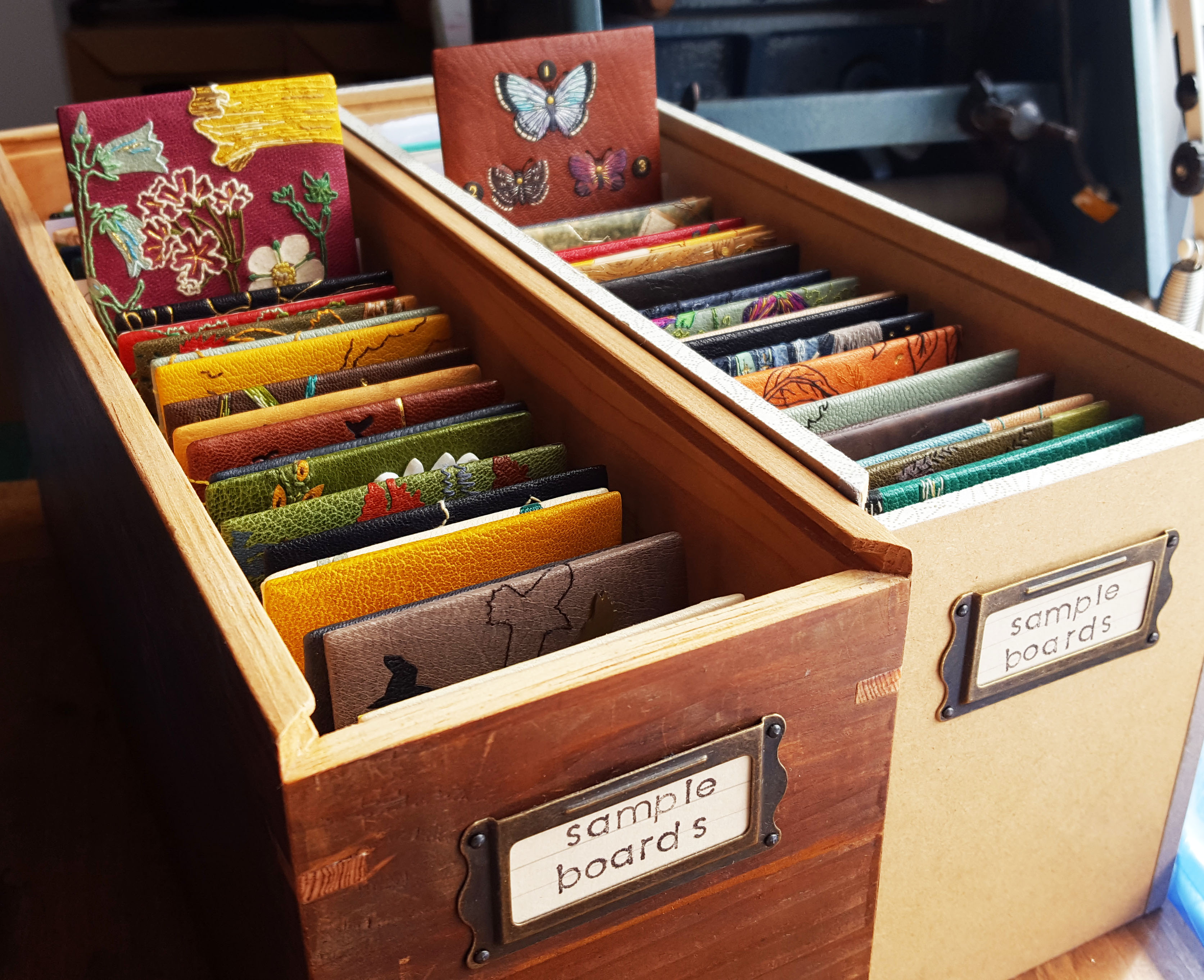
My binding of LOOM is one of my favorite bindings and it was a hard one to let go. That said, I have another 2 sets in sheets, one of which I am working on these days.