RSS Feed

Posts Tagged ‘hedi kyle’

  1. July // Bookbinder of the Month: Ben Elbel

    July 1, 2015 by Erin Fletcher

    BovenKamer1-BenElbel

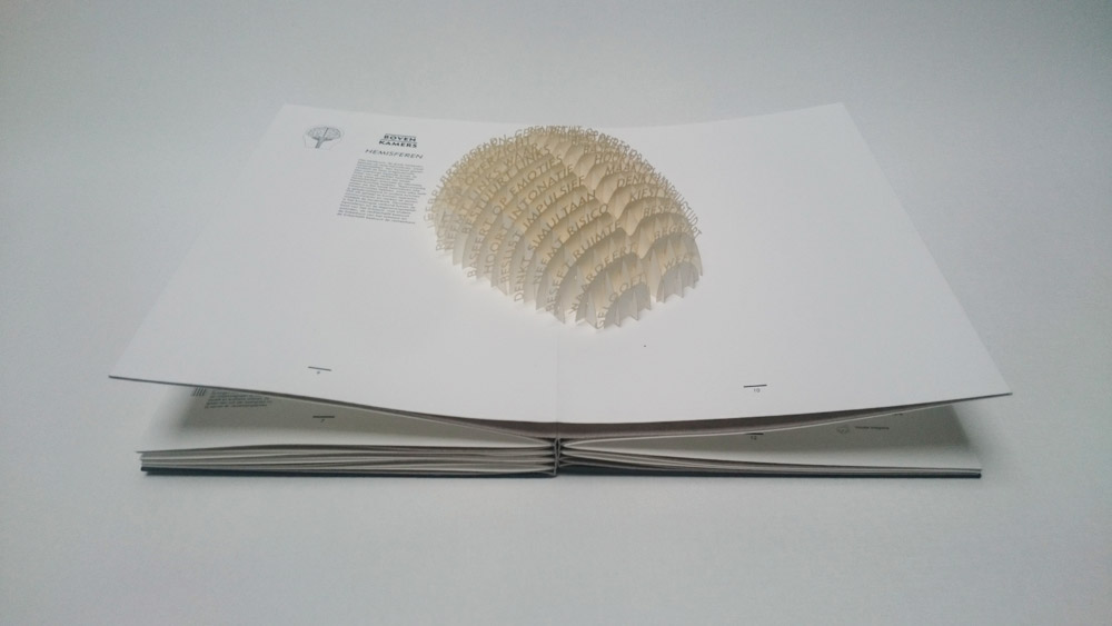
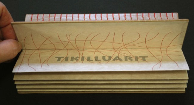
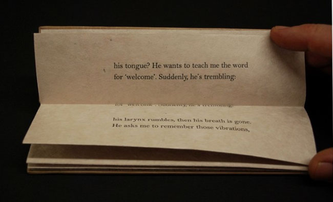
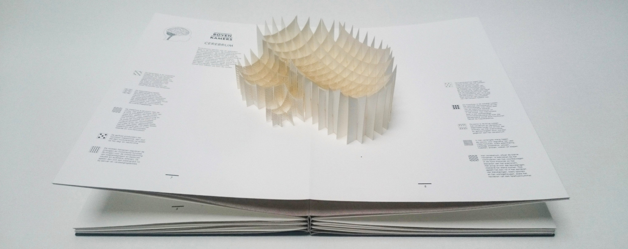
    Boven Kamers is a collaborative Dutch pop-up book between neuroscientist Gerard J. Boer, professor Harry B.M. Uijlings, paper artist Ingrid Siliakus and graphic designer Moon Brouwer. The book contains a total of six laser cut pop-up spreads which send the reader on a tour through the human brain and its functions. Printed in a limited edition of 50, each book is numbered and signed.

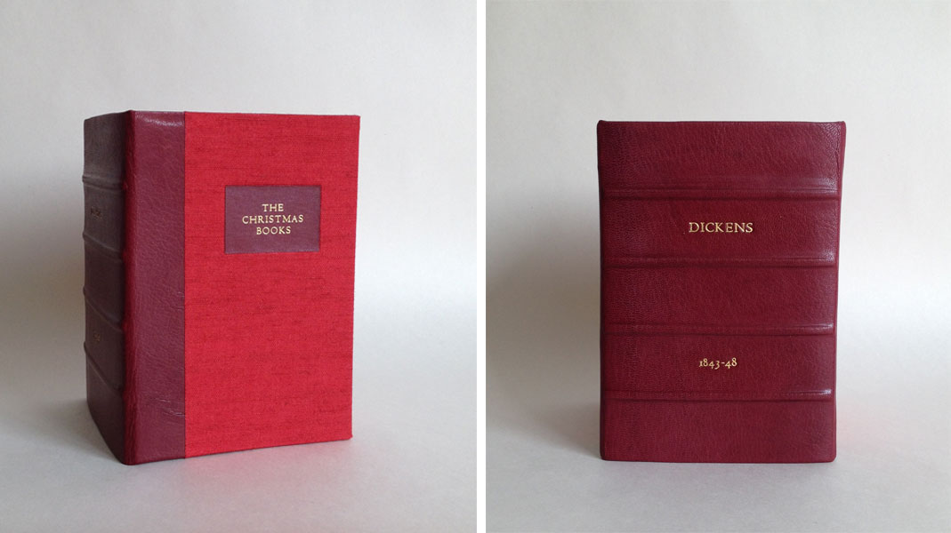
    Ben Elbel‘s innovative rebinding of this book was just completed earlier this year.

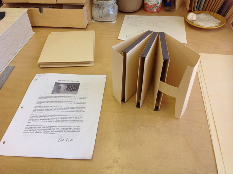
    I have been waiting in anticipation to see this binding after you spoke to me about it. In your newsletter on this binding, you mention that the compensation folios are sewn together. The spine opens to a sharp ‘V’ allowing the pages to lay flat, can you elaborate on the sewing structure and any treatment done to the spine?
    Boven Kamers (literally means upper rooms in Dutch, a colloquial expression meaning brain), is an exploration of the human brain in the form of a pop up book, by the young Dutch designer and publisher Moon Brouwer.

    I was commissioned to re-bind the book by the Dutch Royal Library (The Hague).

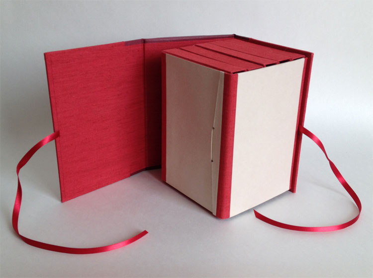
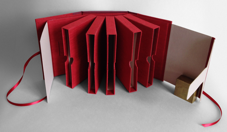
    When I first received it, the book presented itself as a series of folios laminated with one another, each folio containing a pop up. A hard cover was provided but disconnected from the textblock.

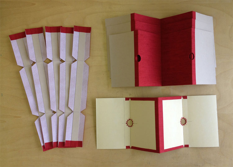
    Technically, the challenge was to provide compensation for the pop-ups as well as a perfectly flat surface for them to smoothly unfold, all of this without sewing and without introducing blank pages between the folios.

    After some research I concluded that none of the existing binding structures (traditional or contemporary) were quite suitable to do all this, so I created a new one from scratch.

    BovenKamer7-BenElbelBovenKamer4-BenElbel

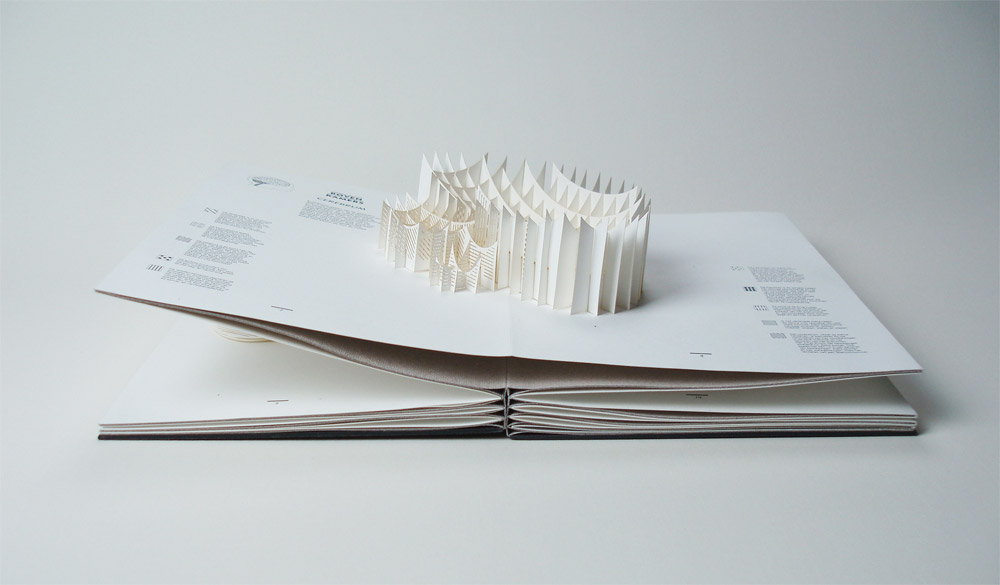
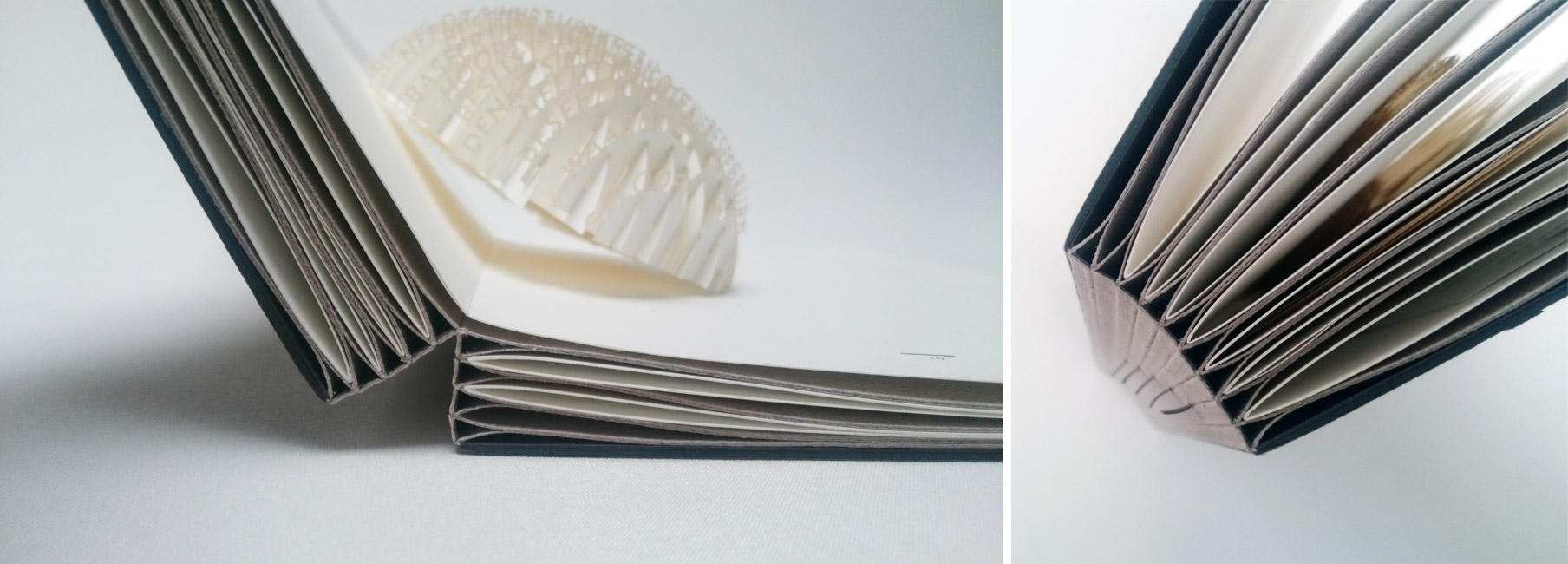
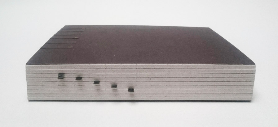
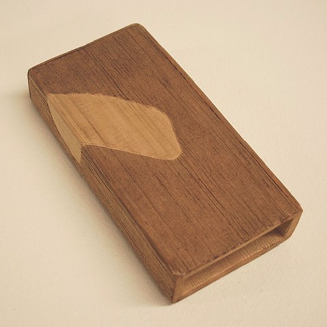
    It took about a year and the result is a series of ‘T’ elements made from heavy paper, sewn with one another. The folios are inserted between each T and secured only at the fore-edge. On the next images one can see how the spread ‘floats’ on top of the binding, allowing the pop up to fully unfold. The original cover was mounted at the back of the book and a lettering was created, on the spine and front board, to evoke a kind of staircase leading to the upper rooms.

    BovenKamer6-BenElbel

    You can read a bit more about the binding and see some images of the book at various stages through the design process here.

    – – – – – – – – – – –

    Ben and I have kept in contact ever since he embarked on offering online courses (more on that in the interview). His work and business ethic are quite inspiring as Elbel Libro has expanded beyond the traditional bindery. He ceases to amaze me with his sleek designs and innovative binding structures. There seems to be no stopping his creativity.

    Check out the interview after the jump and make sure you come back during the month of July for even more probing questions regarding a selection of Ben’s work. You can get email reminders by subscribing to the blog, just click hereread more >


  2. My Hand // Multi-Section Slipcase

    August 5, 2014 by Erin Fletcher

    For the past few months, I’ve been creating a collection of boxes for an aspiring book collector client of mine. Each box is similar in its format and design, only the colors change; a clamshell box with a rounded leather spine with false raised bands. The author and date of the imprint are hand tooled in gold on the spine with the title stamped in gold foil on a leather label recessed on the front board. The trays are covered in Canapetta bookcloth and lined with Bugra paper.

    Five boxes into this ongoing project, my client presented his five volume set of The Christmas Books by Charles Dickens, asking for a box to hold all five that could also mimic the other clamshell boxes I had already made. I remembered a tutorial of Hedi Kyle’s that I had printed out some time ago on a multi-section slipcase, which she presented in 2005 at the GBW Standards held in Portland, Oregon. So I set out to create a model to present to my client.

    MultiSectionSlipcase-ErinFletcher

    The model was constructed using 20 pt. museum board and some scrap bookcloth. For the client’s box, I had to devise a way to cover the 20 pt. using Canapetta bookcloth and Bugra. Since a full sheet of 20 pt. laminated with bookcloth would get too bulky in the fold, the walls were assembled with four separate panels leaving a slight gap creating proper movement at the hinge.

    My client also requested notches on the walls for easy removal of the books. Semi-circles were cut out along the edge of the panels and the cloth was cut into triangles to successfully turn-in around the curve.

    MultiSectionSlipcase2-ErinFletcher

    Construction of this multi-section slipcase could be rather finicky at times, making it difficult to keep each component square. Once the slipcase sections were assembled and the interior ‘tongue and slot’ closure was added, it was time to construct an exterior case to mimic the clamshell boxes. I began by shaping the spine, which was rather difficult on a box that was wider than either of its other dimensions. The false bands were added and finally the leather was pasted down. The spine was then tooled and the leather label was laid into its well on the front board.

    MultiSectionSlipcase3-ErinFletcher MultiSectionSlipcase4-ErinFletcher

    The slipcase block is mounted to the back board of the exterior case, which can freely swing away and aid in the movement of the slipcases.

    MultiSectionSlipcase5-ErinFletcher


  3. May // Book Artist of the Month: Roni Gross

    May 2, 2014 by Erin Fletcher

    Tikilluarit3-RoniGross

    Tikilluarit was created for the An Inventory of Al-Mutanabbi Street exhibition, which began in 2012, exhibiting nationally and internationally until 2015. The exhibition showcases a collection of artist books and broadsides that are a response to the explosion of a car bomb in Al-Mutanabbi Street, the historic center of bookselling and arts culture in Baghdad, back in March 2007. The exhibit came to Cambridge and was exhibited in three parts. Unfortunately, the session I attended did not included this particular work (I wrote a post about it).

    Tikilluarit is the collaborative work of three artists. But Roni Gross is the star of this post; her concept transformed a written piece into a conceptual binding. The sonnet, which makes up the text of the book, was recast from a Greenlandic series by Nancy Campbell titled “The Hunter Teaches Me To Speak” (originally published in Modern Poetry in Translation). The word ‘tikilluarit’ means ‘welcome’ in Kalaallisut, the native language in Greenland. The sonnet is as follows:

    The hunter teaches me to speak
    I place my fingers round his neck and feel
    his gorge rise – or is he swallowing
    his tongue? He wants to teach me the word
    for ‘welcome’. Suddenly, he’s trembling:
    his larynx rumbles, then his breath is gone.
    He asks me to remember those vibrations,
    and, anxious as a nurse who takes a pulse,
    touches my throat to judge its contortions.
    Will I ever learn these soft uvulars?
    I’m so eager, I forget that the stress
    always falls on the second syllable.
    My echo of his welcome is grotesque.
    He laughs, an exorcism of guillemets,
    dark flocks of sound I’ll never net, or say.

    Tikilluarit1-RoniGrossTikilluarit2-RoniGross

    The modified accordion binding was executed by Biruta Auna using calfskin while Roni designed and letterpress printed the text on Mitsumata paper.

    Tikilluarit is bound in such a way that offers little access to the interior parts of the book. How does the text and binding correlate to one another?
    The poem speaks about a person trying to mimic the sound of a word spoken by another person by placing a hand around the throat of the speaker. The spine side of the book was made to be as visually important as the text block, which serves in effect, as the throat of the book. The text moves up and into the spine as if going down the throat. The exposed sewing is similar to the anatomy of the vocal cords.

    Tikilluarit4-RoniGross

    The fourth collaborator is Peter Schell who crafted the unique sound sculpture that is paired with the deluxe edition of the book. In addition the deluxe edition includes a waxed linen wrap to house both the book and sound sculpture.

    Paired with the book is a wooden sound sculpture that can be activated by shaking it. What does the element of sound bring to the experience of this piece?
    The speaker in the poem says of the difficulty in learning to the language…”dark sounds that I will never net or say”. The wooden sculpture has an abstract wing pattern on the outside, which refers to an arctic bird which make a tinkling sound as its wings beat across the water. A sound that the human voice would not be able to replicate. It is another way of amplifying the words so that you can experience the poem in a physical way.

    – – – – – – – – – – – – – –

    I went into this interview not knowing very much about Roni, her history, her work or her artistic outlook. Through the interview, I hope you come to realize what I have: that Roni has a great appreciation for her artistic community and brings together unique artists in collaboration to expand on the concept of the book by conjuring up the senses. Enjoy the interview after the jump and sign up to receive email notifications so you don’t miss a post throughout the month of May which will feature more of Roni’s work.

    read more >


  • My name is Erin Fletcher, owner and bookbinder of Herringbone Bindery in Boston. Flash of the Hand is a space where I share my process and inspirations.
    The StudioNewsletterInstagramEmail me
  • Archives