RSS Feed

July, 2015

  1. Swell Things No. 25

    July 31, 2015 by Erin Fletcher

    stno25a

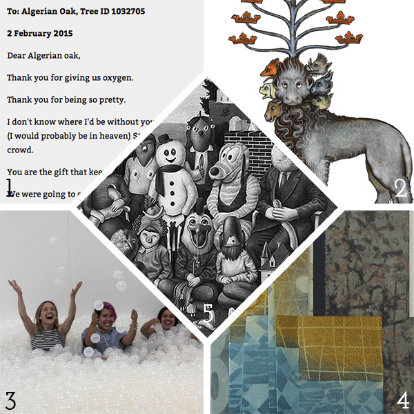
    1. The city of Melbourne has assigned email addresses to trees, which allow citizens to report any issues. Instead, the city has been receiving letters addressed directly to the trees from passing admirers. Check them out here.
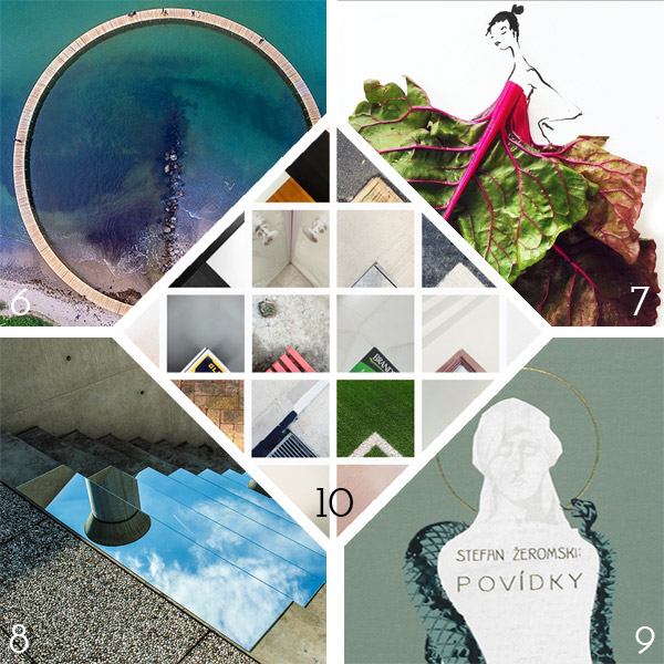
    2. The British Library recently published Medieval Monsters, a delightful picture book from medieval historian Damien Kempf and art historian Maria L. Gilbert. The book explores the fantastic, grotesque and exuberant world of monsters found in illuminated manuscripts throughout the Middle Ages. Check out a this delightful post from the two authors on the Ten Things to Know About Medieval Monsters.
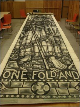
    3. If you can, make your way to the National Building Museum in Washington DC sometime before September 7th to visit The Beach. Design duo Snarkitecture recently installed a massive wading pool out of 1 million translucent polystyrene balls, basically the largest ball pit ever. At the edge of the wading pool is a carpeted space with deck chairs and beach umbrellas. What a unique and relaxing way to enjoy the summer.
    4. The University of Wisconsin – Milwaukee has a great tumblr showcasing treasures from their Special Collections. My favorite column is Book/Not Book which includes animated gifs of artist books from their collection, giving a real sense of the content and how the book functions.
    5. The work of French artist, Amandine Urruty, is truly strange. Her eerie drawings are highly detailed scenes and portraits of nostalgic icons, like Jabba the Hut, Cookie Monster, Cabbage Patch dolls and many more. Each piece will keep your focus as your pane through the scene looking for the recognizable characters.

    stno25b

    6. As part of the Sculpture By the Sea Festival in Denmark, Gjøde & Povlsgaard Arkitekter installed a breathtaking circular bridge off the Danish Coast.
    7. Gretchen Röehrs has been playing with her food in the most haute couture way. Her Instagram is full of creative fashion drawings where the garments are constructed with actual food. Oysters and leafy greens make for gorgeous silhouettes and offering intriguing textures.
    8. Iranian artist Shirin Abedinirad created a dual installation of mirrors placed outside in Italy and Iran. Seen above is Heaven on Earth, in which mirrors were installed on the steps at Fabrica, a communication research center in Treviso, Italy. The installation offers a striking juxtaposition between the hard concrete and brilliant blue sky. The second installation, Evocation, includes round mirrors placed on the desert dunes of Iran.
    9. The Thomas J. Watson Library at the Met in New York recently acquired a group of Czech Publishers’ bindings which demonstrate the rise of importance of the Czech language and the skill of artists and designers working at the time. The designs range from the early 1900s to about 1930. Quite a striking and little seen collection of Publishers’ bindings, read more about it here.
    10. Singapore-based photographer Gabriel Kang has a beautiful Instagram of found triangles. Gabriel crops his images in order to create a triangle with a right angle at the bottom of the frame. Truly beautiful pieces.


  2. Conservation Conversations // Japanese Papers and Tissues

    July 28, 2015 by Becky Koch

    Japanese papers and tissues are used extensively in book and paper conservation; they are used to mend tears, fill losses, back or line weak or brittle papers, line spines and perform innumerable other conservation repairs. These papers originated in Japan (as I’m sure you’ve guessed) and are mostly made from kozo fibers from the paper mulberry tree. They come in a variety of thicknesses for different needs, and some are thin enough to be translucent and are ideal for mending over text or images. Japanese papers are soft and flexible and do not become brittle or discolored over time so they are especially appropriate for conservation. But the most important trait of Japanese tissue is its strength – due to the long kozo fibers these papers are very strong. Deceptively strong. Even the thinnest tissues are useful for mending tears and lining brittle pages, often times creating almost invisible repairs.

    I was introduced to Japanese papers at my first conservation internship during college. I spent the summer repairing larger-than-life stained glass window templates by Rudolf Buenz at the Winterthur Museum in Delaware. The sketches had been kept rolled up in a garage since the 1960s and their edges were crushed and tattered.

    We used a lot of tissue that summer. A LOT.

    My internship advisor, knowing that if we kept on the conservation track Japanese tissue would become our lifeblood, had us make a sample book of all of the lab’s tissues. Being a very well stocked lab, there are 15 papers in my original sample book. This may sound like a nothing task and at the time it didn’t feel that I was doing something very important, but in all honesty I still consult this book today.

    As a side note, this was the first book I ever made

    IMG_3687

    I think all conservators have their favorite go-to tissues, two or three different weights that we use for different tasks. But sometimes when you’re faced with a different type of challenge it’s good to have all of your options at hand, right in front of you in a little booklet, where you can feel the weight, texture and color of each and choose the one that’s best for your task. Whenever I encounter a new tissue I take a small sample and label it (seriously, don’t forget to label it, otherwise it’s useless) and add it to my collection – it’s one of the best tips I can give to any new conservation student.


  3. Bookbinder of the Month: Ben Elbel

    July 26, 2015 by Erin Fletcher

    BreakfastAtTiffanys6-BenElbel

    I am wrapping up this month’s interview with Ben Elbel by showcasing his recent binding of Breakfast at Tiffany’s. Read on to discover the technique behind the decorative covers and what secrets lay within the binding.

    Breakfast at Tiffany’s is covered in beautifully decorated leather, which caught me by surprise. Having only seen this binding online, my initial guess is that the boards are covered in paper. Can you describe how you manipulated the leather to achieve such a wonderful range of color and texture?
    Indeed it is leather, not paper. The technique consists essentially of glueing thin paper to suede leather and then sanding away the paper. I have never actually tried replacing leather with paper but I imagine that paper would probably tear during the process.

    BreakfastAtTiffanys4-BenElbel

    A few years back I was terrified about doing anything to a material. I used materials as they came from the suppliers and found it increasingly frustrating because bookbinding materials only come in a limited range of colours.

    I was working at Shepherds Bookbinders at the time and because we had a splitting machine there were bags full of beautiful suede that would go straight to the bin. So one evening after work I started messing around with suede, glue, leather dyes, papers, etc, having absolutely no idea what I was doing.

    There were a couple of ‘happy accidents’ and after some time, I had identified what had lead to those happy accidents and found that I had a process, so simple that I was even able to teach it. I have a nice collection of these pieces and they are a great starting point for a design binding.

    In this binding, you’ve included a hidden component. The front cover opens up to reveal two panels of text, can you elaborate on your concept for this part of the binding? Does it have a magnetic closure?
    The latest version of my dos rapporté binding has boards made of two layers, hinged at the fore-edge. The two layers are glued together with a flange from the textblock in between. The aim is to provide a very strong cover to text attachment, but of course it is very tempting to see a design opportunity; why not include something in there, and shut the boards with magnets rather than glue.

    BreakfastAtTiffanys3-BenElbel

    The opportunity came with Breakfast at Tiffany’s, the set book from Designer Bookbinders 2014 Competition. At the time we were also producing menus for a hotel in London, and this is how a breakfast menu ended up between the two layers of the front board.

    BreakfastAtTiffanys2-BenElbel


  4. Bookbinder of the Month: Ben Elbel

    July 19, 2015 by Erin Fletcher

    Sonnet-BenElbelandMarjaWilgenkamp

    In Sonnet XVII, Dutch bookbinder Marja Wilgenkamp has reimagined Shakespeare by using a process developed by the artist collective La Société Anonyme. The sonnet was initially read out aloud and recorded, which was then encoded into binary code. The code was then printed making it potentially accessible to the future.

    Offset printed in an edition of 65 copies on Hahnemuhle Ingres paper, the book is still available for purchase here.

    Ben Elbel executed the binding according to Marja’s design. The binding is covered in So Silk paper. The text has been laser cut into the cover boards and flyleaves; inspiration for the design came from costuming seen during Shakespeare’s time.

    ‘Dos Rapporte’ is another structure that you’ve developed and is the style of binding you used on Sonnet XVIII, a collaborative project between you and Marja Wilgenkamp. Can you talk about its design and function and why you chose to use it on this project?
    There have been many efforts in recent years to improve the opening of books and the dos rapporte is my own personal contribution to the subject. In a few words let’s say it is a mixture of a type of industrial brochure as practiced by (among others) the dutch company Hexspoor + Gary Frost’s sewn board binding + the old fashioned springback binding. What is special about my design is that the spine is made separately from the book (this is what ‘dos rapporté’ refers to) and is attached by gluing its inner part, the one that folds back on itself, onto the boards. This makes for a very fluid opening action as well as an interesting profile and a very clean hinge on the outside.

    Sonnet3-BenElbelandMarjaWilgenkamp

    We thought that the strict character of the structure would work well with the laser cut pattern that Marja designed for this edition.

    Sonnet2-BenElbelandMarjaWilgenkamp


  5. Bookbinder of the Month: Ben Elbel

    July 12, 2015 by Erin Fletcher

    OnionSkin3-BenElbel

    I love this structure developed by Ben Elbel, which he appropriately named Onion Skin Binding. A lovely description inspired by layering effect that creates the mesmerizing maze-like spine. In this post I talk about this structure with Ben starting with its development to how he’s adapted the structure.

    The Onion Skin is another one of your innovative structures. Did you develop the structure around an existing project or was it simply a product of play and experimentation?
    Absolutely a product of play back in my student years when I had a lot of time on my hands. :)

    It was born from playing around with the idea of guards/stubs in photo albums. I introduced colour, and tried to use uninterrupted pieces of paper and suddenly the pattern was born. Readability is a key element of my personal work. I like to be able to follow a line, understand how something is built and be able to take it appart mentally. This is also the idea behind my ‘dos rapporté’ binding.

    OnionSkin2-BenElbel

    The Onion Skin binding is another structure that you offer as an online workshop and is also how I learned the technique. I found it to be surprisingly simple once I understood the pattern of the layering. Is this a challenging structure to teach (particularly online)?
    Exactly as you say. Once you have understood the sequence it is very simple to make, and consequently very simple to teach too.

    If you don’t have the opportunity to take Ben’s online course, you can simply purchase his comprehensive tutorial here.

    You’ve really played around with this structure; can you talk about how you’ve adapted the binding?
    I have adapted the principle for a single section binding- the signature is sewn on a single stub made from different layers of paper, which are then folded and glued around the initial connection, until it is thick enough to form shoulders to accommodate boards, exactly as in a traditional binding.

    OnionSkin5-BenElbel


  6. Giveaway – Flash of the Hand Turns 3!!!

    July 11, 2015 by Erin Fletcher

    anniversay2015Flash of the Hand turns 3 today!!! I’m so grateful to my readership (that’s all of you). Your comments (both on and offline) are joyful surprises that affirm the work that I put into every post. To date I’ve conducted over 25 interviews with many wonderful bookbinders and book artist, I’ve shared my work from the bindery and just launched a newsletter! This year has been crazy busy and I’m glad to have brought you in on the journey. To celebrate I’m offering the following giveaway.

    smflatback_sagebricks

    In order to enter and win the book shown above I need you to do one of the following tasks (and then let me know about it in the comment section of this post):
    sign up for my monthly newsletter
    OR
    subscribe to the blog

    It’s that simple. If you’re already signed up for one (or both :)), then just say so in the comment section. Giveaway ends on July 31st (12:00am EST). The winner will be announced via email, so don’t forget to include it when you submit.

    Looking forward to another year of posts! Thanks everyone!


  7. Makin’ Care of Business Interview

    July 8, 2015 by Erin Fletcher

    MCoBLogo

    Check out my interview on Makin’ Care of Business! Rachel Binx is a three-time business owner (MonochōmeGifpop, and Meshu), who started this amazing collection of interviews with other makers who have turned their passion into a small business. She encourages everyone she interviews to speak honestly about their experiences on starting a business, the successes and struggles.

    I did my best to follow these guidelines, I hope you enjoy and please spend some time perusing the other great interviews she has done.


  8. Bookbinder of the Month: Ben Elbel

    July 5, 2015 by Erin Fletcher

    Water-BenElbelFor the Designer Bookbinders International Bookbinding Competition in 2009, binders were invited to produce a binding for the set book Water, a collection of poems and illustrations based on the the theme of water. The set book was published by Incline Press in a limited, letterpress edition that included images from various talented illustrators and marblers. This was the first international competition since the organization began offering competitions back in 1975.

    Ben Elbel put together a beautiful binding in white calf (and quite impressive in how pristine it looks). The bath plug fits snugly into the front cover, but is easily removable to reveal the end of the title.

    This binding is so clever and probably the first binding of yours I ever saw. Can you talk about the process of fitting the plug into the front cover?
    This binding was my entry for the 2009 Designer Bookbinders international competition and was among the prize winners.

    My initial plan was to have the boards produced from enameled steel, the material from old fashioned bath tubs, but a quote from a supplier made me change my mind.

    The boards are made up from 2x 3mm boards, so a total thickness of 6mm. They are heavily beveled around the edges but retain full thickness in the middle to accomodate the plug. The leather was also very thick and I had to thin it down locally to turn it in the hole. This is how I did it.

    Water2-BenElbel


  9. July // Bookbinder of the Month: Ben Elbel

    July 1, 2015 by Erin Fletcher

    BovenKamer1-BenElbel

    Boven Kamers is a collaborative Dutch pop-up book between neuroscientist Gerard J. Boer, professor Harry B.M. Uijlings, paper artist Ingrid Siliakus and graphic designer Moon Brouwer. The book contains a total of six laser cut pop-up spreads which send the reader on a tour through the human brain and its functions. Printed in a limited edition of 50, each book is numbered and signed.

    Ben Elbel‘s innovative rebinding of this book was just completed earlier this year.

    I have been waiting in anticipation to see this binding after you spoke to me about it. In your newsletter on this binding, you mention that the compensation folios are sewn together. The spine opens to a sharp ‘V’ allowing the pages to lay flat, can you elaborate on the sewing structure and any treatment done to the spine?
    Boven Kamers (literally means upper rooms in Dutch, a colloquial expression meaning brain), is an exploration of the human brain in the form of a pop up book, by the young Dutch designer and publisher Moon Brouwer.

    I was commissioned to re-bind the book by the Dutch Royal Library (The Hague).

    When I first received it, the book presented itself as a series of folios laminated with one another, each folio containing a pop up. A hard cover was provided but disconnected from the textblock.

    Technically, the challenge was to provide compensation for the pop-ups as well as a perfectly flat surface for them to smoothly unfold, all of this without sewing and without introducing blank pages between the folios.

    After some research I concluded that none of the existing binding structures (traditional or contemporary) were quite suitable to do all this, so I created a new one from scratch.

    BovenKamer7-BenElbelBovenKamer4-BenElbel

    It took about a year and the result is a series of ‘T’ elements made from heavy paper, sewn with one another. The folios are inserted between each T and secured only at the fore-edge. On the next images one can see how the spread ‘floats’ on top of the binding, allowing the pop up to fully unfold. The original cover was mounted at the back of the book and a lettering was created, on the spine and front board, to evoke a kind of staircase leading to the upper rooms.

    BovenKamer6-BenElbel

    You can read a bit more about the binding and see some images of the book at various stages through the design process here.

    – – – – – – – – – – –

    Ben and I have kept in contact ever since he embarked on offering online courses (more on that in the interview). His work and business ethic are quite inspiring as Elbel Libro has expanded beyond the traditional bindery. He ceases to amaze me with his sleek designs and innovative binding structures. There seems to be no stopping his creativity.

    Check out the interview after the jump and make sure you come back during the month of July for even more probing questions regarding a selection of Ben’s work. You can get email reminders by subscribing to the blog, just click hereread more >


  • My name is Erin Fletcher, owner and bookbinder of Herringbone Bindery in Boston. Flash of the Hand is a space where I share my process and inspirations.
    The StudioNewsletterInstagramEmail me
  • Archives