RSS Feed

October, 2015

  1. Bookbinder of the Month: Tini Miura

    October 4, 2015 by Erin Fletcher

    TreeTalks2

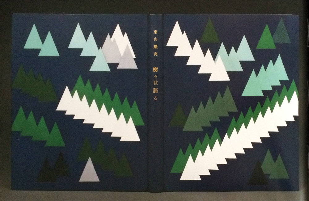
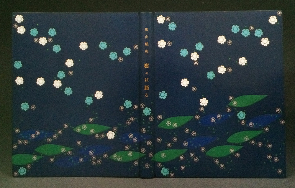
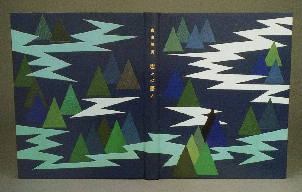
    Trees Talk includes the work of Kaii Higashiyama, a highly respected painter in Japan whose work captures the spirit of the four seasons. The reproductions in this book are a collection of trees paired with poetry reflecting the words spoken by the trees.

    In 1985, Tini Miura bound an impressive 23 editions of Trees Talk in full leather decorative bindings.

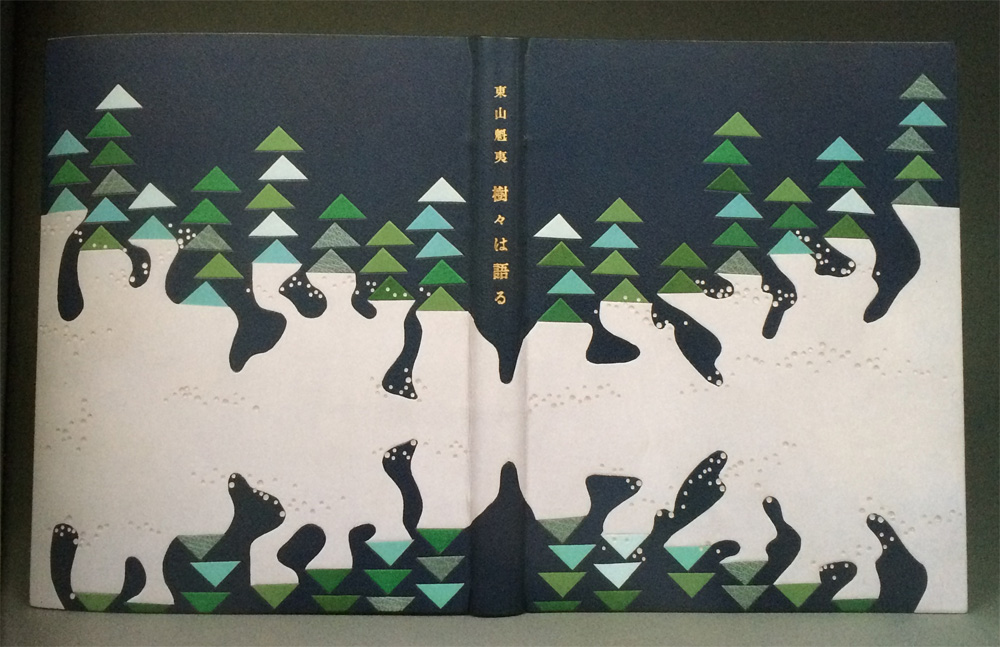
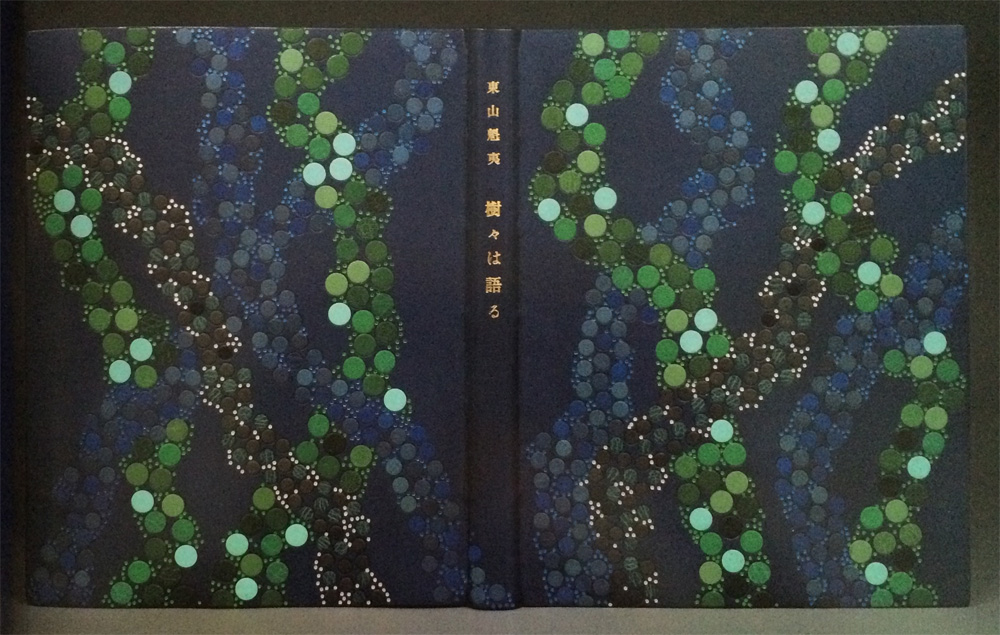
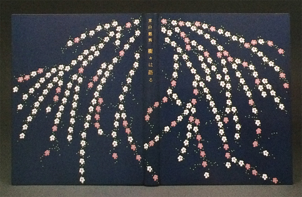
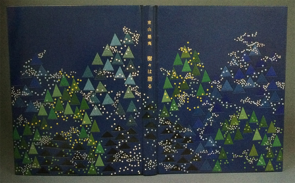
    The designs are a mix of geometric patterns to more organic shapes, but the color palette is limited to shades of blue and green with pops of pink and neutrals such as white, gray and black. Was it challenging to reinterpret a set of work 23 different ways? Was the assembly done like an edition or did you work on each binding separately?
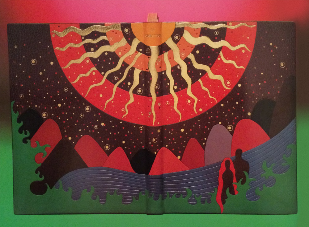
    This edition is showing the work of Kaii Higashiyame, the most famous Japanese artist when I arrived. The main colors used for this book’s illustrations by the artist were: blues, greens, white on every page. I followed the feeling of these images by mainly using his color range.

    I bound the book during a 4-month period, from book block preparation until covering and another 5 months for the execution of the design.

    I often hear: oh, I can tell your designs are influenced by Japanese art. My professor in Paris complained that my colors were too sad, I had guests who came to my slide shows leave, shaking their heads: too colorful.

    My color choice always has to do with the content (in my mind ) colors in Scandinavia are mainly: blue, green, white, grey, violet….usually the literary themes there are not the same as in Spain for example. Colors in the North of Europe are different than those in the Mediterranean region, so are the feelings evoked by colors.

    TreeTalks7 TreeTalks1 TreeTalks4 TreeTalks3 TreeTalks6 TreeTalks5


  2. October // Bookbinder of the Month: Tini Miura

    October 1, 2015 by Erin Fletcher

    LaCreationBlue-TiniMiura

    La Création (from the Old Testament) is a two volume set and was bound two ways by Tini Miura in 1983. The book itself was published in Paris in 1928 and includes illustrations by François-Louis Schmied. The first book is bound in dark blue morocco. The explosive design was created by using a large collection of colored onlays and platinum tooling. The central design of concentric circles symbolizes the calmness amongst darkness and chaos. Click on the image below to see a detailed image of the design.

    LaCreationBlue5-TiniMiura

    The doublures are a pale blue morocco with cool-colored onlays and platinum tooling. The fly leaf is one of her recognizable oleaugraphs (more on that in the interview below).

    LaCreationRed-TiniMiura

    The second binding in La Création is equally expressive, but designed in a warmer palette eluding to the birth of life. This binding contains the suite of illustrations by F.L. Schmied in black and white and is bound in a wine colored morocco. An impressive collection of onlays create the pictorial design along with another explosive central design similar to the first binding. Small tooled shapes are speckled across the background and emphasized with gold and red foils.

    LaCreationRed3-TiniMiura

    The doublures are created in a similar fashion to the other binding using pink morocco and onlays in rose. The tooling is completed with gold foil.

    I think it can be tricky to create a cohesive and attractive design when adding multiple layers of color and tooled elements. Your interpretations of La Création are an example of when this design strategy is successful. When you are building designs this complex, where do you begin? Can you walk through your process for laying out your designs in leather?
    I saw the image in my mind and understood this was from the old testament: In the beginning………The word created the vibrations which are spreading throughout our universe.

    1. I begin with the idea sketch, indicate colors, shapes etc.
    2. make a scale to scale drawing, indicate numbers of lines and curves from the set of the gilding tools
    3. transfer this design onto a long fiber Japanese paper
    4. attach this Japanese paper
    5. begin the tracing using my warm tools through the paper
    6. remove the paper, begin deepen the impressions
    7. moisten parts of the leather, using a warm gilding tool “ crushing” the deep leather grain to a solid line by gradually increasing the temperature and pressure. ( to have an uninterrupted gold line all grain has to be “ crushed “ to a level where no hight differences exist.)
    8. onlay: thinly pared leather is wetted, placed over the shape it is meant for, tapped down by using a soft brush as not to tear or stretch the shape, using a warm gilding tool follow the lines, remove the leather, let dry between board, when dry, cut desired shape holding a penknife at an 45 degree angle. Roughen the form on the original leather on the book with dull side of binders knife for a better hold. Paste out the onlay, wet the roughened shape, paste onlay. down. Press under a thin Japanese paper with fingers or flat hand, pick up excess paste, trace outlines, let dry under weight.

    – – – – – – – – – – –

    Tini Miura became a household name during my time at the North Bennet Street School. Our instructor, Jeff Altepeter, was taught by her while at the American Academy of Bookbinding and so her techniques would emerge into demonstrations every once in a while. For the interview this month, I’m going to be mainly focusing on bindings from her book A Master’s Bibliophile Bindings: Tini Miura 1980 – 1990. This book was my first exposure to her work and when I first fell for her expressive and colorful designs. Tini has had a long and prolific career as a binder and teacher, so I hope you enjoy her responses on those experiences.

    Check out the interview after the jump and make sure you come back during the month of October for even more enlightening responses regarding a selection of Tini’s work. You can get email reminders by subscribing to the blog, just click here.

    read more >


  • My name is Erin Fletcher, owner and bookbinder of Herringbone Bindery in Boston. Flash of the Hand is a space where I share my process and inspirations.
    The StudioNewsletterInstagramEmail me
  • Archives