RSS Feed

October, 2015

  1. Swell Things No. 27

    October 31, 2015 by Erin Fletcher

    stno27b

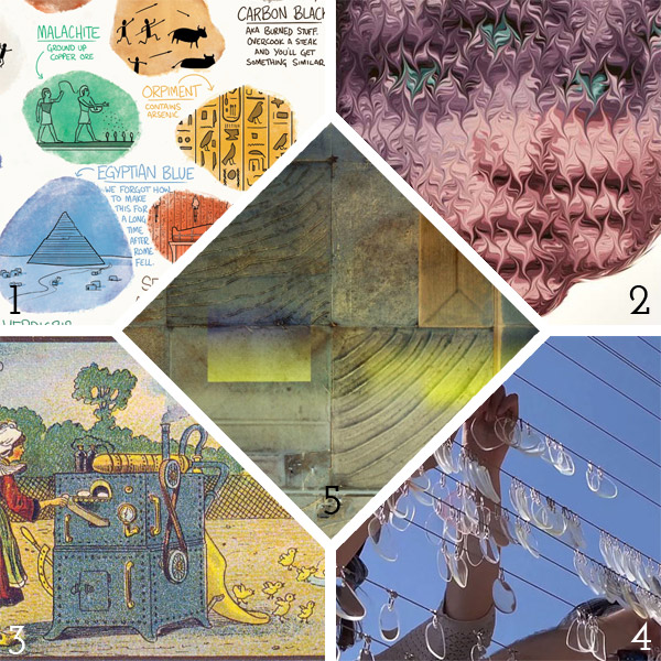
    1. Korwin Briggs is a comic book artist and created this delightful infographic, Mummy Brown and Other Historical Colors, detailing historical colors and where they came from, like Mummy Brown, yes it was derived from actual mummies.
    2. Mikael Takacs creates these wildly abstract and alien-like portraits using marbling techniques.
    3. France in the Year 2000 is a series of paintings from French artist, most notably Jean-Marc Côté. These paintings were created in the late 1890s and around the turn of the century. This series was printed on cigarette and cigar boxes for the 1900 World Exhibition in Paris (later becoming postcards). The imagery shows lots of mechanized devices and flysuits and strange interactions with marine life.
    4. What happens when you string up 14,000 used eyeglass lenses, sea/see/saw, a kinetic sculpture that moves brilliantly with gusts of wind. The sculpture has been recently installed on the façade of the Pera Museum in Istanbul.
    5. the.jefferson.grid is a beautiful instagram collection of Google Earth images. The snapshots capture a square mile of landscape and the geometric designs within it.

    stno27a

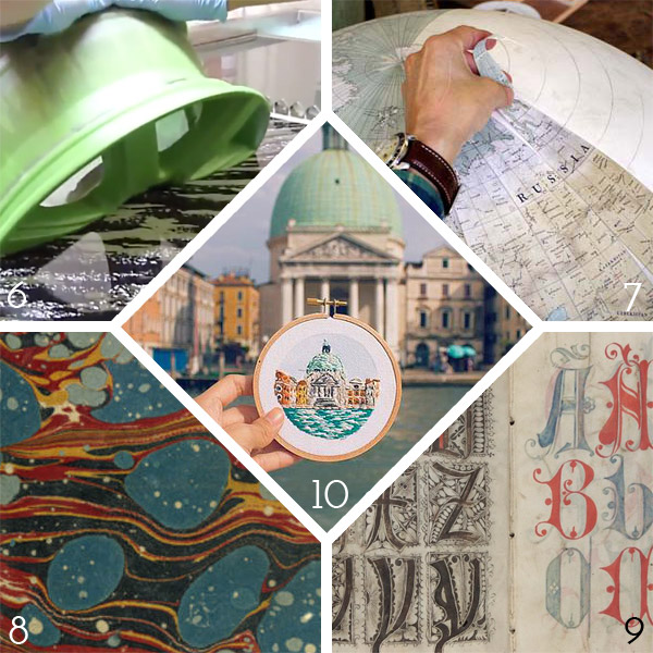
    6. Ever wonder how the rims, doors and other parts of vehicle get their patterning. I guess it happens using traditional marbling techniques. Watch this captivating video as car parts are slowly dipped into deep marbling trays to get their decorative coating.
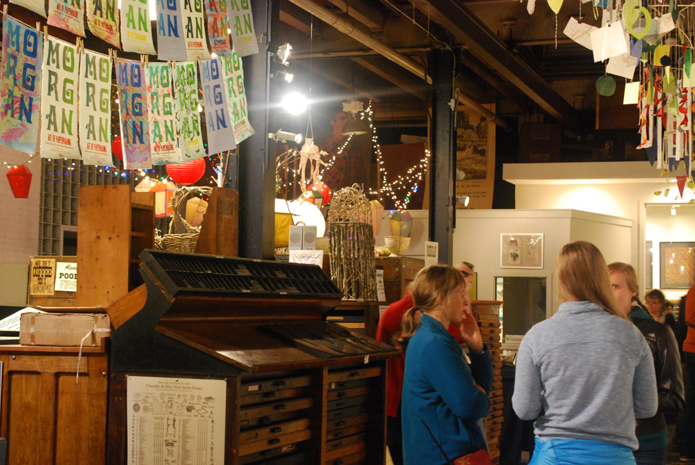
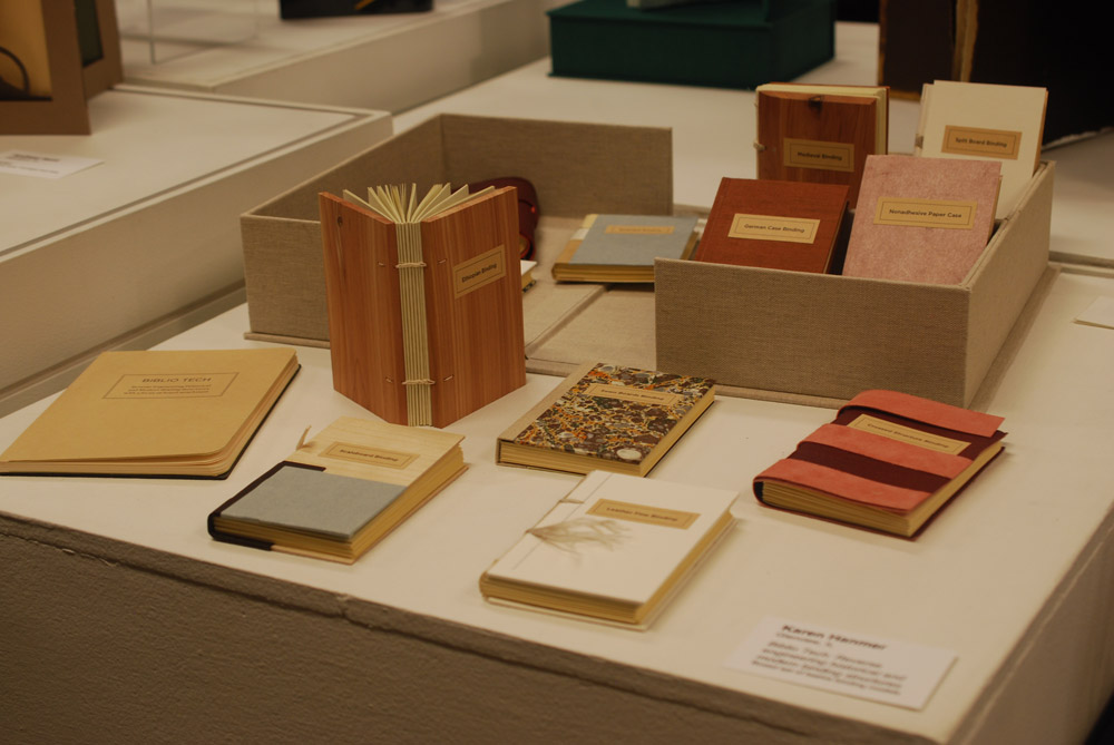
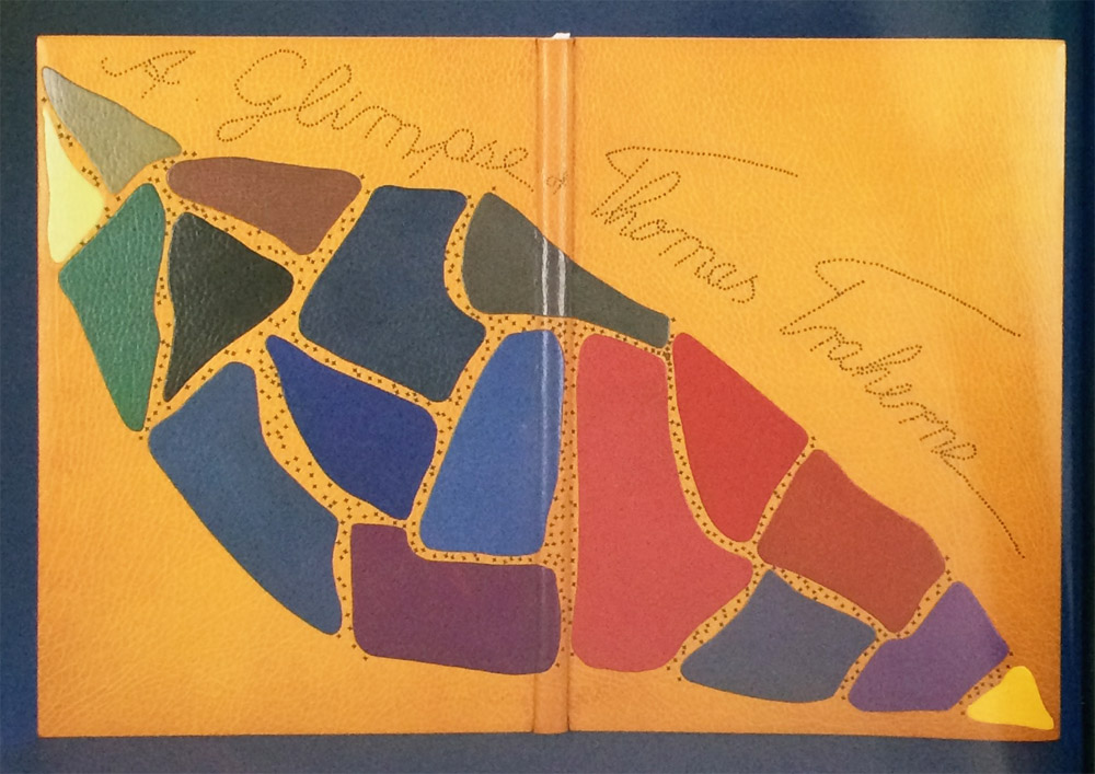
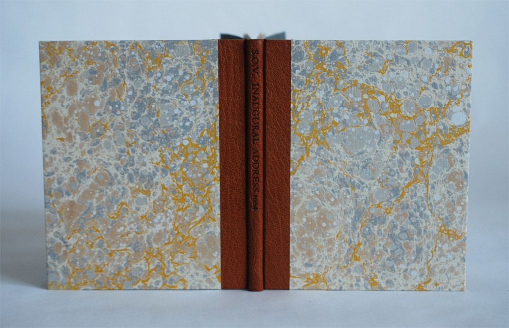
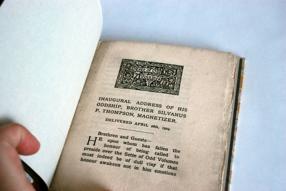
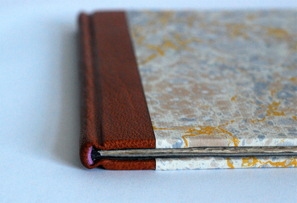
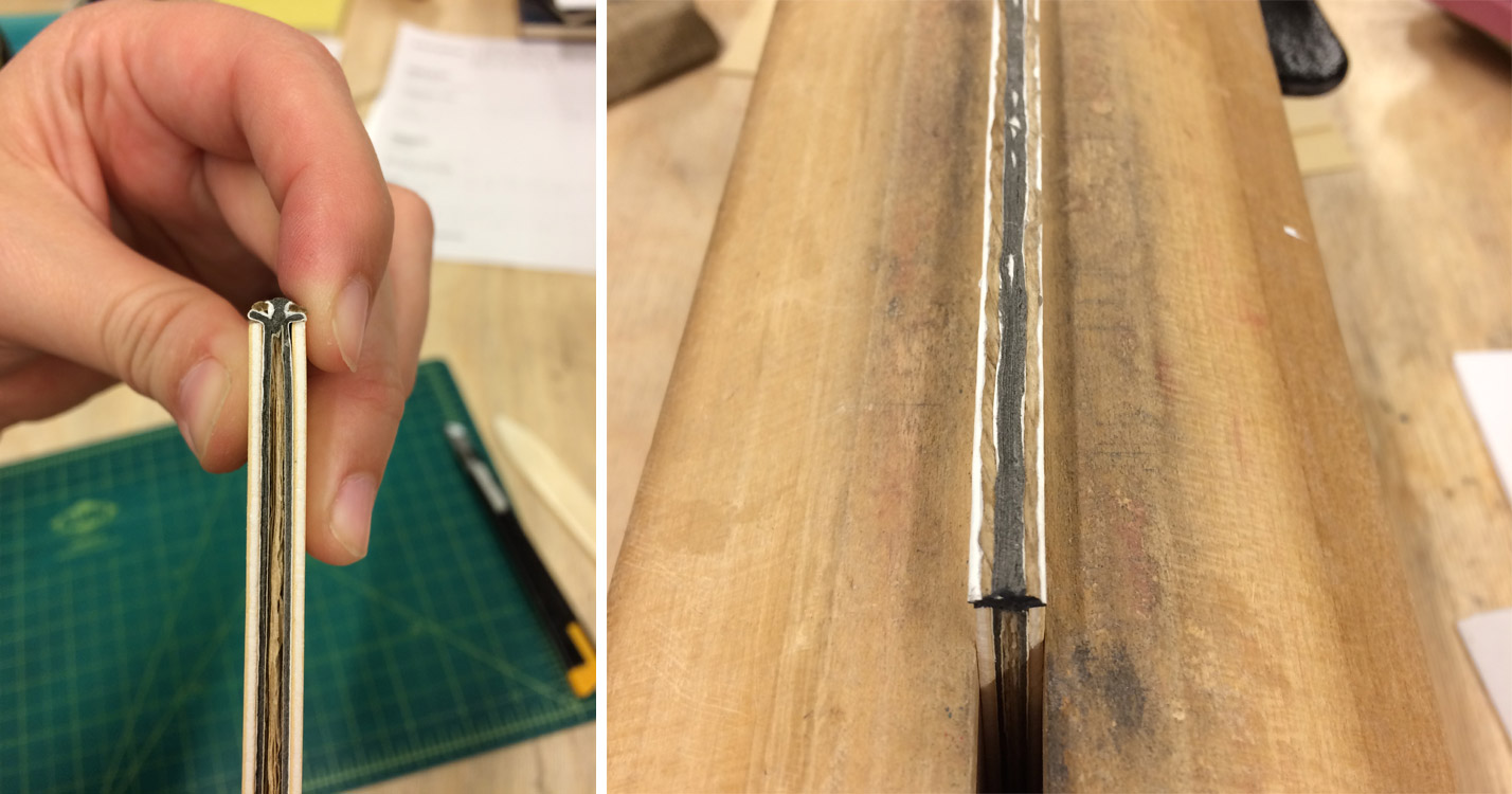
    7. The craft of bookbinding has a long history and has seen a decline over the centuries. So I’m always captivated by trades with a similar history. Check out this behind the scenes look at one of the last handmade globe makers, Bellerby & Co. Globemakers.
    8. The University of Washington recently added a collection of decorative papers to their digital library, which includes a large selection of marbled papers and paste papers that span over several centuries and countries.
    9. This 16th century pattern book is quite interesting and was most likely put together with the purpose of aiding a scribe to refine his skills. A description in the book gives ownership to Heinrich Lercher Wyss who was the official scribe of the duchy of Wüttermberg. The book was gifted to him by his cousin Gregorius Bock. The book includes alphabets in various scripts (includes Greek and Hebrew script) and some decorative initials.
    10. Sew Wanderlust is an ongoing series from artist Teresa Lim. As she travels the world, she captures her experiences not in a photograph but through an embroidered sketch of her surroundings. I love it!


  2. Conservation Conversations // The Continuum

    October 28, 2015 by Henry Hebert

    Typically very few of the items that come through a research library conservation lab are in their original or unaltered state. While library and archives conservation, as a field, is relatively young, many universities have had some form of bindery or mending division in operation for decades. We often find ourselves as the current custodian in conservation continuum, with our professional forebears in possession of very different materials and training backgrounds than our own. The common result is a book with poorly applied repairs or very degraded repair materials, which can compromise the object’s look and functionality. I am often unsure of the absolute best method for resolving the condition issues of the item without obscuring some evidence of the way it was maintained and used.

    As an example of this situation, I was recently confronted with this first edition of Sir Isaac Newton’s Opticks; A valuable book, which gets a significant amount of use.

    Newton's Opticks

    It is obvious that this item has gone through several “campaigns” of repair. Some are more successful than others – but, ultimately none of them have maintained their intended function.

    I cannot say for certain if the boards and leather with the Cambridge panel design are the original binding, but they appear to be roughly contemporary to the text. The book has been rebacked with a very dark brown calfskin, and the new spine leather features a red leather lettering piece and some simple tooling. This leather is now splitting at the joints and along the center of the spine, but was admittedly a well executed repair at the time it was done. The front board also features a rather distracting patch in much lighter, plastic textured calfskin. I assume this was added after the reback, since the person doing the reback would have either matched their repair to this color or just removed this patch altogether.

    The boards show evidence of spine repairs prior to the current one. Impressions of a woven pattern in the original leather and vertical cuts suggest to me that a piece of textile was once glued over the spine and a portion of the boards and trimmed directly on the book.

    Opticks textblock before treatment

    More repairs are visible inside the volume as well. The inner hinges have been repaired with white cloth. A new flyleaf of laid paper has been tipped on and a strip of that same paper has been applied to the pastedowns at front and back.The extant thread and visible sewing supports do not appear to be original. Several types of sewing thread are visible inside the gutter, but much of it has broken. The textblock is essentially split in half and sections are falling out of the book.

    It is immediately clear to me that the functionality of the book must be regained. It is requested often for classes and we don’t want pieces to be lost or damaged in the process of use. The question of which material to retain and which to remove, however, is not so clear.

    Some of these repairs – namely that leather patch on the front board – are so distracting. Yet the fact that this book has been repaired so many times, in so many ways, says something about its value and history. The new materials are in such poor condition, however, that I must take the book apart completely, documenting everything as I go.

    Starting from individual sections, I resew the book onto single raised supports using (as far as I can determine) the original sewing stations. The newer flyleaves from the repair are left out and I add new endsheets of sympathetically colored handmade laid paper. I line the spine with unbleached linen and handmade paper to create an appropriate opening.

    Opticks opening after treatment

    In the course of pulling the textblock, I find evidence of blue and white sewn endbands. I sew endbands in matching colors off the book and adhere them to the spine.

    So many past interventions have left the original boards in very poor shape. The exposed corners have delaminated and become incredibly soft. The original leather has become very brittle from repeated lifting and application of various adhesives. I am not confident that I can safely lift it one more time to insert new material underneath.

    Opticks after treatment

    In concert with the curators, the decision is made to create a new leather binding, but retain the original boards, with all the evidence of their previous repairs. I consolidate the original leather and boards, re-adhere any lifting leather, and create a paper wrapper for them. This sits underneath the volume in the custom enclosure.

    Opticks and box after treatment

    The new binding is constructed and decorated in the same style as a rather plain book from the period, but it is obvious from the materials that it is new. It protects the text and opens well. The high quality materials and optimal storage conditions will hopefully maintain the functionality of the book for a long time. Should some future scholar be interested in the more artifactual evidence of this particular book and its rocky repair history, she will hopefully find the original boards in the box and hopefully be able to access my born-digital treatment documentation. This is all assuming the library can continue performing its duties, that digital preservation initiatives succeed, etc.

    I believe that this treatment is successful in that it is reversible, satisfies the treatment goals for the object, and could be completed in a relatively short amount of time. There will likely be other conservators in the continuum of care for this object. I hope that they agree with the decisions we have made – but only time will tell.


  3. Bonus // Bookbinder of the Month: Tini Miura

    October 25, 2015 by Erin Fletcher

    YouCanJudge-TiniMiura

    In a recent competition put on by the Washington University Libraries Special Collections, the public was encouraged to judge books by their covers and cast their vote for favorite binding. Fittingly, the book being bound was Bernard C. Middleton’s You Can Judge a Book By Its Cover, which was published by Mel Kavin and designed by Ward Ritchie in miniature form back in 1995 (which is presumably around the time it was bound as well).

    The first book of this edition was designed and bound by Tini and Einen Miura and printed by Henry Morris. Later on, 32 more binders were invited to create their own unique binding and to celebrate the artistry of the miniature book.

    Tini bound the book in black morocco. She used the onlaid shapes and design to tell a story about the author. The ascending tooled area represents Bernard Middleton’s larger than life character. Running along side this path are circle onlays of various sizes and colors, which show the abundance of information he has shared with the world throughout his professional life.

    In the image above, the book is shown on the right with the slipcase pictured on the left. Tini also made a miniature chemise, which would be placed around the book before sliding it into the slipcase.

    YouCanJudge2-TiniMiura

    The edges are gilt and headbands handsewn in colored silk. The doublures, seen above, have multicolored circular onlays and tooling.

    The scale of many of the bindings in your book A Master’s Bibliophile Bindings: Tini Miura 1980 – 1990 are quite large. For the final post in your interview I would like to talk about two miniatures you did for Bernard Middleton’s You Can Judge a Book by Its Cover. What challenges did you come across when scaling down the binding and decorating processes?
    Usually my books are large, because they are limited edition livre d’artiste. They have signed original images by artists like Picasso, Leger, Roualt, etc. and are extremely expensive.

    I prefer large books that open well and can be enjoyed easily, while lying on a table. Small books have to be held on both sides to keep them open, there is no weight to the text. But I have enjoyed doing some immensely. No change in binding steps for miniatures.

    – – – – – – – – – – –

    Tini bound an additional copy of Middleton’s book in black morocco with several colored inlays (inspired by the shape printed at the top of the foreword) and foil tooling.

    YouCanJudge3-TiniMiuraYouCanJudge4-TiniMiura

    The edges have been gilt and gauffered with colored polka dots. The endpapers are marbled. The book lives in a small clamshell box.

    YouCanJudge6-TiniMiura


  4. Guild of Book Workers – Standards of Excellence Seminar // Cleveland 2015

    October 25, 2015 by Erin Fletcher

    I woke up very, very early on a Thursday morning to catch a flight out of Boston to Cleveland in order to attend the evening festivities planned for the first day of the Guild of Book Workers Standards of Excellence Seminar. I was delighted to be on the same flight with Deborah Howe, Collections Conservator at the Baker-Berry Library at Dartmouth College. The weekend-long event filled with book-related discussions had officially begun.

    We arrived in Cleveland to a brisk, yet sunny morning. My wonderful friends and colleagues, Henry Hebért and Jeanne Goodman, picked us up at the airport and we were off to the hotel located just a short walk from Lake Erie (and the Rock and Roll Hall of Fame).

    The first day of Standards began with book-related tours across the city. At the last moment, I was able to snag a spot on the tour of the Cleveland Museum of Art. Our docent, a fellow GBW member, gave us a brief tour through the Western Art galleries, stopping from time to time to show off books from their spectacular collection. It was a real treat to see some fine examples of Western-style bindings and manuscripts.

    StandardsCleveland1-ErinFletcher

    In 2002, the Museum underwent renovations that included this beautiful 39,000 square foot enclosed glass atrium that connects the original building with the newer wing and is where we met our tour guide. (click to enlarge images)

    StandardsCleveland2-ErinFletcher

    We appropriately began our tour of early bindings with an Egyptian Book of the Dead of Hori scroll on papyrus dating roughly around 1969 – 945 BC. We swiftly made our way to the 11th century as our docent pointed out this beautiful Byzantine binding with the primary headbands still intact.

    We then saw a small collection of illuminated manuscripts with pigments that had been wonderfully preserved and appeared as bright as if they were created yesterday.

    StandardsCleveland4-ErinFletcher

    As a great lover of Flemish art, Queen Isabella treasured her library of devotional books; on display at the museum is a Book of Hours crafted for her by the most talented manuscript painters active in Ghent and Bruges during early 1500s. This circle of artists were renowned for their border decoration that often featured realistically painted flowers, scrolling acanthus leaves, birds and butterflies.

    StandardsCleveland3-ErinFletcher

    The Gotha Missal dating from about 1370 – 72 is shown in the image above (left) opens to a lovely miniature painting with vines running along the margins. Since the interest for most displayed book is in the content, binders get to see very little of the actual binding. Fortunately, the CMA has digitized and photographed a large portion of their collection. The leather binding over wooden boards is quite a beautiful example of a decorative medieval binding. The tooling could have been completed with a decorative roll and covers the entire surface of the covers.

    Next in the tour was a highly decorated leather case with cut-work and hand painted details in blue once used to cover a Qu’ran dated to sometime in the 15th century. We also saw a leaf from a Jain manuscript from India dating to sometime in the 15th – 16th century. But the final piece we saw was by far my favorite.

    StandardsCleveland5-ErinFletcher

    An Illustrated Marriage of Apparitions (Bakemono konrei emaki) is a humorous hand scroll created in the mid-1800s. The story is mainly told through imagery with cartouches scattered amongst the illustrations as a way to describe the scene (much like a comic book). The scroll is displayed open to the part of the story with the birth of the first child between two apparitions or bakemono. A procession of 100 whimsical and supernatural monsters follow the couple through their matchmaking, engagement, marriage and finally to childbirth.

    StandardsCleveland6-ErinFletcher

    The evening reception occurred at the Morgan Art of Papermaking Conservatory and Education Foundation. This was my first time at the Morgan and I was blown away by the size of the space. It was covered with a multitude of various creations. From what I could gather, the space was divided into different areas, a small shop right near the entrance, an area for printing, the center of the room was used as an exhibitions space, and the back half was for paper making and other workshops. I did miss out on the tour of the garden just outside the building in the back, but I heard it was absolutely gorgeous.

    StandardsCleveland7-ErinFletcher

    Buoyancy was the exhibit on view at the Morgan, which explores themes of water and swimming and includes the work of Aimee Lee and Kristen Martincic. I really enjoyed Kristen’s realistic paper recreations of objects used in the water. Aimee created a large and impressive assortment of intricately woven sculptural ducks from hanji dyed with natural pigments.

    StandardsCleveland8-ErinFletcher

    left: Aimee Lee | right: Kristen Martincic

    Being that we were on the turf of the Midwest Chapter, members were invited to bring books for a pop-up exhibit. To our delight, this was also on display during the opening reception.

    StandardsCleveland9-ErinFletcher

    The books on display in the image above from left to right are: Cris Clair Takacs: Remembering Jan Bohuslav Sobota, Karen Hanmer: Bookbinding with Numerous Engravings and Diagrams and Richard BakerLe Tour du Monde en Quatre-Vingts Jours (Around the World in Eighty Days).

    StandardsCleveland10-ErinFletcher

    Working down the exhibit table is Eric Alstrom’s The Long Goodbye (seen on the left) and Charles Wisseman‘s World Bones. 

    StandardsCleveland11-ErinFletcher

    Next up Biblio Tech: Reverse engineering historical and modern binding structures from Karen Hanmer.

    StandardsCleveland12-ErinFletcher

    On the left is Tunnel of Love from Mary Uthuppuru with miniatures from Gabrielle Fox on the right.
    StandardsCleveland13-ErinFletcher

    Wrapping up my tour of the exhibit table is Joanna Kluba‘s Rainer Maria Rilke: Poems on the left and Emily Martin‘s Who Gets to Say on the right.

    That concludes day one of the Standards Seminar. Stay tuned for part two of the post soon.


  5. Bookbinder of the Month: Tini Miura

    October 25, 2015 by Erin Fletcher

    Alice-TiniMiura

    Alice’s Adventures in Wonderland is one of those titles that has been bound so many different ways and by so many different binders. In 1983, Tini Miura, added her binding to this list with her brightly colored, kaleidoscopic design for an equally mind-bending story. This particular edition was published by the Pennyroyal Press in 1982.

    Bound in red morocco with several onlays that run the spectrum of color between white and black with tooling in gold and green foil. The doublures are a dark red sheepskin and the edges have been in gilt in the rough.

    I love your interpretation of this book, the design emotes feelings of chaos and helplessness. In many of your designs you incorporate floral elements. What does the flower mean within your designs, specifically for this binding and in general?
    It is a fairytale-like story and the things Alice encounters, like rabbit, teapot, etc. Therefore I chose fantasy flowers to make the whole interpretation happen in a “wonderland”.

    Flowers are a wonder of nature that bring joy – like  beautiful words. They do something to your soul, you feel alive and joyful (colors and music does that to me as well).

    When I do a book and see the design in my head, the design becomes this image which I physically execute. After reading the story, if it is not worldwide known literature, I often understand the design after I read the book. I know that is weird. But I feel it is a present and I don’t ever change or complain – just go with it.

    Another reoccurring design element are the built up areas of tiny tooled shapes, which usually flow across the binding. What can you say about the use of this in your work?
    The small dots or squares are my “Pixie” dust, magic or wonderment in the words or stories.


  6. Bookbinder of the Month: Tini Miura

    October 18, 2015 by Erin Fletcher

    AGlimpseOfThomasTraherne-TiniMiura

    Another one of my favorite bindings from Tini Miura. This edition of A Glimpse of Thomas Traherne includes illustrations by Ann Brunskill and was published in 1978 by The Worlds End Press in London. The design on this binding is like an abstract puzzle compiled of “pieces” that represent parts of Traherne’s poetry to offer a picture of his creativity.

    Bound in 1990 in yellow morocco where each onlay is a single, unique color. The title is stretched across the binding and each letter is created through repetitive tooled dots through brown foil. Tini creatively ties together the title and puzzle by tooling a diamond motif through brown foil strewn in the negative spaces between the onlays.

    This is one of the few examples where the title is transformed into a design element. Can you talk about why for this particular binding, you chose to display the title this way as opposed to using type?
    The colored onlay pieces are freely moving over the surface, like a line of a poem is following the former to make a verse. The overall image represents the several verses that make up the poem.

    If I had used letters, then I would have felt an interruption in the free flow of the onlay “verses”. The “dotted” words of the title are, so to speak a “miniature” image of the flowing line of colored “verses”. Kind of two interpretations of the same idea – making spoken words visible, like the vibrations of energy they are.

  7. Client Work // Ye Sette of Odd Volumes

    October 15, 2015 by Erin Fletcher

    SetteOddVolumes-ErinFletcher

    It’s been a while since I’ve posted on my own work due to having a crazy summer, but I recently completed this binding of the 1904 Inaugural Address of his Oddship, Brother Silvanus P. Thompson, Magnetizer for Ye Sette of Odd Volumes. I’m sharing this particular project because it has a really great back story and is the slimmest book I’ve ever bound in leather.

    SetteOddVolumes2-ErinFletcher

    My client who presented me with this project is a member of the Club of Odd Volumes, a private social club founded in 1887 and is a society of bibliophiles with the following mission statement:

    The objects shall be to promote an interest in, and a love for whatever will tend to make literature attractive as given in the form of printed and illustrated volumes, to mutally assist in making researches and collections of first and rare editions, and to promote elegance in the production of Odd Volumes.

    The club’s headquarters is located at the former home of Sarah Wyman Whitman in the neighborhood of Beacon Hill in Boston, Massachusetts. The Club of Odd Volumes is a direct influence of Ye Sette of Odd Volumes, an English bibliophile dining-club formed in 1878.

    As I mentioned above, this particular pamphlet is the inaugural address of Brother Silvanus P. Thompson. During the planning phase for the binding, I did some investigative work on dear old Silvanus. At the age of 27, Thompson was appointed to professor of Physics at the City and Guilds Technical College in Finsbury, England. He had a talent for communicating complicated scientific concepts in a clear and interesting manner. He is best known for this work as an electrical engineer and his most enduring publication, Calculus Made Easy, a 1910 book that teaches the fundamentals of infinitesimal calculus.

    What really spurred my curiosity was the descriptor of Magnetizer added to the end of Thompson’s name in the pamphlet’s title. In 1910, Thompson was involved in early attempts to stimulate the brain using a magnetic field. After this death this technique would eventually be recognized as Transcranial Magnetic Stimulation. This story really inspired me to use a sheet of the hand marbled paper that I made while I was a student at the North Bennet Street School.

    The stone pattern of the marbling has a very organic, almost cellular feel to it. The movement of the yellow veins reminded me of electric currents flowing through the brain. What a perfect fit!

    The structure of the binding is inspired by Ingela Dierick’s article Single Section Bradel Binding in The New Bookbinder (Volume 32, 2012). I’ve created a binding from this tutorial before and even posted about it on the blog. If you want to see/read more about the process, check out this prior post.

    SetteOddVolumes4-ErinFletcher

    The single signature pamphlet is sewn on a stub of equal thickness. This stub is then shaped to create a false round, which allows you to continue with a binding suitable for a leather covering. In the image above you can see the finished binding. Below you can see the book right after I’ve shaped the spine with the help of hemp cord that create false shoulders (in the image on the right, you can see that I also painted the cord to blend in with the grey colored paper used for the stub).

    SetteOddVolumes5-ErinFletcher

    Other details of the binding include leather wrapped headbands in mauve buffalo skin that add a small pop of color. The paste down and flyleaf are Cave Paper in granite. I also hand tooled in blind an abbreviated title onto the spine: S.O.V. INAUGURAL ADDRESS 1904.

    SetteOddVolumes3-ErinFletcher

    I find these single signature bindings to be just as challenging as a multiple signature book. But it offers a certain level of satisfaction to turn something so thin and simple into a substantial leather binding.


  8. The Rock and Roll Capital of the World

    October 14, 2015 by Erin Fletcher

    cleveland

    It’s time again for the Guild of Book Workers annual Standards of Excellence Seminar. This year it will be taking place in Cleveland, Ohio. This will be my first trip to the city known as the home of Rock and Roll (perhaps I’ll make a trip to the Rock and Roll Hall of Fame). But most of my time will be spent mingling with delightful bookbinders and conservators while attending informative presentations and spending all my money in the vendor room on leather skins and other irresistible goods.

    I’ll be writing about my experience at the Seminar upon my return mid-October.


  9. Bookbinder of the Month: Tini Miura

    October 11, 2015 by Erin Fletcher

    LesIlluminations-TiniMiura

    I think this binding from Tini Miura of Les Illuminations by Arthur Rimbaud and is one of my favorite bindings in her portfolio. Published in 1949, this edition includes illustrations by Fernand Leger. Bound in 1985, the book is covered in brown morocco and includes a series of colorful onlays. The title and last names of the author and illustrator are gold tooled onto the spine. There are also a few subtle blind tooled lines within the design on the front cover.

    Tini embraced the range of colors from Leger’s illustrations, which reflect the visual impact of Rimbaud’s poetry.

    I also wanted to include Tini’s binding of Miennes by Tristan Tzara in this post because of its visual similarity to her binding of Les Illuminations (in that they are both unique to her typical way of designing).

    Miennes-TiniMiura

    Bound in 1989, this book is covered in grey morocco with onlays in black, purple, red and pink leather. The title and author are gold tooled over an onlay on the spine. Tini’s response to the design in her book (A Master’s Bibliophile Bindings, 1990) is as follows:
    The colors and forms express the state of mind in a devastated society after the First World War, when Dadaism’s leader Tristan Tzara rejected the traditional ideas of formal beauty.

    The designs on these two bindings have very unique looks from your other work. Can you talk about the inspiration behind the designs?
    It is difficult to capture an artist’s images without copying him. I try to find spaces between the shapes of their illustrations to honor them and keep the feeling they invoked me.

    Les Illuminations incorporates a wide spectrum of colored leather. Do you dye your leathers to produce the perfect shades or are you sourcing your leather from different tanneries? Do you use a combination of vegetable and chrome-tanned skins?
    I have a large range of leathers, all bought in Paris. I don’t dye them myself for durability reasons.


  10. Conservation Conversations // A Helpful Little Hobo

    October 8, 2015 by Henry Hebert

    I’d like to share a rather handy bit of hardware that we recently acquired and started using in my institution: The Onset HOBO MX1101 data logger.

    hobomx1101

    This little device measures approximately 1.5″ in height by 3″ in length, and is about an inch thick. It measures temperature and humidity – which is nothing new for a data logger and I have used many other devices over the years that can do that job just as well. The great thing about this model in particular, however, is the included Bluetooth connectivity, which allows you to view or download the collected data on your mobile device.

    Duke University’s Rubenstein Library recently underwent a major building renovation. The collection storage areas, exhibition spaces, reading rooms, staff offices, and instruction spaces were all redone, including HVAC systems. The library officially reopened in the new space in August, a time of very unpredictable weather in North Carolina. With all these new spaces and infrastructure, it has been helpful to be able to quickly gather data on the environmental conditions in a given space. If the settings of a new air handler are adjusted, for example, we can easily monitor the space it serves for several days and have the data on hand.

    The magnets make this data logger easy to mount on nearby metal surfaces, like library shelving.

    Batteries

    Each unit is powered by two AAA batteries, which the manufacturer says should last for about a year (depending upon some variables). The specified operating range is -4° to 158°F (accurate to ±0.38°F) and 0 to 95% RH (accurate to ±2% at room temperature). You can set the device’s logging rate anywhere from 1 second to 18 hours, and the memory can store over 84,000 measurements. The back of the unit contains four small magnets, making this data logger easy to deploy and monitor. The LCD screen on the front allows you to get a quick visual of the current environmental conditions, and status of the logger – but the real magic happens in the free HOBOmobile App.

    You can give each unit a unique name and restrict access with a password. The manufacturer says the transmission range of the Bluetooth is up to 100 ft, but this is for clear line-of-sight. I usually have to be within about 10-20 feet of the device to be able to connect and download the data with my iPhone 6, but I have been able to do so through fairly thick concrete and masonry. In fact, I can often connect to a unit on the floor directly above or below me. This means you can gather the data from all the units in a space at once, without disturbing them; No more crawling around with a cable looking for each HOBO. In fact, if you forget where a unit is located, you can page the device from the app for easy identification.

    List of Hobos displayed

    Supported file types

    IMG_2649

    After downloading the data from all the units, you can see small display graphs right on your mobile device. You can zoom-in or drag the graph on your screen to get a better view of the data points. My favorite feature is the very simple interface for selecting and sending data files to either cloud storage or other staff.

    There are many different devices for monitoring environmental conditions, and each has different functionality and associated cost. If you just need to collect data on temperature and relative humidity in a normal library or museum environment, though, the HOBO MX1101 is great. It currently retails for around $135, making it a very affordable solution. If you would like to hear more about how these devices can be used, I would suggest watching the webinar titled “Tracking Environmental Conditions in a Museum with Onset Bluetooth Data Loggers“. Staff from the Hunter Museum of American Art in Chattanooga, TN discuss their experiences with these HOBOs.


  • My name is Erin Fletcher, owner and bookbinder of Herringbone Bindery in Boston. Flash of the Hand is a space where I share my process and inspirations.
    The StudioNewsletterInstagramEmail me
  • Archives