The Colour Out of Space stems from the imagination of horror writer H.P. Lovecraft and also happens to be the focus of Amy Borezo‘s most recent artist’s book. A strange color emerges from the devastation left by a meteorite that hits a small fictional town in Western Massachusetts. The ill effects this foreign objects leaves on the land, vegetation and the people of the town mirrors Lovecraft’s own disdain for industrialization and modernization.
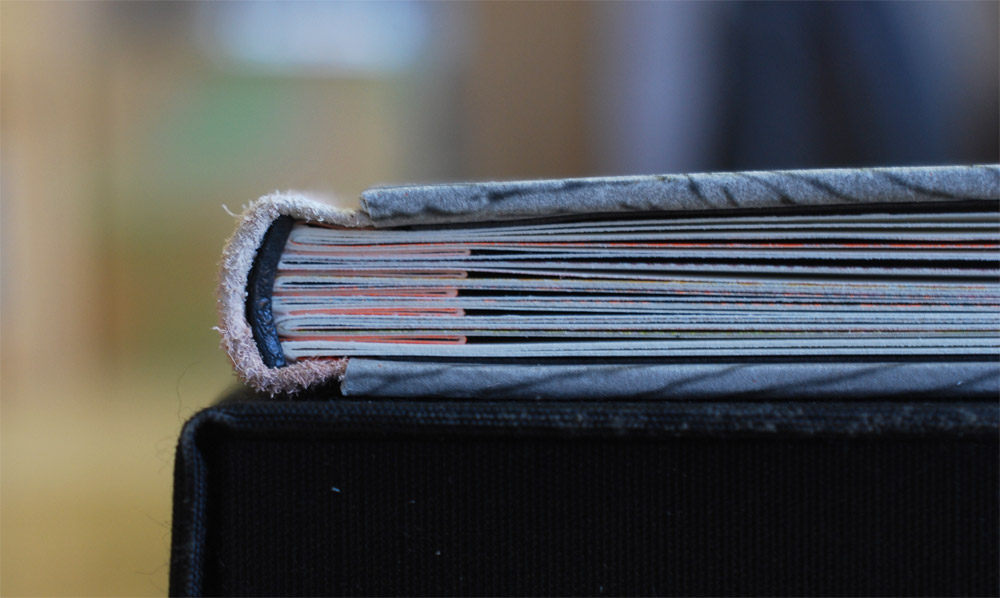
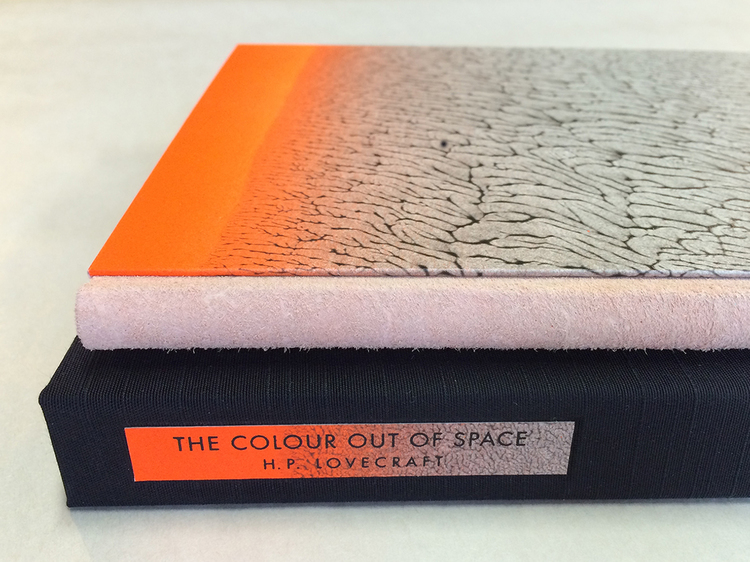
Bound in an edition of 40, the binding is a three-part Bradel structure with the text block sewn onto a shaped concertina.
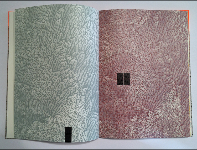
This is a photo I took of Amy’s book, which is why is appears different than the others.
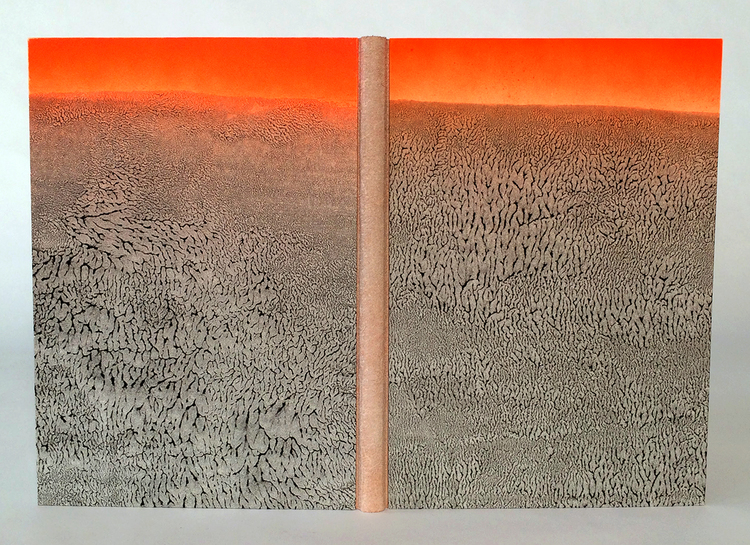
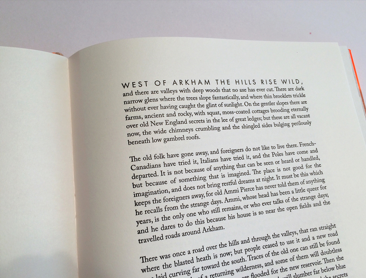
The spine is covered with buffalo suede and the boards are covered with a beautifully designed pulled paste paper. Relief printing was achieved on a letterpress through photopolymer plates and printed on Zerkall Book. The body text is Caslon with titles in Futura.
The book is housed in a cloth presentation box. The title and author are printed on scraps of the same paste paper used on the covers.
One of the last things we discussed during my visit to your studio, was the technique behind your incredible pulled paste papers. For the paper used on The Colour Out of Space, the rhythm of the pull created that gorgeous pattern. Can you share your process for making pulled paste papers?
After adding acrylic paint to the paste in the desired amount, I brush out a large, even area onto a sheet of mylar. I have a water bottle nearby in case the mixture needs more moisture. I lay the sheet of paper down onto the pasted area and press the sheet into the paste mixture gently by using a brayer on the back of the sheet of paper. I then pull up the sheet from one direction. For the covers of The Colour Out of Space, I then also let the sheet gently back down and pulled from a different direction. This allowed the “veins” created by the pulling to orient both vertically and horizontally. It also creates more surprises. No two sheets were alike and I enjoyed the “dance” of pulling in different directions to create different effects.
How does the paste paper reflect the story?
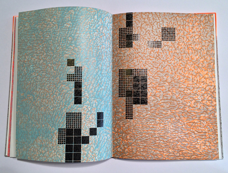
I was searching for a way to evoke the landscape and setting of the story without being literal or illustrating it. Because I live very near what many consider to be the site of the fictional story, I am familiar with the landscape. A big part of my “research” for this project, was simply walking along wooded paths near the site. There are large, imposing trees along the paths that lead to the reservoir that submerged a few towns. I wanted to capture the dark romanticism inherent there. The pulled patterns mimic patterns found in the natural world like rock formations, sediment at the edge of water, foliage. At the same time, the paste papers also reminded me of wallpaper patterns of the nineteenth century and the kind of neo-Gothic interior world that Lovecraft embodies. Not only do I use the paste papers on the cover of the book but I also created photopolymer plates from the papers I made. I then used these plates to print the imagery for the book. I printed the veined, pulled patterns in multiple colors and layered these on top of each other. These then become the backdrop to the “geometry” of the encroaching reservoir. The organic forms of the pulled papers are a foil to this rigidity.
With many of your prior artist’s books, you used the accordion structure in some way. Can you talk about why this particular binding is different and what influenced you to use a different structure?
As a painter I kept coming back to the accordion format because it allowed me to create a larger scale “canvas” when the pages are fully extended. But, with this book, a more traditional format seemed fitting because of Lovecraft’s own distaste for the modern, and because I was printing a full story, which I hadn’t done before. I wanted to make a traditional codex, but enhance it with slightly unusual features like the suede spine, the shaped concertina, and the fluorescent orange airbrushing detail. I also very much wanted to use the shaped concertina structure because I had developed it a few years ago on a book for a client, but I had not had the chance to use it on my own work. Sewing into the shaped concertina also allows for imagery to subtly emerge among the passages of text.
– – – – – – – – – – –
While I was a student at North Bennet Street School, I made the decision that upon graduation, Boston was to become my new home. So I began to investigate the community around me, which is how I stumbled upon Shelter Bookworks and the amazingly talented Amy Borezo. I was lured in by her artist’s books; their inventiveness and flawless printing really heightened my desire to work within this medium again. To say the least, Amy’s work is inspiring.
Last month, I had the chance to visit her studio in Orange, Massachusetts. She shared with me each of her artist’s books and some work she had done for Abigail Rorer and 21st Editions. Check out the interview after the jump (my first interview of the year) and come back each Sunday during the month of May for more on Amy’s work. You can subscribe to the blog and receive email reminders, so you never miss post.
Where did your interest in book arts begin and what form of training did you receive?
I have a deep connection to books and reading that began in my childhood. I have a BFA in painting from the University of Georgia and an MFA in painting and printmaking from the Rhode Island School of Design. I took my first book art class as an undergraduate. During that class, we explored the Special Collections department at my university library and it was there that I first saw fine press and artist’s books by Leonard Baskin, Circle Press, and Claire Van Vliet, among others. I was very drawn to these works and from that class moving forward, I began to make artist’s books.
As a graduate student at RISD, I was a teaching assistant at Brown University for a book art class. It was there that I learned letterpress printing from Walter Feldman and learned a few more simple bookbinding techniques. After grad school, I continued to make books on my own and was one day looking for a place to buy materials and came across a bindery that was very near where I was living at the time. I asked to buy glue and also asked for a job and they gave me one! It was a small, family-owned library bindery. While there I learned on the job in a production environment. I repaired books and also learned the fundamentals of making a basic functional book to library standards. I operated a Kensol and cast type on a Ludlow. I also learned production language and knowledge that serves me to this day. After several years there, I began looking around for ways to improve my binding skills. I studied for a brief period with Barry Spence where I began to work on a traditional full leather binding. Barry mentioned Daniel Kelm to me, who had internships available at that time. I met with Daniel who allowed me to work in his studio on my own work in exchange for working on his projects when appropriate. After a while, he hired me and I worked there part time for two years. During that time I also took many workshops at the Wide Awake Garage.
Before establishing Shelter Bookworks, you worked for Daniel Kelm. Kelm engineers incredible bindings for artists, printmakers and publishers. I would love to hear about your experience working at the Wide Awake Garage and what you took away from Kelm’s guidance.
Daniel is very generous and kind to everyone who comes into his studio, and he has a great sense of humor. He teaches how to think about problems, rather than simply giving you an answer. His work taught me that the book structure is capable of being reinvented over and over again. All of these lessons have been huge gifts to me and allow me to approach each day in the studio as a series of expansive possibilities. His craftsmanship is unmatched and I think about it constantly. I also got a sense of how projects move through a studio of that size.
I’m really interested in your bookmaking process, particularly when it comes to creating your artist books. How does an idea blossom into a final product? Do you have a strategic approach for research and development?
It is a fairly organic process. I usually have two or three ideas in my mind for upcoming projects. At that point the ideas are loose and have come out of reading or just taking in information. When an idea or concept strikes me as something I could use for a book, it’s almost like a physical sensation, an electrical charge. I will experience this a few times a year. I try to listen to this instinct and store it away. It could be a broad concept, it could be a specific piece of writing. I might take a few notes at that point.
From these kernels, I allow myself to envision a book as a whole complete object, an ideal version of the idea. I don’t have much spare time, so a lot of work gets done in my mind. I then begin to think about practical concerns. When would I like the book to be completed (do I have a deadline or show coming up)? What was my last book and how do I want my next book to relate (is there a book structure I’ve been wanting to use? Is there a theme that I want to explore further?) I think about my ideal viewer and what I would want to make for that person to experience. Those practical concerns help me begin to narrow down the two or three kernels of an idea to just one or two. At that point I will sketch the idea on a single sheet of paper–the concept in words and the rough idea of what the ideal version of the book would look like. I will then go to written sources and get more information on the idea. Read as much as I can. Take notes. Then the struggle commences to nail down the specifics. At that point it’s a matter of becoming more specific with the imagery, the text, and the binding structure. Those are the three parts of each project that inch forward in relation to each other. I make an advance in one area that informs the other aspects. There is always a point at which I question every choice I’ve made. I don’t think any project can advance without going to the depths of despair with it. I believe in the “just showing up” part. If I show up for the idea and work at it in any way, whether it’s reading, sketching, writing, it will eventually resolve into a cohesive whole. Most projects take about one year from initial kernel to the first few copies being bound.
You primarily work as an edition binder, which is a topic we will focus on more later this month. But I wanted to get a sense of how you established yourself within the field as an edition binder. I think one of the toughest things to do, as an independent binder, is to develop a client base. Any words of wisdom or strategies that were helpful for you.
Word of mouth is the best way, which means getting your work out there in the world for people to see. My first client came as a referral while I was working at the Wide Awake Garage. That was a large job that allowed me to begin to pay rent on my own studio. Since that time, I’ve been working steadily. I try to put good work out in the world and be a decent person to work with. It’s not that simple, but those things help. Take good photographs of your work or have someone take good photographs for you. Early on I would only advertise the work that I wanted to make. So I may have been doing repair work, but I only put work on my website that I wanted to continue to make, like edition binding for fine press publishers.
One of my business goals is to eventually be in the position to hire an employee. How far along in your business did you come to this milestone and what prompted you to hire someone?
I hired someone about 3 ½ years ago and she, Lisa Hersey, is still working for me now. That was about 7 years into having my own studio practice. At that point I was overworked and realized I would have to begin turning down projects. I did some math and thought the expense was worth it to preserve my sanity. I first invited a couple of people to intern for two months to see how it would work out. Lisa stayed on after that time and I began paying her. She works part time, coming in two days a week. It is a fantastic investment as being a sole proprietor can be difficult. When you get sick or go on vacation, a project grinds to a halt. But if you have a reliable employee, projects stay on track even if I’m not in the studio. It now allows me time also to work on my own projects in addition to client work.
We meet at the Northampton Book Fair where you had a table set up showcasing your artist books and some of the edition work that you’ve done. Do you find shows like this to be beneficial for your business? Does it benefit either your edition work or artist’s books more than the other?
I find doing a few select fairs to be very helpful for sales as well as staying connected to the larger book art community. I can’t do more than that because of the time commitment, and the booth fees and travel costs can get expensive. The fairs at which I have exhibited were mainly for showing my artist’s books and so they resulted in more benefit in that respect. I like to use fairs as an impetus to complete a project as the attendees are usually my “ideal audience”. Without the Northampton Book Fair in December, I might still be working on my latest artist’s book. Instead, I completed it, showed it, sold many copies, and am starting to think about my next book. Book fairs are a good venue for releasing new work.
It was also at this fair where I came across The Colour Out of Space and happily decided to make it the first artist’s book in my library!
During my visit to your studio, you mentioned that you were getting back into painting, which was part of your focus at RISD. How does painting influence your binding work or vice versa?
Last year, I found myself wanting to paint again after taking a bit of a break. So far, my painting process is much like my process for creating an artist’s book. I’m really just trying to listen to my instincts. Painting definitely influenced my latest book as I wanted to treat the prints in The Colour Out of Space as I would a painting. I did not plan out every aspect of the prints, but would print one plate in a single color and then would “reckon” with that choice and plan my next move after considering the resulting print. This improvisatory way of working on the imagery is more painterly than many of my previous works that were planned prior to putting any ink on the press. I enjoyed working this way, though it’s a bit nerve wracking as you can get pretty far down the line and not like the result. I only threw out one page that I didn’t like. I think more of my work going forward will be influenced by my paintings and my paintings will inform my books. I do not know specifically in what ways yet.
At the top of the interview, we looked at your latest artist book, The Colour Out of Space. Having just recently put them out into the world, I’m wondering if you are already thinking about your next project. Anything you care to share with us?
I am thinking about my next project. It isn’t far enough along yet to share exactly what it’s about, but the ideas of interest to me right now are related to human psychology and separately, economics. Or I could make something on a completely different topic. After my last book, it is tempting to create more works related to science fiction and fantasy, as I have a deep interest in those genres, but I think that will not be my next work.
