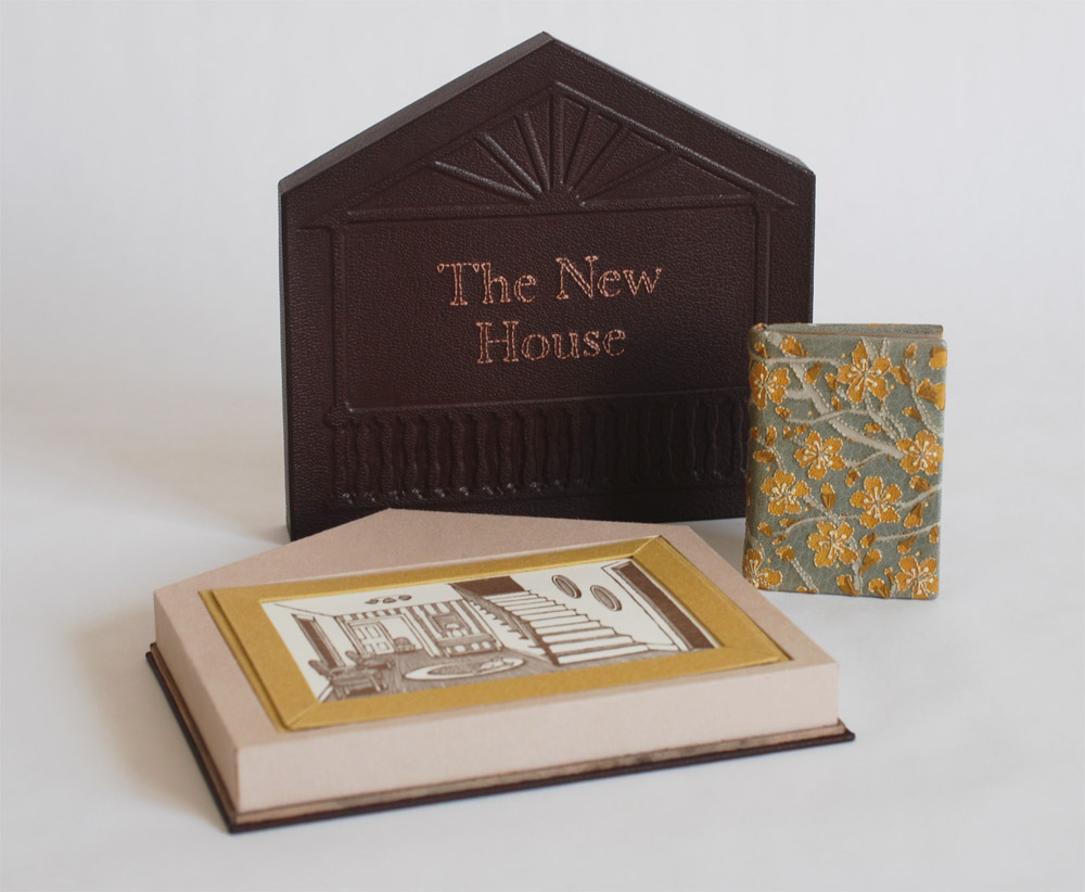
If you’ve ever visited your childhood home as an adult, you were probably flooded with emotional memories and feelings of nostalgia. These experiences are at the center of David Mamet’s poem in The New House. Printed in 1989 from Rebecca Press, this miniature text also includes wood engraving by Sarah Chamberlain.
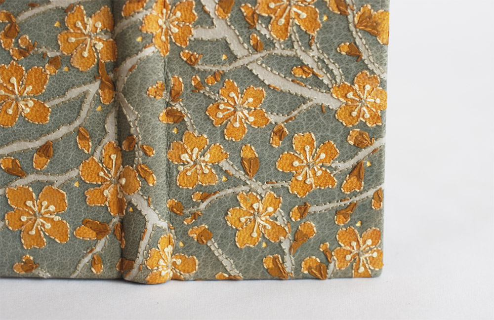
For the design of the binding, I wanted to reflect the warm nostalgic feelings felt by the poem’s protagonist. Something as simple as a color, texture or pattern could bring those memories to the fore front of your mind. I choose a floral patterned wallpaper as my inspiration and reimagined it in a soft color palette of light blues and a range of yellows.
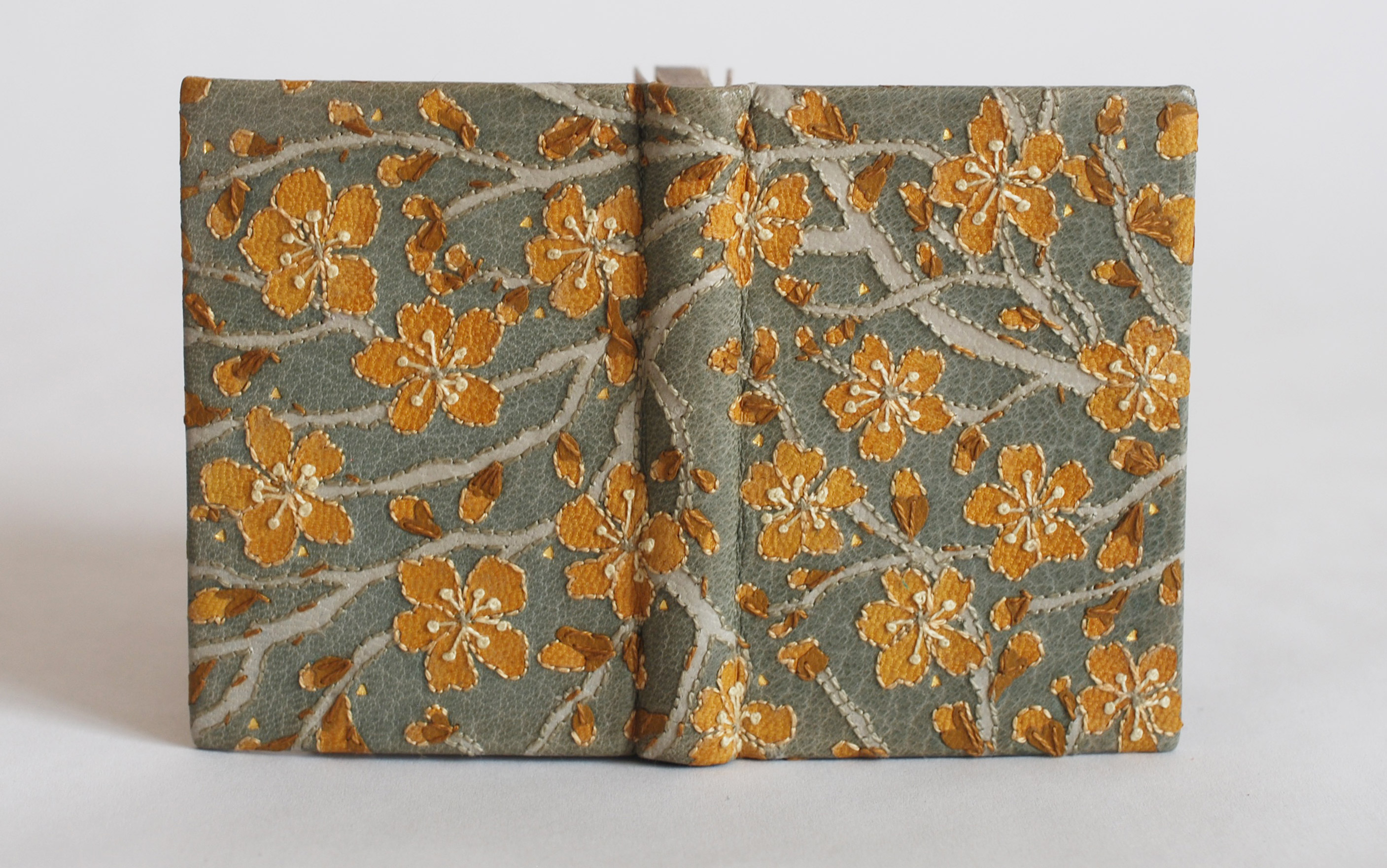
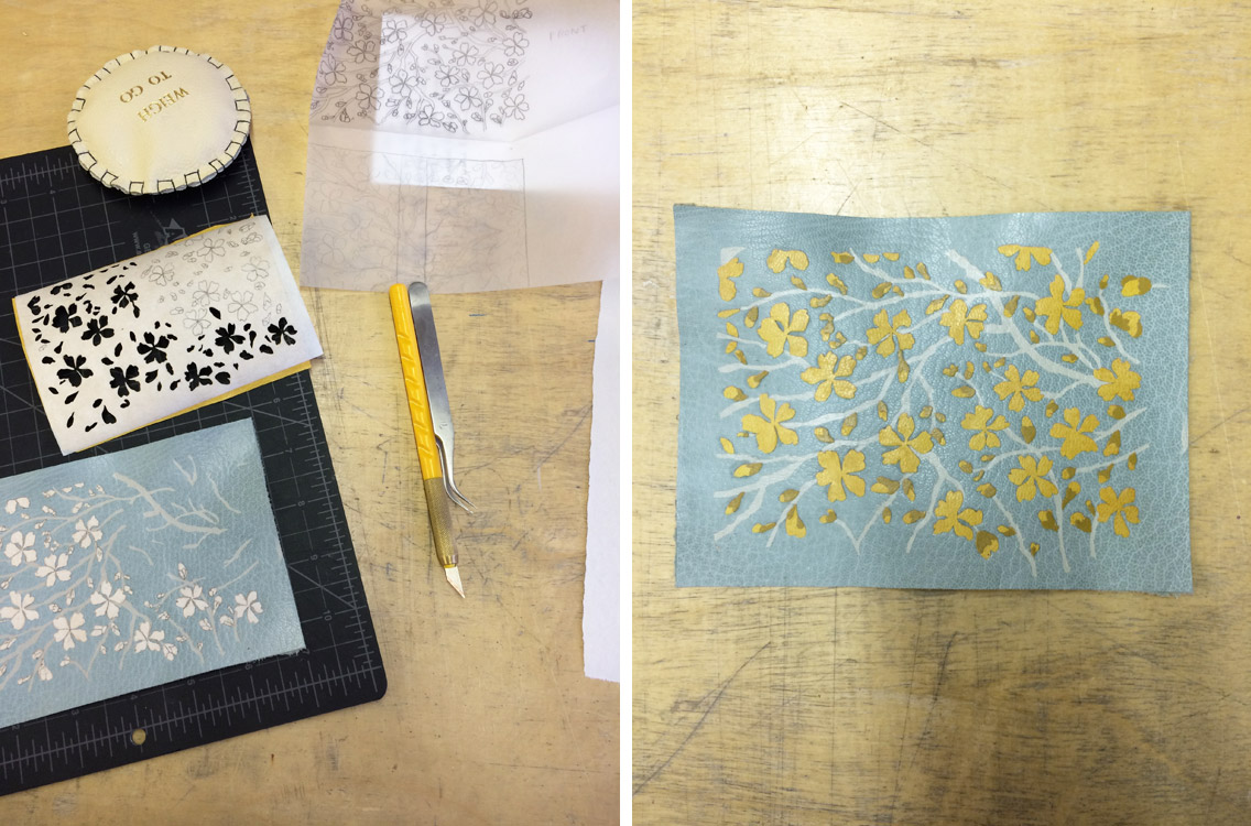
To create the design, my first step was to paint the branches. I wanted the design to exist on multiple planes, so I chose to paint the branches rather than create them out of leather onlays. So to do this, I hand cut a template out of frisket film first, then laid that onto the light blue goatskin. After burnishing down the edges, I painted over the entire skin with a mix of pale blue grey fluid acrylic paint.
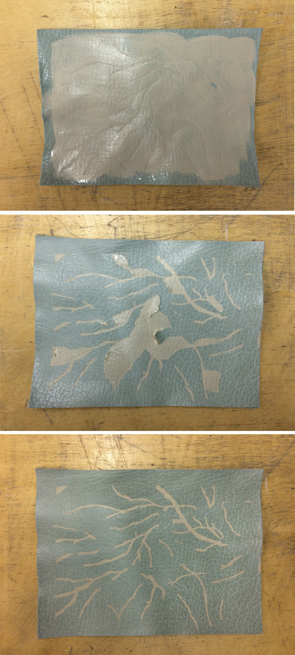
The frisket peels away from the leather rather easily once the paint is fully dry. It’s now time to adhere the onlays. Due to the quantity of onlays, I drew out the shapes in their exact location on both the lighter and dark yellow skins, placing them on the blue leather as I cut them out. I didn’t want to risk losing any pieces or adhereing them in the wrong place. After both yellow skins were in place, it was time to back pare the leather and prepare the embroidery.
I always pre-punch the holes before sewing, but this time I wasn’t working off a separate template, I used the edges of the painted branches and the floral onlays to guide my pin vise while punching. Everything is outlined in a simple back stitch with cotton floss. The stamen are stitched using French knots with tails. I added additional texture and a bit of shimmer with tiny gold tooled triangles that are scattered amongst the blossoms.
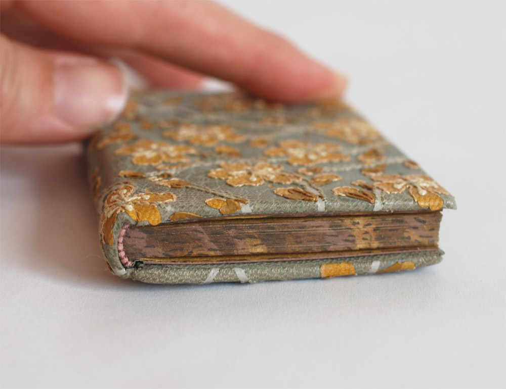
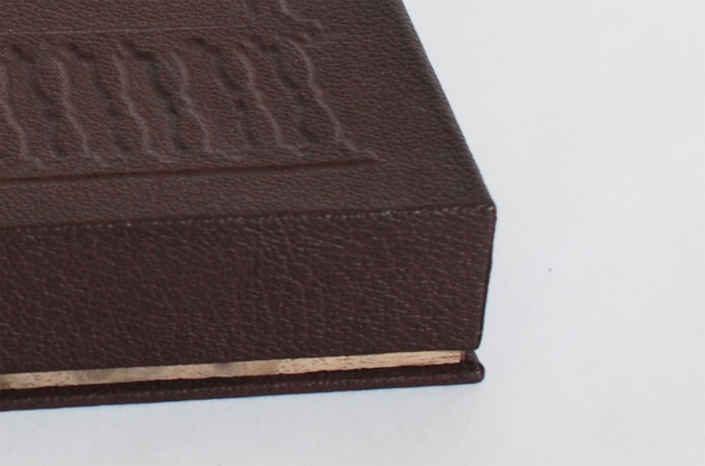
The use of wood grain as a design element is inspired from Mamet’s reference to nicks in the wooden floors of the house. All three edges of the text block are hand painted to resemble wood grain in warm brown and pink tones. The leather wrapped endbands in mauve have additional wraps in a darker mauve cotton floss.
In the image below, you can also see that the painted branches and onlays wrap around the board, but the embroidery stops at the edge.
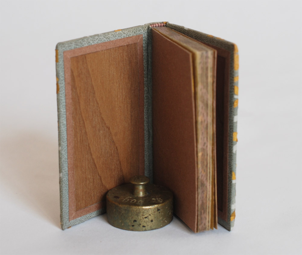
The interior side of the board is covered in the same light blue goatskin doublure with a sunken walnut veneer panel that is framed with handmade paper from Katie MacGregor. The same paper is used for the fly leaves. The endpapers are comprised of additional handmade paper from Katie MacGregor, but in an ochre yellow. Working further into the binding is a folio of soft yellow unryu which has a fabric-like feel. This material is designed to continue the feeling of comfort.
This edition includes a loose wood engraving depicting the entrance of the home. The print is mounted in a paper frame covered in the same ochre Katie MacGregor paper as the endpapers. Both the print and book live inside of a house-shaped telescoping box.
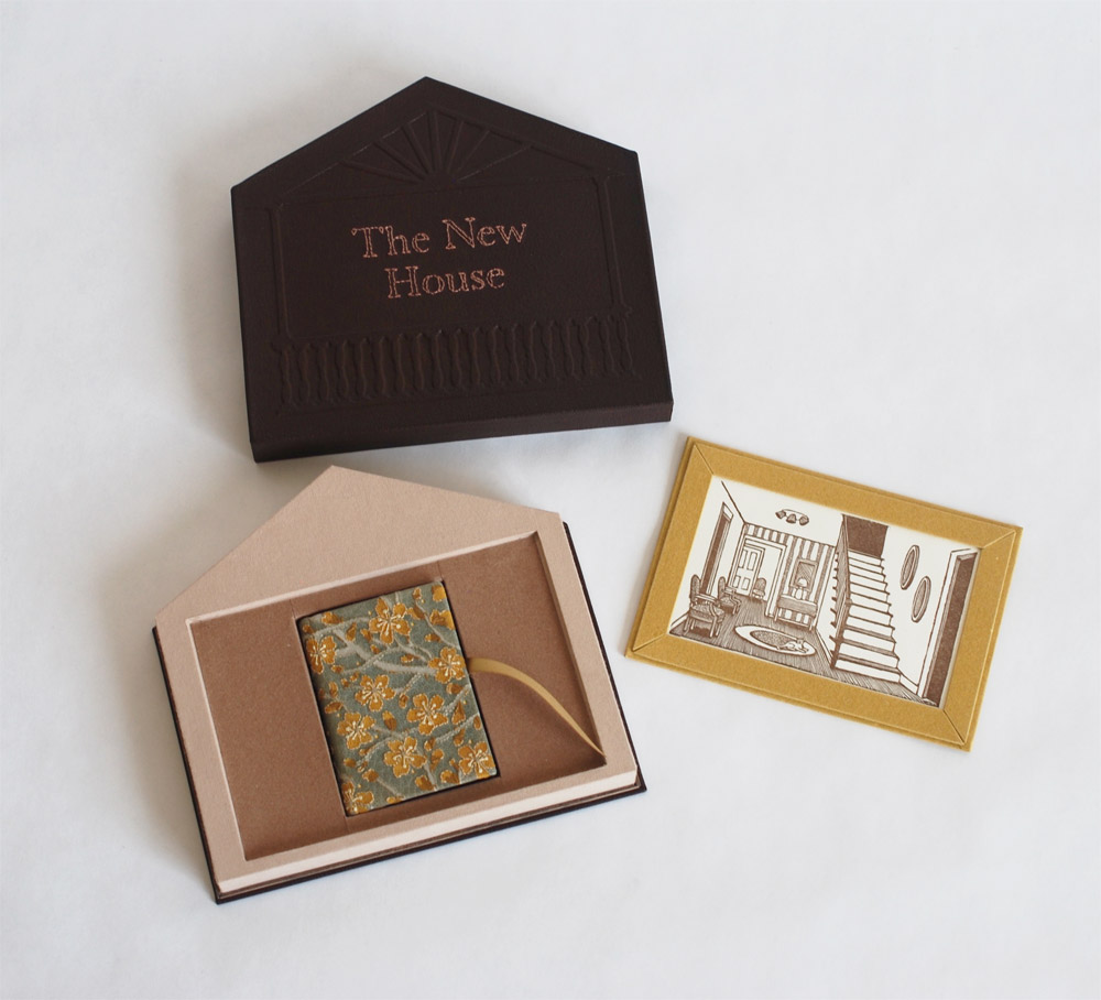
The base of the box includes two compartments; the compartment for the binding sits within and under the spot for the print. I first cut the shape of the base tray and then cut out a cavity to fit the size of the loose print. Within the base for the print, I cut out another cavity for the box. Then I supported all the pieces with walls. The entire base is wrapped in paper, a combination of handmade Katie MacGregor paper and Bugra. The book sits on a lining of cream suede.
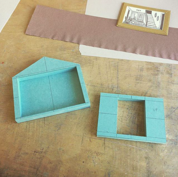
The base tray is attached to a leather wrapped board and a step of walnut veneer runs the perimeter to support the lid and add an additional accent of tone and texture.
The lid is covered in the same medium brown goatskin as the base board. The raised design on the lid is pulled from the embossed design on the title page.
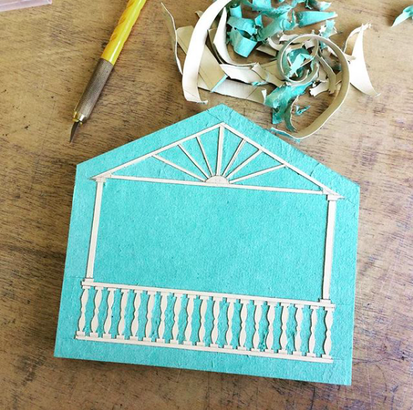
To create the delicate design of the raised structure, I first laminated a piece of 10pt. museum board to the millboard I was using to build the box. I then drew out the design and carefully cut through the 10pt. board. Then I pulled away all of the waste, leaving my complete design on the board.
The leather was edge pared to match the pentagon shape of the box and the title was embroidered before attaching. The addition of foam was used while pressing in order to work the leather down around the sides of the 10pt. board and around the embroidered stitches. In order to do this, the walls were assembled after the leather was attached and dried. I could then proceed to attach and cover the walls on both sides and line the interior.
The box was rather challenging to construct. My main issues were figuring out how to cut the turn-ins, particularly around the corners, and the overall fit of the lid to the base. I will admit that I made the lid twice as the fit on my first attempt was just a bit too snug for my liking.
Overall, I’m really pleased with this little gem and it’s unique presentation. The delicate design and soft color palette offers the feelings of warmth and comfort that I was hoping to convey.

This is one of my favorites of yours. It’s lovely in every way!
Awe! Thanks Becky!
I rarely leave comments on anyone’s blog, but you have moved me with your exquisite artistry and attention to the poem. Thanks for sharing the process, too.
Wow, thank you so much for the extremely kind words.
WOW! thank you for sharing the process. I am in awe.
Erin, I’m thrilled with this interpretation of my miniature book. Exquisite detail and wonderful concept. You have captured the emotion of the poem and created something truly evocative.
Thanks so much. You’re work is so lovely and greatly inspires my designs.