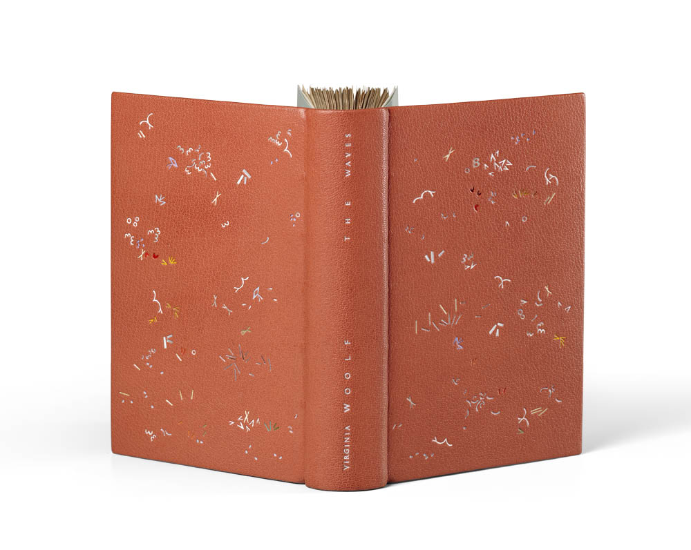
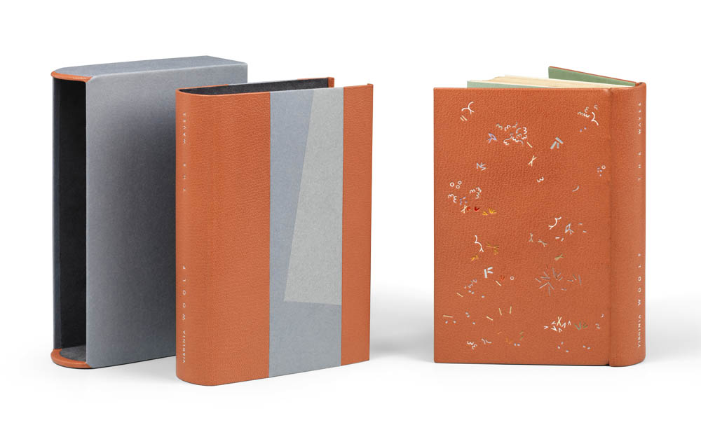
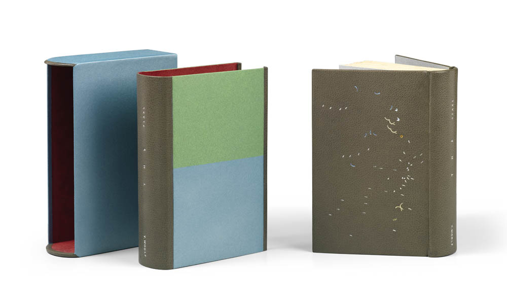
In this post, you get two for one with a discussion on the seventh and eighth book in the series. Starting with The Waves, which Annette Friedrich bound in 2017. The binding is covered in a dusk-rose goatskin with blue silk hand sewn endbands, dark green edge-to-edge doublures and light green flyleaves.
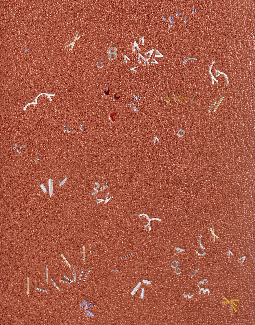
The number of foils is ever increasing with each design. On The Waves, Annette incorporated two metallic foils in gunmetal and matte silver with nineteen pigmented foils in the following colors: two shades of white, four shades of grey, purple, two shades of brown, two shades of yellow, five shades of red and three shades of green. Special guest foils include neon yellow, transparent pearl and iridescent silver.
The chemise is covered in two shades of hand-dyed bluish-silver paper and dusk-rose goatskin. The title is tooled in the matte silver foil. The slipcase is covered in mauve paper with an equally mauve Alcantara. The design on the binding was executed by Claude Ribal.
I noticed the introduction of a “V” tool on The Waves. It made me wonder, is there any significance to the shape and the novel?
Yes, you are picking up on the fact that I am expanding my range of tools, adding to them as I find fit. I mostly do this by filing ‘blanks’ into the shapes I need. There is no real significance to the “V” shape as such, except that it is distinct and weighted. I actually cut three ever so slightly different “V” tools, all of which are on the book! Sometimes on their own, sometimes in conjunction with others, creating more complex figures.
I also began to wonder more about your design process. At the very beginning of the design stage, how are you selecting your tools? Do you pull a combination from the cabinet and force yourself to develop a design with only those tools? Or do you allow yourself to swap out tools that don’t quite work?
To begin with, I pull out the ones that I think I will want to work with. However, if I feel the need for others I just go and have a look if something else fits the bill, or, if I cannot find what I need, I just go and cut the shape(s) that I am missing. For example, I noticed that when I work within a cluster that a variation within size is crucial to give it ‘life’. One can observe that my toolbox has expanded steadily over the duration of the project. I have now two sizes of the ‘3’, four variants in different sizes of the “(” and three “o” etc.! Only two books earlier I would have only been working with a single shape for each… All part of the learning curve, right?
 As I mentioned in a previous post, the bindings visually appear to be part of a series, that they follow a formula. We discussed this topic with the chemise already, but I wanted to bring up another element that ties the work together: the use of hand-dyed papers. Can you speak about the reasons for using hand-dyed papers for the enclosures, doublures and fly leaves? Were these papers dyed by you and if, so what is your process?
The reason for me to hand dye my papers is that I seem to be a complete nerd who needs to be in control of everything, down to the exact shade of color for within the bigger scheme. The process is easy, I use offset printers ink and dilute them down with turpentine. I have the four CMYK at my command, as well as screaming signal yellow and signal red, as well as silver. That’s all I need. The rest is just mixing it to the shade that you want and then use a cloth to soak up the color and apply it to the sheet of paper with circular movements from one edge to the other. The beauty of this process is that there is no visible brushstroke etcetera, just one smooth surface.
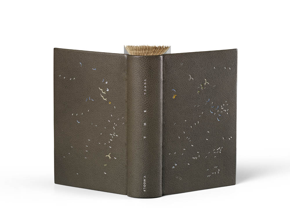
Also bound in 2017, Annette used a grey goatskin for her binding of The Years. The binding also has hand sewn endbands using grey silk with silver edge-to-edge doublures and matching flyleaves.
The number of foils is dialed back significantly on this binding with five shades of metallic foils, which include four shades of silver and blue. Seven pigmented foils were chosen, which include the following colors: two shades of red, grey, blue, two shades of yellow and green. Special guest foils are present with transparent pearl and transparent iridescent.
The chemise is covered in silvery-green and silvery-blue hand-dyed papers with grey goatskin on the spine. The title is tooled in matte silver and silver foils. The slipcase is covered in the same silvery-blue paper and lined with red Alcantara. The design on the binding was tooled by Claude Ribal.
Up until this point we’ve mainly discussed the design of the binding, I want to get into the way the books are titled. The spacing varies with each title, with The Years the spacing speaks to the agony Woolf encountered when writing this novel. For the bindings you chose to title, did you chose a layout to reflect the text or the design in some way?
No, the titling does not reflect the text in any shape or form (but if you see a connection, feel free to do so). Neither does it reflect the design, but is rather part of the design. The title links the two sides of a book and I find it fascinating to find different ways to do this. It is only since Orlando that I cottoned on that it might be helpful for me to start taking basic typographic variants into consideration. They are spacing, direction/placement and the size of the font. Coming up with sexy titling solutions is my new hobby-horse. Thank you for noticing!
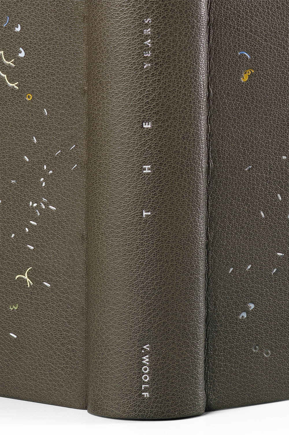
Virginia appears as V. on The Years. This treatment is unique to this binding. Is there any reason for this?
Yes. The trouble with titling is that you are stuck with the title and the author and that you have to work with what you’ve got. I usually design the titling after the design is executed, and normally I only work on one book/design at a time. In this instance though, for reasons of timing, the last three books of the project had gone to Claude together and, after having picked them up again, I worked on the titling for all three books at the same time. The Waves and The Years have a very similar appearance, and I think I just wanted to get some leeway by at least tightening up the length of the authors name a bit. So ahem… the answer is artistic license! I have actually done this before within the project, not with V. Woolf’s name, but for Night and Day where I exchanged the ‘and’ with a ‘+’ to get a more distinct change within the length of lines.
The tone for The Years has darkened. The palette is heavy and moody with minimal colored foils. You mention reading Woolf’s diaries and letters in addition to biographies written about her during this project. How did Woolf’s own practice as a writer and creator inform your approach? Were you pulling influences from her thoughts as well as the novels?
I have a whole bookshelf dedicated to Virginia Woolf, her books, her letters, her diaries, her essays… as well as the mind-blowing and insightful biography by Hermione Lee. It was wonderful to sort of get-to-know the person behind those fairly dense and abstract novels. And there are many parallels between her quest as a writer and me as a maker. The looking around, the searching, the time when one feels super apprehensive and down, as well as those where one jumps up and down with excitement and glee when one thinks that one finally has clocked something. I loved that!
I don’t think though, that reading about her life and delving into her thoughts influenced my approach as such (the novels did!). Maybe I have just not yet noticed though? Who knows.
A beautiful documentation has now been published, that traces the development of this project, which, as it turns out, took seven years to complete. WOOLF I – IX ! 98pp, with an introductory essay and 1:1 reproductions of the bindings, background information, and text excerpts.
Text: Annette Friedrich, Virginia Woolf
Design: BUCHmacher, Germany
Photo: Shannon Tofts, Scotland
£30 + postage / reserve your copy at www.annette-friedrich.com
