RSS Feed

‘bookbinding’ Category

  1. Bookbinder of the Month: Jan Sobota

    December 16, 2012 by Erin Fletcher

    rimskalyrika_jansobota
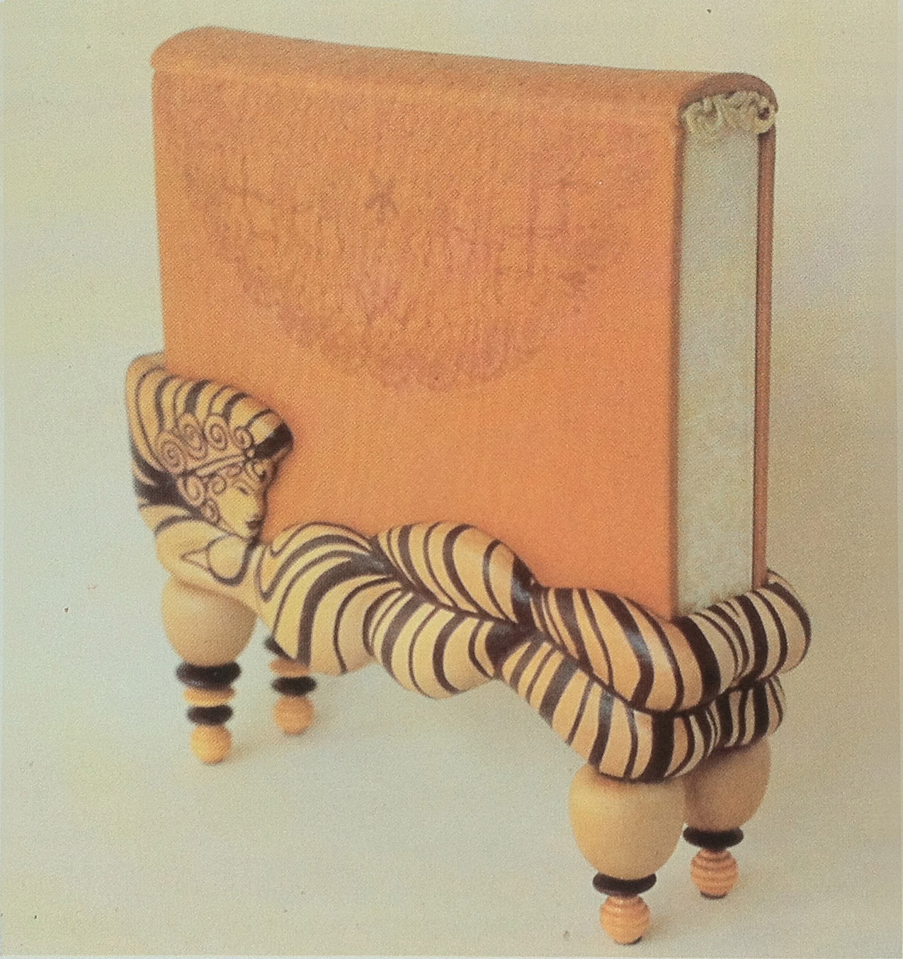
This book object and stand were crafted by Jan Sobota in 1987, the book is Rimska Lyrika (Lyrics of the Roman Empire). The book is covered in natural calfskin with blind tooling, decorative edges and headbands. The stand is made of binders board and balsa wood covered with natural goatskin and dark red onlays. The overall design is a canopy bed with slightly erotic elements inspired by the old Roman lyrics. 

    resource: The New Bookbinder: Journal of Designer Bookbinders. Volume 10, 1990.


  2. Bookbinder of the Month: Jan Sobota

    December 9, 2012 by Erin Fletcher

    Over the course of 10 years, Jan Sobota participated in four Helen Warren DeGolyer Triennial Competitions. Every three years the Bridwell Library on Southern Methodist University’s campus chooses a book from their collection to be rebound by an individual binder. Each participant offers a proposal binding for the chosen title in addition to an example of their work. The winner of the Helen Warren DeGolyer Award receives a commission to bind the selected book according to their design proposal.  Two other prizes are awarded for excellence in fine binding and design. 

    The first time Sobota entered this competition was in 2003, creating a proposal for Mark Twain’s Adventures of Huckleberry Finn. His design was given the Judge’s Distinction of Interpretation award:

    An example of his work submitted for the 2003 competition:

    This binding of Les Chansons de Bilitis by Pierre Loüys is translated from Greek and includes illustrations by G. Barbier engraved on wood by François Schmied. This edition was printed in Paris in 1922. A triple cover board binding structure bound in brown Harmatan goatskin for the top layer, gold leather for the middle and dark blue goatskin for the doublures with blue suede leather flyleaves. The same gold leather was used to create wrapped headbands, the top edge was gilt. 


    For the Fourth Helen Warren DeGolyer Exhibition in 2006, Sobota presented his proposal for Jorge Luis Borges’ Ficciones:

    Sobota proposed a triple cover board binding structure, to be covered in dark blue paper made of leather-maché, light blue French box calf (title in relief outlined in gold tooling) and batik suede pigskin. A brass plate on the spine engraved with the author’s name along with a brass clasp along the foredge engraved with the author’s portrait. The middle board would be covered with gold leather and doublures of batik suede pigskin. The flyleaves would be light blue paper of leather-maché. Double core leather-tooled headbands and silver multi-metallic gilt top edge.

    “The design depicts the ‘fictitious’ soul of the text and the illustrations, which the author also suggests in the title of the book”. The 1987 edition of Ficciones includes illustrations by Gabriela Aberastury, Julio Pagnao, Mirta Ripoll, Raúl Russo and Alicia Scavino.

    An example of Sobota’s work included in the 2006 submission was a binding of Jules Verne’s Le Tour Du Monde En Quatre-Vingts Jours:


    John Grave’s Goodbye to a River: A Narrative was chosen for the Fifth Helen Warren DeGolyer Competition in 2009. Here is Sobota’s proposal submission: 

    read more >


  3. Bookbinder of the Month: Jan Sobota

    December 2, 2012 by Erin Fletcher

    Jan Sobota produced several miniature bindings, which were included in various exhibitions. This binding of Edgar Allen Poe’s The Black Cat was published in a small edition of 20 by Jan and Jarmilla in 2009. This book-object was designed as a ‘Jack-in-the-Box’, the book is permanently attached to a spring that jumps forward as you open the lid. The black cat silhouette on the front cover is laser cut and finished with hand painting and tooling in white foil.

    The box is covered in black binders’ cloth and the lid is hand tooled in a pattern resembling a brick wall. The box measures 2.75″ x 2.75″ and the book measures 2.3″ x 2.3″.

    resource: J. & J. Book Arts Studio


  4. December // Bookbinder of the Month: Jan Sobota

    December 1, 2012 by Erin Fletcher

    Jan Sobota grew up engulfed by books, about 20,000 to be exact. His father was an avid collector of literature, most specifically children’s literature, filling their small house to the brim with books. Every available square inch of wall space was covered with bookcases leaving only the windows and doors untouched; before dinner books were cleared from the table and chairs. Eventually his father’s collection was moved to the barn after being converted into a library and office. Several books suffered from the passage of time and needed to be repaired. Sobota accompanied his father to trips to the bindery, eyeing the machinery and craftwork of the binders. One particular binder who peaked Sobota’s interest was Karel Silinger, working in Pilsen, Czechoslovakia as a designer bookbinder. At the time Pilsen attracted several artists creating a cultured and literate community. 

    Sobota began an apprenticeship with Silinger in 1954, learning binding techniques while conversing with artist, writers and actors. Sobota was accepted to a bookbinding program in Germany, but was unable to attend due to the Communist occupation at the time. Instead, he studied at the School for Applied Arts in Prague, where he was exposed to drawing, painting, sculpture and restoration of materials such as wood, metal, glass, ceramics, glass, paper and books. In 1957, Sobota completed his studies with both Silinger and at the School for Applied Arts.

    Left on his own to work, Sobota struggled with developing his own style of binding. His first bindings matched the style of Silinger’s bindings and other artists he found inspiring. For a time, Sobota did not have access to foreign literature from restrictions put forth by the Communists and therefore it became difficult to further his studies of bookbinding until the mid-1960s. During this time he concentrated on the techniques of Czech early Gothic-style bindings, being introduced to Gothic box bindings. He began to consult with Czech bookbinding professor such as Emil Pertak and Vaclav Vladyka. 

    In 1966, the Communists began lifting restrictions on art, allowing more bookbinding exhibitions and lectures to enter Czechoslovakia exposing Sobota to master bookbinders such as Jindrich Svoboda and Jan Vrtilek. Sobota continued to develop his personal style of binding though he found experimentation to be a struggle from the confinement by deep-rooted techniques of standard bookbinding, believing that binders were being held back from innovation and future development. It wasn’t until 1977, after reading Philip Smith‘s New Directions in Bookbinding did Sobota find the courage to produce more sculptural bindings known as book-objects.

    Sobota’s book-objects are sculptural box-bindings or flat bindings with a sculptural or relief box; the text is completely housed inside the sculpture keeping it safe from dirt and exposure. The construction of his book-objects are quite complex, but the books can be opened easily and read comfortably. Sobota never considered his work to be experimental. His intentions were to create something new, while serving the book by expressing its contents through his artistic and technical abilities. In 1979, he received the title ‘Meister der Einbandkunst’. 

    In 1984, Sobota was directed to Cleveland where he began working in the conservation lab at Case Western Reserve University; his latest position was as the Director of the Conservation Laboratory in the Bridwell Library of SMU in Dallas, Texas. Sobota was active in various bookbinding communities. As one of the initiators of the Society of Czech Bookbinders, he was elected their first president in 1997. Beginning in 1969, Sobota exhibited his bindings in 137 group shows and 32 individual shows, in addition to winning over 30 prizes for this work as a craftsman and educator. 

    In May of 2012, Jan Sobota passed away, months later at the Standards of Excellence conference, his wife Jarmila accepted the Lifetime Achievement Award presented by the Guild of Book Workers in which he was an active member. Sobota was gifted as an artisan and craftsman with a deep knowledge of conservation for both contemporary and historical bindings.

    The design binding in this post is a compilation of works by Charles Perrault completed by Sobota in 2011. The box is styled after the location where Perrault lived and worked, the Chateau de Breteuil, a 17th century castle located near the Chevreuse Valley. The Chateau is well known for its elegant interiors and majestic brick and stone exterior.

    The main text was published in conjunction with the 9th Biennales Mondiales de la Reluire d’Art in France in 2007 in an edition of 1,000 copies in which this is number 414. The additional 12 miniature books were published by Jan and Jarmila Sobota in Czech in 2007 in an edition of one. The box-binding (the tower and building exterior) are covered in both goatskin and calf in five different colors. Windows were cut from hologram glass and cover the ‘hollow boxes’ that house the 12 miniature books. The miniature books are covered in a gray goatskin with silver stamping and hologram silver gilt edges. The main text edges are gilt with hologram gold.

    Blue silk doublures lined the inside covers of the box, which also include portraits of Charles Perrault and Louis de Breteuil (the original owner of the Chateau).

    The tower is hollow with two floors connected by a wooden spiral staircase; on the first floor is an image of Puss in Boots (a character created by Charles Perrault) and on the second floor is a scene from Chateau de Breteuil lining the walls with a replica of the famous Teschen table (also known as the ‘Table of Europe’).

    resources:

    1. The New Bookbinder: Journal of Designer Bookbinders. Volume 10, 1990. pg. 3 – 11
    2. Guild of Book Workers Newsletter. Number 203. August 2012, pg. 9

  5. My Hand…The Twits

    November 26, 2012 by Erin Fletcher

    Only 2 weeks left in my exhibition at Buy Some Damn Art

    I found the pranks between the terrible couple in The Twits to be wicked yet entertaining, which is why I read the book so much as a kid. One particularly gruesome trick that inspired the design for this binding was the worm spaghetti that Mrs. Twit served Mr. Twit. This devious couple live in a cement windowless house complete with a rotting garden, caged monkeys and a big dead tree where Mr. Twit captures birds for pie. The couple get what they deserve in the end as the monkeys and birds play their own clever trick on them, turning their home upside down.

    I bound The Twits in the millimeter Rubow style with white buffalo skin lining the head edge and flanelle buffalo skin lining the tail edge. The color of the leather wrapped headbands correspond to leather edge. The paste paper was a simple design of free forming squiggles painted on with a long bristled brush. The initial layer was a mixture of titanium white acrylic, water and wheat starch paste. For the next two layers I added a bit of bone black and cerulean blue acrylic to create a blue gray ending with a match for the flanelle buffalo. The title was stamped with Centaur handle letters in carbon.

    The edges were painted with a light gray acrylic mixture.  The book opens to reveal smoke Hahnemuhle Ingres paste downs with light gray Hahnemuhle fly leaves before reaching the text block. I wanted to keep the book to be as gray and drab as possible, representing the sad existence of the Twits inside their cement home.

    The book is housed in a clamshell box. The trays are covered in smoke Hahnemuhle Ingres and lined in light gray Ingres. The case is covered quarter-style with black Iris bookcloth and smoke Hahnemuhle Ingres.


  6. Bookbinder of the Month: Edgar Mansfield

    November 25, 2012 by Erin Fletcher

    Moby Dick by Herman Melville is the classic novel possessing the iconic white sperm whale, whose image graces the cover of this binding by Edgar Mansfield. Following the design of Baudelaire’s Les Fleurs du Mal (1952) and A Rage to Live by John O’Hara (1952), Mansfield created this design for Moby Dick in 1953. Tooling in black, Mansfield creates movement and depth with variations in tone and line width.  The book is bound in a native dyed red morocco.

     Les Fleurs du Mal by Baudelaire (The Harvill Press. 1952), bound in yellow morocco inlaid in red and black, tooled in blind

    A Rage to Live by John O’Hara (Random House. 1949), bound in orange-red morocco tooled in blind


  7. My Hand…The Enormous Crocodile

    November 19, 2012 by Erin Fletcher

    Only 3 weeks remain to view or purchase my bindings on Buy Some Damn Art.

    I had never read The Enormous Crocodile when I was a child, therefore, I experienced this devilish tale as a young adult. The Enormous Crocodile lives in the jungle and is a rather sinister character. When meeting other jungle creatures, he boasts about his clever plans to snatch up children in order to eat them. All of the creatures are horrified by this idea and foil his plans along the way. The Elephant has quite enough of this crocodile’s antics and decides to put an end to it. Grabbing the Enormous Crocodile by the tail, the Elephant swings him around with such speed, he is projected far into the atmosphere until he hits the sun and is ‘sizzled up like a sausage’.

    Quite an ending, one that surprised me as a reader. Very few Roald Dahl books contain color, but The Enormous Crocodile is filled with vibrant greens and yellows. When considering the cover design I didn’t want to compete with such a colorful palette plus I couldn’t get the image of a sizzled crocodile out of my mind. This led to the decision of doing a monochromatic binding in black. 

    The book is bound as a millimeter binding with black Pergamena goatskin running along the headcaps and joint. The rest is covered in black Hahnemuhle Ingres. A recess was built into the front board before covering as a well for the crocodile skin. Due to the bumpy texture of the crocodile skin, paring was impossible, but also unnecessary.  Once the skin was glued up and placed in the well, layers of foam were sandwiched between the cover and press boards, this kept the skin flat while drying. The title was stamped in a sans serif typeface with silver foil before gluing down the crocodile skin.

    Continuing with a monochromatic look, the edges were painted black. Using a combination of fluid acrylic, airbrush medium and wheat starch paste I was able to apply a thin yet opaque layer of pigment. When you open the front cover, a rush of brilliant green floods your vision. The endpapers were constructed with emerald green Lokta paper.

    The book is housed in a black clamshell box. The trays are covered and lined with black Hahnemuhle Ingres with Volara foam cushioning the front cover. The case is covered in black Iris bookcloth and kept closed with black satin ribbon.


  8. Bookbinder of the Month: Edgar Mansfield

    November 18, 2012 by Erin Fletcher

    This is an earlier binding from Edgar Mansfield, before he really developed his expressionist style. Room and Book by Paul Nash was published by Soncino Press in 1932 and was bound by Mansfield in 1941. Covered in yellow ochre and red brown morocco with inlays in natural, red, browns and black. All tooling in gold. 

    I particularly love this binding because of its rigidly angular and balanced design; a nice transition from the popular Art Deco bindings and to the surrealist and expressionist designs he’s best known for. 


  9. My Hand…The BFG

    November 12, 2012 by Erin Fletcher

    Just 4 weeks remain at Buy Some Damn Art.

    As I reread The BFG by Roald Dahl, it quickly became clear that I wanted to illustrate the dreams and nightmares captured by the Big Friendly Giant. The reader joins little Sophie in her journey to Giant Country, where we learn about the nasty giants, snozzcumbers and the BFG’s vocation as a dream catcher. Each dream and nightmare is collected into a jar where they remain until released into children’s rooms at night. Sophie describes dreams as being small oblong pale sea-green jellyfish, soft and shimmering, while nightmares thrash around as scarlet blobs of gas and bubbles of jelly. 

    I made the decision to bind The BFG as a millimeter binding in the Rubow style so the design could run the full length of the book uninterrupted. Using Sophie’s description as a guide for the color palette, I created a paste paper to reflect each illusion. Each area of color is a mixture of gouache, sugar and vinegar applied with a scrap piece of binder’s board. As the paint mixture dries the partially dissolved sugar crystals burst leaving a textural and dimensional effect. 

    Each color continues along the board edge and the edge decoration visually saturating each side in a single color. The tail board edge and headband are covered with scarlet goatskin from Harmatan, while the head board edge and headband are covered with buffalo from Remy Carriat in amadine (light sea-green). Each edge is painted with acrylic paint mixed with airbrush medium, water and wheat starch paste. The head edge is a sea-green blue, foredge is a light grey and the tail edge is scarlet red.

    The endpapers were so fun to make. I’ve worked with vegetable papyrus in the past and felt compelled to use the cucumber since the BFG eats only one thing: snozzcumbers. I acquired the cucumber papyrus from Hiromi Paper which are handmade by an artist in Germany. Using a thin paste wash I broke up the papyrus and collaged the pieces together on top of light gray Hahnemuhle Ingres. 

    The book is housed in a clamshell box, the trays are covered with light gray Hahnemuhle Ingres and lined with smoke Ingres. The case is covered with silver Canapetta and light gray Ingres in a quarter style covering.


  10. Bookbinder of the Month: Edgar Mansfield

    November 11, 2012 by Erin Fletcher

    I wish this image were in color, it’s a really striking design; the marks are almost sketch-like appearing at random to build a dimensional landscape. Thirstland Treks by Carel Birkby was printed by Faber and Faber in 1936 and this copy was bound by Edgar Mansfield in 1948. Covered in a native dyed yellow-brown morocco skin with slight creasing in the grain. The tooling is a combination of light and dark blind with a small amount of gold on the cover and spine.

    This is the first experiment with using the grain as an active and expressive element in the design.

    Reference: Modern Design in Bookbinding: The Work of Edgar Mansfield, pg. 27


  • My name is Erin Fletcher, owner and bookbinder of Herringbone Bindery in Boston. Flash of the Hand is a space where I share my process and inspirations.
    The StudioNewsletterInstagramEmail me
  • Archives