RSS Feed

‘bookbinding’ Category

  1. My Hand…James and the Giant Peach

    November 5, 2012 by Erin Fletcher

    Five weeks remain for my exhibition on Buy Some Damn Art. There’s still time to add to your library!

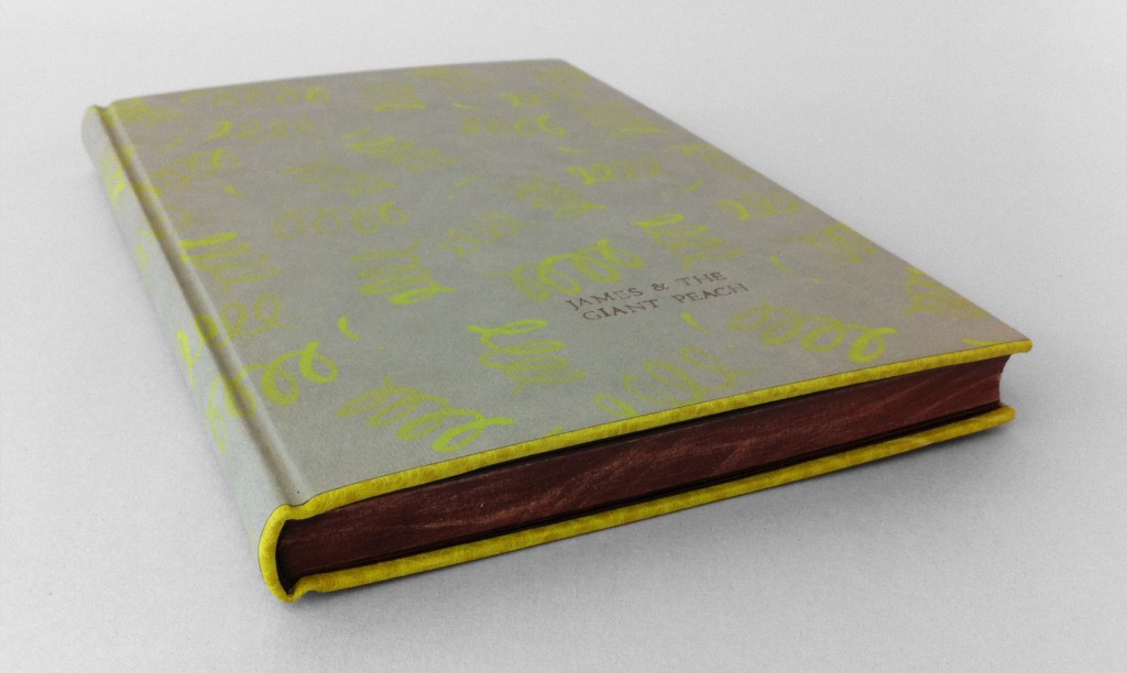
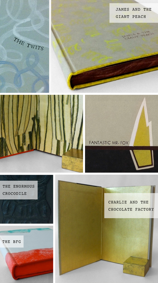
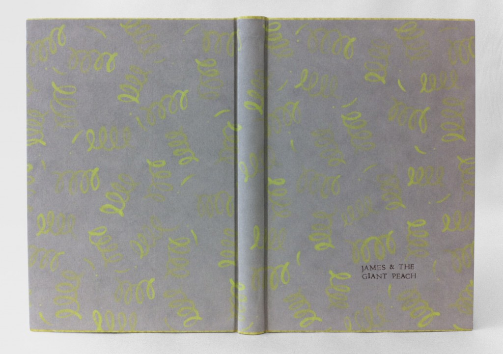
    Initially for this binding of Roald Dahl’s James and the Giant Peach I had intended on covering it in a peachy-colored pig suede to represent the Giant Peach itself. However, dressing the book up like a peach felt too dry, too safe. The story of James and the Giant Peach is loaded with magic from the overgrown peach to the singing insects, which only became possible through the power of those little, luminescent crocodile tongues. Using smoke Hahnemuhle Ingres, I created a simple paste paper representing the little green things, scattering them about randomly. The acrylic paint was mixed with wheat starch paste and watered down significantly, this allowed for the graduation of intensity with each corkscrew shape.

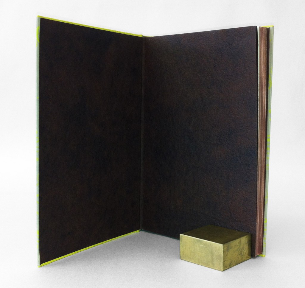
    I choose to execute this design as a Rubow Millimeter binding. This is one of my favorite structures to work with, mainly because the covering material (most commonly paste paper) can lay across the entire book uninterrupted. The head and tail edge of the boards are lined with buffalo skin in Anis (chartreuse green), which matched perfectly to the green tone on the paste paper.

    The edges of the book were painted with an fluid acrylic/paste mixture to match the red walnut Cave Paper endpapers. After application and once the pigment was dry, I used sandpaper to scuff up the edges a bit giving it a distressed look. The headbands are hand sewn around a single core (bead on foredge) in alternating dark brown and reddish brown. The title was hand stamped through brown foil. The book is housed in a clamshell box. The trays are covered in smoke Hahnemuhle Ingres and lined with lime Moriki; the case is covered in a brown Canapetta bookcloth.

    James and the Giant Peach is for sale at the price of $400.

  2. Bookbinder of the Month: Edgar Mansfield

    November 4, 2012 by Erin Fletcher

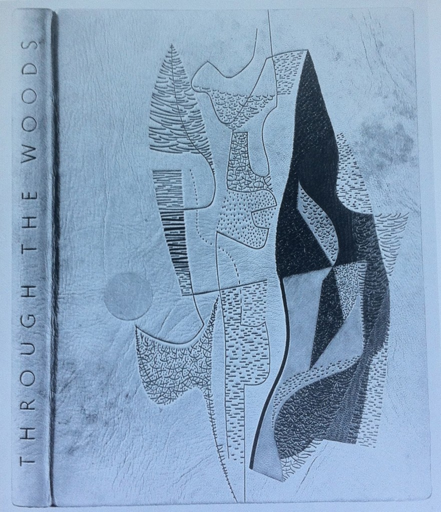
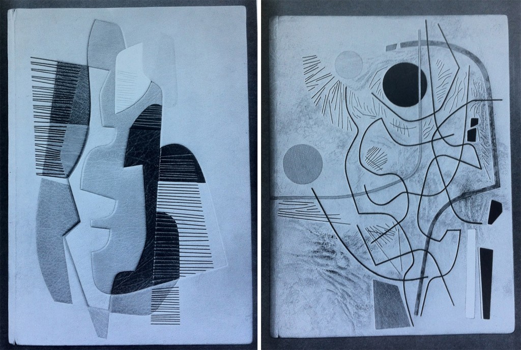
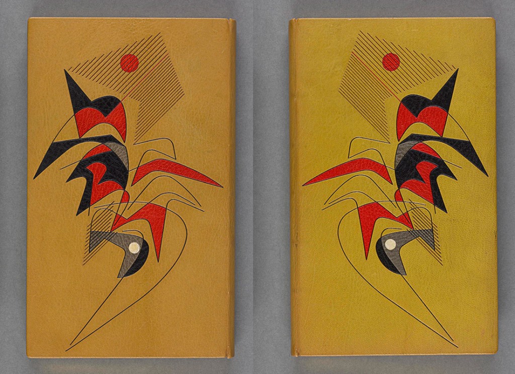
    Throughout Edgar Mansfield’s career as a bookbinder, he bound several copies of Victor Gollancz’s Through the Woods. Twelve of them are represented in The Work of Edgar Mansfield. The binding in the first image was bound in 1958; covered in a native tanned natural morocco with brown markings (both natural and added by Mansfield). The grain creases were induced during covering. All tooling is blind, with inlays of rust-red, greens and chrome yellow.

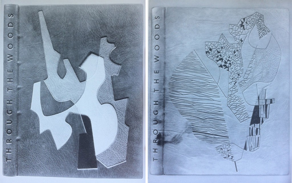
    left side: Bound in 1959 in a native dyed red morocco. The inlaid design spans over four levels built into the cover; inlay leather of chrome yellow, warm black, stone, neutralised green, natural and lemon yellow. All tooling in blind.

    right side: Bound in 1959 in a native tanned natural morocco with natural markings. The grain was creased during covering. All tooling in blind; the solid areas are built up with a short pallet to produce tonal and textural variations.

    left side: Bound in 1960 in a native tanned natural morocco. Inlaid design spans over three levels built into the cover; inlay leather of white, yellows, orange, browns and greens. Tooling in green and blind.

    right side: Bound in 1960 in a native tanned natural morocco with creases added to the grain while covering. Brown staining was added to the areas of the leather built up. Recessed inlays in yellow, red, white, black, grey and green. Tooling in light and dark blind.


  3. November // Bookbinder of the Month: Edgar Mansfield

    November 3, 2012 by Erin Fletcher

    Edgar Mansfield was born in London in 1907. Four years later his parents took him to New Zealand where he spent the next 23 years of his life before returning to England. 

    Starting in 1948, Mansfield began teaching at the London School of Printing, where in regards to bookbinding was a advocate for expressive design inspired by the spirit of the book as opposed to decorative pattern making. Mansfield developed as a binder outside of traditional training, his approach was first as an artist and then a craftsman. However, his execution was impeccable; he excelled in inlays and onlays, shaped his own finishing tools, and developed a technique to heighten the texture of leather during cover. Fellow binder Trevor Jones wrote the following after Mansfield’s death in 1996:

    The nature of the surface of a Mansfield binding and its tactile quality is most important, as befits the work of a sculptor. His preference was always for unpolished and unpressed goatskin enlivened with surface markings and blemishes, especially the native tanned and dyed skins once obtainable from Nigeria that displayed variations of tone and colour, if necessary with his own added ink markings. He often heightened the grain texture on the leather of his bindings by rolling the damp skin on itself before pasting, and later brushing towards the spine with the palm of his hand across the surface of the leather in the act of covering the book….

    read more >


  4. My Hand…Exhibition on Buy Some Damn Art

    October 30, 2012 by Erin Fletcher

    Check out the six Roald Dahl titles I rebound for Buy Some Damn Art. At the beginning of each week I will feature a post on the creative process behind each binding. Check out this week’s post on Fantastic Mr. Fox.


  5. My Hand…Fantastic Mr. Fox

    October 29, 2012 by Erin Fletcher

    Starting tomorrow at Buy Some Damn Art, six of my books will be featured and on sale for six weeks. Follow my blog during that time to see a post on the making of each title.  

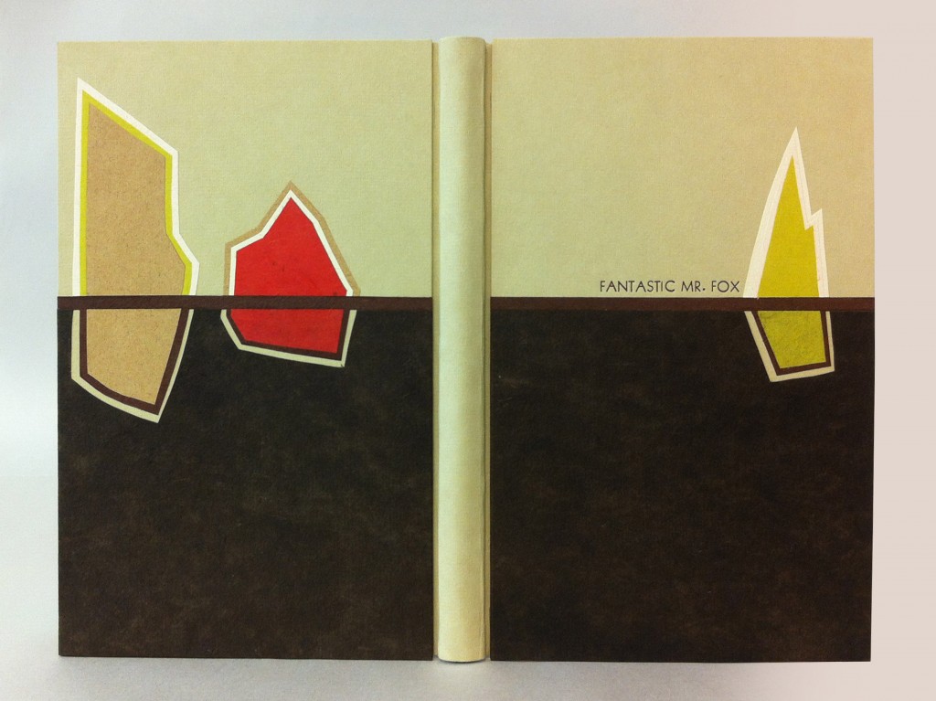
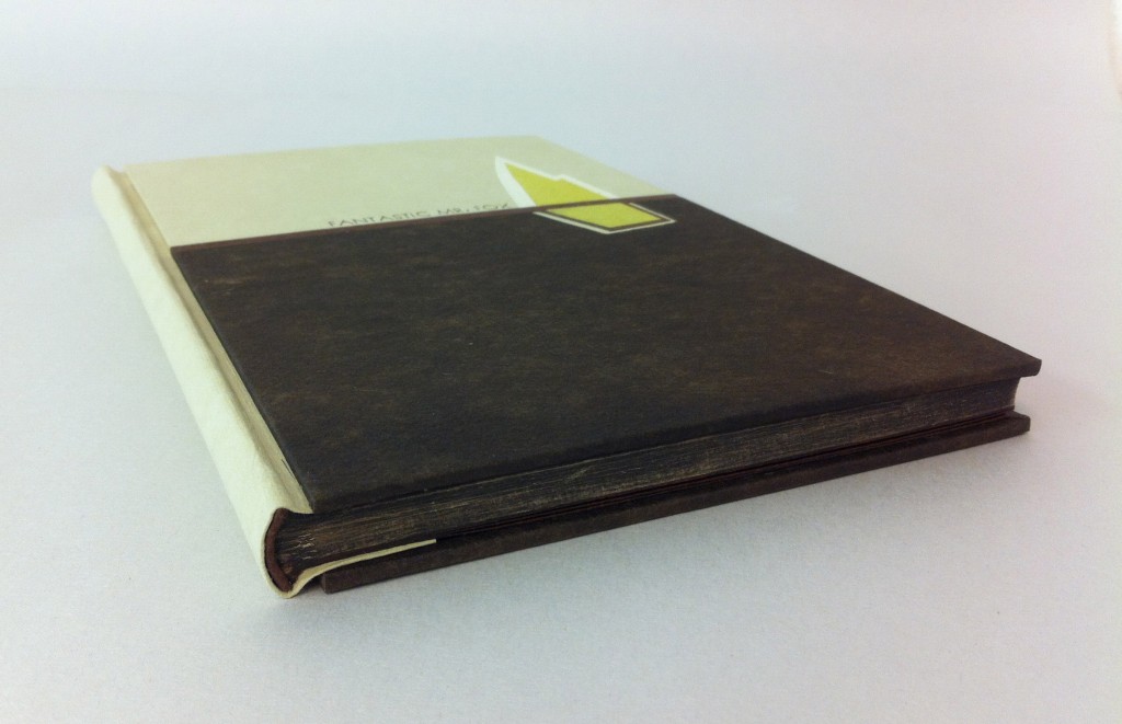
    I’ve been greatly inspired by Art Deco bindings and wanted to incorporate that style into this binding of Fantastic Mr. Fox by Roald Dahl. As a child I read this story over and over, imagining blueprints of the underground tunnels created by those devious foxes. In the spirit of Art Deco design I simplified these underground channels, wrapping them around three colorful, geometric farmhouses. 

    The binding is a variation on a German case structure by Peter Verheyen where the boards are covered separately from the book. The spine and boards were covered with earth Hahnmühle Ingres. To make the farmhouses I layered various handmade and commercially made papers which include Moriki, Hahnmühle Ingres, Cave Paper and Lokta. There is a line of red walnut Cave Paper running the width of each board representing the ground and dividing up the levels of the farmhouses; the walnut Cave Paper is the dirt far below the top soil, highlighting the tunnels around each farmhouse. The title was stamped in a sans serif typeface with brown foil.

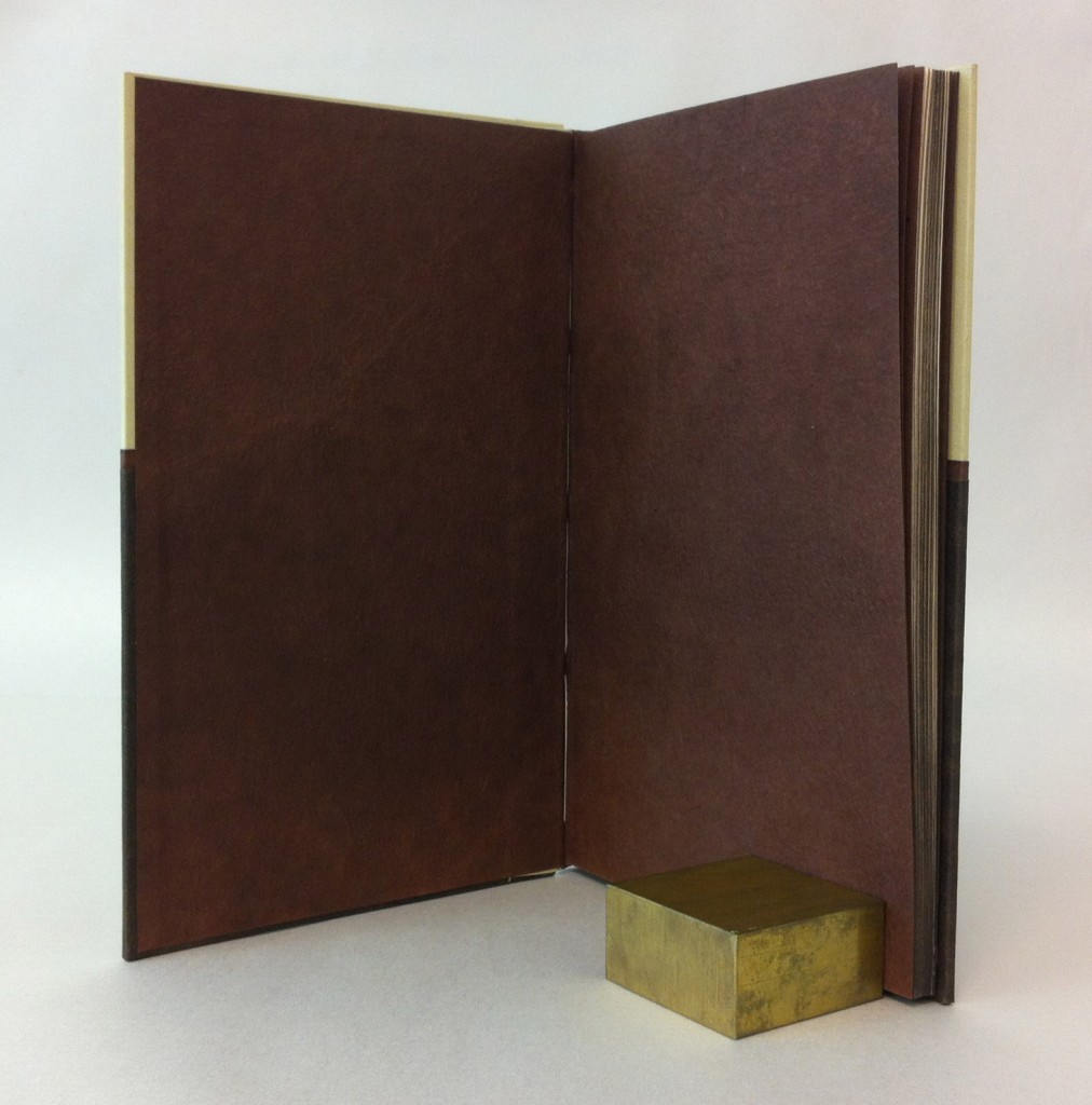
    The headbands are wrapped red walnut Cave Paper around cord. The edges were painted with an acrylic/paste wash, once dry the edges were carefully brushed with sandpaper to give a more textural look. The end papers are red walnut Cave Paper. I loved using Cave Paper for this binding for a few reasons: the handmade quality, use of natural dyes and the textural characteristics seemed most suitable to represent the living, moist dirt deep underground. The book is housed in a clamshell box. The trays are covered in lime Moriki and lined with rose Hahnmühle Ingres and the case is covered with brown Canapetta. 


  6. Bookbinder of the Month: Rose Adler

    October 28, 2012 by Erin Fletcher

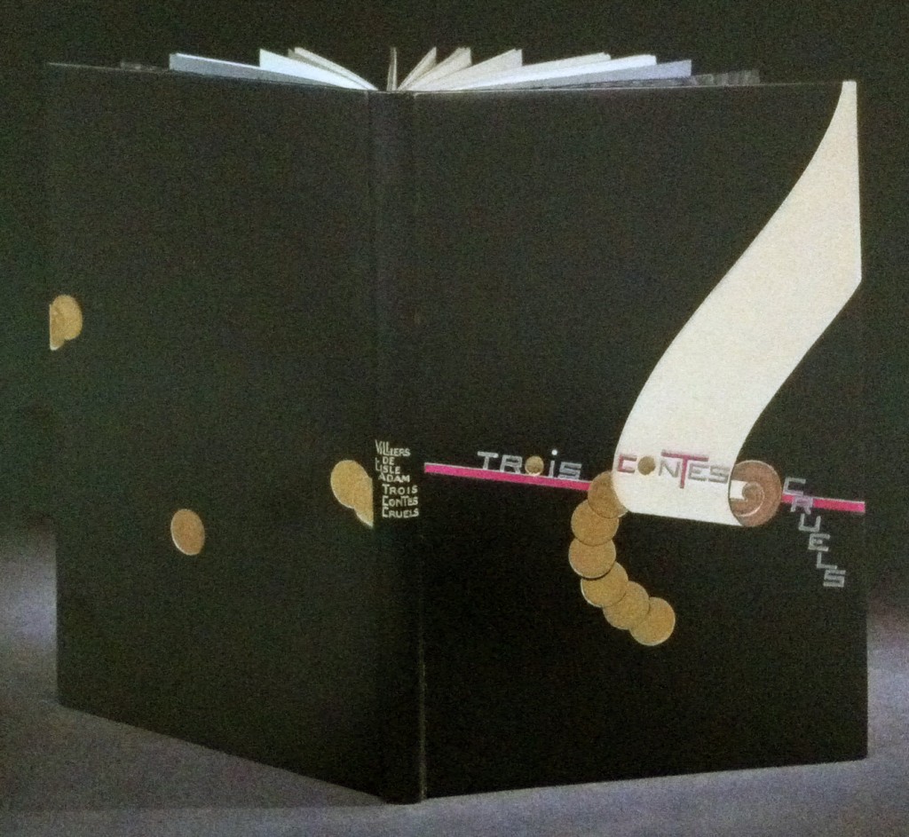
    Bound in full black calf is this 1927 edition of Auguste de Villiers de L’Isle-Adam’s Trois contes cruels with illustrations by Jean-Emile Laboureur.  Rose Adler created the design for the binding in 1929, which was then executed by Emmanuel Lecarpentier. The scroll design is created with ivory and beige calf onlays with a purple calf line onlay running behind and roundels are tooled in solid gilt. Title is tooled in aluminum, inlays of purple calf and gilt tooling, author’s name and title tooled in gilt on the spine. Doublures in beige calf with a pattern of black and purple calf at the bottom where Rose Adler’s signature can be found. Endleaves of alternating purple and aluminum watered silk; second endleaves of glazed aluminum paper. 

    The design is representative of the geometric focus of the first period of the Art Deco era. The design is quite striking, the roundels and descending title create a perfect balance along either side of the scroll.  

    Check out Art Deco Bookbindings: The Work of Pierre Legrain and Rose Adler for more of Rose Adler’s work.  


  7. My Hand…Exhibition on Buy Some Damn Art

    October 25, 2012 by Erin Fletcher

    Check out my show on October 30th over at Buy Some Damn Art.  I rebound 6 titles from the crafty and clever Roald Dahl (my childhood favorite).  All of the books are for sale and would make the perfect addition to your library.

    Stay updated on upcoming exhibitions by signing up to BSDA’s mailing list.  Every week you are introduced to exciting artistic talents, plus at a low cost you can start covering those bare walls or shelves. 


  8. Bookbinder of the Month: Rose Adler

    October 21, 2012 by Erin Fletcher

    Simulacre, a surrealist novella by Michel Leiris with illustration by French artist André Masson was printed in 1925. The binding was designed by Rose Adler and executed by Emmanuel Lecarpentier in 1927. Bound in full black calf with an inlay of cabochon of agate capping off a semi-oval of coral-pink crocodile set within an aluminum fillet. Title on the spine overlaps an inlay of red calf, tooled with aluminum on the black and black on the red. 

    The edges are gilt in aluminum, full leather doublures lacquered in gilt with endleaves of black watered silk. This is an impeccable binding, the vast negative space is perfectly balance against the bold and highly textured crocodile skin.


  9. Bookbinder of the Month: Rose Adler

    October 14, 2012 by Erin Fletcher

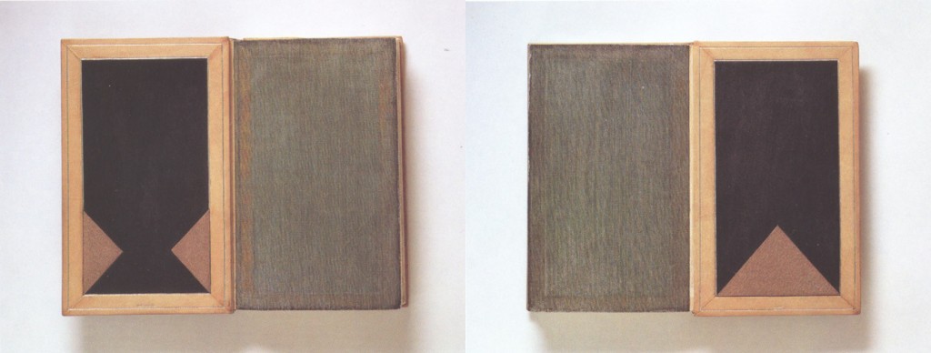
    In 1930, Rose Adler created this design for Francis de Croisset’s Aux fétes de Kapurthala, the binding was executed by Emmanuel Lecarpentier for Jacque Doucet’s collection. Bound in citron calf, the front cover has an inlay of cabochon of chrysoprase topped with a patterned band of black and ivory calf outlined in a gold gilt fillet, at the base of the cover is an inlay of black calf. The title and author’s name has been tooled blind along the spine. Edges are gilt with aluminum. Doublures of ivory calf line the inside of each board paired with black watered silk flyleaves.  

    The book is housed in a wrapper and slipcase decorated with black, orange and gold paper, bordered with citron calf. The wrapper doublure is done with almond-green, hard-grained leather.


  10. Bookbinder of the Month: Rose Adler

    October 7, 2012 by Erin Fletcher

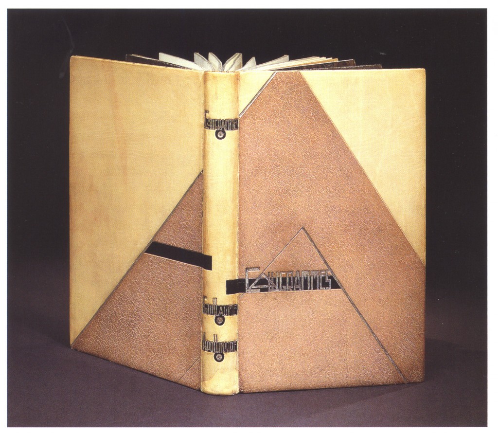
    In 1918, this copy of Guillaume Apollinaire’s Calligrammes: Poémes de la paix et de la guerre was printed with an original etching by Pablo Picasso (engraved by René Jaudon) and an original drawing by René Jaudon. In 1925, Rose Adler created the design and the binding was executed by Adolphe Cuzin for Jacques Doucet’s collection.

    Bound in ivory calfskin with overlapping inlays of black calf and beige goatskin. All tooling on cover and gilding on the edges has been done in aluminum. The turn-ins are ivory calf embellished with aluminum fillets bordering an inlay panel of black calf with a mosaic of beige goatskin. The fly leaf is silver lamé (fabric woven or knit with thin ribbons of metallic threads). The binding is housed in a wrapper and slipcase of aluminum paper framed by red and black calf.  The title and author’s name are tooled over three inlays of beige goatskin in aluminum over a black spine.


  • My name is Erin Fletcher, owner and bookbinder of Herringbone Bindery in Boston. Flash of the Hand is a space where I share my process and inspirations.
    The StudioNewsletterInstagramEmail me
  • Archives