RSS Feed

‘bookbinding’ Category

  1. Guild of Book Workers – Standards of Excellence Seminar // Las Vegas 2014

    October 28, 2014 by Erin Fletcher

    The 2014 Guild of Book Workers Standards of Excellence Seminar was located in Las Vegas at the Excalibur Hotel. My initial experience of the city was enchanting. As my first trip to Las Vegas, the lights and sights were captivating and surreal. The city is constantly bustling with excitement and anticipation. However, these abstractions of Vegas began to weigh on my experience.

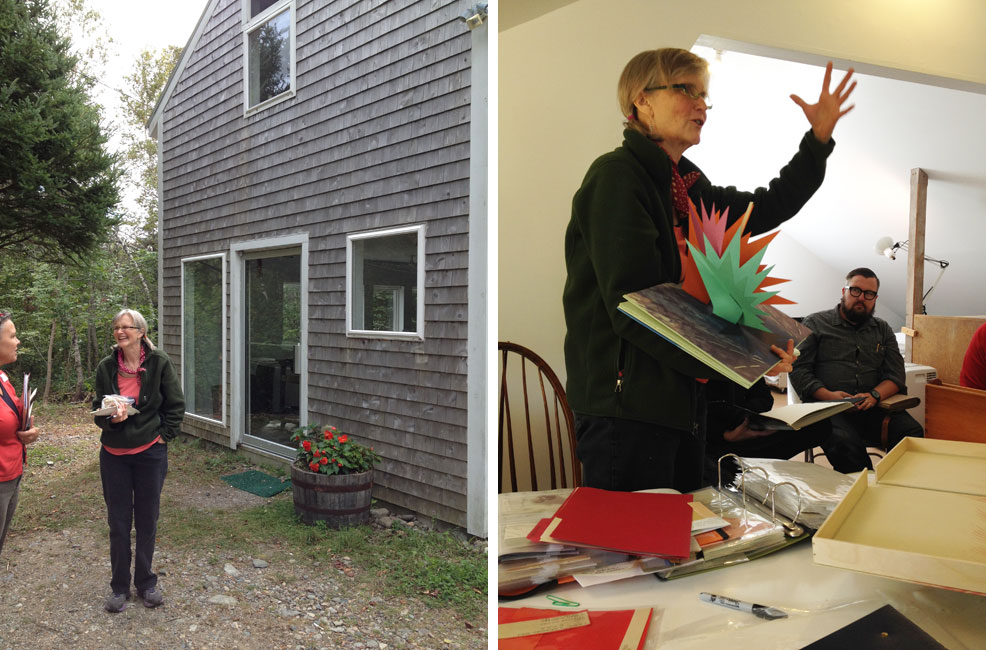
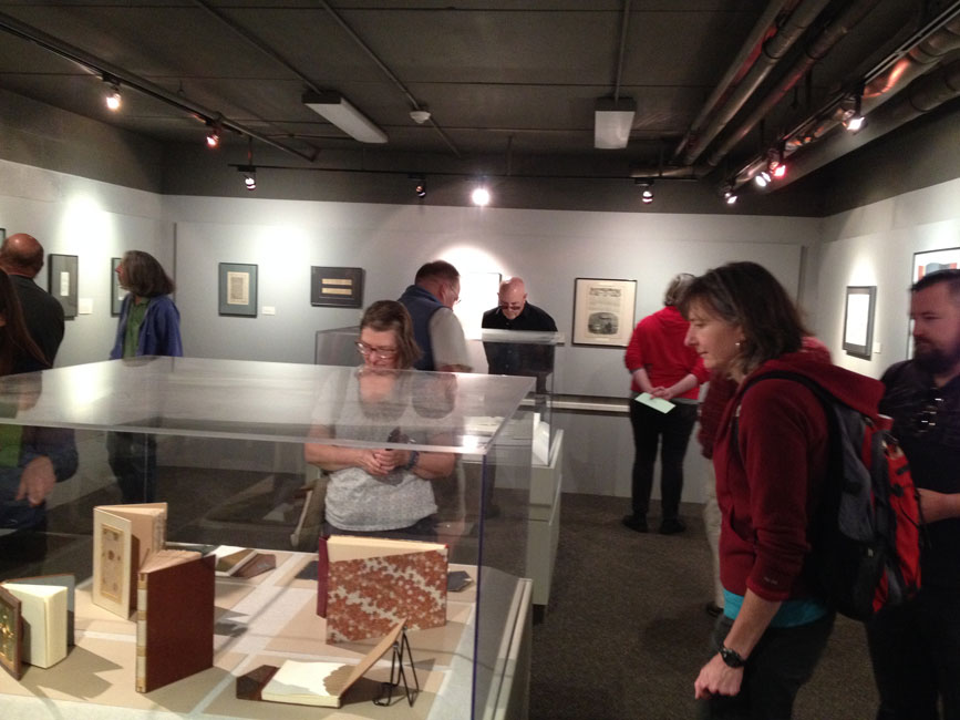
    Despite the circumstances, I thoroughly enjoyed myself at the Seminar and within this post I will present an overview of the events. Each Standards of Excellence Seminar includes a tour. The conservation lab at the University of Nevada, Las Vegas invited the attendees to view their facilities and see an overview of their collection, means of repair and exhibits.

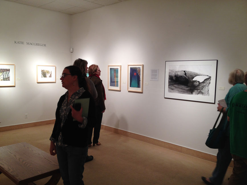
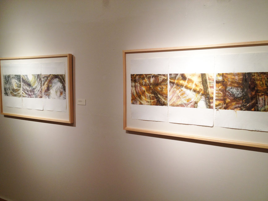
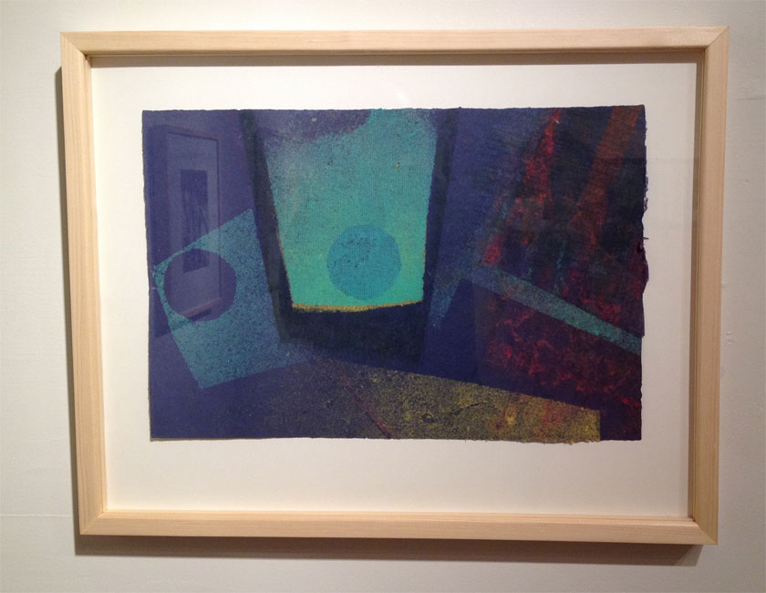
    The official start of the Seminar occurred later that day with an opening reception at the University outside the Barrick Museum. We gathered outside in the warm weather to some treats and libations. The museum was open to us as well and featured a selection of contemporary 2-d and 3-d art juxtaposed with an exhibit of baskets from the Southern Paiute and Shoshone of southern Nevada. The reception is a great way to see who is attending and offers an opportunity to rekindle connections. There are a variety of people whom I connect with every year at Standards, which is one reason I love to attend the Seminar.

    Standards1-ErinFletcher

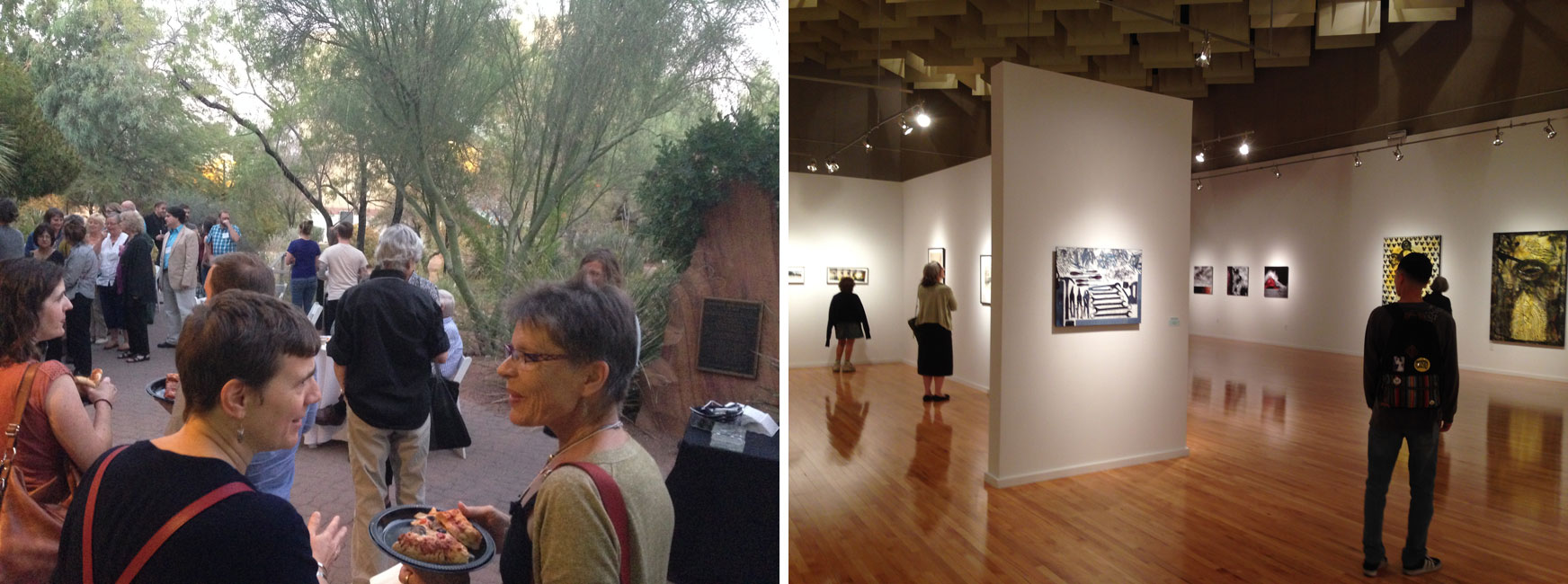
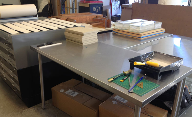
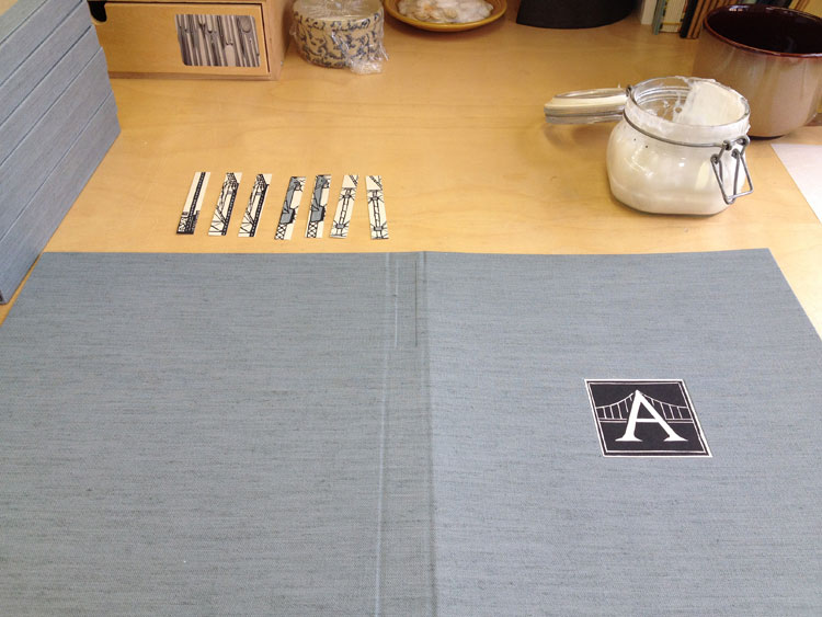
    The first full day of the Seminar included two of the four presentations and ended with a Mix and Mingle event. In addition to those happenings, is the the vendor room. Each year the vendor room is filled with colorful leathers, handmade papers, bindery tools and more. There are many vendors who are staples of the vendor room and many who are new to the crowd. I’m always pleased to chat with the vendors, it’s so wonderful to have a personal relationship with the people who supply our materials. But on to main event: the very first presentation was by Emily Martin.

    Standards2-ErinFletcher

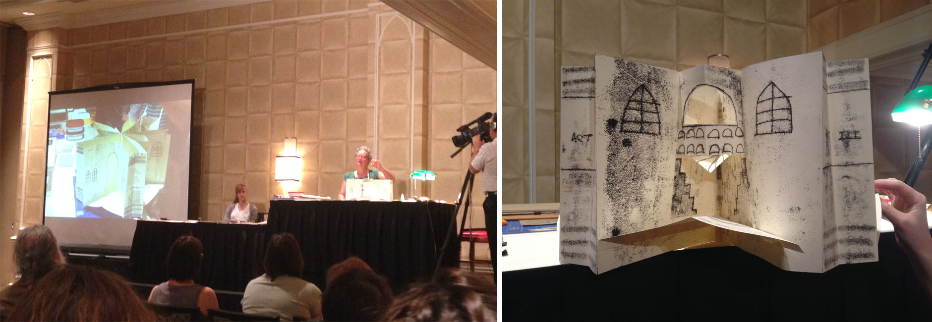
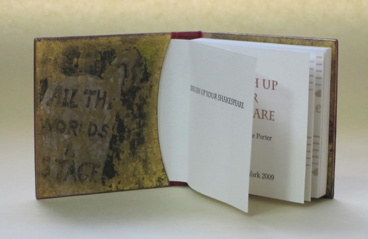
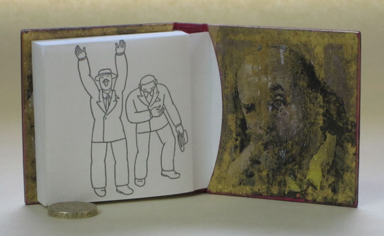
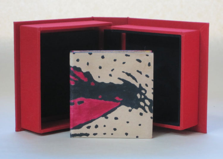
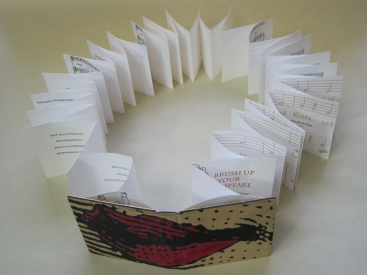
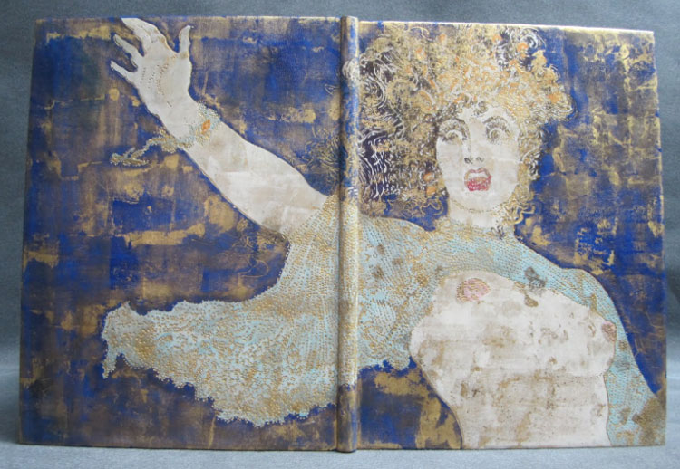
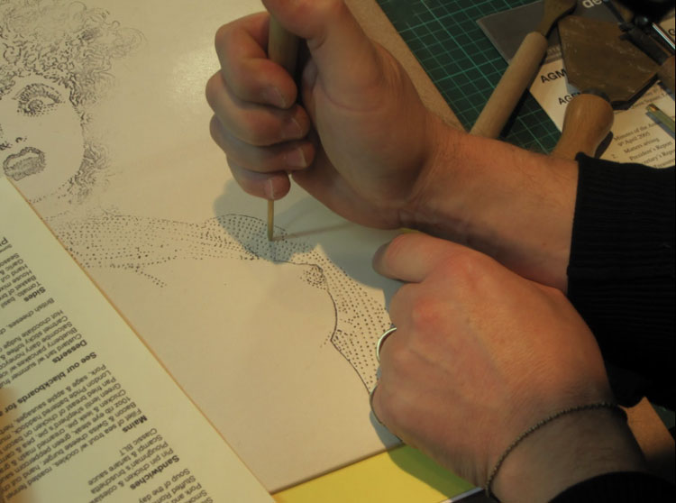
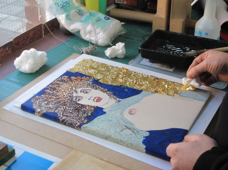
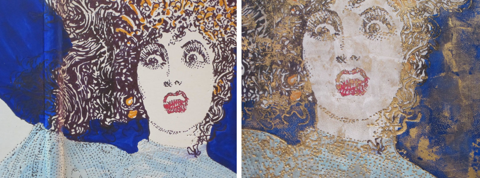
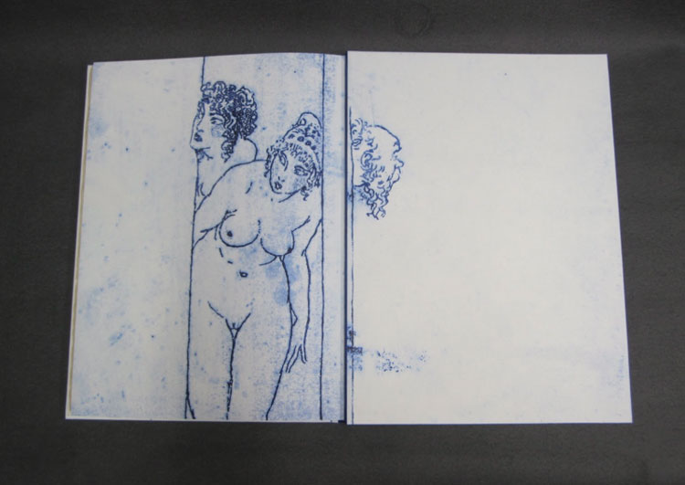
    Emily’s artist book, The Tragedy of Romeo and Juliet, was a Distinguished Winner for the Designer Bookbinders 2013 International Bookbinding Competition and became the subject of her presentation on Carousel Books. This style of binding was first used in the 1930s becoming more popular after WWII. There are two main types of carousel books: 1) floor and wall and 2) window (or starbook). Emily’s presentation was so well executed as she demonstrated how she created a hybrid of the two types for her Shakespeare book. Her instruction was easy to follow as she demonstrated her creative process and the steps for constructing an elaborate carousel book. One other element that I enjoyed from Emily’s presentation was her use of trace monotype as a means of creating illustration.

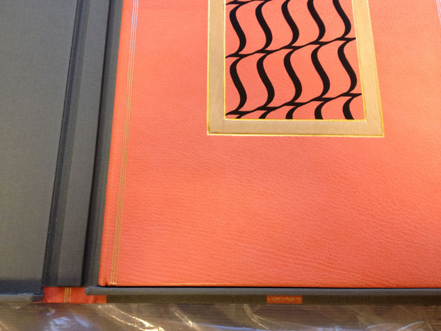
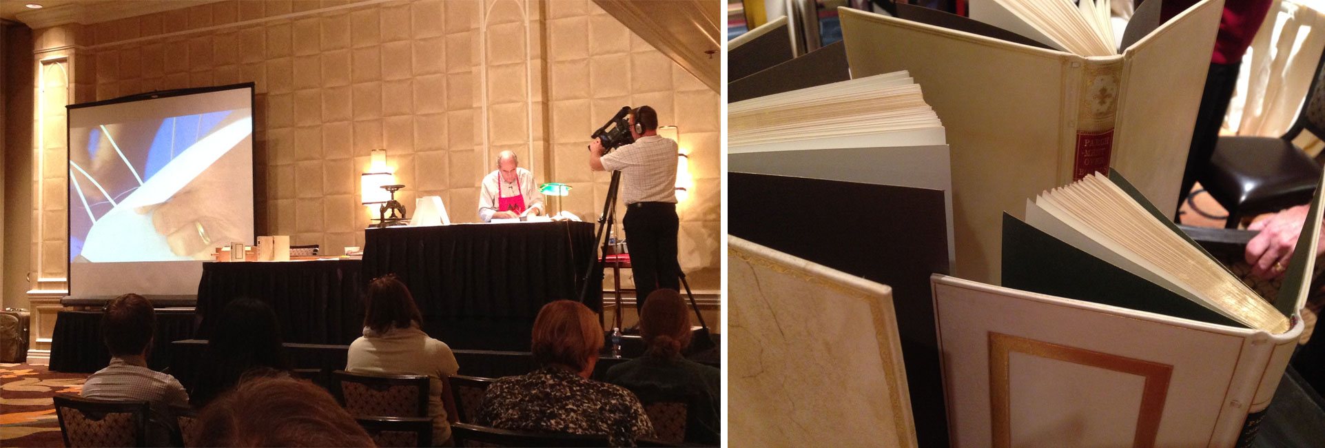
    The second presentation was on Parchment Over Boards from Peter Geraty. This is a structure that I have learned directly from Peter, while I was a student at North Bennet Street School. So Peter’s presentation was a wonderful refresher to a structure that I am currently working on in my studio. Due to the short-time frame of the presentations, many of the steps had to be rush through, but Peter did a wonderful job of completing the major parts of the binding. It was particularly nice to see how to shape the headcap, which can be quite difficult when working in parchment.

    Standards3-ErinFletcher

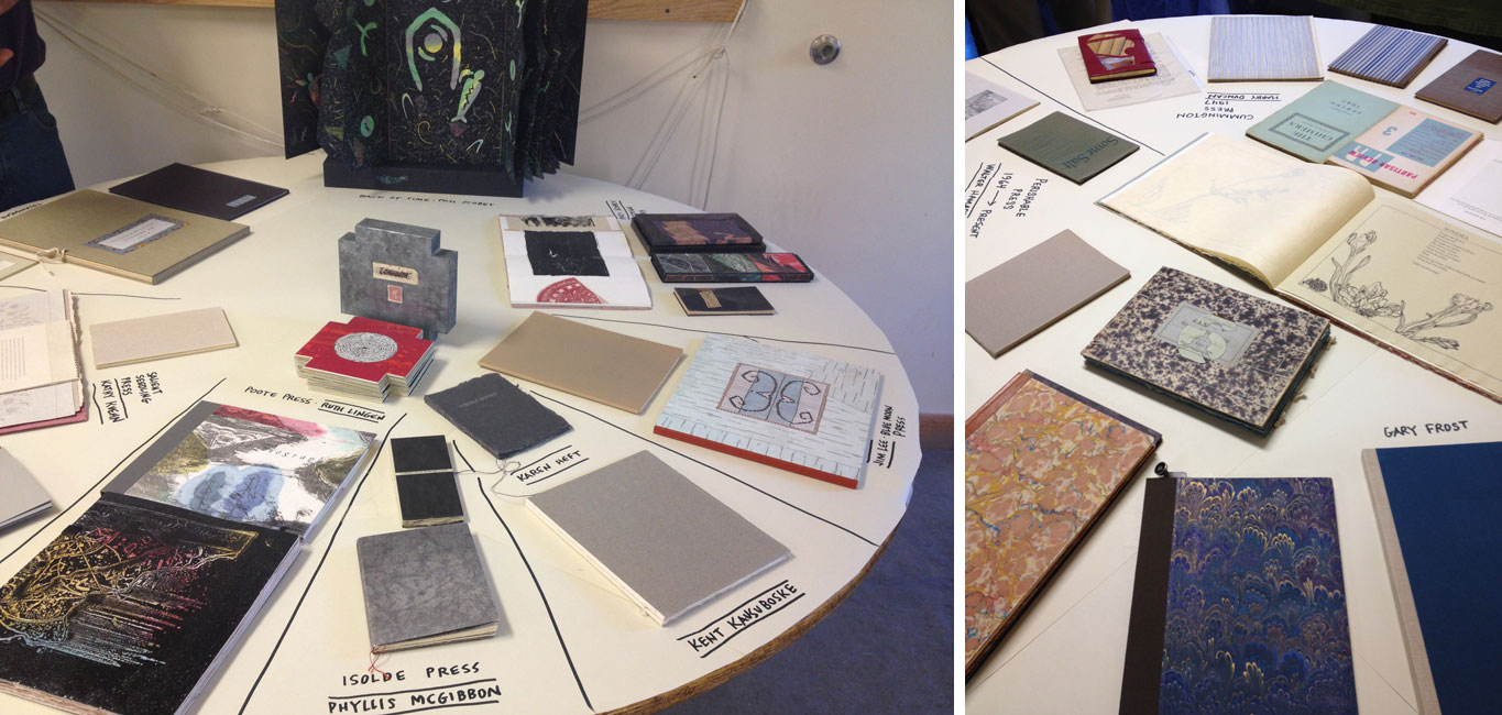
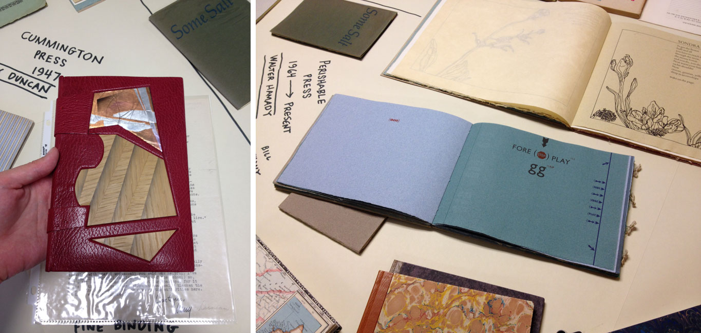
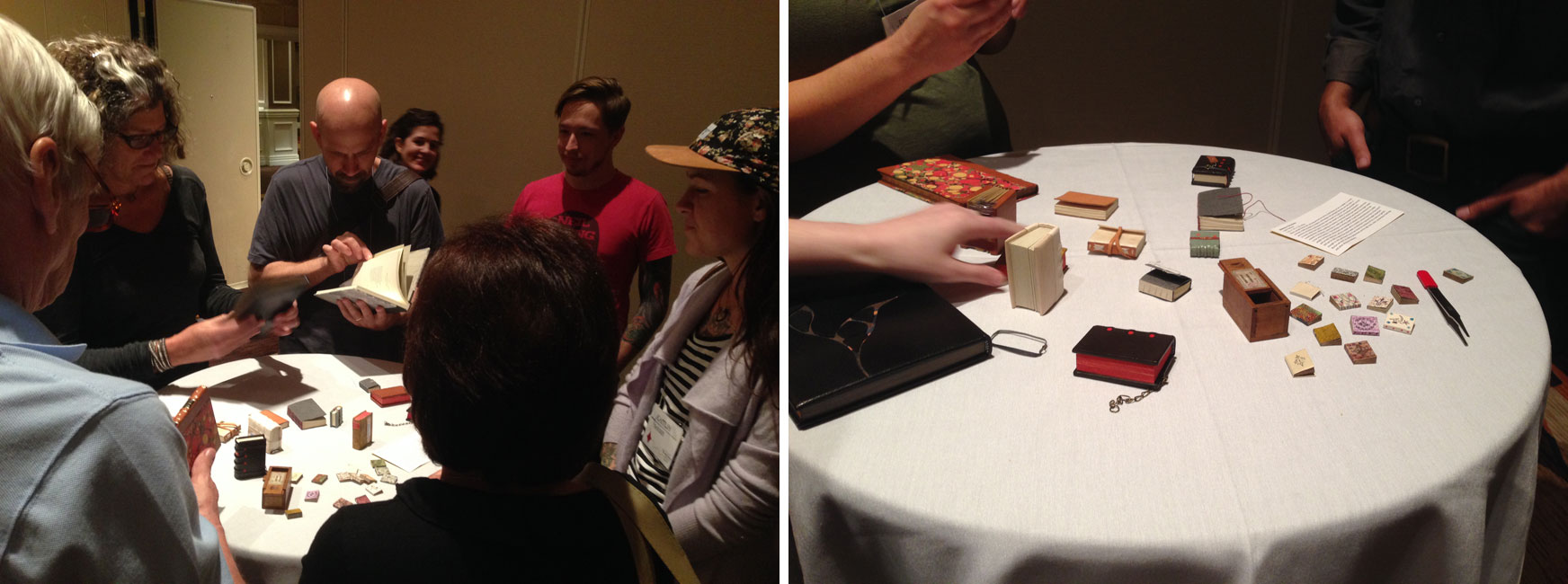
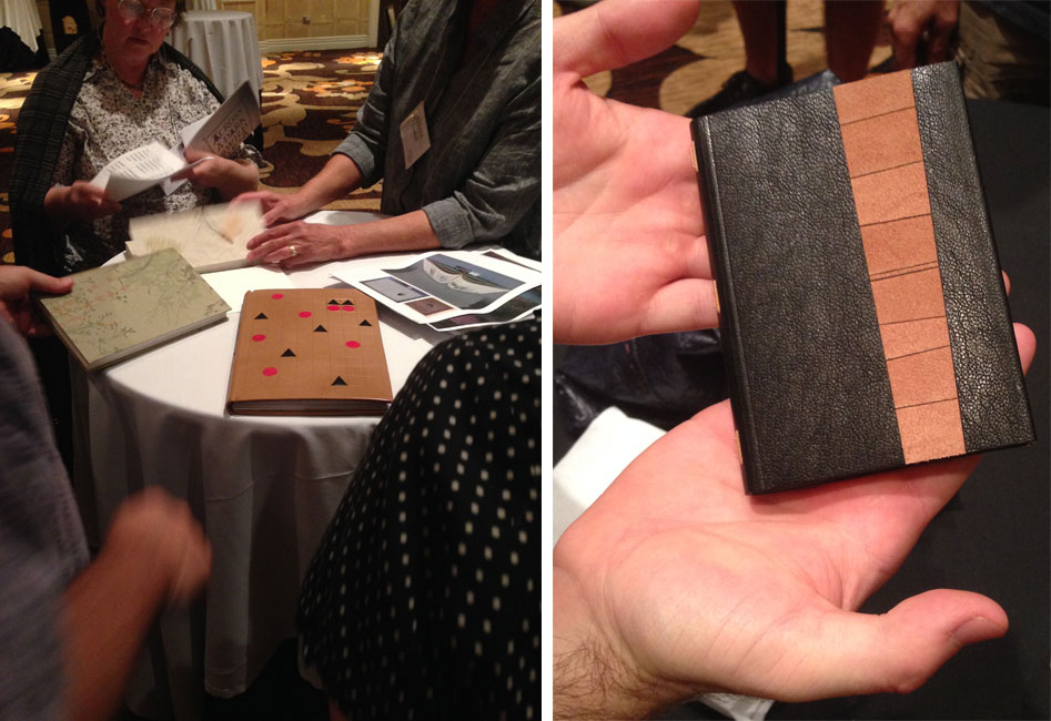
    The first full day of the Seminar ended with a Mix and Mingle event, which is an informal way to show off your more recent work to the fellow attendees. A few tables were filled with a variety of book related projects from miniature bindings and finely printed artist books to handmade tools and fine bindings. It’s always delightful to handle books and have the opportunity to speak with the craftsperson about their work. This Mix and Mingle event is quite a new addition to Standards, only happening once before at last year’s Seminar, but I hope it will continue. It’s a wonderful way to engage in creative conversation with fellow bookbinders and conservators.

    Standards4-ErinFletcher Standards5-ErinFletcher

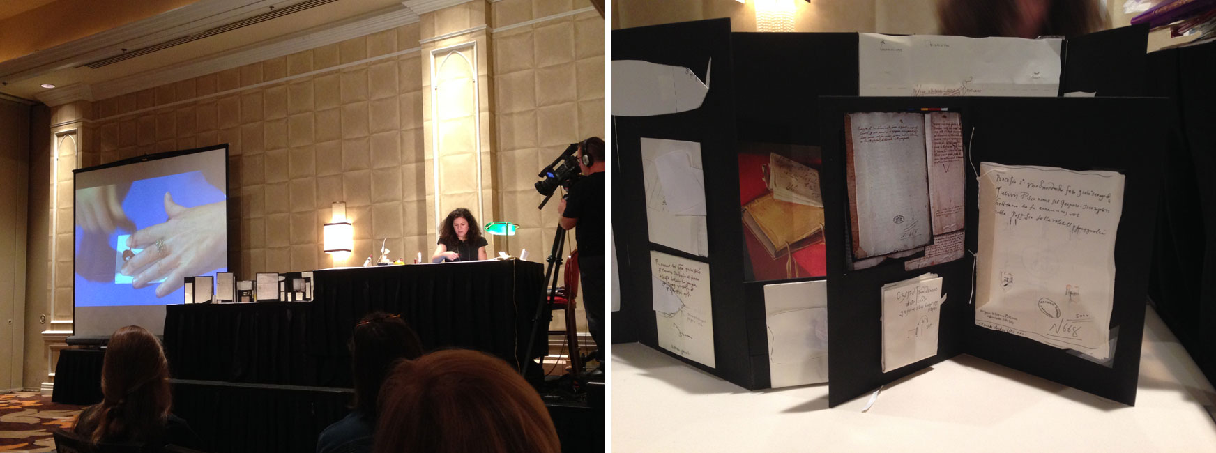
    At the start of the second day of the Seminar was a presentation on Historical Letterlocking by Jana D’ambrogio. I really enjoyed Jana’s presentation because her enthusiasm for the subject of letterlocking was quite infectious. She presented on several letterlocking variations, detailing the folds and locking techniques used in order to secure a letter of importance. And there were quite a lot of variations from using the same material to create the lock, penetrating through all folded layers, pleating, triangular lock, the penguin lock and using wax seals. Every locked letter that Jana demonstrated was based on an actual letter, that had been deeply researched and investigated by Jana herself. She has traveled all over the world viewing various letters to decipher their letterlocking structures. All this research is just the start of a new database of information and a new lexicon on the habits of security during the 15th – 16th century.

    Jana wrapped the audience into her presentation as we were tasked to unlock our own letter. She also demonstrated a quick and easy way to lock a letter into a triangular shape, which can be sent through the mail even today.

    Standards6-ErinFletcher

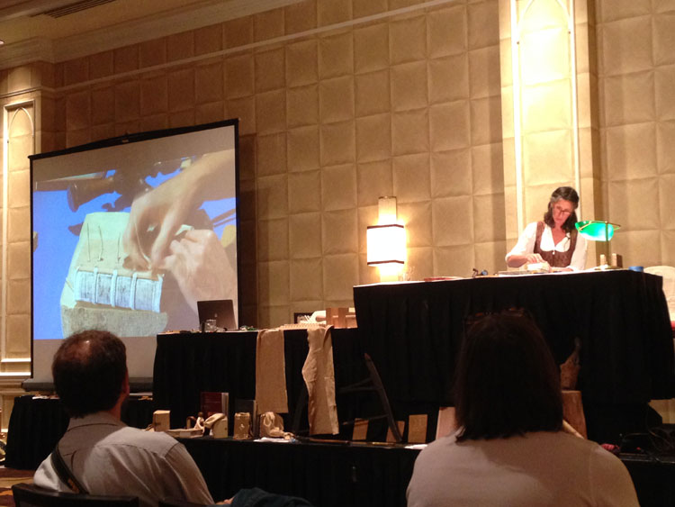
    To wrap up the day was the final presentation on the Traditional Medieval Girdle Book given by Renate Mesmer. In Germany the girdle book is called Das Beutelbuch and was a symbol of faith or status within society of the 15th century. The texts were either religious or legal. Around 800 girdle books can be found in art, yet only 23 physical examples are known worldwide (most in Germany and only 14 in their original cover). The structure of the book is similar to most 15th century wooden board bindings, there are so many variations to the sewing pattern, sewing support, endpapers and spine linings. Renate demonstrated the construction of the binding before moving on the creation of the girdle and Turk’s head knot.

    Renate also engaged the audience’s participation by attempting to teach us the Turk’s head knot using a bouncy ball and a long, thin piece of leather. It was quite difficult to say the least.

    Throughout Renate’s presentation, the audience was enchanted by spurts of medieval knowledge from Jim Croft, who joined the stage to discuss wood and brass hinges.

    Standards7-ErinFletcher

    The final event of the Seminar is the banquet, this year attendees were invited to dress in medieval garb (which is why Renate is dressed so appropriately during her presentation). And thanks to my classmate, Caitlyn Thompson, many of the NBSS students and alum donned hand-crocheted crowns. During dessert, the Guild’s President Mark Andersson, presented the Laura Young Award to Julia Miller and the Lifetime Achievement award to Sam Ellenport. The former is presented to someone who has served the Guild in an outstanding manner. The latter award was presented to Sam Ellenport for the countless ways he has influenced the field of bookbinding. Many people have been affected by his influence, for example, Sam was instrumental in created the bookbinding program at North Bennet Street School.

    Following the food and awards, is the real excitement of the night: the auction. Scholarship winners parade around the room with the items up for auction and excitement ensues amongst the crowd. I was delighted to participate this year for the first time and walked away with two beautiful pieces of suede that were so gorgeously decorated and altered by Coleen Curry. And thanks to Colin Urbina, I also got a dogtooth burnisher.

    Standards8-ErinFletcher

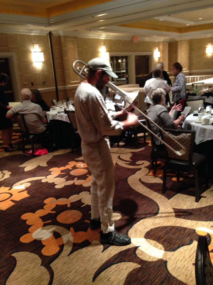
    My night ended with several goodbyes, some lovely music from Jim Croft and an excellent show and tell from Don Glaister.

    Although, I was eager to leave Vegas, I had a wonderful time at the Seminar. Looking forward to seeing all my book friends and colleagues next year in Nashville.


  2. Fort Point Arts Community Open Studios // October 17 – 19

    October 14, 2014 by Erin Fletcher

    FPAC-OpenStudios

    Come by the historic waterfront neighborhood of Fort Point for the 35th FPAC Open Studios. Stroll through the many warehouses that are home to painters, sculptors, ceramicists, jewelers, performance artists, printmakers, book artists, photographers and more. Herringbone Bindery will be participating along with Colin Urbina of Third Year Studio at 369 Congress Street on the 6th floor.

    I’ll be around to show off some of my work both completed and in progress. I will also have a selection of items for sale, all of which can be found in my Etsy shop.

    Ours is just one of the 14 buildings in the Fort Point neighborhood, as well as galleries and pop-up exhibit venues. All buildings are in easy walking distance of each other. However, there will be a free shuttle to help you get around the neighborhood.

    The event is free to the public with free parking available! You can’t beat that. For more details and directions check out the Fort Point Arts Community website.


  3. Bright Light City Gonna Set My Soul

    October 7, 2014 by Erin Fletcher

    J-Wiley-Photography-rural-countryside-pastoral-pasture-urban-gritty-landscape-las-vegas-neon-sign-boneyard-roadtrip-mountains-sunlight-2698

    I’ll be embarking on a trip to the City of Lights for the Guild of Book Workers annual Standards of Excellence Seminar, which will take place at the Excalibur Hotel. I’m looking forward to the late night excitement, warm weather and chatting with all the wonderful book-y people attracted to this event. Plus all the leather (for bookbinding, of course) that I’ll be buying.

    Look forward to a post about the Seminar upon my return mid-October.


  4. New England Chapter of the Guild of Book Workers // Mini-Conference in Maine – Day Two

    October 5, 2014 by Erin Fletcher

    SATURDAY, SEPTEMBER 13
    9:00 – 12:00
    Morning Workshop Session
    The mini-conference offered two half-day workshops with calligrapher, Nancy Leavitt and papermaker, Katie MacGregor. The group of participants were divided into two groups. For the morning session, I attended Nancy’s workshop titled Pen, Paper and Paint.

    Nancy’s first attempt at calligraphy came by inspiration from a Seventeen article; clipping the tip off of a felt tip pen. To pursue the practice of calligraphy, Nancy studied with Peter Halliday in the 1980s. Even though the workshop lasted for only three hours, Nancy was able to pack years of knowledge into her instructions.

    At the start of the workshop, Nancy presented her creative process. When commissioned to calligraph the lyrics to six Beatles’ songs, Nancy took the project beyond the initial request and created an in-depth artist book to incorporate the historical and social events occurring at the release of each song. In the image below, Nancy shows us her charts and mock-ups developed during the creative process.

    MaineConferenceTour17-ErinFletcher MaineConferenceTour12-ErinFletcher

    After whipping up some egg glaire and adding water to the gouache one drop at a time, Nancy presented some tips on mixing paint, filling pen nibs, and painting. Each student received a special packet of paper varieties. One half of the packet included a selection of Katie MacGregor’s handmade paper ranging from 1 day old to 20 years old. Nancy loves to allow her paper to ‘age’ because it creates a more agreeable surface to work on.

    As we experimented with the paper varieties and pen nibs, Nancy came around to write each of our names on the paper of our choice. Towards the end of the workshop, Nancy gave a demonstration on turning a feather into a quill. Nancy shared her amazing collection of feather quills, which are carefully and lawfully collected. First, Nancy removed the membrane from the shaft by running it along a hot iron. Then she revealed her coveted penknife from her apron, a tool specifically for shaping the tip of a quill. Each student was presented with a keepsake quill, which we played with by filling the nib with gouache and writing on each of our paper samples.

    MaineConferenceTour11-ErinFletcher

    1:00 – 4:00
    Afternoon Workshop Session

    MaineConferenceTour15-ErinFletcher

    In the afternoon, my group headed over to Katie MacGregor’s studio for our second workshop session, A Hand Papermaker’s Perspective. Her studio is just steps from her home, set back in the woods and down a long gravel road. Katie invited us upstairs first, to share with us her creative process, how she logs her formulas and a collection of books created using her papers. Katie has also worked on a variety of custom paper orders for institutions and artists, including a three sheet order for the most vibrant and saturated red she could make.

    MaineConferenceTour13-ErinFletcher

    We headed downstairs for the actual labor. Katie first mixed up a bucket of fresh pulp and pigment, which she then added to the large vat. The smaller vat was given an addition of flax. Each student was given the opportunity to pull one small sheet and one large sheet. Katie gave a quick demonstration of the proper posture and techniques for shaking the mould, then the process of tipping the mould onto the felts in order to couch the sheets. After watching Katie, each student embraced the messy, wet process of papermaking.

    As a treat, Bernie Vinzani added a special watermark to the larger sheets. Using vinyl lettering, Guild of Book Workers Maine 2014, was heated to the wire threads of the mould, a quicker alternative to the traditional technique for making watermarks.

    MaineConferenceTour14-ErinFletcher

    Once the last sheet was couched, Katie moved the paper into her hydraulic press, squeezing out the excess water. Then she carefully separated each sheet from the felts for the next stage in the drying process. As we finished the workshop, Katie’s close friends were preparing a wonderful spread of hors d’oeuvres and libations. Katie and Nancy also put together a selection of items for sale and I delightfully walked away with eleven new sheets of handmade paper, two of which I’ve already sewn into two soon to be fine bindings.

    MaineConferenceTour16-ErinFletcher

    7:00 – 9:00
    Evening Presentation
    Wild blueberries are native to parts of Maine and Canada. As an added treat for the mini-conference participants, Nancy and Katie prepared a wonderfully home-cooked meal of Blueberry Chicken over Rice. After our meal, Nancy’s husband, Blueberry Specialist David Yarborough gave a thorough presentation on the history of the blueberry plant and its involvement in Maine’s agriculture industry.

    That ends the festivities of the mini-conference. As the first event of this scope I’ve put together, I think it was a success from the point of view of the CCLC, conference participants and workshop instructors.


  5. New England Chapter of the Guild of Book Workers // Mini-Conference in Maine – Day One

    September 23, 2014 by Erin Fletcher

    What began as a simple workshop idea between myself and papermaker Katie MacGregor, turned into a weekend long mini-conference event. Over the past year, part of the NEGBW team (myself, Todd Pattison and Lauren Telepak) along with Katie MacGregor, Nancy Leavitt and Alan Furth put together the plans for a mini-conference at the Cobscook Community Learning Center in the small northeastern town of Trescott, Maine.

    To our wonderment, we had an almost full attendance and participants traveled as far as Florida and California. The conference was held from September 12th – 14th. I’m going to write about this event in two separate posts; beginning with the events on day one.

    FRIDAY, SEPTEMBER 12
    1:00 – 2:30
    Tour at University of Maine, Machias
    My day began in Boston, driving northbound toward Machias, Maine. The town of Machias is small and charming. The town had a wonderful shop called The French Cellar selling local cheeses, wines and other delicious items. I also made a stop at the local art supplies shop/framers/gallery. It was there that I picked up a beautiful piece of pottery crafted by a local artist. But the real reason to stop in Machias was for the first event of the conference.

    Also located in Machias, is the University of Maine, which enrolls about 1,000 students coming from all around New England for their undergraduate studies. An average of fifty students participate in the Book Arts Program per year. Bernie Vinzani, Director of the Book Arts Studio, lead a tour of their facility. The tour began with a trip to the gallery, displaying works by both students, local artists and historical documents.

    MaineConferenceTour2-ErinFletcher

    We then moved into the other various rooms of the Book Arts Studio, which included the bindery, print shop and a multi-purpose room. Bernie explained that the students are involved in a single project each year in which they must work together. Each student receives a particular job and they learn the process of creating a book, printing a book, assembling a book and then selling a book. The components of their most recent project was laid out for us, along with a wall display of past projects.

    MaineConferenceTour-ErinFletcher

    As a treat, a solo exhibition of Katie MacGregor’s pulp paintings and other artworks were installed early. This part of the tour was quite thrilling for me. I’ve only known the papermaking side of Katie and was intrigued by her creative side.

    MaineConferenceTour3-ErinFletcher MaineConferenceTour4-ErinFletcher

    MaineConferenceTour5-ErinFletcher

    Moon Travel – Katie MacGregor

    5:00 – 8:30
    Presentations and Evening Reception
    The conference participants reconvened at the Cobscook Community Learning Center for the evening festivities. The CCLC hosted most of the activities for the weekend and even had a lodge onsite where many of the participants slept. The lodge was newly built and our group are one of the first to occupy it. I chose a quad for economic reasons and was delighted by the four bunk beds I ended up having to myself. Each room has its own private bathroom complete with shower. 

    Starting off the evening, was a presentation from CCLC Executive Director, Alan Furth, who introduce us all to the Center by giving a brief overview of its history and mission. The Center formed in 1999 as a group of community members from the Passamquoddy Tribe, the Euro-American community, and a community of Canadians from New Brunswick wanted to improve life in this rural region. Paying particular attention to the education models of many Danish folk schools, they developed a center aimed at empowering high school students and to strengthen their community.

    The following presentation was giving by local printer and book artist, Walter Tisdale. Walter filled three tables with wonderful examples of his own work, the work of his friends and some collaborative projects. Walter began his training at the University of Wisconsin in Madison studying book arts with Walter Hamady. Although typography is his real passion, as is collaborating with writers and artists for enriching content; Walter also plays around with book forms. Walter’s aversion for glue forces him to develop innovative non-adhesive structures. Making dummies is his forte. And so he shared some of these models with us.

    MaineConferenceTour6-ErinFletcher MaineConferenceTour7-ErinFletcher

    Last, but certainly not least was a presentation by the imitable bookbinder Gray Parrot (also a local to Maine). With an early interest in 18th century bindings, Gray began to build his collection until the habit became to expensive therefore pushing his interests onto pulp and science fiction novels. Gray was an Enlgish Literature major at Harvard before he embarked on studying bookbinding with Arno Werner in Pittsfield, Massachusetts in 1971. Gray studied with Arno for less than a year before going to Ascona to learn finishing techniques.

    MaineConferenceTour8-ErinFletcher MaineConferenceTour10-ErinFletcher

    In 1973, he opened his own bindery and worked on his first edition project just a year later. To date he’s worked with some very talented printers and respectable presses such as Leonard Baskin, Barry Moser, Pennyroyal Press and Gehanna Press. In addition to his presentation, Gray brought an abundant collection of his own bindings. All of which, he let us handle and gawk at. His hand skills are superb and his tooling immaculate. Gray pays attention to every little detail and leaves no space bare without purpose. I discovered a tooled line on the top lip of a leather covered tray on a clamshell box!

    MaineConferenceTour9-ErinFletcher

    After those three exciting presentations we were eager for dinner, which was served up by a local catering business run by two sisters. Once we took our last bites of decadent chocolate cake, chatter soon arose about the possibility of seeing the Northern lights. We took a short walk out to an open field and patiently waited until a blanket of stars. Sadly, we never saw any sign of the Northern lights and headed back to the lodge to rest after our first day of the conference. (Although some of us were lucky to see a few good shooting stars!)


  6. My Hand // Boxes for Laura Davidson

    September 19, 2014 by Erin Fletcher

    LauraDavidsonBoxes6-ErinFletcher

    Photo courtesy of Laura Davidson

    A while back, I had the chance to interview the artist Laura Davidson as a part of my Book Artist of the Month series. Since then, Laura and I have stayed in contact with each other, which has given me the opportunity to view some of her works in their various stages. Most recently Laura completed a set of prints illustrating various bridges across the country. These six bridges were chosen due to their close proximity to the many spaces Laura views as home. The act of crossing these bridges, Laura is filled with the anticipation of almost being home, therefore, the set of prints are aptly titled Almost Home.

    AlmostHome2-LauraDavidson

    Photo courtesy of Laura Davidson

    AlmostHome3-LauraDavidson

    Photo courtesy of Laura Davidson

    Laura presented me with the opportunity to build an edition of boxes to house the prints from her Almost Home series. I was quite elated. I’ve really enjoyed Laura’s work and was excited to be working with her. Laura knew she wanted a clamshell box, something sleek and clean. I’m came by her studio and we discussed material options and how the prints would fit in the box.

    After everything was settled and the materials were ordered, I began working on the small edition of 8 clamshell boxes. Clamshell boxes are pretty straight forward, but with Laura’s boxes I would be adding a few custom elements. First, the base of the interior tray would include some padding. The prints themselves had no discernible thickness, but Laura wanted the box to be at least ½” thick.  So the outward appearance of the box was the right height for Laura and the interior height of the tray was right for the prints.

    Once the binders board was cut and the trays were assembled, it was time to cover them. Laura chose silver Canapetta cloth for its durability and textural qualities. The color also complimented the prints and the industrial feel of bridges. To streamline the process I used a small paint roller and paint tray filled with PVA.

    LauraDavidsonBoxes7-ErinFletcherLauraDavidsonBoxes2-ErinFletcher

    The second custom element came as the material used on the lining of the trays. Laura provided me with 8 sheets of hand-drawn decorative paper. Using a combination of ink and markers, Laura’s custom lining paper pulled imagery from the prints and grabbed colors from the boxes and brown wrapper. Below is an image of one of the finished boxes showcasing the lining.

    LauraDavidsonBoxes9-ErinFletcher

    Finally, it was time to make the cases, which were also covered in silver Canapetta cloth. Before covering, however, I had to create a label well on the front cover board and the spine piece. Each of these wells would be filled with a printed label that Laura had provided me. I also used a paint roller to streamline the process of making the cases.

    LauraDavidsonBoxes3-ErinFletcherLauraDavidsonBoxes4-ErinFletcher

    The hand-printed label on the front cover is an ‘A’ both acting as the support beams of the bridge and the first letter to the title of the series. The label on the spine came from extra prints from the series. Laura artistically cut down the print to isolate some compelling and inciting imagery.

    It was quite a joy to create these boxes and to work for an artist as talented as Laura!

    LauraDavidsonBoxes5-ErinFletcher

    Photo courtesy of Laura Davidson

    LauraDavidsonBoxes8-ErinFletcher

    Photo courtesy of Laura Davidson


  7. My Hand // Recreating the Stepped Roofs of Bermuda on a Book

    August 25, 2014 by Erin Fletcher

    Bermuda3-ErinFletcher

    A client of mine presented me with a copy of Residence in Bermuda, a promotional text published by Bermuda Trade Development Board in an edition of 2,000 copies. This particular book was copy 591 and bound as a quarter cloth binding with a simple stamped label. My client wanted the book to be rebound in a more artistic binding, extracting colors and inspiration from one of the many photographs printed in the text.

    In search of inspiration I began to page through the book when I came across one image of a watercolor painting of an iconic Bermuda home. The imagery became my direction for the exterior of the binding; the exterior walls of the house were painted a sherbet pink, which popped against the white stepped roof. The vibrancy and brushstrokes of the surrounding landscape became my inspiration for the label on the spine.

    Bermuda5-ErinFletcher

    Since the binding needed to be completed in a fairly short time period and I wanted to work the boards separately, I chose to use a variant of the Bradel structure. Peter Verheyen published an article and tutorial titled Der Gebrochene Rücken: a variation of the German case binding, which was my guide throughout its construction.

    But before any binding could take place, the book had to be removed from its original case. The spine was cleaned by removing the lining and adhesive. The pages showed sign of age with some scuff marks here and there, which called for a bit of surface cleaning. The exterior folio was guarded with tissue to stabilize the paper in preparation for sewing. The original endpapers were quite beautiful and richly printed. However, they were not salvageable for the new binding, but I’ll come back to that later. So I created some new endpapers using three sheets of Canford paper in blush, plum and forest (all colors derived from my inspiration source).

    With the forwarding complete, I attached a piece of pared buffalo skin in the same sherbet pink of the house to the spine. The benefit of this particular binding allows the binder to use a specific material on the spine and another for the boards, so the cover is completed in three parts. This German-style of binding is very similar to the French simplified binding.

    While the book lay to rest, I started working on the boards (which in my opinion are what make this binding superb). In order to best represent the iconic stepped roofs of Bermuda architecture, I decided to create stepped boards. Once I had the final size of my boards, I went to work figuring out the proper dimensions of each layer. I made a single template of each layer which I used to draw out their placement on the boards. Each layer was attached with PVA and pressed. Finally, I glue out a piece of white Hahnemuhle Ingres (which was pre-dampened with a sponge), laid it over the board and put it in the press with some foam which helped sculpt the paper around each layer or step.

    Before attaching the boards, I placed the two labels on the spine which curved down around the shoulder and onto the flange which connects the boards to the binding. Using two separate leathers with matching metallic foil, I stamped the word RESIDENCE and BERMUDA in Gill Sans using a Kwikprint. The leather was then pared away to offer a rough silhouette of a brushstroke. The word IN was hand-tooled directly on the spine in palladium.

    Bermuda4-ErinFletcher

    A large book with white covers needs a box or it will never appear in such pristine condition again. The clamshell box was simply made with a cloth spine sided up with paper. The spine of the box includes a long paper label stamped in metallic pink with the title. The decorative paper label is a strip of the original endpaper. The trays are lined with a frame of Volara foam for the book to rest on, preventing it from teetering side to side.

    Bermuda-ErinFletcher Bermuda2-ErinFletcher

    My client was thrilled with the book’s transformation. He plans to present it as a wedding gift to the Governor of Bermuda’s daughter. I hope she is equally thrilled with my interpretation of her rich and colorful surroundings.


  8. Bookbinder of the Month: Mark Cockram

    August 24, 2014 by Erin Fletcher

    DieNibelungen-MarkCockram
    Die Nibelungen arrived in Mark Cockram‘s studio bound together with staples. After removing the pesky binding material, Mark transformed this book into an intriguing sculptural object.

    What’s the inspiration behind this sculpted binding? The additional panel almost appears to swing between each cover, although I believe it is attached to the lower cover.
    This is a charming book with fantastic illustrations. One aspect of the illustrations are the backgrounds, often of buildings. The outlines of the buildings create a framework for the rest of the illustration. I wanted to explore this with the binding. You are correct to say that the panel is attached to the back board. The concept is simple, but like a lot of simple things it works well. The edge of the binding is extended beyond the normal square. When the book is partially open the panel gives us an angular perspective, again a reflection of the illustrative style.

    The leather is hand dyed with traditional gold tooling, I tend to make my own simple tools and adapt them as I work. I set out to produce a simple, controlled, rather elegant book with angles and forms. As with all my work, I had fun making Die Nibelungen.

    DieNibelungen2-MarkCockram DieNibelungen3-MarkCockram


  9. Bookbinder of the Month: Mark Cockram

    August 17, 2014 by Erin Fletcher

    BrushUpYourShakespeare-MarkCockram

    Brush Up Your Shakespeare is a limited edition accordion from the Piccolo Press in New York. The text is a combination of music and words to the song Brush Up Your Shakespeare from the musical Kiss Me Kate (which is inspired by The Taming of the Shrew) and includes charming illustrations by Seymour Chwast.

    Mark Cockram bound a chemise in full leather fair goat with a stylized image of a pair of pouty lips. The dye was applied carefully with a brush. The doublures double as a pocket which hold the first and last pages of the text. The doublures are hand-printed using soft plate off-set and colored with a layer of worked cold gold.

    BrushUpYourShakespeare4-MarkCockram BrushUpYourShakespeare3-MarkCockramBrushUpYourShakespeare5-MarkCockram

    You mention that you weigh down the lid of the clamshell box for your miniature books. How do you go about doing this?
    For Brush Up Your Shakespeare I made a two tray drop back box. The box is the last thing to be made and the first thing to be seen. It protects, it informs and I like to think of the opening of the box like the parting of theatre curtains. The box sets the scene, it can hint at the contents, tantalising us, making us want to see inside. The opening and closing, the fit of the book can tell us, from the very outset the skill of the maker.

    I have made a number of miniature books and bindings. One of the common issues is the opening and closing of the box. The way the air is expelled as the lid closes and the slight tug of the vacuum on opening. This is not only down to the accuracy of the box, but also the weight of the materials involved, the bigger the box the heavier the overall weight of the materials. The smaller the box the more difficult it is to keep the lid closed, it has a habit of just popping open that fraction of a mil. One way to counter this is to use magnets. I do not like to use magnets for the simple reason that magnets attract metal particles (it is in the nature of magnets to do this). These metal particles can, in turn begin to rust leading to all manner of issues.

    I prefer to use lead to gently weight the upper lid. After varnishing in a metal lacquer I place the small piece of lead in a recess created in the upper tray (this is done in the construction) the recess is covered on one side by the outer case of the box and the inner lining of the upper tray. Simple and very effective.

    BrushUpYourShakespeare2-MarkCockram


  10. Bookbinder of the Month: Mark Cockram

    August 10, 2014 by Erin Fletcher

    Lysistrata-MarkCockram

    Bound in 2010, this is just one binding of Lysistrata that Mark Cockram has bound. Grabbing illustrations from the text for both the cover design, doublures and endpapers; Mark transforms them into a visual experience rarely seen on a book. The cover mimics that of a fresco painting.

    The book was bound in fair goat which was hand-dyed and the design was initially blind tooled onto the leather. Mark handcrafted 7 new tools for the book, which were modified throughout the tooling process. He discusses his technique more in depth below.

    This binding is by far my most favorite from your portfolio. There are so many artistic details I find to be rather captivating. I wanted to ask you about your technique for distressing the gold leaf?
    My glib answer would be to say that shouting at gold leaf usually distresses it, though I feel that is not the answer you were looking for.

    Though gold leaf and other metals are used in bookbinding, gold leaf and the like tend to be used in a static manner. By static manner I refer to the traditional way in which it is applied to books. Please forgive me if I do not elaborate on finishing/tooling with gold leaf, there are many books, workshops and bits and bobs on the Internet for those who wish to find out more. There is so much more to the application of gold leaf than traditional gold tooling or finishing, one only has to look outside of bookbinding to realise that.There is great skill in finishing, indeed, the training for a finisher is usually longer than for a forwarder, with the finisher being paid more. What has always made me smile is the way the layman is always amazed with the gold tooling, but fails to see the book. If it were not for the forwarder there would be nothing for the finisher to do except, perhaps, wall panels and the like. This brings to mind one lecture and one question in particular. I was asked by a very earnest student what I thought of fine binding? I asked her to tell me what a ‘fine binding’ was.  Her reply was the usual ” Well, it is full leather with gold tooling …….. of course.” After a considered pause I told her that I had seen many full leather bindings with lashings of gold tooling and that in no way would I call them fine. Any book beautifully made, balance of materials, fit for purpose, harmony of craft and art is a fine binding in my eyes. I cannot remember her response, but I do remember her looking over to a small group of people, arms folded, scowls and mumbling between themselves, whom I can only assume were her teachers. I only hope that the student began to ask questions and open not only her eyes, but ears also.I suppose that like many people, bookbinders and collectors like things to be classified to make them easy to understand. Just as a point, if one were to ask what is fine art? Would the answer be oil paint on canvas? I, of course, doubt that to be any answer that any serious artist or those appreciating the arts would give. So why is it that so many contemporary bookbinders and collectors, curators and so on appear to have the pre-impressionist salon approach to what fine binding is? To carry this forward we could argue that though both the salon artists (the establishment) and the Impressionists (non establishment) used the same materials, it was the application of the materials and the way the artists saw their work that was different. One challenged the preconceptions of what is and painted what they felt and saw, the other hid behind technique and history (I realise this is a somewhat simplified view, but I hope you get my drift). I always have half an eye on technique and history, but I will not let them get in the way or limit what I want to produce. Please do not assume that I consider myself to be in any way akin to the Impressionists, I only use them to make a point.

    With the 2010 Lysistrata I wanted to echo the illustrations in the text block. One method commonly used is to copy an illustration, have a block made and use that to do the tooling with. Another method is to transfer the image to thin paper, blind tool through that and then tool in the usual way. However, I feel that the line is static, it has no life. I know that by putting the tool down at an angle the reflected light creates an impression of movement, but there is still that feeling of it being contrived. I suppose I am of the ilk that think if you want something to look like a splash of paint then splash with paint, there is no need to spend hours, days in trying to get gold tooling to look like a spontaneous splash of paint. Are we meant to admire the technique ? That it looks so much like a spontaneous (even though it is not) splash of paint or do we admire the spontaneity of the person who is able to splash the binding with paint? The paint being an intrinsic element of the book as opposed to an applied decoration. Is this a case of seeing the technique and not seeing the book? Perhaps people find it easier to admire technique as that is quantifiable and can be tweaked, whereas the spontaneous is less quantifiable and in no way can be tweaked. The spontaneous it is less safe and one has to live with the result, in other words it is alive.

    Lysistrata6-MarkCockram Lysistrata5-MarkCockram
    Lysistrata4-MarkCockram

    I do not think that I have to say that in some of my work I am spontaneous with the 2010 Lysistrata captureing some of that working style. The leather was hand dyed off and on the book. The black line and cold gold work is loose, it is the sketch like quality of the line that creates the tension and that all so elusive movement. The gold is adhered (please do not ask me what adhesive I use, a boy has to have a secret or you could come to a workshop) to the binding after the black line work with the tooling done with a number of warmish hand tools. The gold is further worked with 000 grade, oil free, wire wool. I wanted the finished work to resemble a wall painting or fresco, I think I am somewhere near the mark. The work was a commission and I kept the client informed of progress, he would pop into the studio and watch me work. He delighted in the non formulaic approach, so far from the rest of his collection. I prefer to work with collectors that give me and the book space to breath, to expand and explore what is or maybe possible and not to rely on what has been.

    Lysistrata2-MarkCockram

  • My name is Erin Fletcher, owner and bookbinder of Herringbone Bindery in Boston. Flash of the Hand is a space where I share my process and inspirations.
    The StudioNewsletterInstagramEmail me
  • Archives