The first time I interviewed Coleen Curry was back in 2013. I am continuously inspired by Coleen’s work. She skillfully brings layers of color and texture to her work in new and interesting ways. So let’s start off the year feeling inspired to challenge and improve upon our own work with this updated interview with Coleen. We are starting off with Coleen’s binding of Of Woodland Pools, Spring-holes & Ditches.
 Of Woodland Pools, Spring-holes & Ditches was design and printed by Michael Russem of Kat Ran Press and includes 28 engravings by Abigail Rorer of Lone Oak Press. The prints are accompanied by selected entries from Henry David Thoreau’s journals from the months of March, April and May. These passages elegantly describe the early springtime landscape in New England. The woodland pools, spring-holes and ditches were all terms Thoreau used to describe the breeding grounds of wildlife as the fauna awoke from the winter season.
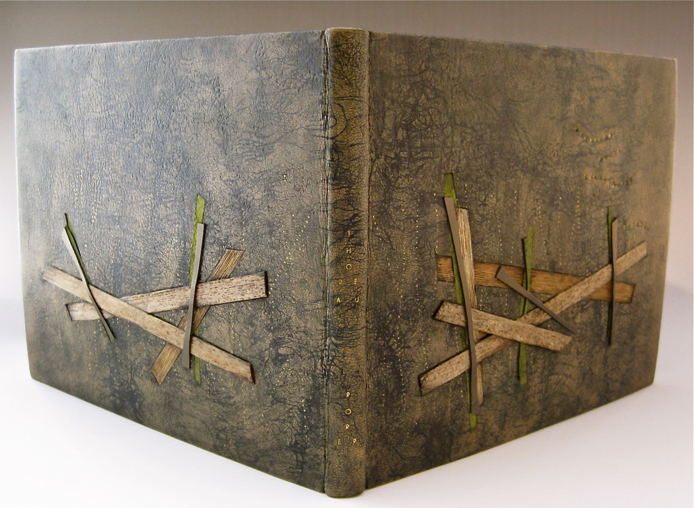
Coleen’s binding is covered in a hand-dyed goatskin with edge-to-edge leather doublures. The design includes inlays of cat-tails and green calfskin with additional onlays of bronzy calfskin. The author and printer’s last name were hand-tooled in golf leaf. The leather doublures are distressed and paired with a leather split flyleaf. Coleen bound this copy for the Designer Bookbinders InsideOUT Exhibition in 2014.
When I saw this binding for the first time, I felt that you had created a style that was uniquely yours. The most striking element of this binding is the hand-dyed leather. The dark veins flow across the book like water making the pieces of inlaid cat-tails and leather almost appear to float on the surface. Can you talk about the dying process for the leather and why you choose to have the accented pieces both sunken on the board and jutting outward?
I would walk my dogs in a coastal woodland area by my home that has ponds and pools as described by Thoreau. With my tall wellingtons protecting me from the water, I would spend a few hours at various times of the day and peer down into the pools observing the multiple layers of life and plants teeming within. This murky layering was the inspiration for my design. I am deeply attracted to texture and color, and during my design process, I spend a lot of time choosing materials and found objects, mixing and matching, in an attempt to try to visually create the emotions I experience while reading a text and enjoying the art. I find stuff, constantly experiment, and keep everything. I want my designs to introduce the text by appealing to all 5 senses. This binding captured that essence and perhaps that is why you feel it is my own style.
Working with undyed ‘fair’ goatskin, I applied several paste resists using liquid acrylics, a technique called ‘Craquele’. Thick layers of wheat paste are applied directly to the leather, allowed to dry, and then ‘cracked’ intentionally. The acrylic is then applied and is absorbed in the paste cracks; the paste is then removed. Several resists in various colors were applied to achieve depth and layers I desired. Hewits’ aniline dyes were applied to create the ruddy brown color, along with various embossing and debossing with inks.
The leather became my water, and now I needed to create movement. First, I gold tooled dotted lines to create the glints of light that appear when sunlight hits water at certain angles. I used a special roulette, that I designed and Pascal Alivon crafted, of uneven dots that roll out crooked. Next, I added a few bright green inlays and onlays for the color of new plant life in the spring. I collected cat-tails from the ponds and dried them. After many experimentations with finishes to seal and protect the cat-tail, I settled on layers of black bison wax – a fine wood finishing wax that has an aroma of wood. To create the feeling of floating layers of intertwined cat-tail leaves, I created two inlay pieces off the book and these needed to be a variety of thicknesses to accommodate effective layering. At this point I had what Suzanne Moore and Don Glaister call ‘the eleventh hour blues’, this is when I experience the ‘my design sucks, it needs something else, it is ruined…”. And yes, this happens with almost every binding I create. At this point, I sift through all my materials and usually find that ‘one thing’ to add. For Pools it was some bronzy calf. I placed thin strips over the cat-tail leaves and inlaid only the tips so the mid portion has air.
I’m also curious about the treatment of Thoreau and Rorer, their names appear in a sort of V-shape on the spine. It’s quite an unusual layout, does this reference the text in some way?
The title is quite long ‘Of Woodland Pools, Spring-holes and Ditches’ – I toyed with a variety of shortened versions and settled on ‘Woodland Pools Spring-holes Ditches’ tooled in gold each on its own line meandering line on the front upper right in tiny type.
I decided to highlight both the prominent author and artist on the spine. I enjoy incorporating letters as part of the design to add interest and intrigue. The ‘O’ in each name lines up with the cat-tails on both front and back covers and the gold letters add that glint on water and adds some continuity between the front and back covers.