RSS Feed

Posts Tagged ‘artist book’

  1. September // Book Artist of the Month: Michelle Ray

    September 2, 2013 by Erin Fletcher

    godcreatedthesea-michelleray

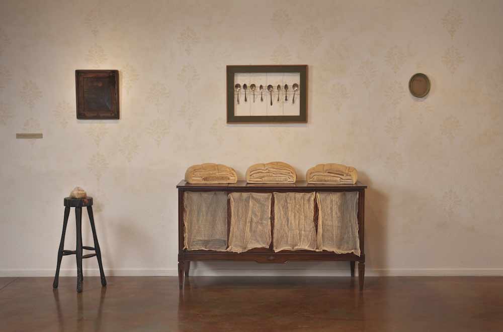
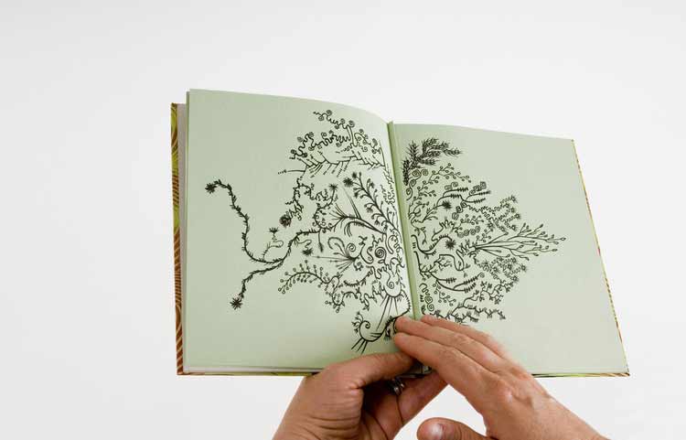
    As I read the concept behind God Created the Sea and Painted it Blue so We’d Feel Good on it, I am reminded of the Michel Gondry film The Science of Sleep and how we create vessels in the physical world to guide our journeys through our imaginary worlds. In 2013, Michelle Ray used such an experience as the inspiration for her most recent artist book. 

    godcreatedthesea3-michelleray

    Michelle first learned how to use a map while sailing. Out on the sea, where there are no landmarks just an ever-changing landscape.

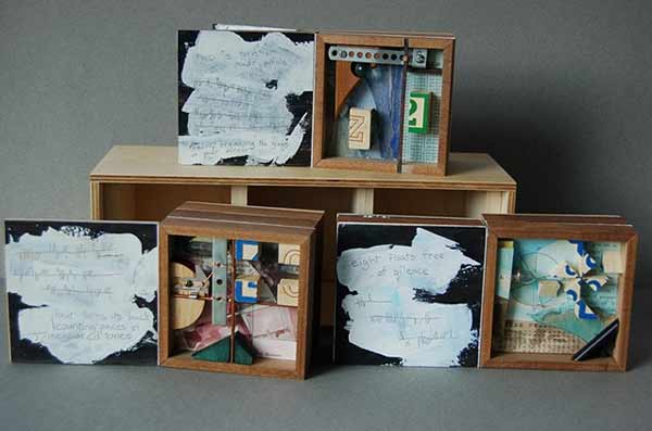
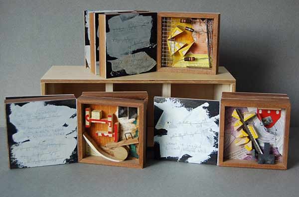
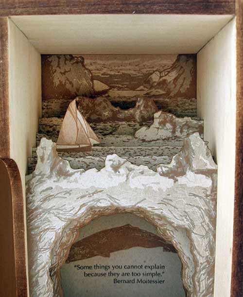
    As Michelle explains: In reference to the sea, this edition’s text states, “There are no markers in this/ monochromatic/ parking lot.” In the absence of these markers, we become painfully aware of their significance. This work is about experience, perception, memory and the space in between composed of symbol, sound and object. This is the space of mediation, the space where significant things happen; it is the ocean on which my imaginary crew and I sailed­, the place for which there are no maps.

    godcreatedthesea1-michelleraygodcreatedthesea2-michelleray

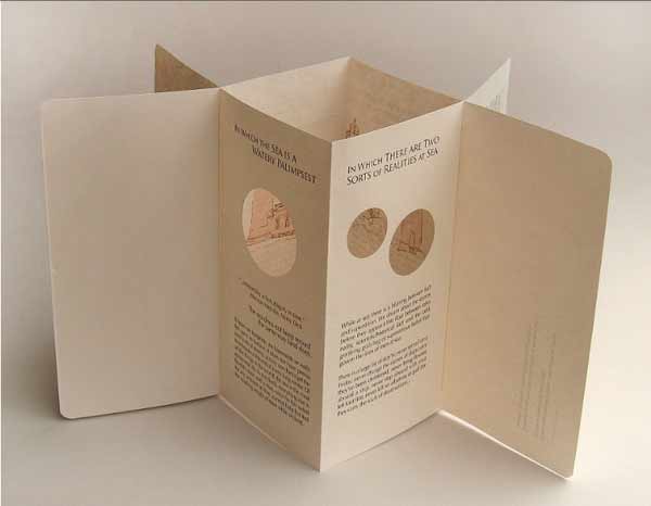
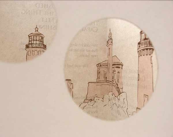
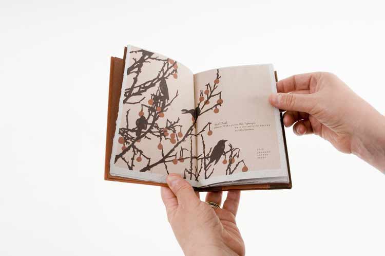
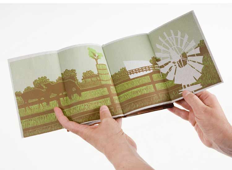
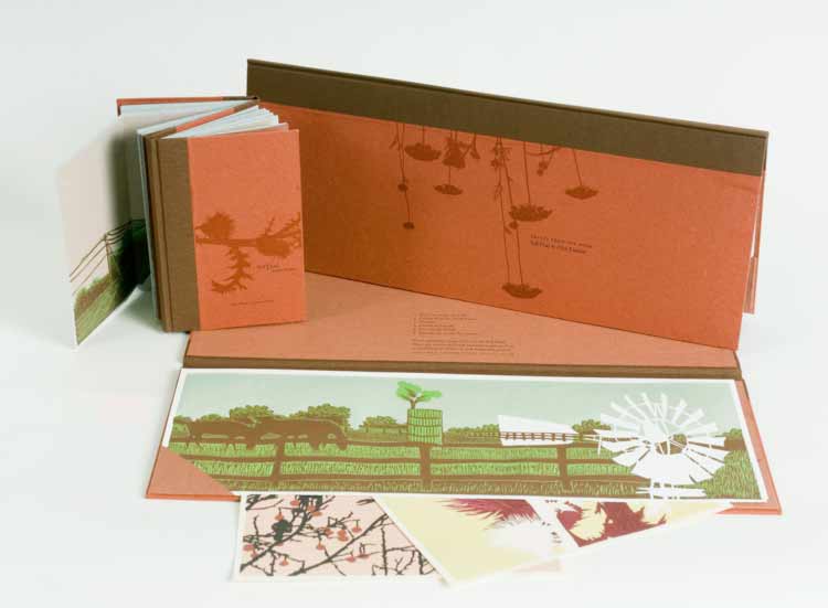
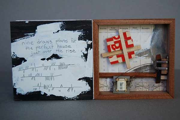
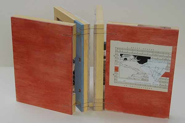
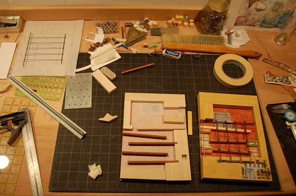
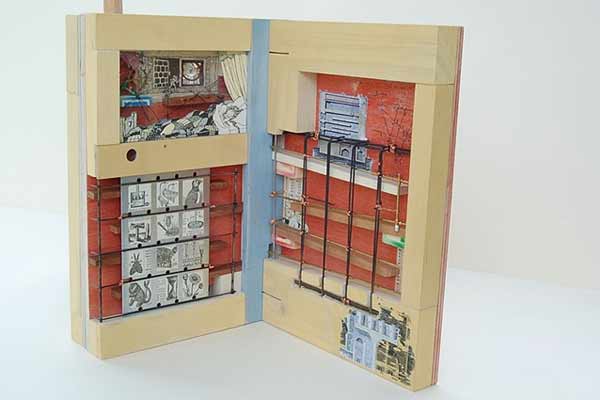
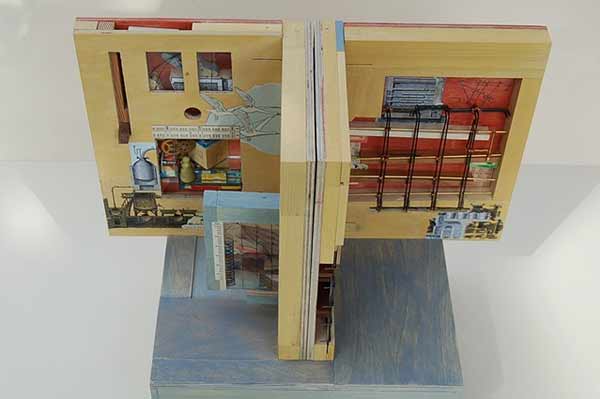
    Imagery and text have been printed using photopolymer plates on handmade cotton/abaca, French Construction and Neenah Environment papers. The photographs that follow were taken to document the printing and binding processes of God Created the Sea

    godcreatedtheseaprogress-michelleray

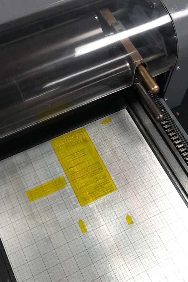
    Photopolymer plates on the Vandercook.

    godcreatedtheseaprogress3-michelleray

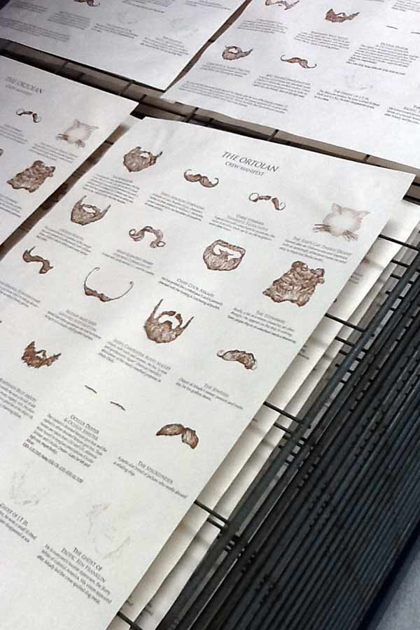
    Prints laying out on the drying rack. 

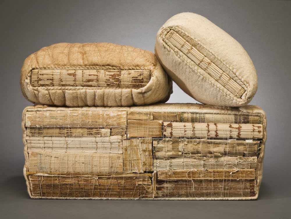
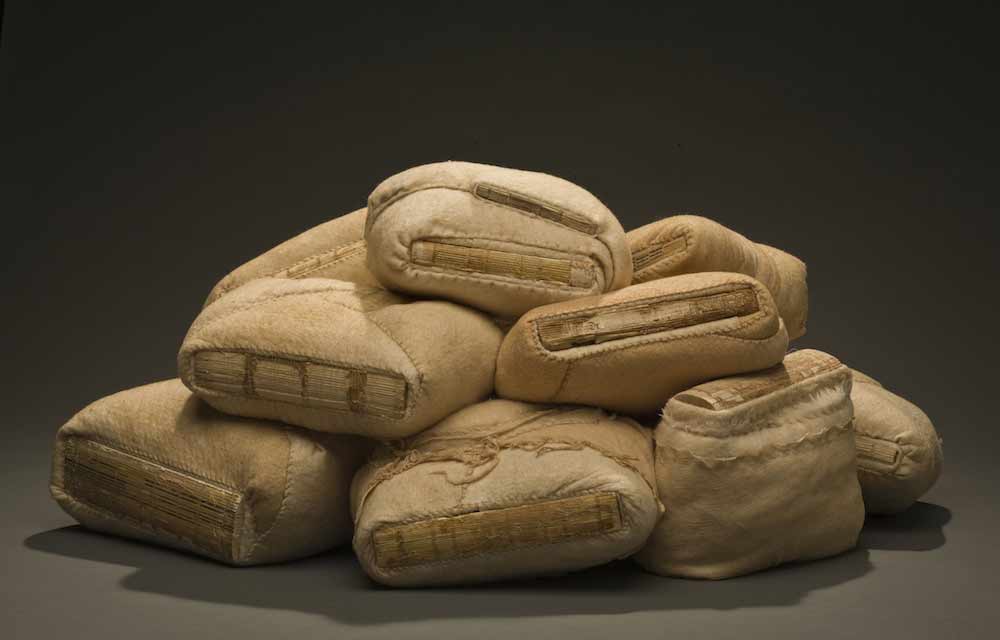
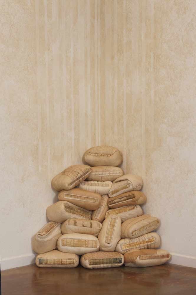
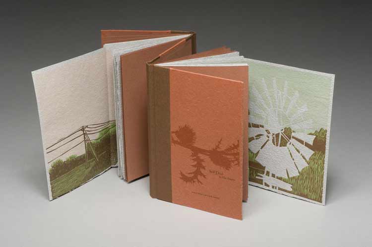
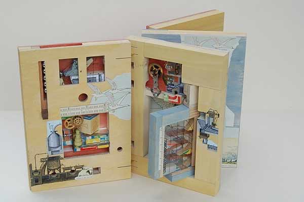
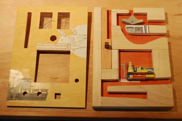
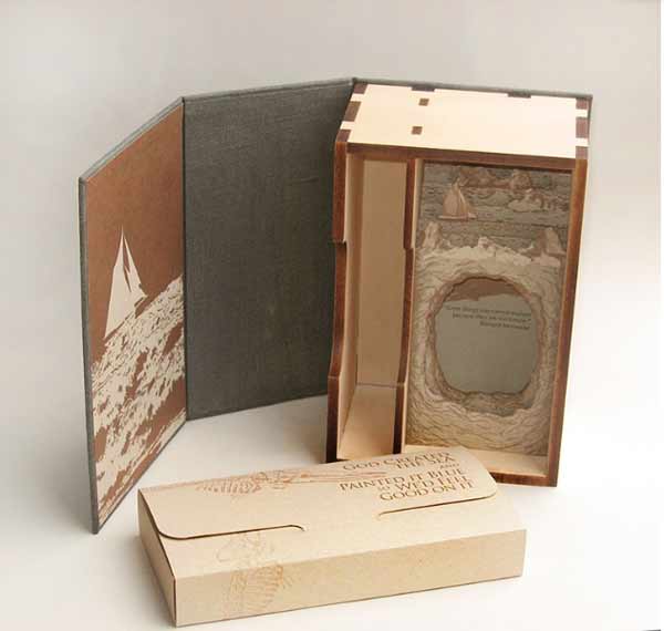
    The enclosure is made of linen and basswood. The linen is printed with the image of a whale skeleton along with the title in gold. This piece was produced in an edition of 50 at the Small Craft Advisory Press as Michelle’s creative project in the MFA Book Arts Program for The University of Alabama.

    godcreatedtheseaprogress4-michelleray

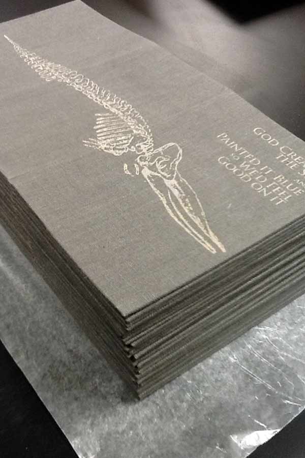
    Outer linen cloth wrapper.

    godcreatedtheseaprogress5-michelleray

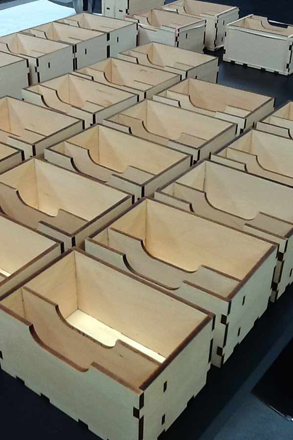
    Basswood enclosures.

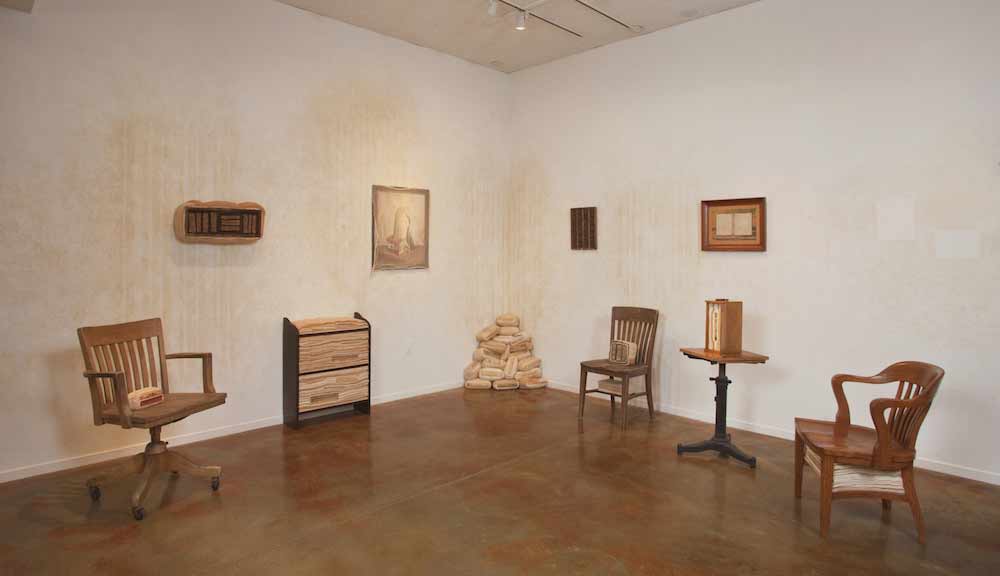
    God Created the Sea is already housed in several collection across the United States and in the United Kingdom. In addition, been awarded Best of Show at the Foundry Art Centre in Missouri and runner-up at The Sheffield International Artist’s Book Exhibition in the UK.

    Michelle is the recent recipient of the Artists’ Book Cornucopia IV Gallery Director’s Exhibition Award presented by the Abecedarian Gallery. This announcement is when I first discovered and fell in love with her work. Although, I’ve never had the pleasure of seeing Michelle’s work in person. Her work is clearly crafted beautifully, balancing rich content and concepts with thoughtfully executed structures. Her work will be featured in a solo Reading Room exhibition from April 18 – June 7, 2014 at the Abecedarian Gallery in Denver, Colorado. Oh, how I hope I find myself in Colorado next spring. Read the interview after the jump and come back each Monday during the month of September for more posts on the work of Michelle Ray.

    read more >


  2. Book Artist of the Month: Jody Alexander

    August 26, 2013 by Erin Fletcher

    exposedspines-jodyalexander

    Over the span of a year, Jody Alexander, created a series of altered books under the title Exposed SpinesThis series of work is a celebration of the most beautiful part of the book that is so often covered. Each object is comprised of discarded books, fabric and thread. 

    exposedspines2-jodyalexander

    At the end of the year in 2012, Jody exhibited Preparing for Evanescence at the Cabrillo Art Gallery in Aptos, California. This massive installation combined three different series: Sedimentals, Uphosterables and Suspendables. The Exposed Spines pieces are considered Uphosterables in this installation, although they were created before the concept of this exhibit, they were the catalyst.

    Statement for Preparing for Evanescence at Cabrillo Art Gallery
    Preparing for Evanescence addresses the relative ephemeral nature of humans compared to the belongings that we accumulate, and how we cope with our mortal awareness. The treatment of the objects in this installation exhibits a concern for their well-being, and the caretaker’s need to create and protect in the face of powerlessness and dematerialization. Each possession has been attentively prepared and placed for safekeeping between the folds of fabric, stitches of thread, in the sediment of a household.

    In the final days in this space the caretaker found that he/she was evanescing – or gradually disappearing.  The treatment of objects was as much for their care as it was a necessary process for the caretaker – a busying of the hands, a distraction from the inevitable.  Equal attention has been given to objects of use and sentiment as well as space and time.

    exposedspines4-jodyalexander

    exposedspines3-jodyalexanderpreparingforevanescence2-jodyalexander preparingforevanescence3-jodyalexander


  3. Book Artist of the Month: Jody Alexander

    August 12, 2013 by Erin Fletcher

    pharmacistdaughter1-jodyalexander

    The Pharmacist’s Daughter is a ‘boxed book’ piece by Jody Alexander created in 2005 based on the character of the same name. The Pharmacist’s daughter used thread and stitching to heal, mimicking the actions of her father. The viewer is asked to fill in the rest of the story. Housed within the wooden box are glass bottles filled with various colored threads. The book is pack-sewn over cords; the cords have been used to create the raised design on both covers. The book is bound with gampi/kozo paper.

    pharmacistdaughter2-jodyalexander


  4. Book Artist of the Month: Ellen Knudson

    July 29, 2013 by Erin Fletcher

    subjectverbobject1-ellenknudson

    Subject/Verb/Object grew from frustration and anger towards art criticism and other academic writings, which largely incorporates language to control its audience and exclude outsiders. In 2012, Ellen Knudson of Crooked Letter Press created this word game, with no beginning, no end and no way to win. The turning, fitting and order of words can cause clarification or confusion. Using simplistic language forces the reader to attempt a visual organization of the things we cannot put in order: our desires. 

    subjectverbobject2-ellenknudson

    subjectverbobject3-ellenknudson

    The volvelle is made of three layers bound with a metal brad and measures at 12″ in diameter. The book was letterpress printed in an edition of 85 on a Vandercook Universal I from a combination of handset metal type and photopolymer plates. Murillo paper was used to created the volvelle, interior sleeve and belly band which is held together with a set of metal grommets; the exterior sleeve is covered in Iris coffee bookcloth. 

    This artist book can be purchased from 23 Sandy Gallery


  5. Book Artist of the Month: Ellen Knudson

    July 22, 2013 by Erin Fletcher

    wildgirlsredux1-ellenknudson

    In 2009, Ellen Knudson revisited her work How to Become One of the Original Wild Girls, a book that was designed and printed in 1997 in the new piece Wild Girl Redux: An Operator’s Manual.

    wildgirls1-ellenknudson

    How to Become One of the Original Wild Girls

    The original work includes a playful list of imaginary “rules” that “should” be followed to achieve a Wild Girl status. The rules are light in nature, but the deep-rooted sexist issues are easily recognizable. 

    wildgirls2-ellenknudson

    How to Become One of the Original Wild Girls – page detail

    In Wild Girls Redux, Ellen reexamines these issues, combining motorcycle road and driving rules as text (adapted from the Missouri Department of Revenue Motorcycle Operator Manual) along with images of pin-up girls and industrial schematic illustrations. All parts of the book were letterpress printed on Indian Sunn Hemp Contemporary with photo-polymer plates. Bound as an accordion portfolio cover with two single signature pamphlets sewn in. In addition to the printed pages are pieces of ephemera, which include pink heart paper doilies, white doily placemats, and green office ledger papers. The cover is flocked paper in maroon. Each books comes with a set of stickers, which are kept inside a yellow office mailing envelope decorated with a wrap-around belly band. The intent of the Operator’s Manual is tongue-in-cheek and provides the ordinary, mechanical, and absurd rules of how to operate women.

    wildgirlsredux3-ellenknudson wildgirlsredux4-ellenknudson wildgirlsredux2-ellenknudson

    Created in an edition of 100, each signed by the artist. Wild Girls Redux: An Operator’s Manual was the winner of the 2009 Florida Artist’s Book Prize for The Bienes Museum of the Modern Book and The Florida Center for the Book.


  6. Book Artist of the Month: Ellen Knudson

    July 15, 2013 by Erin Fletcher

    selfdual1-ellenknudson

    Photo by Jerry Mathiason

    Over the course of graduate school, Ellen Knudson, would travel the road between Starkville, Mississippi and Tuscaloosa, Alabama. Self-Dual (How to Walk a 30,000 Mile Tightrope) is a collection of visual and textual vignettes in reflection of those trips; little pieces of the scenery and her thoughts during those drives. 

    The paper used in the book is 100% cotton rag, handmade from Ellen’s family’s clothing. The six large illustrations are linoleum reduction prints, the other illustrations are line art drawings printed from photopolymer plates. The type is handset in multiple sizes of Lutetia metal type, cast by Harold Berliner. The book is bound as a built-in groove case in the dos-a-dos style binding with two illustrated fold-outs. This book was bound in an edition of 50. 

    selfdual2-ellenknudson

    Photo by Jerry Mathiason

    selfdual3-ellenknudson

    Photo by Jerry Mathiason

    The deluxe edition is a handmade portfolio that houses the six large linoleum prints. This edition was produced in a quantity of 15. Self-Dual was made during 2005-06.

    selfdual4-ellenknudson

    Photo by Jerry Mathiason


  7. Book Artist of the Month: Ellen Knudson

    July 8, 2013 by Erin Fletcher

    howtolove2-ellenknudson

    In 2004, Ellen Knudson printed and bound How to Love Someone Forever in an edition of 50 books and 50 broadsides. This collection of poems are written by Kevin Knudson (Ellen’s husband) and herself for one another and for their son. As Ellen explains it: We are always working on how to love each other, Kevin, Gus, and I, so this is a hint of the grand gooey mess that is us.

    howtolove1-ellenknudson howtolove4-ellenknudson

    Illustrations throughout the book are done by Ellen to represent weeds as a reflection of the tangle of relationships, lovely and difficult as they are. The illustrations are line drawings and letterpress printed from photopolymer plates. The book is about the every day of relationships and finding beauty in them when they can be taken for granted and so easily go unnoticed, much like weeds.

    The poems were handset and printed in Gould Old Style 394 and Caslon metal type. Pages were letterpress printed on dampened Hahnemuhle Bugra paper in mint and marble gray. The book is double-pamphlet sewn and bound as a built-in groove case binding. The paste paper covers are handmade on mint Bugra. All printing was done by Ellen at her studio, Crooked Letter Press, in Starkville, Mississippi on the (as Ellen puts it) badass Vandercook Universal 1 proofing press. 

    howtolove3-ellenknudson

    The poem Valentine Sestina written by Kevin is printed on the only fold-out found in the book and  is also available as a separate broadside. The poem is a sestina, which is a 39-line poem consisting of six stanzas of six lines each followed by a three lined stanza.


  8. July // Book Artist of the Month: Ellen Knudson

    July 2, 2013 by Erin Fletcher

    americanbreedingstandards-ellenknudson

    American Breeding Standards is the most recent work from Crooked Letter Press run by book artist and graphic designer Ellen Knudson and was produced in an edition of 60 in 2012-2013 in Gainesville, Florida. This artist book explores the systemized rules about what comprises a good or bad horse, a good or bad woman — and the steps one might take to achieve the breed standard.

    American Breeding Standards was designed and letterpress printed on Zerkall Book paper. The illustrations and text are printed from photo-polymer plates and handset metal types. Some text excerpted from American Horses and Horse Breeding (John Dimon, 1895) and Canine Breeding Standards of the German Shepherd (American Kennel Club, 2012), while the rest of the text and illustration are by Ellen.

    The binding structure is an exposed spine sewn on Cave Paper tapes and attached to paste paper covered boards. The cover of the book has a hinged pop-up that folds out. There are also 3 additional foldout pages throughout the book.

    americanbreedingstandards2-ellenknudsonamericanbreedingstandards5-ellenknudson americanbreedingstandards3-ellenknudson americanbreedingstandards6-ellenknudsonamericanbreedingstandards4-ellenknudson

    While setting up the Marking Time exhibition for the Guild of Book Workers at Dartmouth College, I came across Ellen’s piece Self-Dual (How to Walk a 30,000 Mile Tightrope). By the way, I’ll be featuring this book in a post later this month. The prints featured in this artist book are beautifully illustrated and printed in rich and muted earth tones. The book was favorably executed as the dos-a-dos style binding. 

    I’m excited to present this interview with Ellen and to post a portion of her work throughout the month of July. Ellen has such a versatile design sense, offering a range of artist books so throughly executed. Read the interview after the jump and come back each Monday in the month of July for more posts on Ellen Knudson.

    read more >


  9. Book Artist of the Month: Susan Collard

    May 27, 2013 by Erin Fletcher

    3x3-susancollard

    In 2010, Susan Collard created 3×3 a series of board books made from birch aircraft plywood, maple and walnut bound with Tyvek. Each page spread represents a single number ranging from one to nine. For Susan, numbers have definitive personalities that sprout from their mathematical associations. As Susan developed each numerical character sketch she began with a few poetic words (on the verso) before morphing into a collaged “portrait” (on the recto). 

    3×3 was featured in Quantified Aesthetics, an exhibit held at the Minnesota Center for Book Arts in 2010.

    3x3-susancollard2 3x3-susancollard3 3x3-susancollard4


  10. Book Artist of the Month: Susan Collard

    May 13, 2013 by Erin Fletcher

    shortcourse-susancollard

    A Short Course in Recollection was built by Susan Collard in 2009 for the Guild of Book Workers national exhibit Marking Time and through this book I was introduced to Susan’s work. Although the book may appear fairly plain on the outside, the interior pages are an inch thick in order to house a series of ramps and switchbacks. Susan began with her fascination of children’s toys built of ramps and towers. This literal marking of time in a direct, mechanistic, clattering fashion appealed to Susan (as did the technical challenge of interpreting that into a book).

    shortcourse2-susancollard

    At the top left of the first page is a vertical slot where the steel marbles are fed into the course. A blue toggle switched to the left stales the first marble upon its decent. The next marble will knock the toggle to the right and both marbles will move forward into the course on different paths. This toggle trick was inspired by woodworker, Matthias Wendel, who builds complex and ingenious marble machines. Susan approached the design of Short Course just as many artists do, by considering her materials first. In order to reduce any awkward bulkiness to the book, Susan choose steel marbles that are smaller then normal (about 7/16″). The ramps are made from ½” poplar and the face of the pages are aircraft plywood. The pages are bound together with slotted brass hinges. 

    Susan drafted full-size diagrams of the pages and made a cardboard model to aid in the building of Short Course. This is more planning that usual for Susan and all aesthetic elements came in after the pages started taking shape and the title of the book was chosen. 

    shortcourseprocess3-susancollardshortcourseprocess-susancollard shortcourseprocess2-susancollardshortcourse4-susancollard

    The third and fourth pages are more open, where the steel marbles can navigate more reliably. The marbles that fall to the right of the first toggle switch come down a ramp above the sleeping girl’s head, then hit a second toggle switch at her feet.

    The book can only function in one position, with the pages butted together tightly so the marbles can travel freely between them. There are three distinct courses, regulated by two toggle switches. The mechanism of the book does work, but rather temperamentally and can be viewed as a metaphor for memory. Some marbles will travel the course flawlessly, while others get hung up between pages, jump a guardrail or cause a traffic jam. As Susan so elegantly says “it seems easy to extend the metaphor to include these accidents of blockage and retrieval. Perhaps the book, as is, is a better representation of our own flawed memories than if it worked reliably every time. Which is not to say I wouldn’t fix it in a heartbeat if I had the ability. Probably my favorite thing about this book was integrating more childish elements (the fairy tales, alphabet blocks, even the colors of the milk paint) with the very intricate mechanisms and depictions of machinery—as if to suggest childhood is a serious and convoluted endeavor, or that understanding the world requires great leaps of nonsense and whimsy.” 

    shortcourse3-susancollard


  • My name is Erin Fletcher, owner and bookbinder of Herringbone Bindery in Boston. Flash of the Hand is a space where I share my process and inspirations.
    The StudioNewsletterInstagramEmail me
  • Archives