RSS Feed

Posts Tagged ‘artist book’

  1. Book Artist of the Month: Roni Gross

    May 26, 2014 by Erin Fletcher

    TheNightHunter3-RoniGross

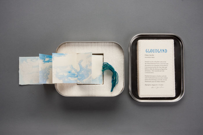
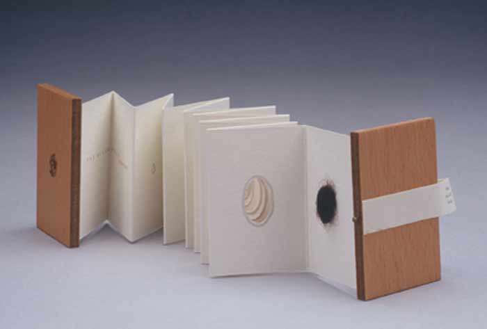
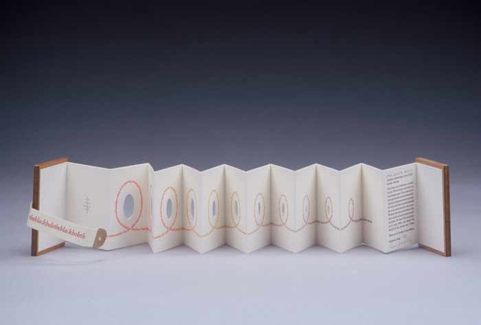
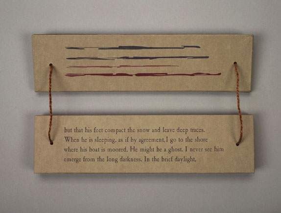
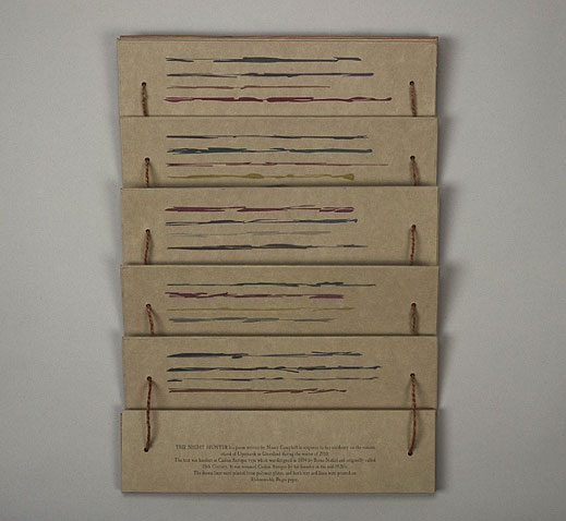
    The Night of the Hunter is another collaborative artist book between Roni Gross, Peter Schell and Nancy Campbell.

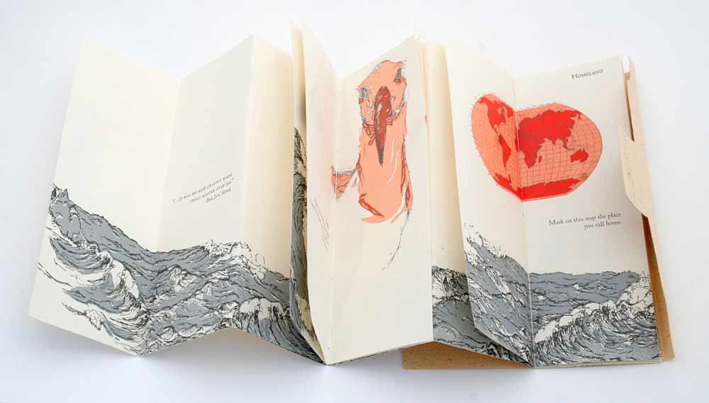
    The text comes directly from a poem by Nancy Campbell of the same title, which was based on her residency on a remote island off the coast of Greenland during the winter of 2010. Roni reinterprets the text as a visual pattern of drawn colored lines repeating as the language repeats creating a unique landscape housed within a palm leaf structure. The poem is written as a pantoum, where lines repeat in specific patterns.

    TheNightHunter5-RoniGross TheNightHunter6-RoniGross

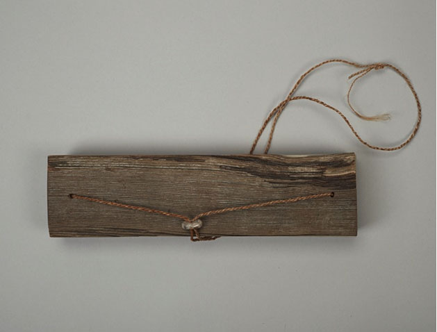
    The book is paired with an interactive board game constructed from salvaged wood and game pieces made from found materials that have been shaped by Peter Schell. On Nancy’s blog, she explains these material elements of the artist book “are a perfect physical expression of the austere Arctic environment that I had tried to capture in the poem.

    TheNightHunter2-RoniGross

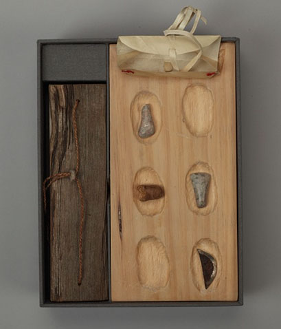
    The objects stored inside the rawhide pouch are meant to be placed in the depressions on the board. Can you describe the interaction between the reader, these objects and the story itself?
    This work is an example of our interest in having the viewer participate in the telling of the story by feeling the objects – stone, bone and metal – and then placing them on the game board. There are not a lot of raw materials in Greenland, and so the materials are found or repurposed. The wood of the covers is driftwood, the cordage is made from dogbane – a natural fiber, and the game board was found wood. By holding these object, materials that the night hunter might encounter, you are entering his realm. Your freedom to place the pieces as you wish involves you in the unfolding of the poem.


  2. Book Artist of the Month: Roni Gross

    May 19, 2014 by Erin Fletcher

    AnniversaryCommission-RoniGross

    Roni Gross crafted this celebratory gift for a couple’s 50th anniversary. The piece is housed in a birch plywood box distressed with milk paint and includes the stenciled word ‘TULIP’ in red. The text printed on the inside of the lid is a poem by Frank O’Hara called Having a Coke with You. 

    AnniversaryCommission2-RoniGross

    This is such a beautiful commissioned piece for a couple’s 50th anniversary. Can you talk about the relationship between the elements: poem, wooden typographic map and the book necklace?
    The couple are collectors of art glass, and are more visual than literary. The wife enjoys collecting wacky jewelry and so I thought that a book necklace would make sense for them. I am motivated by language however, and I told the daughter that I needed some text to start working from. The poem, by Frank O’Hara, is a avery New York poem, and we thought that a sculptural topographical map of a place in Riverdale would be an interesting reference for people that have lived their whole lives in NYC. The waterway provides the trough for the necklace to reside.

    AnniversaryCommission3-RoniGross

    – – – – – – – – – – –

    The text which makes up the poem by Frank O’Hara (see the poem in it’s entirety below) was printed, cut and sewn as a coptic structure along with monoprints. The wooden covers of the coptic book necklace have also been treated with milk paint.

    Having a Coke with You by Frank O’Hara

    is even more fun than going to San Sebastian, Irún, Hendaye, Biarritz, Bayonne
    or being sick to my stomach on the Travesera de Gracia in Barcelona
    partly because in your orange shirt you look like a better happier St. Sebastian
    partly because of my love for you, partly because of your love for yoghurt
    partly because of the fluorescent orange tulips around the birches
    partly because of the secrecy our smiles take on before people and statuary
    it is hard to believe when I’m with you that there can be anything as still
    as solemn as unpleasantly definitive as statuary when right in front of it
    in the warm New York 4 o’clock light we are drifting back and forth
    between each other like a tree breathing through its spectacles

    and the portrait show seems to have no faces in it at all, just paint
    you suddenly wonder why in the world anyone ever did them

    I look
    at you and I would rather look at you than all the portraits in the world
    except possibly for the Polish Rider occasionally and anyway it’s in the Frick
    which thank heavens you haven’t gone to yet so we can go together the first time
    and the fact that you move so beautifully more or less takes care of Futurism
    just as at home I never think of the Nude Descending a Staircase or
    at a rehearsal a single drawing of Leonardo or Michelangelo that used to wow me
    and what good does all the research of the Impressionists do them
    when they never got the right person to stand near the tree when the sun sank
    or for that matter Marino Marini when he didn’t pick the rider as carefully
    as the horse

    it seems they were all cheated of some marvelous experience
    which is not going to go wasted on me which is why I am telling you about it


  3. Book Artist of the Month: Diane Jacobs

    February 24, 2014 by Erin Fletcher

    Cloudland1-DianeJacobs

    Housed inside this tin box is the miniature artist book Cloudland. Painted on site in the Mt. Hood National Forest, Diane Jacobs captures the altering cloud patterns viewed across the sky with the use of watercolor and slight burning of the paper. The eight accordions inside the tin fold out to 18″ long by 2.5″ tall.

    Cloudland2-DianeJacobs Cloudland3-DianeJacobs

    I was particularly drawn to this artist book due to my fondness for clouds and the gorgeous typeface you used for the title page. The cloud formations were painted on site at Boulder Lake in the Mt. Hood National Park, was this outing planned or were you unexpectedly struck by inspiration?
    I painted all the accordion folios on site. I had an idea to do a book about clouds before going on the Alpenglow backpacking trip with Signal Fire. The first part of the trip was backpacking then we could retrieve art supplies for the remaing 3 days where we were stationed at Boulder Lake. While planning for the trip I folded up some paper trimmings to take with me. For CLOUDLAND I used handmade cotton paper scraps from Helen Hiebert.


  4. Book Artist of the Month: Diane Jacobs

    February 3, 2014 by Erin Fletcher

    TheBlackHole-DianeJacobs

    The Black Hole is an intimate miniature accordion that explores the personal issues one may feel about body hair and so of, course it includes a surprise hairball at the end. The accordion can be read on either side and is letterpress printed with wooden covers and a parchment strap. This artist book was created in an edition of 45 by Diane Jacobs back in 2003. 

    TheBlackHole2-DianeJacobs

    In your work, you demonstrate the versatility of hair as a medium by forming hairballs, felted shapes and using full locks of hair to loose strands. Do you enjoy manipulating hair one way more than another?
    I love to roll my own hair into balls. It is very easy because of it being curly and relatively fine. But I discovered that I can pretty much roll anyone’s hair into a ball. I like comparing different hair color and texture in the ball form. I like the association of a hairball being something else when put in a different context such as the hairballs in the gum ball machine. I also enjoy weaving hair in the combs to spell out words.

    HairChart-DianeJacobs Tails-DianeJacobs Combs-DianeJacobs

    I noticed you only use hair with natural color. Do you avoid artificially colored hair for a reason?
    I am sure some of the hair I use is dyed. Personally I have always liked the natural  color of someone’s hair. I have used a bit of blue hair but that has been the only really artificially colored hair I have in my massive collection.


  5. Book Artist of the Month: Mary Uthuppuru

    January 27, 2014 by Erin Fletcher

    UndefinedLines4-MaryUthuppuru

    In 2012, Mary Uthuppuru created Undefined Lines. This unique artist book is designed with a cover that converts into an easel, making the image heavy content read as a guided tour along a trail commonly traveled by Mary. Using ink and watercolors to layout each scene on Rives BFK, the pages have a very soft, nostalgic feeling.

    UndefinedLines2-MaryUthuppuruUndefinedLines3-MaryUthuppuruUndefinedLines-MaryUthuppuru

    Undefined Lines is a really unique structure. The binding acts as an easel to direct the point of view of the imagery. Where did your inspiration come from for this structure?
    I chose to depict a hike I take every morning in a forest near my house. It is there that I sort out the agenda for the day, contemplate what might be on my mind or just clear my head. Being a little reserved with letting imagery be the message in my books, I decided that this book would be centered on large ink drawings with watercolors.

    This structure was a complete response to the content. In an unusual way, unusual to me, I created the pages of the book before considering how it would come together in the binding. As I finished the image panels, it occurred to me that I did two things: I created single sheets that then needed to be bound, and the image format begged for each page to be upright when viewed.

    UndefinedLines-inprocess-MaryUthuppuru

    So I leaved through all of the books about artist books I could find, hoping something would trigger an idea for my unique situation. First, I stumbled upon one of Claire Van Vliet’s bindings and I remembered the quilted books for which I first came to know her. The Lilly Library has a copy of her book Woven and Interlocking Book Structures from the Janus so I paid a visit and found a binding style that worked for my pages. The woven paper allowed me to bind the single sheets in an elegant and mostly hidden way. Another inspiration for the binding came from Susan Skarsgard, from whom I took a class at the Paper and Book Intensive in 2011. She showed us a non-adhesive structure that allowed the spine piece to slide into the cover to allow for the pages to open completely flat, something I found out I needed once I decided on the cover format.

    UndefinedLines-inprocess2-MaryUthuppuru

    Woven binding detail.

    Next, was to find a way to get the pages upright. I wanted the viewer to have the experience that they were walking through the forest with me. With the images as large as they are, I thought this would be possible especially if I could get the pages to turn towards the viewer. As each page is turned down, the viewer would find themselves in a new scene. I looked for inspiration in objects that are propped up for use that already exist like iPad cases and art easels. I made a few mock ups, but none of those things would work without making the book look clunky. Remembering that the box itself could act as the “easel”, I found the simplest ways possible to prop up the book. Having the box act as the cover in the form of a multi-flap portfolio was a good solution not only can all of the flaps be folded back for my purposes, but it also had a good-for-travel sort of feel. Once all the flaps are closed, it is self-contained.

    UndefinedLines5-MaryUthuppuru

    Last week you discussed your use of painted tissue for the cover of Fantasy & Nonsense. For Undefined Lines, Interpreter of Maladies and other works you’ve used paste cloth. Can you talk about your process for creating paste cloth?
    I first learned about paste cloth at my first Standards in 2008 in Toronto. Martha Cole demonstrated her beautiful technique of creating and using paste cloth for books as well as textile pieces. She even provided everyone with her recipes. I don’t use her recipe but I make a very simple recipe for mine which is just paste cooked as though you are using it for repair work, strained and thinned to the desired consistency, then divide the paste to be mixed with Golden acrylic paints. For the cloth, I use undyed natural cotton or linen…usually cotton since it has a consistent texture and tight weave that provides a nice smooth surface for combing if desired. All of my paste work with paste cloth is done on Mylar taped to a hard surface for drying.

    PasteCloth-MaryUthuppuru

    The cloth is sprayed with water and spread flat on the Mylar. At this stage, I make sure the fabric is laying evenly and the threads are not warped or distorted. The cloth is then pasted out with clear paste until the whole piece is evenly coated. Using your hands or a long ruler, turn the pasted cloth over onto the same piece of Mylar and smooth out gently with your hands getting rid of any air bubbles. At this point, you have to start making design decisions. If you plan on combing or drawing through the paste, then you need to decide if you will allow the color of the cloth to come through, by applying a layer of clear paste first, or if you want to build different colors on top of one another, in which case you just start your painting. If you are merely painting a design with the paste/paint mixture, you are ready to begin. Paste cloth lends itself to building rich designs by layering different colors or patterns on top of one another which is really fun to play with depending on the book’s subject matter.

    – – – – – – – – – – –

    Thanks Mary for a wonderful interview. It was great of you to share some of your techniques and creative processes.

    – – – – – – – – – – –

    UPDATE: Check out this wonderful review on Undefined Lines over at the Abecedarian Gallery Blog. The post includes a great slideshow of each page of the book!


  6. Book Artist of the Month: Mary Uthuppuru

    January 6, 2014 by Erin Fletcher

    DestinyOfChoice1-MaryUthuppuru

    Can books save the world? Can artist books raise consciousness, create awareness or change thinking? These were the questions that EcoEditions aimed to answer through a collection of artist books that could raise awareness on the state of our environment. For her submission, Mary Uthuppuru, created Destiny of Choice in a small unique edition of three. Each book is bound in the Ethopian style with a tab closure on the fore edge. The title is hand stenciled on three unique covers sourced from boxes that were headed to the recycling bin.

    DestinyOfChoice4-MaryUthuppuru

    The text block is made from trash entirely sourced from Mary’s house. Which is also the major influence for creating this book. Most of us assume our trash is going straight to a landfill, but we lose sight of the fact that it may not. Mary’s concern with reducing the amount of waste that comes out of her household is an attitude that more people need to obtain.

    The books were sewn with dental floss (which Mary notes was unused for hygienic purposes). The illustrations and text have been inkjet printed onto packaging material. Other bits of trash including plastic bags and plastic netting were scattered throughout the text block.

    DestinyOfChoice3-MaryUthuppuruDestinyOfChoice2-MaryUthuppuru

    This artist book is brilliant; once again you successfully bring together humor and interactive elements. Destiny of Choice was part of EcoEditions, an exhibition at 23Sandy Gallery. Did you create this artist book specifically for the exhibition?
    This book was created for the EcoEditions exhibit. It was also a part of the hoped for quarterly project with Kristin of Space Paste Press. As mentioned earlier, we hoped to create more advanced projects than the one book per month endeavor. At the time, we were both thinking of environmental themes so it sounded like a really good goal, create a book that can also be submitted to an exhibit.

    I was really happy with the way the book turned out. Since I was already thinking of the theme, it was great timing. The theme asks artists to illicit change through the content of their artwork.  When trying to get people to change or realize that what they might be doing is harmful, I don’t think it is best to begin by ordering them around. I don’t listen this way, so I wanted to avoid a book full of preaching. The Choose Your Own Adventure format seemed really appropriate to me because the arrangement is playful, inviting the reader in. As a kid, I used to read choose your own adventure books all the time and I always approached them with a sense of reserve. I was choosing what would happen to the characters in the story, which hit home for me. So I wanted that same feeling to translate through this book.

    A favored story-telling method of mine is to anthropomorphize sometimes unexpected objects. In this case, a plastic bag is the main character of the story and while the reader decides what happens, the bag is doing the action. The reader chooses between recycling and throwing it away then how the bag gets from the garbage can or recycling bin at home to its final destination. Many people have heard about the gyres (islands of garbage) in the middle of the ocean. We all know about landfills. It is a very contemporary concern all over the world, and one that I have on my mind daily.


  7. January // Book Artist of the Month: Mary Uthuppuru

    January 2, 2014 by Erin Fletcher

    AndThenThereWere8_3-MaryUthuppuru

    In preparation for their 2013 Annual Open House and Silent Auction, the Morgan Conservatory presented participants with two sheets of paper made at the Morgan and asked them to create a piece of art to be auctioned off during the event. Mary Uthuppuru was given one sheet of charcoal grey and the other of bright white.

    Mary found inspiration from the recent drop Pluto experienced from its rank as a planet and the heated discussions that followed. As the sole character in this artist book, Mary personifies the now dwarf planet in the form of a letter, where Pluto freely express himself after hearing this news of rejection. You can read more about Mary’s process in her blog post, Poor Pluto

    And Then There Were Eight is bound as an accordion with a removable spine piece, when fully opened the viewer can experience the vast and expanding qualities of outer space. The covers are most appropriately wrapped in beautiful handmade Moon Paper from Hook Pottery Paper. The paper appears to be a 3-dimensional print of the moon, but it is actually smooth (like paper). The interior pages were given an airbrush look by using a mouth atomizer and drawing inks.

    AndThenThereWere8-MaryUthuppuruAndThenThereWere8_4-MaryUthuppuruAndThenThereWere8_2-MaryUthuppuruI really enjoyed reading about your thought process behind this book. Not only did you find inspiration in a literary influence, but also in your own sense of humor. The application of pigment really captures the atmosphere and depth of space. Can you talk about the challenges and benefits to using a mouth atomizer?
    The mouth atomizer was a really fun thing to use. I actually had it for over ten years before I discovered its use during this project. It looks a lot like a compass, but without the pencil. One end goes into whatever liquid you are using (in the case of the Pluto book it was India ink and Winsor & Newton drawing ink) and then you blow on the other tube.

    The benefit in its use is also its challenge. So long as you have the lung capacity, this tool is very simple. Blow in the horizontal tube, and the ink is sprayed from the vertical tube. The difficulty is in style. If you are trying to get consistent coverage, then you have to be consistent with the pressure behind your breath. But it is easy to get used to with a practice piece of paper. Also, beware your work space. Cover anything surrounding the piece you are working on with newsprint or other waste unless you want a speckled work space.

    ThereWere8_Atomizer-MaryUthuppuru

    There is more than one way to use it too. In this book, for example, I cut stencils from transparency sheets to create the planetary bodies. This allowed for a clean, shaded shape that is much faster and reads truer than a traditional stippling stenciled technique. It is also easy to clean by running it under water then drying.

    ThereWere8_Stenciling-MaryUthuppuru

    I first met Mary in Chicago for the One Book, Many Interpretations exhibit at the Chicago Public Library, where both Mary and I had work in the show. I’ll be featuring her binding of Interpreter of Maladies from that show later this month. From the beginning, I noted Mary’s impeccable skill and her exceptional eye for detail, but I can’t forget to mention her infectious personality. Her humor mixed with kindness and generosity makes her a delightful person to engage with and learn from.

    Like myself, Mary, is just beginning her career in the field of bookbinding. Her ambition and creativity are inspiring, as is the interview (after the jump). Mary discusses her love for bookbinding and how she caught “the book bug”. Later in the interview, Mary talks about setting up her own home studio and how being self-employed has its ups and downs. But it’s quite clear to see that Mary tackles her obstacles with smarts and humor. 

    Come back each Monday during the month of January for more on Mary Uthuppuru and her work, which will bounce between bookbinding and book arts.

    read more >


  8. Book Artist of the Month: Michelle Ray

    September 23, 2013 by Erin Fletcher

    tocomeuponastreet-michelleray

    During the Standards of Excellence Seminar in 2012, presenter Steve Miller, professor at the University of Alabama brought a fine collection of student work to share with the audience. One of these pieces was To Come Upon a Street, a collaborative artist book between Michelle Ray and poet, AB Gorham. Michelle met AB in her front yard while living in Tuscaloosa. AB is the new Small Craft Advisory Press resident artist as well as Michelle’s neighbor. 

    Bound in a hardcover case is a modified tunnel book on the right and an accordion on the left in an edition of 40. The text is written and designed by AB, while the visual design, printing and binding was completed by Michelle. The images and text are printed using photopolymer plates on machine made and handmade papers. 

    tocomeuponastreet3-michelleray

    The visual content of To Come Upon a Street captures the intimacy of the tunnel book structure through an act of voyeurism. The view is of a lewd street scene, where letterpress “ladies of the evening” echo the four complex stanza written by AB. The visual content is quite appealing despite its crude imagery. It strikes a balance between delicate tenderness and indecency.

    Michelle describes this work as creating a piece that is kitschy yet tender; a celebration of delicate visual smut and witty double entendre.

    To Come Upon a Street is housed in several collections including the Maryland Institute College of Art, The University of Utah and Chapman University in California. You can add this wonderful and humorous artist book to your private collection through Michelle’s Etsy shop: MichelleRayArt.

    tocomeuponastreet2-michelleray


  9. Book Artist of the Month: Michelle Ray

    September 16, 2013 by Erin Fletcher

    admeasure-michelleray

    In 2011, Michelle Ray created this softcover accordion with pamphlet inserts in an edition of 35. Text and images are printed from photopolymer plates and linoleum blocks on handmade and Somerset Book papers. Admeasure is another artist book from Michelle inspired by the sea as well as maritime traditions and regulations. The term admeasure refers to the act of measuring the dimensions and capacity of a vessel for official registration. 

    admeasure5-michellerayadmeasure2-michelleray

    A note from Michelle:
    The act of naming things creates a sense of relative safety at sea. Like the pilot’s verse that guided sailors through dangerous shoals, Admeasure is about gaining a false sense of control through signifiers and ritual that guide one through a world that is largely uncontrollable. This book explores the dialectic tension between the dangerous unknown and measure, rules and tradition. While at sea, measurements, maritime law, navigation aids and other modes of dominance through organization are easily lost to the forces of nature and the psychology of a journey. 

    The content of Admeasure not only draws from Michelle’s own experiences in small boats, but also from a variety of standard journeys in the sea. These included Samuel Taylor Coleridge’s The Rime of the Ancient Mariner, Homer’s Odyssey, and Bas Jan Ader’s In Search of the Miraculous.

    Admeasure is included in a variety of collections ranging from Scripps College in California to the University of Iowa to Atelier Vis-à-Vis in France.  Admeasure is also featured amongst the pages of the recently published 500 Handmade Books Volume 2

    admeasure3-michelleray


  10. Book Artist of the Month: Michelle Ray

    September 9, 2013 by Erin Fletcher

    homeiswhere-michelleray

    In this unique artist book created in 2010, Michelle Ray explores human relationships in the scope of the houseguest. Home is Where I’m Alone Unless I Have Company includes a series of interviews conducted with houseguests capturing feelings on personal and public life, intimacy and human interaction. These interviews are inkjet printed on scrolls encased in a wooden enclosure. This artist book is held at the Mandeville Special Collections Library at the University of California in San Diego.

    A note from Michelle:
    An artist’s book is an ideal medium for conveying the duality of private and public living, as books are democratic objects that live in the public but demand an intimate viewing experience.

    homeiswhere2-michelleray


  • My name is Erin Fletcher, owner and bookbinder of Herringbone Bindery in Boston. Flash of the Hand is a space where I share my process and inspirations.
    The StudioNewsletterInstagramEmail me
  • Archives