RSS Feed

Posts Tagged ‘beechingstoke’

  1. Bookbinder of the Month: Lori Sauer

    March 31, 2013 by Erin Fletcher

    topiary-lorisauer

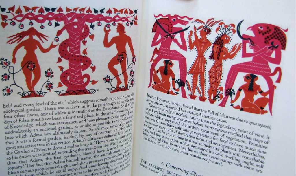
    Topiary by Cecil Stewart is about the art of clipping and sculpting foliage to maintain a clearly defined shape, like a geometric design or animal. In 1936, Topiary was published by Golden Cockerel Press in a limited letterpress edition on handmade paper with whimsical illustrations by Peter Baker Mill.

    topiary illustration

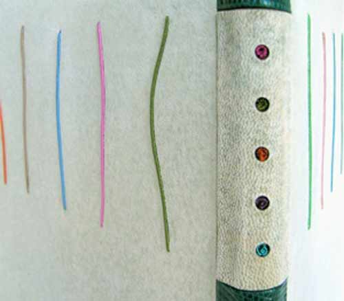
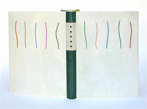
    In 2011, Lori Sauer completed a binding of Topiary in the dos rapporté structure. The binding is covered in reverse vellum dyed with leather dye. The spine is made up of 3 pieces covered in lizard skin and reverse goat. The boards have inlays of wire wrapped in silk and the spine has colured wire coils placed in cutout holes. The doublures and flyleaves are Japanese paper; the flyleaves have cutouts and ink decoration.

    The design is based around the layout of the text and the colours used in the illustrations.
    topiarydetail-lorisauer


  2. Bookbinder of the Month: Lori Sauer

    March 24, 2013 by Erin Fletcher

    glassroom-lorisauer

    The Glass Room by Simon Mawer is a novel about a Jewish family and the house they built in Czechoslovakia prior to WWII. The house is based on the Villa Tugendhat, designed by the architect Mies van der Rohe in Brno in the late 1920s. The building was inscribed on the National List of Cultural Heritage in 1969 and after renovations is open to the public. The story in the novel details the plight of the family as they are forced to leave the country and the subsequent uses their house was put to.

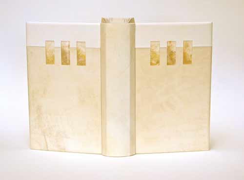
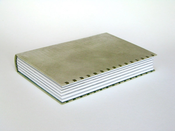
    In 2009, Lori Sauer bound The Glass Room for the Man Booker Prize. The binding is a dos rapporté structure and is covered in two shades of vellum. The Perspex (also known as Plexiglass) inlays have dyed Tyvek underneath to simulate onyx. Lori had wanted to use real onyx as it was a major feature in the house, but the cost of having it thinly sliced for inlays was too high. The onyx wall is located in the living room of the house and is partially translucent, changing its appearance with the evening sun. The doublures are dyed Tyvek made to look similar to veins in onyx.

    The house and its design dominate the novel. It is a very modern building with large rooms and lots of glass. Built when art deco was at its peak, Lori chose to design a binding around the motifs and in the spirit of the architecture.


  3. Bookbinder of the Month: Lori Sauer

    March 17, 2013 by Erin Fletcher

    brothergiles-lorisauer

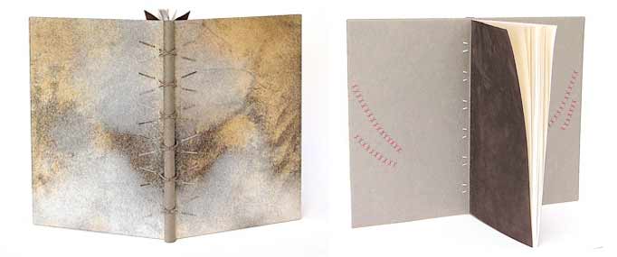
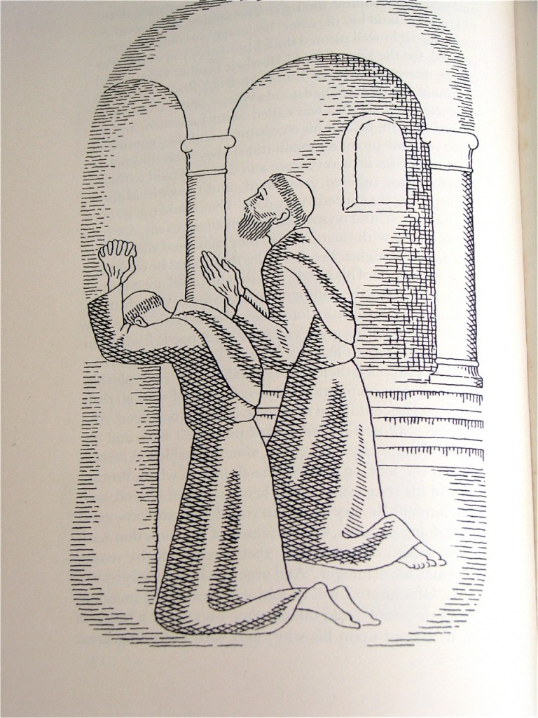
    This book was bound in 2009 by Lori Sauer as a modified sewn-board binding with a wooden spine. The boards are covered in natural vellum and the spine is attached with threads and vellum strips that are laced into the boards. I find the unusual pattern of the vellum to be quite alluring; it adds a great amount of depth and texture. The doublures are Japanese paper with suede flyleaves. The doublures are embroidered with silk in a crosshatch motif, inspired by the method used in the illustrations.

    brother giles illustrations

    The Life and Chapters of Sundry Goodly, Sayings of the Teachings of Brother Giles was printed by the City of Birmingham School of Printing in 1941 with illustrations by Neil Leitch MacCuaig. The book is comprised of wise words and sayings by a companion of St Francis, Brother Giles. 


  4. Bookbinder of the Month: Lori Sauer

    March 10, 2013 by Erin Fletcher

    water-lorisauer

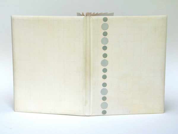
    The first Designer Bookbinders International Competition was organized in conjunction with the Bodleian Library in 2009. Each binder involved submitted a binding of the set book Water, which is a collection of poems and illustrations based on the theme of water. The set book was published by Incline Press in a limited, letterpress edition.

    In 2008, Lori Sauer bound a copy of Water as a stub binding covered in three stages: the spine attached first with the covers stuck on afterwards. The binding is covered in white vellum and the surfaces are decorated with impressions of circles that sit on a graphite grid. The rear board has pairs of circles and the front has single, larger circles. Onlaid colored circles run down the length of the front board. The spine has a pattern of plus symbols. The doublures are Fabriano Roma.

    Lori describes the text as being filled with a myriad of styles of illustrations and poems from different writers, adding to its broad theme. The circles of her design are simply the symbols for the chemical composition of water, two hydrogen atoms plus one oxygen. The onlaid colored circles on the front cover were added a couple of years after completing the binding as Lori felt a focus was needed to the design. I certainly think the addition of the circles offers a focal point to the viewer, then you slowly begin to realize the complex pattern of lines and circles underneath. 


  5. Bookbinder of the Month: Lori Sauer

    March 3, 2013 by Erin Fletcher

    kyffin1-lorisauer

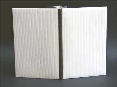
    Kyffin: A Celebration is a collection of essays about the Welsh artist Kyffin Williams. This book was published and letterpress printed by Gwas Gregynog Press (2007) in a limited edition containing linocut prints from the artist. Production began with the artist’s collaboration, but Kyffin died before its completion. In 2008, Lori Sauer bound a copy of this book as a modified sewn-board binding. 

    The boards are covered in embossed vellum that is drummed on and the spine is shaped from black African hardwood. Doublures and flyleaves are Fabriano Roma in black and blue/grey, the colours of the linocuts.

    Lori wrote me a few words regarding her concept for the cover design.
    Illustrated books present the challenge of how to design the cover, especially this one with such strong images. I never want to imitate the artist or transfer their work to the outside. My aim is to be complimentary and pick up on ideas of tone and intent. In this case the binding uses the colours of the text and the texture of author’s medium.


  6. March // Bookbinder of the Month: Lori Sauer

    March 1, 2013 by Erin Fletcher

    garden1-lorisauer

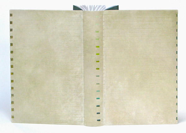
    The Garden of Evening Mists by Tan Twan Eng was bound for the Man Booker Prize in 2012 by Lori Sauer. This copy was published by Mrymidon Books Ltd. and is a story about a Malaysian woman who reflects on her apprenticeship with a Japanese gardener during her younger years. This takes place during The Malaysian Emergency, a time of civil war after WWII. Political and personal struggles dominate a narrative that is set against the backdrop of the creation of a garden in the highlands of Malaysia.

    I asked Lori to provide a description of the binding, along with her concept for the design.
    The binding is covered in reverse vellum dyed with acrylic ink and embossed with blind lines. The structure is a simplified binding that is made in 3 pieces. It has under lays of paste paper on the fore-edges and Japanese paper doublures and flyleaves.

    I used many shades of green on the binding, for obvious reasons. The design happened as I worked while I kept in mind the idea of ‘borrowed scenery’ an axiom of Japanese garden design.

    garden2-lorisauer

    Lori works both independently as a bookbinder and as an instructor, teaching her innovative structures to students with a wide range of artistic backgrounds. Check out the interview after the jump to find out how Lori got into bookbinding and come back every Sunday this month for more work by Lori.

    For a number of years you worked in publishing before studying bookbinding at The City Lit in London. Can you talk about your path into bookbinding and the training you received through The City Lit.
    I was working in London at The Poetry Society when I decided I needed a change in direction – back to doing something creative with my hands. I had always drawn and painted and ‘made’ things. A writer friend made a casual remark about having some things bound by the local bookbinder and the idea was planted in my head to find out more about this subject. My job was just 4 days a week so on my free day I enrolled for an adult ed. class at the City Lit. By the second class I was hooked and in time added evening classes and a second day at the then London College of Printing.

    My tutors were Sally Lou Smith and David Sellars, who was himself taught by Lou. I couldn’t have wished for better teachers and the exacting standards they required. I attended for three or four years before feeling I was ready to set up on my own. I continued to receive tuition in specialised workshops and by pestering established binders with many questions.

    In retrospect I can see that the things I had done since I was a small child all pointed to the place I’m in now. Apart from constantly making marks on paper, I loved to build things, from a split-level house for my trolls (with all the furniture) to forts in the woods. I studied architecture for a short time in university before switching disciplines to painting and photography. Binding books has turned out to be a perfect medium where I can combine my love of literature, visual interests and building 3D objects. I used to feel I lacked focus and couldn’t settle on what I wanted to do. Now I understand I was doing related and intertwined activities all along.

    I’ve noticed that you frequently use vellum as the covering material for your bindings. What are your reasons for favoring this material and can you talk about the struggles or favorable techniques you’ve encountered from working with what can sometimes be a tricky material.
    Leather is wonderful to work with and I enjoyed using it on my earlier bindings. Gradually it lost its appeal as a material to cover the entire book, it didn’t posses the surface I wanted. I don’t remember exactly when or how I decided to start using vellum but I quickly became very fond of it. The skins’ markings are all different and I find myself endlessly drawn to their variations. I now often begin with a white skin and colour it to suit. I enjoy experimenting with dyes and get some surprising and interesting results.

    I have never found it difficult to work with and I put this down to the vellum itself. My supplier is based in The Netherlands and his vellum is lovely, not too much pull and he has a big stock to choose from. By using different structures or covering the boards off the book I can avoid the large joint needed for a full vellum binding (I don’t like the way it looks).

    I have used reversed vellum on my last few pieces, which gives the benefit of the slightly fuzzy underside, making the book very tactile. Along with the superior strength of vellum, as opposed to leather, it has a historic record of lasting for centuries and maintaining its beautiful characteristics.

    Your minimal designs yield a sense of thoughtfulness to the text and materials. In addition to your individualistic design is your unique binding style. I’m particularly attracted to the rigid, shaped spine of Kyffin: A Celebration and The Life and Chapters of Sundry Goodly Sayings and the Techniques of Brother Giles, Companion of Saint Francis. Is this a structure you developed? What are the features of its construction that you find appealing?
    Both of these bindings use a structure I developed and although each is done with slight variations they are similar. It’s a modification of the sewn board binding that originates with Gary Frost; it also has parallels to the construction of some medieval books that use a sewn-on vellum flange to sandwich the boards.  I like it because it opens flat, something I strive for in all my work, and has good board movement. The shaped wooden spine came about because I wanted to make the flat back of this structure more sophisticated in appearance. I had to figure out a way to attach it securely while not letting it impede the opening. These particular bindings have small holes drilled in the wood and threads from the sewn text pass through the holes to secure everything together.

    You’ve founded BINDING re:DEFINED, an organization offering specialized workshops taught by professional bookbinders including yourself, Benjamin Elbel and Emily Martin. As an instructor myself, I can understand the passion for teaching such a significant trade. What led you teach bookbinding? Could you describe your typical student and what aspects of teaching you enjoy most?
    I fell into teaching by accident. A local college asked me to take over from a retiring tutor and it built up from there. What I have discovered after a very nervous beginning is that I enjoy it. As my own work has developed I have become more committed to passing on my interest in structures and to illustrate how they are a viable alternative to the norm.

    About half of my teaching is repair and restoration (I run a weekend class for this during the academic year) and the other half is focused on new work. Whatever path a student chooses to follow in binding I am adamant that they all have a solid grounding in how a book is put together. If they don’t understand their tools or materials then the finished product will be a disaster.

    Many people have come from other disciplines: calligraphy, textile art, photography and architecture. It’s lovely to see them get the bug for binding and add it to their other skills. Opening someone’s eyes to the possibilities in making books is very gratifying. I am on a gentle campaign to inform students that modern texts are unsuitable for Victorian pastiche and that we owe it to the craft to move it into the future.

    And to top it all, teaching is one of the best ways to learn. The information and ideas that I have received from students is invaluable and inspiring. I’d be worse off for not running classes.

    In addition to teaching, you also work as a self-employed bookbinder. Can you describe your workspace and the type of work you specialize in.
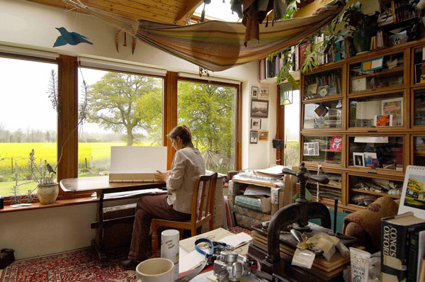
    I have a separate studio in my house with big picture windows that overlook very beautiful English countryside. The first thing anyone says when they visit is ‘what an amazing view’. My room is stuffed full of materials and equipment and my working space grows smaller every year. While working I listen to BBC radio 4, a wonderful non-music station that I learn something from every day.

    I have discovered that running the workshops for BINDING re:Defined takes an enormous amount of time in admin, maintaining the website, etc. It’s a new venture that’s only been going for 2 years and one I am convinced has a place in the binding canon. As it grows and evolves my hope is that it will become an important resource for the study of structures.

    Bench time is spent on a steady trickle of repair work, commissions for various projects and making bindings for exhibitions. I have a project list for sculptural pieces that I fit in between the other things.

    studio-lorisauer

    My dog, Sev, is with me always and has a dedicated chair in my studio where he snoozes most of the day. He comes to all workshops and has made many friends. Binding is a very solitary occupation and I couldn’t do what I do without his company. Our daily walks together are a great time for me to clear my head and solve design problems. I’d recommend it.

    sev-lorisauer


  • My name is Erin Fletcher, owner and bookbinder of Herringbone Bindery in Boston. Flash of the Hand is a space where I share my process and inspirations.
    The StudioNewsletterInstagramEmail me
  • Archives