RSS Feed

Posts Tagged ‘chicago public library’

  1. Bookbinder of the Month: Lang Ingalls

    March 9, 2014 by Erin Fletcher

    GoTellItOnTheMountain2-LangIngalls

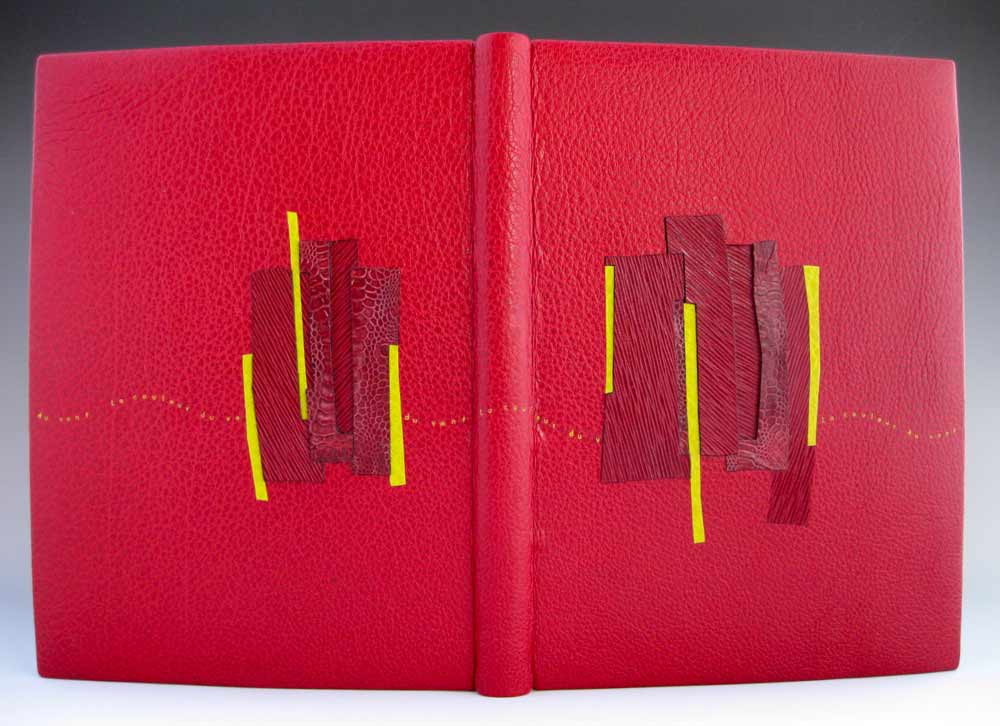
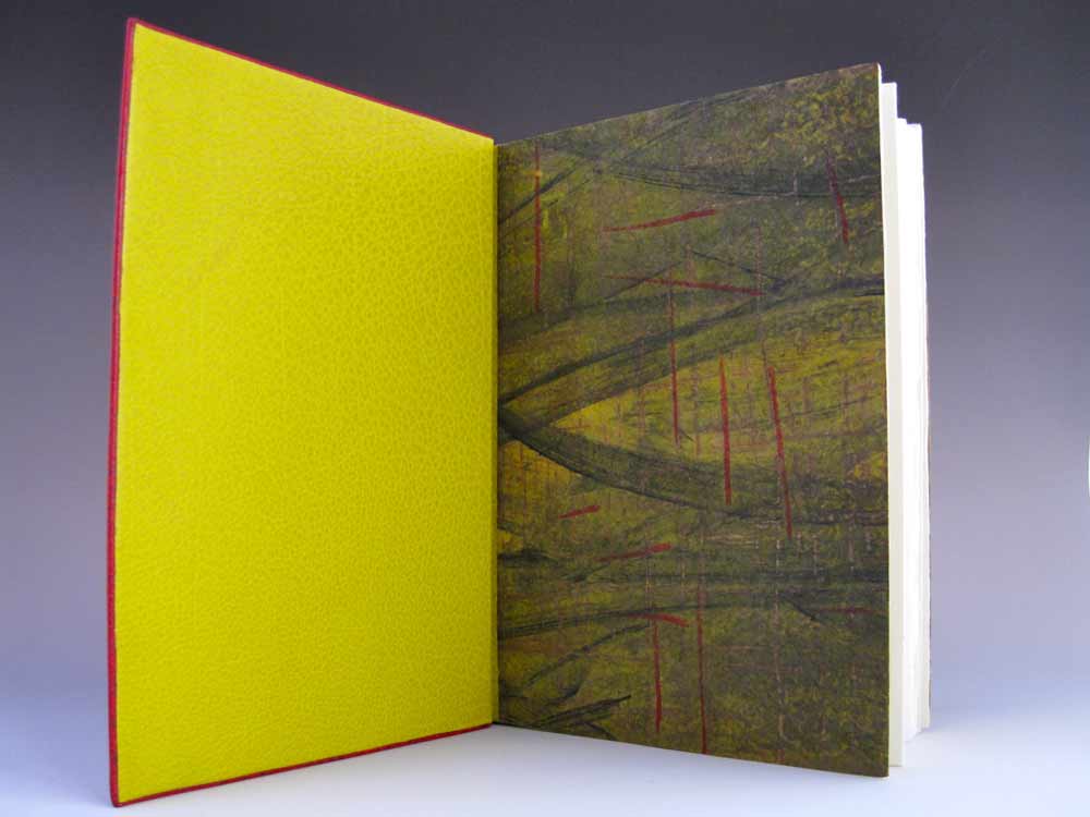
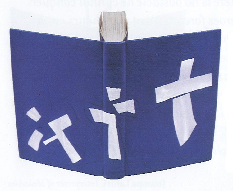
    In 2011, Lang Ingalls won the Best Binding Award from the Chicago Public Library’s One Book Many Interpretations exhibition for her binding of Go Tell It on the Mountain by James Baldwin. It was during the reception for this exhibition that I met Lang. I was drawn to her binding because of the stark contrast between the rich purple leather and bright white onlays.

    Bound in the French technique and covered in purple goatskin. Spanning across the covers and spine are white eel onlays.  Other design details along with the title are hand tooled blind.

    This is the binding that led to our being introduced during an exhibit in Chicago. I am so attracted to the brilliant contrast between the vivid purple leather and the bright white eel skin onlays. I have little experience using exotic leathers, how does eel skin compare to traditional bookbinding leathers?
    This eel skin is really really thin, perfect for onlays, and not difficult to execute. I had fun deciding which way the spine parts would go to complement the design.


  2. Book Artist of the Month: Mary Uthuppuru

    January 13, 2014 by Erin Fletcher

    InterpreterOfMaladies5-MaryUthuppuru

    Mary Uthuppuru received ‘Best Binding’ for her work based on Interpreter of Maladies. This award was given at the opening reception for the second edition of One Book, Many Interpretations exhibition at the Chicago Public Library in 2011. A total of ten titles were chosen by the CPL, a handful of bindings were created for each title and the award for ‘Best Binding’ was awarded to one binding for each title. 

    Housed in a beautifully shaped slipcase are nine individual books. Each book is bound in the Bradel binding style with handmade paste cloth. Details explained below are hand stenciled. Titles are stamped in gold. 

    This piece is so complex; you divided Interpreter of Maladies into nine books, which can be arranged two different ways to create either a map of India or the United States. I’ve never read these short stories by Jhumpa Lahiri, what inspiration did you find within the text to execute the binding in this manner? 
    This was my first competition binding and it was a perfect book for me because I have an intimate look into the content of Lahiri’s subject matter. Interpreter of Maladies is a compilation of nine stories featuring Indian people both in India and the United States as they deal with cross cultural issues and in some cases, the westernization of India. While the stories are about a specific culture, Lahiri writes them in such a way that they speak to a more universal experience.

    My husband is the son of an Indian father and a Japanese mother who moved to the United States for college in the 1960s. They moved here at a time when communication and travel is nothing like it is today. Letters were written and silences between phone calls were very long if at all possible. My first memories of visiting them were the numerous maps throughout the house. After a while it became clear that when you move to a new country with your family on the other side of the world, especially at the time that they did, there is comfort in looking at a map and seeing the two places a little closer together. It is this element that helped me tie the content of Interpreter with what became familiar to me.

    Since the stories take place in India and the United States I wanted both maps to be a part of the design. However, I didn’t want to overload the books with too many design features. Having the maps only appear one at a time as simple line drawings inset in the cover was the perfect solution. Additionally, I wanted the ability to create an intense color similar to marigolds, a flower present in various aspects of Indian culture, so I created paste cloth for my cover material. This also allowed me to easily stencil guides for arranging the maps into both configurations without which would make it nearly impossible for the viewer to figure out their order.

    InterpreterOfMaladies-process2-MaryUthuppuru

    Stencils used to create guides to help in arranging maps.

    This shuffling of book covers and rearranging them to create the two countries helped reinforced the difficulty of the themes in the book: life is a challenge, and when you move to a new place or what once was familiar changes, you have to make adjustments…and it can be difficult.

    – – – – – – – – – – –

    Below are images of the map blueprints and how the covers can be arranged to create both the United States and India. 

    InterpreterOfMaladies-process4-MaryUthuppuruInterpreterOfMaladies2-MaryUthuppuruInterpreterOfMaladies6-MaryUthuppuru


  3. July // Bookbinder of the Month: Coleen Curry

    July 1, 2013 by Erin Fletcher

    lacouleurduvent-coleencurry

    Coleen Curry was amongst the talented bookbinders who participated in the ARA-Canada exhibit La Couleur du Vent, an international design binding exhibition starting in Paris before traveling to Quebec in September 2013 and then Montreal in November 2013. La Couleur du Vent is a collection of poems by Gilles Vigneault, illustrated and designed by Nastassja Imiolek under the artistic direction of Cécile Côté. If it sounds familiar, I posted about this exhibition during last month’s interview with Sonya Sheats

    Coleen bound this copy of La Couleur du Vent as a ‘Montage sur onglets’ style so the prints would not get lost in the gutter. The term ‘Montage sur onglets’ refers to the signatures being sewn on stubs to release them from the confines of the gutter and offering a less restricted opening. Sewn on cords with laced-in boards, the book is bound in red water buffalo with chartreuse water buffalo edge to edge doublures. Exotic leather inlays of varying depths decorate the front and back covers. Title tooled with gold foil. The flyleaves are decorated papers made by Coleen. 

    A brief explanation about the design from Coleen:
    The colors match the prints in the book.  I took some of the shapes from the prints and altered them to create a feeling of blowing in the wind and to create movement.

    lacouleurduvent2-coleencurry lacouleurduvent3-coleencurry

    Coleen’s work has been on my radar ever since I came across her binding of Toni Morrison’s A Mercy at the Chicago Public Library’s exhibition One Book, Many Interpretations in 2011. I attended the opening reception not only because I love design bindings, but to see my own binding of Arthur Miller’s The Crucible. This was the first time I had a binding on exhibit and I was quite honored to be on display with so many other talented binders.

    A Mercy by Toni Morrison bound by Coleen Curry

    A Mercy by Toni Morrison bound by Coleen Curry

    Coleen’s work masterfully mixes traditional leathers with some non-traditional textures such as exotic leathers, agate, and horsetail (to name a few). But I am more attracted to Coleen’s brilliant use of color; either by adding pops of color, subtle hints or just out-right all-over bold color palettes. 

    Read the interview after the jump and come back each Sunday in the month of July to view more gems from Coleen’s portfolio.

    read more >


  • My name is Erin Fletcher, owner and bookbinder of Herringbone Bindery in Boston. Flash of the Hand is a space where I share my process and inspirations.
    The StudioNewsletterInstagramEmail me
  • Archives