RSS Feed

Posts Tagged ‘gabby cooksey’

  1. Online Exhibit for Stitch·illo – Creative Expressions through Thread and Fiber

    January 14, 2018 by Erin Fletcher

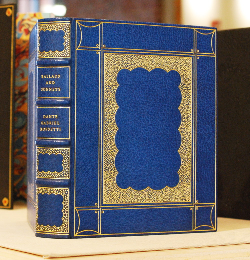
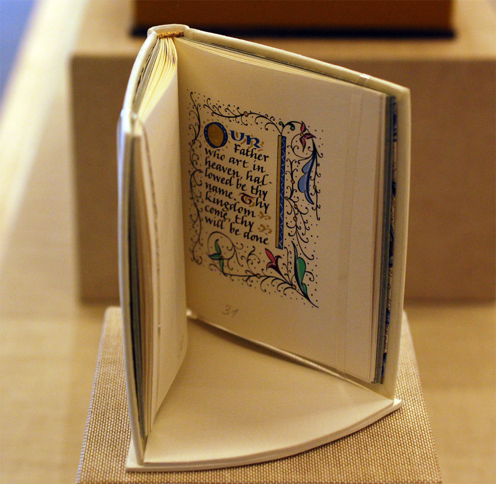
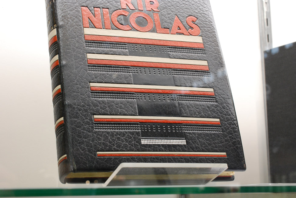
    binder: Jennifer Evers

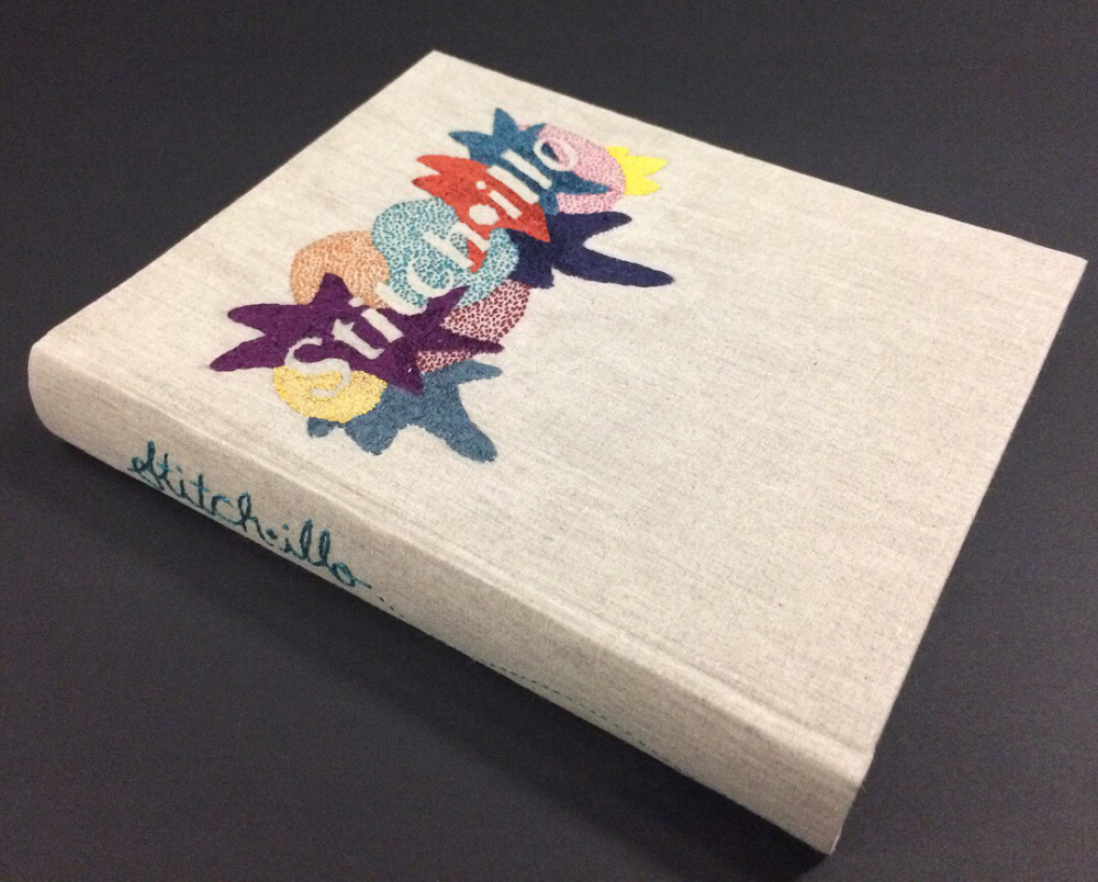
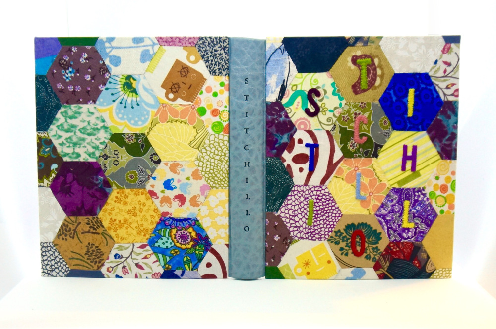
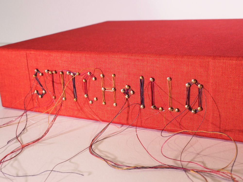
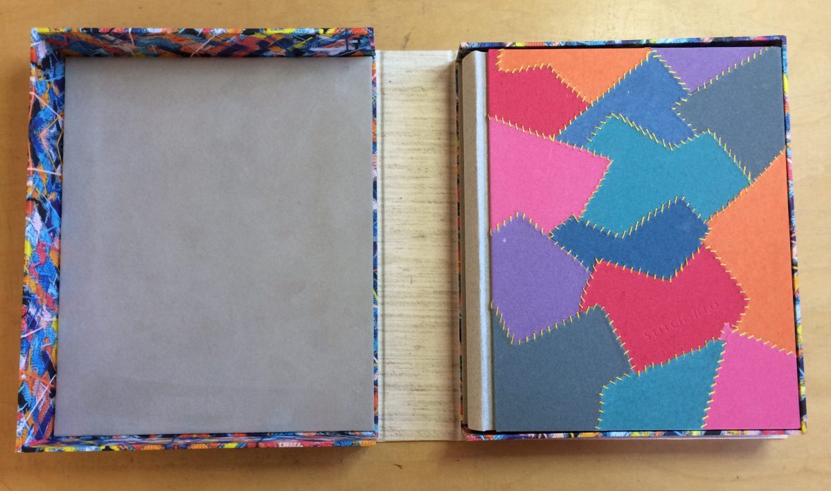
    Last year, I posted about my binding Feed Sacks: The Colourful History of a Frugal Fabric, which came about through an invitation from Todd Pattison. Along with fourteen other binders, we each bound a copy in our own style. The Feed Sacks bindings are now on display at the Iowa Quilt Museum alongside objects made with feed sack fabrics. In addition to our bindings, we also had the chance to recommend a binder for a second project. Janine Vanpool, the publisher of Uppercase magazine generously donated copies of Stitch·illo – Creative Expressions through Thread and Fiber.
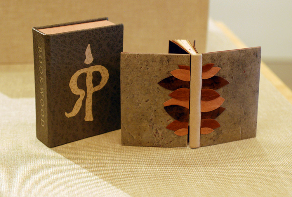
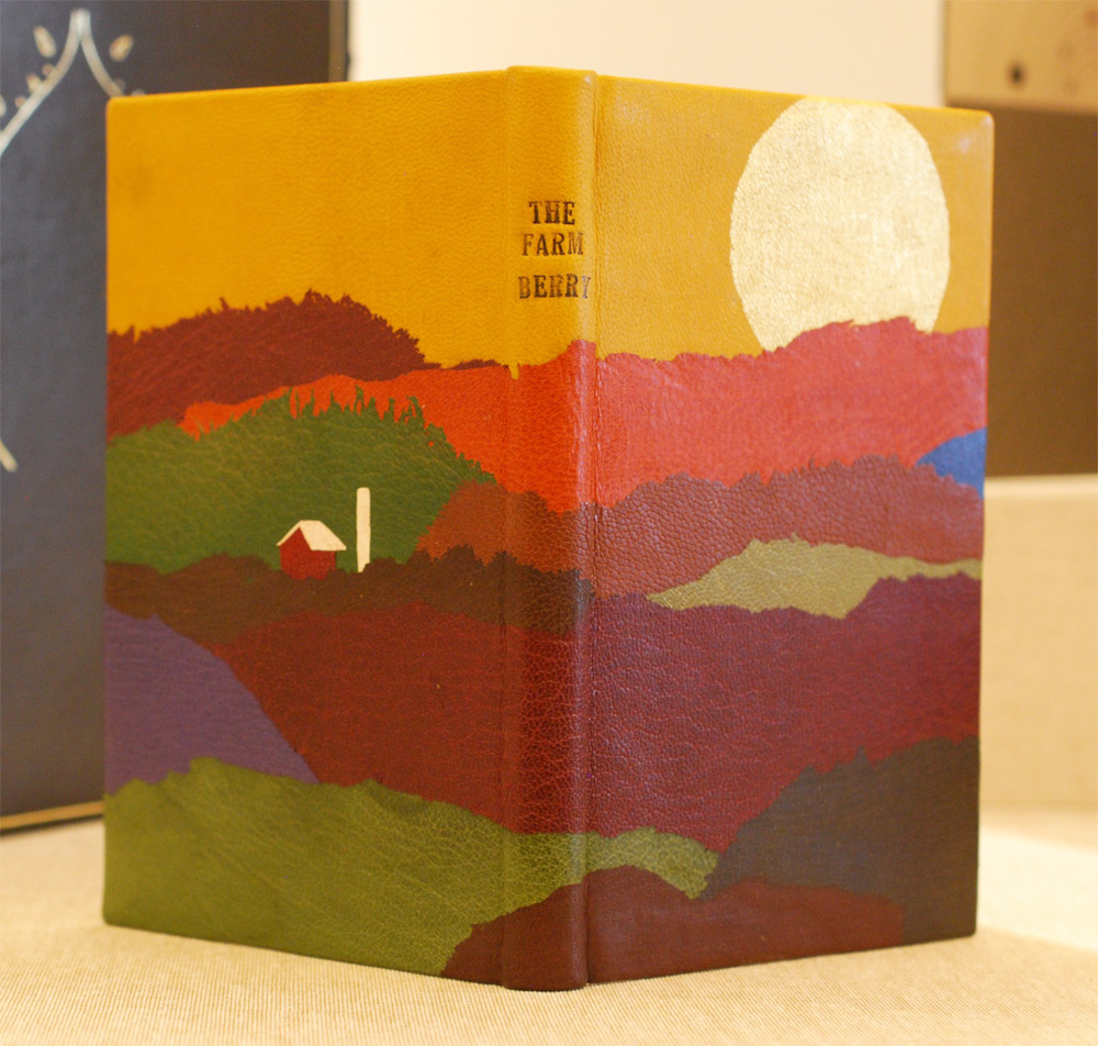
    binder: Becky Koch

    This book profiles 46 contemporary artists who are using embroidery and other textile processes to explore their art by honoring historical techniques and exploring new ways of crafting through fiber arts. Check out the fifteen binders who put their own unique spin on Stitch·illo.

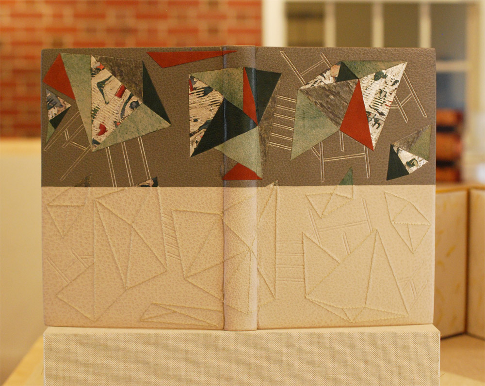
    binder: Gabby Cooksey
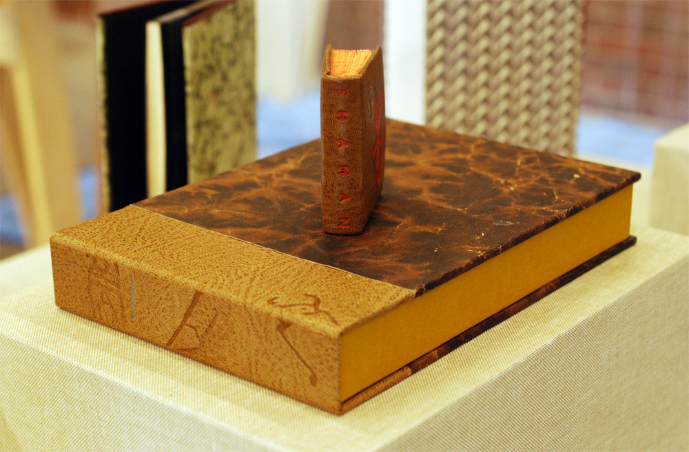
    binder: Kate Levy


  2. North Bennet Street School // Student & Alumni Exhibit 2017 – Alumni Work

    May 18, 2017 by Erin Fletcher

    In the second portion of my post on the Student and Alumni Exhibit at North Bennet Street School, I want to highlight some of the pieces showcasing the talents of our alumni. If you missed the post where I interviewed the graduating class on their set book, check it out here.

    I’ll start with my own bindings. This year I chose to submit two recently completed bindings. The first is a miniature binding of Bobbie Sweeney’s Rookwood printed by Mosaic Press in 1983. The text chronicles the Rookwood Pottery studio founded in 1880 by Maria Longworth Nichols who fell in love with the Arts & Crafts movement. She and her employees pioneered a variety of different pottery styles and glazes over the course of Rookwood’s existence.

    Bound in a Dorfner-style binding, the boards are covered with stone veneer with onlays of wood veneer and handmade paper. The interior side of the board is also covered in stone veneer facing a suede fly leaf. The edges have been sprinkled with purple gouache. The box is covered in dark grey buffalo skin with a back-pared onlay of light grey buffalo skin in one variation of the Rookwood insignia.

    The second binding I chose to submit was completed just last month after working on it for over a year. This fine binding of Italo Calvino’s Invisible Cities is bound in two buffalo skins, with dark grey on top and light grey on the bottom. The top is adorned with a series of onlays in green goatskin (show in both leather and suede), ruby Novasuede, stone veneer and multilayered palladium gilt pieces. The bottom half is embroidered in a matching thread in such a way that partially mimics the top portion. All of the lines on the top are palladium tooled and the bottom are blind. I was greatly inspired by all of the imagery in Calvino’s abstract telling of a conservation between Kublai Khan and Marco Polo. I will be posting on this binding further, there is so much to reveal about the edge decoration and doublures.

    Colin Urbina, BB’11
    Next up is another lovely miniature, this one was bound by Colin Urbina.

    Colin’s binding of Shaman is covered in a medium brown goatskin and adorned with onlays of stone veneer. Illustrations gleaned from the text are stamped in red foil. The head edge is sprinkled with red acrylic paint. The title is stamped in the same red foil along the spine of the book.  The box for this miniature book is quite large because it holds the book, a paper folder of loose prints and a map (displayed open). The spine of the box is covered in a tan goatskin stamped in blind with the same icons from the book.

    Samuel Feinstein, BB’12
    As always, Samuel Feinstein impresses with his incredible tooling abilities. His binding of Dante Gabriel Rossetti’s Ballads and Sonnets is covered in a bright blue goatskin and intricate gold tooling. His work is always teetering on the line of classic design and modernism.

    Gabby Cooksey, BB’14
    The Book of Penumbra comes from the very talented Gabby Cooksey. Her work is always fresh and interesting and splendidly weird. The cover stands out in a unique way against the rest of the bindings and so does the technique. Gabby arranged the illustrations from the book in a chaotic way before debossing them into the black goatskin. Contrast is created through the application of varnish on the raised areas. The text block was also illustrated and printed by Gabby, you can read more about the work here.

    Becky Koch, BB’12
    My dear friend Becky Koch submitted this delightful little binding of The Farm by Wendell Berry. I love the array of colors she used to capture such a bucolic landscape.

    The sun is beaming over the country side, literally beaming with Becky’s use surfacing gilding in gold leaf. Oh, I love that little patch of blue. Brilliantly place amongst a sea of mainly reds and browns. The title has been hand-tooled with carbon.

    Fionnuala Gerrity, BB’ 11
    Last up is Trinity is a small, but not quite miniature, laced vellum binding containing hand calligraphed pages from Maryanne Grebenstein. The transparent vellum reveals Fionnuala’s painting underneath.


  3. Trip to the 2015 New York Antiquarian Book Fair

    April 21, 2015 by Erin Fletcher

    On April 10th, I took the train down to New York City for the annual Antiquarian Book Fair and shadow show put on by the Fine Press Book Association. I spent the weekend ogling over a delightful selection of fine bindings, artist books and finely pressed editions amongst a sea of rare objects and books. I wanted to highlight a few of the gems that I saw, which there were many.

    BookFair1-ErinFletcher

    My first stop was at the shadow show, where I am afraid I was less of spectator (I only captured two images from this event). My first stop was at the Two Ponds Press table where I had a wonderful conversation with co-found Liv Rockefeller and browsed through some Gehanna Press editions and Gray Parrot bindings.

    Next, I stopped at the table of book artist Sue Higgins Leopard of Leopard Studio Editions, whose work is pictured above. We discussed the concepts behind a few of her pieces on display. After browsing through the selection of large-scale artist books on the Booklyn table, I made a point to chat with David Esslemont on his current projects. My next notable stops were with two highly accomplished and exquisite printers: Russell Maret and Gaylord Schanilec of Midnight Paper Sales. Gaylord was quite gracious with his time and walked me through this latest and most elaborate printed accomplishment, Lac Das Pleurs. It was such a pleasure to examine each print through his eyes as he pointed out subtle details, such as how each scale of one particular fish were drawn individually to capture the unique qualities of nature.

    Before leaving, I stopped by Abby Schoolman’s booth and met bookbinder Christine Giard, whose work was on display. It was such a treat to speak with her not only about her binding training, but discuss the techniques employed in her work. My goal is to get her interviewed on the blog sometime this year (Christine gladly accepted!).

    BookFair2-ErinFletcher

    From the Lux Mentis booth: left: Russell Maret’s Interstices & Intersections | right: a book from Nancy Loeber

    I spent one and a half days exploring the Antiquarian Book Fair, which was held at the Park Avenue Armory. As a former storage space for weaponry and tanks, the room was massive and has been transformed for several types of events and art installations. My first stop was at the Lux Mentis booth run by Ian Kahn. He always has delightfully strange and unique items on display, such as the work of Diane Jacobs and some fellow colleagues of mine Colin Urbina and Gabby Cooksey.

    As I wondered through the aisles, I stumbled upon one embroidered binding after another. If you are regular to the blog, you know my fascination with historical embroidered bindings and creating my own. So it was pure enjoyment to see such a pristine collection of historical embroidered bindings from England and France.

    BookFair3-ErinFletcherBookFair4-ErinFletcher

    The three embroidered bindings shown above range from 17th to 18th century and were found at the  Librairie Camille Sourget booth, a dealer from France. Click on the image to see the detail of the embroidery work.

    BookFair5-ErinFletcher

    Over at the Musinsky Rare Books booth were three really beautiful examples of embroidered French pocket Almanacs. I choose to include my two favorites. The example on the left has a great example of couched ribbon creating a bold border. The example on the right is bound in a luscious pink silk with painted appliqué pieces that build up the central design and dots. These pieces were in such wonderful condition, I don’t think they were carried around too often.

    BookFair6-ErinFletcher

    At the very end of the fair, my eye caught this shelf of embroidered bindings. Unfortunately, in my haste I neglected to note anything about the bindings or the dealer who was exhibiting them.

    In addition to embroidered bindings, I like to search out design bindings and binders whose name or work I recognize. One binder that popped up again and again was Brother Edgard Claes. The two books in the image below seem like they were made on two different planets, yet the bindings are actually very similar. The book on the left was spotted at the Sophie Schneideman Rare Books booth and is an example of one of Claes’ Dorfner bindings. The covers are wood veneer with delicate marquetry and hand painted elements.

    BookFair7-ErinFletcher

    The book on the right was found in the Bromer Booksellers booth. It was one of three bindings by Claes they had on display. This binding of erotica is an example of Claes’ polycarbonate bindings. The color palette is inspired by the original cover which has been included in the text block.

    BookFair8-ErinFletcher

    One binder commonly found at Antiquarian Fairs is Pierre Legrain. The binding above was found at the booth of Dr. A. Flühmann of Switzerland. I took a photograph of this particular binding because it reads so differently from his other highly geometrical designs. The emphasis on typography really grabbed me.

    I truly had a wonderful experience at the book fairs in New York City. I ran into familiar faces and met many wonderful artist, publishers and dealers. I’ll finish off this post with a charming engraved tunnel book discovered at one of the booths.

    BookFair9-ErinFletcher


  • My name is Erin Fletcher, owner and bookbinder of Herringbone Bindery in Boston. Flash of the Hand is a space where I share my process and inspirations.
    The StudioNewsletterInstagramEmail me
  • Archives