RSS Feed

Posts Tagged ‘lauren schott’

  1. North Bennet Street School // Student & Alumni Exhibit 2015 – Part Two

    May 28, 2015 by Erin Fletcher

    In addition to the set books I wrote about in Part One of this post, the Student and Alumni Exhibit at North Bennet Street School includes a selection of bindings produced by current students and alumni of the full-time program. In this post, I’ll be highlighting some of my favorites.

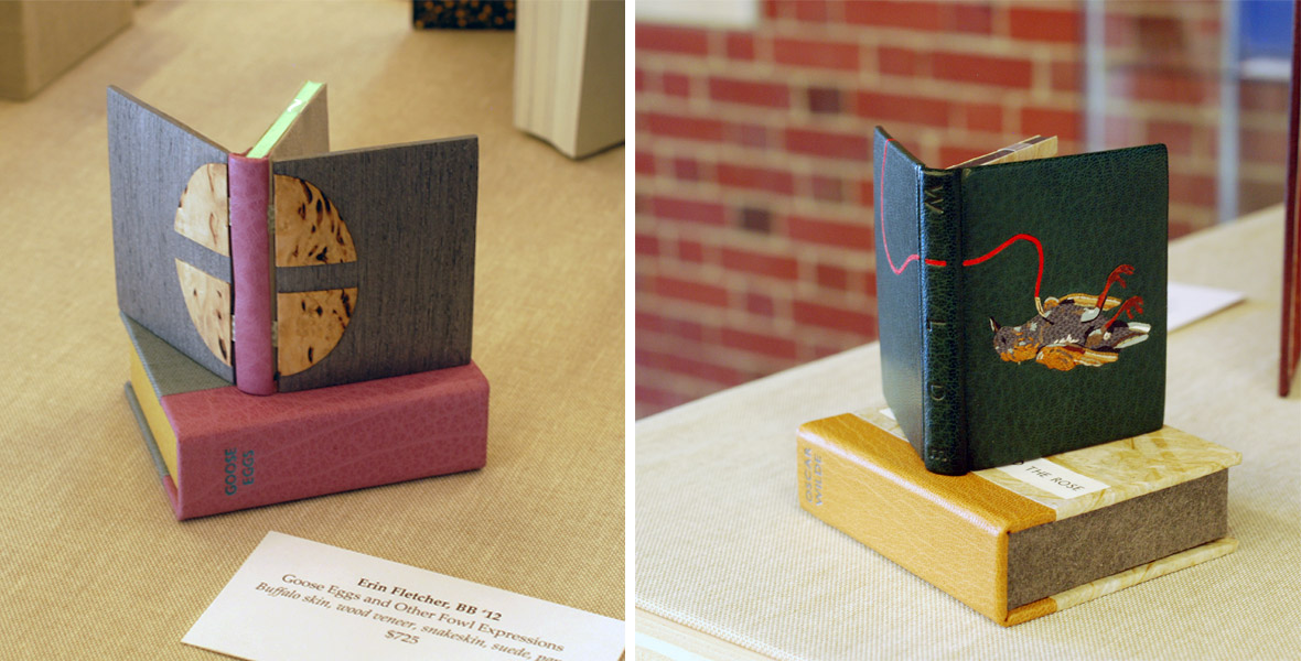
    I’ll start with my own bindings. This year I submitted two miniature bindings, which I’ve completed within the last 8 months. The book on the left is Goose Eggs & Other Fowl Expressions bound in the Dorfner-style with wood veneer boards. I wrote about the process a few months ago, you can check that out here.

    The second binding is The Nightingale and the Rose by Oscar Wilde. The book is bound as a traditional French-style fine binding. The nightingale on the front board is created using various back-pared onlays, feathered onlays and embroidery. For those of you who know the story, there is also a small wood veneer inlay that represents the rose’s thorn. The binding includes tan goatskin doublures. The back doublure showcases the rose and was created in the same manner as the nightingale.

    ErinFletcher-NBSSExhibit

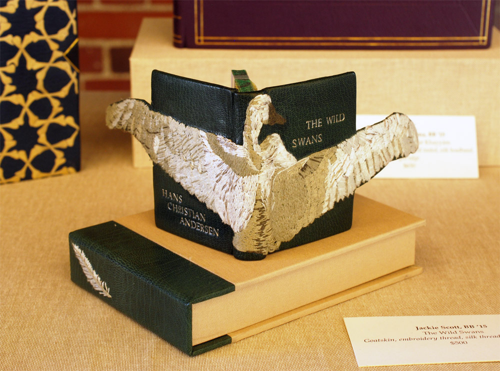
    Next up is Jacqueline Scott’s embroidered binding of Hans Christian Andersen’s The Wild Swans. Jacqueline is apart of the 2015 graduating class and I featured her set book in the first post. Her work is so stellar and I had the delightful opportunity to see this book as it took a journey to became this very gorgeous binding.

    The embroidery is so delicately handled and the feather embroidered on the spine of the box adds just the perfect amount of intrigue. The swan’s wings extend beyond the fore edge and are covered on the backside with matching green goatskin leather. I can’t wait to see how Jacqueline continues to explore embroidery in her work.

    JaquelineScott-NBSSExhibit

    The rest of the images were taken after the exhibit was fully installed, so please pardon any glares, shadows or my reflection. I would also like to note that I had intended to include the work of Rebecca Koch and Anne McLain, but it was rather difficult to capture an accurate photograph of their bindings due to reflection and glare issues. So sorry you two but I would like to say that loved your bindings!

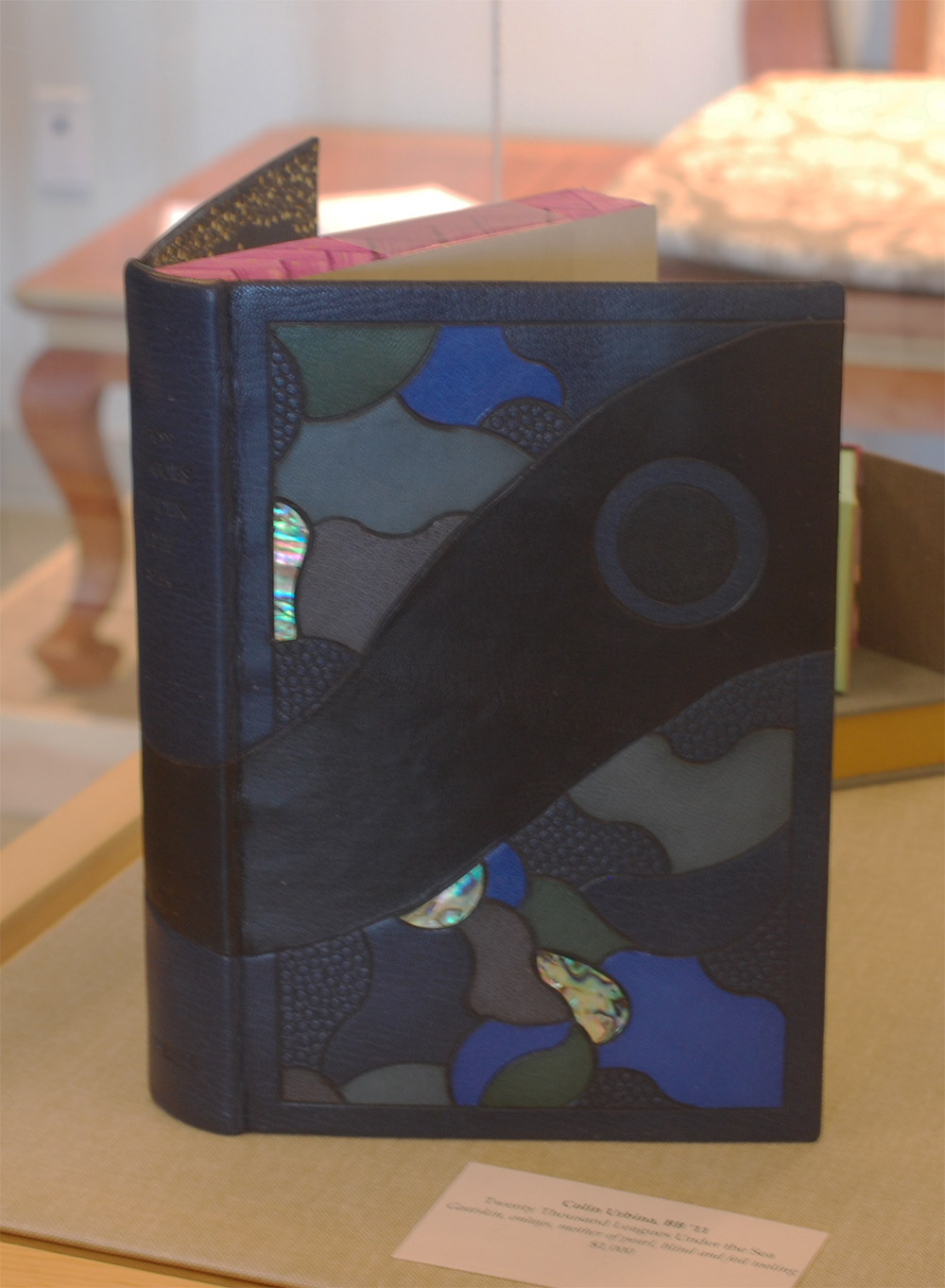
    The following binding was recently bound by my charming bindery mate Colin Urbina, 2011. In his binding of Twenty Thousand Leagues Under the Sea by Jules Verne, he created an abstract underwater scene with several tooled leather onlays and inlays of pearl. Other portions of the design are texturized with an open circle tool and by pressing sandpaper into the wet leather. The title and author are blind tooled on the spine.

    The head edge is painted in a vibrant purple with brushstrokes that cross over one another. Colin put in matching edge-to-edge doublures and added a frame of ascending “bubbles” using the same open circle tool.

    ColinUrbina-NBSSExhibit

    GabrielleCooksey-NBSSExhibit

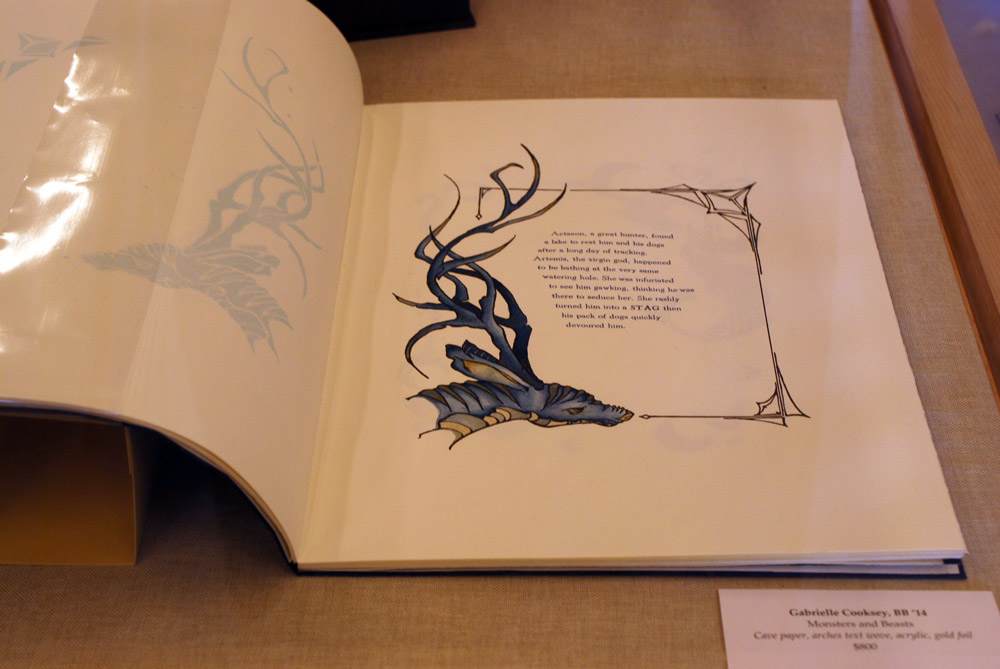
    Monsters and Beasts is the work of the incredibly talented Gabrielle Cooksey, 2014. Unfortunately, I don’t know much about this piece. But I believe that everything from the illustrations to the printing were all done by Gabrielle. It’s absolutely beautiful work!

    KaitlinBarber-NBSSExhibit

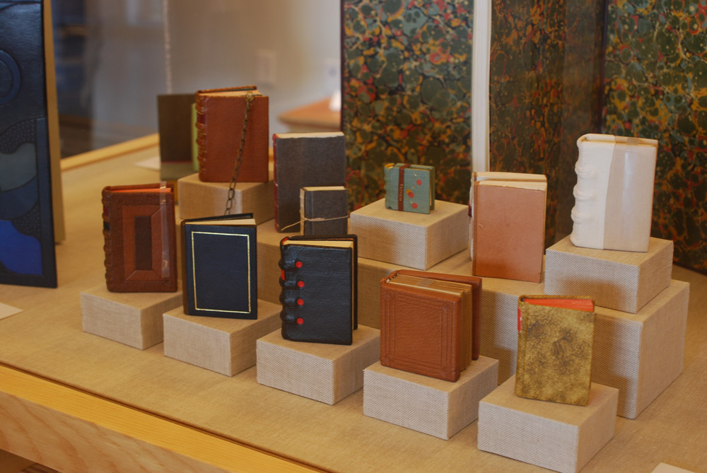
    Kaitlin Barber is the master of miniatures (and there always seems to be one in every class). In this adorable and wildly impressive collection of bindings, Kaitlin has miniaturized a selection of historical bindings she learned over the course of her time at North Bennet Street School. She’ll be apart of the 2015 graduating class and I wrote more about her work in the first post.

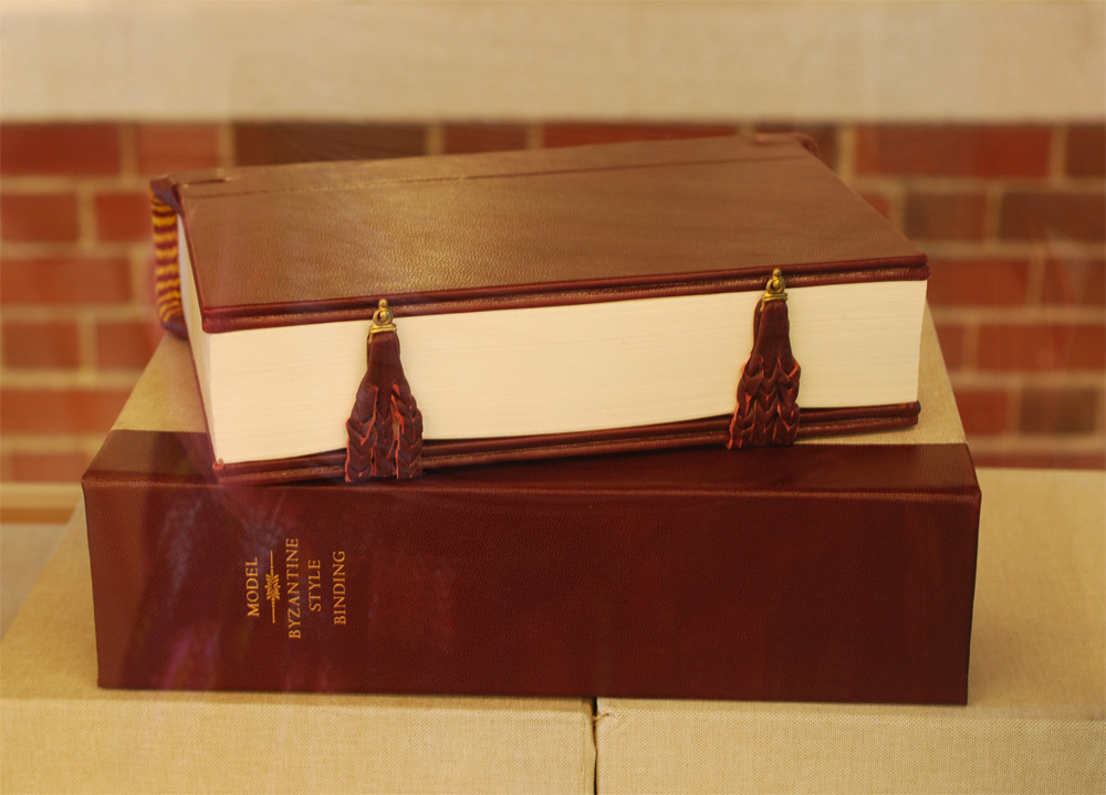
    Continuing on with the topic of historical structures, the students were treated to a week long workshop in the spring with Dr. Georgios Boudalis. Using his extensive understanding of Byzantine culture, he taught the students none other than a traditional 12th century Byzantine structure. Todd Davis, 2016, included his binding in the exhibit. The bindings are quite massive and required a lot of detailed work, such as board shaping, primary and secondary headbands, braided straps and clasps. After all that blood, sweat and tears, the class bound some really lovely models.

    ToddDavis-NBSSExhibit

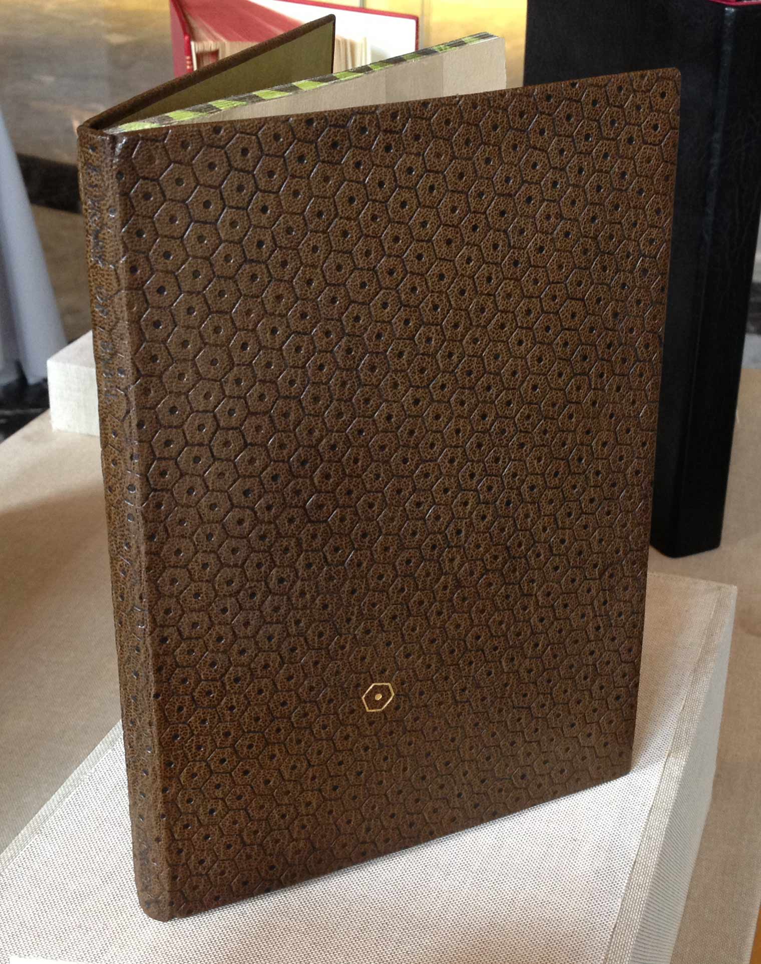
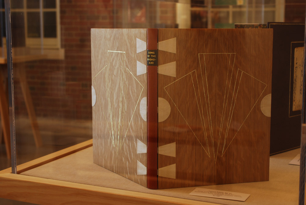
    The next binding on my list of favorites was done by another studio mate of mine, Lauren Schott, 2013. Bound in the Dorfner-style (same as Goose Eggs) with wood veneer boards and a leather spine. Lauren’s design on this binding of Walt Whitman’s Song of the Broad-Axe is so elegant.

    Lauren and I are both a big fan of incorporating shapes and symmetry into our designs. The front and back board are gold tooled onto the wood veneer; the tooling sits in the veneer so that at certain angles becomes almost invisible.

    LaurenSchott-NBSSExhibit

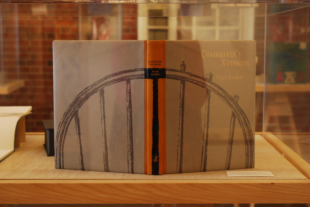
    And to round out the favorites is this stunning binding from Johanna Smick Weizenecker, 2010. This binding of Chairmaker’s Notebook is a quarter leather goatskin binding with semi-hidden corners. The design on the front and back cover continues onto the spine as an onlay. The title and author are hand titled using black and copper foils.

    JohannaSmickWeizenecker-NBSSExhibit

    So that concludes this year’s Student and Alumni exhibit at the North Bennet Street School. I hope you enjoyed this overview and I want to thank all of you who were able came out to see the show in person!


  2. Conservation Conversations // Another Look at Su-Su

    November 15, 2014 by Erin Fletcher

    Earlier this year, as part of the Conservation Conversations column, Lauren Schott wrote an article on su-su, which highlighted the steps to creating this alternative matter for toning materials as part of the conservation treatment. Also referred to as paper dirt or paper extract, I was first introduced to this alternative toning pigment at North Bennet Street School by my instructor Martha Kearsley. Later on, I used it while interning at the Boston Public Library, just as Lauren did the following year during her internship.

    Conservation is a science and therefore it evolves as our understanding of it grows through research, experiments, discussions and time. John O’Regan recently brought the following article to my attention, which he found through CoOL (Conservation OnLine). In 2008, Erin Gordon of Queen’s University wrote Comparing Paper Extract to Traditional Toning Materials. Erin’s introduction to paper extract came during a workshop conducted by Renate Mesmer, Head of Conservation at the Folger Shakespeare Library in Washington, D.C. The information Renate presented was largely based on an article by Piers Townshend, Head of Paper Conservation at the Tate Conservation Department. Interestingly, this is the same article Lauren cites in her post as further reading on the subject.

    Erin’s paper, as the title suggests, is based on her research conducted for the purpose of her studies in the Master of Art Conservation program at Queen’s University. If you are interested in knowing the science behind paper extract and other toning materials, I suggest you read through Erin’s paper. But those of you who are interested in reading the exciting conclusions Erin found right now, well here it is:

    Paper extract has some positive characteristics. Paper extract is transparent and matches the tone of aged paper exactly. It absorbs into the paper substrate and maintains the paper’s matte appearance. Paper extract is more lightfast than tea and it is the most reversible of all the materials tested. Another advantage to paper extract may be that a colour shift as the repair ages may not be as visible. As shown in the aging trials, watercolour and acrylic both faded. After a few years when the surrounding paper has aged, but the repair has faded, these repaired areas will become quite apparent and will likely need to be re-done. The use of paper extract may prevent this dramatic colour shift.
     
    These characteristics make paper extract a very attractive material to use for toning. Before choosing paper extract an important result of this investigation must not be overlooked. Paper extract degrades the paper substrate upon accelerated aging. The paper samples became more brittle and were significantly discoloured after artificial aging. According to the analysis done to the paper extract materials and then paper sources of the extract, the main culprit behind the deterioration upon aging seems to be lignin. Half the papers used as the raw material for the extract tested positive for lignin. The GC-MS results found a high abundance of lignin and its degradation products. Although the results show the content of lignin in the paper extract is contributing to the degradation of the samples during aging, there is a notable improvement in folding endurance and discolouration when the alkalized extract results are compared to the non- alkalized extract results. Further research should be conducted to test whether an adequate alkaline buffer can be added to the extract to make it archival or to test whether the extract can be applied to material that has been de-acidified with an alkaline buffer. Extract made from paper that is lignin free should also be tested to compare artificial aging results with the lignin containing sample results. After analyzing the results of this research, the conclusion can be made that paper extract is not the best choice for a toning material, as paper extract has been shown to degrade the paper substrate with accelerated aging. Although having better aging characteristics than tea, a commonly used toning material, the best choice remains to be either watercolour or acrylic paint.
     
    Gordon, ANAGPIC 2008, 19-20
     

    So the point of this post, is not to claim that Lauren or anyone using su-su is wrong in their methods (because it might be the most appropriate). But that as professions in the field of conservation, there is a responsibility to understand the positive and negative consequences of the treatments and materials employed (and how those factors may change over time). The pros and cons must be weighed for each object individually, while keeping in consideration its history, its function and its future. Understanding our materials and why we choose to bind, rebind or repair a book in a certain way must continually be reaccessed.

    I’ve targeted the conservator throughout this post, but I don’t believe that professional bookbinders are free of this task either. As is the case with most professions, we grow as an industry and individual through consistent research, experimentation and discussion.


  3. Conservation Conversations // An Additional Form of Documentation

    August 26, 2014 by Lauren Schott

    No one likes to think about all the little things (or, heaven forbid!, big things) that can go wrong as we work on our conservation projects. We are trained professionals. Our hands are steady. Our minds are sharp. And yet, as we work, any number of things could go wrong. A hand may slip as we lift adhered materials; a fragment may fall to the floor and crumble into a thousand irretrievable pieces. It’s sometimes intimidating to think about, but we all know in the back of our minds the myriad things that could go wrong.

    This, of course, is why we take the preliminary photos so often considered as “simply routine.” With them, we preserve a record of what the book once was. Imperfect though they may be, photographic evidence is better than no evidence at all. But what if a photograph doesn’t show just what we were hoping?

    I recently had the opportunity to fulfill the role of the William Reese Fellow at Rare Book School in Charlottesville, VA. The fellowship provided a week of class for a week of service to RBS. In my case, specifically, I acted as an on-site conservator for some of their most in-need collections. The class I took was Jan Storm Van Leeuwen’s “Introduction to the History of Bookbinding,” which coincidentally was the same class attended by Erin Fletcher, the proprietor of this blog. The conservation projects were wide and varied, as RBS’s large collection is intended for teaching students of the book with countless focuses and interests.

    One of the books I was presented with was a first edition of Joel Barlow’s The Columbiad—A Poem. Of course, RBS valued this copy not only for its edition, but for its binding. The binding was original; in full calf, decorated in gold and blind tooling, it was an exquisite example of early American deluxe binding.

    The upper board was entirely detached, and the bottom was in imminent danger of becoming so. The tight back spine was cracked and suffered redrot, and it was evident that a leather reback was necessary to preserve the book’s utility to the school. The danger of this treatment, of course, is that, should anything go wrong with lifting the spine, its beautiful panel tooling might be lost.

    I photographed the book before commencing work, documenting individual tools as well as the overall patterns in which they were used, and then I began.

    First, of course, was consolidating with redrot cocktail, a combination of SC6000 and Klucel G. This in and of itself revealed a new element to the book. With the darkened leather characteristic of redrot cocktail, blind tooling was revealed on the spine where originally it had appeared as an empty intermediary panel. I re-photographed the spine to document this tool, but it was difficult to make out even with a naked eye, let alone through the lens of my camera.

    Documentation-LaurenSchott

    I then realized I could make use of one of the techniques taught to me in Van Leeuwen’s class. This is something Van Leeuwen made use of frequently in his time as Keeper of the Book at the Dutch Royal Library in the Hague, and which I now hope to employ more regularly in my documentation. In short, he took rubbings of the decorative covers of the library’s books.

    Van Leeuwen uses an artist’s soft graphite pencil and a light wove paper he commissioned specially for the practice. He lays the paper over the area to be documented, plants one hand firmly to keep the assembly in place, and begins his work. Holding the pencil at a nearly 45 degree angle, he rubs gently horizontally, vertically, and to every angle. He changes the angle of the pencil as he works to capture the specific aspects he wishes to be revealed in the tooling, sometimes circling the pencil, sometimes pressing harder or softer. Varied depths and lacework lines reveal themselves in great detail as he works, rendering a copy in shades of black and white of the book’s decoration. Van Leeuwen takes care to note the book being documented, to what portions of the book each image belongs, as well as the date and the taker of the rubbing to provide a good record for researchers.

    Documentation4-LaurenSchott

    It was with great excitement that I was able to use this technique in a real-life situation so shortly after having learned it. I experimented with various tissues intended for repair. Their soft texture and flexibility offered a good medium for capturing the imagery of the tooling that the camera would not. It took several trials to find a suitable paper that would provide the suppleness to sink into the tooling, yet not tear with the use of the graphite pencil, but once the proper paper was found and the rubbing taken, the image of the tool was revealed in greater detail even than could be seen simply by the eye. A satisfying result indeed!

    Documentation5-LaurenSchottDocumentation2-LaurenSchott

    Having taken the rubbing, I faced the spine with solvent set tissue, lifted it in one solid piece, performed the reback, readhered it, and once again removed the tissue. In all, the added precautions of taking the rubbing were not strictly necessary, but it was a reassuring way to expiate the danger of losing this piece of early American tooling in its entirety.

    Documentation3-LaurenSchott


  4. Conservation Conversations // Su-Su

    July 29, 2014 by Lauren Schott

    Everyone who washes paper is familiar with the dramatic color transformation that takes place on the page after it is removed from its final bath. The evidence is left in the washing tanks; the water turns an unsavory yellowed color, and the paper is, to a degree, returned to its former glory.

    SuSu-LaurenSchottSuSu9-LaurenSchott

    The concept of su-su is to harvest this colorant and use it to dull the often glaring white of repair tissues. It helps the eye transition over repairs to appreciate the elements of the original object, rather than the work that’s been done.

    My first introduction to su-su was a brief mention during a paper repair workshop. My instructor, while addressing a question concerning blending and color matching to make repairs less obvious, told the class about this paper color extract. “Dirt paint,” she casually called it. It sounded like something slightly magical and a little counterproductive, though she assured us it was effective and safe for the paper. (For more information on the science behind su-su, check out the article by Peirs Townsend titled “Toning with ‘Paper Extract’” in The Paper Conservator, Vol. 26 (2002) 21-26.)

    The concept of su-su lingered in my mind. It came up in conversation at my bindery every once in a while, so it seemed it was on everyone else’s minds, too. “Hey, you remember that su-su coloring? How does that work again?” and “Have you tried to make it yet?” But for one reason or another, it wasn’t until a few years later that I actually got to produce it myself.

    The first step in creating su-su is to gather acidic papers that won’t be missed. Scour what your library is discarding for those telltale brittle yellow pages. The conservation department where I was working when I made my su-su had been saving discarded covers, endpapers and other scraps for years just for this occasion.

    SuSu8-LaurenSchott

    We filled a half gallon pot with acidic paper, breaking it up into small pieces as we went to increase surface area. After the pot was about three quarters full, we added water.

    SuSu7-LaurenSchott

    We set the concoction on high heat over our small stove until it came to a boil. Once it was hot enough, we turned it down to a low simmer and let it cook for several hours, stirring occasionally. The water took on first that yellow color, then started to darken as it concentrated.

    SuSu6-LaurenSchott

    After a few hours, we used tongs to remove the large pieces of pulp, and poured it through a strainer to remove the smaller particles. Then it was back to the stove for more simmering.

    SuSu5-LaurenSchott

    The dark brown liquid soon cooked off to create a viscous syrup, which we stirred regularly to prevent burning, just as you would while cooking chocolate.

    SuSu4-LaurenSchott

    We siphoned off the syrup into various shallow containers so the last bit of moisture would evaporate quickly. We mostly used the lids of small mason jars and some watercolor trays.

    SuSu3-LaurenSchott

    Since several of our containers were made of plastic, we couldn’t put them back over the stove at this point. By this time, making the su-su had taken several hours of work, though often with on-and-off attention. We elected to allow nature to take its course and let the small cakes dehydrate on their own while we worked on other projects, although we did occasionally take a moment to help them along with the assistance of a hairdryer.

    This is the result.

    SuSu2-LaurenSchott

    Though Townsend’s article claims that the resulting colorant is non-acidic, it’s always best to be sure of your medium before you use it on actual repairs. Test out the acidity of your result by painting the tint over a pH strip, and then take appropriate measures to balance out the pH of the tint before applying it to tissue. This batch was fairly neutral when tested, so I can use it without alteration.

    Su-su has become a regular part of my repairs. Whenever I pack a tool roll for conservational trips, it’s one of the first things to go in, right alongside my favorite bone folders and lifting knives. From my experience, a little goes a long way, and I anticipate this batch lasting me for quite a while.


  5. North Bennet Street School // Student & Alumni Exhibit 2013

    May 30, 2013 by Erin Fletcher

    At the annual Student & Alumni Exhibit for North Bennet Street School, the 2013 graduating Bookbinding class* showcased their design bindings for the set book The Periodic Table by Primo Levi. The text is largely a memoir of the years before and after Levi was transported to Auschwitz. Through a set of chapters titled after elements on the periodic table, Levi recounts his Jewish community in Italy and his life as a student and young chemist; exposing how life’s pleasures can resist and endure in the face of tyranny.

    studentalumni-kevinsheby

    Kevin Sheby bound his edition in black goatskin with hand-dyed goatskin onlays, tooled with palladium. The title and author are also hand tooled in palladium. Edges decorated with graphite and irregularly gilt with palladium. Kevin finished off the inside covers with black goatskin doublures and sunken ebonized veneer panels.

    studentalumni-jeannegoodman

    Jeanne Goodman covered her binding in full navy blue goatskin with sunken hexagon panels on either cover displaying two illustrations from the text. Each illustration is created through the use of several decorative techniques including feathered onlays, tooling in blind and gold and surface gilding in palladium. A tooled double border in gold runs along the outer edges of the covers. All three edges are gilt in gold and the interior is finished with handmade graphite paste papers.

    studentalumni-katrinakiapos

    Bound in full black goatskin, Katrina Kiapos, accented her design binding with a minimalist, geometric design. Three onlays in shades of black and grey mirror each other from the front and back covers. Katrina hand tooled the title and author in palladium. Edges decorated with graphite and sprinkled with palladium. The interior is covered with black goatskin doublures and leather flyleaves.

    studentalumni-betsyroper

    Betsy Roper bound her design binding in full hand-dyed goatskin. The skin was dyed to have a mottled look, creating texture and movement. Various hexagons are placed on the front and back cover, both protruding from and sinking into the boards. Title hand tooled in blind. Edges decorated in a soft brown tone. A marbled paper accents the island paste down and flyleaf.

    studentalumni-averybazemore

    Avery Bazemore created a design to reflect the chapters of the book, emphasizing the section about gold with a surface gilt square onlay on the front cover. The book is bound in full grey goatskin with additional onlays in black goatskin. Title and author were hand tooled in carbon. Head edge decorated before sewing in graphite; Avery again emphasizes the chapter in gold by gilding that particular section of the text. The single line continues onto the headband and headcap. The interior is finished off with leather doublures.

    studentalumni-laurenschott

    Covered in full dark green goatskin, Lauren Schott created a design binding reminiscent of the Art Deco era. Hand tooled gilt lines run the height of the front cover, wrapping around the spine, board edges and back cover leaving the outline of a hexagon. The title and author were also hand tooled in gold. Edges decorated with graphite and sprinkled with gold leaf.

    In addition to student work, a small handful of alumni work was also on display.

    libraryofbabel-colinurbina

    Library of Babel bound by Colin Urbina in full brown goatskin and hand tooled in a repeating hexagon pattern. A single hexagon is gilt on the front cover. Edges decorated with alternating shades of brown and chartreuse green.

    libraryofbabel2-colinurbinawhitman-samfeinstein

    A full leather rounded spine clamshell box from Samuel Feinstein. The front cover has a built-in window to house a printed portrait of Walt Whitman in addition to a gold tooled border along the frame.

    shakespeare-celinelombardi

    The Complete Works of Shakespeare bound by Celine Lombardi in full red goatskin. Titling and cover design hand tooled in gold. Each title on the spine is linked to a tab on the foredge of the text block through a corresponding gilt line.

    alumnicase-erinfletcher

    There are four great pieces on display in this case. On either corner are two of my bindings: Fantastic Mr. Fox and James and the Giant Peach. Last year, Marie Oedel paired up with book artist Laura Davidson (whom I interviewed on my blog in April) to make custom boxes for her book Every Nib. Lastly, is Celine Lombardi’s Murmurations, a small edition printed and bound during her year long fellowship at The Center for Book Arts in New York.

    * Nancy Baker’s set book was taken from the exhibit before I could photograph it for this blog post.


  • My name is Erin Fletcher, owner and bookbinder of Herringbone Bindery in Boston. Flash of the Hand is a space where I share my process and inspirations.
    The StudioNewsletterInstagramEmail me
  • Archives