RSS Feed

Posts Tagged ‘vellum’

  1. Bookbinder of the Month: Lori Sauer

    March 31, 2013 by Erin Fletcher

    topiary-lorisauer

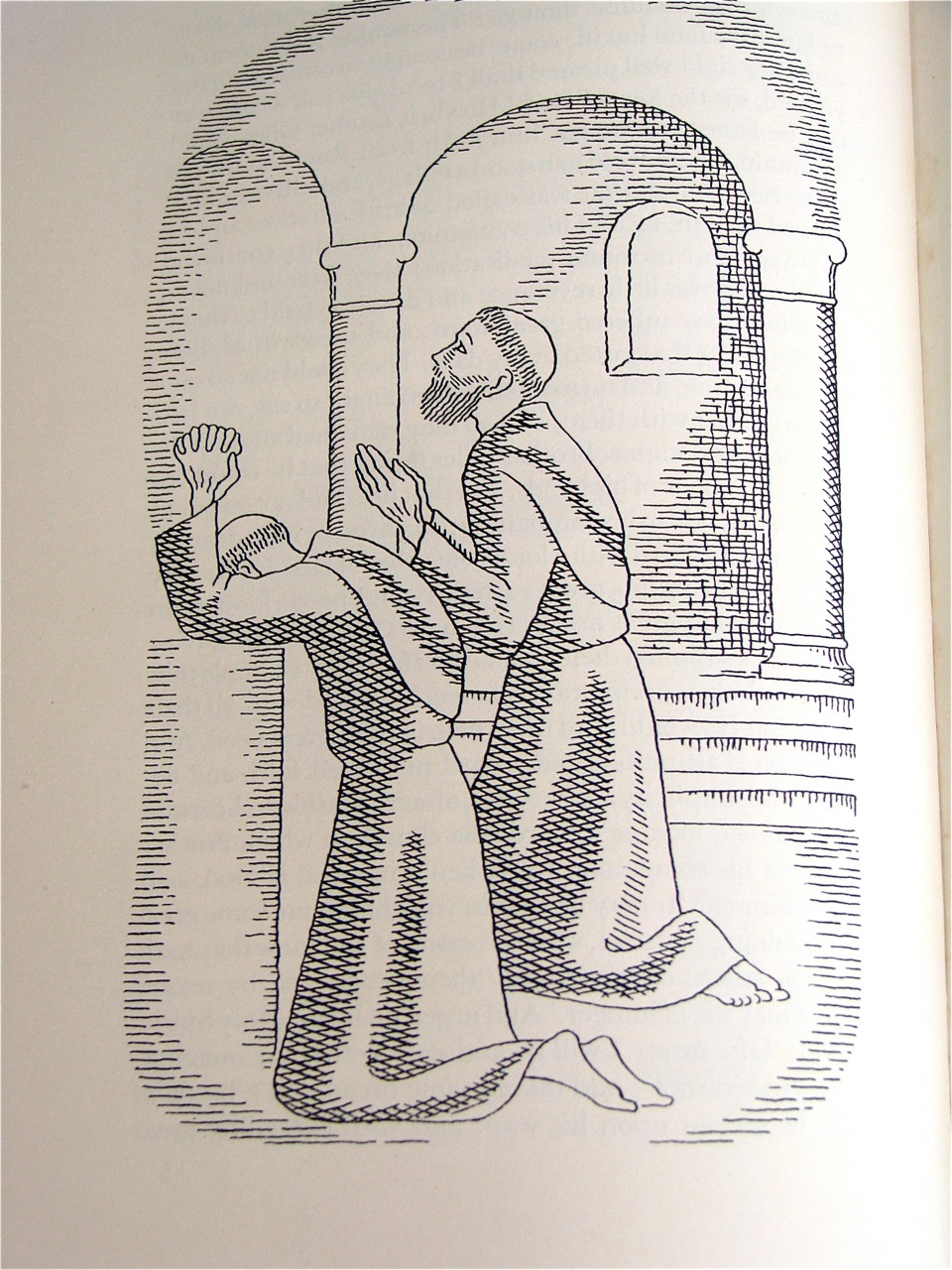
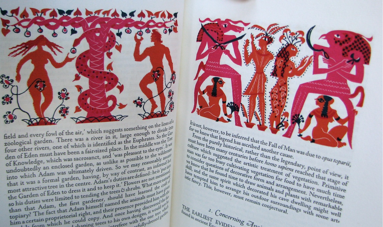
    Topiary by Cecil Stewart is about the art of clipping and sculpting foliage to maintain a clearly defined shape, like a geometric design or animal. In 1936, Topiary was published by Golden Cockerel Press in a limited letterpress edition on handmade paper with whimsical illustrations by Peter Baker Mill.

    topiary illustration

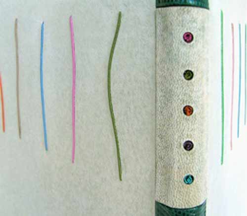
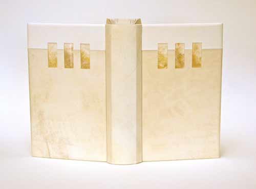
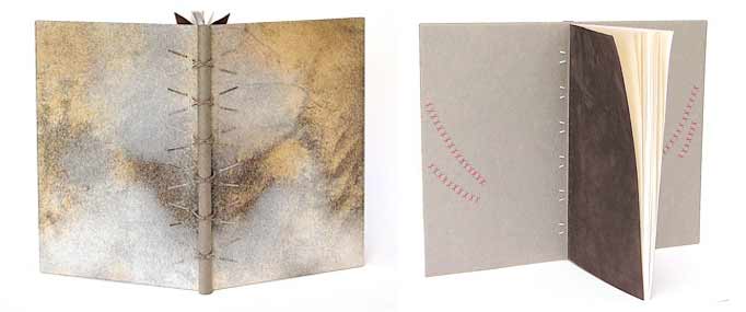
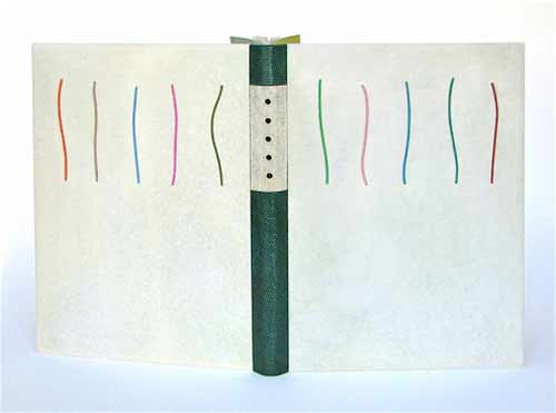
    In 2011, Lori Sauer completed a binding of Topiary in the dos rapporté structure. The binding is covered in reverse vellum dyed with leather dye. The spine is made up of 3 pieces covered in lizard skin and reverse goat. The boards have inlays of wire wrapped in silk and the spine has colured wire coils placed in cutout holes. The doublures and flyleaves are Japanese paper; the flyleaves have cutouts and ink decoration.

    The design is based around the layout of the text and the colours used in the illustrations.

    topiarydetail-lorisauer


  2. Bookbinder of the Month: Lori Sauer

    March 24, 2013 by Erin Fletcher

    glassroom-lorisauer

    The Glass Room by Simon Mawer is a novel about a Jewish family and the house they built in Czechoslovakia prior to WWII. The house is based on the Villa Tugendhat, designed by the architect Mies van der Rohe in Brno in the late 1920s. The building was inscribed on the National List of Cultural Heritage in 1969 and after renovations is open to the public. The story in the novel details the plight of the family as they are forced to leave the country and the subsequent uses their house was put to.

    In 2009, Lori Sauer bound The Glass Room for the Man Booker Prize. The binding is a dos rapporté structure and is covered in two shades of vellum. The Perspex (also known as Plexiglass) inlays have dyed Tyvek underneath to simulate onyx. Lori had wanted to use real onyx as it was a major feature in the house, but the cost of having it thinly sliced for inlays was too high. The onyx wall is located in the living room of the house and is partially translucent, changing its appearance with the evening sun. The doublures are dyed Tyvek made to look similar to veins in onyx.

    The house and its design dominate the novel. It is a very modern building with large rooms and lots of glass. Built when art deco was at its peak, Lori chose to design a binding around the motifs and in the spirit of the architecture.


  3. Bookbinder of the Month: Lori Sauer

    March 17, 2013 by Erin Fletcher

    brothergiles-lorisauer

    This book was bound in 2009 by Lori Sauer as a modified sewn-board binding with a wooden spine. The boards are covered in natural vellum and the spine is attached with threads and vellum strips that are laced into the boards. I find the unusual pattern of the vellum to be quite alluring; it adds a great amount of depth and texture. The doublures are Japanese paper with suede flyleaves. The doublures are embroidered with silk in a crosshatch motif, inspired by the method used in the illustrations.

    brother giles illustrations

    The Life and Chapters of Sundry Goodly, Sayings of the Teachings of Brother Giles was printed by the City of Birmingham School of Printing in 1941 with illustrations by Neil Leitch MacCuaig. The book is comprised of wise words and sayings by a companion of St Francis, Brother Giles. 


  4. Bookbinder of the Month: Lori Sauer

    March 10, 2013 by Erin Fletcher

    water-lorisauer

    The first Designer Bookbinders International Competition was organized in conjunction with the Bodleian Library in 2009. Each binder involved submitted a binding of the set book Water, which is a collection of poems and illustrations based on the theme of water. The set book was published by Incline Press in a limited, letterpress edition.

    In 2008, Lori Sauer bound a copy of Water as a stub binding covered in three stages: the spine attached first with the covers stuck on afterwards. The binding is covered in white vellum and the surfaces are decorated with impressions of circles that sit on a graphite grid. The rear board has pairs of circles and the front has single, larger circles. Onlaid colored circles run down the length of the front board. The spine has a pattern of plus symbols. The doublures are Fabriano Roma.

    Lori describes the text as being filled with a myriad of styles of illustrations and poems from different writers, adding to its broad theme. The circles of her design are simply the symbols for the chemical composition of water, two hydrogen atoms plus one oxygen. The onlaid colored circles on the front cover were added a couple of years after completing the binding as Lori felt a focus was needed to the design. I certainly think the addition of the circles offers a focal point to the viewer, then you slowly begin to realize the complex pattern of lines and circles underneath. 


  5. Bookbinder of the Month: Lori Sauer

    March 3, 2013 by Erin Fletcher

    kyffin1-lorisauer

    Kyffin: A Celebration is a collection of essays about the Welsh artist Kyffin Williams. This book was published and letterpress printed by Gwas Gregynog Press (2007) in a limited edition containing linocut prints from the artist. Production began with the artist’s collaboration, but Kyffin died before its completion. In 2008, Lori Sauer bound a copy of this book as a modified sewn-board binding. 

    The boards are covered in embossed vellum that is drummed on and the spine is shaped from black African hardwood. Doublures and flyleaves are Fabriano Roma in black and blue/grey, the colours of the linocuts.

    Lori wrote me a few words regarding her concept for the cover design.
    Illustrated books present the challenge of how to design the cover, especially this one with such strong images. I never want to imitate the artist or transfer their work to the outside. My aim is to be complimentary and pick up on ideas of tone and intent. In this case the binding uses the colours of the text and the texture of author’s medium.


  6. Bookbinder of the Month: Sybil Pye

    September 16, 2012 by Erin Fletcher

    Sybil Pye was a long-term companion to artist and poet Thomas Sturge Moore and throughout her career bound several copies of his book of poetry The Little School. This copy was printed on vellum by Eragny Press in 1905 and bound by Sybil in 1916. Covered in green goatskin with inlays of vellum and gold tooled with her familiar brass tools. Marianne Tidcombe’s Women Bookbinder 1880-1920 gives ownership to the Wormsley Library, but you can view this binding on the British Library’s online catalogue


  7. My Hand…The Songlines

    July 17, 2012 by Erin Fletcher

    In the second and final year at North Bennet Street School all students are given the same book in sheets (known as a set book) to complete as a fine binding.  Given complete freedom over the materials and design, the inspiration should be derived from the set book.  This year we bound copies of The Songlines by Bruce Chatwin.

    My main inspiration came from an Aboriginal painting depicting imagery referred to as Dreaming.  At the moment a mother is conscience of conception, the unborn child receives the spirit of a totemic ancestor connected with the location when awareness occurred.  In a general sense, the Dreaming relates to a period before the memory of living creatures, during the time of the creator ancestors and supernatural beings.  The paintings themselves are visual representations of the artist’s individual spiritual beliefs.

    read more >


  • My name is Erin Fletcher, owner and bookbinder of Herringbone Bindery in Boston. Flash of the Hand is a space where I share my process and inspirations.
    The StudioNewsletterInstagramEmail me
  • Archives