RSS Feed

Posts Tagged ‘william shakespeare’

  1. Bookbinder of the Month: Kathy Abbott

    December 6, 2015 by Erin Fletcher

    AsYouLikeIt-KathyAbbott

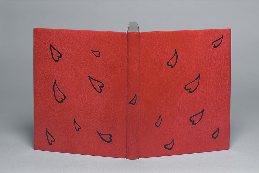
    Jumping back to 2008 with this binding of William Shakespeare’s As You Like It. Kathy Abbott bound this 1903 Roycroft Shop edition in full scarlet goatskin. The cascading hearts are black goatskin onlays. The head edge is gilt using moon gold.

    I’ve noticed that you never title your bindings. What are your reasons for this choice? Are you ever criticized for this decision by collectors or other binders?
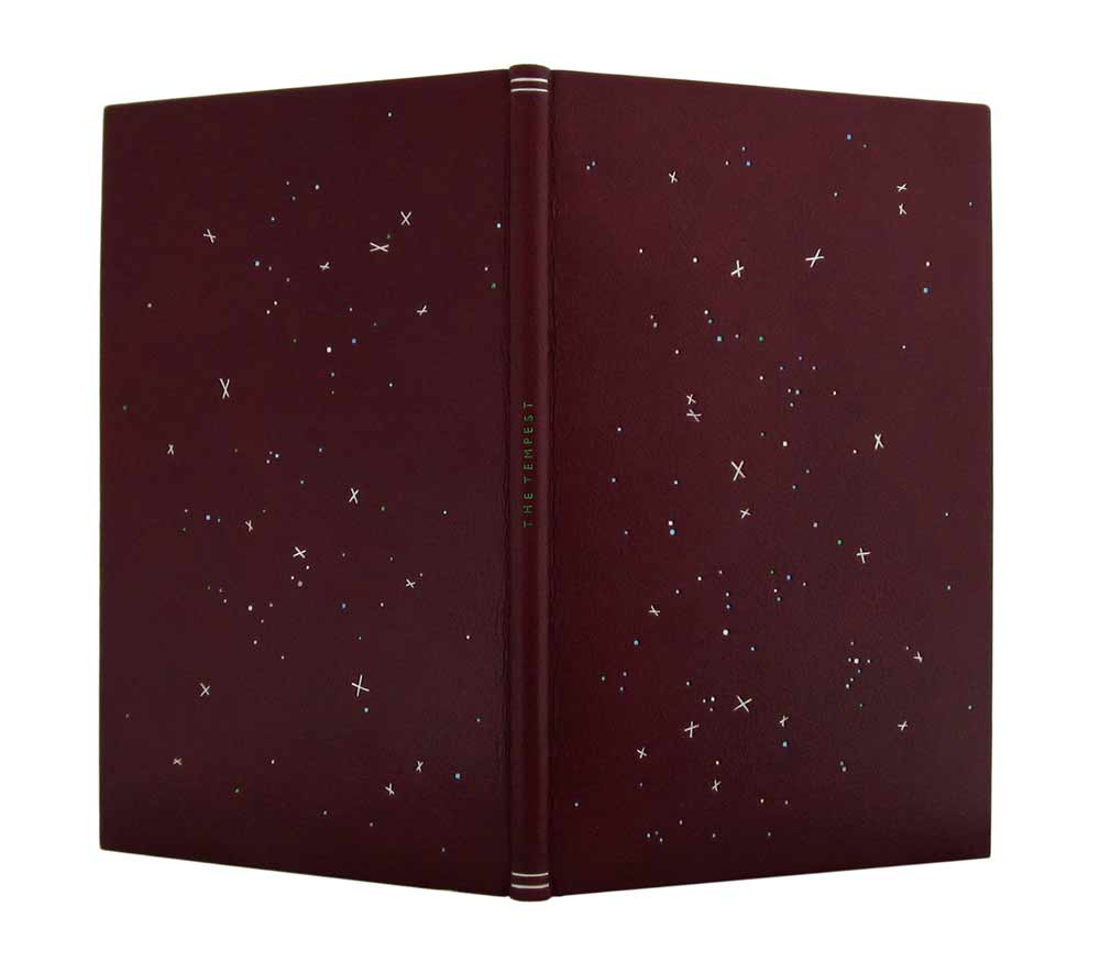
    I wouldn’t say criticized but it is often commented on! I like the reader to be curious about what’s inside the book, without actually ‘telling them’ what it’s about. For me, a book’s design must flow freely across the front board, the spine and the back board without interruption. I feel that a title would break the flow in my work. This is purely personal: I have seen many binders use titling beautifully as an essential element of their design but this is just not for me, at least for now that is! All of my bindings are housed in bespoke drop-back boxes and the title of the book is always on the box, so it’s not a problem.

    The free-flowing design for this book is a nod towards the love letters that Orlando leaves for Rosalind in the trees of the forest.


  2. August // Bookbinder of the Month: Annette Friedrich

    August 1, 2013 by Erin Fletcher

    thetempest1-annettefriedrich

    This edition of The Tempest by William Shakespeare from The Nonesuch Press, was bound by Annette Friedrich in 2012. Bound as a full leather fine binding in red-brown goatskin. Decorative tooling on the covers in white, grey, two shades of blue, metallic green and silver. The title is tooled along the center of the spine in metallic green with matte silver lines at the head and tail.

    thetempest3-annettefriedrichOn the inside, the paper bord-a-bord doublures are bright blue, matching leather joints and fly leaf in silver. All papers used are hand dyed.

    thetempest4-annettefriedrich

    The binding is housed in a green chemise and slipcase. The chemise is decorated with linear tooling across the sides in two shades of blue. The author’s name is tooled in metallic green in the center the spine of the chemise along with tooled lines in matte silver and blue at the head and tail.

    I first stumbled upon Annette’s work through the Autumn 2012 Newsletter of Designer Bookbinders. The cover offers a detailed image of Annette’s binding Water bound in 2008.

    water-annettefriedrich

    The fine binding work of Annette Friedrich is delightful! Her portfolio matures with every new binding as she skillfully depicts the essence of each story with delicate and artistic flair. Read the interview after the jump and come back each Sunday in the month of August for more posts on the work of Annette Friedrich.

    read more >


  • My name is Erin Fletcher, owner and bookbinder of Herringbone Bindery in Boston. Flash of the Hand is a space where I share my process and inspirations.
    The StudioNewsletterInstagramEmail me
  • Archives