RSS Feed

October, 2013

  1. My Hand // Field Book of Western Wild Flowers: Part Three

    October 31, 2013 by Erin Fletcher

    wildflowers12-erinfletcher

    Part One can be read here
    Part Two can be read here

    I need to backtrack a bit. Part two ends with the covering of the matching leather doublures. The remainder of the design elements that are going to be explained in this post were applied before the doublures were pasted down. Part two has been revised accordingly. 

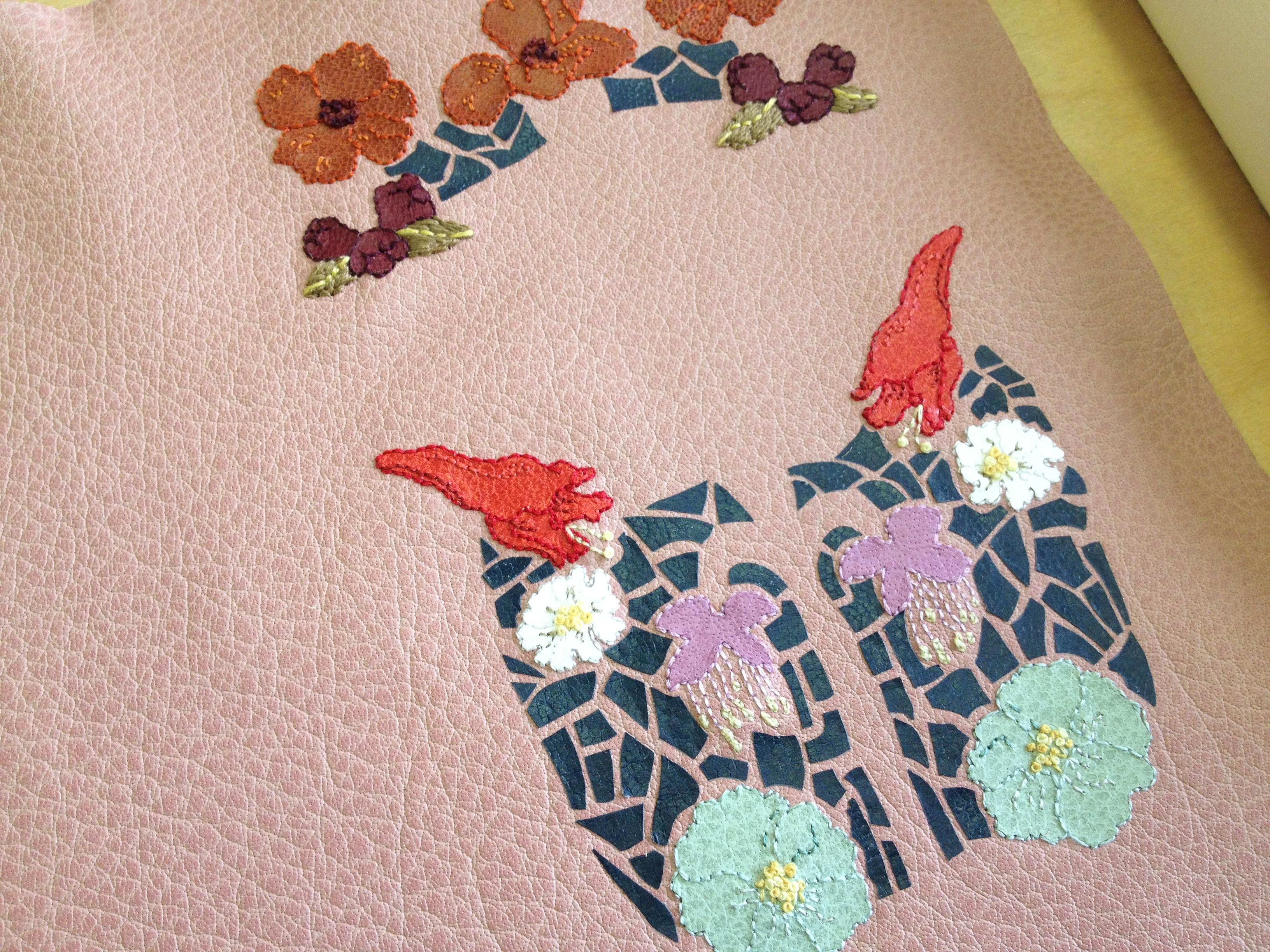
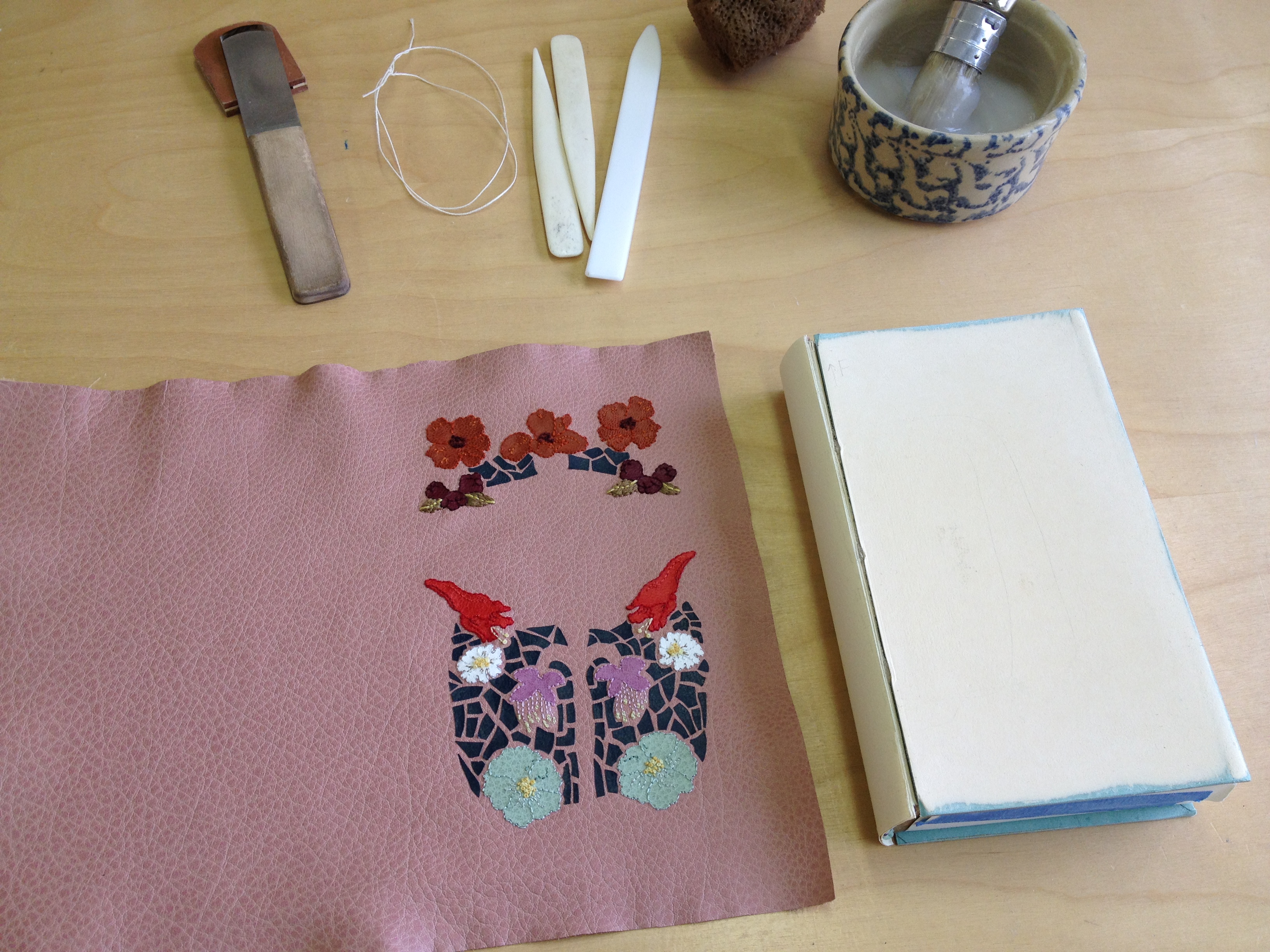
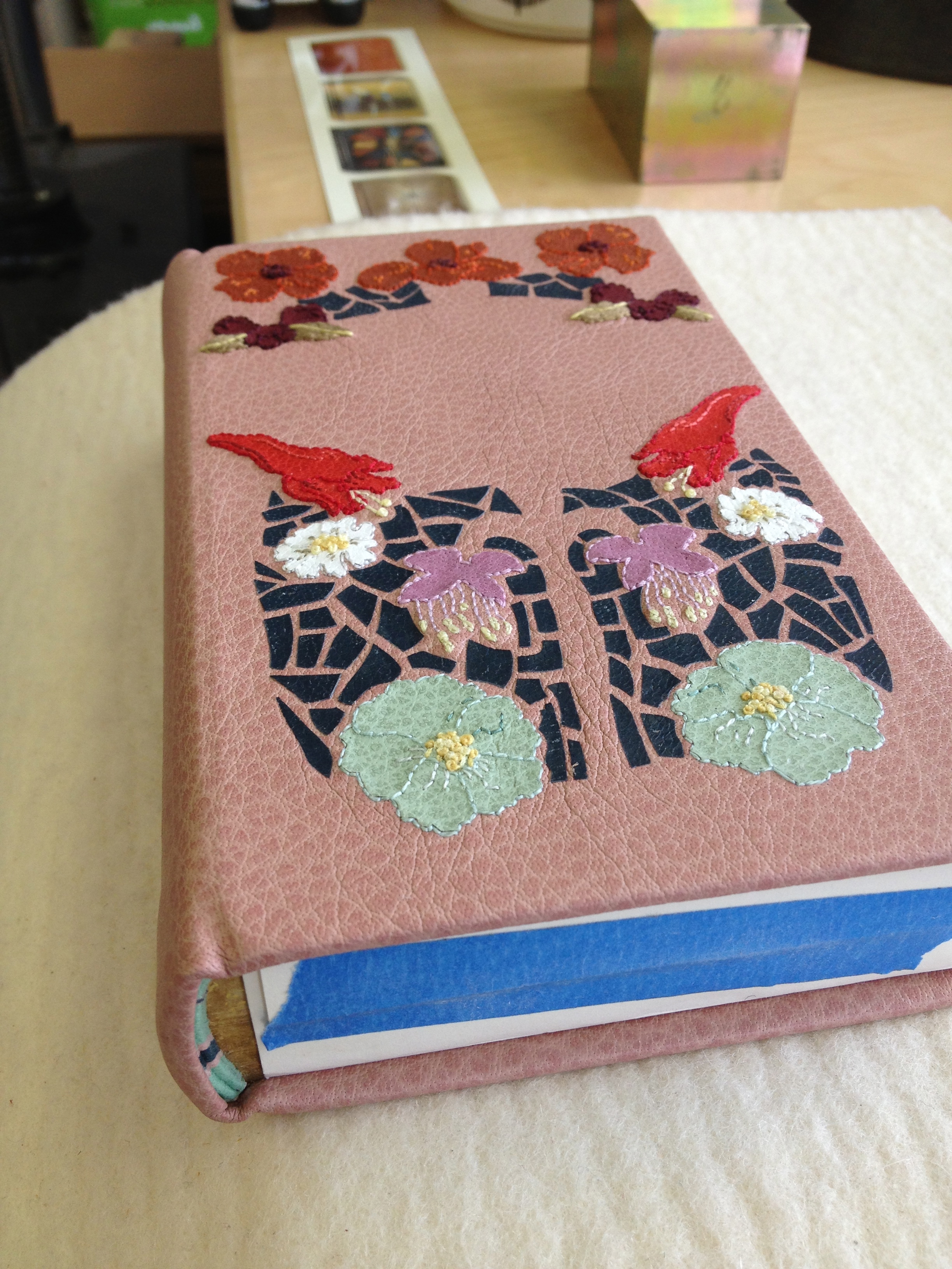
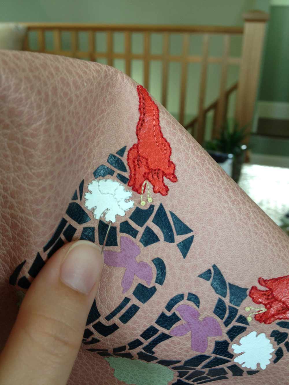
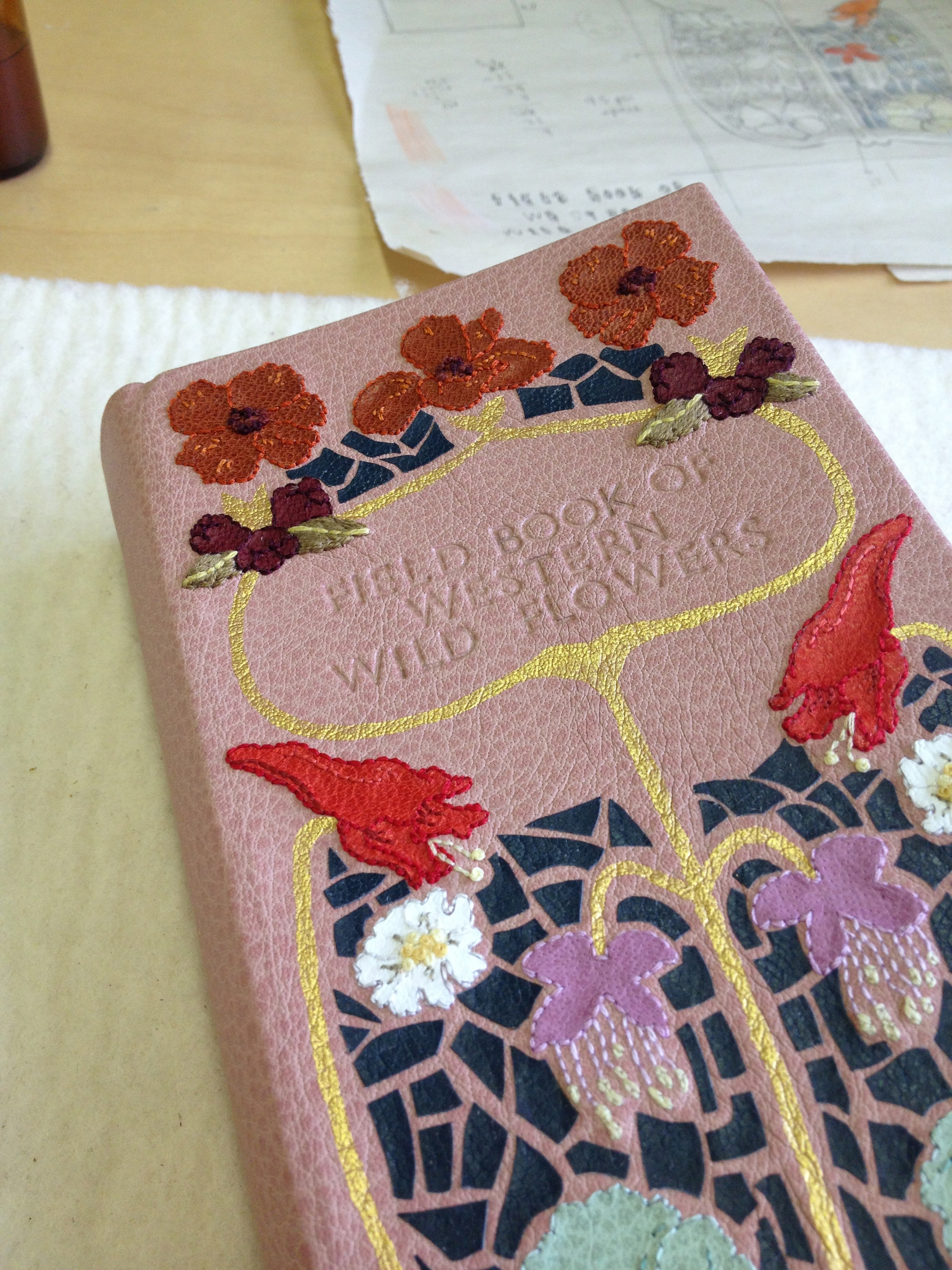
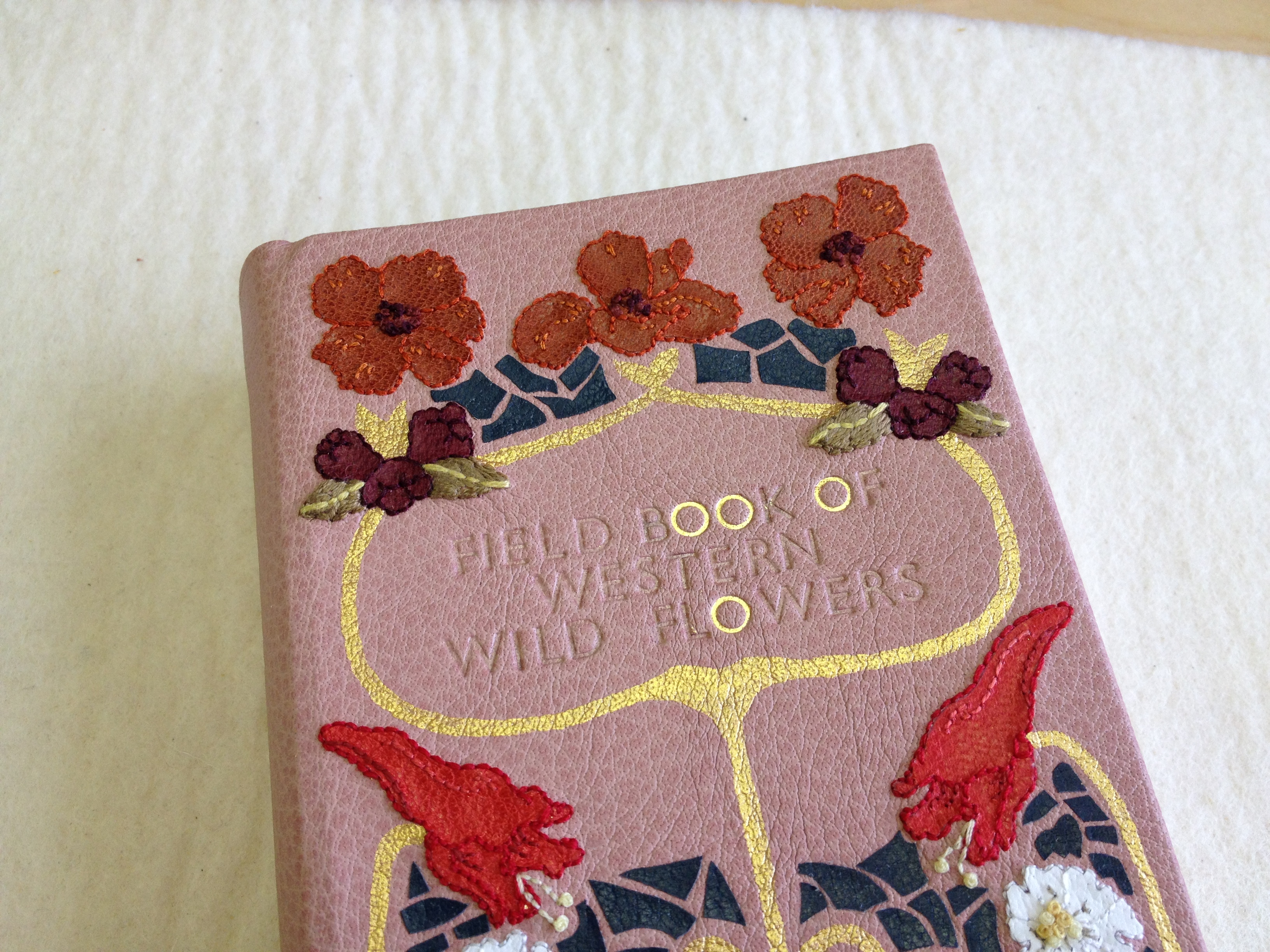
    The final steps to completing the design included the addition of a gold border and the title. In the early stages of designing the cover, I wanted to create the gold border through surfacing gilding. Which would have been done before covering because I didn’t want to risk getting gold leaf on the embroidery stitches. However, after a few tests I decided my supply of gold leaf was too yellow against the dusty pink buffalo skin. The border was therefore painted onto the leather with a fluid acrylic pigment. This is the same technique I used on the fine binding for The Songlines

    The title has been tooled with handle letters in the typeface Gill Sans. Buffalo can often feel spongy under the tool and requires slightly more pressure to achieve a crisp impression. I’ve found that buffalo will not blind in the same manner as other animal skins and can be a bit more finicky to tool. So with a bit more patience, the title was gilt in gold leaf one letter at a time. 

    wildflowers13-erinfletcher

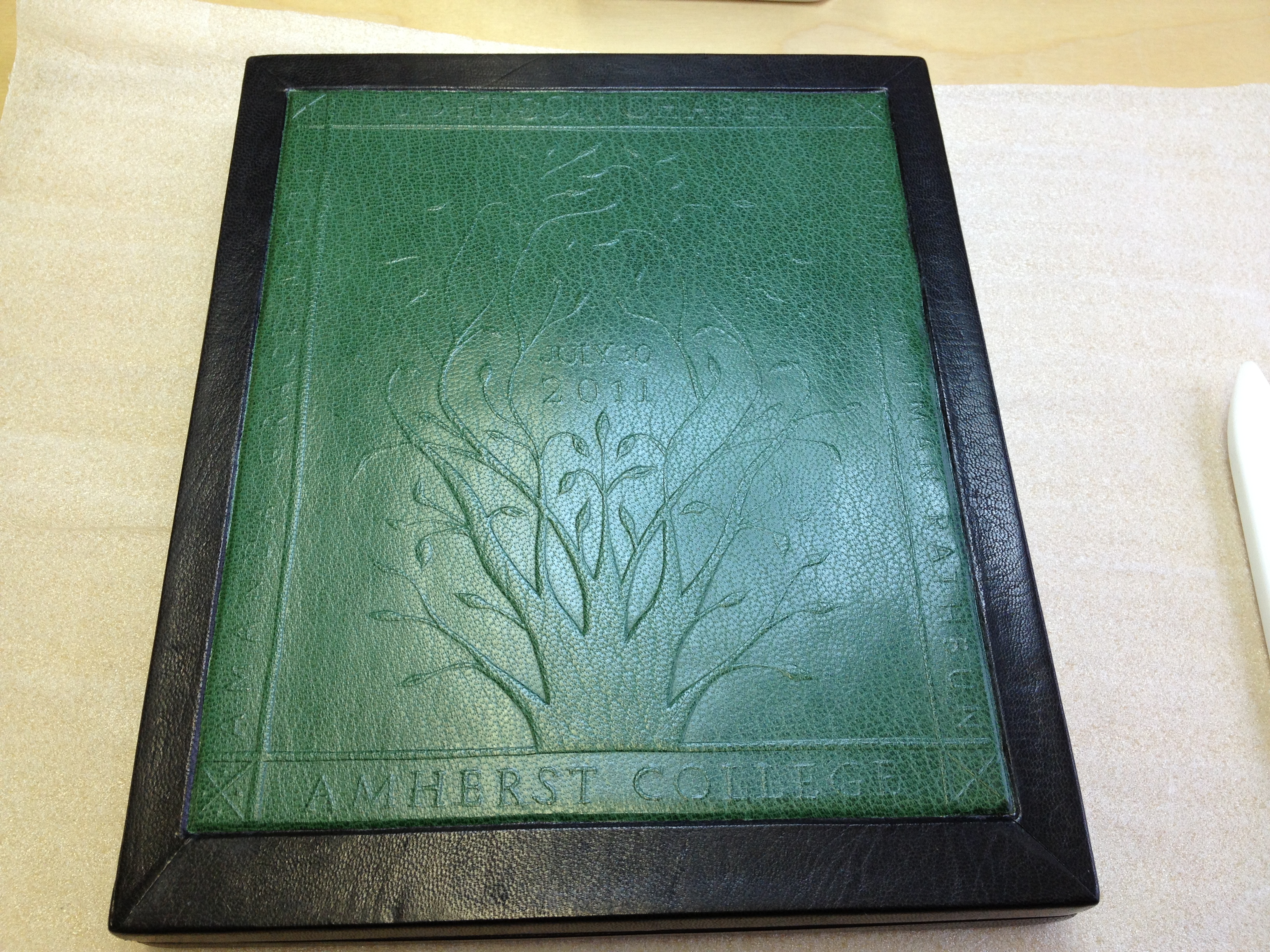
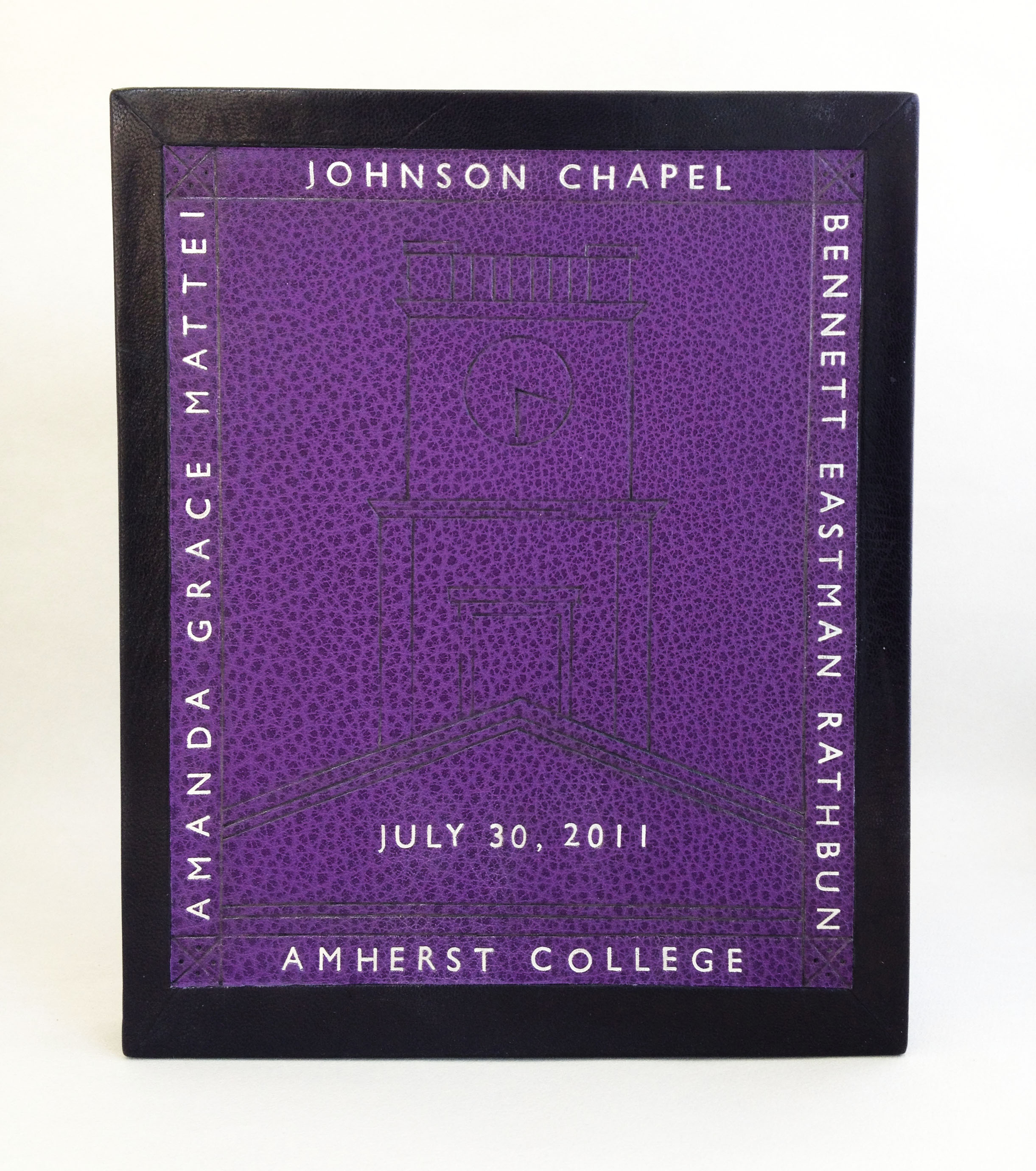
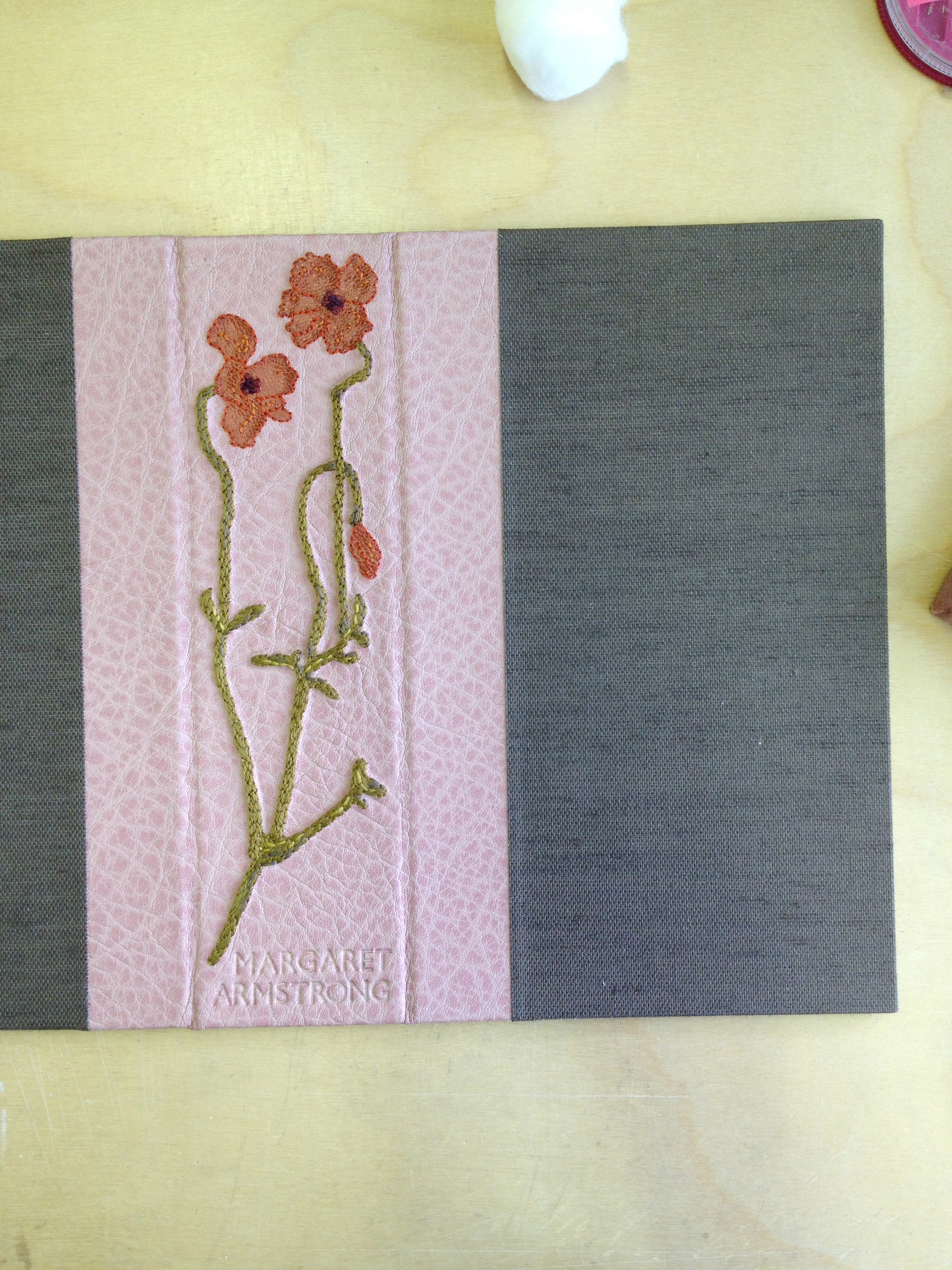
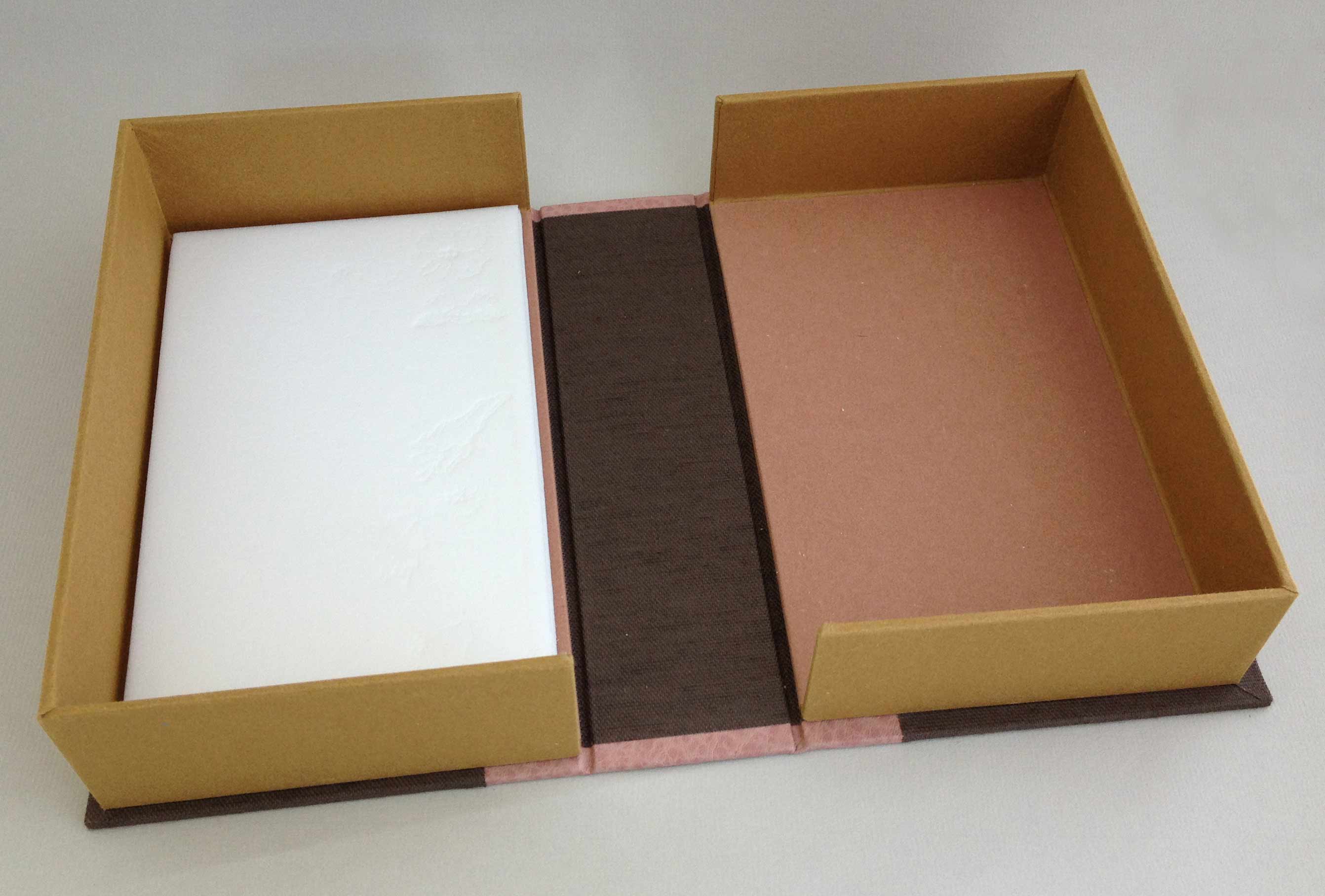
    With the completion of the binding, I was set to make a custom clamshell box. The box reflects the binding in terms of color and design. The spine of the box is covered in matching leather that has also been embroidered. The design is derived from an illustration in the book and includes similar onlays from the book’s cover. The stem was embroidered freehand and Margaret Armstrong’s name has been hand tooled with gold leaf. 

    wildflowers14-erinfletcher

    The trays are covered and lined with the same handmade paper from Katie MacGregor that are used as the endpapers in the binding. The rest of the case and joint are covered in brown Canapetta bookcloth. A layer of Volara foam was added to the outer tray as protection for the embroidered stitches. 

    wildflowers11-erinfletcher

    I am really pleased with my first attempt at an embroidered leather binding. I plan to continue experiments with this technique, as well as incorporate other sewn elements. I recently had the opportunity to showcase this binding at the Standards of Excellence Conference in Washington, DC. Through the ‘Mix & Mingle’ event, I got the chance to speak with and meet many new bookbinders while discussing my binding on top of receiving wonderful compliments and suggestions. 

    wildflowers10-erinfletcher

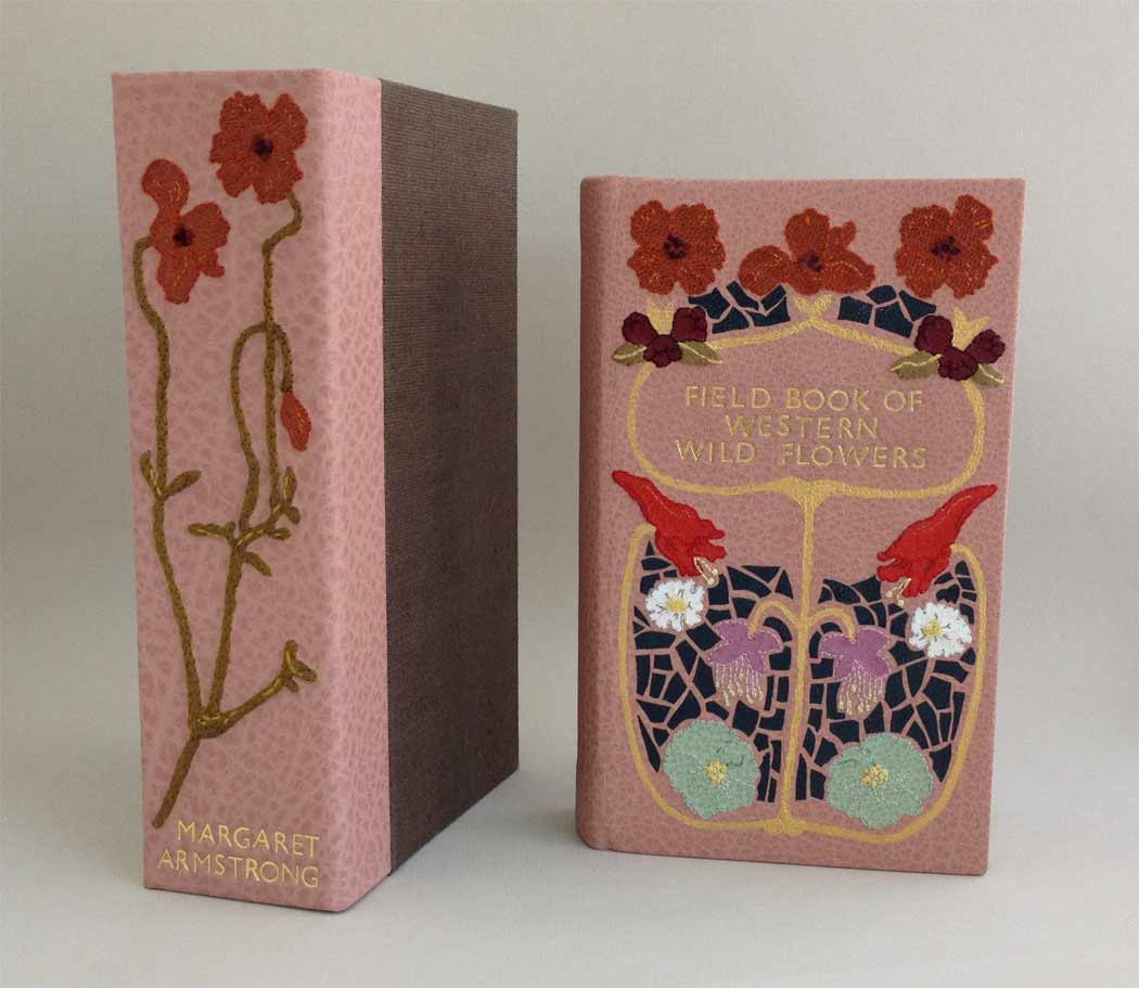
    Finished binding next to clamshell box.

    wildflowers9-erinfletcher

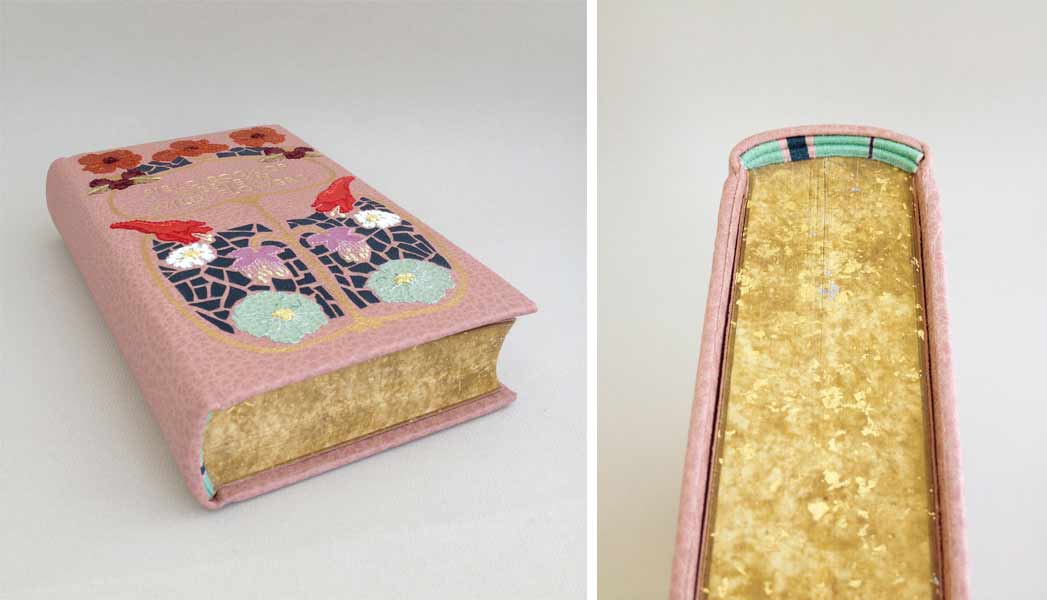
    Side profile. Detail of edge decoration and hand-sewn headband.


  2. Swell Things No. 9

    October 31, 2013 by Erin Fletcher

    stno9a

    1. I was pleasantly surprised during my last visit to Paper Source, where I had the delight of purchasing a wedding card designed by my good friend, Laura Szumowski. On her blog Geometry is Awesome, she posts these wonderful in-progress sketches of her designs. 
    2. Enjoy the lovely illustration work of Lily Padula. Some of her pieces involve flashes and blinking eyes.
    3. Another lovely illustrator and textile designer: Vikki Chu
    4. 100 Natural Laws is apart of a larger mixed media project by Sophia Wallace called Cliteracy. In this project Sophia brings to light how our culture sexualizes the female form while suppressing and ignoring female sexuality. It wasn’t until 1998, that the clitoris was proven to be larger and more complex of an organ than what was known before. 
    5. Photographer Leland Bobbé captured these extraordinary portraits of drag queens in Half Drag…A Different Kind of BeautyEach portrait captures the male subject and his female counterpart by literary splitting the two personas down the center of the face. It’s so interesting to see how makeup can manipulate and enhance the structure of the face. 

    stno9b

    6. I’m quite jealous of the talented Oana Befort. I wish her watercolor illustrations were hanging all over my walls. Her blog offers free print outs, DIY projects, in-progress videos of her work and more. Get ready to drool. 
    7. Staxpeditions is a bi-weekly video series from the University of Iowa Special Collections & University Archives. The librarians ask for your favorite Library of Congress call number range, then go hunting through the rare book stacks. A single item is pulled and explored throughout each episode. It’s a very fun and creative way to view item in a library’s collection.
    8. Brian Gennett creates beautifully patterned table tops, headboards, wall hangings and more. The designs are crafted using old book covers, which are cut up and arranged into an array of geometric patterns.
    9. Everything That I Know is an ongoing project by Amanda Tiller where each volume is filled with factual information from her own memory on a particular subject. In other projects, Amanda has often relied on her memory to guide her work as a form of rebellion against the internet. 
    10. The Seed from Johnny Kelly is an older video on vimeo, but it combines paper and hand-drawn animation in such a lovely and fluid manner, I wanted to share it with you. This short follows the life of a seed; I especially enjoy its journey through the human body.


  3. My Hand // Field Book of Western Wild Flowers: Part Two

    October 15, 2013 by Erin Fletcher

    wildflowers4-erinfletcher

    If you missed part one, you can find it here.

    After hours of embroidery work, I was finally ready to cover the binding. The book itself had been removed from its original case binding, taken apart signature by signature and resewn. Once rounded and backed with boards attached, the edges were ploughed and sanded down in preparation for edge decoration. At this point, I had been filling in for Jeff Altepeter at North Bennet Street School and conveniently the students already had everything set up for edge decoration and gilding. I spent the day perfecting the edge, experimenting with the application of gouache through various brushes and sponges. Finishing off the edge with the sprinkling of gold leaf. 

    The hand sewn double-core French headbands came next. I love sewing my headbands in an asymmetrical pattern and by extracting colors from the binding. Sadly, I didn’t take any in-progress photos of these two steps, but you can see hints of the edge and headband in some of the images to follow. 

    Now, back to covering. 

    wildflowers5-erinfletcher

    After applying a healthy dose of wheat starch paste, the embroidered leather was wrapped around the binding, being folded and tucked and squished into place. The leather had expanded after paring more than expected, so covering became difficult to keep the shape of the design within the confines of the board. 

    wildflowers6-erinfletcher

    The covered binding was put to rest under control weight between a bed of felt and acrylic boards. The next day I eased open the boards. Once the finishing design elements were added to the front cover I was able to line the inside of the boards and joint with matching edge to edge leather doublures. The handmade paper fly leaves are a perfect color match and came to me by happenstance from papermaker Katie MacGregor at Standards last year. 

    wildflowers8-erinfletcher

    Part three coming next week…


  4. Client Work: Leather Panel Redesign

    October 15, 2013 by Erin Fletcher

    panelredesign-erinfletcher

    This beautiful leather box was crafted by a student at North Bennet Street School. The green leather panel was stamped with a hand carved wooden block to create the delicate design. Unfortunately, the color and subtleness of the design conflicted with the client’s vision. Placed inside the box is a daguerreotype-style plaque of Johnson Chapel located at Amherst College, where the couple noted on the cover got married. The client approached me to have the panel redesigned using the color of Amherst: purple. 

    panelredesign2-erinfletcher

    The green leather panel was carefully removed and a new piece of purple leather was cut down and pared to the right size. For the new design, I kept the original border layout and text placement, which indicates the location of the wedding, the couple’s names and the date of the ceremony. The center motif is inspired by the Johnson Chapel building. Using simple architectural lines, the tower of the chapel was recreated through carbon tooling. The clock at the top of the tower indicates the time at which the wedding ceremony began. 

    All of the text on the new purple panel has been hand tooled using Gill Sans handle letters and palladium leaf. Palladium was chosen to mimic the look of the plaque inside.

    panelredesign3-erinfletcher

    The design on the box was rather tricky to capture within the limitations of my photo-documentation set-up. But the image below highlights the design through raking light, bringing out the grain of the leather against the blackness of the tooled lines. The client was very happy with the newly completed box and couldn’t wait to present the couple with their overdue wedding present. 

    panelredesign4-erinfletcher


  5. My Hand // Field Book of Western Wild Flowers: Part One

    October 8, 2013 by Erin Fletcher

    During my first year at North Bennet Street School, I stumbled upon this underrepresented category of bookbindings referred to quite accurately as embroidered bindings. Embroidery has been an interest and hobby of mine since I was a child. My research into this style of binding led me as far as Cyril Davenport’s Book of English Embroidered Bookbindings, which is one of a handful of books written solely on embroidered bindings. 

    From my research, I set out to create an embroidered binding using similar materials and techniques. I bound The Crucible in 2011. The overall layout and imagery on the covers are inspired by traditional outlines and iconography seen in historical embroidered bindings. The Crucible was a success (landing me Best Binding from the OBMI Chicago Public Library Exhibition) and ever since embroidery has been a technique that I’ve been wanting to translate onto a fine binding.

    Entering for the first time to the most recent Society of Bookbinders International Competition, I decided to bind a copy of Margaret Armstrong’s Field Book of Western Wildflowers. Margaret Armstrong is notable for designing covers for Publishers’ Bindings during the 1920s. As an illustrator, she also enjoyed drawing life-like representations of wild flowers. Margaret published Field Book in 1915, surveying wild flowers throughout the western hemisphere of the United States. The book includes 500 black and white illustrations and 48 colored plates. For the design of my fine binding I wanted to capture Margaret’s fame as a designer and skill as an illustrator. The cover on my fine binding is inspired by Margaret’s design for Henry Van Dyke’s Out of Doors in the Holy Land.

    07.04

    Beginning with a detailed sketch of the cover design, I labeled each onlay with a number and color. Each flower is taken directly from one of Margaret’s illustrations. The onlay leather ranged from goatskin to buffalo, the colors chosen to best represent the natural color of that specific species of flower. The leather was pared down to almost nothing, the illustrations were then pasted down to the leather and carefully cut out.

    wildflowers-erinfletcher

    I carefully arranged each piece of leather onto the sketch as a means to keep order to the mounting onlays, which came out to a total of 93 itty bitty pieces.

    wildflowers1-erinfletcher

    I cut down the base leather to it’s final size, I chose a dusty pink buffalo skin both for it’s soft, muted color and texture. I glued down each onlay one by one with PVA, pressing it between acrylic boards as I went. Once the onlays were in place and secured, I pared the entire skin to it’s final thickness. While paring the blade is removing more flesh from the areas with onlays creating a ghost-like silhouette, thus the technique of a back-pared onlay. This allows for a smoother transition between the base leather and the onlay leather.

    wildflowers2-erinfletcher

    At this point, the leather was ready to be embroidered and this became my favorite part. Each flower onlay was outlined with a floss that best matched the color of the leather. Additional colors were chosen to add highlights and shadows. Stitching through leather was surprisingly easy. However, a misguided needle could leave a lasting hole, so it was very important to accurately pierce through the leather. 

    wildflowers3-erinfletcher

     Part Two coming soon… 


  • My name is Erin Fletcher, owner and bookbinder of Herringbone Bindery in Boston. Flash of the Hand is a space where I share my process and inspirations.
    The StudioNewsletterInstagramEmail me
  • Archives