RSS Feed

March, 2014

  1. Bonus // Bookbinder of the Month: Lang Ingalls

    March 31, 2014 by Erin Fletcher

    KingOfTheAlps-LangIngalls

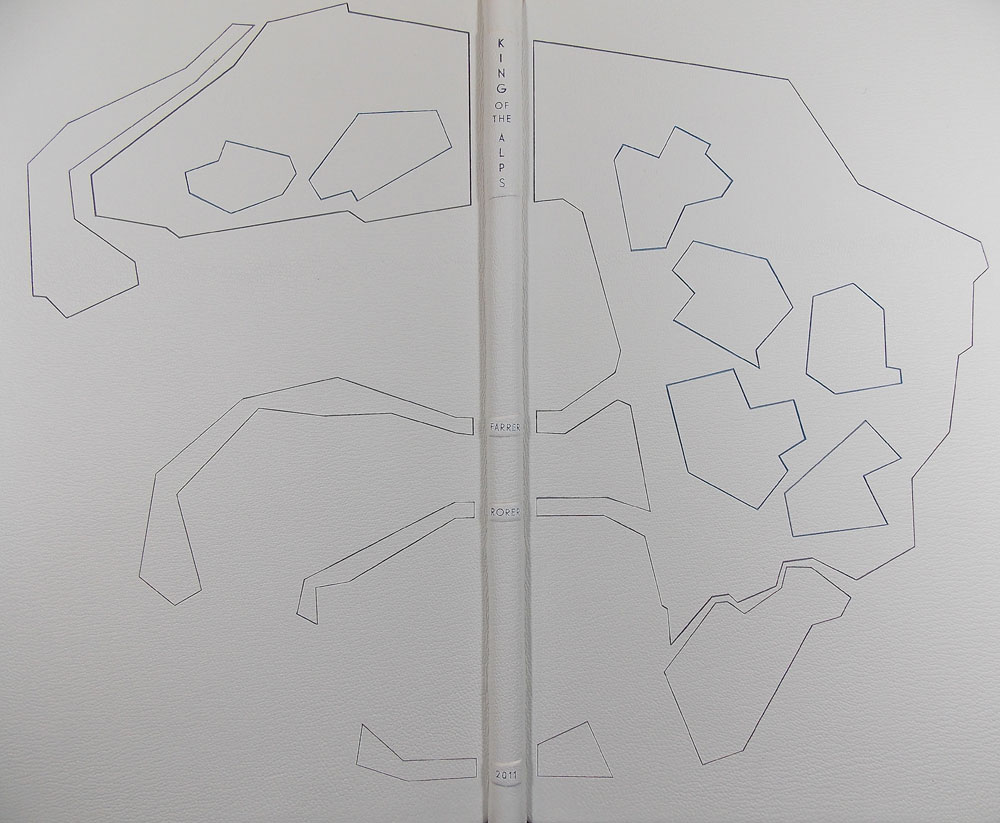
    Just one more bonus binding from Lang Ingalls to end out the month. King of the Alps by Reginald Farrer with illustrations by Abigail Rorer was bound by Lang in 2013. The Lone Oak Press edition is signed by the illustrator.

    Bound in the French technique in full white alum-tawed goat. The geometric design on the covers is an interpretation of one of the illustrations. Lang continues to use the incision technique in which a thin line of leather is removed and painted with acrylics in grey and blue tones. The same palette continues on the inside with blue leather edge-to-edge doublures and grey suede flyleaves. The title, author, illustrator and date of edition are on decorative onlays on the spine.
  2. Swell Things No. 13

    March 31, 2014 by Erin Fletcher

    stno13b

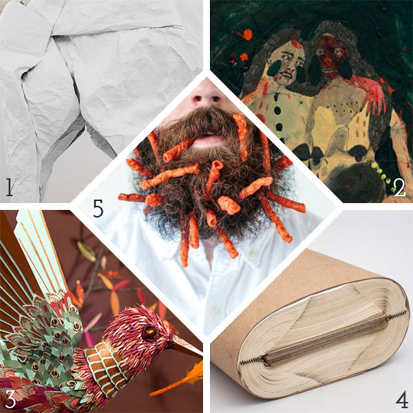
    1. After a successful Indiegogo campaign, artist Sipho Mabona was able to construct a life-sized origami elephant from a single sheet of paper. The elephant is beautiful and quite impressive, but I’m a bit skeptical about its construction from a single sheet of paper. 
    2. I am both entranced and repulsed by these paintings from artist Lauren Roche
    3. I am always impressed by the meticulous work and patience needed to construct an object, animal or whatever out of paper. New paper illustrations from the French duo Lucie Thomas and Thibault Zimmermann aka Zim&Zou are just beautiful and brilliant. 
    4. Last year at the Venice Art Biennale, artist Odires Mlászho put on an exhibit of sculptures that really tested the flexibility of the book as an object. Each sculpture is constructed of at least two books that have been contorted into beautiful and unusual shapes by interweaving the book’s pages and covers. 
    5. I bet he’s just saving those Flaming Hot Cheetos for later. In an ongoing series called Will It Beard, photographer Stacy Thiot tests the lodging capabilities of her husband’s beard by sticking as many objects that can fit within his tangled facial hair. 

    stno13a

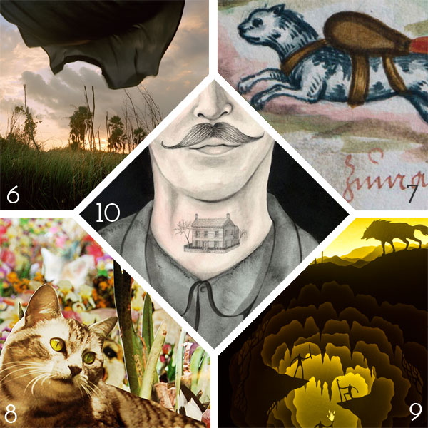
    6. Marjory’s World I is just a beautiful and peaceful photographic series from artist Rebecca Reeve.
    7. A German manuscript from the 1530s contains illustrations and text about the use of ‘Rocket Cat‘. Unfortunately, it’s not as cool as it sounds. Cats were nabbed off the streets and strapped with an explosive sack. After the sack was ignited, the cat was set loose in the hopes that it would run and hide behind the walls of an enemy’s fortress. I bet that plan didn’t work very well. 
    8. After cutting out images from over 700 discarded books on the subjects of flora and fauna, artist Andrea Mastrovito began the task of collaging each piece for the installation. The Island of Dr. Mastrovito II includes a ceiling consumed by bats, while butterflies cascade up the wall in a frenzy, the base of the installation is filled with various mammals, insects and plants. Quite an impressive installation. 
    9. These whimsical dioramas are not animated scenes, but layers of precisely cut watercolor paper lit with various flexible LED lights. Hari & Deepti are the artist couple behind these fantastic pieces. 
    10. Sophie Blackall has been illustrating the online listings put forth by lovelorn strangers hoping to reconnect known as Missed Connections. She’s even published a book of the illustrations, which are beautiful and lovely and endearing. 


  3. Bookbinder of the Month: Lang Ingalls

    March 30, 2014 by Erin Fletcher

    Ici-LangIngalls

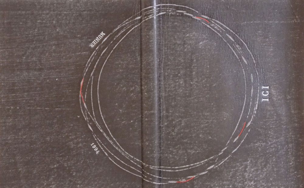
    On exhibit from June 20th to September 14th of this year is Lang Ingalls‘ binding of Ici by Roger Munier. The exhibit is sponsored by ARA France in partnership with the city of NÎmes and its renowned Carré d’Art Library for the XIth FIRA International Forum & Exhibition.

    This edition is copy 13 of 47 and is signed by the author. Bound in the reliure à cru structure in black sanded calf with sewn red thread elements. The binding is complete with squared suede headbands, suede doublures and suede flyleaves. The title, author and date are hand tooled on both covers.

    This binding stands out in your portfolio due to the absence of color in the design, however the treatment of the leather is exceptional. It reminds me of how a photocopied image begins to degrade and become fuzzy with each subsequent copy. Was this effect created through a dyeing or printing process?
    This binding was made in Paris with Ana Ruiz-Larrea last fall. The structure is called reliure a cru, a soft-cover leather binding. The text is about how all things go round, all things in life. I decided on a circular element and taped #18 thread to the back of black calf. I sanded and — viola! — the calf was distressed and the circle came through. There is a hint of red in the text, the initial letter at the start of the copy, and I borrowed from that when I made small sewings of red thread through parts of the circle. The French teach that 2/3 of your design is on the recto and 1/3 is on the verso, thus the placings of these tiny thread elements, while considering the title, author and year.


  4. Bookbinder of the Month: Lang Ingalls

    March 23, 2014 by Erin Fletcher

    Chanson-LangIngalls2

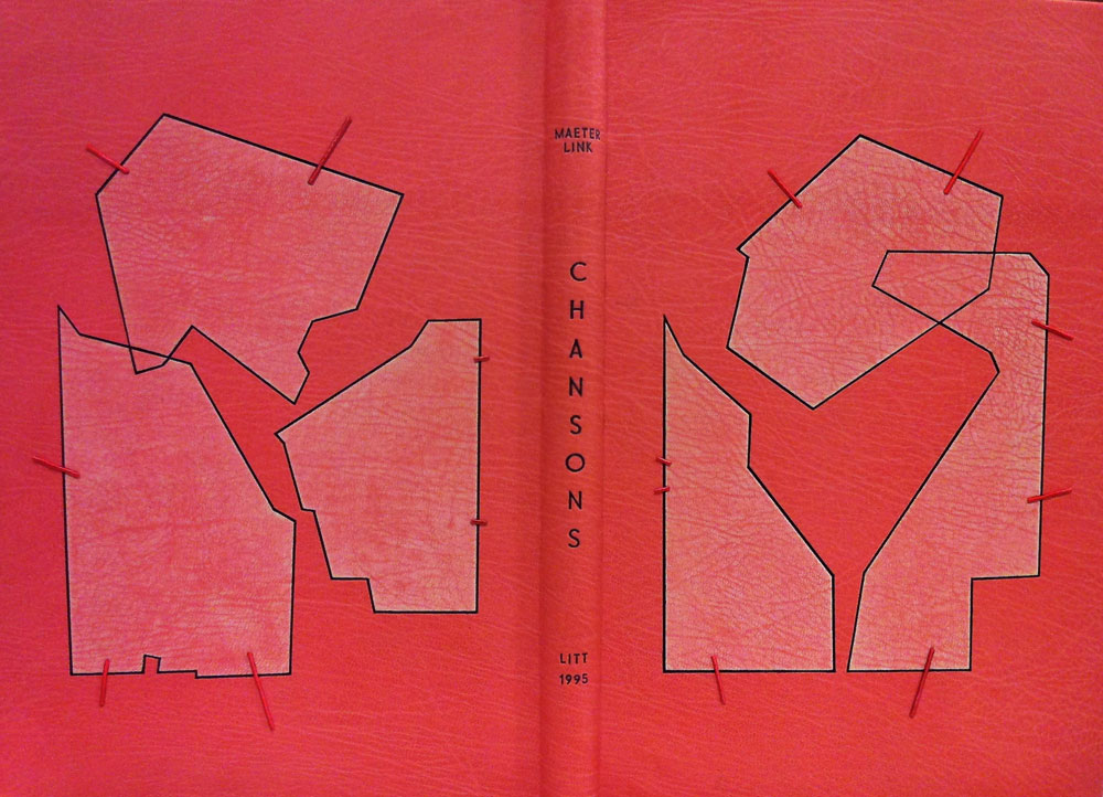
    Chansons is a text written by the Belgian poet and playwright Maurice Maeterlink. This particular 1995 edition is in French and includes engravings by Ginette Litt; the copy is signed by Litt and bibliophile G.A. Dassonville. Lang Ingalls bound this copy in 2013 and it will be exhibited from April 4 to June 30 of this year in a show titled ‘Belgian Writers, a Binding Homage’ sponsored by Bibliotheca Wittockiana and ARA Belgica.

    The binding is bound in the French technique in pink goatskin. Lang describes the cover design inspiration and techniques below in response to my question. However, not shown are the hand-sewn silk headbands and black suede pastedowns and flyleaves.

    Once again, you’ve created such a beautiful binding. I would just love for you to discuss your concept behind the design and how you translated that into the materials used on the binding.
    This binding is recent, and one that took a long time to develop, and one that is amongst my favorites I’ve made. The shapes on both the recto and verso are taken from the etchings of Ginette Litt, one for each song (six). The shapes were removed and sanded, then re-adhered to the covers. The incision lines were painted black. The small connecting lines are thin twine that has been wound with silk thread in a near-pink hue, then adhered in a tooled line. The title is blind tooled then painted in the same black as the incisions.


  5. Moving Images: #PostModem

    March 21, 2014 by Erin Fletcher

    The internet just celebrated its 25th birthday and since I’m just a couple years older I have fond memories of how it slowly crept into my school life then my social life. I find my generation to be a mixed bag of those who integrate their lives full force into the internet, those who don’t and the range of us who fall in-between. 

    The internet is definitely changing our lives in how we interact… and doing it rather quickly. I would put myself into that in-between category, I’m comfortably active in a few social networks and I have my own website and blog. But I’m also really behind technologically speaking, which is why I enjoy having a nerdy husband who lovingly rolls his eyes when I don’t understand some meme or thread on reddit. 

    #PostModem is a comedic satire by Jillian Mayer and Lucas Leyva based on the post-human theories of converting your consciousness into a digital form. 


  6. Conservation Conversations // Leafcasting

    March 20, 2014 by Athena Moore

    DSC03802

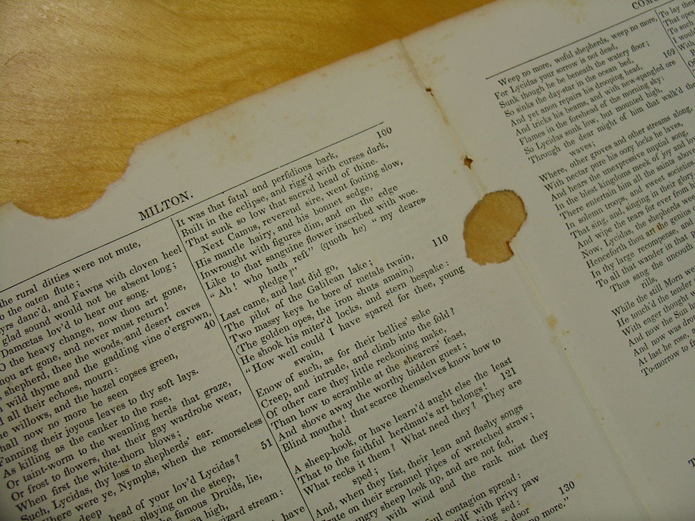
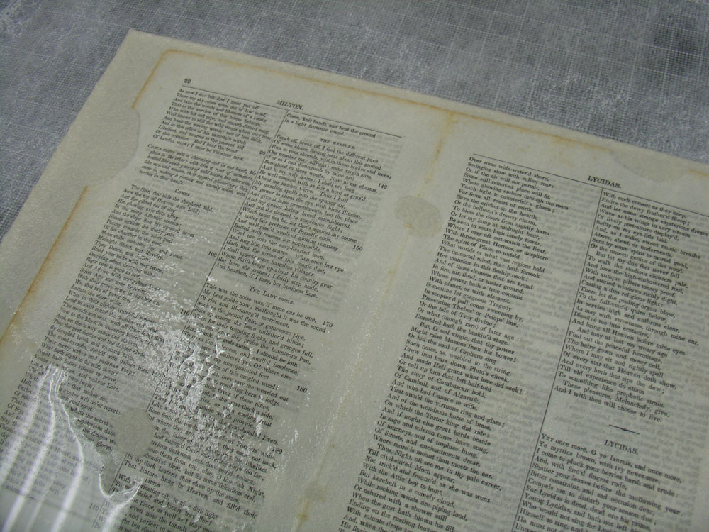
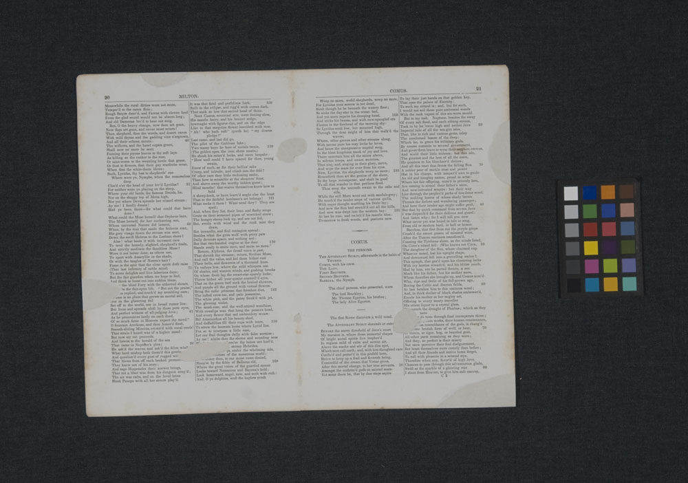
    Leafcasting is magic. Well, it at least LOOKS like magic. A not-oft-used conservation method, leafcasting helps to strengthen paper by filling areas of loss with pulp. Experimentation with this treatment began by hand in the 1950s, but was made considerably easier and more efficient with the advent of the leafcasting machine in the following decade.

    There are only a small number of institutions that have leafcasting machines and an even smaller number that use them. At the Northeast Document Conservation Center, where I work as an assistant book conservator, we’re lucky enough to have one (on semi-permanent loan from the North Bennet Street School – thanks, Jeff!). Before coming to NEDCC, I had no idea what this machine was or what it did. Kiyoshi Imai, who has been with NEDCC’s book laboratory for over 20 years, is something of an expert on this treatment. He was kind enough to teach me the process (and re-train my brain on the intricacies of arithmetic) and I’ve been somewhat obsessed ever since.

    The leafcaster is essentially a paper-making machine. A document or folio (or multiple folios, as is sometimes the case) with losses is measured to determine the weight and full size dimensions. The areas with losses are measured and subtracted from that. There are a few more math steps in there, but essentially what you come up with is one number – this is the amount of pulp needed to fill the losses in grams. Leafcasting pulp can be made out of cotton and/or hemp fiber pulp or handmade paper. It is often necessary to use a combination of both, as one of the issues a conservator is attempting to address in the process is finding a good color match for the object.

    DSC03807

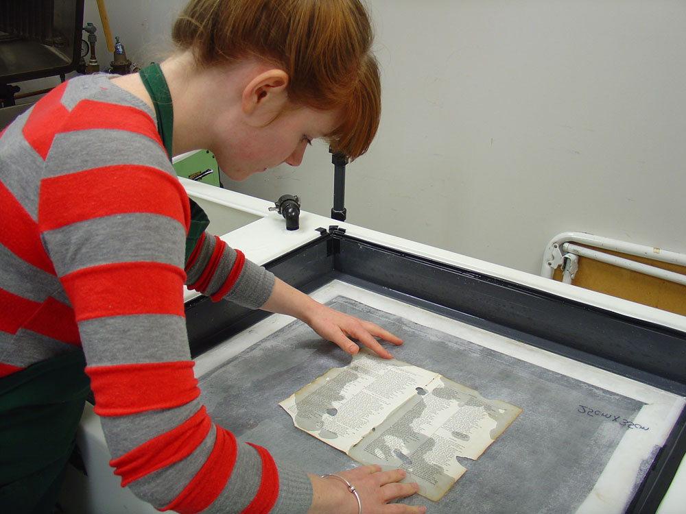
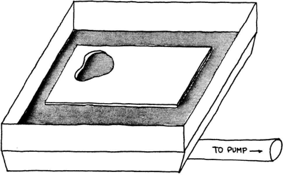
    The material that is chosen is blended with water to form a slurry. The object is placed on a sheet of spun polyester (which makes for easier handling and allows water to pass through) in the “casting area” of the machine and is held down by a screen while water is poured in. The pulp slurry is added to this water, distributed evenly and finally removed from the casting area by a pump located below. The pulp is pulled to the areas in the object with losses. If the conservator has done their job well, the new material will appear even and well matched in thickness and color.

    DSC03811

    The cast object is removed from the leafcaster with a second sheet of spun polyester and can be sized on a suction table, which helps to improve the strength of the original object and the adherence of the new cast material to the original material. The object can be dried either in a press or under blankets, depending on the intended result – drying it in a press can often augment the size, so in the case of casting just a folio or two from a bound volume, it may be best to allow for a slower, more gentle form of drying. If the object is a one-off, it can be slightly faster to dry it in the press.

    000002

    While it isn’t the appropriate treatment for all items, leafcasting can be a great option for some. Volumes that have large amounts of insect damage, for instance, often require a huge amount of mending time. Attempting to hand fill losses at that scale is daunting. Because the damage is usually fairly consistent, it is relatively easy to use the same math on large sets of folios. It’s also very likely that the same pulp would be used, so the biggest time commitment is just the initial set up. When an object is well cast, the strength and stability of it is greatly increased. Objects that have been cast are protected against further damage in weak areas and can be handled much more safely. Because it is essentially just handmade paper pasted to the object, it is also reversible.

    It’s easy enough to create your own losses in sample materials, so if you’ve got access to a leafcaster, try it out!

    leafcasting illustration

    I am currently working with Helen Bailey, Library Fellow for Digital Curation and Preservation at MIT, to develop software that can use digital images of objects with losses to determine the amount of pulp needed and will be leading a leafcasting demonstration and lecture for SUNY Buffalo’s art conservation graduate students this spring. I have also created a user’s manual for the Model 0901 Leafcaster, so if you have any related questions, please feel free to send them my way! 


  7. Half Light Bindery

    March 18, 2014 by Erin Fletcher

    HalfLightBindery5

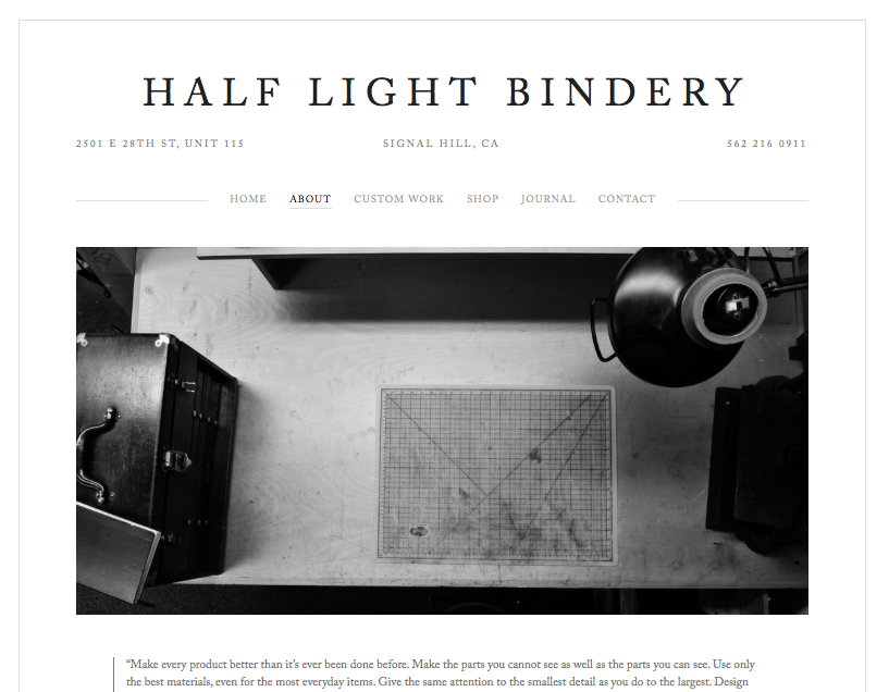
    As Kevin Sheby graduated from the full-time program at North Bennet Street School, I had to say my goodbyes. He and his wife, with their two dogs, left soon thereafter to return to California. Since graduating in 2013, Kevin has custom built an efficient bindery space where he runs Half Light Bindery (which I have to say is a wonderfully chosen bindery name).

    Kevin is so talented and has created such amazing work that is both well crafted and artistically executed. Spending time with Kevin at NBSS, made me realize the importance of whole-heartedly investigating bookbinding structures and materials. What are the limits and what are the possibilities. Kevin has such a superb attention to detail and I’m always looking forward to the work that comes out of his bindery. 

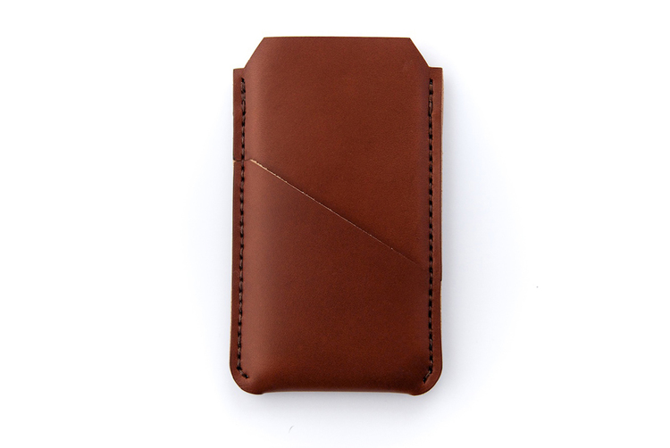
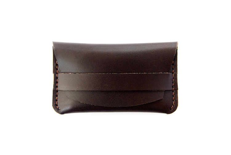
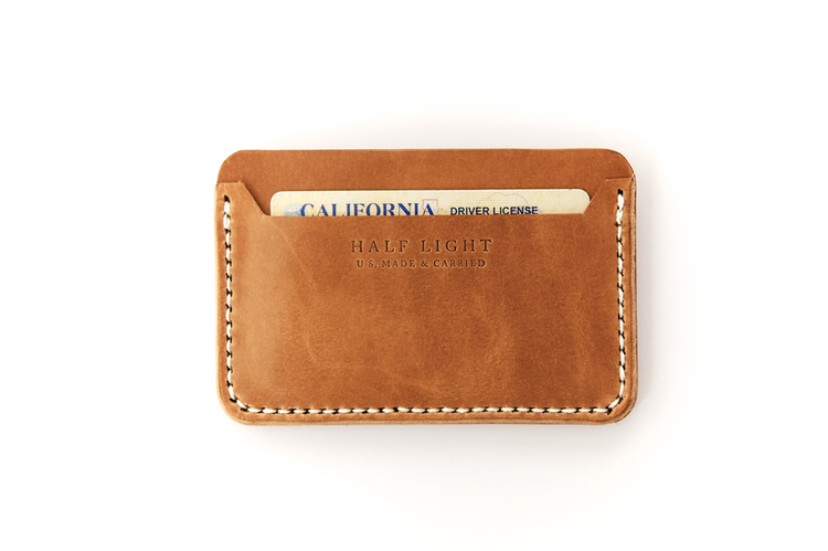
    Recently, Kevin launched a collection of handmade leather products. Again his innate attention to details are seen in every product and within the professionalism of his website. 

    HalfLightBindery7HalfLightBindery3 HalfLightBindery2


  8. Bookbinder of the Month: Lang Ingalls

    March 16, 2014 by Erin Fletcher

    FantasyAndNonsense-LangIngalls

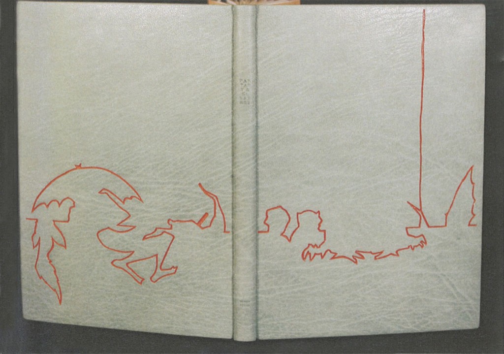
    The exhibition showcasing design bindings of the Tryst Press edition of Fantasy & Nonsense has been mentioned a few times on the blog. I first discussed the exhibition with my own submission, then again when I featured the work of Coleen Curry and Mary Uthuppuru. The book itself is a compilation of works by the American poet James Whitcomb Riley paired with beautiful wood engravings by Berrot H. Hubrecht. Each of the exhibitors really captured the whimsy of the poems and illustrations, transforming each binding into a unique object.

    Lang Ingalls‘ binding of Fantasy & Nonsense is no different in this respect. Her simple yet elegant design extracts the illustrations and complies them to form an intriguing landscape across the open binding. Lang created the binding in 2012 for the exhibition which was hosted by the Rocky Mountain Chapter of the Guild of Book Workers and displayed at the J. Willard Marriott Library at the University of Utah. Bound in the French technique in full light blue goatskin. The linear design was painted with acrylic inside a pulled leather line. Other design elements include colored head edge, custom paste paper endsheets and hand tooled title in blind on the spine.

    I love the color palette on this binding. Even though I had the opportunity to view this binding in person, I was stumped by how you created such a fine line of color in the leather. Can you talk about the technique you employed in this binding?
    This is one of the techniques I learned form Hélène Jolis — it is called an incision line. You actually cut the two sides of the line with a scalpel, remove the leather and paint with acrylics (yes, you need a paintbrush with only three bristles!) inside the line. I advise an optivisor for the work…


  9. Celebrate The One Year Anniversary of My Etsy Shop With This Offer

    March 14, 2014 by Erin Fletcher

    anniversary-march15blog

    March 15th marks the first anniversary of the Herringbone Bindery Etsy Shop. All items will be marked 15% off in celebration and just in time to make room for a whole new collection! 

    Browse through a selection of blank journals in various sizes, leather bound notebooks and bookbinding kits. 


  10. Artist: Marcela Cárdenas

    March 13, 2014 by Erin Fletcher

    MarcelaCardenas2

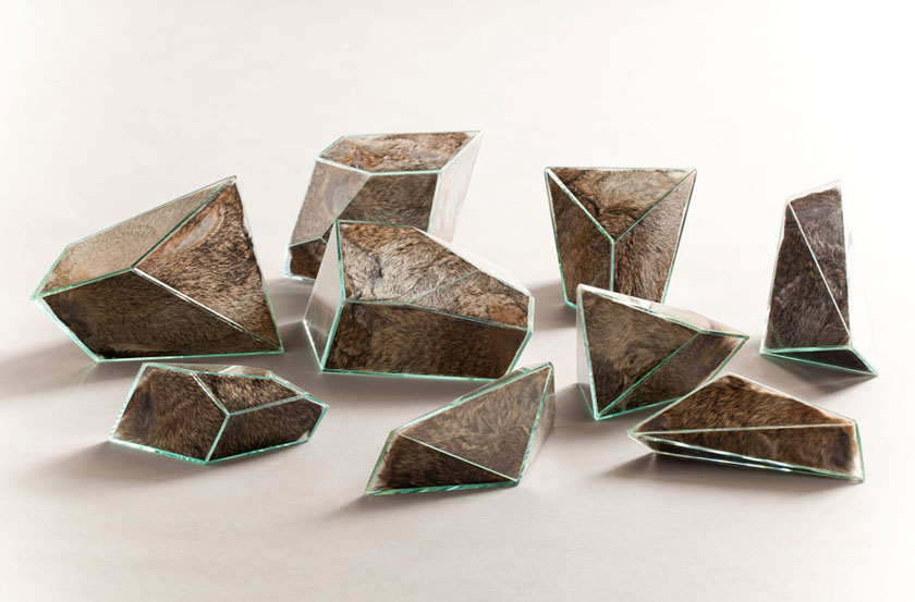
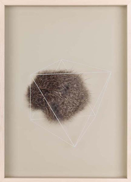
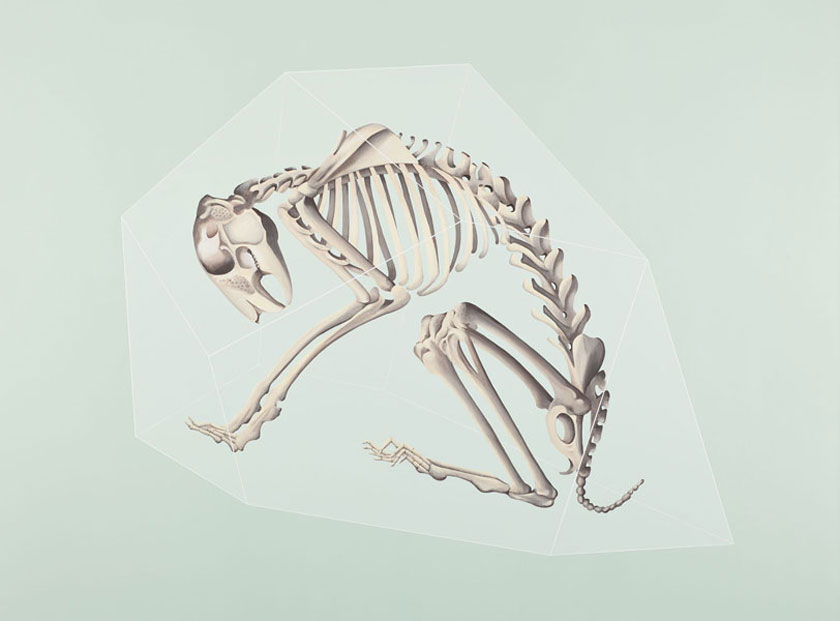
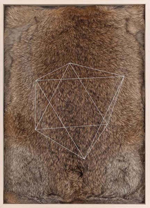
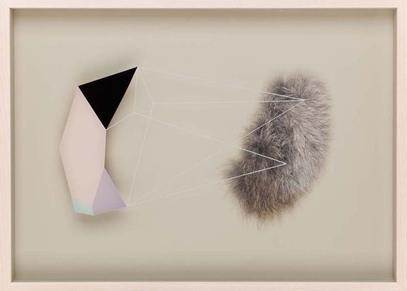
    In her series Transicionales, artist Marcela Cárdenas explores the relationship between the organic shapes found within the natural kingdoms of fauna and minerals. The glass geode sculptures above are filled with animal fur, while in the image below, fur is trapped between a backing and a piece of glass with a reverse painting. I’m appealed by how my eye is misguided to believe the image as 2-dimensional, but the flat paintings overlaid on the detailed fur creates such texture.  

    MarcelaCardenas5 MarcelaCardenas3 MarcelaCardenas4 MarcelaCardenas1


  • My name is Erin Fletcher, owner and bookbinder of Herringbone Bindery in Boston. Flash of the Hand is a space where I share my process and inspirations.
    The StudioNewsletterInstagramEmail me
  • Archives