RSS Feed

April, 2017

  1. Swell Things No. 42 // Callen Evans Williams

    April 30, 2017 by Erin Fletcher

    Callen Evans Williams is a super cool gal living in San Francisco. We met through a mutual friend at the School of the Art Institute in Chicago, but after graduation we fell out of touch. However, some years later we both ended up in Boston at the same time working at the same Paper Source. How serendipitous! I knew Callen would be a perfect fit for Swell Things. She approaches art and design with so much appreciation and consideration to both the artist and their process. I second her nod to Travel Man, as Callen was the one who introduced me to the show, it’s quite hilarious and you’ll especially enjoy it if you love The IT Crowd.

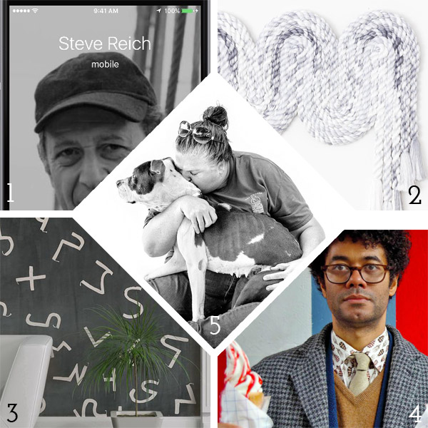
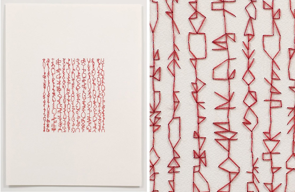
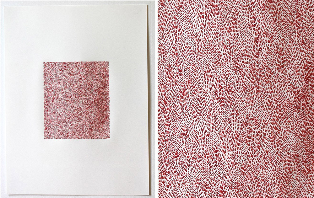
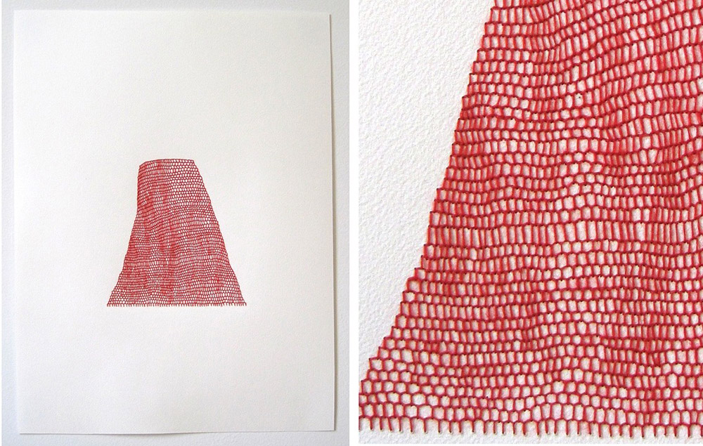
    1. Steve Reich is Calling: This witty project by Seth Kranzler (found via Kottke) made me laugh and wonder what else in my daily life could be a Steve Reich composition.
    2. Multidisciplinary sculpture artist Cindy Zell manages to arrange rope into so many unique and appealing forms (and watching her process could be a meditative practice!)
    3. Porter Teleo’s wallpaper and fabrics are completely hand-painted. As you might imagine, this is the kind of luxury that shows up in celebrity homes and interiors by design-giant Kelly Wearstler…but what I really love is how they hire art graduates in the midwest and employ them to make one-of-a-kind work.
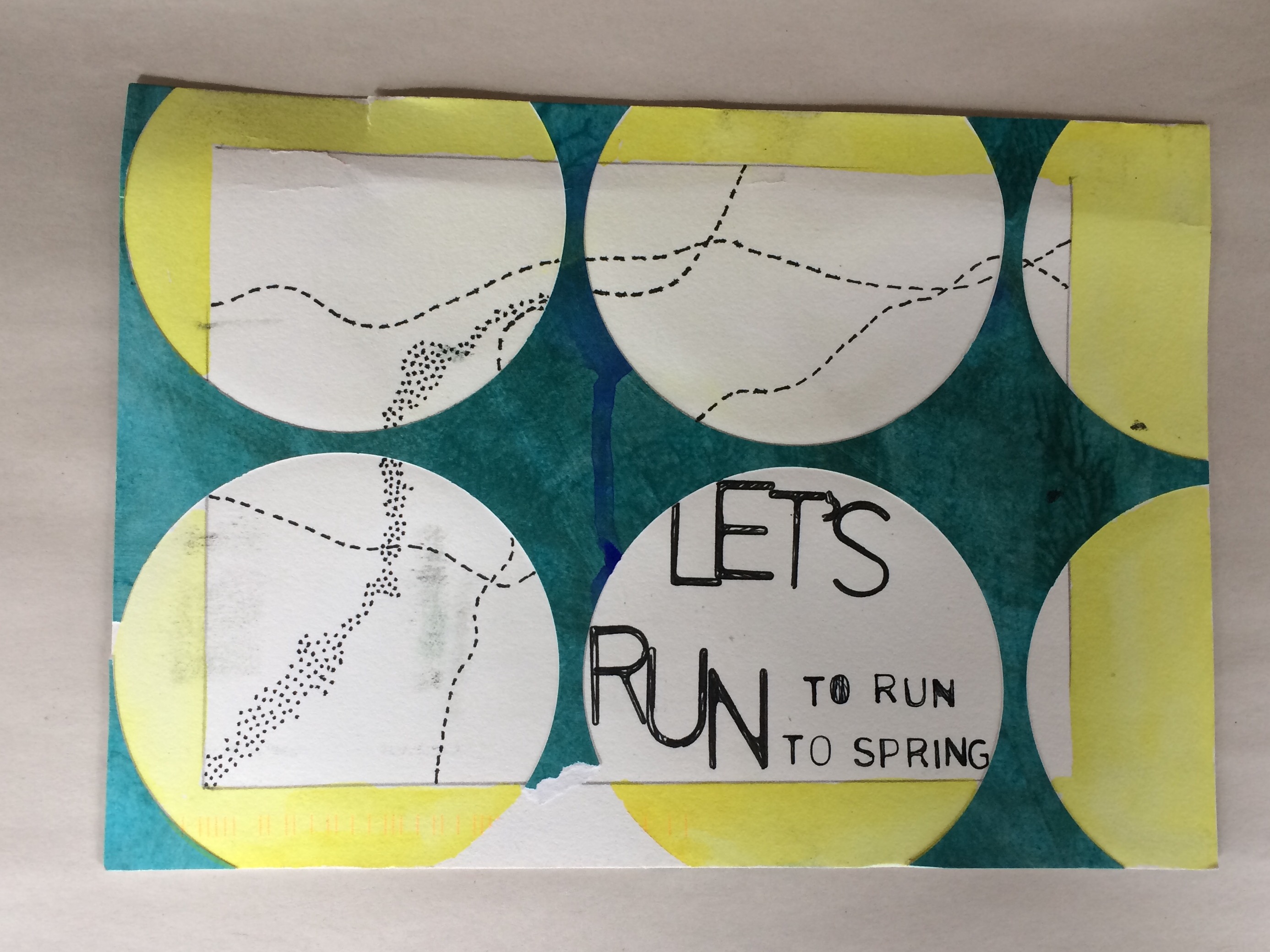
    4. In Travel Man, Richard Ayoade invites other funny people on 48-hour vacations to foreign lands. Short, sweet, hilarious, awkward–it might be the best 25 minutes of your day.
    5. In his new book Finding Shelter, photographer Jesse Friedin shares touching portraits of shelter animals and the volunteers who care for them.

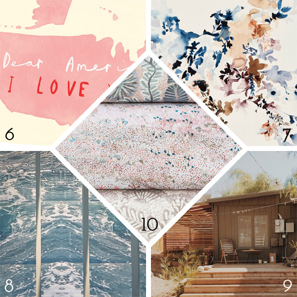
    6. In this frustrating, fearful and uncertain time, I am buoyed by the outpouring of activism and artful response to our national politics. It often seems that these issues are out of our hands when in fact many individual actions and voices do make a difference. Love Letter America shares postcard art (like this one by Oliver Jeffers) that you can freely download to send your legislators some snail mail. (If you want something even easier that doesn’t require printing or postage, check out resistbot –you write a text message and they make it a fax to your senators!)
    7. San Francisco artist Jen Garrido reminds you that even if you’re a grown-ass professional woman, you’ll never be over florals, especially when they’re this lush, delicate and evocative. (If you are also a fan, you may like to know she has a current collaboration with Anthropologie.)
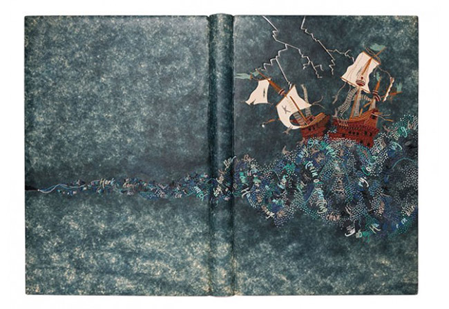
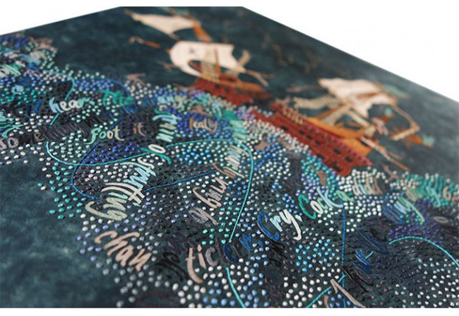
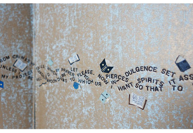
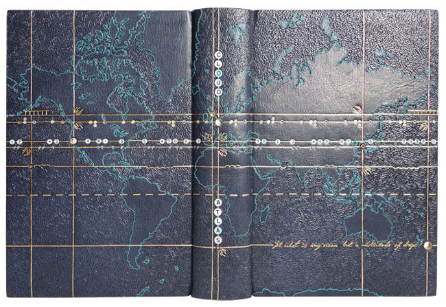
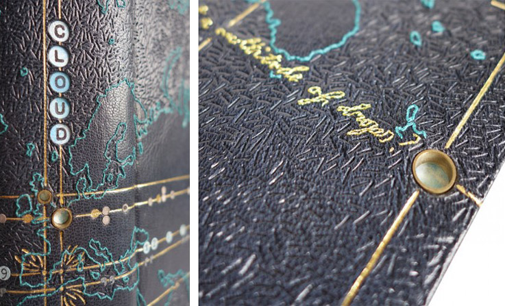
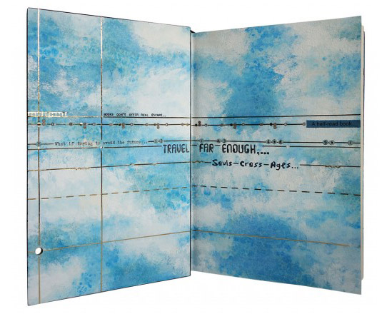
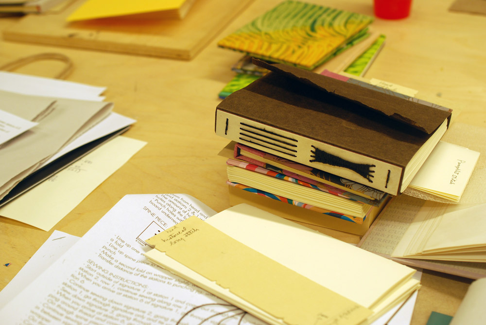
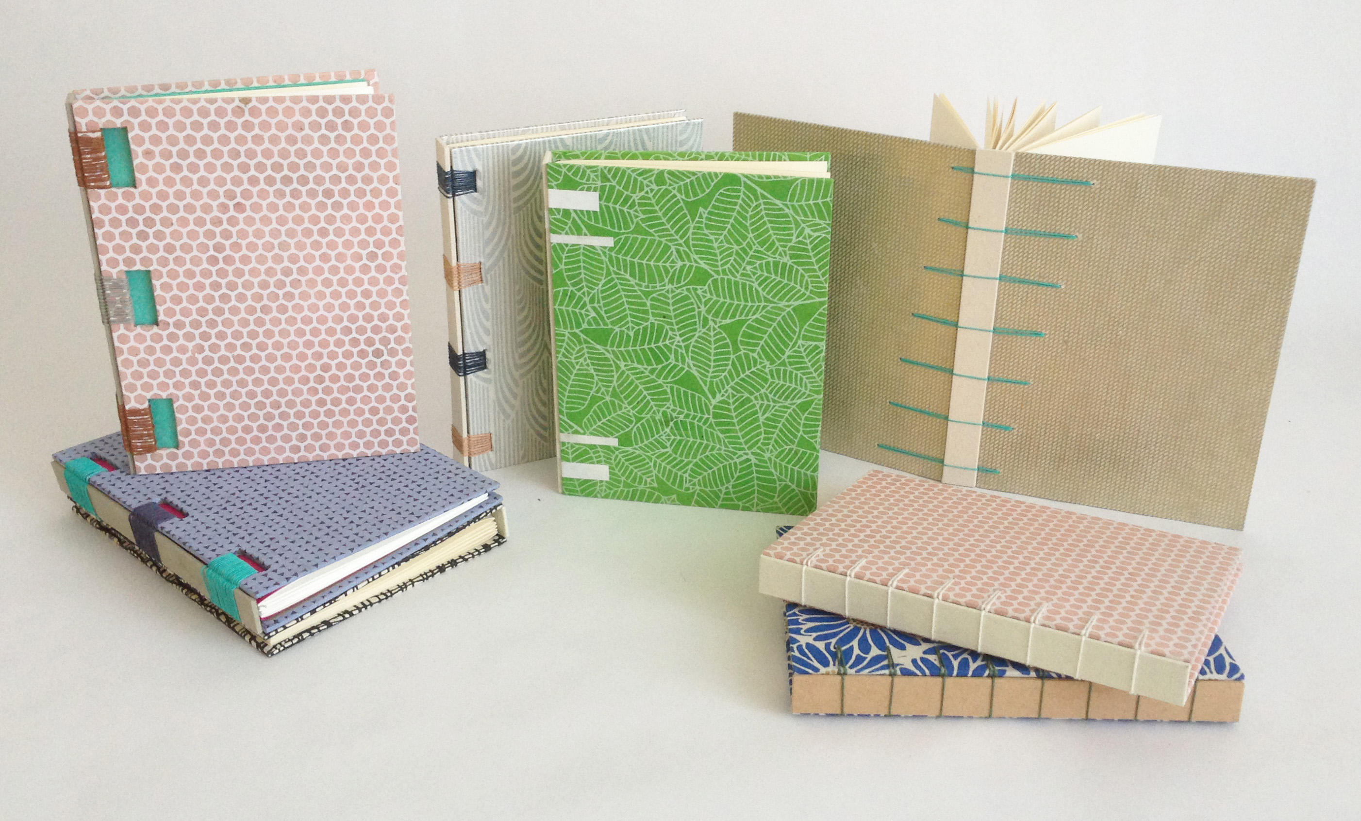
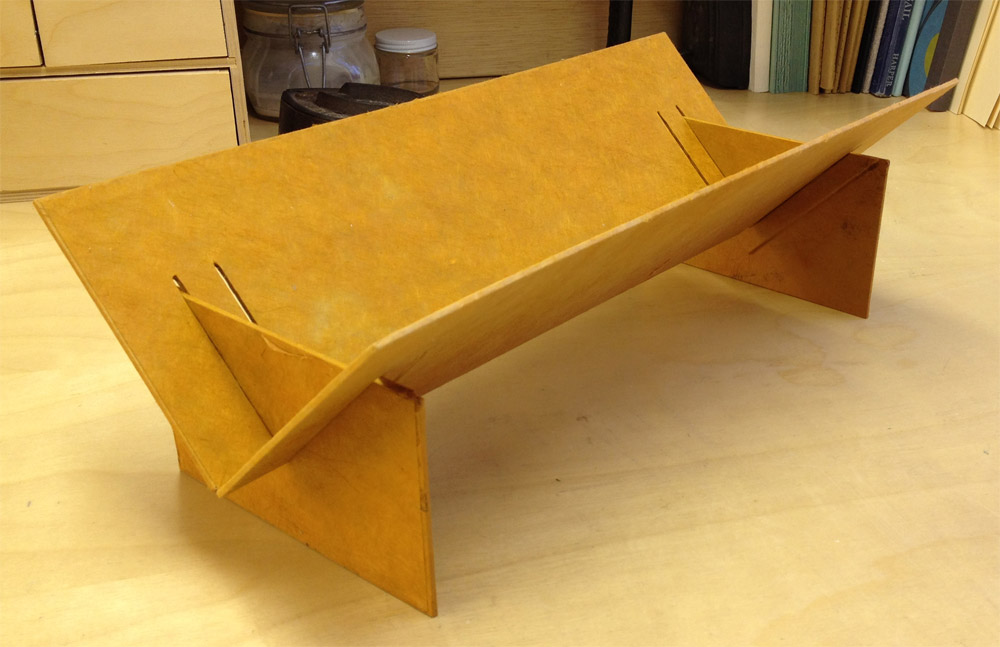
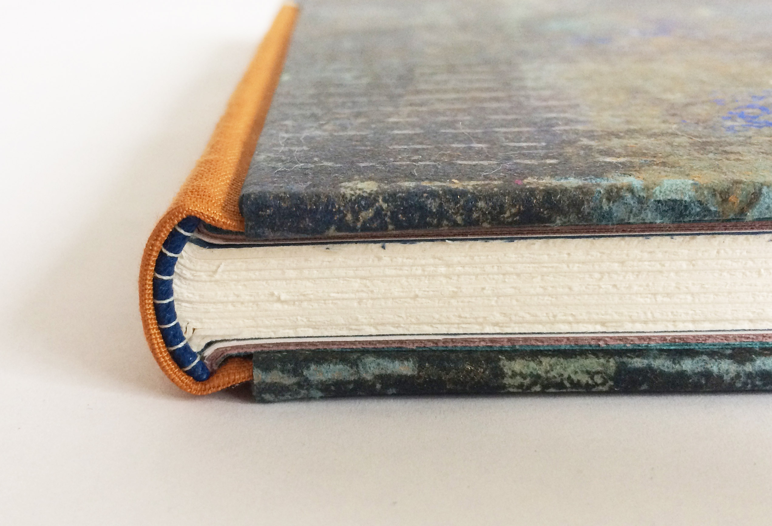
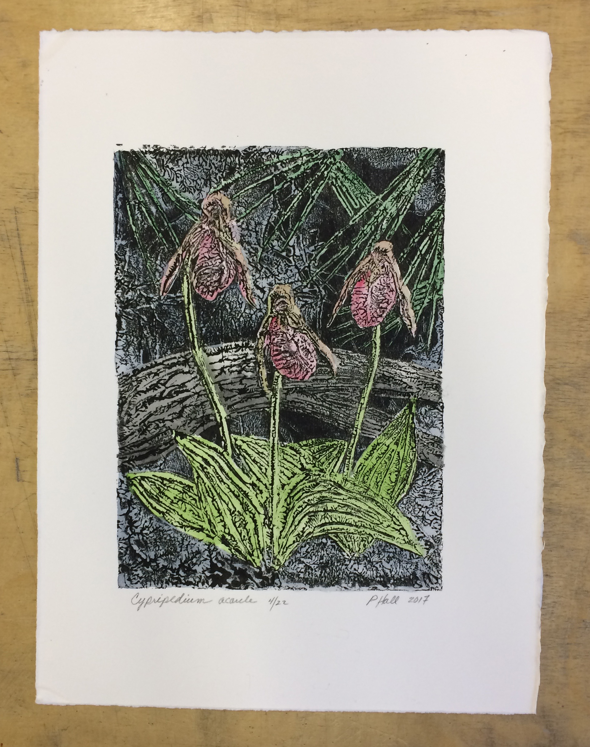
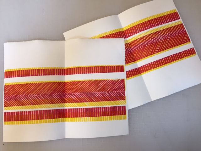
    8. Erin invited me to tag along to Codex this year, and it was an eye opening experience! I was amazed at the amount of skill, creativity and craftsmanship under one roof–and by how very well-read you bookbinders are! One piece that caught my attention was Precipitous by Nicole Pietrantoni. These accordion books display striking photographs of rising sea levels with overlaid poems by Devin Wootten. They are at once beautiful and foreboding.
    9. It’s been almost 2 years since we moved from the east coast to Northern California, and it’s grown on me fast. I am starting to see how the style and culture of California, and the bay area in particular, influence aesthetics nationwide. Mason St. Peter is an architect whose work seems to embody that laid-back California spirit.
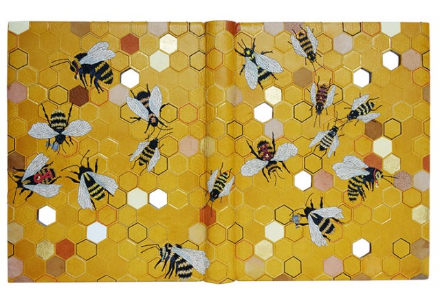
    10. One of my favorite aspects of my work as a design assistant is product research and discovering amazing artists, designers and makers of all kinds. Willie Weston is a company in Australia that collaborates with Indigenous artists to create textiles and wallpapers. I’m especially fond of the colors in all the variations of Singing Bush Medicine by Colleen Ngwarraye Morton.


  2. Catching Up With Hannah Brown // No. 5

    April 30, 2017 by Erin Fletcher

    For the final installment, I asked Hannah Brown about her binding of Love is Enough by William Morris. Just like The Tempest, shown in the previous post, Hannah used fair calf and an array of colored leather onlays. The design includes four beautifully embroidered birds and five beetles. At the points of intersection on the trellis, Hannah has attached twenty-eight gold plated brass pieces. Smaller details in the design have been blind and gold tooled.

    The cover design is complimented with a patterned endpaper. The book lives in a teak box with a frosted prespex lid, which allows you to view the book.

    I had the chance to see this binding in person, while visiting last year’s Antiquarian Book Fair in NYC. First I want to say that it is absolutely gorgeous and I may have stared at it for an awkward length of time. The embroidery on the birds, is some of the most detailed embroidery I’ve seen on your work. As your work evolves the embroidery is becoming more painterly and reads more traditional in style. For the final question of the month, I’d love for you to talk about how your think you’re previous work has informed the way you build a design today, particularly how you’ve grown from simple machine embroidery to complex and layered hand embroidery.
    Thank you for your comments! It was an absolutely wonderful text block to be commissioned to bind. I am starting to see my embroidery work more like “painting” with thread. Through various social media channels I am now aware of more embroidery artists who are inspiring me to develop my embroidery skills further. I love the way that colour can by built up so subtly with the threads whilst adding a pleasing texture to the surface of the leather on a binding.

    One thing that I am very careful with though is durability, books are made to be used so I have to be very mindful of this when placing my stitches. The difference between utilising embroidery techniques on bindings in comparison to general embroidery on things like wall art is that is has to be designed to be handled. I make sure I tether down my stitches as well as possible to avoid the design catching or being abraded prematurely over time and take extra care when placing stitches over the board joints.

    During my time working at the V&A Museum I had the pleasure of looking at a variety of embroidered bindings from the National Art Library’s collection (the library housed within the museum). It was wonderful to see how the stitching had held out over time, on some better than others due to the amount of handling!

    Machine embroidery has its purposes and is good for producing lines quickly but to me now looks too rigid due to the way it punches the holes in the leather and the regularity of the stitches created. I love the layers than can be built up using hand embroidery as it has far more depth and accuracy to it and following years of practice my fingers are now toughened to it. I have a feeling that binding by binding my work will continue to evolve in this way, especially as my collection of threads grows and grows in size! I have started to teach some classes in embroidery techniques for fine bindings and hope to grow on this and therefore spread my knowledge further in this field.


  3. Catching Up With Hannah Brown // No. 4

    April 23, 2017 by Erin Fletcher

    Last year, Hannah Brown created this impeccable binding of Shakespeare’s The Tempest. Bound in full leather, Hannah first dyed the fair calf in a mottled effect, which provides the perfect stormy backdrop. The rest of the design is comprised of a variety of colored onlays, silk embroidery and blind, carbon and gold tooling.

    The endpapers have a similar mottled effect as the leather cover. Yet Hannah achieved this decoration by placing the paper over  textured surface before rolling on gold letterpress ink. The book is housed in an oak box and frosted acrylic lid.
    This might be one of the most ambitious designs you’ve created thus far. First, I’d love to know how you kept track of all those little onlays as you were working.
    I worked word by word and made sure there was no draft to blow the pieces away once they had been cut out! The key to ease of cutting was to regularly change my scalpel blade. As the words got smaller and smaller they became too tricky to pierce from leather so I embroidered them instead which gave me more control.

    Many of your bindings are done in goatskin, but The Tempest is bound in a hand-dyed calfskin. Did you find the calf to be more susceptible to scuffs during the embroidery process?
    Yes, this was my first time working with calf. I bought this skin as fair calf and it was dyed in a stippled pattern which I thought might help mask any possible scuffs that would occur during the embroidery process. I always make sample boards ahead of working on a binding so I was able to test whether this was going to be an issue ahead of working on the actual covering leather. Fortunately I had no issues with scuffing of the leather and since then have gone on to bind another binding in fair calf with even less margin for error!

    I will definitely use more calf in the future as I felt the smooth nature of the surface lent itself well to being embroidered. It was tough to back-pare and work ahead of applying the embroidery but I was very pleased with the end result.


  4. Catching Up With Hannah Brown // No. 3

    April 16, 2017 by Erin Fletcher

    Hannah Brown covered this binding of David Mitchell‘s Cloud Atlas in dark blue goatskin. An embroidered outline of a world map expands across the entire binding. To create contrast between land formations and water, Hannah blinded in a short line tool in a dense sporadic pattern.

    The longitude and latitude lines are gold-tooled and cross at six points across the map. These points are marked with brass tubing, which are inset into the boards, giving the viewer a peek of the endpapers. As you open the cover, the same longitude and latitude lines appear in gold. The background is decorated with watercolor altered by salt crystals, then painted with acrylic. The book is housed in a Rosewood box with a frosted acrylic lid patterned in the same fashion as the book.

    Lately, I’ve been thinking about the many ways a book can be exhibited. If displayed fully open, the viewer has an opportunity to collect more information on the binder’s concept. However, when parts of the book are hidden from view, how does that change the viewer’s perception of the binder’s work? When I look through your portfolio it is common to see a detailed cover paired with a custom interior that plays off your design. While working on the design are you conscious of how the different planes of the binding work as individual sides and as a whole?
    Absolutely, I love the fact that there are so many dimensions to a book, with new aspects of the design revealing themselves as you open it up – it gives a lot of scope for illustrating the content. There are so many skills required to make a successful binding, it is a three dimensional object and therefore needs to be planned and executed as such. However with that I feel you need to be a master of so many trades, especially using the variety of materials that I do on one binding paired with it’s box; a designer, a printmaker, a draughtsman, a carpenter, a juggler…the list goes on!

    I always try and make my endpapers marry in some way with the book design, whether they are just a similar colour palette or perhaps directly inspired by an illustration within the cover design, I feel it is important there is some connection between them. On a number of my previous bindings I have incorporated holes cut through the boards in the cover design so part of the endpapers can be seen. This is the case with Cloud Atlas to some degree with different diameter brass rods inset into the boards through which you can see the painted cloud endpapers. Another example of this on a larger scale was on a binding I did of, William Blake’s Watercolour Designs for the Poems of Thomas Gray where a cat was illustrated on the endpapers and also, Randall Davies and His Books of Nonsense with hexagonal viewing holes.

    In terms of the actual displaying of bindings, without mirrors or walk around cabinets it is very difficult to show all aspects of the book as a whole. When I worked as mount-maker at the V&A Museum I used to make a lot of book cradles for displaying open bindings in exhibitions. I always found it incredible that the cradles had to be made not just specific to the book, but to the actual page of the book that was to be open. They were rarely able to be reused again due to the fact that the profile of the book would change if opened on a different page.

    For Cloud Atlas in particular, how does the interior design speak to the cover?
    The design of this binding I found to be very challenging as there are so many stories and themes running through the book. The novel consists of six interconnected stories, however the main characters do not directly interact with one another but their lives are infinitely connected and affected by the actions of the others. The first five stories are broken into two parts – each being interrupted or halted at a pivotal moment. After the sixth story, which is completed in one central section, the other five stories are closed, in reverse chronological order, and each ends with the main character reading or observing the chronologically previous work in the chain. The main characters are also linked in spirit through the reoccurring image of a comet-shaped birthmark which are also depicted at crossing points on the cover.

    The cover design is based on a map of the world, the points marked by the crossing of the longitude and latitude lines are placed where each of the six stories within the book are set. Each longitude line on the cover design has an additional design element running along it to tie in with the theme of the stories as follows (from top to bottom); a train track (the character travels by train between London and Hull), stylised musical notes (the character is a composer who writes “Cloud Atlas Sextet”), typewriter letters (the character is a 1970’s journalist), troughs and peaks (the character travels across seas and over mountains), quote marks in a futuristic font (the story is based in the far future) and finally the embroidered words of the very last quote of the entire book to tie it all together, “Yet what is any ocean but a multitude of drops?”.

    As well as being able to “spy” the clouds on the endpapers through the brass rods inset into the cover, I chose to also run the longitude and latitude lines through onto the endpapers and doublures and also show quotes from each of the stories on them. The atlas of clouds in the sky ties all the stories together therefore was a key part of my design choice.


  5. Upcoming Workshops // April to June

    April 15, 2017 by Erin Fletcher

    APRIL:
    Fundamentals of Bookbinding I
    April 24 – 28 (Monday – Friday)
    8:30am – 4:30pm
    North Bennet Street School, Boston MA

    There are still a few seats available for this workshop. This is a great workshop if you are interested in the full-time program at North Bennet or wanting to learn a new skill. During the workshop students will explore the basics of bookbinding through a variety of non-adhesive structures and finish the week by making a flatback case binding. We will discuss materials, adhesives, tool use and students will have access to traditional bindery equipment. This workshop is also available in June, see below for dates and link.


    MAY:
    Secret Belgian Binding – 3 Ways
    May 6 – 7 (Saturday & Sunday)
    8:30am – 4:30pm
    North Bennet Street School, Boston MA

    This workshop is sold out. On day one, students assemble two variations of this non-adhesive structure, which is simple and can be quickly constructed. It opens flat and is perfect for thinner text blocks. On day two, students explore modified versions of the Secret Belgian binding by playing with the amount and size of sewing holes and incorporating Tyvek.

    Make Your Own Punching Cradle
    May 20 (Saturday)
    9:00am – 1:00pm
    North Bennet Street School, Boston MA

    A punching cradle is a very useful piece of equipment for bookbinders. During this class, students create a collapsible punching cradle with a variable length. The collapsible cradle is lightweight, saves space, and is perfect for traveling or working in small spaces.


    JUNE:
    Fundamentals of Bookbinding I
    June 19 – 23 (Monday – Friday)
    8:30am – 4:30pm
    North Bennet Street School, Boston, MA

    This is a great workshop if you are interested in the full-time program at North Bennet or wanting to learn a new skill. During the workshop students will explore the basics of bookbinding through a variety of non-adhesive structures and finish the week by making a flatback case binding. We will discuss materials, adhesives, tool use and students will have access to traditional bindery equipment.

    Three-Part Bradel Binding
    June 26 – 30 (Monday – Friday)
    8:30am – 4:30pm
    North Bennet Street School, Boston, MA

    The 3-Part Bradel binding offers a unique aesthetic over a traditional case binding. As the name suggests, the binding is assembled in three parts, which encourages the binder to use different materials to cover the spine and covers. For this workshop, students will use leather to cover the spine and a cloth or paper of their choice for the covers. Students will be guided as they pare their own leather.

    Students will also be using a variety of bindery equipment such as a sewing frame, job backer, plow and Kwikprint to complete their structure. We will also cover how to create a painted edge and stamp a custom label. Experience with leather is not necessary, but encouraged.


  6. Artist: Emily Barletta

    April 11, 2017 by Erin Fletcher

    If you go to Emily Barletta‘s website (and I highly recommend that you do), click on her paper portfolio page. You’ll have to scroll all the way to the bottom of the page to find more pieces like the ones in this post, but along the way you’ll stumbled upon one amazing piece after another. Emily’s expressive illustrations are created through calculation and precision, building the image one stitch at a time.


  7. Catching Up With Hannah Brown // No. 2

    April 9, 2017 by Erin Fletcher

    Randall Davies and His Books of Nonsense is bound in yellow goatskin with a hexagonal honeycomb pattern. Hannah Brown used a variety of techniques to adorn the honeycomb, which include embroidery, gold, carbon and blind tooling, leather onlays and inlays, impressions and cut-outs through the boards. There are sixteen embroidered bees made from onlaid leather and Japanese tissue. Five gold-plated brass pieces are drilled and inserted through the boards. The lino-printed and embroidered endpapers share the same honeycomb pattern.

    The embroidered bees are quite captivating on this binding. What I particularly love about them is your use of Japanese tissue. I’ve not considered using paper as an onlay for embroidery. Did you find that the paper reacted differently to the embroidery? Have you used paper under embroidery on other bindings?
    This was the first binding on which I used Japanese tissue as an onlay. My main concern before doing it was that the glue would show through and/or appear patchy on the surface. I did some tests and I managed to avoid this by wetting the tissue slightly during application in order to draw the adhesive through the paper evenly. When it dried the appearance was as I had hoped – it gave me the colour and delicate texture I wanted for the wings.

    The paper was less forgiving than a leather onlay for the embroidery as it was more apparent if I pricked a hole in the wrong place! By applying the stitches the way I did to the wings the thread is protecting the paper as I it would be more susceptible to getting damaged if it were on the book without this surround.

    I have used Japanese paper since for onlays but not in the same way. I have used it as a backing for gold leaf, adhering the gold leaf to it in and cutting out shapes order to create gold onlays. I have been using this for my most recent binding commission, The Noble Knight Paris and Fair Vienne, as it is a good way of getting around not having the right shape of finishing tool for all of the gold elements I want to include on the binding.


  8. New England Chapter Print Exchange

    April 5, 2017 by Erin Fletcher

    I recently participated in a print exchange with a few fellow members of the New England Chapter of the Guild of Book Workers. Our instructions were to create a print edition using any medium we desired around the optional theme of Spring. The prints were then sent through the mail to each other. So in the end I made 11 prints (plus a few extras) and received 11 different prints from everyone else.

    Erin Fletcher

    The print I created was part collaboration with my husband. He drew an image that I had turned into a metal die, which was heated and pressed into paper. I chose two papers handmade by Katie MacGregor, orange and a sort of dull algae green. Once the impression was made, I then drew several marks with colored pencils. The dots are hand-stitched french knots.

    It was fun to send these out into the world, but it was more fun to receive so much interesting mail over the course of a week. Here are the rest of prints from the exchange:

    Katherine Beaty

    Carol Blinn

    Penelope Hall | Cypripedium acaule

    Martha Kearsley

    Kate Levy | Spring Garlic

    Anne McLain | March Hare

    Melanie Mowinski

    Emily Patchin | Ostara

    Colin Urbina

    Linnea Vegh | Swag


  9. Catching Up With Hannah Brown // No. 1

    April 2, 2017 by Erin Fletcher

    The first interview on the blog was conducted back in February 2013 with the very talented Hannah Brown. Over the past four years, her work has really matured in both design and technique. So over the course of April, I’ll be catching up with Hannah by featuring work made over the past four years. Let’s start with one of my favorites, bound in 2014 is Hannah’s copy of Truman Capote’s Breakfast at Tiffany’s.

    Bound in dark blue goatskin with a variety of leather onlays in grey, black, brown, green, blue, cream and orange. The design is then amplified through the use of machine and hand embroidery, as well as areas that are sanded and painted with acrylics. Texture has been added to the binding through the use of blind and gold tooling. Hannah received the Mansfield Medal for Best Book in Competition in the 2014 Designer Bookbinders Annual Competition.

    The design on the binding for Breakfast at Tiffany’s combines a range of techniques that include machine and hand embroidery, painting, onlay work and tooling. I would love for you to speak about working through such a complex design. Are you planning each stitch and every painted element beforehand or are you working in a spontaneous way?
    For every binding I do I make a sample board of a small section of the design. I have done this since my very first binding and now have a extensive physical archive of all my books to date. I started making these sample boards for a few reasons, mainly it was to test out colours, but given I now have quite a collection they are an invaluable aid for teaching purposes and for showing to clients.

    The sample board tends to be the spontaneous part of my working process as I use it to test out colours and stitches ahead of working on the binding itself. I certainly don’t plan every stitch but do try and work methodically through the design when it comes to the embroidery work, executing the outlines first before filling in the gaps with more intricate embroidery.

    With Breakfast at Tiffany’s I worked through the same method as with all of my bindings. The onlays had to be applied first so the leather could be back-pared ahead of the embroidery. The next step was brushing on the paints and the whole thing was then brought to life with the needlework by adding the outlines, adding tonal colours and securing down the onlays with stitches. I have different tracing paper templates for each stage of the process to ensure everything gets put in the correct place. The last thing is the tooling as of course this is done once the leather is on the book.

    I am not a huge fan of drawing people so for this particular binding I thought a good way around this was by just depicting the legs. Because this book was for the Designer Bookbinders Annual Competition I was working to a tight deadline therefore I incorporated a lot of machine embroidery for the outlines of the legs first (for speed) and then hand-whipped these stitches afterwards. I was very happy with this method for this particular binding as I was able to put the cover design together more speedily.


  • My name is Erin Fletcher, owner and bookbinder of Herringbone Bindery in Boston. Flash of the Hand is a space where I share my process and inspirations.
    The StudioNewsletterInstagramEmail me
  • Archives