RSS Feed

‘bookbinding’ Category

  1. My Hand // Multi-Section Slipcase

    August 5, 2014 by Erin Fletcher

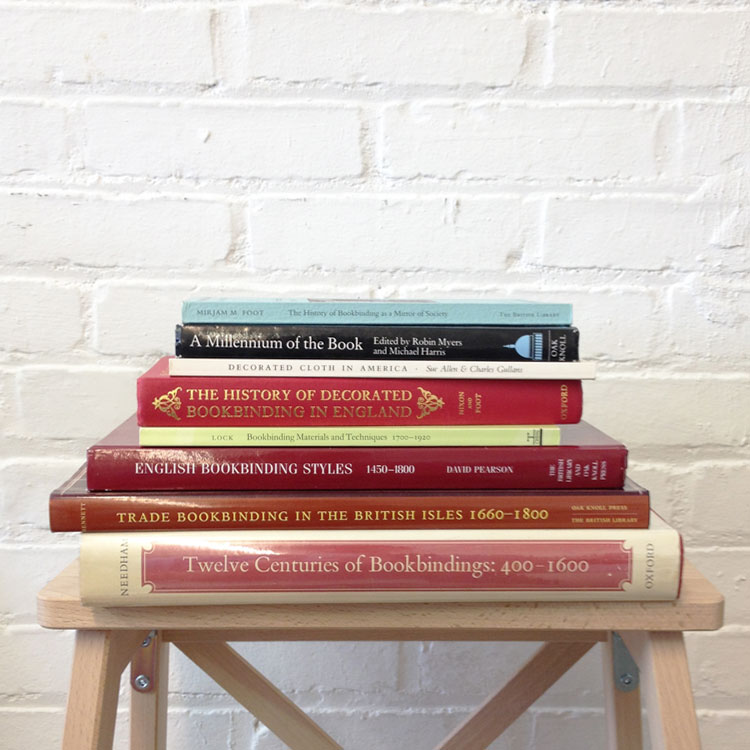
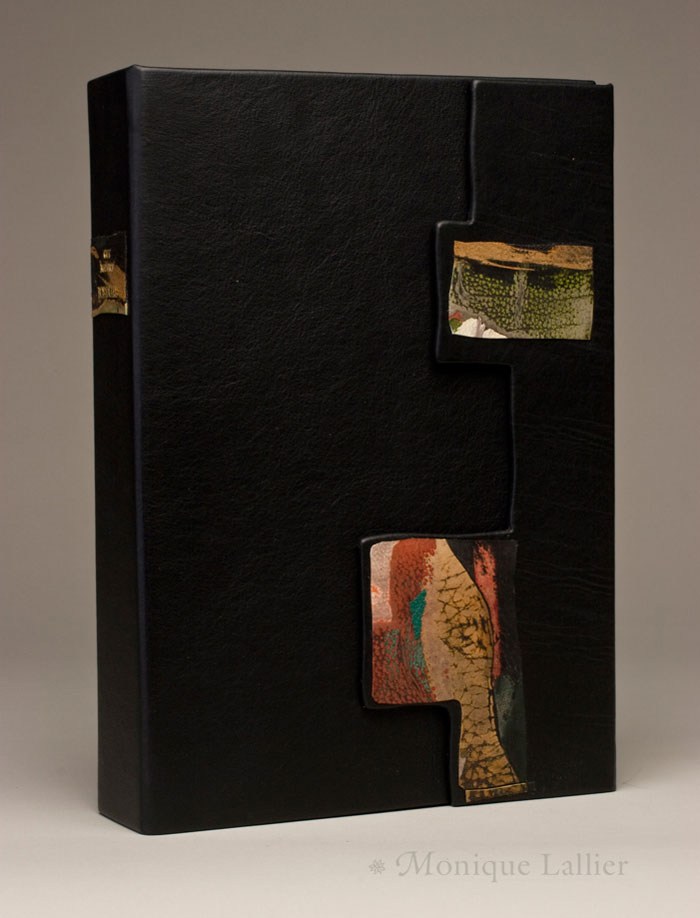
    For the past few months, I’ve been creating a collection of boxes for an aspiring book collector client of mine. Each box is similar in its format and design, only the colors change; a clamshell box with a rounded leather spine with false raised bands. The author and date of the imprint are hand tooled in gold on the spine with the title stamped in gold foil on a leather label recessed on the front board. The trays are covered in Canapetta bookcloth and lined with Bugra paper.

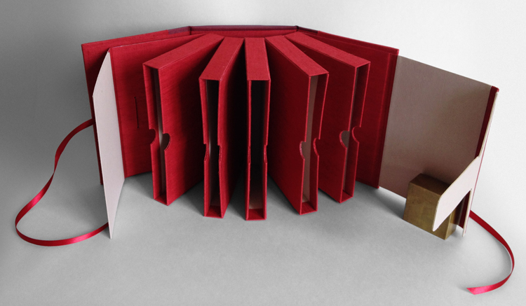
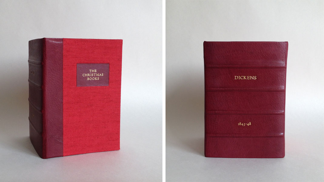
    Five boxes into this ongoing project, my client presented his five volume set of The Christmas Books by Charles Dickens, asking for a box to hold all five that could also mimic the other clamshell boxes I had already made. I remembered a tutorial of Hedi Kyle’s that I had printed out some time ago on a multi-section slipcase, which she presented in 2005 at the GBW Standards held in Portland, Oregon. So I set out to create a model to present to my client.

    MultiSectionSlipcase-ErinFletcher

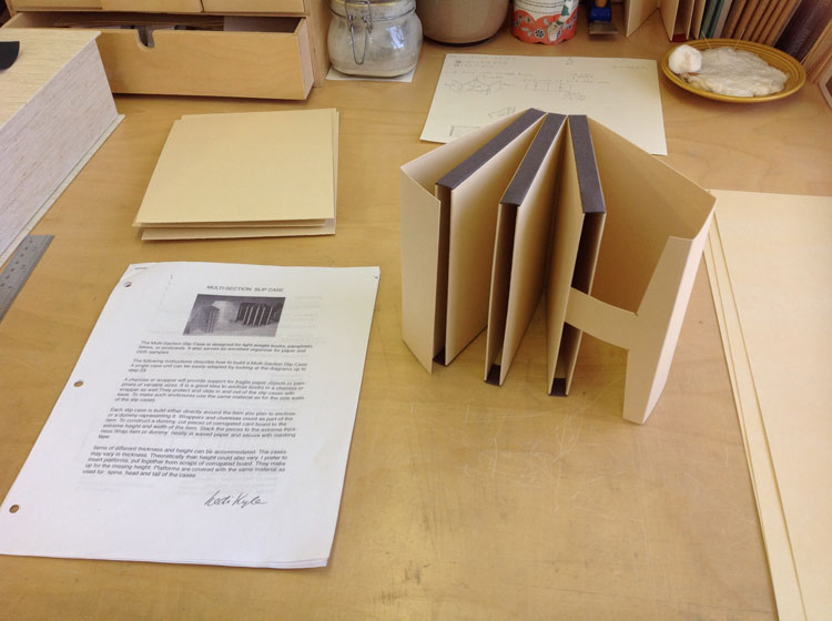
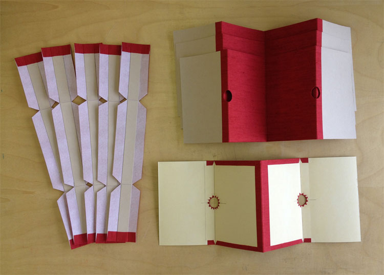
    The model was constructed using 20 pt. museum board and some scrap bookcloth. For the client’s box, I had to devise a way to cover the 20 pt. using Canapetta bookcloth and Bugra. Since a full sheet of 20 pt. laminated with bookcloth would get too bulky in the fold, the walls were assembled with four separate panels leaving a slight gap creating proper movement at the hinge.

    My client also requested notches on the walls for easy removal of the books. Semi-circles were cut out along the edge of the panels and the cloth was cut into triangles to successfully turn-in around the curve.

    MultiSectionSlipcase2-ErinFletcher

    Construction of this multi-section slipcase could be rather finicky at times, making it difficult to keep each component square. Once the slipcase sections were assembled and the interior ‘tongue and slot’ closure was added, it was time to construct an exterior case to mimic the clamshell boxes. I began by shaping the spine, which was rather difficult on a box that was wider than either of its other dimensions. The false bands were added and finally the leather was pasted down. The spine was then tooled and the leather label was laid into its well on the front board.

    MultiSectionSlipcase3-ErinFletcher MultiSectionSlipcase4-ErinFletcher

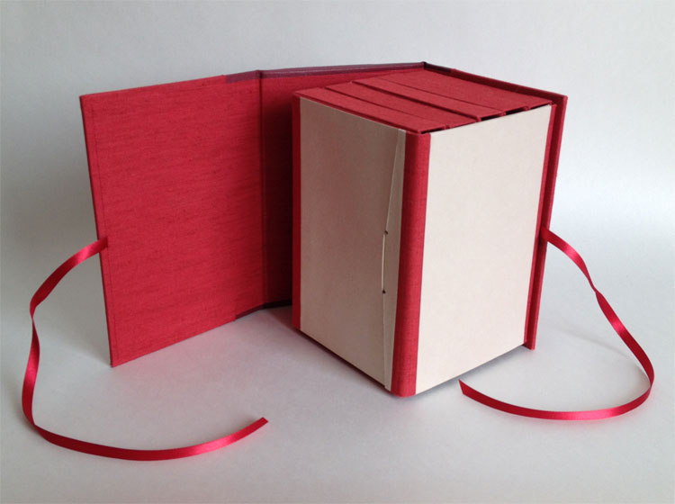
    The slipcase block is mounted to the back board of the exterior case, which can freely swing away and aid in the movement of the slipcases.

    MultiSectionSlipcase5-ErinFletcher


  2. Bookbinder of the Month: Mark Cockram

    August 3, 2014 by Erin Fletcher

    TheLivesofGallantLadies-MarkCockram

    In 2009, Mark Cockram bound a two volume set of The Lives of Gallant Ladies. Bound in full leather with hand dyed elements, layers of gold leaf and tooled shapes creating brilliant texture and depth. Just like many of Mark’s bindings, you can read about the progression of the design on his blog here.

    Below on the left shows the leather freshly pared with the first layer of dye carefully brushed on depicting a portion of a woman’s face. Later, after covering the binding more color is added to the skin.

    TheLivesOfGallantLadies_progress-MarkCockram

    After each square of gold leaf was carefully applied, the tooling was done in a free-style way offering for a more expressive design. Finally the gold was lightly rubbed away using a fine wire wool brush revealing the layer of dyed imagery.

    TheLivesOfGallantLadies_progress3-MarkCockram

    The base layer of this binding is revealed through the series of in-progress photographs included on your blog. Much of the design of the base layer is hidden under the blocks of gold. Why do you lean towards heavy applications of gold on your bindings? How does the use of gold project your artistic concepts?
    I enjoyed The Lives of Gallant Ladies. It is always nice to work on multiple volumes, more area to express and create a narrative. The images are built up with dyes then layered over with gold and cold tooled. I feel that working this way allows for great freedom in the mark making process. The gold is then re-worked to create layers that draw us into the binding.

    Though the gold may look heavy in the images online, the reality is that they are very light. When viewed at certain angles the images become more or less defined, rather like looking through a silk drape. Gold like other metals we use in bookbinding is traditionally used with hot tools, glaire and so on. I wanted something that was less stiff and moved. Using gold in this way enabled me to create a soft, final layer to the finished work. I tend to look outside of bookbinding to see what other artists do with similar materials, adopting and adapting to suit my requirements.

    TheLivesofGallantLadies2-MarkCockram TheLivesofGallantLadies3-MarkCockram


  3. August // Bookbinder of the Month: Mark Cockram

    August 1, 2014 by Erin Fletcher

    AClockworkOrange-MarkCockram

    This binding of A Clockwork Orange by Anthony Burgess was recently completed by the imitable Mark Cockram. The design is free of constraints, running wild and pushing the boundaries of the typical composition found on bindings past or present.

    Below are just two of the many photographs that Mark has shared on his blog documenting the progression of the binding. You can find more posts here. Seeing the transformation of the covers offers an even greater appreciation for the binding, exploring the work and dedication that was put into it.

    AClockworkOrangeprogress-MarkCockram

    A Clockwork Orange is special to Mark and deserved the right style of binding and design to speak of its story appropriately. The book is a second edition with a tipped in plate signed by the author.

    Your bindings have begun to develop into more textural surfaces with complex layers of color and graphics. What made you feel ready as an artist and bookbinder to bind a copy of this iconic title?
    I think I have always been interested in mixed media, even at art college my tutors would run out of things to say about my work. I suppose that with all the combinations of materials that have been and are being used to make books and how artists use materials, there is nothing new about what I do. I went to college in an age before the computer and for me cut and paste is just that… cut and paste.

    One aspect of bookbinding is to learn the skills that we need to make a book. This can be a life long journey. Some get so wound up in the technique and the craft of making that they forget the art of making and how design and art are as important as craft. I feel there has to be a balance in all things. Worse are the binders who say they work in the contemporary. Binding each book that finds itself on their bench with the same technique and material manipulation year in year out. The only apparent difference being the colour and the title.

    I realise that binders like to sell their work and it is so tempting to go for the easy option, after years of training and developing their ‘signature binding style’ and then the work begins to sell, it is at that time that forward movement ends. The collectors become comfortable with the styles of these binders. I have heard collectors say, at more than one private view “I have to have a so and so binding, I do not have one of his/hers yet”. It would appear that they are not collecting books, but binders work… Most binders working in this field tend to work with private press books from the 1890’s + (Golden Cockerel and the like) or modern private presses. I know that some text blocks are beautifully printed, but most titles and themes just seem to be dated. So who is to blame? The binders for doing the same thing year in year out? Or the collector, buying the same thing year in, year out? Or is it something else? Like a combination of the two.

    I prefer to move forward, to work with each book separately. To use an existing technique or to find something different depends on what the book needs. I do revisit past styles or working techniques if suitable … not as a matter of course. Over the last year or so I have been working with more mixed media. I suppose it looks like I go through phases with my work, but I tend to collect a few books that I feel a particular way of working would lend itself to and go for it.

    A Clockwork Orange is one of about 3 or 4 books that have a very graphic, layered, multi media feel and look to them. What else could I do with Clockwork? A full leather binding, generic traditional gold tooling with a nice label to the spine, 5 raised bands, marbled paper endpapers? Hardly contemporary and hardly in keeping with the text I think. It has been said that I am a brave binder, to take risks, to do what is not expected. I could take the safe path, bind in a fashion I know would sell, with the least amount of thought. But in reality I could not call myself a designer bookbinder let alone a contemporary bookbinder if I were to do that and most important I would not be either honest with my work and the book.

    AClockworkOrange3-MarkCockram AClockworkOrange2-MarkCockram

    – – – – – – – – – – –

    While a student at North Bennet Street School, I had the opportunity to travel with my fellow classmates to London. On this trip we spent an afternoon at Studio 5, Mark’s bindery space. His energy was infectious as he bounced around the room demonstrating various techniques and answering all of our eagerly asked questions. I regrettably did not take the time to get to know Mark further that day, so I was very happy that he agreed to be interviewed on my blog. I am in constant awe of the work he churns out, both in their execution and design.

    I’m so delighted to present the following interview with Mark Cockram. His bindings transform the traditional view of bookbinding and push the form into a new level of design. His work and dedication to the craft is aspirational and Mark has thoughtfully answered each of my questions with so much passion and truthfulness (with a bit of wit mixed in). Throughout the month of August, I’ll be presenting a binding of Mark’s each Sunday.

    Enjoy the interview after the jump.

    read more >


  4. Preparing the La Couleur du Vent Exhibit + Opening Reception

    July 24, 2014 by Erin Fletcher

    Last week, North Bennet Street School opened their first bookbinding exhibit in the Windgate Gallery. During the set-up, along with Jeff Altepeter and Katie Barber, I had the pleasure in handling the design bindings for ARA-Canada‘s La Couleur du Vent exhibit. To start off, I unpacked all of the books, unraveling them from their protective layering while keeping everything organized.

    LaCouleurDuVent1-ErinFletcher

    Jeff and I then went to task in laying out the books in their respective spots, doing our best to arrange the cases in a complimentary fashion. The school recently built new wooden bases for the exhibit with sawhorse-style legs. In order to have an adequate base, we decided to hide the wood by making some custom wrapped boards in a suitable and subtle bookcloth. After the wooden bases were installed we put the bindings in their final place, making minor adjustments by adding risers and wedges for the books lying flat.

    LaCouleurDuVent2-ErinFletcher LaCouleurDuVent3-ErinFletcher

    In addition to the bindings, a table was set up with a facsimile of the printed text. This gave real insight to the inspiration many of the binders saw within the illustrations, many of the graphics were replicated or abstracted on several of the bindings.

    LaCouleurDuVent5-ErinFletcher

    The night of the reception was attended by quite a crowd of binders coming from as far as France and Canada. Odile Douet of École Estienne in Paris was accompanied by Jonathan Tremblay, president of ARA-Canada (both with beautiful bindings in the show). Odile gave a heartwarming talk about the transformation of this simple idea and how it flourished into an international traveling exhibit. If you haven’t had a chance to view the exhibit, you can do so until it closes on September 14th.

    LaCouleurDuVent7-ErinFletcher LaCouleurDuVent6-ErinFletcher


  5. Rare Book School – Here I Come

    July 4, 2014 by Erin Fletcher

    RBS-ErinFletcher

    After reading through 1,275 pages of content detailing the history of bookbinding, I’m ready for my week-long course at the Rare Book School. For the following week, I’ll be spending my days at the University of Virginia in Charlottesville filling my brain with even more detailed information on the history of bookbinding! RBS was founded by Terry Belanger in 1983 at Columbia University as an institute to support the study of the history of books and printing and related topics for scholars and professionals working in these fields. RBS was moved to the University of Virginia in 1992.

    I’ll be taking Introduction to the History of Bookbinding, which is a course that has been taught by Jan Storm van Leeuwen for over ten years. He is the retired Keeper of the Binding Collection at the Dutch Royal Library in The Hague. In his retired years, he continues to publish and lecture widely on the history of bookbinding. 

    While I’m in Virginia, the blog will be a bit quiet. Once I return to Boston, filled with greater bookbinding knowledge, you can look forward to a post about my experience at RBS.


  6. La Couleur du Vent Exhibit is Coming to Boston

    June 22, 2014 by Erin Fletcher

    La couleur du vent is an international fine binding exhibit organized by ARA-Canada, which I may have mentioned a few times on the blog before. After traveling around France and Canada, the exhibit will be coming to the new Windgate Gallery space at the North Bennet Street School in Boston. Needless to say, I’m really looking forward to it. The exhibit is being sponsored by the New England Chapter of the Guild of Book Workers and the American Academy of Bookbinding, along with North Bennet Street School. 

    The exhibit will feature 51 design bindings on a selected project titled La couleur du vent (The color of the wind). The text is a collection of poems by Gilles Vigneault, illustrated and designed by Nastassja Imiolek under the artistic direction of Cécile Côté.

    The opening reception will be held on:
    July 18, 2014
    North Bennet Street School
    150 North Street
    6:00 – 8:00

    But if you can’t make the reception, the exhibit will be open until September 14, 2014. Check out NBSS’s website for the official press release. Hope to see you there. 


  7. Conservation Conversations // Removing Tape with an Air Pencil

    June 6, 2014 by Becky Koch

    For those of you that don’t know, tape is bad for paper and books! Tape eventually stains paper it comes in contact with (the length of time it takes to do this depends on the type of tape and environmental conditions), and the vast majority of the time this staining is non-reversible. Removing the tape itself is a high-risk activity, as there’s a chance that the top layer of paper can peel away, or fragile paper can tear during the process. If you want to keep anything for the long term, it’s just safer to keep the tape far, far away from it!

    DSC_3868

    Tape didn’t help this marriage certificate!

    There are lots of different ways to remove tape – some tape is so old and desiccated it almost falls off by itself, some types of tape easily come off in a water bath or with a poultice, and sometimes heat or solvents have to be used.   In our studio we try to avoid strong solvents as much as possible just for our own health, so our usual tape removal techniques involve heat.

    DSC09749

    Don’t fix your books with electrical tape!

    My go-to method has always been warming the tape up with a tacking iron to reactivate the adhesive and then picking at it with a microspatula or scalpel. After the carrier (the plastic or paper part of the tape that the adhesive is attached to) is removed, the sticky residue that remains can be picked up with a crepe eraser. Sometimes this method works great, but sometimes that tape just does not want to move! In those cases I get out the air pencil.

    photo 1

    The air pencil is something I had never seen before starting my job here. It is a soldering tool that generates a hot, concentrated stream of air. While it’s made to melt wires together, we use it to heat up tape.

    It’s a good alternative to the tacking iron because you’re never applying pressure directly to the tape, which can make the tape just adhere more securely to the paper rather than helping to lift it. The air pencil reactivates the adhesive without actually touching the tape itself, making it much easier to slide a scalpel under the carrier!

    photo 3

    Be aware that the air pencil can get really hot – remember that it’s made to melt wires! It’s easy to not only burn yourself but also burn the paper or even melt the tape carrier. We keep the temperature between levels 1 and 2 which seems to work on most tapes and has yet to damage any paper.


  8. Book Artist of the Month: Roni Gross

    May 26, 2014 by Erin Fletcher

    TheNightHunter3-RoniGross

    The Night of the Hunter is another collaborative artist book between Roni Gross, Peter Schell and Nancy Campbell.

    The text comes directly from a poem by Nancy Campbell of the same title, which was based on her residency on a remote island off the coast of Greenland during the winter of 2010. Roni reinterprets the text as a visual pattern of drawn colored lines repeating as the language repeats creating a unique landscape housed within a palm leaf structure. The poem is written as a pantoum, where lines repeat in specific patterns.

    TheNightHunter5-RoniGross TheNightHunter6-RoniGross

    The book is paired with an interactive board game constructed from salvaged wood and game pieces made from found materials that have been shaped by Peter Schell. On Nancy’s blog, she explains these material elements of the artist book “are a perfect physical expression of the austere Arctic environment that I had tried to capture in the poem.

    TheNightHunter2-RoniGross

    The objects stored inside the rawhide pouch are meant to be placed in the depressions on the board. Can you describe the interaction between the reader, these objects and the story itself?
    This work is an example of our interest in having the viewer participate in the telling of the story by feeling the objects – stone, bone and metal – and then placing them on the game board. There are not a lot of raw materials in Greenland, and so the materials are found or repurposed. The wood of the covers is driftwood, the cordage is made from dogbane – a natural fiber, and the game board was found wood. By holding these object, materials that the night hunter might encounter, you are entering his realm. Your freedom to place the pieces as you wish involves you in the unfolding of the poem.


  9. Bonus // Bookbinder of the Month: Monique Lallier

    May 25, 2014 by Erin Fletcher

    LaLune1-MoniqueLallier

    As much as I would like to feature every single binding from Monique Lallier’s portfolio, the month as finally come to an end. But I thought I’d sneak in one last binding to leave you in awe.

    La Lune was recently bound by Monique using dark blue smooth goatskin from Steven Siegel with matching edge to edge doublures. The endpapers perfectly match the design and title of the book. The ‘moon’ paper came from Andrea Peterson of Hook Pottery Paper.

    Throughout the month we’ve looked at your hidden panel bindings which offer a distinct element to your work and unique movement to the structure. We’ve also looked at bindings that include depth and texture through the use of laser cutting or lacunose. With the binding for La Lune you really bring together movement and texture in such a brilliant and unique way. What can you tell us about the concept for the binding and how the rotation of the moon was constructed?
    La Lune was a commission from an artist friend. I wanted to have texture for the full moon so I choose egg shells of different tones of blue to white. The crescent are of white shells, the new moon is of black vellum that has some gray tone in it. I had the circles laser cut. I cut a channel in each circle for the metal rod and put it in place before covering. From the inside of the boards I cut another channel, longer at the top than the bottom one so I could push the rod up until I could adjust it in the bottom channel. The rod has to stay free to allow the rotation.

    LaLune2-MoniqueLallier LaLune3-MoniqueLallier LaLune4-MoniqueLallierLaLune5-MoniqueLallier LaLune6-MoniqueLallier


  10. Bookbinder of the Month: Monique Lallier

    May 25, 2014 by Erin Fletcher

    LaPetitePouled'Eau-MoniqueLallier

    La Petite Poule d’Eau by Gabrielle Roy was bound by Monique Lallier in the French technique in full leather with onlays of lacunose. This technique transforms leather into a uniquely distinct design, offering texture and depth. The process calls for patience and muscle. Lacunose is created through a series of layers of thin leather pieces which are covered in a PVA wash and sanded smooth between each layer. The result is a build-up of various leathers in a seamlessly smooth finish, which can than be used as a decorative onlay.

    Another design element visible throughout your work is the lacunose onlay. The lacunose technique can be quite time consuming as you begin to add more and more layers. What is your process for the lacunose and how long does the process take?
    This is the story of a village in Manitoba, Canada, called La Petite Poule d’Eau. I wanted to convey a sense of structure and colorful personalities. I had seen Paul Delrue demonstrating “Lacunose” at the Standards and I thought it would be nice on my binding. Little did I know how long it would take me to achieve the result I wanted, but I am patient and determine so I kept sanding…It took several days, as you have to wait for the leather to dry between sanding sessions. Now I have several boards covered with “Lacunose” or (cuir peaufiné) sanded leather as they call it in France, because it’s a nice way to use your bits and pieces of leather. I have done some with one or two colors of different shades…you can play with it and do it in between steps in bookbinding…it’s fun!

    box-MoniqueLallier MoniqueLallier


  • My name is Erin Fletcher, owner and bookbinder of Herringbone Bindery in Boston. Flash of the Hand is a space where I share my process and inspirations.
    The StudioNewsletterInstagramEmail me
  • Archives